Crafting a Winning Newsletter in Microsoft Word 2008 for Mac

Do you want to learn how to design engaging newsletters in Microsoft Word 2008 for Mac?

In this article, we’ll show you how to create a beautiful newsletter using Microsoft Word 2008 for Mac, step by step. You’ll learn the fundamentals of Word, as well as create captivating layouts and distribute your newsletter effectively, if you use our Word tutorials.

Let’s get started on our quest to take your newsletter game to the next level with Microsoft Word 2008 for Mac!.

Understanding the Basics of Microsoft Word 2008

Understanding the Basics of Microsoft Word 2008
Image by: weebly.com

Understanding the basics of Microsoft Word 2008 for Mac is fundamental for anyone aiming to create professional newsletters efficiently. Released as part of the Office 2008 suite, this version of Word introduced several features tailored to Mac users, offering a user-friendly interface and seamless integration with other Office applications. The cornerstone of Word 2008 lies in its intuitive design, providing users with a familiar environment for document creation and editing. With its robust set of tools, Word 2008 empowers users to design visually appealing newsletters without the need for advanced graphic design skills.

Key features and functionalities in Word 2008 play a pivotal role in simplifying the newsletter creation process. The application offers a wide array of templates specifically designed for newsletters, allowing users to jumpstart their projects with pre-designed layouts and styles. Moreover, Word 2008 incorporates advanced formatting options, enabling users to customize their newsletters with ease. From adjusting fonts and colors to adding images and graphics, the versatility of Word 2008 facilitates creative expression while ensuring professional results.

However, it is essential to be aware of the compatibility and limitations of Word 2008 when creating newsletters. While the application boasts extensive compatibility with various file formats, including DOC, DOCX, and RTF, users may encounter challenges when collaborating with individuals using different versions of Word or other word processing software. Additionally, Word 2008 may have limitations in terms of advanced design capabilities compared to dedicated graphic design software. Therefore, users should leverage the strengths of Word 2008 while being mindful of its constraints to maximize their newsletter creation experience.

Planning Your Newsletter Content

When it comes to planning your newsletter content, meticulous attention to detail and strategic thinking are paramount. The first step in this process involves defining your audience and purpose. Understanding who your target audience is and what they’re interested in enables you to tailor your content to their preferences and needs. Whether you’re reaching out to potential clients, existing customers, or members of a community, identifying your audience allows you to craft messages that resonate and drive engagement. Additionally, clarifying the purpose of your newsletter is essential for establishing clear goals and objectives. Are you aiming to inform, educate, entertain, or persuade? Defining your purpose guides the content creation process and ensures that each piece of content serves a specific function in achieving your overarching goals.

Setting goals for your newsletter is the next crucial step in the planning process. These goals should align with your broader marketing or communication objectives and provide a framework for measuring success. Whether you’re looking to increase brand awareness, drive website traffic, generate leads, or nurture customer relationships, setting SMART (Specific, Measurable, Achievable, Relevant, Time-bound) goals enables you to track progress and evaluate the effectiveness of your efforts. By establishing clear benchmarks and metrics for success, you can refine your strategies and optimize future newsletter campaigns for maximum impact.

Choosing the right template or designing your newsletter from scratch is the final piece of the planning puzzle. While pre-designed templates offer convenience and time savings, designing from scratch provides greater flexibility and customization options. Consider factors such as branding guidelines, layout preferences, and visual appeal when selecting or creating your newsletter template. Ensure that the chosen template aligns with your brand identity and supports the overall message and objectives of your newsletter. Whether you opt for a ready-made template or embark on a custom design journey, prioritizing aesthetics, functionality, and user experience is key to creating a compelling and visually appealing newsletter that captivates your audience and drives desired outcomes.

Designing Your Newsletter Layout

Designing Your Newsletter Layout
Source: pinimg.com

In the realm of newsletter creation, the layout serves as the canvas upon which your content flourishes, making it imperative to design with both aesthetic appeal and user engagement in mind. Selecting fonts, colors, and visuals is the initial step in crafting a visually captivating newsletter that captures readers’ attention from the get-go. Fonts play a crucial role in conveying the tone and personality of your brand, with choices ranging from sleek and modern sans-serifs to elegant and timeless serifs. Similarly, color palettes should be carefully curated to reflect your brand’s identity and evoke the desired emotional response from your audience. Vibrant hues can inject energy and excitement, while muted tones lend an air of sophistication and elegance. When incorporating visuals, such as images, illustrations, or icons, opt for high-quality, relevant visuals that complement your content and reinforce your message.

Effectively organizing content sections is essential for enhancing readability and navigation within your newsletter. Utilize whitespace generously to create breathing room between content elements and ensure a clean, uncluttered layout. Group related content sections logically, using headings and subheadings to guide readers through the newsletter’s flow. Consider the hierarchy of information, prioritizing the most important content and placing it prominently within the layout. By structuring your newsletter in a cohesive and intuitive manner, you enhance user experience and encourage readers to engage with your content more deeply.

Incorporating headers, subheadings, and call-to-action elements is the final touch in designing a newsletter layout that drives action and encourages interaction. Headers and subheadings break up large blocks of text, making content more digestible and scannable for readers. Use descriptive and engaging language to entice readers to delve deeper into specific sections of your newsletter. Additionally, strategically place call-to-action elements throughout the layout to prompt desired actions, whether it’s subscribing to a mailing list, visiting a website, or making a purchase. By incorporating clear and compelling calls-to-action, you guide readers towards meaningful engagement and conversion opportunities, maximizing the impact of your newsletter campaign.

Creating Engaging Content

Crafting engaging content for newsletters is a delicate balance of creativity, relevance, and persuasion, with each element playing a crucial role in capturing and retaining readers’ attention. Crafting compelling headlines and subject lines is the first step in drawing readers into your content. Headlines should be concise yet attention-grabbing, offering a glimpse into the value proposition of the content while sparking curiosity and intrigue. Utilize power words, questions, and numbers to pique interest and entice readers to delve deeper into your newsletter. Similarly, subject lines in email newsletters serve as the gateway to your content, making it imperative to craft captivating lines that compel recipients to open and engage with your message.

Writing engaging articles, updates, and announcements is the heart and soul of your newsletter content, providing value and relevance to your audience. Start by understanding your audience’s interests, pain points, and preferences, tailoring your content to address their needs and aspirations. Use storytelling techniques to convey information in a compelling and relatable manner, weaving narratives that resonate with readers on a personal level. Incorporate a mix of informative, educational, and entertaining content to keep readers engaged and eager for more. Additionally, strive for clarity and brevity in your writing, avoiding jargon and unnecessary complexity that may alienate or confuse your audience.

Integrating multimedia elements like images and videos enhances the visual appeal and interactivity of your newsletter content, enriching the reader experience and increasing engagement. Visuals have the power to convey emotions, concepts, and information more effectively than text alone, making them valuable assets in capturing and retaining attention. Choose high-quality images and videos that complement your written content and reinforce your message, ensuring consistency in branding and visual identity. Incorporate multimedia strategically throughout your newsletter, breaking up text-heavy sections, illustrating key points, and providing additional context and depth to your content. By integrating multimedia elements seamlessly into your newsletter layout, you create a dynamic and immersive reading experience that captivates and resonates with your audience, driving increased engagement and retention.

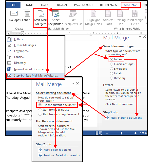
Utilizing Microsoft Word Tools and Features

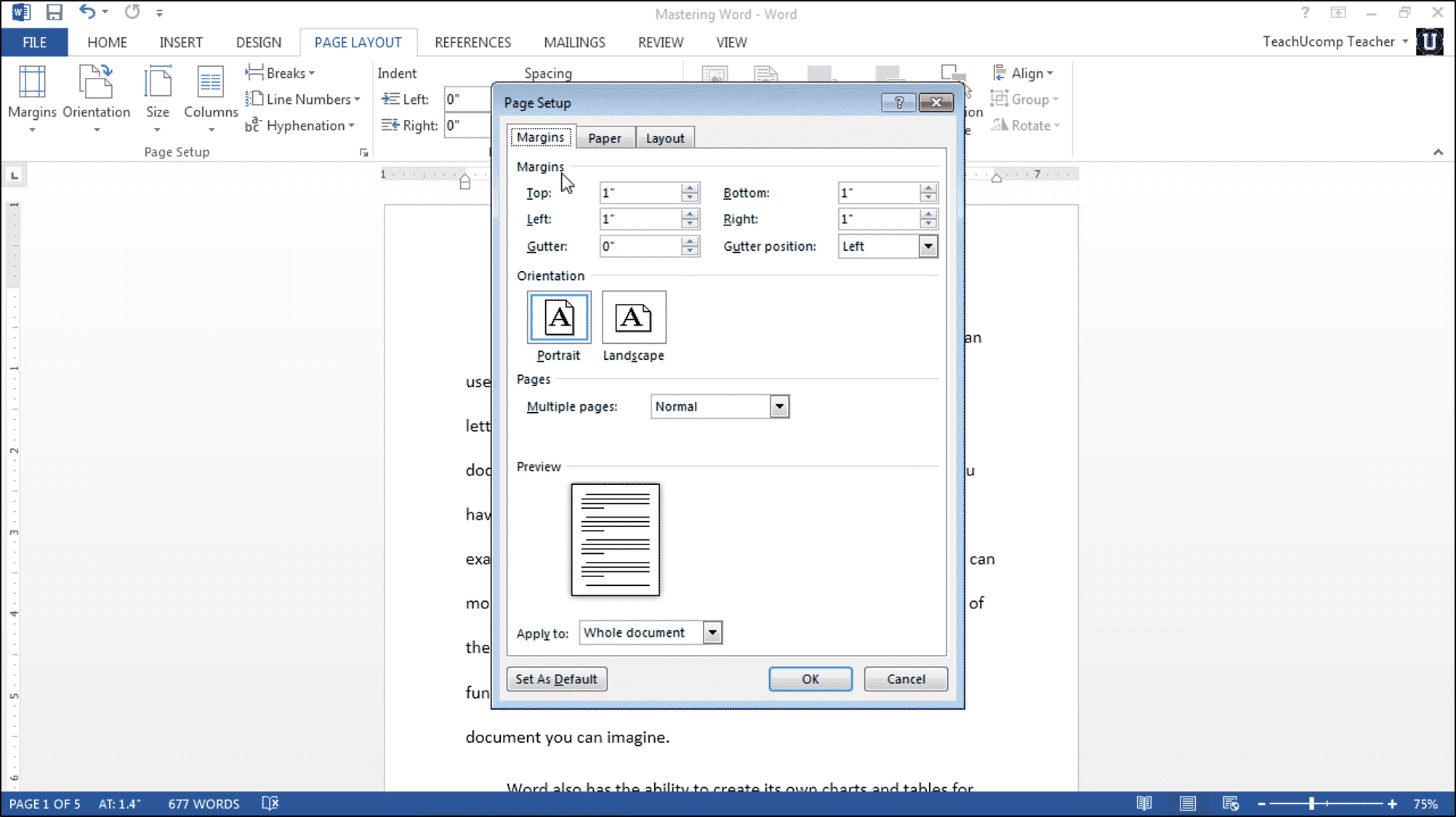
Utilizing Microsoft Word’s extensive array of tools and features is essential for optimizing the layout and design of your newsletter, ensuring a polished and professional appearance that captivates readers and enhances readability. Tables and columns offer powerful options for structuring content, allowing you to organize information in a visually appealing and easy-to-digest format. Whether you’re presenting data, comparing products, or outlining key points, tables and columns enable you to create structured layouts that improve clarity and comprehension. Leverage these tools to arrange content logically, streamline information, and maintain consistency throughout your newsletter.

Inserting hyperlinks and anchors is another valuable technique for enhancing navigation and facilitating interaction within your newsletter. Hyperlinks allow you to seamlessly integrate external resources, such as websites, articles, or documents, into your content, providing readers with additional context and supplementary information. Additionally, anchors enable you to create internal links within your newsletter, allowing readers to navigate effortlessly between sections or reference specific content within longer articles. By strategically incorporating hyperlinks and anchors, you enrich the reader experience, encourage exploration, and drive engagement with your content.

Furthermore, leveraging text boxes and shapes adds a layer of visual interest and sophistication to your newsletter design, allowing you to highlight important information, draw attention to key messages, and create visually dynamic layouts. Text boxes provide a versatile canvas for presenting content, enabling you to add emphasis, structure, and visual hierarchy to your text. Shapes offer additional design elements that can be used for decorative purposes, branding accents, or interactive elements such as buttons or icons. By incorporating text boxes and shapes strategically throughout your newsletter, you enhance visual appeal, reinforce branding, and elevate the overall presentation of your content, resulting in a more engaging and impactful reader experience.

Formatting and Polishing Your Newsletter

When it comes to formatting and polishing your newsletter, meticulous attention to detail is key to ensuring a professional and polished final product that resonates with your audience. Checking for consistency in formatting is the first step in this process, ensuring that fonts, colors, and styles are applied uniformly throughout your newsletter. Consistent formatting not only enhances visual appeal but also reinforces your brand identity and credibility. Take the time to review each section of your newsletter, paying close attention to headings, body text, and other design elements, to ensure a cohesive and harmonious layout that reflects your brand’s image and values.

Proofreading for grammar and spelling errors is equally important in refining the quality of your newsletter content. Typos, grammatical mistakes, and spelling errors can detract from the professionalism of your message and undermine your credibility as a communicator. Take advantage of proofreading tools and resources to catch errors that may have slipped through the cracks during the drafting process. Additionally, consider enlisting the help of a trusted colleague or professional editor to provide a fresh perspective and identify any lingering issues that may need attention. By investing time and effort into thorough proofreading, you can ensure that your newsletter is free of errors and polished to perfection before it reaches your audience.

Optimizing for readability and accessibility is the final step in formatting and polishing your newsletter, ensuring that it is easy to understand and accessible to all readers, regardless of their background or abilities. Pay attention to factors such as font size, line spacing, and text alignment to maximize readability and minimize strain on the eyes. Use clear and concise language, avoiding jargon and complex terminology that may alienate or confuse readers. Additionally, consider incorporating accessibility features such as alt text for images and descriptive links to enhance the experience for users with disabilities. By prioritizing readability and accessibility, you demonstrate your commitment to inclusivity and ensure that your newsletter can be enjoyed by all members of your audience.

Reviewing and Testing

Reviewing and Testing
Picture source: https://evaluationforms.org

In the final stage of newsletter creation, reviewing and testing are critical processes that ensure the quality and effectiveness of your content before it reaches your audience. Previewing your newsletter before finalizing allows you to assess its layout, formatting, and overall presentation across different devices and platforms. Take the time to view your newsletter on desktop computers, tablets, and mobile devices to ensure that it displays correctly and maintains its visual appeal across various screen sizes and resolutions. Additionally, testing links and interactive elements is essential to verify functionality and identify any potential issues or errors. Click on each link and interactive element within your newsletter to confirm that they lead to the intended destinations and perform as expected. This includes testing subscription forms, social media buttons, and any other interactive features to ensure seamless user experience.

Gathering feedback from colleagues, friends, or members of your target audience is invaluable in identifying areas for improvement and making necessary revisions to your newsletter. Share your newsletter draft with a select group of individuals and solicit their input and suggestions for enhancements. Pay attention to their comments and recommendations regarding content clarity, visual appeal, and overall user experience. Use this feedback to refine your newsletter content, address any concerns or shortcomings, and optimize its impact on your audience. Remember that feedback is a valuable tool for continuous improvement, and embracing constructive criticism can lead to a more polished and effective final product. By reviewing and testing your newsletter thoroughly and incorporating feedback from trusted sources, you can ensure that it meets the highest standards of quality and resonates with your audience, ultimately driving engagement and achieving your communication objectives.

Saving and Distributing Your Newsletter

When it comes to saving and distributing your newsletter, attention to detail and careful consideration of distribution methods are paramount to ensure maximum reach and effectiveness. Saving your document in compatible formats is the first step in this process, ensuring that your newsletter can be accessed and viewed across different platforms and devices without any compatibility issues. Choose common file formats such as PDF or HTML to ensure broad accessibility and compatibility with various email clients and web browsers. Additionally, consider optimizing your document for mobile viewing by selecting responsive design options and minimizing file size to ensure fast loading times and smooth user experience on smartphones and tablets.

Selecting distribution methods is the next crucial step in reaching your target audience and maximizing the impact of your newsletter. Email remains one of the most popular and effective distribution channels for newsletters, allowing you to deliver content directly to subscribers’ inboxes and maintain regular communication with your audience. Leverage email marketing platforms and tools to manage subscriber lists, schedule delivery times, and track engagement metrics such as open rates and click-through rates. In addition to email distribution, consider alternative methods such as print distribution for offline audiences or social media sharing for broader reach and visibility. Choose distribution methods that align with your audience preferences and communication objectives, ensuring that your newsletter reaches its intended audience effectively and efficiently.

Ensuring compliance with privacy and data protection regulations is essential to maintain trust and credibility with your audience while safeguarding their personal information. Familiarize yourself with relevant regulations such as the General Data Protection Regulation (GDPR) in Europe or the CAN-SPAM Act in the United States, and ensure that your newsletter complies with their requirements. Obtain explicit consent from subscribers before collecting and storing their personal data, and provide clear opt-in and opt-out mechanisms to give them control over their information. Implement robust security measures to protect subscriber data from unauthorized access or misuse, and regularly review and update your privacy policies and procedures to ensure ongoing compliance with evolving regulations. By prioritizing privacy and data protection, you demonstrate your commitment to ethical and responsible communication practices, building trust and loyalty with your audience over the long term.

Troubleshooting Common Issues

When encountering common issues while creating newsletters, addressing them effectively is crucial to ensure a seamless and successful distribution process. Formatting discrepancies often arise when transferring content between different platforms or software applications. To address this issue, ensure that you are using compatible file formats and formatting options that are supported by your chosen software. Additionally, double-check formatting settings such as margins, fonts, and spacing to identify and rectify any inconsistencies that may affect the appearance and readability of your newsletter content.

Fixing compatibility issues with other software is another common challenge that newsletter creators may encounter. If you experience compatibility issues when importing or exporting content between different software applications, explore alternative file formats or conversion methods to ensure smooth data transfer. Additionally, consider updating your software to the latest version or installing patches and updates that may address compatibility issues with third-party applications. By staying proactive and vigilant in addressing compatibility issues, you can minimize disruptions and streamline your newsletter creation process.

Troubleshooting printing and distribution problems is essential to ensure that your newsletter reaches its intended audience effectively. If you encounter issues when printing your newsletter, such as formatting errors or missing content, review your printer settings and document layout to identify and resolve any issues that may be affecting print quality. Additionally, test your newsletter distribution methods, such as email delivery or online publishing, to ensure that recipients receive the content as intended. Monitor delivery metrics and user feedback to identify any distribution problems and take corrective action as needed to optimize the distribution process.

Overall, troubleshooting common issues in newsletter creation requires a systematic and proactive approach to identify and address potential challenges effectively. By addressing formatting discrepancies, fixing compatibility issues, and troubleshooting printing and distribution problems, you can ensure a smooth and successful newsletter creation process and deliver high-quality content to your audience without disruptions or delays.

Additional Tips and Resources

Additional Tips and Resources
Picture source: https://baltimorecity.gov

In the realm of newsletter creation and distribution, continuous learning and staying updated with best practices are essential for achieving success and maximizing impact. To further develop your skills in newsletter creation, there is a plethora of learning resources available online, ranging from comprehensive guides and tutorials to video courses and webinars. Platforms like Udemy, Coursera, and LinkedIn Learning offer courses specifically tailored to newsletter creation, covering topics such as content strategy, design principles, and distribution tactics. Additionally, industry-leading blogs and websites such as HubSpot, Mailchimp, and Neil Patel’s blog provide valuable insights, tips, and case studies to help you refine your newsletter creation skills and stay abreast of the latest trends and developments in the field.

When it comes to best practices for newsletter creation and distribution, adhering to a few key principles can significantly enhance the effectiveness and impact of your newsletters. Firstly, focus on providing valuable and relevant content that resonates with your target audience’s interests and needs. Tailor your content to address their pain points, answer their questions, and offer solutions to their challenges. Additionally, prioritize visual appeal and readability by incorporating eye-catching visuals, concise yet compelling copy, and clear calls-to-action. Ensure that your newsletters are mobile-friendly and optimized for different screen sizes and devices to reach a wider audience and maximize engagement.

In addition to learning resources and best practices, implementing time-saving tips and shortcuts can help streamline your workflow and boost productivity in newsletter creation. Utilize templates and pre-designed layouts to expedite the design process and maintain consistency across your newsletters. Take advantage of automation tools and software features to schedule content delivery, segment subscriber lists, and track performance metrics more efficiently. Invest time in building and nurturing relationships with your audience through personalized messaging, targeted campaigns, and interactive content to foster loyalty and engagement over time.

Read More

Crafting Stylish Monograms in Microsoft Word: A Step-by-Step Guide

Using Microsoft Word, it never has been easier to create a unique and visually striking monogram. Discover how to create personalized masterpieces with simple initials using Microsoft Word! This is a must-read for anyone who has ever wondered how to create a simple combination of initials.

This article, in a nutshell, is your go-to guide for transforming basic initials into elegant monograms in Microsoft Word. We’ll walk you through each step of the process, from choosing the right fonts to adding decorative elements. Through the art of overlapping and aligning, you will discover how to achieve a seamless look, explore color options, and troubleshoot common issues. We’ll show you how to make custom monograms that reflect your unique style and creativity in a matter of minutes.

Let’s get started on the journey to discovering your monogram potential. Whether you’re a design lover or simply want to add a personal touch to your documents, this guide will show you how to create stylish monograms. You can take your initials to the next level in Microsoft Word!, as we’ll go over the fascinating world of monogram design.

Setting Up Microsoft Word

Setting Up Microsoft Word
Photo by – https://teachucomp.com

In the intricate dance of digital document creation, setting up Microsoft Word serves as the foundational choreography, dictating the rhythm of your creative process. To embark on this journey seamlessly, first, ensure you’re riding the wave of innovation with the latest version of Microsoft Word. Keeping your software up-to-date isn’t just about novelty; it’s a strategic move, providing you with access to the latest features, security patches, and performance enhancements. The digital landscape evolves, and staying current ensures you’re equipped with the most potent tools to navigate it.

As you step into the Microsoft Word arena, the initial pas de deux involves acquainting yourself with the Word interface. Picture it as your canvas; familiarity is the key to unlocking its full potential. A user interface might seem like a mere stage setting, but in reality, it’s the backstage pass to a world of functionalities. From ribbon tabs adorned with diverse tools to the intricate web of menus, each element is a brushstroke in your digital masterpiece. Take the time to explore, click, and hover; in this exploration, you’ll uncover the hidden gems that elevate your document creation experience.

In this digital tango, understanding the rhythm of Microsoft Word extends beyond surface-level interaction.

Maximizing the Ribbon Tabs

is akin to mastering the dance steps – each tab revealing a new set of tools. Whether it’s formatting, inserting elements, or reviewing your composition, these tabs are your partners in design, waiting to be twirled into action. Navigating through them seamlessly is your ticket to efficiency and precision.

The Intricacies of the Status Bar

may seem subtle, but in the grand symphony of document creation, it’s the heartbeat. From word count to language preferences, this unassuming bar at the bottom is your guide to maintaining the rhythm and structure of your composition. Recognizing its nuances ensures your document is not just visually appealing but also structurally sound.

In this digital realm, efficiency is the currency of productivity, and keyboard shortcuts are the secret handshake.

Mastering Keyboard Shortcuts

propels you into the fast lane, allowing you to execute commands with a flick of the wrist. From Ctrl+C for copying to Ctrl+V for pasting, these shortcuts are the keystrokes of empowerment, enhancing your workflow and saving precious time.

In a world where every click counts,

Customizing the Quick Access Toolbar

is the personalized signature on your creative expression. Tailoring this toolbar with the commands you use most frequently is akin to having a bespoke set of tools at your fingertips, streamlining your experience and eliminating unnecessary navigation.

So, as you embark on the exhilarating journey of setting up Microsoft Word, consider it more than a mere prelude—it’s the overture to a symphony of creativity. Stay current, familiarize yourself with the interface, and delve into the intricacies that transform a blank document into a canvas awaiting your digital brushstrokes. This, my fellow creators, is the art of orchestrating your digital narrative in the grand stage of Microsoft Word.

Selecting Fonts

Selecting Fonts
Image by – itscreativejuice.com

In the intricate world of monogram design, the selection of fonts is not merely a choice but a pivotal design decision that can elevate your creation from mundane to magnificent.

Exploring Fonts Suitable for Monograms

is akin to delving into a treasure trove of typographic possibilities. The font you choose becomes the voice of your monogram, conveying personality and style. Opting for classic and timeless fonts such as Serif or Script can imbue your monogram with an air of sophistication, while more modern sans-serif fonts can inject a contemporary flair. The key is to strike a harmonious balance between readability and aesthetics, ensuring your chosen font resonates with the essence of the initials it represents.

Navigating this typographic terrain, it’s crucial to understand that each font has its own personality, and

Combining Different Fonts for a Personalized Touch

is where the magic happens. This is not a mere exercise in mixing and matching; it’s a nuanced art form. Pairing a bold, uppercase initial with a cursive lowercase counterpart can create a dynamic contrast, offering a visual feast for the eyes. Experimenting with fonts that share common design elements ensures cohesion, while playing with variations in size and spacing adds a layer of intricacy. The goal is to craft a visual symphony where each font plays its unique part without overpowering the ensemble.

However, amidst the myriad choices, it’s essential to exercise restraint. Too many fonts can lead to visual chaos, diluting the impact of your monogram.

Strategic Font Selection for a Cohesive Design

demands a discerning eye. Consider the context in which your monogram will be used. For formal settings, lean towards elegant and classic fonts, while casual or creative contexts allow for more playful experimentation. Align the font choices with the intended mood and audience, ensuring your monogram communicates effectively and resonates with its viewers.

As you tread the fine line between creativity and coherence, keep in mind that less can often be more. Don’t be afraid to embrace white space and simplicity; a well-chosen font duo can speak volumes without the need for embellishments. The art lies in finding that sweet spot where fonts complement each other, creating a harmonious visual narrative that leaves a lasting impression.

In the realm of SEO, the importance of font selection extends beyond aesthetics. Fonts impact readability, and search engines favor user-friendly content. Choosing fonts that are legible across devices ensures a seamless user experience, contributing to your website’s overall SEO health. Additionally, consider the impact of font size and spacing on mobile responsiveness, as search engines prioritize mobile-friendly websites.

In the grand tapestry of monogram design, selecting fonts isn’t a mere task; it’s a design philosophy that intertwines creativity, strategy, and technical considerations. So, explore the vast landscape of fonts, experiment with combinations, and craft monograms that not only visually captivate but also stand the test of SEO scrutiny in the digital realm.

Creating a New Document

In the digital realm where the keystrokes of creativity meet the canvas of virtual documents, the process of creating a new Word document is the genesis of every written endeavor. To embark on this journey seamlessly, one must not merely open a blank canvas but orchestrate it with precision and intentionality.

Opening a New Word Document

is not just a mechanical act; it’s an initiation, a beckoning of possibilities. The cursor blinks, awaiting the inception of ideas that will unfold in the digital expanse. As you press ‘Ctrl + N’ or click ‘New Document,’ you’re not just opening a file; you’re opening the gateway to a world where words materialize into narratives, and ideas morph into tangible creations.

With the digital canvas unfurled, the next step is to set the stage by configuring document preferences. This isn’t a mundane task of ticking checkboxes; it’s an editorial decision that shapes the reader’s experience.

Setting Document Preferences: Size and Orientation

is akin to selecting the dimensions of a physical canvas—a crucial choice that influences the visual impact of your creation. Consider the nature of your content; is it a sprawling narrative that demands a landscape orientation, or a succinct report that thrives in portrait mode? The size and orientation of your document should align with the narrative cadence you wish to establish.

In the digital storytelling realm, efficiency is paramount. Bullet points become the storyteller’s tools, transforming information into digestible nuggets. So, as you embark on the journey of document creation, remember:

  • Open with Purpose: The act of opening a new Word document should be deliberate, setting the stage for creativity to flow.
  • Cursor as Catalyst: The blinking cursor is not just a symbol; it’s the catalyst that transforms thoughts into tangible words.

Navigating the preferences menu is not a chore but an editorial decision that shapes the visual narrative. As you set document preferences:

  • Size Matters: Choose the dimensions wisely, aligning them with the nature and tone of your content.
  • Orientation Dynamics: Landscape or portrait, the orientation should enhance the reading experience and complement your storytelling style.

While the act of opening a new document may seem routine, it’s the initial brushstroke on the canvas of creation. Each click, each preference set, contributes to the symphony of a well-crafted document. In the SEO landscape, the efficiency of document creation impacts user experience, a crucial metric in search engine rankings. A seamless opening process ensures that readers stay engaged, reducing bounce rates, and signaling to search engines that your content is valuable.

So, as you embark on the journey of creating a new Word document, remember that it’s not just a file; it’s the inception of ideas, the birth of narratives, and the beginning of a digital odyssey. Open with purpose, set preferences with intention, and let your document be the masterpiece that captivates both readers and search engines alike.

Adding Initials

Adding Initials
Image source: https://apowersoft.info

In the intricate tapestry of monogram design, the stage of adding initials emerges as the brushstroke that breathes life into the canvas of creativity. This isn’t a mere technicality; it’s the crux where personalization transforms from concept to visual reality.

Inserting Text Boxes for Each Initial

is akin to placing the protagonists on the stage, each initial poised to play its unique role in the narrative. The text box becomes the spotlight, framing the characters with precision and allowing them to shine individually.

As you embark on this creative journey, envision each initial as a character in a story waiting to be told. The process involves:

  • Strategic Placement: Consider the visual composition and hierarchy. Where each initial sits on the canvas impacts the overall balance and aesthetics.

  • Uniformity vs. Diversity: While each initial has its identity, maintaining a sense of uniformity ensures a cohesive and visually pleasing monogram.

Moving beyond the technicalities of placement, the true art lies in

Adjusting Font Size, Color, and Style

. This is the directorial decision, where each character’s nuances are meticulously curated to harmonize with the overarching narrative. As you navigate the realms of font customization:

  • Size Matters, But Proportion Prevails: Adjust font sizes thoughtfully, allowing larger initials to assert prominence without overshadowing their counterparts.

  • Color Symphony: The color palette is your artistic palette. Each hue contributes to the emotional tone—bold blacks, muted grays, or vibrant hues, each telling a unique story.

  • Style as Identity: Fonts carry personalities. Whether it’s a sleek and modern sans-serif or a classic and timeless serif, the style choice becomes the identity of your monogram.

In the realm of SEO, this stage is not just about aesthetics; it’s about user experience. A visually appealing monogram enhances engagement, reducing bounce rates and signaling to search engines that your content is valuable. Additionally, the proper use of text boxes and font adjustments contributes to mobile responsiveness, a crucial factor in SEO rankings.

So, as you embark on the nuanced journey of adding initials to your monogram, remember that it’s not a mere technicality; it’s the narrative unfolding, the characters finding their place on the stage. Place them strategically, adjust their attributes with precision, and let your monogram be the visual tale that captivates both eyes and algorithms alike. In this intricate dance of design, every initial has a role, and every adjustment contributes to the symphony of a well-crafted monogram.

Overlapping and Aligning

In the intricate realm of monogram design, the pivotal stage of overlapping and aligning initials is the choreography that transforms a collection of characters into a harmonious visual composition. This isn’t a mere technicality; it’s the conductor’s baton guiding the symphony of design towards a cohesive and aesthetically pleasing crescendo.

Positioning and Overlapping Initials for a Cohesive Look

is akin to arranging instruments in an orchestra—each initial playing its part, yet coming together to create a unified masterpiece. As you navigate this creative dance:

  • Strategic Overlapping: Overlapping isn’t just about merging letters; it’s a strategic decision to enhance visual appeal. Experiment with various overlaps to find the sweet spot where each initial complements its counterpart.

  • Visual Hierarchy: Consider the hierarchy of your initials. Is one more dominant, acting as the focal point, while others provide a supporting role? Achieving balance ensures a visually engaging and harmonious monogram.

Moving beyond the art of overlapping, the precision of alignment becomes the linchpin in creating a polished and professional monogram.

Utilizing Alignment Tools for Precision

is like fine-tuning an instrument before a performance—each adjustment contributing to the overall harmony. Here’s how you can master the art of alignment:

  • Grids as Guides: Leverage the power of grids to create a structured framework. Aligning initials to a grid ensures a disciplined and organized layout, adding a touch of professionalism to your design.

  • Centering for Symmetry: Center alignment exudes a sense of balance and symmetry. Whether it’s a single initial or a combination, centering anchors your monogram and enhances its visual impact.

  • Spacing as a Design Element: Consider the spacing between initials as a deliberate design choice. Tight spacing creates a sense of unity, while generous spacing allows each initial to breathe, contributing to an elegant and sophisticated aesthetic.

In the realm of SEO, the meticulousness of overlapping and aligning is not just about visual aesthetics; it’s about user experience. A well-crafted and visually appealing monogram reduces bounce rates, signaling to search engines that your content is engaging and valuable. Additionally, the strategic use of alignment contributes to mobile responsiveness, a critical factor in SEO rankings.

As you embark on the choreography of overlapping and aligning initials, envision it as a ballet of design elements, each movement contributing to the overall grace of your monogram. It’s not just about letters; it’s about their orchestrated arrangement, their nuanced alignment that transforms a collection of characters into a visual masterpiece. So, position with purpose, overlap with intention, align with precision, and let your monogram be the visual symphony that captivates both eyes and algorithms alike. In this intricate dance of design, every initial has its role, and every alignment contributes to the seamless choreography of a well-crafted monogram.

Adding Decorative Elements

Adding Decorative Elements
Credit: flylib

In the intricate symphony of monogram design, the stage of adding decorative elements is the crescendo that elevates your creation from mere initials to a visual masterpiece. This isn’t just embellishment; it’s the strategic infusion of artistic flair that adds character and depth to your monogram.

Incorporating Shapes, Lines, or Ornamental Elements

is akin to adding embellishments to a garment—each shape, line, or ornamental detail contributes to the overall aesthetic, transforming a simple monogram into a work of art. Here’s how you can navigate this embellishment journey:

  • Shapes as Visual Anchors: Consider geometric shapes as visual anchors that frame your initials. Circles, rectangles, or even more intricate polygons can add structure and sophistication to your monogram.

  • Lines for Movement: Lines are not just boundaries; they create movement and flow. Whether it’s a subtle underline or an ornate border, lines guide the eye and contribute to the overall dynamism of your design.

  • Ornamental Flourishes: Ornamental elements bring a touch of elegance and personality. Scrolls, filigree, or floral motifs can be strategically placed to enhance the aesthetic appeal of your monogram.

Moving beyond the incorporation of decorative elements, the true art lies in

Adjusting Sizes and Placements for Aesthetic Balance

. This is the curator’s decision, where each element is meticulously positioned to create a sense of harmony and visual balance. Here’s how you can master the art of adjustment:

  • Size Dynamics: Size isn’t just about scale; it’s about hierarchy. Larger decorative elements can act as focal points, guiding the viewer’s gaze, while smaller details add subtlety and nuance.

  • Strategic Placements: Consider the negative space around your initials as a canvas waiting to be adorned. Placing decorative elements strategically ensures that they enhance rather than overpower your monogram.

  • Consistency in Style: Whether you opt for a minimalist approach or a more ornate design, consistency in the style of decorative elements ensures a cohesive and polished look.

In the realm of SEO, the addition of decorative elements is not just about aesthetics; it’s about user engagement. A visually appealing and well-balanced monogram reduces bounce rates, signaling to search engines that your content is not only relevant but also captivating. Additionally, the strategic use of decorative elements contributes to mobile responsiveness, a crucial factor in SEO rankings.

As you embark on the journey of adding decorative elements to your monogram, envision it as the final brushstroke that completes the canvas. It’s not just about shapes and lines; it’s about the meticulous curation of visual elements that contribute to the overall aesthetic narrative. So, incorporate with intention, adjust with precision, and let your monogram be the visual opus that captivates both eyes and algorithms alike. In this intricate dance of design, every element has its role, and every adjustment contributes to the seamless choreography of a well-crafted monogram.

Coloring Your Monogram

In the vibrant realm of monogram design, the stage of coloring your creation is the palette that breathes life into the visual narrative. This isn’t a mere selection of hues; it’s a strategic exploration of color options that infuse personality, evoke emotions, and elevate your monogram to a realm of visual resonance.

Exploring Color Options for Initials and Decorative Elements

is akin to stepping into an artist’s studio, where each pigment becomes a brushstroke on the canvas of your design. As you embark on this chromatic journey, consider the following:

  • Psychology of Colors: Each color carries its own psychological weight. Delve into the emotional nuances; does blue evoke calmness, red ignite passion, or green signify growth? Align your color choices with the intended mood and message of your monogram.

  • Contrast for Impact: Contrast is not just a design principle; it’s a storytelling tool. Experiment with contrasting colors for initials and decorative elements to create visual impact and ensure readability.

  • Harmony in Hues: While contrast is powerful, harmony is equally crucial. Consider color harmonies such as complementary, analogous, or monochromatic schemes to create a visually pleasing and cohesive monogram.

Moving beyond the exploration of color options, the true art lies in

Using the Color Palette Effectively

. This is not just about selecting colors; it’s about orchestrating them in a symphony that resonates with your audience. Here’s how you can master the art of color palette usage:

  • Balance and Proportion: Like a conductor balancing instruments in an orchestra, balance the distribution of colors within your monogram. Proportionality ensures that no color overwhelms the visual harmony.

  • White Space as a Canvas: Embrace white space as the unsung hero in your color palette. It provides breathing room, allowing colors to shine without visual clutter, contributing to a clean and sophisticated design.

  • Consistency Across Platforms: In the digital age, your monogram might traverse various platforms. Ensure color consistency across print, web, and mobile applications to maintain brand integrity and recognition.

In the realm of SEO, the effectiveness of coloring your monogram extends beyond aesthetics; it impacts user engagement and brand recognition. A well-chosen color palette enhances user experience, reducing bounce rates and signaling to search engines that your content is not only visually appealing but also valuable. Additionally, color consistency contributes to brand recognition, a crucial factor in SEO rankings.

As you embark on the journey of coloring your monogram, envision it as the palette that tells a story without words. It’s not just about hues; it’s about the emotions they evoke, the messages they convey, and the visual resonance they create. So, explore with intention, use with precision, and let your monogram be the chromatic symphony that captivates both eyes and algorithms alike. In this intricate dance of design, every color has its role, and every usage contributes to the seamless choreography of a well-crafted monogram.

Grouping and Locking Elements

In the intricate landscape of monogram design, the stage of grouping and locking elements is the meticulous choreography that ensures precision and cohesion within your visual composition. This isn’t a mere technicality; it’s the conductor’s wand orchestrating the seamless movement of components, each element harmonizing with the others to create a visually compelling monogram.

Grouping Components to Move and Resize Together

is akin to assembling a puzzle—each piece, when grouped, moves and transforms as a cohesive unit. As you navigate this organizational dance, consider the following:

  • Efficient Arrangement: Grouping components streamlines the design process, allowing you to arrange, move, and resize multiple elements simultaneously. It’s the efficiency of a well-coordinated dance where each move impacts the entire visual narrative.

  • Logical Grouping: Group components logically based on their relationships. Whether it’s initials, decorative elements, or text boxes, grouping ensures that related elements stay connected, contributing to a well-organized and visually appealing monogram.

Moving beyond the art of grouping, the true mastery lies in

Locking Elements to Maintain the Desired Arrangement

. This is not just about locking; it’s about preserving the intentional arrangement and preventing unintentional shifts. Here’s how you can master the art of element locking:

  • Preserving Alignment: Locking elements safeguards the meticulous alignment achieved during the design process. It ensures that each component stays in its designated place, maintaining the visual balance of your monogram.

  • Preventing Accidental Adjustments: In the dynamic world of design, accidental clicks or drags can disrupt the carefully crafted arrangement. Locking elements acts as a protective measure, preventing unintended adjustments that could compromise the overall aesthetic.

  • Facilitating Collaboration: If multiple designers or collaborators are involved, element locking becomes a collaborative tool. It establishes a consistent visual framework, allowing contributors to work within the predefined structure without inadvertently altering the design.

In the realm of SEO, the effectiveness of grouping and locking elements extends beyond design aesthetics; it impacts user experience and reduces bounce rates. A well-organized and visually cohesive monogram enhances engagement, signaling to search engines that your content is not only visually appealing but also valuable. Additionally, the strategic use of element locking contributes to mobile responsiveness, a crucial factor in SEO rankings.

As you embark on the journey of grouping and locking elements within your monogram, envision it as the precision that ensures your visual narrative unfolds as intended. It’s not just about technicalities; it’s about orchestrating the dance of design elements, each movement contributing to the seamless choreography of a well-crafted monogram. So, group with intention, lock with precision, and let your monogram be the visual masterpiece that captivates both eyes and algorithms alike. In this intricate dance of design, every element has its role, and every locking mechanism contributes to the fluidity of a well-coordinated monogram.

Saving and Exporting

In the culmination of your monogram creation journey, the pivotal steps of saving and exporting mark the transition from the design realm to real-world applications. These are not just technicalities; they are the gateways that allow your meticulously crafted monogram to transcend the digital canvas and find its place in various facets of your personal or professional endeavors.

Saving Your Monogram as a Word Document

is akin to encapsulating your design in a versatile and accessible format. Here’s how you can navigate this saving process:

  • Preserving Editability: Saving your monogram as a Word document ensures that the design remains editable. Whether it’s for future tweaks or collaborative efforts, the Word format retains the flexibility for adjustments without compromising the integrity of your initial creation.

  • Textual Integration: As a Word document, your monogram seamlessly integrates with textual content. This is particularly valuable for branding materials, official documents, or any context where the combination of text and visual identity is paramount.

Moving beyond the realm of Word documents, the art lies in

Exporting as an Image for Versatile Use

. This step is the liberation of your monogram, allowing it to transcend platforms and mediums. Here’s how you can master the art of image export:

  • Visual Integration: Exporting your monogram as an image unlocks its potential for visual integration. From social media profiles to websites and promotional materials, the image format ensures a seamless and visually consistent representation across diverse platforms.

  • Print and Display: An exported image opens the door to print materials. Whether it’s business cards, merchandise, or signage, the image format provides the high-resolution clarity necessary for impactful print and display applications.

In the landscape of SEO, the efficacy of saving and exporting extends beyond design considerations; it impacts brand consistency and user engagement. A well-saved monogram in both Word and image formats contributes to a unified brand identity, a crucial factor in SEO rankings. Additionally, the versatility of image export enhances user engagement, reducing bounce rates as users interact with your visual identity across various online platforms.

As you embark on the concluding steps of saving and exporting your monogram, envision it as the bridge that connects your digital creation to the tangible and digital realms. It’s not just about file formats; it’s about the adaptability and accessibility of your design across a myriad of contexts. So, save with foresight, export with intention, and let your monogram be the versatile emblem that seamlessly integrates into both the digital and physical tapestry of your brand. In this final act of the design journey, every click of the save button and export command contributes to the lasting impression your monogram leaves on the world.

Troubleshooting Tips

In the intricate landscape of monogram design, the creative journey is not without its potential challenges. As you embark on the final stages of crafting your visual emblem, become the compass guiding you through common pitfalls, ensuring a seamless path to a flawless final design. Here, we delve into the nuances of addressing issues and implementing solutions that elevate your monogram creation process:

  • Font Rendering Challenges: One common hurdle in monogram design is font rendering. As you explore fonts suitable for your initials, you may encounter discrepancies in how certain fonts display. To overcome this, consider the following:

    • Font Compatibility Testing: Before finalizing your font selection, conduct comprehensive tests to ensure compatibility across different devices and platforms. This proactive approach minimizes unexpected variations in font rendering.

    • Opt for Web-Safe Fonts: Opting for web-safe fonts mitigates potential rendering issues. These fonts are widely supported, enhancing the consistency of your monogram across diverse environments.

  • Alignment Anomalies: Achieving precise alignment is paramount in monogram design. When faced with alignment anomalies, consider the following troubleshooting measures:

    • Snap-to-Grid Functionality: Leverage the snap-to-grid functionality in your design software. This feature ensures that elements align seamlessly, reducing the likelihood of misalignments.

    • Use Alignment Tools: Utilize alignment tools provided by the design software. These tools enable pixel-perfect adjustments, enhancing the overall symmetry of your monogram.

  • Exporting Image Quality: The transition from digital creation to exported image format can sometimes lead to a loss of image quality. To ensure optimal image quality, implement the following solutions:

    • High-Resolution Export: When exporting your monogram as an image, prioritize high-resolution settings. This guarantees sharp and clear visuals, especially crucial for print and display applications.

    • File Format Selection: Choose the appropriate file format based on your intended use. For images with transparency, PNG is preferred, while JPEG is suitable for standard visuals without transparency.

Troubleshooting in monogram design is not merely a reactive process; it’s a strategic approach to anticipate and address potential issues before they impact the final outcome. By implementing these troubleshooting tips, you fortify your design journey with the resilience needed to navigate challenges seamlessly. In the realm of SEO, the emphasis on troubleshooting contributes to user satisfaction, reducing bounce rates and signaling to search engines that your content is user-friendly and reliable.

As you encounter and conquer challenges in the pursuit of a flawless monogram, envision each solution as a brushstroke refining your masterpiece. Troubleshooting is not a detour; it’s an integral part of the design narrative, ensuring that your monogram emerges not only visually captivating but also technically robust. So, troubleshoot with precision, design with intention, and let your monogram stand as a testament to the meticulous craftsmanship that defines your brand identity. In this final act of troubleshooting, every resolved issue contributes to the resilience and sophistication of your visual emblem, leaving an indelible mark on both users and search engines alike.

Inspiration and Ideas

In the realm of monogram creation, the journey is not merely a technical process; it is an artistic exploration fueled by . As we navigate through the vast landscape of monogram design, showcasing exemplary examples becomes a beacon guiding the creative spirit. Here, we delve into the nuanced artistry of monograms, offering a tapestry of inspiration that encourages creativity and personalization:

  • Showcasing Diverse Monogram Styles:

    • Monogram designs are as diverse as the individuals or brands they represent. From elegant and classic monograms exuding timeless sophistication to modern and minimalist renditions reflecting contemporary aesthetics, a curated showcase unveils the spectrum of possibilities.
  • Incorporating Symbolism and Significance:

    • Beyond mere aesthetics, monograms often carry profound symbolism. A well-designed monogram can encapsulate the essence of a brand, individual, or concept. Examples featuring symbolic elements inspire creators to infuse deeper meaning into their designs.
  • Exploring Color Palettes and Typography:

    • The interplay of colors and typography is a crucial facet of monogram design. By presenting examples that masterfully navigate these elements, creators gain insights into harmonious combinations, leveraging the psychology of color and the artistry of fonts to amplify their visual narratives.
  • Highlighting Creative Personalization:

    • Monograms offer a canvas for creative expression and personalization. Showcasing examples where individuals or brands have ingeniously personalized their monograms fosters a spirit of innovation. From integrating personal motifs to experimenting with unconventional layouts, the possibilities for customization are boundless.
  • Encouraging Iteration and Experimentation:

    • The creative process thrives on iteration and experimentation. By featuring diverse examples that showcase the evolution of monogram designs, creators are inspired to embark on their own journeys of exploration. The path to a unique and impactful monogram often involves embracing the iterative nature of the design process.

In the world of SEO, inspiration is not merely a creative impetus; it is a strategic tool for engagement and user retention. By infusing your content with visually compelling examples and thought-provoking ideas, you not only captivate your audience but also signal to search engines that your content is relevant, valuable, and likely to be shared.

As we immerse ourselves in the rich tapestry of monogram examples, the underlying message is clear: monogram design is a canvas for limitless creativity. From traditional to avant-garde, each example serves as a testament to the boundless potential inherent in this art form. So, let the showcased monograms spark your imagination, emboldening you to weave a narrative that is uniquely yours. The world of monogram design awaits, inviting you to draw inspiration from the past, infuse it with your present creativity, and carve a path towards a future where every monogram tells a story—a story that resonates, inspires, and stands the test of time.

More questions

How do I use Microsoft Word for monogram creation?

To craft a monogram using Microsoft Word, start by opening a new document and adjusting preferences like size and orientation. Explore fonts suitable for monograms, combining them for a personalized touch. Insert text boxes for each initial, adjusting font size, color, and style. Ensure a cohesive look by positioning and overlapping initials, using alignment tools for precision. Incorporate decorative elements like shapes, lines, or ornaments, adjusting sizes for aesthetic balance. Explore color options for initials and elements, utilizing the color palette effectively. Group components to move and resize together, and lock elements to maintain the desired arrangement. Finally, save your monogram as a Word document and export it as an image for versatile use. Troubleshoot common issues for a flawless final design.

What are the best fonts for monograms in Word?

For creating captivating monograms in Word, opt for elegant and versatile fonts that exude a timeless appeal. Classic serif fonts like Times New Roman and Garamond offer a sophisticated touch, ideal for traditional monograms. If you prefer a more modern and chic look, sans-serif fonts such as Helvetica or Arial can add a contemporary flair to your monogram. Script fonts like Edwardian Script or Lucida Calligraphy convey a sense of elegance and personalization. Experiment with combinations to find the perfect pairing for your initials. Remember, clarity is key, so choose fonts that maintain legibility even when scaled down. Ultimately, the best fonts for monograms are those that reflect your personal style and resonate with the intended aesthetic.

Can I add decorative elements to my monogram in Word?

Certainly! Microsoft Word provides the flexibility to enhance your monogram with decorative elements. After adding your initials using text boxes, you can incorporate shapes, lines, or ornamental elements to elevate the visual appeal. Experiment with different designs and placements to achieve aesthetic balance. Adjust sizes and positions to complement your monogram. This creative freedom allows you to infuse personalized touches, making your monogram truly unique. Utilize the design tools in Word to enhance the overall visual impact of your monogram, ensuring it reflects your style and creativity. The ability to seamlessly integrate decorative elements adds a layer of sophistication to your monogram creation process in Microsoft Word.

How do I troubleshoot common issues when making a monogram?

Troubleshooting common issues when creating a monogram in Word involves a systematic approach. First, ensure you’re using the latest Word version. If facing layout problems, check document preferences like size and orientation. For text-related issues, verify font settings and consider suitable alternatives. If elements overlap incorrectly, use alignment tools for precision. Grouping components helps in moving and resizing them together, while locking ensures the desired arrangement. If colors appear inconsistent, explore the color palette and adjust accordingly. Saving the monogram as a Word document and exporting it as an image for versatile use safeguards your design. Following these steps ensures a smooth troubleshooting process, resulting in a flawless and visually appealing monogram in Microsoft Word.

Are there any online resources for monogram inspiration?

Certainly! Online platforms like Pinterest, Etsy, and design blogs offer a plethora of monogram inspiration. Explore these resources to discover a wide array of creative and personalized monogram examples. Pinterest, with its visual boards, showcases diverse styles and ideas for initials, decorative elements, and color schemes. Etsy, a marketplace for handmade and unique items, often features monogrammed products, providing inspiration for design and arrangement. Additionally, design blogs frequently curate monogram content, offering insights into the latest trends and innovative approaches. Delve into these online havens to spark your creativity and find the perfect inspiration for crafting a distinctive and visually appealing monogram.

What is the importance of grouping and locking elements in monogram design?

Grouping and locking elements in monogram design is pivotal for maintaining precision and achieving a cohesive aesthetic. By grouping components, you ensure they move and resize collectively, streamlining the design process and preserving the intended arrangement. This feature enhances efficiency, especially when handling intricate monogram layouts with multiple elements. Locking elements then becomes crucial to safeguard the desired design, preventing accidental shifts or misalignments. It guarantees that each element stays in its designated position, ensuring the final monogram reflects the meticulous planning and creative vision. In essence, the importance of grouping and locking lies in the ability to maintain design integrity, streamline workflows, and produce a polished and visually appealing monogram with utmost precision.

What size and orientation are suitable for monogram documents?

Optimal size and orientation for monogram documents depend on personal preferences and the intended use. Commonly, a square layout, such as 8×8 inches, offers a balanced canvas for monogram creation. This size accommodates various design elements without overwhelming the space. However, flexibility is key, and adjustments can be made based on the desired size and shape of the final monogram. As for orientation, both portrait and landscape orientations are viable, with the choice influenced by the stylistic direction and the arrangement of initials and decorative elements. Ultimately, the suitability of size and orientation is subjective, allowing for creative freedom and customization in crafting unique and visually pleasing monograms.

How can I make my monogram look cohesive and balanced?

Achieving a cohesive and balanced monogram involves thoughtful design choices. Begin by selecting fonts that complement each other and suit the monogram’s style. Maintain visual harmony by ensuring consistent sizing and alignment of initials. Overlapping and aligning elements strategically contribute to a unified look. Incorporating decorative elements, such as shapes or lines, can enhance overall balance. Experiment with color options, considering a harmonious palette that resonates with the intended aesthetic. Grouping and locking components help maintain proportionality, ensuring a well-balanced composition. Regularly step back and assess the design to identify areas for refinement. Through a meticulous approach to each design element, your monogram will exude cohesion and balance, resulting in a visually appealing and harmonious final product.

The bottom line

Finally, mastering the art of monogram creation in Microsoft Word grants you a wide range of creative options. After completing the various steps, including selecting font and adding decorative elements, you’ll be able to make personalized and visually appealing monograms that will be remembered for a long time.

By studying the nuances of overlapping, aligning, and utilizing color effectively, you will have developed your skills in order to create a cohesive and balanced design. Your new appreciation for monogram design has been fueled by a variety of factors, including grouping and locking elements, troubleshooting common issues, and incorporating inspirational ideas.

One of the greatest qualities of monogram creation is its simplicity and the wide range of ways it can be used to express your individual style. This course will undoubtedly elevate your design skills if you choose to use it for personal or professional reasons.

As you progress through the process of making your monogram, keep drawing inspiration from various sources and allowing your creativity to run wild. When you use Microsoft Word, you give it your canvas, and now you have the knowledge to make your initials stand out by combining them with eye-catching monograms. Your creativity has taken your design to a whole new level.

Read More

Mastering the Shortcut: How to Make a Number Superscript in Microsoft Word

When you create numbers superscript in Microsoft Word, you can significantly enhance the overall appearance of your documents, whether you’re crafting a scientific paper, a presentation, or simply adding footnotes to your documents; mastering this formatting technique can significantly improve readability and professionalism.

Simply put, this article is your best bet for learning the shortcut for making numbers superscript in Microsoft Word. You will learn how to simplify your document formatting workflow with practical tips and insights as we walk you through the process step by step.

Let’s dive into the world of superscript formatting in Microsoft Word so that you can customize your documents to their maximum potential.

Understanding Superscript in Microsoft Word

In the realm of document formatting, understanding the intricacies of superscript in Microsoft Word can significantly enhance your ability to create visually compelling and professionally structured documents. Superscript, a typographical term, refers to text that is slightly raised above the normal line of text. This formatting feature holds immense significance across various fields, ranging from academia to business presentations, where precision and clarity are paramount.

What is Superscript?

Superscript, often denoted by a smaller-sized and raised numeral or character, serves multiple purposes in document formatting. It is commonly utilized in mathematical expressions, scientific notations, chemical formulas, and footnotes to denote references or citations. Additionally, superscript is employed in typographical conventions such as ordinal indicators (1st, 2nd, 3rd) and abbreviations (m2 for square meters, km3 for cubic kilometers).

Typical Use Cases

Understanding the typical use cases for superscript is essential for harnessing its full potential in document creation. In mathematical expressions, superscript denotes exponents, making it indispensable for illustrating powers or indices. Similarly, in scientific and technical documents, superscript is utilized to denote units, symbols, or constants, facilitating clear and concise communication of complex information. Furthermore, in academic writing, superscript is commonly employed for citing sources, inserting footnotes, or indicating references, enhancing the credibility and professionalism of scholarly work.

In essence, mastering the utilization of superscript in Microsoft Word empowers individuals to create documents that are not only visually appealing but also effectively convey information with precision and clarity. Whether you’re crafting a research paper, preparing a presentation, or composing a scientific report, incorporating superscript can elevate the quality and professionalism of your documents, setting them apart in a crowded digital landscape. So, why not explore the vast potential of superscript in Microsoft Word and unlock new avenues for effective communication in your documents?

The Shortcut for Making a Number Superscript

In the world of document formatting, precision and efficiency are paramount. Microsoft Word, one of the most widely used word processing tools, offers a myriad of features to enhance document presentation. Among these features is the ability to format numbers as superscript, a formatting style commonly used for mathematical expressions, chemical formulas, footnotes, and more. While manually formatting numbers as superscript can be time-consuming, Microsoft Word provides a shortcut method that streamlines the process, enabling users to effortlessly elevate the visual appeal and clarity of their documents.

Introduction to the Shortcut Method

The shortcut method for making a number superscript in Microsoft Word is a game-changer for users seeking efficiency and convenience in document formatting. Unlike traditional methods that involve navigating through menus and dialog boxes, the shortcut method offers a seamless and intuitive approach to formatting numbers as superscript. With just a few simple keystrokes, users can transform regular numbers into superscript, saving valuable time and effort in the document creation process.

Step-by-Step Guide

Mastering the shortcut method for making a number superscript in Microsoft Word is easier than you might think. Follow these step-by-step instructions to unlock the power of superscript formatting:

  1. Select the Number: Begin by selecting the number you wish to format as superscript within your document.

  2. Apply the Shortcut: Once the number is selected, simply press the shortcut key combination. In most versions of Microsoft Word, this shortcut involves pressing “Ctrl + Shift + +” (Ctrl and Shift simultaneously, followed by the plus sign). Alternatively, you can use “Ctrl + Shift + =” on some keyboards.

  3. Enjoy the Superscript: Voila! Your selected number is now formatted as superscript, seamlessly integrated into your document for enhanced visual appeal and clarity.

By incorporating this shortcut method into your document creation workflow, you can streamline the formatting process and elevate the professionalism of your documents with ease. Whether you’re crafting a scientific report, academic paper, or business presentation, the ability to quickly format numbers as superscript can significantly enhance the readability and visual impact of your content. So why wait? Unlock the power of the superscript shortcut in Microsoft Word today and take your document formatting skills to new heights.

Alternative Methods for Superscript Formatting

In the realm of document formatting, precision and flexibility are paramount. Microsoft Word, a staple tool for many professionals, offers various methods for formatting numbers as superscript, each with its own set of advantages and considerations. While the shortcut method is widely favored for its speed and efficiency, alternative approaches exist within the software’s interface, providing users with additional options for achieving the desired formatting. Let’s delve into these alternative methods and explore how they compare to the shortcut method in terms of speed, convenience, and ease of use.

Overview of Alternative Methods

  • Font Dialog Box: One alternative method for making a number superscript in Microsoft Word is through the Font dialog box. This method involves selecting the desired number, opening the Font dialog box through the Home tab or by right-clicking, and then checking the superscript option within the dialog box. While this method offers precise control over formatting options such as font size and baseline shift, it may be less efficient for users seeking a quick and streamlined approach.

  • Home Tab Options: Another alternative method is to utilize the options available in the Home tab of the Microsoft Word ribbon. Users can select the desired number, navigate to the Home tab, and click on the Superscript button within the Font group. This method provides a straightforward and easily accessible way to format numbers as superscript directly from the ribbon interface, making it ideal for users who prefer a visual and intuitive approach to formatting.

Comparison with Shortcut Method

When comparing these alternative methods with the shortcut method, several factors come into play, including speed, convenience, and ease of use. While the shortcut method offers unparalleled speed and efficiency, allowing users to format numbers as superscript with just a few keystrokes, it may lack the precision and customization options provided by alternative methods such as the Font dialog box. On the other hand, the Font dialog box and Home tab options offer greater control over formatting parameters but may require additional steps and navigation, potentially slowing down the formatting process.

In essence, the choice between the shortcut method and alternative approaches depends on the user’s specific needs and preferences. For users who prioritize speed and efficiency, the shortcut method remains the go-to option for quickly formatting numbers as superscript. However, for users who require more precise control over formatting options or prefer a visual interface for formatting tasks, alternative methods such as the Font dialog box and Home tab options offer viable alternatives that cater to diverse formatting needs. Ultimately, Microsoft Word’s versatility in providing multiple formatting methods empowers users to choose the approach that best suits their workflow and preferences.

Mastering Advanced Superscript Techniques

Mastering Advanced Superscript Techniques
Image by – https://pixelatedworks.com

In the intricate world of document formatting, mastering advanced techniques for superscript in Microsoft Word can elevate your writing to a new level of professionalism and clarity. Beyond the basics lies a realm of possibilities where non-numeric characters, symbols, and special characters can be effortlessly transformed into superscript, adding finesse and sophistication to your documents. Let’s delve into the realm of advanced superscript techniques and unlock the full potential of Microsoft Word’s formatting capabilities.

Enhancing Superscript Formatting

  • Character Styling: While superscript is commonly associated with numeric characters, mastering advanced techniques involves extending this formatting to non-numeric characters. With Microsoft Word’s powerful styling options, you can effortlessly apply superscript to letters, symbols, and special characters, enhancing the visual appeal and readability of your text.

  • Symbolic Representation: In addition to traditional numeric superscript, advanced techniques allow for the inclusion of symbols and special characters in superscript formatting. Whether it’s mathematical symbols, copyright or trademark symbols, or other special characters, Microsoft Word provides intuitive tools for seamlessly incorporating superscript into your documents, adding depth and clarity to your written content.

Guidance on Implementation

  • Advanced Formatting Tools: To master advanced superscript techniques, familiarize yourself with Microsoft Word’s advanced formatting tools, such as the Font dialog box and the Equation Editor. These tools offer precise control over superscript formatting, allowing you to customize the size, positioning, and style of superscript characters to suit your specific needs.

  • Shortcut Keys: In addition to advanced formatting tools, leveraging shortcut keys can streamline the process of applying superscript formatting to your text. By memorizing key combinations or creating custom shortcuts, you can expedite the formatting process and boost your efficiency when working with superscript in Microsoft Word.

Unlocking Creative Possibilities

By mastering advanced superscript techniques, you unlock a world of creative possibilities that can enhance the visual appeal and readability of your documents. Whether you’re crafting scientific papers, mathematical equations, or technical documents, the ability to seamlessly incorporate superscript formatting into your text adds a touch of professionalism and sophistication that sets your writing apart.

Troubleshooting and Common Issues

In the intricate world of document formatting, making a number superscript in Microsoft Word may seem like a straightforward task, but as with any digital endeavor, it comes with its fair share of challenges. From formatting errors to inconsistencies in display, troubleshooting these common issues requires a keen eye for detail and a knack for problem-solving. Let’s delve into the realm of troubleshooting and explore some of the most common issues encountered when attempting to make a number superscript in Microsoft Word.

Identification of Common Issues

  • Incorrect Shortcut Usage: One of the most common issues users encounter is incorrect usage of shortcuts for superscript formatting. Using the wrong key combinations or failing to activate the superscript feature can lead to formatting errors and inconsistencies in display.

  • Font Compatibility: Another common issue arises from font compatibility issues. Certain fonts may not support superscript formatting or may render superscript characters differently, leading to discrepancies in appearance across different devices and platforms.

  • Document Conversion: When sharing documents across different platforms or converting files between formats, issues may arise with superscript formatting. Incompatibilities between software versions or conversion errors can result in loss of formatting and misalignment of superscript characters.

Troubleshooting Tips and Solutions

  • Verify Shortcut Usage: To address issues with incorrect shortcut usage, double-check the key combinations for activating superscript formatting in Microsoft Word. Ensure that the correct keys are pressed simultaneously or use the formatting options available in the Ribbon menu to apply superscript to selected text.

  • Choose Compatible Fonts: To mitigate font compatibility issues, select fonts that fully support superscript formatting and are compatible with Microsoft Word. Stick to commonly used fonts such as Arial, Times New Roman, or Calibri to ensure consistent display across different platforms and devices.

  • Check Document Settings: When encountering issues with document conversion, review the settings and preferences for file compatibility in Microsoft Word. Adjust the settings to optimize compatibility when sharing or converting documents to prevent loss of formatting and preserve superscript characters.

Best Practices for Superscript Formatting

Best Practices for Superscript Formatting
Credit: wallstreetmojo

In the realm of document formatting, mastering the art of superscript in Microsoft Word can elevate the quality and professionalism of your work. To ensure consistency, readability, and a polished appearance, adhering to best practices is essential. Here are some recommendations for maximizing the effectiveness of superscript formatting and enhancing the overall design of your documents:

1. Use Superscript Sparingly and Purposefully

  • Limit Usage: While superscript can be a valuable tool for highlighting specific content, overusing it can clutter your document and detract from readability. Reserve superscript for essential elements such as footnotes, mathematical expressions, or references, ensuring that its usage is purposeful and enhances the clarity of your content.

  • Prioritize Readability: When incorporating superscript into your document, prioritize readability by choosing a font size and style that maintains legibility. Avoid excessively small or obscure superscript characters that may be difficult to read, especially in printed materials or presentations.

2. Maintain Consistency in Formatting

  • Uniformity: Consistency is key to creating a professional and cohesive document design. Ensure that the size, style, and positioning of superscript characters remain consistent throughout your document. Use Microsoft Word’s formatting tools to standardize superscript appearance and maintain a polished aesthetic.

  • Alignment: Pay attention to the alignment of superscript characters within your text. Align superscript elements vertically with the baseline of the surrounding text to maintain visual harmony and prevent distractions or disruptions in flow.

3. Optimize for Accessibility and Compatibility

  • Accessibility: Consider the accessibility of your document when using superscript formatting. Ensure that superscript characters are legible and discernible for all readers, including those with visual impairments or using assistive technologies. Choose fonts and styles that prioritize accessibility and readability for all users.

  • Compatibility: Keep compatibility in mind when sharing or distributing your documents across different platforms or devices. Test the display of superscript formatting in various software applications and environments to ensure compatibility and prevent formatting errors or discrepancies.

4. Review and Proofread Carefully

  • Quality Control: Before finalizing your document, take the time to review and proofread your content carefully. Check for any formatting inconsistencies, errors, or typos in superscript elements, ensuring that they align with your intended design and messaging.

  • Feedback: Seek feedback from peers, colleagues, or proofreaders to gain valuable insights and perspectives on the effectiveness of your superscript formatting. Incorporate constructive feedback to refine your document and enhance its overall quality and impact.

Practical Applications of Superscript in Documents

In today’s digital age, where information is abundant and attention spans are fleeting, mastering the art of document formatting is crucial for effectively conveying ideas and capturing audience engagement. Superscript, a formatting technique commonly used to elevate specific elements within text, offers a myriad of practical applications across various types of documents, ranging from academic papers to business reports and presentations. Let’s explore some real-world examples showcasing the versatility and creative potential of superscript formatting:

1. Academic Papers and Citations

  • Footnotes and Endnotes: In academic writing, superscript is frequently employed to denote footnotes or endnotes, providing additional context, references, or explanations without disrupting the flow of the main text. By incorporating superscript numbers or symbols, scholars can seamlessly integrate supplementary information into their research papers or dissertations, enhancing the comprehensiveness and scholarly rigor of their work.

  • Citations and References: Superscript is also utilized to denote citations within academic papers, directing readers to the corresponding bibliography or reference list. By adopting a standardized format for citing sources, scholars ensure accuracy, consistency, and credibility in their academic writing, facilitating peer review and academic discourse.

2. Technical Documents and Formulas

  • Mathematical Equations: In technical documents, such as scientific reports or engineering manuals, superscript is indispensable for formatting mathematical equations, formulas, and exponents. By visually distinguishing numerical elements raised to a power or denoting mathematical constants, superscript aids in clarity, precision, and comprehension, enabling readers to interpret complex technical information with ease.

  • Chemical Notations: In chemistry and other scientific disciplines, superscript is utilized to represent chemical elements, isotopes, and molecular structures. By employing superscript symbols and subscript numbers, scientists can convey intricate chemical notations and formulae accurately, facilitating scientific communication and knowledge dissemination.

3. Presentations and Visual Design

  • Highlighting Key Points: In presentations or slide decks, superscript can be used to emphasize key points, statistics, or data points, drawing attention to critical information and enhancing audience engagement. By strategically incorporating superscript elements into visual design layouts, presenters can create dynamic and impactful presentations that resonate with viewers and leave a lasting impression.

  • Creating Visual Hierarchy: Superscript is instrumental in establishing visual hierarchy within documents, enabling designers to prioritize content and guide reader attention. By elevating headers, subheadings, or numerical annotations using superscript formatting, designers can organize information effectively, improve navigability, and enhance overall document aesthetics.

In conclusion, the practical applications of superscript formatting in documents are diverse and far-reaching, spanning academic research, technical documentation, presentations, and beyond. By harnessing the creative potential of superscript, writers, scholars, and designers can elevate the quality, clarity, and impact of their documents, fostering effective communication and knowledge dissemination in an increasingly digital world.

The main points

The ability to use a shortcut for making numbers superscript in Microsoft Word is a valuable skill that can help you improve your document presentation and readability. Superscript numbers can be incorporated into your text in a variety of ways, including scientific papers, presentations, and other documents, thanks to the step-by-step guide provided in this article.

Throughout this article, we’ve covered the importance of superscript numbers, provided detailed instructions on how they can be used in Microsoft Word, and offered practical tips for formatting documents more efficiently. You can enhance the clarity and professionalism of your documents by incorporating superscript formatting, making them more visually appealing and engaging.

As you continue to fine-tune your document design skills, experiment with various formatting options and techniques to determine which is best for you. Superscript numbers can be used to highlight footnotes, cite sources, or demarcate mathematical equations, all of which require a polished finish.

You can create visually stunning and professionally formatted documents by mastering the art of creating numbers superscript in Microsoft Word. Don’t waste any time; start implementing these techniques right away and you’ll be able to improve the quality of your document design to the highest level.

Read More

Crafting Your Own Jigsaw Puzzle Using Microsoft Word

Have you ever wanted to create your own jigsaw puzzle but didn’t know where to start? Imagine the pleasure of completing your own puzzle that was designed by you, filled with memories or photographs. You can turn your vision into reality by using Microsoft Word.

In this article, we will go over how to make a personalized jigsaw puzzle from start to finish using Microsoft Word. You’ll learn everything you need to know about puzzle creation in Microsoft Word by selecting the right image, adding interlocking features, and doing the math.

Do you have a creative outlet that challenges your mind and engages your senses? That’s why we’ve compiled a list of DIY jigsaw puzzles for you to try out with Microsoft Word.

Understanding the Basics of Jigsaw Puzzles

Understanding the Basics of Jigsaw Puzzles
Image taken by: justfunfacts.com

Understanding the basics of jigsaw puzzles lays the foundation for an enjoyable and engaging experience, whether you’re a novice or a seasoned enthusiast. These captivating puzzles, characterized by interlocking pieces forming a complete image, have intrigued minds and sparked curiosity for generations. So, what exactly defines a jigsaw puzzle, and why does crafting one with Microsoft Word hold appeal?

At its core, a jigsaw puzzle is a tactile and visual challenge, requiring individuals to assemble interlocking pieces to recreate a predetermined image. This timeless pastime transcends age and background, offering a blend of relaxation, cognitive stimulation, and satisfaction upon completion. Assembling a jigsaw puzzle stimulates various cognitive skills, including pattern recognition, spatial reasoning, and problem-solving abilities, making it a valuable activity for individuals of all ages.

In the realm of puzzle creation, Microsoft Word emerges as an unexpected yet versatile tool, offering a platform for unleashing creativity and turning digital visions into tangible realities. But why opt for Microsoft Word in the first place? The answer lies in its accessibility, familiarity, and robust set of features that enable users to manipulate images, shapes, and text with ease. By harnessing the power of Word, puzzle enthusiasts can transform ordinary images into captivating puzzles, infusing each piece with personality and charm.

As you embark on your journey to create a jigsaw puzzle with Microsoft Word, several fundamental questions guide your exploration:

  • What is a jigsaw puzzle, and why do people find them so captivating?
  • How do jigsaw puzzles work, and what cognitive skills do they stimulate?
  • Why should you consider using Microsoft Word as a tool for crafting your own puzzles?

By delving into the answers to these inquiries, you gain a deeper understanding of the intricacies and possibilities that await within the realm of puzzle creation. Armed with knowledge and curiosity, you’re poised to embark on a creative endeavor that promises hours of enjoyment, challenge, and fulfillment. So, let your imagination soar as you explore the art and science of crafting jigsaw puzzles with Microsoft Word.

Planning Your Jigsaw Puzzle Design

In the meticulous process of planning your jigsaw puzzle design, several crucial elements demand attention, each contributing to the overall aesthetic appeal and level of engagement for puzzle enthusiasts. Selecting an appropriate image serves as the cornerstone of your puzzle’s visual narrative, setting the tone and capturing the imagination of solvers. Whether it’s a breathtaking landscape, a beloved pet, or a cherished memory, the image you choose forms the centerpiece of the puzzle-solving experience, inviting participants to embark on a journey of discovery and delight.

Determining the level of difficulty represents a delicate balance between challenge and accessibility, catering to a diverse audience of puzzle enthusiasts with varying skill levels and preferences. From casual solvers seeking leisurely entertainment to seasoned veterans craving a mental workout, the level of difficulty shapes the overall experience and satisfaction derived from completing the puzzle. Whether you opt for a simple design suitable for beginners or a complex masterpiece reserved for the most daring of challengers, striking the right balance ensures universal appeal and enjoyment.

Estimating the number of puzzle pieces requires careful consideration of both practical and aesthetic factors, guiding the puzzle’s scale and complexity. While a larger number of pieces may offer a more intricate and immersive experience, it also demands patience and perseverance from solvers, testing their resolve and attention to detail. Conversely, a smaller puzzle size offers a more manageable challenge, ideal for quick sessions or younger participants eager to test their skills. By aligning the number of pieces with the intended audience and thematic elements of the puzzle, you create an immersive and rewarding experience that resonates with solvers of all ages and backgrounds.

In the dynamic landscape of puzzle design, the planning phase serves as a crucial stage in shaping the overall experience and appeal of your creation. By carefully considering factors such as image selection, difficulty level, and puzzle size, you lay the groundwork for a captivating and memorable puzzle that captivates solvers and sparks their curiosity. As you embark on your creative journey, remember that each decision contributes to the puzzle’s unique identity and charm, inviting participants to unravel its mysteries and revel in the joy of discovery. With careful planning and attention to detail, your jigsaw puzzle design has the potential to captivate hearts and minds, leaving a lasting impression on all who dare to solve its enigmatic pieces.

Setting Up Microsoft Word for Puzzle Creation

Setting up Microsoft Word for puzzle creation is a pivotal step in unleashing your creativity and transforming digital images into captivating jigsaw puzzles. Accessing Microsoft Word marks the initial foray into the realm of puzzle design, offering a familiar and versatile platform for crafting intricate and visually stunning puzzles. With a few simple clicks, users gain access to a plethora of tools and features designed to streamline the puzzle creation process and bring their visions to life.

Creating a new document serves as the canvas for your puzzle masterpiece, providing a blank slate upon which to weave your creativity and imagination. As the cursor blinks expectantly, users are presented with endless possibilities, from selecting the perfect image to defining the puzzle’s size and layout. With each keystroke, the puzzle begins to take shape, evolving from a simple concept into a tangible work of art.

Adjusting page layout and size represents the final polish in preparing your document for puzzle creation, ensuring optimal presentation and usability for solvers of all skill levels. Whether you opt for a traditional square layout or venture into the realm of custom shapes and sizes, Microsoft Word offers unparalleled flexibility in tailoring the puzzle to your specifications. With a keen eye for detail and a touch of creativity, users can fine-tune every aspect of the puzzle, from margins and spacing to font size and alignment.

As the stage is set and the pieces fall into place, Microsoft Word emerges as a powerful ally in the quest for puzzle perfection. With its intuitive interface and robust feature set, users can embark on a journey of exploration and discovery, pushing the boundaries of creativity and pushing the boundaries of what’s possible. From novice puzzlers to seasoned veterans, Microsoft Word offers a gateway to endless possibilities, empowering users to unleash their inner artist and share their creations with the world.

In the dynamic landscape of puzzle creation, Microsoft Word stands as a beacon of innovation and inspiration, bridging the gap between imagination and reality. With its user-friendly interface and robust feature set, it empowers users to transform their digital dreams into tangible works of art, fostering creativity and fostering a sense of accomplishment. As you embark on your puzzle creation journey, let Microsoft Word be your trusted companion, guiding you every step of the way towards puzzle perfection.

Importing and Formatting Your Image

Importing and formatting your image is a critical aspect of the puzzle creation process, ensuring that your chosen visuals seamlessly integrate into your Microsoft Word document while maintaining clarity and visual appeal. As you embark on this pivotal stage of puzzle design, several key considerations come into play, guiding you towards creating a puzzle that captivates and engages your audience.

First and foremost, inserting the chosen image into your Word document sets the stage for the puzzle’s visual narrative, laying the foundation upon which solvers will embark on their journey of discovery. Whether it’s a picturesque landscape, a whimsical illustration, or a cherished photograph, the chosen image serves as the centerpiece of your puzzle, capturing the imagination and inspiring solvers to unravel its mysteries.

Once the image is in place, resizing and cropping become essential tools in shaping the puzzle’s overall aesthetic and level of challenge. By adjusting the size and dimensions of the image, you can strike the perfect balance between detail and difficulty, ensuring that solvers are both challenged and rewarded as they piece together the puzzle. Additionally, cropping allows you to focus on specific elements of the image, highlighting key details and enhancing the overall visual impact of the puzzle.

As you fine-tune the image properties for optimal puzzle creation, attention to detail becomes paramount, ensuring that every aspect of the puzzle is thoughtfully considered and meticulously executed. From adjusting brightness and contrast to enhancing color saturation and clarity, each modification contributes to the puzzle’s overall visual appeal and accessibility, inviting solvers of all skill levels to embark on an immersive and rewarding experience.

In the dynamic landscape of puzzle design, importing and formatting your image represents a pivotal stage in bringing your creative vision to life. By leveraging the tools and capabilities of Microsoft Word, you have the power to transform ordinary images into extraordinary puzzles, captivating audiences and inspiring imagination. As you navigate the intricacies of image manipulation and formatting, remember that every decision you make contributes to the puzzle’s unique identity and charm, setting the stage for an unforgettable solving experience. With careful attention to detail and a touch of creativity, your puzzle will transcend the ordinary, captivating hearts and minds for generations to come.

Dividing Your Image into Puzzle Pieces

Dividing your image into puzzle pieces is a meticulous process that requires precision, creativity, and attention to detail. Within the realm of Microsoft Word, utilizing shapes emerges as a powerful tool in bringing your puzzle to life, allowing you to craft custom pieces that seamlessly integrate with your chosen image. As you embark on this journey of transformation, several key considerations come into play, guiding you towards creating a puzzle that captivates and challenges solvers of all ages.

Utilizing shapes in Microsoft Word serves as the cornerstone of puzzle piece creation, offering a versatile palette of geometric forms to choose from. From squares and rectangles to circles and polygons, the possibilities are endless, allowing you to tailor each piece to fit the unique contours of your image. With a few simple clicks, you can resize, rotate, and position shapes with ease, ensuring a seamless fit that enhances the overall aesthetic of your puzzle.

Customizing shapes to fit the puzzle design represents a delicate balance between form and function, as you strive to strike the perfect equilibrium between complexity and accessibility. Whether you opt for simple shapes with clean lines or intricate designs that challenge the mind, each piece contributes to the puzzle’s overall visual appeal and level of difficulty. By experimenting with different shapes, sizes, and configurations, you can create a puzzle that is as visually stunning as it is intellectually stimulating.

Ensuring uniformity and consistency in puzzle piece shapes is essential to maintaining the integrity and cohesion of your puzzle. As you craft each piece with care and precision, attention to detail becomes paramount, ensuring that all components align seamlessly with the overall design. By adhering to a standardized set of dimensions and proportions, you create a cohesive puzzle experience that flows effortlessly from piece to piece, inviting solvers to immerse themselves in the challenge.

In the dynamic landscape of puzzle creation, dividing your image into puzzle pieces represents a journey of exploration and discovery, where creativity knows no bounds. With the power of Microsoft Word at your fingertips, you have the tools and resources to bring your vision to life, transforming ordinary images into extraordinary puzzles that captivate and inspire. As you navigate the intricacies of shape manipulation and customization, remember that every decision you make contributes to the puzzle’s unique identity and charm, inviting solvers to unravel its mysteries and revel in the joy of discovery. With careful planning and attention to detail, your puzzle will transcend the ordinary, leaving a lasting impression on all who dare to solve its enigmatic pieces.

Adding Interlocking Features to Puzzle Pieces

Adding Interlocking Features to Puzzle Pieces
Image credit: https://studereducation.com

In the intricate world of puzzle creation, adding interlocking features to puzzle pieces marks a crucial phase where craftsmanship and innovation converge. With the incorporation of interlocking tabs and slots, puzzle enthusiasts embark on a journey of discovery, where each piece seamlessly interlocks with its counterparts, forming a cohesive and engaging whole. The process begins with meticulous attention to detail, as creators align and position interlocking features with precision and care. By ensuring accurate alignment and positioning, puzzle solvers are presented with a challenge that is both visually captivating and intellectually stimulating.

The art of incorporating interlocking tabs and slots represents a delicate balance between form and function, where design meets practicality. Each tab and slot is carefully crafted to complement the overall aesthetic of the puzzle, creating a seamless interplay of shapes and contours. As puzzle pieces come together, solvers are invited to explore the intricate web of connections, unraveling the mysteries hidden within.

Aligning and positioning interlocking features accurately is essential to the integrity and functionality of the puzzle. Through meticulous craftsmanship and attention to detail, creators strive to achieve a seamless fit that enhances the overall puzzle-solving experience. By aligning tabs and slots with precision, puzzle solvers are presented with a challenge that is both intuitive and rewarding, sparking a sense of curiosity and wonder with each piece they connect.

Testing interlocking mechanisms for functionality is the final step in the puzzle creation process, where creators put their designs to the ultimate test. Through rigorous testing and iteration, creators ensure that each tab and slot functions as intended, providing solvers with a seamless and immersive experience. By refining and perfecting interlocking mechanisms, creators elevate the art of puzzle solving, transforming ordinary images into extraordinary works of art.

In the world of puzzle creation, adding interlocking features to puzzle pieces represents a journey of exploration and innovation, where creativity knows no bounds. With each tab and slot carefully crafted, creators invite solvers to embark on a journey of discovery, where every piece tells a story and every connection reveals a new mystery. As puzzle enthusiasts immerse themselves in the challenge, they discover a world of endless possibilities, where imagination takes flight and every piece has a place.

Enhancing Your Puzzle Design

In the realm of puzzle design, enhancing the visual appeal and user experience is paramount to captivating audiences and fostering engagement. With the advent of modern CSS techniques, creators are empowered to elevate their puzzle designs to new heights, infusing them with creativity, accessibility, and aesthetic charm. Adding visual elements such as borders or background colors serves as a foundational step in enhancing the overall presentation of the puzzle. By strategically applying borders or background colors, creators can delineate puzzle pieces, adding depth and definition to each element while creating a cohesive visual experience for solvers.

Furthermore, the inclusion of decorative elements represents a key strategy in augmenting the aesthetics of puzzle designs. From ornate motifs to subtle embellishments, decorative elements imbue puzzles with character and personality, transforming them from mere challenges into works of art. By integrating decorative elements thoughtfully and purposefully, creators can evoke emotion, inspire curiosity, and evoke a sense of wonder in puzzle solvers, elevating the puzzle-solving experience to a realm of artistic expression.

However, in the pursuit of aesthetic enhancement, creators must also prioritize accessibility, ensuring that their designs are inclusive and user-friendly for individuals with color-blindness or visual impairments. Through mindful consideration of color contrast, readability, and alternative text descriptions, creators can ensure that their puzzle designs are accessible to a diverse audience, accommodating the needs of all users and fostering a sense of inclusivity and belonging in the puzzle-solving community.

Finalizing and Testing Your Jigsaw Puzzle

Finalizing and testing your jigsaw puzzle is a critical stage in the puzzle creation process, ensuring that the design is not only visually appealing but also functional and user-friendly. This phase encompasses a series of meticulous steps aimed at reviewing the completed puzzle design, conducting test assemblies, and making necessary adjustments to optimize usability and enjoyment for puzzle enthusiasts.

First and foremost, reviewing the completed puzzle design entails a comprehensive examination of each component, from individual puzzle pieces to the overall layout. This meticulous scrutiny allows creators to identify any discrepancies, inconsistencies, or imperfections that may detract from the puzzle-solving experience. By meticulously reviewing the design, creators can ensure that every aspect of the puzzle meets their exacting standards of quality and craftsmanship.

Following the review process, conducting test assemblies represents a crucial step in evaluating the practicality and functionality of the puzzle design. Through hands-on testing, creators can assess how well the puzzle pieces fit together, identify any potential alignment issues or irregularities, and gauge the overall cohesiveness of the design. Test assemblies provide invaluable insights into the user experience, allowing creators to anticipate and address any challenges or frustrations that solvers may encounter during the puzzle-solving process.

Moreover, making necessary adjustments based on test assembly feedback is essential for refining the puzzle design and enhancing its usability. Whether it involves resizing puzzle pieces, fine-tuning interlocking mechanisms, or adjusting visual elements for clarity, creators must be responsive to user feedback and proactive in addressing any issues or concerns that arise during testing. By iteratively refining the design based on real-world feedback, creators can ensure that the final puzzle product is polished, seamless, and optimized for maximum enjoyment.

Saving and Sharing Your Jigsaw Puzzle

Saving and Sharing Your Jigsaw Puzzle
Image credit: pinimg

Saving and sharing your jigsaw puzzle is the culmination of the creative process, offering puzzle enthusiasts the opportunity to preserve their meticulously crafted designs and share them with friends, family, and fellow enthusiasts. This multifaceted endeavor involves several key steps, each aimed at ensuring seamless compatibility, accessibility, and enjoyment for puzzle enthusiasts worldwide.

First and foremost, saving your puzzle document in compatible formats is essential for ensuring broad accessibility and usability across different devices and platforms. By selecting widely supported file formats such as JPEG, PNG, or PDF, creators can ensure that their puzzles can be easily viewed, edited, and shared across a variety of devices, including computers, tablets, and smartphones. Additionally, opting for compatible formats minimizes the risk of file corruption or compatibility issues, preserving the integrity of the puzzle design for years to come.

Once the puzzle document is saved in a compatible format, the next step is sharing your puzzle with friends and family—a delightful opportunity to spread joy and camaraderie through the timeless art of puzzling. Whether it’s sharing a digital file via email, messaging apps, or social media platforms, or printing out physical copies to distribute as gifts or keepsakes, sharing your puzzle fosters connections, sparks conversations, and creates cherished memories that last a lifetime. Moreover, inviting others to participate in the puzzle-solving experience amplifies the sense of community and collaboration, transforming a solitary pastime into a shared adventure filled with laughter, camaraderie, and shared triumphs.

Beyond personal circles, exploring options for online distribution and sharing platforms opens up exciting possibilities for reaching a wider audience and connecting with fellow puzzle enthusiasts from around the globe. From dedicated puzzle-sharing websites and forums to social media groups and online marketplaces, these platforms offer creators a vibrant ecosystem to showcase their work, exchange ideas, and engage with a diverse community of puzzle enthusiasts. By leveraging the power of online distribution and sharing platforms, creators can amplify the visibility of their puzzle designs, attract new audiences, and forge meaningful connections with like-minded individuals who share a passion for puzzling.

In conclusion, saving and sharing your jigsaw puzzle is a gratifying journey that celebrates creativity, connection, and community. By saving puzzle documents in compatible formats, sharing them with friends and family, and exploring online distribution and sharing platforms, creators can extend the reach of their designs, foster connections, and inspire joy and wonder in the hearts of puzzle enthusiasts worldwide. As creators continue to share their passion for puzzling with the world, each puzzle becomes not just a work of art, but a testament to the power of human creativity, ingenuity, and imagination.

Exploring Advanced Techniques and Tips

Exploring advanced techniques and tips in puzzle design opens a realm of creativity and innovation, allowing enthusiasts to push the boundaries of traditional puzzling and unlock new dimensions of challenge and enjoyment. By delving into advanced features and methodologies, puzzle designers can elevate their craft, captivate audiences, and create immersive puzzling experiences that resonate with enthusiasts of all skill levels.

One key aspect of advancing puzzle design involves harnessing the power of sophisticated tools and software platforms, such as Microsoft Word, to unleash intricate and visually stunning puzzle designs. By leveraging advanced features like custom shapes, gradients, and textures, designers can imbue their puzzles with a level of complexity and sophistication that transcends conventional boundaries. From intricately shaped puzzle pieces to dynamic background designs, the possibilities for creativity are limitless, allowing designers to craft puzzles that dazzle the eye and engage the mind.

Incorporating additional elements such as text or hidden messages adds an extra layer of intrigue and mystery to puzzle designs, inviting solvers to unravel hidden clues and uncover deeper meanings embedded within the puzzle itself. Whether weaving cryptic messages into the fabric of the puzzle or embedding subtle hints within the artwork, designers can imbue their creations with a sense of narrative and discovery that captivates solvers and keeps them coming back for more.

Moreover, seeking inspiration and resources for further puzzle creation endeavors fuels the creative fire, empowering designers to explore new techniques, experiment with unconventional concepts, and push the boundaries of traditional puzzling. From online communities and forums to books, tutorials, and workshops, the wealth of resources available to aspiring designers offers a treasure trove of insights, ideas, and inspiration waiting to be discovered. By immersing themselves in the vibrant puzzle-making community, designers can tap into a rich tapestry of knowledge and expertise, forge meaningful connections with fellow enthusiasts, and embark on a journey of continuous learning and growth.

Read More

Mastering Payment Schedules in Microsoft Word

Are you having trouble keeping your payment schedule organized?

In this article, we’ll go over how Microsoft Word can help you create a payment schedule. We’ll walk you through the steps involved in formatting your financial documents so you can streamline your process and ensure their accuracy.

You will be able to take control of your payment schedule and Microsoft Word if you complete the steps outlined below.

Creating payment schedules with Microsoft Word is simple, and we’ve compiled a simple guide to help you get started. If you want to save time and ensure accuracy in your financial records, learn how to manage your finances, whether you’re a business owner, freelancer, or simply managing your personal finances. In this lesson, we’ll examine the fundamentals of payment schedules as well as Microsoft Word’s power to improve financial management.

Understanding Payment Schedules

Understanding payment schedules is essential for effective financial management and organization. At its core, a payment schedule is a structured plan that outlines when payments are due, the amounts to be paid, and any associated terms and conditions. This detailed roadmap ensures timely payments and helps both parties involved in a transaction stay on track with their financial obligations. Moreover, the importance of creating a payment schedule cannot be overstated, particularly in business settings where cash flow management is critical. By having a clear and concise schedule in place, businesses can avoid missed payments, late fees, and potential disputes with clients or suppliers.

One of the key benefits of using Microsoft Word for creating payment schedules is its versatility and accessibility. With its user-friendly interface and robust features, Word provides a convenient platform for designing and customizing payment schedules to suit individual needs. Additionally, the integration of tables, formatting options, and calculation functions makes it easy to organize payment details and ensure accuracy in calculations. Furthermore, Microsoft Word offers seamless compatibility with other Microsoft Office applications, such as Excel, allowing for seamless integration and collaboration across different documents and platforms.

When it comes to creating payment schedules, Microsoft Word offers several distinct advantages over other software options. Firstly, its widespread popularity and familiarity make it an ideal choice for businesses and individuals alike. Whether you’re a seasoned professional or new to financial management, chances are you’re already familiar with Word’s interface and basic functionality. This familiarity translates into increased efficiency and productivity, as users can quickly create and modify payment schedules without a steep learning curve. Additionally, Word’s extensive range of templates and formatting options provides ample flexibility for tailoring payment schedules to specific requirements. From simple tables to complex formulas, Word’s versatility makes it easy to design professional-looking documents that accurately reflect your financial agreements.

Setting Up Your Document

Setting Up Your Document
Image by: teamavalon.com

When it comes to setting up your document in Microsoft Word, several crucial steps ensure a smooth and professional start to your project. First and foremost, opening Microsoft Word is the initial step in the process. Whether you’re launching the application from your desktop or accessing it through an online platform, ensure you have the latest version for optimal performance and access to all the latest features and updates. Once you’re in Word, the next step is choosing the appropriate template or creating a new document from scratch. Templates offer pre-designed layouts tailored to various document types, including resumes, reports, and letters, saving you time and effort in formatting. However, if you prefer a blank canvas or have specific design requirements, creating a new document allows for complete customization and flexibility.

After selecting your document type, it’s essential to adjust the page layout and margins to suit your preferences and document specifications. Whether you’re creating a formal report or a creative flyer, adjusting the page layout ensures that your content is properly aligned and visually appealing. Margins play a crucial role in defining the boundaries of your document and ensuring that text and images are positioned correctly within the page. Additionally, setting consistent margins throughout your document maintains a professional appearance and enhances readability.

Once you’ve established your document’s structure, selecting fonts and formatting options adds the finishing touches to your project. Fonts not only contribute to the visual appeal of your document but also impact readability and convey tone and style. Choose fonts that are clear, legible, and appropriate for your audience and purpose. Additionally, experimenting with formatting options such as bold, italics, and underline can help emphasize key points and create visual interest. Consistency is key when selecting fonts and formatting options, ensuring a cohesive and polished look throughout your document.

Structuring Your Payment Schedule

Structuring your payment schedule is a meticulous process that involves several key components to ensure clarity, accuracy, and transparency in financial transactions. Firstly, identifying the parties involved is paramount. Whether it’s a business-to-business agreement or a client-to-vendor relationship, clearly stating the names and contact information of all parties establishes accountability and facilitates communication. Next, listing payment details is essential for providing a comprehensive overview of the transaction. This includes specifying the goods or services rendered, the agreed-upon payment amounts, and any applicable taxes or fees. By clearly outlining these details, both parties can easily reference the terms of the agreement and avoid misunderstandings or disputes.

In addition to listing payment details, including payment dates and amounts is crucial for establishing a timeline and ensuring timely payments. Clearly stating the due dates for each payment installment, along with the corresponding amounts, helps both parties plan their finances and meet their obligations on time. Furthermore, incorporating payment terms and conditions provides additional clarity and protection for all parties involved. This may include specifying acceptable forms of payment, late payment penalties, and any applicable interest rates or finance charges. By outlining these terms upfront, you can mitigate the risk of payment delays or disputes and ensure a smooth transaction process.

Finally, adding any additional notes or instructions can provide valuable context and guidance for both parties. This may include special instructions for making payments, contact information for customer support or account inquiries, or any other relevant details. By including these additional notes, you can address any potential questions or concerns upfront and streamline the payment process for all parties involved. In summary, structuring your payment schedule involves careful consideration of the parties involved, listing payment details, including payment dates and amounts, incorporating payment terms and conditions, and adding any additional notes or instructions. By following these steps, you can create a comprehensive and transparent payment schedule that facilitates smooth financial transactions and fosters positive relationships with your clients or vendors.

Using Tables and Formatting

Using Tables and Formatting
Image taken by: ubalt.edu

In the realm of document creation, mastering the art of using tables and formatting in Microsoft Word can significantly enhance the visual appeal and organizational structure of your content. Inserting tables for organization is a fundamental aspect of document design, allowing you to compartmentalize information into clear, easily digestible sections. Whether you’re creating a financial report, project timeline, or data analysis, tables provide a systematic way to present data and facilitate comparison. Adjusting table properties, such as size and borders, allows for further customization and refinement to match your document’s aesthetic and functional requirements. By fine-tuning these properties, you can create tables that seamlessly integrate into your document layout and enhance readability.

Moreover, formatting text within tables plays a crucial role in ensuring consistency and coherence throughout your document. Alignment, font size, and styling choices can all contribute to the overall visual impact of your tables and enhance the accessibility of your content. Consistency in formatting not only enhances the professional appearance of your document but also improves readability and comprehension for your audience. Additionally, utilizing shading or highlighting for emphasis can draw attention to key data points or highlight important information within your tables. Whether you’re highlighting trends, emphasizing totals, or signaling outliers, shading and highlighting techniques can help guide your audience’s focus and convey critical insights effectively.

Adding Formulas and Calculations

Adding formulas and calculations to your documents in Microsoft Word can revolutionize the way you manage and analyze data, bringing efficiency and accuracy to your financial processes. Incorporating formulas for automatic calculations is a powerful feature that eliminates manual computation, saving you time and reducing the risk of human error. Whether you’re calculating totals, balances, or due dates, leveraging formulas allows you to automate repetitive tasks and streamline your workflow. From simple addition and subtraction to more complex calculations involving percentages or averages, Microsoft Word’s formula capabilities provide endless possibilities for enhancing your document’s functionality and utility.

Calculating totals, balances, and due dates is essential for managing finances effectively and ensuring timely payments. Whether you’re tracking expenses, invoicing clients, or managing project budgets, accurate calculations are crucial for maintaining financial health and transparency. By incorporating formulas directly into your document, you can dynamically update totals and balances as data changes, providing real-time insights into your financial status. Moreover, calculating due dates for payments or project milestones enables you to stay organized and meet deadlines with ease, avoiding late fees or penalties and maintaining positive relationships with clients and vendors.

Ensuring accuracy and consistency in calculations is paramount when working with financial data. Microsoft Word offers robust tools for validating formulas and verifying calculations, helping you identify and correct errors before finalizing your document. By double-checking your calculations and cross-referencing data points, you can minimize the risk of discrepancies and ensure that your financial reports are reliable and trustworthy. Additionally, maintaining consistency in formatting and notation enhances clarity and readability, making it easier for stakeholders to interpret and analyze your data.

Testing formulas for functionality is an essential step in ensuring that your calculations produce accurate results. Microsoft Word provides built-in tools for testing formulas and troubleshooting errors, allowing you to identify and resolve issues quickly and efficiently. Whether you’re using simple arithmetic or complex mathematical functions, thorough testing ensures that your formulas perform as expected across different scenarios and data sets. By conducting rigorous testing and validation, you can have confidence in the accuracy and reliability of your calculations, empowering you to make informed decisions based on sound financial analysis.

Customizing for Visual Appeal

Customizing your documents for visual appeal in Microsoft Word is a crucial aspect of creating professional and engaging content that captures the attention of your audience. Inserting logos or graphics can elevate the visual impact of your document, adding a touch of branding and personality. Whether you’re designing a business proposal, marketing brochure, or presentation slide, incorporating relevant logos or graphics can help reinforce your brand identity and make your content more memorable. Additionally, using colors and font styles for branding can further enhance the visual appeal of your document and create a cohesive and polished look. By selecting colors and font styles that align with your brand guidelines, you can create a consistent and recognizable visual identity across all your documents.

Aligning elements for professional presentation is another essential aspect of customizing your documents for visual appeal. Proper alignment ensures that your content is well-organized and easy to navigate, enhancing readability and comprehension for your audience. Whether you’re aligning text, images, or other graphical elements, consistency is key to creating a visually appealing and professional-looking document. Moreover, ensuring readability and accessibility for all users is paramount when customizing your documents for visual appeal. This includes choosing font styles and sizes that are easy to read, selecting color combinations that provide sufficient contrast, and incorporating accessible design principles to accommodate users with disabilities.

Reviewing and Finalizing

Reviewing and Finalizing
Photo by – uoregon

Reviewing and finalizing your document in Microsoft Word is a critical step in ensuring its accuracy, clarity, and professionalism before sharing it with stakeholders or publishing it online. Proofreading for errors and clarity is the first essential task in this process. Take the time to carefully review your document for spelling mistakes, grammatical errors, and any unclear or ambiguous language. By meticulously proofreading your content, you can catch and correct any mistakes or inconsistencies that may detract from its overall quality and impact.

Checking for accuracy in details and calculations is equally important, especially when dealing with financial or technical information. Verify that all figures, data points, and calculations are correct and up to date. Double-check any formulas or mathematical functions to ensure that they are functioning correctly and producing accurate results. Additionally, confirm that all dates, names, and other details are accurate and consistent throughout the document. Accuracy in these details is crucial for maintaining credibility and trustworthiness with your audience.

Getting feedback from stakeholders, if necessary, can provide valuable insights and perspectives that you may have overlooked. Share your document with colleagues, supervisors, or other relevant parties and solicit their feedback and suggestions. Pay attention to any comments or concerns raised and consider incorporating them into your document to improve its quality and relevance. Collaborating with stakeholders ensures that your document meets their expectations and addresses their needs effectively.

Finally, saving and sharing the document in appropriate formats ensures that it can be easily accessed and viewed by your intended audience. Choose the appropriate file format based on the requirements of your stakeholders and the platform on which the document will be shared. Whether it’s a PDF for printing, a Word document for editing, or a web-friendly format for online publishing, selecting the right format ensures seamless compatibility and accessibility for all users.

Tips for Efficiency and Effectiveness

In the realm of document management and productivity, mastering efficient techniques can significantly enhance your workflow and effectiveness. One valuable tip is to utilize keyboard shortcuts for faster navigation within Microsoft Word. By memorizing and incorporating commonly used shortcuts for tasks such as copying, pasting, and formatting, you can expedite your document creation process and minimize reliance on mouse clicks, ultimately saving time and boosting productivity. Additionally, leveraging templates for recurring payment schedules is a game-changer for streamlining repetitive tasks. Create customized templates for common document types, such as invoices or project proposals, to eliminate the need for recreating documents from scratch each time. This not only saves time but also ensures consistency and accuracy across your documents.

Keeping track of revisions and updates is another essential practice for efficiency and accuracy. Utilize Word’s built-in version control features to track changes, compare different versions of a document, and revert to previous iterations if needed. This allows you to maintain a clear audit trail of document modifications and ensure that you’re always working with the most up-to-date information. Furthermore, staying organized with file management practices is crucial for maintaining a clutter-free and efficient workspace. Establish a logical folder structure, use descriptive file names, and employ tags or labels to categorize and prioritize your documents effectively. This enables you to locate and access files quickly, reducing time spent searching for specific documents and improving overall productivity.

Troubleshooting Common Issues

Troubleshooting common issues in Microsoft Word is an essential skill for ensuring smooth and efficient document creation and management. One frequent challenge users encounter is dealing with formatting discrepancies, which can arise when copying and pasting content from different sources or when collaborating with others. To address this issue, it’s crucial to familiarize yourself with Word’s formatting tools and techniques, such as clearing formatting, adjusting styles, and using the Format Painter feature to apply consistent formatting throughout your document. Additionally, addressing errors in calculations or formulas is paramount, especially when working with financial or technical data. If you encounter discrepancies or inaccuracies in your calculations, double-check your formulas for errors, verify your data inputs, and consider seeking assistance from online resources or forums where experts can provide guidance and solutions.

Resolving compatibility issues with other software is another common challenge that users may face when working with Microsoft Word. If you encounter compatibility issues, such as difficulty opening or saving documents in different file formats, it’s essential to ensure that your software is up to date and that you’re using compatible file formats. Additionally, exploring alternative software solutions or plugins that offer compatibility with Word documents can help mitigate compatibility issues and streamline your workflow. Finally, seeking help from Microsoft Word support resources can provide valuable assistance and guidance when troubleshooting complex issues. Whether you’re encountering technical glitches, error messages, or functionality issues, Microsoft’s support website, community forums, and help documentation offer a wealth of resources and troubleshooting tips to help you resolve your issues efficiently.

Read More

Mastering Mathematical Matrices in Microsoft Word

You know, I know, you’re tired of having formatting issues when you’re trying to create mathematical matrices in Microsoft Word, but mastering the art of creating matrices can significantly improve your visual appeal and clarity in your work. We will examine the mysteries of matrix creation to reveal how to integrate matrices into Word documents with ease.

In a nutshell, the purpose of this article is to provide a comprehensive guide on how to quickly create mathematical matrices in Microsoft Word. Our tutorial covers the entire process of creating a new document from the very beginning to the very end, covering formatting, alignment, and adding mathematical symbols. It is essential to learn how to streamline your workflow by learning essential tips, shortcuts, and troubleshooting techniques. You will gain a thorough understanding of matrix creation as you progress through this article, as well as valuable insights to help you enhance the overall presentation of your documents.

Take a journey where precision meets simplicity in this course to learn about mathematical matrices and gain new skills for creating documents in Microsoft Word. We will go over the steps, address common questions, and provide hands-on exercises in this course to ensure that you understand fundamentals but also have a flair for creating visually appealing matrices in the most efficient way possible. Let’s take advantage of Microsoft Word’s full potential and get started with your mathematical projects.

Creating a New Document

In the realm of document creation, mastering the initial steps is akin to laying the foundation of a skyscraper—essential for a sturdy and seamless structure. When delving into the process of creating a new document in Microsoft Word, the journey begins with finesse, ensuring that each keystroke paves the way for a document that stands out amidst the digital clutter.

Opening Microsoft Word:

The very first step in this orchestration of digital creation is the act of opening Microsoft Word. This mundane yet pivotal task is the gateway to a world of possibilities. As you hover over the icon and initiate the software, envision a blank canvas awaiting the stroke of your creative genius. With a mere click, you transcend into a realm where words materialize, and ideas take shape. The interface unfolds before you like a blank canvas, inviting you to embark on a literary odyssey.

Starting a Blank Document:

As the canvas beckons, the next move is to breathe life into it by starting a blank document. In the realm of Microsoft Word, this is your declaration of creative autonomy, a pristine canvas where thoughts morph into tangible entities. Picture this process as inaugurating a new chapter, a narrative yet to be written, or a mathematical matrix awaiting its numerical symphony. Here, the options are your palette, and the cursor, your brush; with each keystroke, you craft a symphony of words or a meticulous arrangement of data points.

In practical terms, these two fundamental actions—opening Microsoft Word and starting a blank document—lay the groundwork for your creative venture. Beyond their apparent simplicity lies the potential for a masterpiece. Here’s a breakdown of these steps, akin to deciphering the opening notes of a symphony:

  1. Opening Microsoft Word:

    • Click on the Microsoft Word icon to initiate the application.
    • Wait for the interface to unfold, revealing a virtual canvas ready for your input.
  2. Starting a Blank Document:

    • Navigate to the “File” tab.
    • Select “New” and opt for a blank document.
    • Witness the transformation of an empty space into a canvas primed for your creative touch.

Now, let’s delve into the nuances, the subtle cadence of creating a new document. It’s not just about clicking buttons; it’s about setting the stage for a digital opus. As you open Microsoft Word, consider it the raising of the curtain, and as you start a blank document, think of it as the opening paragraph of a story waiting to unfold. These actions are the prologue, the inception of a narrative where every stroke of the keyboard propels you towards the creation of something extraordinary. So, let your digital pen dance on the canvas of Microsoft Word, for in these seemingly simple steps, the potential for brilliance awaits your command.

Inserting a Table

In the intricate landscape of document creation, the strategic insertion of tables stands as a pivotal act, akin to laying the groundwork for a complex structure. This digital maneuver is not merely a mechanical task but a nuanced orchestration requiring finesse. Let’s navigate through the meticulous steps encapsulated in the heart of this operation——a feat that transcends mundane data structuring into an art form within the realm of Microsoft Word.

Navigating to the “Insert” Tab:

Picture yourself as the captain of a digital vessel, charting through the seas of document creation. The first course of action involves navigating to the “Insert” tab—an essential waypoint on your journey. Here, the interface metamorphoses into a command center, offering an array of options ready to respond to your directives. In this maritime escapade, you are the helmsman, steering towards the “Insert” tab with the precision of a seasoned navigator.

Instructions for Navigating:

  • Locate the Ribbon: Like a compass pointing north, find the Ribbon at the top of your Word interface.
  • Spot the “Insert” Tab: Among the tabs, identify the beacon marked “Insert.”
  • Embark on the Journey: Click on “Insert” to unfurl a menu of possibilities.

Choosing “Table” and Selecting the Desired Dimensions:

Having successfully charted your course to the “Insert” tab, the next navigation point is selecting “Table”—the compass rose guiding you towards data organization. Think of this action as choosing the vessel that best suits your expedition, with each table dimension representing a unique class of ship tailored to your specific needs. Your choices here sculpt the very vessel that will carry the payload of your data across the digital seas.

Actions for Table Insertion:

  1. Hover Over “Table”: Let your cursor hover over the “Table” option, a digital shipyard awaiting your selection.
  2. Select Dimensions: As the dropdown unfolds, choose the dimensions of your table—a blueprint for your vessel.
  3. Specify Rows and Columns: With the precision of a shipwright, specify the number of rows and columns, shaping the very structure of your digital vessel.

The Journey Unfurls:

As the digital ink settles on your chosen dimensions, envision the table as a vessel setting sail on a sea of words and numbers. The intricacies of this insertion process transcend mere functionality; they become a symphony of order within the cacophony of data. The navigational prowess to reach the “Insert” tab and the discernment to choose table dimensions are the compass and sextant in your hands, allowing you to navigate the vast expanse of your document with purpose.

In essence, inserting a table is not a perfunctory task but a deliberate act of design within the Microsoft Word ecosystem. It’s the blueprint for structured data, a pivotal chapter in the story you’re crafting. As you steer through the “Insert” tab, choosing the dimensions becomes the plot twist, shaping the narrative of your document. So, fellow navigator, set your course, unfurl your digital sails, and let the insertion of a table be the wind in your creative voyage across the seas of Microsoft Word.

Populating the Matrix

Populating the Matrix
Credit: avolutionsoftware

In the intricate dance of data visualization, the process of populating a matrix within Microsoft Word emerges as a meticulous choreography where each step is a note in the symphony of mathematical clarity. The fourth segment in our odyssey, , transcends mere data entry; it is an art form where precision meets creativity.

Filling in the Cells with Numbers:

Imagine the cells of your matrix as blank canvases, awaiting the strokes of numerical paint to weave a narrative of mathematical significance. Filling in the cells is not a mundane task but a strategic composition—a sonnet in numbers. As you embark on this numerical journey, consider the following steps, akin to the strokes of a brush on a canvas:

  1. Select the Cell: Click on the cell where your numerical masterpiece begins.
  2. Enter the Number: With the finesse of a maestro, input the numerical value, letting it resonate within the confines of the cell.
  3. Navigate Seamlessly: Move from cell to cell, orchestrating a sequence that captures the essence of your data.

Adjusting Cell Formatting for Mathematical Clarity:

Once the numerical ballet commences, the next act is to ensure the clarity and precision of your mathematical expressions. This involves more than the mere placement of numbers; it’s about refining the visual presentation for optimum comprehension. Here’s how you can fine-tune your numerical opus:

Optimizing for Mathematical Clarity:

  • Format as Text or Number: Depending on the nature of your data, ensure cells are formatted as text or number to avoid misinterpretation.
  • Utilize Cell Borders: Define the boundaries of your numerical territories with well-defined cell borders, enhancing the visual distinction.
  • Align Numbers Appropriately: Align your numbers for visual consistency, employing the alignment tools to achieve a polished look.

Striking the Harmonious Balance:

In the realm of matrix creation, populating the matrix is not a mechanical endeavor but a thoughtful process that demands a fusion of precision and aesthetics. Picture your matrix as a canvas where numbers are the pigments, and cell formatting is the brushstroke that shapes the narrative. Each digit and formatting tweak contributes to the overall resonance of your mathematical symphony.

As you traverse the cells of your matrix, filling them with numbers and adjusting their formatting, envision the outcome not just as a collection of data points but as a visual representation of mathematical elegance. In the grand tapestry of Microsoft Word, your matrix is not merely a table; it is a testament to your prowess in transforming raw numbers into a visually compelling and intellectually digestible composition. So, let the numbers flow like notes on a musical staff, and may the formatting choices be the rhythm that guides the reader through the melodic intricacies of your mathematical masterpiece.

Formatting Options

In the intricate tapestry of matrix creation, the realm of formatting options stands as a crucial chapter—a meticulous endeavor that transforms a simple table into a visually captivating canvas of data. As we delve into the fifth section of our odyssey, , envision this as the brushstroke that adds depth and dimension to your numerical masterpiece.

Adjusting Cell Borders and Shading:

In the symphony of matrix formatting, adjusting cell borders and shading is akin to orchestrating the visual rhythm of your tableau. Here’s how you can seamlessly integrate these options into your matrix creation:

  1. Defining Cell Borders:

    • Precision is Key: Employ the ‘Borders’ tool judiciously, delineating the boundaries of each cell with surgical precision.
    • Enhance Readability: Strategic use of borders enhances the visual hierarchy, guiding the eyes through your numerical composition.
  2. Shading for Visual Impact:

    • Visual Cues: Utilize shading to provide visual cues, making specific cells or sections stand out for emphasis.
    • Harmony in Hues: Choose shading that complements the overall aesthetic, ensuring a harmonious blend within the matrix landscape.

Changing Text Alignment for Better Presentation:

In the intricate dance of matrix elements, text alignment is the choreography that dictates the flow and readability of your numerical ballet. Mastering the art of alignment is tantamount to ensuring your audience can effortlessly follow the numerical narrative:

Text Alignment Tactics:

  • Left, Center, Right Alignment: Employ left alignment for a standard presentation, center alignment for emphasis, and right alignment for a structured appearance.
  • Top, Middle, Bottom Alignment: Fine-tune vertical alignment to control the positioning of text within cells, creating a polished visual flow.

Visual Harmony Unleashed:

As you venture into the territory of formatting options, consider it not as a mere embellishment but as a strategic elevation of your matrix’s visual appeal. The adjustment of cell borders is the framing of your numerical artwork—defining where each element begins and ends. Shading, on the other hand, is the interplay of light and shadow, guiding the viewer’s gaze with subtlety and nuance.

Text alignment, akin to the conductor’s baton, directs the eyes of your audience, ensuring a seamless experience through the rows and columns of your matrix. Left, center, or right-aligned—each choice is a deliberate note in the symphony of presentation.

In essence, the art of formatting options is not about embellishment for its own sake but a strategic enhancement of your matrix’s communicative power. With cell borders crisply defined, shading judiciously applied, and text aligned with finesse, your matrix evolves beyond a mere collection of numbers into a visual narrative that captivates and informs. So, let the formatting options be your artistic tools, shaping a tableau that not only conveys data but does so with an elegance that resonates with your audience.

Adding Mathematical Symbols

In the intricate landscape of mathematical matrix creation within Microsoft Word, the infusion of mathematical symbols serves as the arcane language that elevates a mere table to a canvas of precision and complexity. As we delve into the sixth segment of our odyssey, , envision this as the infusion of symbolic poetry into the numerical narrative.

Inserting Mathematical Symbols Within Cells:

Within the cells of your matrix, the insertion of mathematical symbols is the act of imbuing each numeric entity with nuanced meaning. It’s akin to adding accents to words, transforming a simple statement into an eloquent expression. Here’s how you can seamlessly integrate mathematical symbols into your matrix:

  1. Identify Symbol Placement:

    • Select a Cell: Begin by selecting the cell where the mathematical symbol is to be inserted.
    • Access Symbol Options: Navigate to the ‘Insert’ tab and explore the ‘Symbol’ options, unraveling a palette of mathematical symbols at your disposal.
    • Click and Confirm: Click on the desired symbol, confirming its insertion into the chosen cell.
  2. Utilize for Clarity and Precision:

    • Logical Expressions: Integrate symbols into logical expressions within cells, enhancing the clarity of relationships between numbers.
    • Mathematical Operations: Use symbols to signify mathematical operations, elucidating the purpose and function of each numeric element.

Utilizing the Equation Editor for Complex Expressions:

Beyond the realm of simple symbols, the equation editor emerges as a sophisticated tool, akin to a maestro’s baton orchestrating a complex symphony of mathematical expressions within your matrix.

Unlocking Equation Editor Capabilities:

  • Access the Editor: Journey to the ‘Insert’ tab and select ‘Equation’ to open the equation editor, a digital canvas for mathematical expression.
  • Compose Complex Equations: Leverage the equation editor to craft intricate mathematical expressions, incorporating fractions, exponents, and other advanced elements.
  • Visualize in Real-Time: As you type, witness the real-time rendering of your mathematical masterpiece, ensuring accuracy and coherence.

The Art of Mathematical Expression Unveiled:

In the realm of matrix creation, the addition of mathematical symbols is not a mere embellishment but a strategic enhancement that transforms your numeric landscape into a rich tapestry of meaning. Each symbol is a brushstroke, adding layers of sophistication and depth to the visual narrative of your matrix.

Utilizing the equation editor is the masterstroke, allowing you to transcend the constraints of standard symbols and venture into the realm of complex expressions. It’s the equivalent of composing a sonnet in numbers, where every exponent, fraction, or radical adds a nuanced element to the mathematical poetry within your matrix.

In essence, the infusion of mathematical symbols and the utilization of the equation editor are not mere technicalities; they are the alchemical processes that transmute your matrix into a work of intellectual art. As you navigate the intricacies of symbol insertion and equation composition, envision your matrix not merely as a table of numbers but as a testament to the fusion of precision, logic, and aesthetic coherence. Let each symbol be a note in the mathematical symphony you’re composing, and may your equation editor be the conduit through which complex expressions harmonize within the structured canvas of Microsoft Word.

Aligning Matrices

In the intricate dance of matrix manipulation within Microsoft Word, the often-overlooked yet crucial act of aligning matrices emerges as the conductor’s baton orchestrating a symphony of visual precision. As we immerse ourselves in the seventh segment of our exploration, , picture this as the choreography that elevates your numerical tableau from mere data to a structured visual narrative.

Adjusting the Overall Alignment of the Matrix:

The global alignment of your matrix is the first note in the symphony, setting the tone for the visual harmony of your numerical composition. Imagine it as the curator’s meticulous arrangement of artwork within a gallery, ensuring that each piece contributes to the collective aesthetic appeal.

Steps to Achieve Overall Alignment:

  1. Select the Matrix: Begin by selecting the entire matrix, signaling your intention to adjust its alignment.
  2. Navigate to the Layout Tab: Head to the ‘Layout’ tab, a command center for matrix aesthetics within Microsoft Word.
  3. Align the Matrix: Utilize the alignment options within the ‘Align’ group to position your matrix precisely, be it to the left, center, or right of the document.

Fine-Tuning Individual Cell Alignment for Precision:

Beyond the overarching alignment lies the nuanced task of fine-tuning individual cell alignment, akin to a calligrapher adjusting each stroke for flawless script. This granular precision ensures that every numerical entity is in perfect visual harmony with its counterparts.

Strategies for Individual Cell Alignment:

  • Select Specific Cells: Zoom in on specific cells by selecting them individually or as a group, honing in on the micro-level of your matrix.
  • Utilize Alignment Tools: Within the ‘Alignment’ group on the ‘Layout’ tab, experiment with horizontal and vertical alignment options to achieve the desired precision.
  • Visualize Symmetry: Envision your matrix as a mosaic, ensuring that the alignment of each cell contributes to the overall symmetry and balance of the numerical tableau.

The Visual Symphony Unfolds:

In the orchestration of matrix alignment, envision your numerical creation not as a static entity but as a living, breathing visual symphony. The overall alignment is the conductor’s initial gesture, signaling the commencement of the performance, while the individual cell alignment is the intricate dance of each musician playing in perfect harmony.

As you navigate the alignment options within Microsoft Word, consider it a process of sculpting visual elegance within the canvas of your document. Aligning matrices is not a mechanical task but an art form, where each adjustment contributes to the overall aesthetic composition. Let the alignment be your visual signature, ensuring that your matrix stands as a testament to precision, clarity, and an unwavering commitment to visual excellence. So, as you fine-tune the alignment of your matrices, envision the culmination of numerical data transformed into a visual masterpiece, an ode to the artistry within the world of Microsoft Word.

Adjusting Matrix Size

Adjusting Matrix Size
Image source: imimg.com

In the intricate realm of crafting a visual narrative through matrix manipulation within Microsoft Word, the often-overlooked but pivotal task of adjusting matrix size emerges as the sculptor’s chisel, shaping the aesthetic contours of your numerical creation. As we delve into the eighth segment of our exploration, , envision this as the delicate dance where precision meets proportion, ensuring that your matrix not only conveys data but does so with a visually harmonious balance.

Resizing Rows and Columns:

Resizing rows and columns within your matrix is not a mere adjustment of dimensions but a strategic play in achieving visual equilibrium. Think of it as the conductor orchestrating the spacing between musicians in an orchestra, ensuring each element has its designated place within the composition.

Steps for Resizing Rows and Columns:

  1. Select Target Rows or Columns: Begin by selecting the rows or columns you intend to resize, using the cursor as your virtual measuring tool.
  2. Navigate to the Layout Tab: Head to the ‘Layout’ tab, your command center for matrix aesthetics within Microsoft Word.
  3. Adjust Height or Width: Utilize the ‘Height’ and ‘Width’ options to resize the selected rows or columns, customizing the matrix dimensions to suit your visual narrative.

Maintaining Proportions for a Visually Balanced Matrix:

The artistry in adjusting matrix size lies not just in arbitrary resizing but in maintaining proportions, akin to preserving the golden ratio in a masterpiece. The goal is to create a visually balanced matrix where each row and column coexists harmoniously, contributing to the overall aesthetic appeal.

Strategies for Maintaining Proportions:

  • Use Uniform Scaling: Maintain visual coherence by scaling rows and columns uniformly, avoiding distortions that may compromise the integrity of your matrix.
  • Preserve Aspect Ratios: Ensure that the relationship between row height and column width is preserved, fostering a sense of symmetry and proportionality.
  • Visualize the Outcome: Before finalizing adjustments, visualize the impact on the overall matrix, anticipating how the resizing will enhance or detract from the visual harmony.

Crafting a Visual Narrative:

In the realm of matrix creation, adjusting size is not a utilitarian task but an art form where each dimension contributes to the overall visual narrative. Consider your matrix as a canvas, and the resizing of rows and columns as the strokes that define the proportions of your numerical tableau. It’s the delicate interplay of numbers and visual aesthetics that transforms a matrix from a collection of data points into a visual composition.

As you navigate the intricate process of adjusting matrix size within Microsoft Word, envision the outcome not merely as a resized table but as a visually balanced masterpiece. Let each row and column be a brushstroke, contributing to the symphony of visual elements within your matrix. So, with precision and an eye for proportion, may your matrix transcend the confines of data representation and emerge as a testament to the artistry achievable within the digital canvas of Microsoft Word.

Styling for Clarity

In the intricate landscape of matrix presentation within Microsoft Word, the often-underestimated yet pivotal aspect of styling takes center stage as the curator’s brush, infusing clarity into the numerical canvas. As we navigate the ninth segment of our exploration, , envision this as the artful application of fonts and formatting, transforming your matrix into a visually accessible narrative.

Choosing Appropriate Fonts:

The selection of fonts transcends mere aesthetics; it is a strategic choice that can either enhance or obscure the clarity of your matrix. Think of fonts as the typography of your numerical language, influencing how readers interpret and engage with the data.

Considerations in Font Selection:

  • Readability is Key: Opt for fonts that prioritize readability, ensuring that numerical data is easily discernible without causing visual strain.
  • Consistency Matters: Maintain a consistent font throughout your matrix for a cohesive and professional appearance.
  • Variable Fonts for Hierarchy: Utilize variations in font weight and style to establish a visual hierarchy within your matrix, distinguishing between headings, subheadings, and numerical entries.

Using Bold or Italics for Emphasis:

Within the intricate tapestry of matrix styling, the strategic use of bold or italics emerges as the nuanced brushstroke that guides the viewer’s gaze and emphasizes critical elements. Imagine it as the author’s emphasis in a written narrative, guiding the reader through key points.

Strategies for Emphasis:

  • Highlighting Headings: Employ bold formatting for headings, providing clear demarcation and aiding in the visual navigation of your matrix.
  • Emphasizing Key Data: Use bold or italics to draw attention to specific numerical entries, emphasizing their significance within the overall dataset.
  • Creating Visual Flow: Strategically apply formatting to create a visual flow within your matrix, guiding the reader through the logical progression of information.

Crafting a Visual Language:

In the realm of matrix presentation, styling becomes the language through which your numerical narrative speaks to the audience. The choice of fonts is not a mere typographic decision but a conscious effort to communicate clarity, ensuring that the numerical message transcends the confines of data and becomes a coherent visual story.

As you navigate the options within Microsoft Word, envision font choices and formatting not as arbitrary selections but as deliberate elements contributing to the overall clarity of your matrix. Let the fonts be the silent storytellers, guiding the reader through rows and columns with ease, and let bold or italics be the subtle annotations that elevate certain elements from mere data points to focal points within the narrative.

In essence, styling for clarity is not a superfluous endeavor but a strategic curation, where each font choice and formatting decision contributes to the visual accessibility of your matrix. So, let your matrix wear the garment of clarity, with fonts and formatting as the tailored threads that weave precision, coherence, and aesthetic appeal into the numerical fabric of Microsoft Word.

Saving and Exporting

In the meticulous realm of matrix creation within Microsoft Word, the final act of transforms your numerical masterpiece from a dynamic workspace to a shareable artifact. Think of it as the culmination of a grand symphony, where each note, meticulously arranged within the matrix, is now ready to resonate beyond the confines of your document. Let’s explore the intricacies of saving your work in Microsoft Word format and the strategic act of exporting it as a PDF for wider accessibility.

Saving the Document in Microsoft Word Format:

Saving your matrix in Microsoft Word format is akin to preserving a valuable manuscript in a secure archive. This format retains the dynamic nature of your matrix, allowing for future edits and adjustments while ensuring compatibility with the ubiquitous Microsoft Word environment.

Steps for Saving in Microsoft Word Format:

  1. Navigate to File: Click on the ‘File’ tab, your gateway to a myriad of document management options.
  2. Choose Save As: Opt for the ‘Save As’ option, signaling your intention to store the document in a specific format.
  3. Select .docx Format: Choose the .docx format, the native format of Microsoft Word, ensuring optimal compatibility for future edits and collaborations.

Exporting as PDF for Wider Accessibility:

While Microsoft Word format encapsulates the dynamic essence of your matrix, exporting it as a PDF broadens its reach, making it accessible across diverse platforms without compromising on formatting. Consider this the transformation of your matrix into a universally understood document, akin to translating a literary work into a language comprehensible to a global audience.

Strategies for Exporting as PDF:

  • Preserve Formatting: PDFs maintain the formatting integrity of your matrix, ensuring that the visual aesthetics are retained regardless of the viewing device or software.
  • Enhanced Security: Exporting as a PDF allows you to apply security settings, controlling access to your numerical masterpiece and safeguarding it against unauthorized edits.
  • Wider Accessibility: PDFs transcend the Microsoft Word ecosystem, offering compatibility across various operating systems and devices, making your matrix universally accessible.

Crafting a Shareable Artifact:

As you navigate the realms of saving and exporting, envision your matrix not as a static document but as a dynamic artifact meant for sharing and collaboration. Saving in Microsoft Word format preserves the workbench for future enhancements, while exporting as a PDF transforms it into a polished, shareable masterpiece.

Tips and Tricks

In the intricate tapestry of matrix creation, where precision meets efficiency, the eleventh chapter unveils a treasure trove of , akin to unlocking the secret vault of seamless data orchestration. These insights transcend the conventional, offering a glimpse into the world of keyboard shortcuts for efficient matrix creation and the strategic utilization of templates for unwavering consistency.

Keyboard Shortcuts for Efficient Matrix Creation:

In the realm of matrix crafting, time is of the essence, and mastering keyboard shortcuts is akin to wielding a swift brush for intricate strokes. Consider these shortcuts as the virtuoso’s finesse, elevating your matrix creation to a symphony of efficiency.

Essential Keyboard Shortcuts:

  • Ctrl + C / Ctrl + V: The maestros of copy-paste, swiftly replicating formulas and data points with precision.
  • Ctrl + Z: The undo virtuoso, ensuring a safety net for experimentation without fear of irreversible missteps.
  • Ctrl + Arrow Keys: The navigational ballet, gliding seamlessly across rows and columns for swift data traversal.
  • Ctrl + B / Ctrl + I: The formatting duet, instantly boldening or italicizing selected elements for visual emphasis.

Utilizing Templates for Consistency:

In the matrix symphony, templates emerge as the conductor’s baton, maintaining a harmonious rhythm across diverse sections. Templates ensure not just consistency but also serve as blueprints for efficiency, enabling a streamlined approach to matrix creation.

Strategies for Template Utilization:

  • Establishing a Standard Layout: Craft a template with a standardized layout, ensuring uniformity in headings, subheadings, and data placement.
  • Incorporating Formulas: Embed commonly used formulas within the template, expediting the calculation process and minimizing errors.
  • Color Coding for Clarity: Utilize color-coded cells to visually distinguish different types of data, enhancing both aesthetics and interpretability.
  • Saving as a Master Template: Once perfected, save your template as a master file, ready to be replicated for various matrix endeavors.

Crafting a Symphony of Efficiency:

As you delve into the realm of tips and tricks, envision your matrix creation not as a laborious task but as a symphony where every keystroke and template utilization contributes to the overall harmony. The keyboard shortcuts become the nimble dancers, executing intricate moves effortlessly, while templates serve as the timeless score guiding the orchestra.

Troubleshooting

XII. Troubleshooting: Navigating the Matrix Maze

Embarking on the journey of matrix creation within the intricate landscape of Microsoft Word is not always a seamless odyssey. As you navigate through the digital expanse, you might encounter hurdles that impede your progress. Fear not, for this chapter is your guide through the labyrinth of troubleshooting, offering insights into common issues and their solutions, and providing a beacon for seeking assistance from Microsoft Word support.

Common Issues and Solutions: Unraveling the Matrix Mysteries

  1. Formula Fiascos:

    • Issue: Formulas not calculating correctly or displaying errors.
    • Solution: Double-check cell references, ensure correct syntax, and use parentheses for complex expressions. Verify cell formatting for numerical data.
  2. Formatting Fumbles:

    • Issue: Inconsistencies in cell borders, shading, or text alignment.
    • Solution: Utilize the “Format Painter” tool to copy formatting from a correctly styled cell. Ensure consistent application of formatting options across the matrix.
  3. Symbolic Stumbling Blocks:

    • Issue: Difficulty inserting and displaying mathematical symbols.
    • Solution: Explore the “Equation” feature for seamless integration of mathematical expressions. Adjust font settings for clarity in symbol rendering.
  4. Alignment Anomalies:

    • Issue: Overall misalignment or misplacement of matrix elements.
    • Solution: Use the alignment tools in the “Layout” tab to fine-tune the overall matrix alignment. Adjust individual cell alignment for precision.

Seeking Help from Microsoft Word Support: Navigating the Support Seas

  1. Online Resources:

    • Navigating the Microsoft Support Website: Explore the extensive knowledge base on the official Microsoft Support website. Find step-by-step guides, video tutorials, and troubleshooting articles for diverse issues.
  2. Virtual Assistance:

    • Virtual Agent Support: Engage with the virtual assistant on the Microsoft Support website. Utilize natural language queries to seek instant solutions and guidance for specific matrix-related problems.
  3. Community Collaboration:

    • Microsoft Community Forums: Join the Microsoft Community forums to connect with users worldwide. Share your matrix challenges and benefit from the collective wisdom of the community. Microsoft experts and experienced users often provide valuable insights.
  4. Direct Support Channels:

    • Contacting Microsoft Support: In persistent or complex cases, consider reaching out directly to Microsoft Support through the official channels. Utilize chat, email, or phone support for personalized assistance.

In the matrix troubleshooting saga, persistence and resourcefulness are your allies. Embrace the challenges as opportunities to refine your skills and deepen your understanding of Microsoft Word’s matrix intricacies. Remember, each issue conquered is a step toward mastery, and Microsoft’s robust support ecosystem stands ready to guide you through the twists and turns of the troubleshooting maze. Happy matrix crafting!

Practice Exercise

XIII. Practice Exercise: Unleashing Your Matrix Mastery

Embarking on the journey of mastering matrix creation isn’t a passive endeavor; it’s a hands-on experience that propels you into the realm of dynamic data manipulation. In this practice exercise, we present you with a sample scenario to dive into, igniting your passion for crafting matrices with finesse. Get ready to flex your intellectual muscles and create your own matrices, unlocking the potential for practical application and skill refinement.

Sample Exercise: Calculating Quarterly Sales Performance

Imagine you are tasked with analyzing the quarterly sales performance of a burgeoning tech company. Your dataset comprises four quarters, each housing the sales figures for various product categories. Your goal is to create a matrix that visually represents this data, making it accessible for in-depth analysis.

Hands-On Steps: Crafting Your Matrix Masterpiece

  1. Open Microsoft Word:

    • Fire up Microsoft Word to embark on your matrix creation journey. Remember, the canvas is yours to command.
  2. Set Up Your Matrix:

    • Navigate to the “Insert” tab and choose “Table.” Select the dimensions that suit your data; for our scenario, a 4×4 matrix for the four quarters and product categories.
  3. Populate Cells with Data:

    • Dive into each cell, filling it with the corresponding sales figures. Use the equation editor for mathematical clarity if needed, ensuring precision in your representation.
  4. Adjust Formatting Options:

    • Play with cell borders, shading, and text alignment. Enhance visual clarity by adjusting formatting options to present your data with the utmost precision.
  5. Insert Mathematical Symbols:

    • If your analysis involves mathematical expressions, confidently insert symbols within cells using the equation editor. Ensure seamless integration for a professional and polished matrix.
  6. Fine-Tune Alignment:

    • Perfect your matrix alignment using the alignment tools. Adjust overall alignment and fine-tune individual cell alignment to achieve the precision your analysis demands.

Encouragement for Matrix Mastery: Unleash Your Creativity

Now, the canvas is yours to explore. As you embark on this hands-on exercise, consider it not just as a task but as an opportunity for creative expression and skill enhancement. Craft matrices that tell compelling stories, transforming raw data into insightful narratives. Let your imagination flow as you explore various formatting options, experiment with fonts, and utilize bold or italics for emphasis.

Why Create Your Own Matrices? The Power of Practical Learning

Creating your own matrices transcends theoretical understanding. It transforms concepts into practical skills, enhancing your ability to tackle real-world challenges. Remember, mastery is a journey, not a destination. So, dive into the practical realm, where mistakes are stepping stones, and each matrix crafted is a testament to your evolving proficiency.

In the spirit of hands-on learning, this exercise serves as a launchpad for your matrix mastery. As you create, tweak, and analyze, relish in the satisfaction of seeing your digital canvas transform into a dynamic representation of data. The power is in your hands—craft, refine, and conquer the world of matrices with confidence and creativity. Happy matrix crafting!

Related Questions

How do I format matrices in Microsoft Word?

To format matrices in Microsoft Word seamlessly, navigate to the “Insert” tab, choose “Table,” and select the desired dimensions. Populate cells with data, utilizing the equation editor for mathematical precision. Enhance clarity by adjusting cell borders, shading, and text alignment. Insert mathematical symbols using the equation editor for complex expressions. Fine-tune alignment, adjusting both overall matrix alignment and individual cell alignment for precision. For a polished look, explore formatting options, adjusting cell borders, shading, and text alignment. Additionally, consider using appropriate fonts and incorporating bold or italics for emphasis. After perfecting your matrix, save it in Microsoft Word format and export as a PDF for wider accessibility. Mastering these steps ensures your matrices not only convey data effectively but also exude a professional and visually appealing presentation.

What are the different ways to align matrix elements in Word?

Aligning matrix elements in Word offers precise control for a polished presentation. Firstly, adjust the overall alignment of the matrix by selecting the entire table and using the alignment options. Fine-tune individual cell alignment for precision, ensuring each element sits exactly as desired. Navigate to the “Layout” or “Table Design” tab, depending on your Word version, to access these alignment options. Experiment with horizontal and vertical alignment settings to achieve the desired layout. Additionally, adjusting cell margins can further refine the spacing between elements. By utilizing these methods, you can customize the alignment of matrix elements in Microsoft Word to meet specific formatting requirements, enhancing the visual clarity and professionalism of your document.

Can I customize the appearance of the matrix cells?

Absolutely, customizing the appearance of matrix cells in Microsoft Word is both achievable and essential for a polished document. Navigate to the “Design” or “Layout” tab, depending on your Word version, and select the desired cell or cells. From here, you can modify various aspects such as cell borders, shading, and text alignment. Adjusting cell borders enhances visual separation, while changing shading adds a layer of distinction. Furthermore, modifying text alignment improves the overall presentation. This customization capability allows you to tailor the matrix cells to your specific preferences, ensuring a professional and visually appealing layout that meets your document’s unique requirements.

Are there any shortcuts for inserting mathematical symbols in Word?

Absolutely, Microsoft Word offers efficient shortcuts for inserting mathematical symbols, streamlining the process for users. To access these symbols swiftly, utilize the “Alt” key in combination with numeric codes. For instance, pressing “Alt + =” simultaneously opens the equation editor for complex expressions. Alternatively, employ the “Alt + X” shortcut followed by the symbol’s Unicode hexadecimal code to transform a code into a corresponding symbol. This method significantly accelerates the insertion of mathematical elements, enhancing your workflow and productivity while working on mathematical or scientific documents in Microsoft Word.

How can I troubleshoot common issues while creating matrices in Word?

When troubleshooting common issues while creating matrices in Word, follow these steps for a seamless experience. Firstly, ensure your software is updated, as bugs are often resolved in newer versions. Check for conflicting third-party add-ins that might disrupt matrix formatting. Verify your system’s font compatibility, choosing standard fonts to prevent display discrepancies. If encountering alignment problems, adjust cell margins and spacing. For missing features, consider updating or reinstalling Microsoft Word. Lastly, consult Microsoft Word support for specialized assistance, providing a comprehensive solution to any persistent issues. By following these troubleshooting steps, you’ll optimize your matrix creation process in Word effortlessly.

Read More

Mastering the Art of Liking in Microsoft Word

Have you ever wished for a seamless way to express your approval or agreement while collaborating on a document? Imagine a tool that not only streamlines communication but also adds a touch of interactivity to your work. We’ll show you how to enjoy document views in Microsoft Word, which will elevate your productivity. How can a simple click transform how you collaborate in Word?

You can also use Microsoft Word to do more than simply send a digital message. This feature is intended to improve collaboration by allowing you to express your approval, acknowledge changes, and encourage teamwork. This article will walk you through the process in detail, with clear explanations and efficient results, from the basics of locating the like button to advanced features for power users. Our goal is to help you realize your true potential as a Microsoft Word user and transform the way you collaborate on documents.

If you visualize this, you’re in the middle of a collaborative project, and your team is coming up with great ideas. How can liking in Microsoft Word help you create a collaborative and engaging document creation process? Let’s explore how liking in Microsoft Word can be your secret weapon.

Understanding the Basics of Microsoft Word

In the realm of digital document creation, delving into the intricacies of Microsoft Word is akin to unlocking a treasure trove of efficiency and versatility. Let’s embark on a journey to comprehend the foundational elements, the very bedrock, of this ubiquitous word processing software that has become an indispensable tool for millions.

Introduction to Microsoft Word

In the bustling world of document creation, Microsoft Word stands tall as the quintessential powerhouse, and understanding its nuances is key to harnessing its full potential. Navigating the landscape of this word processor entails comprehending the intricacies of its interface, akin to a maestro orchestrating a symphony. Here, the user is greeted by a canvas of possibilities, where the right combination of elements transforms ideas into eloquent expressions.

  1. Overview of Microsoft Word Interface

    • The interface of Microsoft Word is a digital canvas, a workspace meticulously designed to cater to the diverse needs of document creators.
    • A ribbon laden with tools and options crowns the screen, providing a user-friendly hub for formatting, styles, and a myriad of functionalities.
    • Toolbar icons, akin to an artist’s palette, allow for seamless navigation through fonts, styles, and document formatting.
  2. Creating a New Document

    • Initiating the document creation process is akin to setting the stage for a captivating performance, where every keystroke contributes to the narrative.
    • Users can kickstart their creative endeavors by selecting “New Document,” unveiling a blank canvas brimming with possibilities.
    • Templates, an arsenal of pre-designed layouts, offer a head start, enabling users to tailor their creations with a touch of personalization.

Unveiling the Symphony of Document Creation

Delving into the intricacies of Microsoft Word is akin to unraveling a symphony of document creation. The interface serves as the conductor’s podium, orchestrating a harmonious blend of tools and options for users to compose their literary masterpieces. Each click, akin to a note in a musical score, contributes to the opus of content creation. The overview of the interface paints a vivid picture of a user-friendly realm where the ribbon and toolbar icons serve as the instruments, each playing its part in creating a seamless and efficient environment.

Creating a new document is an art form in itself, akin to a writer staring at a blank page, ready to weave tales or articulate ideas. The process is not merely about clicking “New Document” but about embarking on a journey of creativity. The blank canvas is an invitation, a challenge, and a realm of infinite possibilities. Templates, akin to creative prompts, offer a launchpad, ensuring that the document creation process is not just functional but infused with a touch of artistry.

As we unravel the layers of Microsoft Word’s basics, it becomes evident that this is not just a software; it’s a symphony awaiting its conductor. The interface, the tools, and the act of creating a new document seamlessly blend into a composition where every user becomes the author, and every click becomes a note in the grand symphony of digital document creation. In the next movements of our exploration, we’ll delve deeper into the functionalities that make Microsoft Word a maestro in the realm of word processing. Stay tuned for a crescendo of insights and proficiency.

Exploring the Like Feature in Microsoft Word

In the vast landscape of Microsoft Word, the journey of document collaboration takes an intriguing turn with the exploration of its sophisticated Like feature. This isn’t just a simple thumbs-up; it’s a digital tool strategically positioned for seamless collaboration. Let’s embark on a journey into the heart of Microsoft Word’s collaborative capabilities, unveiling the intricacies of locating the elusive Like button.

Locating the Like Button

In the symphony of Microsoft Word’s interface, finding the Like button is akin to discovering a hidden melody. The Ribbon, a virtuoso’s command center, orchestrates the document creation process. Navigating this digital score reveals the harmonious integration of the Like button into the composition:

  1. Navigating the Ribbon

    • The Ribbon, like a musical score, is divided into tabs, each a thematic section of tools and commands.
    • Within the “Review” tab, the Like button awaits, nestled among the instruments of collaboration.
    • Clicking on this tab is akin to raising the conductor’s baton, ready to initiate a symphony of digital interaction.
  2. Toolbar Options for Quick Access

    • Microsoft Word’s Toolbar is the virtuoso’s quick access repertoire, allowing for seamless interaction without delving into the depths of the Ribbon.
    • Users can customize their Toolbar, adding the Like button for instant access and a more personalized collaboration experience.
    • This strategic placement transforms the Like button into a quick-response instrument, enhancing the efficiency of the collaborative process.

Understanding the Purpose of Liking

As the Like button is unveiled, understanding its purpose transcends a mere digital gesture. It becomes a conduit for a collaborative narrative, offering benefits that extend beyond the superficial act of approval:

  1. Document Collaboration Benefits

    • Liking a document is not just an endorsement; it’s a silent applause that fosters a positive collaborative atmosphere.
    • Team members can acknowledge contributions, boosting morale and creating a sense of unity in the collaborative endeavor.
    • This digital accolade serves as a beacon, guiding collaborators to sections of the document that resonate positively.
  2. Tracking Changes and Feedback

    • The Like feature intertwines with the fabric of tracking changes, creating a dynamic record of collaborative interactions.
    • Users can track the journey of their document, noting not just edits but the affirmations encapsulated in each Like.
    • Feedback becomes a two-fold process – explicit comments and the subtle nods of approval through likes, providing a comprehensive view of the collaborative evolution.

Collaborative Symphony Unveiled

Exploring the Like feature in Microsoft Word is akin to orchestrating a collaborative symphony. The Ribbon and Toolbar serve as the conductor’s podium, guiding users through the nuances of document creation. Locating the Like button is not just a mechanical process but a poetic discovery, an integrated element in the grand composition of collaboration.

Understanding the purpose of liking elevates this feature from a mere digital gesture to a strategic tool in the collaborative arsenal. It’s a silent language that resonates positivity, acknowledgement, and unity among collaborators. As users navigate the Ribbon and Toolbar, they engage in a harmonious dance with the Like feature, transforming the act of liking into an integral part of the collaborative symphony within Microsoft Word. In the upcoming movements of our exploration, we will delve deeper into the practical aspects of liking, offering tips and tricks for mastering this collaborative masterpiece. Stay tuned for the crescendo of insights and proficiency in the realm of Microsoft Word collaboration.

How to Like a Document in Microsoft Word

In the intricate dance of document collaboration within Microsoft Word, the art of liking a document becomes a pivotal element, a silent expression that transcends the mere mechanical click. Let’s unravel the layers of this seemingly simple yet profoundly impactful feature, diving into the step-by-step guide and unlocking the efficiency of keyboard shortcuts.

Step-by-Step Guide

  1. Opening the Document

    • Begin your journey by opening the document you wish to engage with. The document serves as the canvas, and every collaborative stroke is an opportunity to express approval or acknowledgment.
    • Navigate through the Ribbon or Toolbar, those maestro’s tools, and unveil the composition you’re about to interact with.
  2. Identifying the Like Button

    • Like a well-composed note in a symphony, the Like button is strategically placed within the “Review” tab on the Ribbon. Here, among the array of collaboration tools, it stands ready for engagement.
    • For the efficiency-oriented users, the Toolbar provides a shortcut, placing the Like button within arm’s reach for quick and seamless interaction.
  3. Clicking and Confirming the Like

    • Once the document is open, and the Like button is identified, the next step is the click – a simple yet powerful gesture of approval. Clicking on the Like button is akin to applauding a stellar performance.
    • Confirm the like, ensuring your digital applause echoes through the collaborative space. The confirmation seals the interaction, marking your positive engagement with the document.

Keyboard Shortcuts for Efficiency

  1. Shortcut Combinations for Liking

    • Elevate your liking experience with keyboard shortcuts, the virtuoso’s technique for efficient collaboration. Ctrl + Alt + L is the maestro’s command for a swift and silent like.
    • Mastering these combinations enhances your document interaction, turning liking from a deliberate action to a seamless part of your workflow.
  2. Customizing Shortcuts

    • Tailor your liking experience by customizing keyboard shortcuts. Like a conductor choosing the perfect baton, customize your shortcuts through the “Options” menu.
    • Personalization not only enhances efficiency but transforms the act of liking into a nuanced and individualistic expression within the collaborative ensemble.

Efficient Collaboration Unleashed

Liking a document in Microsoft Word is not merely a mechanical process; it’s an art form, a subtle dance of clicks and keystrokes that reverberate through the collaborative space. The step-by-step guide serves as the notation, guiding users through the rhythmic journey of opening, identifying, and confirming their digital approval.

The efficiency of keyboard shortcuts is the virtuoso’s technique, a way to seamlessly integrate liking into the symphony of document creation. Ctrl + Alt + L becomes the signature stroke, a key that unlocks not just efficiency but a personalized expression within the collaborative landscape. Customizing shortcuts is the encore, allowing users to shape their interactions and make liking a distinctive part of their collaborative repertoire.

As users navigate the intricacies of liking in Microsoft Word, it’s not just a click or a keystroke; it’s a contribution to the collaborative composition. The document becomes a living, breathing entity, and liking is the silent language that resonates positivity, encouragement, and acknowledgment. In the upcoming movements of our exploration, we will delve deeper into collaborative tips and best practices, ensuring that every like becomes a note in the symphony of efficient and positive collaboration. Stay tuned for the crescendo of insights and proficiency in the collaborative realm of Microsoft Word.

Managing Likes and Reactions

In the intricate tapestry of collaborative document creation within Microsoft Word, the dynamics of managing likes and reactions emerge as a sophisticated symphony, adding depth and nuance to the collaborative experience. Let’s unravel the layers of this pivotal element, exploring the functionalities of viewing like history and the art of reacting with comments.

Viewing Like History

  1. Accessing the Like Log

    • Navigating the collaborative journey requires the ability to trace the footsteps of digital interactions. The Like Log, a digital diary of approvals and acknowledgments, can be accessed through a seamless process:
      • Click on the “Review” tab in the Ribbon, akin to opening a chapter in the collaborative saga.
      • Locate the “Like History” option, a portal to the past interactions that have shaped the document’s collaborative evolution.
  2. Sorting and Filtering Options

    • The Like Log is not just a chronicle but a dynamic tool for analysis and understanding collaborative patterns. Sorting and filtering options provide a nuanced exploration:
      • Sort likes chronologically to trace the evolution of approval and acknowledgment.
      • Filter likes based on collaborators, allowing users to discern specific contributors’ impact on the collaborative narrative.

Reacting with Comments

  1. Adding Comments to Accompany Likes

    • Elevating the collaborative discourse involves not just silent nods of approval but the articulate expression of thoughts through comments:
      • Click on the text where the Like button resides, initiating the commenting process.
      • Craft comments that accompany likes, offering context and insights that enrich the collaborative landscape.
  2. Collaborative Discussions

    • Reacting with comments is not just a solitary act; it’s an invitation to collaborative discussions, a digital roundtable for exchanging ideas:
      • Encourage collaborators to respond to comments, fostering a dynamic dialogue within the document.
      • Utilize the collaborative space to its full potential, turning likes and comments into a robust discussion forum.

Navigating the Collaborative Landscape

In the realm of managing likes and reactions within Microsoft Word, the viewing of like history becomes a journey into the collective memory of collaborative efforts. Accessing the Like Log is akin to flipping through the pages of a shared narrative, understanding the ebb and flow of approvals that have shaped the document’s evolution. Sorting and filtering options are the compass, allowing users to navigate this history with precision and purpose.

Reacting with comments is the art of adding a personal touch to collaborative engagements. It’s not just about approval; it’s about contributing to the narrative with articulate expressions that transcend the boundaries of a simple like. Collaborative discussions, born from these comments, transform the document into a dynamic space for the exchange of ideas, opinions, and feedback.

As users explore the functionalities of managing likes and reactions, it becomes evident that this is not just a feature set; it’s a strategy for fostering a rich and engaging collaborative environment. The Like Log, sorting options, and comments become the tools for shaping the collaborative narrative, turning the document into a living entity shaped by the interactions and insights of its collaborators. In the next movements of our exploration, we will delve into advanced features for power users, unlocking the full potential of collaboration within Microsoft Word. Stay tuned for the crescendo of insights and proficiency in the collaborative realm.

Collaboration Tips and Best Practices

In the intricate landscape of collaborative document creation within Microsoft Word, mastering real-time collaboration is akin to conducting a symphony of shared ideas and insights. This journey unveils not just the mechanics but the art of simultaneous editing and liking, navigating potential conflicts, and using likes as strategic tools for effective collaboration.

Real-Time Collaboration

  1. Simultaneous Editing and Liking

    • Simultaneous editing, the hallmark of real-time collaboration, allows team members to contribute concurrently, transforming the document into a living canvas of ideas.
    • Likes, in this dynamic environment, serve as the silent applause of collaboration. Clicking the Like button becomes a gesture of approval in real-time, acknowledging contributions as they unfold.
  2. Avoiding Conflicts in Collaborative Environments

    • The collaborative landscape, while fostering creativity, can also present challenges. Avoiding conflicts becomes paramount in this shared space:
      • Communicate effectively with collaborators to ensure clarity in editing intentions, preventing conflicting changes.
      • Leverage version history to track and reconcile changes, maintaining a harmonious flow of collaboration without disruptions.

Using Likes Effectively

  1. Signifying Approval or Agreement

    • Likes, beyond being digital nods, serve as a universal language of approval and agreement:
      • Strategically use likes to acknowledge contributions, providing instant positive feedback to collaborators.
      • Consider likes as a form of non-verbal communication, signifying agreement without the need for explicit statements.
  2. Encouraging Collaboration Through Likes

    • Likes are not merely digital gestures; they are motivational tools within the collaborative space:
      • Encourage collaborators by using likes as a form of positive reinforcement, fostering a culture of appreciation and acknowledgment.
      • Make liking a deliberate part of the collaborative process, creating a dynamic environment where every contribution is met with a digital round of applause.

Navigating the Symphony of Collaboration

Real-time collaboration within Microsoft Word is a symphony of shared creativity, where simultaneous editing and liking harmoniously blend to create a collaborative masterpiece. The art lies not just in the mechanics but in avoiding conflicts through effective communication and utilizing version history as a strategic ally.

Likes, in this collaborative symphony, become the notes that weave through the narrative, signifying approval and encouraging continued collaboration. It’s not just about the act of liking; it’s about using likes as tools to motivate, acknowledge, and foster a positive collaborative environment.

As users navigate the intricacies of real-time collaboration and the effective use of likes, the document transforms into a dynamic space where every keystroke and click contribute to a collaborative masterpiece. In the upcoming movements of our exploration, we will delve into advanced features for power users, unlocking the full potential of collaboration within Microsoft Word. Stay tuned for the crescendo of insights and proficiency in the collaborative realm.

Advanced Features for Power Users

Advanced Features for Power Users
Image by – userpilot

In the realm of Microsoft Word, power users embark on a journey beyond the basics, diving into the intricacies of advanced features that elevate their collaborative prowess. One such feature that unveils a new layer of sophistication is the integration of likes with track changes, a nuanced approach that transcends the conventional boundaries of collaboration. Let’s explore the intricacies of this advanced functionality, where likes become not just digital gestures but integral elements in the dynamic landscape of document tracking and collaboration.

Integrating Likes with Track Changes

  1. Like Interactions in Document History

    • The integration of likes with track changes marks a paradigm shift in collaborative dynamics, providing a holistic view of the collaborative journey:
      • Every like becomes a tracked interaction, seamlessly integrated into the document history alongside edits and comments.
      • Power users can review the evolution of collaboration, discerning not just changes but the collective approval and acknowledgments encapsulated in each like.
  2. Advanced Tracking and Collaboration Options

    • The advanced capabilities extend beyond the mere tracking of likes, ushering in a new era of collaborative sophistication:
      • Power users can customize tracking options, choosing to display or hide likes in the document’s markup.
      • Likes contribute to the overall collaboration statistics, offering insights into the frequency and distribution of positive interactions within the document.

Navigating the Collaborative Landscape

The integration of likes with track changes transforms the collaborative landscape within Microsoft Word into a dynamic tapestry where every digital interaction leaves a trace. As power users navigate this advanced feature, they unearth a trove of benefits that redefine the collaborative experience:

  • Holistic Document Evolution: Likes become integral elements in the historical narrative of document evolution, providing a comprehensive view of collaborative contributions.
  • Efficient Review Process: With likes seamlessly integrated into the track changes feature, power users streamline the review process, discerning not just edits but the nuanced layers of collaboration.
  • Customization for Precision: The ability to customize tracking options empowers users to tailor their collaborative environment, ensuring that likes contribute meaningfully to the overall document dynamics.

In the realm of advanced features for power users, the integration of likes with track changes is a testament to Microsoft Word’s commitment to providing a collaborative ecosystem that goes beyond the conventional. As power users leverage this feature, their collaborative endeavors transcend the digital realm, leaving an indelible mark on the document’s history. In the upcoming movements of our exploration, we will delve into additional advanced features, unraveling the full spectrum of possibilities that Microsoft Word offers to those who seek to master the art of collaborative document creation. Stay tuned for the crescendo of insights and proficiency in the collaborative realm.

Staying Updated with Latest Features

In the dynamic realm of collaborative document creation, staying abreast of the latest features in Microsoft Word is a strategic imperative for users seeking to maximize their efficiency and embrace the full spectrum of collaborative possibilities. Let’s delve into the meticulous process of navigating Microsoft Word updates, ensuring that users not only have access to the latest software enhancements but also unearth the wealth of new collaboration features that transform their document creation experience.

Microsoft Word Updates

  1. Checking for Software Updates

    • The heartbeat of continuous improvement lies in regular software updates. To ensure that users are equipped with the latest enhancements, the process of checking for updates is a fundamental step:
      • Navigate to the “File” tab in Microsoft Word, signaling the portal to the application’s core functionalities.
      • Click on “Account” and select “Update Options,” followed by “Update Now.” This process ensures that users have the latest version of Microsoft Word at their fingertips.
  2. Exploring New Collaboration Features

    • Beyond the routine of software updates lies the treasure trove of new collaboration features, each update bringing forth innovations that redefine the collaborative landscape:
      • Stay informed about the specifics of each update by exploring the official Microsoft website or accessing the application’s release notes.
      • Actively engage with the Microsoft community and support channels to discover firsthand insights and user experiences regarding the latest collaboration features.

Navigating the Seas of Innovation

As users embark on the journey of staying updated with the latest features in Microsoft Word, they become navigators of innovation, steering through the seas of continuous improvement and evolving collaboration dynamics:

  • Efficiency Through Updates: Regularly updating Microsoft Word ensures not only bug fixes and optimizations but also introduces efficiency-enhancing features that streamline the collaborative document creation process.
  • Community Insights: Engaging with the Microsoft community serves as a beacon, illuminating the path to new collaboration features. Learning from the experiences of fellow users provides invaluable insights into the practical implications and benefits of each update.

In the era of rapidly evolving technology, the commitment to staying updated is the key to unlocking the full potential of collaborative document creation. As users immerse themselves in the process of checking for software updates and exploring new collaboration features, they position themselves at the forefront of innovation, ready to harness the power of Microsoft Word’s latest advancements. In the upcoming movements of our exploration, we will delve into expert tips and tricks, ensuring that users not only stay updated but also master the art of collaborative document creation. Stay tuned for the crescendo of insights and proficiency in the collaborative realm.

Frequently asked questions

How do I react to a document in Microsoft Word?

To react to a document in Microsoft Word, utilize the “Like” feature for quick acknowledgment. Navigate to the “Review” tab in the Ribbon, locate the “Like” button, and click it to express approval or agreement. This provides a streamlined way to acknowledge contributions without adding comments. Alternatively, if more detailed feedback is needed, use the commenting feature. Highlight the text, right-click, and select “New Comment” to add contextual remarks. These reactions enhance collaboration by providing a clear channel for acknowledging and responding to document content.

Where is the like button located in Microsoft Word?

In Microsoft Word, locate the “Like” button in the “Review” tab of the Ribbon. Positioned within the collaborative toolkit, this button offers a convenient way to express approval or agreement with document content. Users can seamlessly access it while reviewing or editing documents, promoting efficient acknowledgment of contributions. By integrating the “Like” feature into the Ribbon’s interface, Microsoft Word ensures that users can easily navigate and utilize this collaborative tool to enhance the document creation experience.

Can I see who liked my document in Microsoft Word?

As of the latest information available, Microsoft Word does not provide a built-in feature to see a list of individuals who liked a document. The “Like” feature primarily serves as a tool for expressing approval or agreement without revealing specific user identities. While it promotes collaborative acknowledgment within the document, the anonymity of likes contributes to a streamlined and privacy-conscious user experience. For more granular insights into collaborative activities, users are encouraged to explore features like comments, track changes, or version history within Microsoft Word. Always check for updates, as Microsoft may introduce new functionalities in subsequent releases.

Are there keyboard shortcuts for liking in Microsoft Word?

As of the latest information, Microsoft Word does not have dedicated keyboard shortcuts specifically designed for the “Like” feature. The “Like” functionality is primarily accessible through the Ribbon interface in the “Review” tab. Users can click on the “Like” button to express approval or agreement with document content. While Microsoft Word offers a variety of keyboard shortcuts for various functions, the “Like” feature is currently best accessed using the mouse or touch input. Users looking for efficient keyboard interactions may explore other collaborative actions like commenting or track changes, each with its set of corresponding shortcuts, to enhance their document creation experience.

What is the purpose of liking a document in Microsoft Word?

Liking a document in Microsoft Word serves the purpose of providing a quick and non-intrusive way for collaborators to express approval or agreement with specific content. This feature enhances communication and collaboration by allowing users to acknowledge contributions without the need for detailed comments or edits. It streamlines the collaborative process, fostering a positive and efficient environment where document creators and collaborators can readily identify areas of consensus or appreciation. The “Like” functionality is particularly useful in scenarios where a simple acknowledgment suffices, promoting a fluid and dynamic collaboration experience within the Microsoft Word platform.

How do I manage likes and reactions in Microsoft Word?

To manage likes and reactions in Microsoft Word, users can navigate to the “Review” tab in the Ribbon. Under the “Tracking” group, the “Show Markup” dropdown menu provides options to display or hide likes, ensuring flexibility in managing their visibility within the document. The “Advanced Options” submenu allows users to customize the display of specific types of markup, providing a nuanced approach to managing collaborative interactions. Additionally, users can access the “Comments” pane to view and address any accompanying comments linked to likes, fostering a comprehensive understanding of collaborative feedback. By leveraging these features, document creators can efficiently manage likes and reactions, tailoring the collaborative environment to suit their preferences and optimize the document creation experience.

Is there a way to track changes and likes simultaneously in Microsoft Word?

As of the latest information available, Microsoft Word does not provide a built-in feature to track changes and likes simultaneously. While users can individually enable the “Track Changes” feature in the “Review” tab to monitor edits and comments, the “Like” feature operates independently. Collaborators seeking a comprehensive view of both tracked changes and likes may need to alternate between the respective options in the “Show Markup” dropdown menu under the “Tracking” group. It’s advisable to stay informed about software updates, as Microsoft may introduce new functionalities to enhance the simultaneous tracking of changes and likes in future releases. Users are encouraged to explore community forums and support channels for the latest insights and potential workarounds.

Are there any advanced collaboration features related to liking in Microsoft Word?

As of the latest information, Microsoft Word’s advanced collaboration features related to liking extend beyond simple approval. Collaborators can utilize the “Like” feature in conjunction with “Track Changes,” allowing them to acknowledge edits, comments, and likes simultaneously. The integration of likes into document history provides an advanced layer of transparency, enabling users to understand not just the changes made but also the elements appreciated by collaborators. This advanced collaboration feature enhances communication efficiency, promoting a nuanced understanding of document feedback. As Microsoft continually refines its collaborative tools, users are encouraged to stay updated with software releases for potential additions to the suite of advanced collaboration features in Microsoft Word.

Read More

Mastering Bulk Surface Orders in Microsoft Word

It’s easy to fall into a cycle of document orders when you’re drowning, but Microsoft Word can help you streamline your processes, especially in the digital age. How does one efficiently manage surface orders?

This article will walk you through the steps involved in mastering bulk surface orders in Microsoft Word. We’ll walk you through the process of configuring document settings, using the powerful Mail Merge feature, and so on. It’s time to get rid of manual data entry and get a system that’s structured and organized.

If you’re ready to transform your bulk order processing, read on to learn the step-by-step procedure, expert tips for customization, and troubleshooting hacks to ensure smooth sailing. Here are some ideas for you to get started in your quest to become a Microsoft Word master for bulk surface orders.

Understanding the Basics of Surface Ordering

In the dynamic landscape of document management, unraveling the intricacies of surface ordering in Microsoft Word is akin to navigating a digital labyrinth where precision and proficiency are the watchwords. The introductory phase sets the stage for comprehending the fundamentals, delving into the raison d’être of surface ordering within the Microsoft Word ecosystem. Defined as the strategic arrangement of document elements, the purpose is twofold: to present information cohesively and, more crucially, to optimize efficiency, particularly in the realm of bulk orders.

Configuring Microsoft Word for mass surface orders is not a mere technicality; it’s an art form that demands meticulous attention to detail. Document settings become the cornerstone of this process, akin to the architectural blueprints of a skyscraper. Configuring these settings with a savvy touch ensures a seamless and customized environment, aligning the platform with the specific needs of bulk order management. To maintain a harmonious visual symphony across documents, templates emerge as unsung heroes, providing consistency and a professional aesthetic. Think of them as the well-rehearsed ensemble in a symphony, each playing its part to perfection. Fonts and styles, the creative notes in this composition, add the final strokes, contributing to a visually appealing and brand-aligned presentation.

As we traverse this digital terrain, the journey involves more than a mere technical walk-through. It’s about understanding the pulse of Microsoft Word and orchestrating its features to dance in unison. A deeper dive into document settings reveals a treasure trove of possibilities – a playground for customization that elevates mundane orders into polished, professional documents. Templates, the unsung heroes, deserve the spotlight. Picture them as the backstage crew ensuring every scene change is seamless, every order consistent in its appearance. Fonts and styles, the sartorial choices of the document world, add the finishing touch, ensuring your document not only communicates effectively but does so with flair.

The intricacies of surface ordering in Microsoft Word extend beyond the technicalities, akin to mastering the nuances of an intricate dance. Document settings serve as the rhythm, dictating the tempo of your document composition. Templates step into the limelight as the choreographers, ensuring every move is synchronized and consistent. Fonts and styles, the dancers, add the aesthetic flair, transforming a routine order into a visually captivating performance.

Amid the expanse of Microsoft Word’s capabilities, surface ordering emerges not as a task but as a strategic choreography, where each step contributes to the harmony of the final presentation. From defining the purpose of surface ordering to configuring the intricate settings and leveraging templates, the journey is one of orchestration and finesse. In this symphony of digital document management, fonts and styles provide the artistic brushstrokes, culminating in a masterpiece of bulk order efficiency and visual appeal. So, as you embark on this digital ballet of surface ordering, remember – it’s not just about documents; it’s about crafting a narrative that resonates with precision and style.

Organizing Data for Bulk Surface Orders

In the intricate dance of document management, the art of organizing data for bulk surface orders takes center stage, transforming the mundane into a symphony of efficiency. The initial step in this choreography involves creating a comprehensive spreadsheet – the backstage blueprint that dictates the rhythm of your document composition. Picture it as the conductor’s score, with each column representing a note in the melody. Product details form the crescendo, capturing the essence of what makes each surface order unique. Quantity and specifications, the harmonic counterparts, add depth to the composition, ensuring a nuanced understanding of the order’s requirements.

Crafting the Spreadsheet Symphony

Columns for Product Details

The columns in your spreadsheet are the protagonists, each with a role in telling the story of your surface orders. Product details, the lead characters, shine brightly. Include fields for product names, descriptions, and any other relevant identifiers. This not only aids in swift identification but also streamlines the subsequent steps in the ordering process. Much like a well-structured plot, clarity here is key.

Quantity and Specifications

Enter the supporting cast – quantity and specifications. These columns provide the context, offering a comprehensive view of the order’s scope. Quantity ensures you know just how much of each product is needed, while specifications outline the unique attributes required. Think of them as the narrative arcs, guiding the progression of your document with clarity and precision.

With the spreadsheet symphony finely tuned, the next act involves importing this organized data into the Microsoft Word stage.

Importing Data: A Seamless Performance

Linking Excel Spreadsheets

The beauty of Microsoft’s suite lies in its interconnectedness. Linking your Excel spreadsheet seamlessly integrates the data, creating a dynamic connection between the backstage spreadsheet and the front-facing Word document. Any updates or changes made in the spreadsheet are reflected in real-time, ensuring your document is always in sync with the latest information. It’s like having an ensemble of instruments playing in perfect harmony, each note complementing the other.

Importing Data for Mail Merge

Now, it’s time to bring your data into the spotlight using the Mail Merge feature. This is where the magic happens – transforming raw data into a personalized, polished document. Think of it as the final rehearsal before the grand performance. By importing data for Mail Merge, you automate the process of populating your document with the information from the spreadsheet. It’s the difference between manual script distribution and a perfectly orchestrated delivery.

As you embark on this journey of organizing and importing data for bulk surface orders, envision it as crafting a literary masterpiece. The spreadsheet forms the chapters, with each column narrating a pivotal element of the story. Linking and importing, on the other hand, are the ink and quill, transforming your narrative into a compelling document. So, let the spreadsheet be your canvas, the columns your characters, and the import process your literary flourish as you compose the symphony of bulk surface orders in Microsoft Word.

Mastering the Mail Merge Feature

Mastering the Mail Merge Feature
Picture source: techhive.com

In the realm of document management, the Mail Merge feature in Microsoft Word stands as a digital maestro, orchestrating a seamless symphony of personalized communication. Understanding this powerful tool is akin to wielding a conductor’s baton, directing a harmonious blend of data and content. The overview of Mail Merge serves as the prelude, introducing users to its capabilities and emphasizing its pivotal role in transforming generic documents into tailored masterpieces.

Decoding Mail Merge: An Overview

Overview of Mail Merge

Mail Merge is not merely a function; it’s a transformative process that turns static documents into dynamic, personalized communication. At its core, Mail Merge empowers users to merge a document with a data source, creating multiple personalized versions with minimal effort. Imagine sending out invitations, newsletters, or bulk communications tailored to each recipient, transcending the limitations of generic messaging.

Choosing the Right Type of Merge

Much like selecting the right melody for a musical composition, choosing the appropriate type of Mail Merge is critical. Whether it’s letters, emails, envelopes, or labels, each type requires a nuanced approach. Understanding the nature of your communication and the desired outcome guides the selection process. It’s about choosing the right instrument for the symphony you’re creating, ensuring a harmonious delivery of your message.

Navigating the Mail Merge Symphony: A Step-by-Step Guide

Selecting Recipients

The first movement in mastering Mail Merge involves selecting the recipients, the individuals who will be at the heart of your personalized communication. This step is akin to curating the guest list for an exclusive event. Whether you’re reaching out to clients, stakeholders, or a broader audience, precision in recipient selection sets the stage for a tailored and impactful communication strategy.

Inserting Merge Fields

The beauty of Mail Merge lies in its ability to infuse personalization effortlessly. Inserting merge fields is the creative refrain, allowing you to dynamically incorporate recipient-specific information. Think of it as addressing each individual in your audience by name, creating a connection that transcends generic communication. Whether it’s a personalized greeting, tailored recommendations, or specific details, merge fields add the personalized touch that elevates your message.

Previewing the Document

Before the grand performance, a dress rehearsal is imperative. Similarly, previewing the document in Mail Merge provides a glimpse into the final output. It’s the chance to ensure that the personalized elements seamlessly integrate with the overall document structure. This step is the equivalent of checking the lighting, sound, and stage setup before a live performance – a crucial moment to catch any potential hiccups and ensure a flawless execution.

As you embark on the journey of mastering the Mail Merge feature, envision it as conducting a symphony of personalized communication. The overview sets the stage, introducing the capabilities of Mail Merge, while choosing the right type of merge determines the composition’s tone. The step-by-step guide, from selecting recipients to previewing the document, guides you through the intricate dance of transforming data into a personalized masterpiece. In the digital orchestra of document management, Mail Merge emerges as the virtuoso, turning the mundane into a personalized, resonant, and impactful communication experience.

Customizing and Formatting Bulk Orders

In the intricate realm of document customization and formatting for bulk orders, the process is not merely a technicality; it’s an artful fusion of design aesthetics and practical functionality, elevating the mundane to a visually appealing symphony. Designing an appealing template serves as the first stroke on the canvas, setting the tone for the entire composition.

Crafting Visual Harmony: Designing an Appealing Template

Adding Logos and Branding

Much like an artist signing their masterpiece, incorporating logos and branding into your template is the signature of your document. It’s not just about placing a logo; it’s about integrating it seamlessly, ensuring it resonates with your brand identity. Think of it as the opening chord in a musical piece – it sets the mood and establishes the identity of the composition. Logos become visual anchors, instantly connecting the document to your brand, creating a cohesive visual narrative.

Ensuring Readability and Clarity

In the world of bulk orders, clarity is king. Ensuring readability is not just a design principle; it’s a strategic choice that impacts the effectiveness of your communication. Fonts, colors, and layout contribute to the overall readability, guiding the reader through the document effortlessly. Think of it as creating a roadmap for your audience – each element strategically placed for optimal understanding. In a world inundated with information, clarity becomes a competitive advantage, ensuring your message stands out amidst the noise.

Crafting a Visual Symphony for Print and Digital: Formatting Strategies

Page Layout and Margins

Formatting for both print and digital distribution requires a delicate balance – it’s a dance between the tangible and the virtual. Page layout and margins play a pivotal role in this choreography. For print, consider it as framing a physical piece of art – the dimensions and margins ensuring a visually appealing presentation on paper. In the digital realm, where screens are the canvas, responsiveness and adaptability become the focus. Page layout and margins become the silent conductors, orchestrating the visual experience whether it’s on paper or pixels.

Optimizing for Digital Sharing

As documents transcend the confines of paper, optimizing for digital sharing becomes imperative. It’s not just about compatibility; it’s about creating an immersive experience. Bullet points and concise text snippets become the staccato notes in this digital composition – easily digestible and engaging. Think of it as preparing a digital feast; the formatting becomes the plating, making the content visually appetizing. Social media, emails, or shared drives – wherever your document goes, the optimization ensures it arrives in its full visual glory.

In the grand symphony of customizing and formatting bulk orders, the template design and formatting strategies play distinct roles, akin to the different sections of an orchestra harmonizing to create a masterpiece. Adding logos and branding is the opening movement, setting the stage with visual signatures. Ensuring readability and clarity becomes the melodic core, guiding the audience through the narrative seamlessly. Page layout and margins, along with optimization for digital sharing, act as the instrumental crescendos, adapting the composition for both print and digital landscapes. In this visual orchestration, the design choices and formatting nuances transform bulk orders into not just documents but captivating visual experiences.

Reviewing and Finalizing Bulk Surface Orders

In the meticulous process of reviewing and finalizing bulk surface orders, the attention to detail becomes the linchpin in ensuring a flawless and professional outcome. Conducting a thorough document check is akin to the final act in a theatrical production, where every element must align for a stellar performance.

The Document Check Curtain Call

Proofreading for Errors

As the curtain rises on the document check, the spotlight is on proofreading – the vigilant guardian against linguistic glitches and typographical hiccups. Think of it as the final dress rehearsal where every line is scrutinized. Typos, grammatical errors, or formatting inconsistencies are the unruly actors that need taming. Bullet points emerge as the script, marking each area for scrutiny, ensuring no error goes unnoticed. The stakes are high; a single oversight can disrupt the entire narrative.

Ensuring Consistency Across Orders

Consistency becomes the director’s cue, harmonizing the various elements across the ensemble of bulk orders. It’s about ensuring that each document adheres to the same visual and stylistic standards. Imagine a play with actors donning different costumes for the same character – the inconsistency becomes a distraction. Numbered lists play a key role, delineating specific areas for consistency checks, from formatting to language usage.

Obtaining Approvals and Signatures: The Grand Finale

Implementing Approval Workflows

With the document check spotlight dimming, obtaining approvals and signatures takes center stage as the grand finale. Implementing approval workflows is the orchestration of a structured process, ensuring each order undergoes the necessary scrutiny before reaching its audience. It’s the equivalent of actors receiving a nod from the director before the premiere. Here, numbered lists come into play, outlining the sequential steps of the approval process – from initial review to the final green light.

Digital Signatures and Authentication

In this digital era, the signature scene transforms into a seamless act with the introduction of digital signatures and authentication. Picture it as actors acknowledging their roles with a digital flourish. The authenticity and security provided by digital signatures ensure the credibility of the document. Bulleted lists become the prompt for detailing the advantages of this digital evolution – from enhanced security to expedited approval processes.

In the grand performance of reviewing and finalizing bulk surface orders, the document check and approval processes are not mere technicalities; they are the climactic scenes that determine the success of the entire production. Proofreading and ensuring consistency set the stage, with numbered lists guiding the meticulous examination of every detail. Obtaining approvals and signatures becomes the grand finale, a well-choreographed sequence ensuring the orders are not just documents but polished, error-free productions ready for the spotlight. In this meticulous theater of document management, every act counts, and the final bow is taken only when each document passes the scrutiny with flying colors.

Handling Challenges and Troubleshooting

Handling Challenges and Troubleshooting
Photo by: potential

Navigating the terrain of mass surface orders in Microsoft Word is akin to embarking on a digital odyssey, where challenges and troubleshooting become the unsung heroes of the narrative. As organizations grapple with the complexities of handling bulk orders, common issues inevitably surface, demanding adept problem-solving strategies.

Unraveling Common Challenges: A Strategic Approach

Dealing with Data Discrepancies

In the symphony of bulk surface orders, data discrepancies emerge as the discordant notes that threaten harmony. Addressing this challenge requires a methodical approach, akin to tuning instruments before a performance. The identification and correction of inconsistent data points become the focal point. Bullet points act as the sheet music, guiding users through a step-by-step process to reconcile disparities and ensure the accuracy of the information. It’s the meticulous attention to detail that transforms data discrepancies from stumbling blocks to stepping stones in the orchestration of bulk orders.

Addressing Formatting Challenges

Formatting challenges, the elusive specters in the document management realm, demand a nuanced dance of troubleshooting. It’s akin to adjusting the lighting in a theater for optimal visibility – each element plays a role in the overall presentation. Bullet points, akin to lighting cues, highlight specific areas where users may encounter formatting hiccups. From inconsistent fonts to misaligned elements, addressing formatting challenges requires a strategic alignment of design elements. The troubleshooting guide becomes the script, ensuring a seamless execution of the formatting performance.

Troubleshooting Tips: Navigating the Digital Landscape

Resolving Mail Merge Errors

As the narrative unfolds, Mail Merge errors emerge as plot twists that demand swift resolution. This is where troubleshooting tips become the narrative arc, guiding users through the maze of potential errors. Numbered lists act as the compass, delineating the sequential steps to identify and rectify Mail Merge anomalies. From mismatched data sources to variable field formats, the troubleshooting guide becomes the user’s script, ensuring they navigate the Mail Merge landscape with confidence.

Handling Printing or Exporting Issues

The climax of challenges often centers around the critical moments of printing or exporting documents. This juncture requires troubleshooting strategies akin to stage management – ensuring a flawless execution when the curtain rises. Bullet points outline the potential pitfalls, from print layout inconsistencies to export file format clashes. The troubleshooting guide becomes the director’s cue, providing users with the insights to overcome printing or exporting hurdles seamlessly.

In the realm of handling challenges and troubleshooting in mass surface orders, the approach is strategic and methodical. Data discrepancies and formatting challenges are the adversaries that, when confronted with precision, transform into allies in the pursuit of flawless document management. Troubleshooting becomes the narrative guide, providing users with the tools to navigate the twists and turns of Mail Merge errors, as well as the challenges posed by printing or exporting issues. In this digital drama, challenges are not roadblocks but pivotal scenes that, when handled adeptly, contribute to the narrative of efficient and error-free mass surface orders.

Additional questions and answers

How can I efficiently order surfaces in Microsoft Word in bulk?

Efficiently ordering surfaces in bulk in Microsoft Word involves leveraging the Mail Merge feature. Begin by creating a comprehensive spreadsheet with product details. Link this to Word, selecting recipients and inserting merge fields. Design an appealing template, incorporating logos for brand consistency. Ensure readability and consistency across orders. To troubleshoot, address data discrepancies by meticulously proofreading and resolving formatting challenges. Implement approval workflows and obtain digital signatures for a smooth process. For optimal results, follow a strategic step-by-step guide, from data organization to final document checks. This meticulous approach ensures seamless mass surface orders in Microsoft Word.

What are the steps for setting up Microsoft Word for mass surface orders?

To set up Microsoft Word for efficient mass surface orders, follow these strategic steps:

  1. Configure Document Settings:
    Adjust page size, orientation, and margins to accommodate the surface specifications. Access the “Layout” or “Page Setup” options to refine these settings.

  2. Utilize Templates for Consistency:
    Develop templates with predefined styles, fonts, and layouts. Templates ensure uniformity across orders, saving time and maintaining a professional aesthetic.

  3. Manage Fonts and Styles:
    Establish a standardized font and style palette to enhance document consistency. Utilize the “Styles” feature to apply uniform formatting throughout the document.

By implementing these steps, you streamline the document creation process, ensuring that mass surface orders in Microsoft Word are not only efficient but also maintain a cohesive and polished appearance.

How do I import data into Microsoft Word for bulk surface orders?

To import data into Microsoft Word for bulk surface orders, follow these succinct steps:

  1. Link Excel Spreadsheets:
    Utilize the “Mailings” tab and select “Start Mail Merge.” Choose “Step-by-Step Mail Merge Wizard” and connect to an Excel spreadsheet. This establishes a dynamic link between your Word document and the spreadsheet.

  2. Import Data for Mail Merge:
    Navigate to the “Mailings” tab, choose “Select Recipients,” and pick the Excel spreadsheet as your data source. Insert merge fields where necessary. This integrates the data seamlessly, allowing for personalized content in each document.

By linking Excel spreadsheets and leveraging the Mail Merge feature, you ensure a smooth and efficient process for importing data into Microsoft Word, a crucial step in managing bulk surface orders.

Can you provide a detailed guide on using the Mail Merge feature for bulk orders?

Certainly, executing bulk orders efficiently through the Mail Merge feature in Microsoft Word involves a methodical process. Start by accessing the “Mailings” tab and selecting “Start Mail Merge.” Choose the document type and select recipients, linking to an Excel spreadsheet. Insert merge fields where personalized information is needed. Preview the document to ensure accuracy. The step-by-step guide continues with selecting the finish and merge option, allowing you to print documents directly or create a new document for digital sharing. This detailed guide ensures a seamless utilization of the Mail Merge feature for bulk orders, enhancing efficiency and personalization in your document creation process.

What are the best practices for customizing and formatting bulk surface orders in Microsoft Word?

Optimizing customization and formatting for bulk surface orders in Microsoft Word requires adherence to best practices:

  1. Design an Appealing Template:
    Create a template with logos for brand consistency. Prioritize readability and clarity by ensuring fonts and styles are uniform throughout.

  2. Formatting for Print and Digital Distribution:
    Adjust page layout and margins for print, optimizing for readability. Ensure digital sharing by formatting for online platforms, utilizing bullet points for concise information.

By designing appealing templates, maintaining consistency, and adapting formatting for both print and digital mediums, you enhance the visual appeal and accessibility of bulk surface orders. These practices contribute to a professional presentation and seamless distribution across various channels, ensuring the effectiveness of your Microsoft Word documents.

How can I review and finalize mass surface orders to ensure accuracy?

Ensure accuracy in reviewing and finalizing mass surface orders in Microsoft Word with a meticulous approach:

  1. Thorough Document Check:
    Conduct a detailed proofreading for errors, addressing typos and grammatical inconsistencies. Ensure consistency across orders by verifying formatting and stylistic standards.

  2. Obtaining Approvals and Signatures:
    Implement approval workflows to systematically review orders. Utilize digital signatures for authentication, ensuring the credibility and security of the documents.

By incorporating a comprehensive document check, from proofreading to consistency verification, and implementing approval workflows with digital signatures, you guarantee the accuracy and professionalism of your mass surface orders. This approach enhances the overall quality and reliability of the documents, fostering confidence in their content and presentation.

What are the common challenges in handling bulk surface orders, and how can I overcome them?

Handling bulk surface orders in Microsoft Word may pose challenges, such as data discrepancies and formatting issues. Overcoming them requires a strategic approach:

  1. Dealing with Data Discrepancies:
    Regularly proofread documents to identify and rectify inconsistencies in data. Establish a standardized format for data entry to minimize discrepancies.

  2. Addressing Formatting Challenges:
    Create and utilize templates with predefined styles to maintain consistent formatting. Regularly review and adjust templates to align with any updates or changes in requirements.

By proactively addressing data discrepancies through meticulous proofreading and implementing standardized data entry practices, and by maintaining consistent formatting using templates, you can navigate and overcome the common challenges associated with handling bulk surface orders in Microsoft Word. This strategic approach ensures accuracy and efficiency in the document creation process.

Are there any troubleshooting tips for issues encountered during the surface ordering process in Microsoft Word?

Certainly, troubleshooting tips are vital for addressing issues in the surface ordering process within Microsoft Word:

  1. Resolving Mail Merge Errors:
    Check data source compatibility, ensuring it aligns with document requirements. Verify field formats and troubleshoot mismatched data sources by revisiting the Mail Merge Wizard.

  2. Handling Printing or Exporting Issues:
    Address discrepancies in page layout and file format compatibility. Ensure proper configuration for printing or exporting by reviewing the settings and adjusting them as needed.

By adeptly navigating Mail Merge errors through data source verification and resolving printing or exporting issues with careful settings adjustment, users can troubleshoot effectively in Microsoft Word. These tips contribute to a smoother surface ordering process, minimizing disruptions and ensuring the seamless creation of documents.

Let’s sum it up

Finally, mastering bulk surface orders in Microsoft Word opens up a whole new world of possibilities for efficiency and organization in your document management process. The comprehensive toolkit includes foundational steps such as setting up the document and importing data, as well as advanced techniques such as Mail Merge and customizing templates.

As you apply these newfound skills, it is critical that you carefully review and finish each one. When it comes to delivering a professional and polished service, the devil is in the details, and ensuring accuracy is the key to achieving this. The approval and signature processes are integrated, resulting in an extra layer of validation on your documents.

As long as you have the troubleshooting tips, you will be prepared to face any obstacles that may arise. Whether you need to solve Mail Merge errors or address formatting issues, you have a road map to follow.

It’s not the end of the road; the process of refining and optimizing bulk surface orders will continue on. Maintain an active interest in learning new skills in Microsoft Word, explore new features, and stay up to date on the latest best practices in document management.

Your future surface orders must reflect your expertise in leveraging Microsoft Word’s capabilities to their greatest, not just documents. Thank you for your order.

Read More

Unlock the Power of Change: Making Deltas in Microsoft Word

Have you ever wondered how to efficiently track changes and collaborate on documents in Microsoft Word? The digital realm has transformed the way we work, but navigating the intricacies of tools like Word can be difficult. Fear not, because we’ll show you how to make deltas in Microsoft Word, allowing you to collaborate more effectively on your documents.

What is a delta and how can it revolutionize your editing process? In simple terms, a delta is a change made to a document that allows you to track it over time. When you understand and harness the power of deltas, you can use them to your advantage no matter what type of project you’re working on or how far along you are in your journey.

In this step-by-step guide, we will not only show you how to enable and use Track Changes, but we will also teach you advanced collaborative editing techniques. This article will assist you in navigating Microsoft Word’s tracking capabilities in an easy manner by covering everything from inserting and reviewing deltas to customizing their appearance.

The next step in document editing is to learn the ins and outs of delta editing in Microsoft Word, discovering tips and tricks that will improve your digital editing experience. This guide will help you improve your Word skills while streamlining your document collaboration process, whether you are a Word veteran or a new user.

Overview

In the intricate landscape of document editing, Microsoft Word stands as a formidable tool, and within its arsenal lies a feature that holds the key to efficient collaboration – deltas. Deltas, in the context of Microsoft Word, are the incremental changes made to a document, encapsulating additions, deletions, and modifications. This dynamic feature serves as a compass in the sea of edits, allowing users to navigate the evolution of a document with precision.

Understanding the essence of deltas begins with recognizing their role in tracking changes. In the fast-paced world of document collaboration, where multiple hands shape the narrative, the importance of using deltas becomes paramount. It’s not merely about capturing alterations; it’s about fostering transparency, accountability, and a streamlined editing process.

Diving Deeper into Deltas: Unlocking the Potential

To embark on this journey, one must first comprehend the significance of deltas in Microsoft Word. Picture this – a legal document undergoing reviews by multiple stakeholders. Deltas step in as silent sentinels, meticulously recording every tweak, ensuring that no nuance escapes scrutiny. In a digital era where precision matters, the ability to track changes becomes a linchpin in maintaining the integrity of a document.

  1. The Art of Incremental Changes: Deltas, by nature, capture the subtleties of edits, preserving the evolutionary trail of a document. This incremental approach allows users to pinpoint specific alterations, whether it’s an insightful addition to a report or the removal of redundant content.

  2. Fostering Collaboration: Collaboration is the heartbeat of contemporary work environments, and deltas serve as catalysts in this symphony. Enabling the Track Changes feature becomes a collaborative game-changer, providing a real-time canvas where team members can contribute, revise, and iterate seamlessly.

Mastering the Track Changes Symphony: A Step-by-Step Guide

Locating the Track Changes feature: Begin your journey by familiarizing yourself with the Track Changes feature. Located strategically within the toolbar, this toggle becomes your gateway to the world of deltas.

Activating and Deactivating Track Changes: With a deft click, activate Track Changes to initiate the delta dance. The document transforms into a canvas of color-coded edits, each hue representing a different contributor. Deactivating, on the other hand, freezes the deltas, preserving a moment in the document’s evolutionary timeline.

Inserting Deltas – Adding, Deleting, Modifying: The core essence of deltas lies in their versatility. As you delve into the art of inserting deltas, discover the power of addition, deletion, and modification. Seamlessly incorporate new content, excise the extraneous, and refine existing elements.

Reviewing and Accepting Deltas: Navigation becomes key as you review the landscape of tracked changes. Move effortlessly through each delta, deciding whether to accept or reject alterations. The document metamorphoses in real-time, a collaborative effort sculpted by the synergy of contributors.

Collaborative Editing Unleashed: Sharing becomes caring in the world of deltas. Explore the nuances of collaborative editing, understanding how deltas facilitate real-time contributions. Address conflicts with finesse, creating a harmonious document that mirrors the collective intelligence of a team.

Customizing Delta Appearance: Elevate your editing experience by customizing the appearance of tracked changes. Immerse yourself in a palette of colors, each representing a unique contributor. Tailor the settings to align with your preferences, creating a personalized editing haven.

Version Control with Deltas: The evolution of a document unfolds through different versions, each captured by deltas. Learn the art of version control, saving and comparing different states of the document. Deltas become the architects of version history, preserving the narrative of edits over time.

Troubleshooting Delta Issues: No journey is without its challenges, and the realm of deltas is no exception. Navigate through common issues with finesse, armed with troubleshooting insights. Should the need arise, seek refuge in Microsoft Word support, ensuring a seamless editing experience.

Frequently Asked Questions: Navigating the Delta Terrain

How do I use Microsoft Word to track changes? The answer lies in activating the Track Changes feature, unlocking the power to record every edit in real-time.

Can I customize the appearance of tracked changes in Word? Absolutely. Delve into the settings, explore the color palette, and tailor the appearance to align with your editing preferences.

What is the purpose of accepting or rejecting changes in Track Changes? Accepting or rejecting changes is the editorial helm, allowing users to curate the final state of the document based on collaborative inputs.

How can I collaborate with others using tracked changes in Word? Tracked changes transform Word into a collaborative canvas, enabling real-time contributions and edits from multiple users.

Are there any common issues with tracking changes, and how can I resolve them? Like any digital terrain, tracking changes may encounter glitches. Navigate through common issues and, if needed, seek assistance from Microsoft Word support for a swift resolution.

As you navigate the realm of making deltas in Microsoft Word, remember that this journey is not just about edits; it’s about orchestrating a symphony of collaboration. The power to refine, iterate, and collaborate seamlessly lies at your fingertips. Let deltas be your companions in the digital odyssey of document editing, transforming the mundane into a canvas of collaborative brilliance.

Step-by-Step Guide to Making Deltas

Step-by-Step Guide to Making Deltas: Mastering Microsoft Word’s Collaborative Symphony

In the intricate dance of document editing, mastering the art of making deltas in Microsoft Word can be a transformative journey. This step-by-step guide is your roadmap to navigating the nuances of delta tracking, providing a comprehensive understanding of how to harness this powerful feature for efficient collaboration.

1. Understanding Delta Tracking

  • Definition and Purpose: Deltas, in the realm of Microsoft Word, signify incremental changes made to a document. This dynamic feature serves as a vigilant guardian, meticulously recording additions, deletions, and modifications, preserving the document’s evolutionary trail.
  • When and Why to Use Deltas: The strategic use of deltas comes to the forefront in collaborative environments where multiple hands shape a document. Tracking changes becomes not just a record-keeping mechanism but a linchpin in maintaining transparency, accountability, and a streamlined editing process.

2. Enabling Track Changes

  • Locating the Track Changes Feature: Begin your journey by navigating to the Track Changes feature strategically placed within Word’s toolbar. This toggle becomes your gateway to the world of deltas, transforming your editing canvas into a collaborative masterpiece.
  • Activating and Deactivating Track Changes: With a deft click, activate Track Changes to initiate the delta dance. The document transforms into a canvas of color-coded edits, each hue representing a different contributor. Deactivating freezes the deltas, preserving a moment in the document’s evolutionary timeline.

3. Inserting Deltas

  • Adding New Content: The power to add new content seamlessly is at your fingertips. Deltas capture these additions with precision, ensuring that every insightful contribution becomes an integral part of the document’s narrative.
  • Deleting Content: Navigate the delicate act of content deletion effortlessly. Deltas record each removal, allowing for a transparent understanding of what elements have been excised from the document.
  • Modifying Existing Content: The art of modification is central to effective document editing. Deltas capture these nuanced changes, ensuring that the evolution of each element is meticulously documented.

4. Reviewing and Accepting Deltas

  • Navigating Through Tracked Changes: Become a maestro in navigating the landscape of tracked changes. Move seamlessly through each delta, understanding the context of edits and their impact on the overall document.
  • Accepting or Rejecting Changes: The editorial helm is in your hands as you decide whether to accept or reject changes. This process ensures a curated final state for the document, aligning with the collective vision of contributors.
  • Managing Comments and Annotations: Deltas not only capture textual changes but also facilitate collaboration through comments and annotations. Master the art of managing these additional layers of communication within the document.

5. Collaborative Editing with Deltas

  • Sharing Documents with Tracked Changes: Deltas unlock the potential for real-time collaboration. Explore the nuances of sharing documents with tracked changes, enabling team members to contribute, revise, and iterate seamlessly.
  • Resolving Conflicts in Collaborative Editing: Collaborative efforts can sometimes lead to conflicts. Deltas offer mechanisms to address these conflicts with finesse, ensuring a harmonious final document that mirrors the collective intelligence of a team.

6. Customizing Delta Appearance

  • Changing the Color of Tracked Changes: Elevate your editing experience by customizing the appearance of tracked changes. Immerse yourself in a palette of colors, each representing a unique contributor. This not only adds a visual dimension to the editing process but also enhances collaboration.
  • Adjusting Settings for a Personalized Experience: Tailor the settings to align with your editing preferences. Deltas provide a customizable environment, allowing users to create a personalized editing haven that caters to individual workflow nuances.

7. Version Control with Deltas

  • Saving Different Versions of the Document: Deltas contribute to the document’s version control, allowing users to save different states of the document. This archival feature ensures that the evolution of the document is preserved over time.
  • Comparing Versions to Identify Changes: Deltas become architects of version history, facilitating the comparison of different versions to identify changes. This feature is invaluable in understanding the document’s evolution and pinpointing specific modifications.

8. Troubleshooting Delta Issues

  • Common Problems and Solutions: No journey is without challenges, and the realm of deltas is no exception. Navigate through common issues with finesse, armed with troubleshooting insights that ensure a seamless editing experience.
  • Seeking Help from Microsoft Word Support: In moments of complexity, seek refuge in the support offered by Microsoft Word. Efficiently resolving delta-related challenges ensures an uninterrupted collaborative editing experience.

Embark on your journey of mastering Microsoft Word’s collaborative symphony through the lens of making deltas. This guide empowers you to not just edit documents but to orchestrate a harmonious collaboration where every change becomes a note in the symphony of collective intelligence. Happy editing!

Read More

How to Create a Packing Slip in Microsoft Word

Have you ever wondered how to effectively organize your shipments with professional-looking packing slips?

In a few simple steps, you’ll learn how to create a packing slip in Microsoft Word, ensuring that your packages are well-marked and that your shipments are handled properly.

Make your shipping process simple and your customers remember you with this step-by-step guide on creating a packing slip that meets all of your business needs.

Discover the essential steps and expert tips in our comprehensive guide to customizing packing slips for your shipping process.

Understanding the Importance of Packing Slips

Understanding the Importance of Packing Slips
Image taken by: website-files

Understanding the importance of packing slips is fundamental in optimizing the efficiency and professionalism of your shipping process. These seemingly small documents play a pivotal role in ensuring that your shipments are accurately documented and seamlessly processed. A packing slip serves as a detailed inventory list of the items included in a shipment, providing vital information to both the sender and the recipient. It outlines essential details such as product names, quantities, and any special instructions or notes pertaining to the order. By including packing slips in your shipments, you not only facilitate smooth handling and delivery but also establish transparency and accountability in your business transactions.

Moreover, the significance of packing slips extends beyond mere documentation; they serve as a valuable communication tool between you and your customers. By including a packing slip with each shipment, you demonstrate a commitment to transparency and customer satisfaction. Customers appreciate the added convenience of having a detailed record of their order included with their package, which can help prevent misunderstandings or disputes regarding the contents of the shipment. Additionally, packing slips provide an opportunity to reinforce your brand identity and professionalism. By customizing your packing slips with your company logo and contact information, you create a cohesive and branded experience for your customers, enhancing their overall perception of your business.

In today’s fast-paced e-commerce landscape, where customer expectations are higher than ever, including packing slips in your shipments is not just a best practice; it’s a competitive necessity. It ensures accuracy, transparency, and professionalism in your operations, setting you apart from competitors who may overlook this critical aspect of the shipping process. Furthermore, from a logistical standpoint, packing slips serve as a valuable internal tool for inventory management and order fulfillment. They provide a clear record of items shipped, aiding in quality control and inventory reconciliation processes. Overall, understanding the importance of packing slips is essential for any business looking to optimize its shipping operations and deliver an exceptional customer experience.

Preparing to Create a Packing Slip

Before diving into the process of creating a packing slip in Microsoft Word, it’s essential to lay the groundwork by preparing the necessary information and organizing the data effectively. This critical step sets the stage for a smooth and efficient packing slip creation process, ensuring that all relevant details are readily available and accurately documented.

Firstly, gathering the necessary information involves compiling a comprehensive list of items included in the shipment, along with relevant order details such as customer information, order numbers, and shipping addresses. This information serves as the foundation for the packing slip and must be accurate and up-to-date to avoid any errors or discrepancies during the shipping process. By meticulously gathering and verifying this information upfront, you can streamline the packing slip creation process and minimize the risk of errors or omissions.

Once the necessary information has been gathered, the next step is to organize the data for the slip. This involves structuring the information in a clear and logical manner, ensuring that it is easily understandable and accessible to both the sender and the recipient. One effective way to organize the data is to create a standardized template for the packing slip, with designated sections for item details, quantities, and recipient information. This template can then be populated with the relevant information, making it easy to generate packing slips consistently and efficiently for each shipment.

Additionally, organizing the data for the slip may involve categorizing items by type, size, or any other relevant criteria to facilitate easy reference and retrieval. By organizing the data in a systematic manner, you can streamline the packing slip creation process and minimize the risk of errors or oversights. Furthermore, maintaining consistency in the organization of the data ensures that packing slips are uniform and professional-looking, enhancing the overall efficiency and effectiveness of your shipping operations.

Setting Up Microsoft Word

In the realm of creating packing slips efficiently, setting up Microsoft Word serves as the initial gateway to crafting professional and organized documentation for your shipments. Opening Microsoft Word is the first step in this process, providing access to a versatile platform equipped with various tools and features to streamline your document creation. Whether you’re a seasoned Word user or just getting started, launching the application is a straightforward task that sets the stage for creating polished packing slips with ease.

Once Microsoft Word is open, the next crucial decision is choosing a template or starting from scratch. Templates offer pre-designed layouts and formatting options tailored to specific document types, including packing slips. These templates can save time and effort by providing a ready-made framework for your packing slip, complete with placeholders for essential information such as item details, quantities, and recipient information. Alternatively, starting from scratch allows for complete customization and flexibility in designing your packing slip from the ground up. This option is ideal for users who prefer a more personalized approach or have specific formatting requirements unique to their business needs.

When choosing a template or starting from scratch, consider factors such as branding, clarity, and professionalism. Select a template that aligns with your brand identity and conveys a professional image to your recipients. Ensure that the layout is clear and easy to read, with ample space for detailing item information and any additional notes or instructions. Whether opting for a template or starting from scratch, Microsoft Word offers a range of formatting options to customize your packing slip to suit your preferences and requirements.

Designing the Packing Slip

Designing the Packing Slip
Image credit: easyship.com

In the realm of creating packing slips that exude professionalism and clarity, the design aspect plays a pivotal role in ensuring that your documents are not only functional but also visually appealing. When considering formatting options, it’s imperative to prioritize clarity and professionalism to convey a polished image to your recipients. Utilizing clear and legible fonts, such as Arial or Calibri, enhances readability and ensures that essential information is easily comprehensible at a glance. Additionally, employing consistent formatting throughout the document, including font size and spacing, contributes to a cohesive and organized appearance.

Incorporating your company logo and contact information is another crucial element in designing a packing slip that reinforces your brand identity and fosters trust with your customers. Placing your logo prominently at the top of the document not only adds a professional touch but also serves as a visual reminder of your brand. Including contact information, such as your company’s phone number, email address, and website, ensures that recipients have multiple channels to reach out in case of any inquiries or concerns, further enhancing the customer experience.

Structuring sections for item details, quantities, and recipient information is essential for organizing the content of your packing slip in a logical and systematic manner. Consider dividing the document into clear sections or columns to delineate different types of information, making it easy for recipients to locate specific details. Including headers or labels for each section, such as “Item Description,” “Quantity,” and “Recipient Information,” further enhances clarity and facilitates quick reference.

Moreover, leveraging numbering or bullet points within each section can help break down information into digestible chunks and improve overall readability. For example, listing each item along with its corresponding quantity in a numbered or bulleted list ensures that the information is presented in a structured and easily scannable format. Similarly, organizing recipient information, such as shipping addresses and contact details, in a clear and concise manner streamlines the process of verifying and processing orders.

In summary, designing a packing slip involves careful consideration of formatting options, incorporating company branding, and structuring sections for optimal clarity and professionalism. By prioritizing these elements, you can create packing slips that not only fulfill their functional purpose but also serve as a reflection of your commitment to quality and excellence in customer service. With the right design approach, you can elevate the shipping experience for your customers and strengthen the overall perception of your brand.

Incorporating Essential Information

Incorporating essential information into packing slips is paramount to ensuring accurate and efficient shipments, fostering transparency, and minimizing errors throughout the process. Listing items accurately is the cornerstone of a well-executed packing slip, providing recipients with a comprehensive inventory of the items included in their shipment. Utilizing a clear and concise format, such as a numbered or bulleted list, facilitates easy identification and verification of each item, reducing the likelihood of discrepancies or misunderstandings.

Furthermore, including order numbers, dates, and other pertinent details is essential for tracking and record-keeping purposes. Order numbers serve as unique identifiers that enable both senders and recipients to trace the shipment’s journey and reference specific transactions. Dates provide valuable context regarding when the order was processed and shipped, helping to manage expectations and ensure timely delivery. Additionally, incorporating other pertinent details, such as special instructions or product specifications, enhances the completeness and accuracy of the packing slip, further bolstering the overall efficiency of the shipping process.

Ensuring clarity in shipping and billing addresses is equally crucial in facilitating smooth and error-free deliveries. Clearly labeling shipping and billing addresses in the packing slip minimizes the risk of misdelivery or delays by providing accurate guidance to carriers and logistics providers. Using standardized address formats and including all necessary information, such as street addresses, postal/ZIP codes, and country names, enhances the readability and comprehensibility of the addresses, reducing the likelihood of errors during transit.

Moreover, leveraging technology, such as address validation software, can help automate the process of verifying shipping and billing addresses, further enhancing accuracy and efficiency. By incorporating essential information into packing slips with precision and clarity, businesses can streamline their shipping operations, improve customer satisfaction, and uphold their reputation for reliability and professionalism. Ultimately, attention to detail and a commitment to accuracy are paramount in ensuring the success of every shipment and maintaining trust with customers.

Enhancing Readability and Accessibility

Enhancing readability and accessibility in packing slips is crucial for ensuring that recipients can easily understand and process the information provided, regardless of their background or abilities. One of the primary ways to achieve this is by using clear fonts and colors that are legible and easy on the eyes. Opting for sans-serif fonts such as Arial or Helvetica can improve readability, especially when printing small text on packing slips. Additionally, choosing colors with high contrast between text and background enhances visibility, particularly for individuals with visual impairments or color blindness. By prioritizing clarity in font selection and color usage, businesses can ensure that packing slip information is easily comprehensible to all recipients.

Moreover, adjusting font size and spacing plays a pivotal role in enhancing readability, especially for individuals with visual impairments or those viewing packing slips on smaller screens. Increasing font size and adjusting spacing between lines and paragraphs can improve legibility and comprehension, making it easier for recipients to quickly scan and digest the information provided. Additionally, ensuring adequate whitespace around text elements helps reduce visual clutter and improves overall readability, contributing to a more user-friendly experience for recipients.

Considering accessibility features for diverse audiences is essential in ensuring that packing slips are inclusive and accessible to individuals with disabilities. This includes providing alternative text for images, using descriptive hyperlink text, and ensuring compatibility with screen readers and other assistive technologies. Furthermore, adhering to web accessibility standards, such as the Web Content Accessibility Guidelines (WCAG), ensures that packing slips are usable by individuals with a wide range of abilities and disabilities. By prioritizing accessibility features in packing slip design, businesses can demonstrate their commitment to inclusivity and ensure that all customers can access and understand the information provided.

Adding Additional Elements

Incorporating additional elements into packing slips can elevate the functionality and value of these documents, enhancing their utility for both senders and recipients. One essential element to include is special instructions or notes, which provide important information related to the shipment, such as handling instructions or specific customer requests. By including clear and concise instructions on the packing slip, businesses can ensure that recipients are informed of any special requirements or considerations related to their order, helping to prevent misunderstandings and ensure a smooth delivery process.

Furthermore, incorporating barcodes or QR codes for tracking purposes adds a layer of convenience and efficiency to packing slips, allowing recipients to easily track their shipments throughout the delivery process. By scanning the barcode or QR code with a smartphone or other mobile device, recipients can access real-time tracking information and updates, providing them with peace of mind and transparency regarding the status of their order. Additionally, barcodes and QR codes streamline the tracking process for businesses, enabling them to efficiently monitor and manage shipments as they move through the logistics chain.

Customizing the slip to fit specific business needs is another important consideration when designing packing slips. This may involve adding company branding elements, such as logos or color schemes, to reinforce brand identity and establish a professional image. Additionally, businesses can tailor the content and layout of the packing slip to include information relevant to their specific industry or customer base, such as product warranties, return policies, or promotional offers. By customizing the slip to fit their unique requirements, businesses can enhance the overall customer experience and differentiate themselves from competitors.

Reviewing and Editing

When it comes to creating packing slips, the final step of reviewing and editing is paramount to ensure accuracy, professionalism, and effectiveness. Double-checking all information for accuracy is the first essential task in this phase. This involves meticulously reviewing each detail on the packing slip, including item descriptions, quantities, shipping addresses, and other pertinent information, to verify its correctness. Taking the time to verify the accuracy of every piece of information helps prevent errors and discrepancies that could lead to shipping delays or customer dissatisfaction.

Editing for grammar, spelling, and formatting errors is the next critical step in the review process. This entails carefully proofreading the packing slip to identify and correct any grammatical or spelling mistakes, ensuring that the document is clear, concise, and error-free. Additionally, paying attention to formatting details, such as font consistency, alignment, and spacing, helps maintain a professional and polished appearance. By conducting thorough editing, businesses can present themselves in the best possible light and instill confidence in their customers.

Furthermore, seeking feedback from colleagues or stakeholders, if necessary, can provide valuable insights and perspectives that contribute to the overall quality of the packing slip. Collaborating with team members allows for fresh eyes to review the document and catch any overlooked errors or inconsistencies. Additionally, gathering feedback from stakeholders, such as customer service representatives or warehouse staff, can help identify areas for improvement and ensure that the packing slip meets the needs and expectations of all parties involved.

Saving and Printing the Packing Slip

Saving and Printing the Packing Slip
Credit: stepbystepquickbookstutorial

Saving and printing the packing slip is the final step in the process of creating a comprehensive and efficient shipping document. Choosing the appropriate file format for saving the packing slip is the first consideration. Common file formats such as PDF or DOCX are often preferred for their compatibility with various devices and software applications. PDF files, in particular, are widely used for packing slips due to their ability to preserve formatting and ensure consistency across different platforms. By selecting the right file format, businesses can ensure that the packing slip remains accessible and easily shareable throughout the shipping process.

Ensuring compatibility with printing equipment is the next crucial step in preparing the packing slip for physical distribution. This involves verifying that the file format and layout of the packing slip are compatible with the printing equipment used by the business. Factors such as paper size, orientation, and print settings should be carefully configured to ensure that the packing slip is printed accurately and legibly. Additionally, businesses may need to adjust printer settings, such as paper type and print quality, to achieve optimal results. By ensuring compatibility with printing equipment, businesses can avoid printing errors and delays, streamlining the shipping process and minimizing disruptions.

Printing multiple copies of the packing slip may be necessary in certain situations, such as when shipping multiple items or sending parcels to multiple recipients. In such cases, businesses should take care to print the appropriate number of copies to accompany each shipment. This ensures that recipients receive a packing slip with their order, providing them with important information about the contents of their package and facilitating smooth processing upon receipt. Additionally, printing multiple copies of the packing slip allows businesses to retain a record of each shipment for their records, aiding in inventory management and order tracking.

Additional questions and answers

How do I generate a shipment document in Word?

To generate a shipment document in Word, open Microsoft Word and choose a template or start from scratch. Input the necessary information such as item details, quantities, recipient information, and any special instructions. Customize the document to fit your specific business needs, ensuring clarity and professionalism. Double-check all information for accuracy, edit for grammar and spelling errors, and save the document in a compatible file format. Print multiple copies if needed, ensuring they’re compatible with your printing equipment.

What are the steps to make a packing list using Microsoft Word?

To create a packing list using Microsoft Word, start by opening the program and selecting a suitable template or creating a new document. Organize the information you want to include, such as item details, quantities, and recipient information. Design the layout for clarity and professionalism, incorporating your company logo and contact information if desired. Double-check all details for accuracy, ensuring clear fonts and colors for readability. Consider adding special instructions or notes, as well as barcodes or QR codes for tracking purposes if necessary. Save the document in a compatible file format and print multiple copies as needed, ensuring compatibility with your printing equipment.

How can I customize a packing slip template in Word?

To customize a packing slip template in Word, open the template and navigate to the section you wish to modify. Use Word’s formatting tools to adjust font styles, sizes, and colors to match your branding. Insert your company logo and contact information for a professional touch. Rearrange sections or add new ones as needed to fit your specific requirements. Consider including barcodes or QR codes for tracking purposes if applicable. Double-check the customization for consistency and clarity. Save the modified template for future use, ensuring compatibility with different devices and software versions.

What information should be included in a shipping slip?

A shipping slip should include essential information such as the sender’s and recipient’s addresses, shipment date, tracking number, item descriptions, quantities, and any special instructions or notes. Additionally, it’s crucial to include order numbers, invoice numbers, or reference numbers for easy identification and tracking. Clear labeling of the contents, including product names and SKU numbers, helps ensure accurate delivery. Including contact information for the sender and recipient can facilitate communication in case of any issues or inquiries. Finally, it’s advisable to include any regulatory or compliance-related information, such as hazardous material warnings or customs declarations, depending on the nature of the shipment and destination.

Are there any specific Word features to streamline packing slip creation?

Yes, Microsoft Word offers several features to streamline packing slip creation. Utilizing templates designed specifically for packing slips can save time and ensure consistency in formatting. Features like tables and text boxes help organize information neatly, while formatting tools allow customization of fonts, colors, and styles to match branding guidelines. Additionally, the “Save As” function allows for easy duplication and modification of existing packing slips, reducing repetitive tasks. Word’s spell check and grammar check features can help ensure accuracy in the final document. Moreover, integrating Excel spreadsheets or other data sources using the “Mail Merge” function enables automatic population of information, further streamlining the process. These features collectively enhance efficiency and professionalism in packing slip creation within Microsoft Word.

Read More