Mastering Pie Charts in Microsoft Word for Mac: A Step-by-Step Guide

Do you want to visually represent data in your documents easily? Pie charts can help. How do I create a design in Microsoft Word for Mac?

This guide will teach you everything you need to know about creating pie charts in Microsoft Word for Mac. We can help you if you need anything from inserting and customizing to formatting options and troubleshooting.

As we will see, you will learn how to create beautiful pie charts using Microsoft Word for Mac.

Creating a New Document

When embarking on the journey of crafting compelling documents on Microsoft Word for Mac, the initial step is to seamlessly initiate a new document. The process begins with the simple yet crucial task of opening Microsoft Word on your Mac device. With a swift click on the application icon or a quick search through the Spotlight feature, the familiar interface of Microsoft Word gracefully emerges, ready to serve as your canvas for creativity. Once inside the realm of Word, the next logical move is to kickstart a new document, laying the foundation for your literary masterpiece or professional report. This can be effortlessly achieved by navigating to the “File” menu, where a plethora of options awaits, including the all-important “New Document” command. A single click on this command launches a pristine blank canvas, eagerly awaiting your thoughts, ideas, and inspirations to breathe life into its digital realm.

As you embark on this journey of document creation, it’s essential to harness the power of organization and structure. Utilizing bullet points or numbered lists can aid in presenting information in a clear and concise manner, enhancing readability and comprehension for your audience. Whether outlining key points, delineating steps in a process, or itemizing important details, the judicious use of lists can elevate the effectiveness of your document, guiding readers through complex concepts with ease.

Streamlining the Process

Streamlining the process of creating a new document not only saves time but also fosters efficiency and productivity. With Microsoft Word for Mac, users can leverage built-in templates to jumpstart their projects, offering a wide array of pre-designed layouts tailored to various document types and purposes. From resumes and newsletters to brochures and reports, these templates serve as invaluable starting points, providing a solid framework for customization and personalization.

Unlocking Creative Potential

Beyond the practicalities of document creation lies a realm of boundless creative potential waiting to be unlocked. With Microsoft Word for Mac’s robust suite of formatting tools and design features, users have the freedom to customize every aspect of their documents, from fonts and colors to margins and spacing. Whether aiming for a sleek and professional aesthetic or a playful and vibrant vibe, the flexibility offered by Word empowers users to bring their unique vision to life on the digital page.

In essence, the process of creating a new document on Microsoft Word for Mac transcends mere technicality, embodying the artistry of expression and the precision of organization. By mastering this fundamental step, users pave the way for seamless document creation experiences, where ideas flow freely, and creativity knows no bounds. So, embrace the blank canvas before you, and let your words paint a masterpiece that captivates, informs, and inspires.

Inserting a Pie Chart

To seamlessly integrate a pie chart into your Microsoft Word document on Mac, you’ll need to navigate through a series of intuitive steps. Let’s delve into the process:

  • Accessing the “Insert” tab: Begin by launching Microsoft Word on your Mac device. Upon opening a new or existing document, direct your attention to the top toolbar, where you’ll find a series of tabs. Click on the “Insert” tab to unveil a plethora of options for enhancing your document.
  • Finding the “Chart” option: Within the “Insert” tab, locate the “Chart” option, typically represented by an icon resembling a graph or chart. This command serves as your gateway to incorporating various types of visual aids, including the coveted pie chart.
  • Choosing the “Pie” chart type: After selecting the “Chart” option, a dialog box or dropdown menu will appear, presenting you with a selection of chart types to choose from. Scroll through the options until you spot the illustrious “Pie” chart type, and click on it to proceed.

Streamlining Chart Insertion

Streamlining the process of inserting a pie chart into your document not only saves time but also enhances efficiency, allowing you to focus on crafting compelling content without unnecessary distractions. By familiarizing yourself with the location of essential commands and options within Microsoft Word’s user interface, you can seamlessly navigate through the chart insertion process with confidence and ease.

Customizing Your Pie Chart

Once you’ve successfully inserted a pie chart into your document, the journey doesn’t end there. Microsoft Word offers a plethora of customization options to tailor your chart’s appearance and functionality to suit your specific needs and preferences. From adjusting colors and labels to fine-tuning data representation, harnessing the power of customization empowers you to create visually stunning and informative pie charts that captivate your audience’s attention and convey your message with clarity and impact.

In essence, the process of inserting a pie chart into a Microsoft Word document on Mac epitomizes the marriage of simplicity and sophistication, where intuitive design meets robust functionality to facilitate seamless data visualization experiences. So, embrace the tools at your disposal, and let your pie charts elevate your documents to new heights of professionalism and effectiveness.

Entering Data

When it comes to creating informative and visually appealing pie charts in Microsoft Word for Mac, the process begins with the essential step of entering data into the spreadsheet. Let’s explore how to execute this task effectively:

  • Inputting data into the spreadsheet: Start by selecting the spreadsheet area within the chart tool. This action triggers a data table to appear, where you can input your data values. Simply click on each cell and enter the corresponding data point, ensuring accuracy and completeness in your entries. Whether you’re analyzing sales figures, survey responses, or any other dataset, meticulous data entry lays the groundwork for a meaningful and insightful pie chart.
  • Adjusting labels and values: Once your data is entered, you may need to refine the labels and values to enhance clarity and comprehension. Microsoft Word provides intuitive options for customizing these elements within the chart tool. Utilize features such as axis labels, data labels, and legend entries to annotate your pie chart with descriptive text and meaningful context. By fine-tuning these details, you can ensure that your audience interprets the chart accurately and gains valuable insights from the presented data.

Maximizing Data Accuracy

In the realm of data visualization, accuracy is paramount. To ensure the integrity of your pie chart, double-check your data inputs for precision and consistency. Verify numerical values for correctness and review labels for relevance and coherence. By prioritizing data accuracy from the outset, you lay a solid foundation for constructing insightful and trustworthy visualizations that resonate with your audience.

Enhancing Visual Clarity

In addition to accurate data entry, optimizing the clarity of your pie chart labels and values enhances the overall effectiveness of your visualization. Consider adjusting font sizes, styles, and colors to improve readability and visual impact. Emphasize key data points with bold or contrasting formatting, guiding viewers’ attention to the most salient insights. By striking the right balance between aesthetics and functionality, you can create pie charts that not only inform but also engage and inspire action.

In essence, entering data into the spreadsheet and adjusting labels and values represent foundational steps in the process of creating compelling pie charts in Microsoft Word for Mac. By mastering these essential tasks with diligence and attention to detail, you set the stage for crafting visualizations that illuminate complex concepts and empower informed decision-making. So, roll up your sleeves, dive into your data, and let your pie charts tell a story that captivates and enlightens your audience.

Customizing the Pie Chart

Customizing your pie chart in Microsoft Word for Mac is key to creating visually compelling and impactful visualizations that effectively convey your data insights. Let’s explore the various customization options available:

  • Changing chart design and layout: Microsoft Word offers a range of design options to customize the layout and appearance of your pie chart. Experiment with different chart styles, such as 3D or exploded pie charts, to add depth and dimensionality to your visualization. Additionally, you can adjust the size and position of the chart within your document to optimize visual impact and alignment with surrounding content.
  • Adjusting colors and styles: Infuse personality and branding into your pie chart by customizing colors and styles to match your document’s aesthetic or corporate identity. Microsoft Word provides a palette of pre-defined color schemes, or you can create custom color combinations to suit your preferences. Consider using contrasting colors to differentiate data segments and enhance readability, while also ensuring accessibility for all viewers.
  • Adding titles and legends: Enhance the clarity and context of your pie chart by incorporating descriptive titles and informative legends. Utilize the chart tools within Microsoft Word to easily add titles above or below the chart, providing viewers with essential context and interpretation guidance. Additionally, include a legend that identifies each data category, ensuring that viewers can accurately interpret the chart without ambiguity.

Maximizing Visual Impact

Customizing your pie chart’s design and layout is more than just a stylistic choice—it’s an opportunity to maximize visual impact and engagement. By selecting design elements that resonate with your audience and reinforce your message, you can elevate your chart from a mere data visualization to a compelling storytelling tool that captivates and informs.

Ensuring Accessibility and Inclusivity

In the quest for customization, it’s essential to prioritize accessibility and inclusivity. Choose color combinations that provide sufficient contrast for viewers with visual impairments, and ensure that text labels are clear and legible for all readers. By embracing universal design principles, you can create pie charts that are accessible to diverse audiences and convey your data insights effectively to everyone.

In essence, customizing your pie chart in Microsoft Word for Mac offers endless possibilities for creativity and expression. Whether you’re crafting a professional report, a persuasive presentation, or an informative infographic, harnessing the power of customization enables you to tailor your visualizations to suit your unique message and audience. So, dive into the customization options available, unleash your creativity, and watch as your pie charts transform from mere data points into impactful visual stories that resonate with your audience.

Formatting Options

Formatting Options
Image by – amazonaws

Customizing the formatting of your pie chart in Microsoft Word for Mac allows you to fine-tune its appearance and ensure that it aligns seamlessly with your document’s overall aesthetic and message. Let’s delve into the various formatting options available:

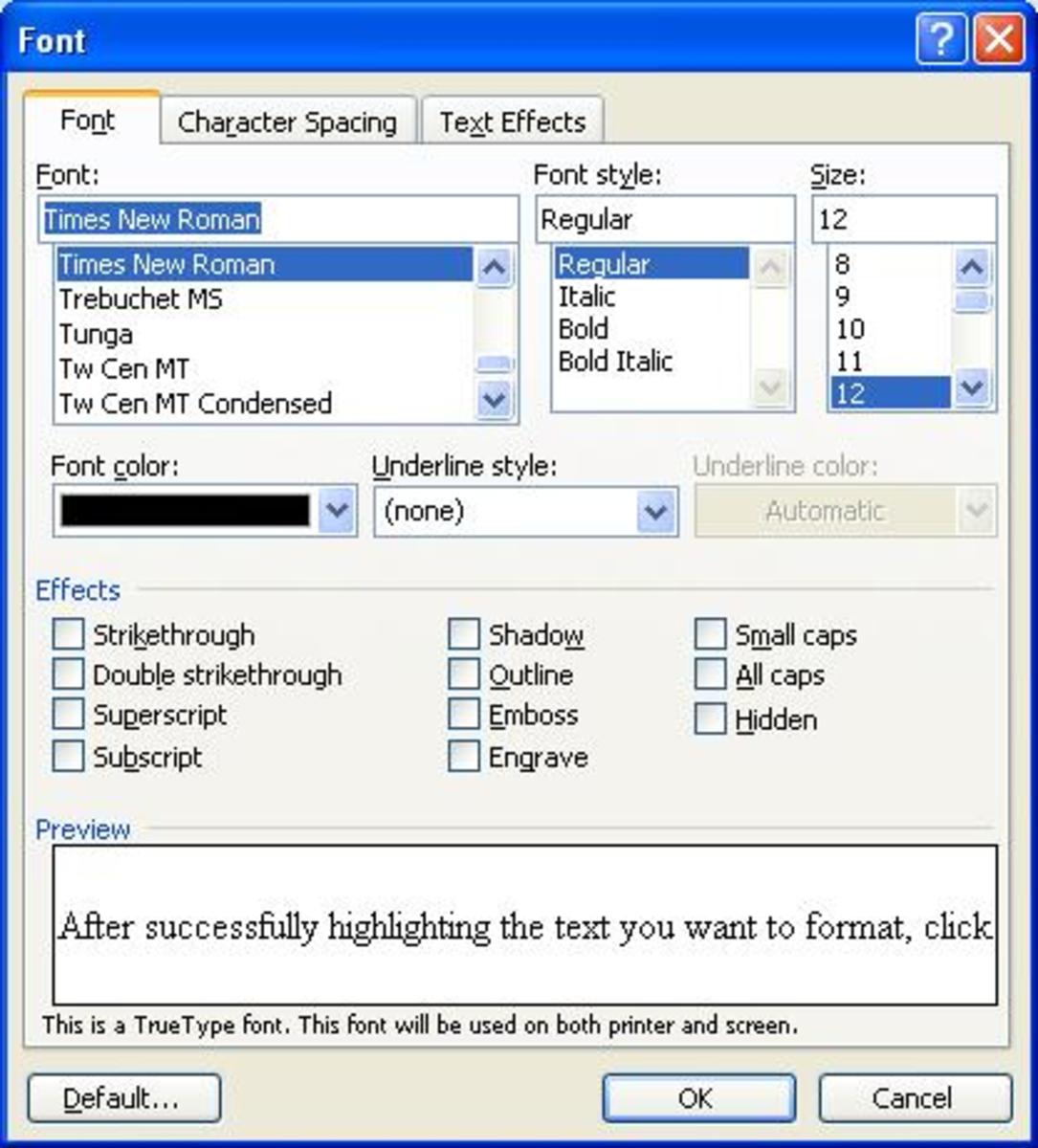
  • Exploring formatting options for chart elements: Microsoft Word offers a wealth of formatting options for each individual element of your pie chart. From data labels and axis titles to chart titles and legends, you have the flexibility to customize fonts, colors, sizes, and styles to enhance clarity and visual appeal. Dive into the chart formatting dialog box to explore the full range of options available, allowing you to tailor each element to your specific preferences and requirements.
  • Adjusting font styles and sizes: One of the most impactful ways to customize your pie chart is by adjusting font styles and sizes. Experiment with different font families, such as Arial, Times New Roman, or Calibri, to find a style that complements your document’s typography. Additionally, vary font sizes to emphasize key elements of the chart, such as titles, labels, and data values, ensuring that important information stands out and grabs the viewer’s attention.
  • Changing background and border colors: In addition to font formatting, you can also modify the background and border colors of your pie chart to create visual contrast and emphasis. Choose background colors that complement your document’s color scheme while ensuring that data segments remain clearly visible and distinct. Likewise, experiment with border colors to frame the chart and add a polished finishing touch to your visualization.

Enhancing Visual Cohesion

By exploring the myriad formatting options available for pie charts in Microsoft Word for Mac, you can achieve visual cohesion and consistency across your document. Consistent font styles, sizes, and colors create a sense of harmony and professionalism, guiding the viewer’s eye through the chart with ease and clarity.

Emphasizing Key Insights

Effective formatting isn’t just about aesthetics—it’s also about conveying information efficiently and effectively. By strategically adjusting font styles, sizes, and colors, you can draw attention to key insights and data points within your pie chart, ensuring that viewers grasp the most important information at a glance.

Fine-Tuning the Chart

Fine-tuning your pie chart in Microsoft Word for Mac is essential to ensure its effectiveness and seamless integration within your document. Let’s explore the process of fine-tuning the chart with precision and finesse:

  • Editing data labels: Data labels provide crucial context and clarity to your pie chart, allowing viewers to understand the significance of each data segment. With Microsoft Word’s intuitive editing tools, you can easily modify data labels to enhance readability and relevance. Adjust font styles, sizes, and colors to ensure that labels stand out against the background of the chart, and consider adding descriptive text to provide additional insights into the data.
  • Resizing and positioning the chart: Achieving optimal chart size and placement within your document is essential for visual balance and readability. Use the resizing handles to adjust the dimensions of the chart to your desired specifications, ensuring that it neither overwhelms nor gets lost amidst other content. Additionally, leverage Microsoft Word’s alignment tools to position the chart precisely within the document, aligning it with surrounding text and graphics for a cohesive and professional appearance.
  • Aligning with document content: Seamlessly integrating the pie chart with the rest of your document content enhances overall coherence and impact. Ensure that the chart’s visual style and formatting align with the document’s overall design aesthetic, maintaining consistency and reinforcing your message. Consider incorporating the chart within relevant sections of the document, strategically highlighting key insights and supporting data points to augment comprehension and engagement.

Enhancing Visual Clarity

Fine-tuning the chart goes beyond mere aesthetics—it’s about optimizing visual clarity and impact. By meticulously editing data labels, resizing, and positioning the chart, and aligning it with document content, you can create a visual representation that effectively communicates your message and resonates with your audience.

Ensuring Seamless Integration

The key to fine-tuning the chart lies in its seamless integration within the broader context of your document. By aligning visual elements with document content and design principles, you create a cohesive and compelling narrative that captivates and informs your audience, elevating the overall effectiveness and professionalism of your work.

Saving and Exporting

When it comes to working with pie charts in Microsoft Word for Mac, the final steps involve saving your document and exporting the chart for use in other applications. Let’s delve into these crucial tasks:

  • Saving the document: After meticulously crafting your document and pie chart, it’s essential to save your work to ensure that your efforts are preserved. Utilize Microsoft Word’s “Save” function to store your document locally on your Mac or choose cloud storage options such as OneDrive or Dropbox for added security and accessibility. Be sure to give your file a descriptive name and select an appropriate file format, such as .docx or .pdf, to facilitate easy sharing and future editing.
  • Exporting the chart for use in other applications: If you intend to incorporate your pie chart into presentations, reports, or other projects beyond Microsoft Word, exporting the chart is necessary. Fortunately, Microsoft Word offers seamless export options that allow you to save the chart as an image file, such as .png or .jpg, for universal compatibility with various applications and platforms. Simply right-click on the chart, select “Save as Picture,” and choose your desired file format and destination folder.

Preserving Your Work

Saving your document ensures that your hard work and creative endeavors are safeguarded against unforeseen circumstances. By adopting a regular saving routine and leveraging cloud storage solutions, you can minimize the risk of data loss and maintain peace of mind knowing that your documents are securely backed up and accessible whenever you need them.

Enhancing Cross-Application Compatibility

Exporting your pie chart for use in other applications extends its utility and versatility, allowing you to leverage your visualizations across a diverse range of projects and platforms. Whether you’re crafting a PowerPoint presentation, designing a brochure in Adobe InDesign, or compiling a data analysis report in Microsoft Excel, exporting the chart as an image file ensures seamless integration and consistent visual representation across different software environments.

Tips and Tricks

Tips and Tricks
Source: openclipart

Unlock the full potential of pie chart creation in Microsoft Word for Mac with these invaluable tips and tricks designed to streamline your workflow and enhance your productivity:

  • Keyboard shortcuts for faster chart creation: Mastering keyboard shortcuts is the secret weapon of efficient chart creation. Familiarize yourself with essential shortcuts such as Command + Shift + K to insert a new chart, Command + Shift + F to open the chart formatting dialog, and Command + C to copy the chart for easy duplication. By incorporating these shortcuts into your workflow, you can accelerate the chart creation process and work more seamlessly within Microsoft Word.
  • Utilizing templates for consistent chart design: Consistency is key to professional-looking documents, and templates offer a convenient solution for maintaining uniform chart design across multiple projects. Explore Microsoft Word’s extensive library of chart templates or create custom templates tailored to your specific needs and preferences. By leveraging templates, you can streamline the chart design process, ensure brand consistency, and save valuable time on repetitive tasks.

Boosting Efficiency with Shortcuts

Harnessing the power of keyboard shortcuts is a game-changer for chart creation efficiency. With just a few keystrokes, you can perform complex actions with ease, saving time and minimizing manual effort. Incorporate shortcuts into your workflow to unlock new levels of productivity and streamline your chart creation process like never before.

Ensuring Consistency with Templates

Templates are the cornerstone of consistent chart design, providing a framework for cohesive and professional-looking visualizations. By adopting templates, you can maintain brand consistency, adhere to corporate design guidelines, and ensure that your charts convey information effectively and accurately across all your documents. Invest time in creating or selecting templates that align with your aesthetic preferences and workflow requirements, and reap the benefits of streamlined chart design and enhanced productivity.

Troubleshooting

Troubleshooting
Image credit: https://weebly.com

Encountering issues while working with pie charts in Microsoft Word for Mac can be frustrating, but fear not—here are some common problems and their solutions to help you troubleshoot like a pro:

  • Common issues and their solutions: One common issue users face is difficulty in resizing or formatting the pie chart to their liking. If you find yourself struggling with chart dimensions or appearance, try selecting the chart and adjusting the sizing handles to resize it accordingly. Additionally, explore the formatting options available in Microsoft Word to customize the chart’s design and layout to better suit your needs.
  • Dealing with compatibility problems: Another challenge that users may encounter is compatibility issues when sharing or exporting documents containing pie charts. If you encounter compatibility problems, such as charts appearing distorted or not displaying correctly in other applications, consider exporting the chart as an image file and inserting it into the document as a picture. This can help ensure seamless compatibility across different platforms and applications.

Solving Chart-related Challenges

Navigating troubleshooting challenges with pie charts requires a combination of patience and problem-solving skills. By understanding common issues and their solutions, you can tackle chart-related challenges with confidence and efficiency, ensuring smooth sailing in your document creation process.

Ensuring Seamless Compatibility

Compatibility problems can be a headache, but with the right approach, you can overcome them effortlessly. By taking proactive steps such as exporting charts as image files and optimizing document formatting, you can minimize compatibility issues and ensure that your charts display flawlessly across various platforms and applications.

Mastering Pie Charts in Microsoft Word for Mac: A Step-by-Step Guide – Conclusion

In conclusion, learning how to create pie charts in Microsoft Word for Mac opens up a whole new world of possibilities for the visually impaired. The step-by-step guide will assist you in rapidly inserting, customizing, and formating pie charts into your documents.

We must practice in order to perfect. Choose the style that best fits your needs by experimenting with different colors, designs, and formatting options. If you encounter any issues during your journey, you should refer to this troubleshooting guide for advice.

You can easily incorporate captivating pie charts into your documents to enhance their visual appeal. Using pie charts in Microsoft Word for Mac makes it simple to present project data, visualize financial trends, or simply add visual interest to your reports. Thank you so much for charting me.

Read More

Crafting a Permission Slip Using Microsoft Word

If you’re struggling to make a permission slip in Microsoft Word, don’t worry; you’ll be able to create professional-looking permission slips in no time with these three simple steps.

The goal of this article is to walk you through the entire process of creating a permission slip on Microsoft Word, covering everything from understanding what the permission slip is and how it should be formatted and styled to how it should be distributed.

In this course, you’ll learn how you can simplify the creation of permissions slip documents in Microsoft Word. You’ll discover how to make them easier to create and ensure that they meet the legal requirements.

Whether you plan a field trip for a teacher or an activity for a student, mastering the art of creating permission slips in Microsoft Word will save you time and ensure smooth communication with your students’ parents and guardians. Please keep an eye out for this article.

Understanding the Purpose of a Permission Slip

Understanding the Purpose of a Permission Slip
Image by: slideserve

Understanding the purpose of a permission slip is foundational to ensuring the smooth execution of various activities involving minors. A permission slip, succinctly put, is a formal document granting consent from a parent or guardian for their child to participate in a specific event or activity. Its importance lies in its function as a legal safeguard, providing organizers with assurance that they have obtained proper authorization for the child’s participation. Moreover, permission slips serve as a means of communication between organizers and parents, conveying essential details about the event or activity, including its purpose, location, and any associated risks or requirements. Whether it’s a school field trip, a sports team outing, or a club excursion, instances requiring a permission slip are manifold. Any situation where a child will be under the supervision of individuals other than their legal guardians warrants the use of a permission slip. This could include educational outings, extracurricular activities, community events, or even medical treatments. In each case, the permission slip acts as a formal acknowledgment of parental consent, ensuring that organizers are compliant with legal regulations and parental expectations. Therefore, grasping the significance of a permission slip goes beyond mere paperwork; it underscores the importance of accountability, communication, and safeguarding the well-being of minors in various social and educational settings.

Getting Started with Microsoft Word

When embarking on the journey of using Microsoft Word, one must first acquaint oneself with its fundamental features and functionalities. As the quintessential word processing software, Microsoft Word stands as a cornerstone in the realm of document creation, offering a plethora of tools to streamline the writing process. An introduction to Microsoft Word unveils its user-friendly interface, designed to cater to the needs of both novice and experienced users alike. Its intuitive layout, featuring easily accessible menus and toolbars, facilitates seamless navigation and efficient document editing. Opening Microsoft Word marks the inception of a world of possibilities, where individuals can unleash their creativity and productivity with just a few clicks.

Upon launching Microsoft Word, users are greeted with a blank canvas, eagerly awaiting their creative input. Opening a new document is as simple as selecting the “New” option from the File menu or clicking on the dedicated icon on the toolbar. This action initiates the creation process, setting the stage for users to bring their ideas to life. Whether it’s drafting a letter, crafting a report, or designing a flyer, the blank document serves as a blank canvas, ready to be transformed into a masterpiece of words and graphics. With the click of a button, users can customize various aspects of the document, such as its size, orientation, and margins, to suit their specific needs and preferences.

Creating a new document in Microsoft Word is akin to embarking on a voyage of creativity and productivity. Armed with a plethora of templates and formatting options, users can tailor their documents to achieve their desired aesthetic and functionality. From academic papers to business proposals, Microsoft Word offers templates catered to a diverse array of document types, providing users with a head start in their writing endeavors. Furthermore, the software’s robust formatting tools empower users to customize every aspect of their documents, from font styles and sizes to paragraph alignment and spacing. With Microsoft Word, the possibilities are endless, and the journey of document creation is as exhilarating as it is rewarding. So, whether you’re a seasoned writer or a novice user, dive into the world of Microsoft Word and unleash your creativity like never before.

Designing Your Permission Slip

When it comes to designing a permission slip, attention to detail and visual appeal are paramount in ensuring its effectiveness. Choosing an appropriate template serves as the initial step in this process, offering a foundation upon which to build a professional and informative document. Templates tailored specifically for permission slips are readily available in Microsoft Word, providing users with a variety of designs to suit their needs. Whether opting for a simple and streamlined layout or a more elaborate design featuring graphics and borders, selecting the right template sets the tone for the entire document.

Once a template has been chosen, the next step is customizing the layout and design to align with the specific requirements of the event or activity. This involves adjusting elements such as text formatting, color schemes, and spacing to enhance readability and visual appeal. Customization options in Microsoft Word are extensive, allowing users to personalize every aspect of their permission slip to reflect the branding and messaging of the organization or school. By carefully crafting the layout and design, users can ensure that the permission slip not only conveys essential information clearly but also leaves a lasting impression on recipients.

Incorporating relevant graphics or images can further enhance the visual appeal and effectiveness of a permission slip. From logos and icons to photographs and illustrations, visual elements can help convey important details and capture the attention of recipients. When adding graphics or images, it’s essential to choose ones that are appropriate for the context of the permission slip and reinforce its message. Additionally, ensuring that images are high-quality and properly sized will contribute to the overall professional appearance of the document. By thoughtfully integrating graphics and images, users can elevate their permission slips from mundane forms to engaging and visually appealing communications tools.

Including Essential Information

In crafting a permission slip, inclusion of essential information is paramount to ensuring clarity and effectiveness in communication. The title of the permission slip serves as the first point of contact, succinctly conveying the purpose and nature of the document. Whether it’s a “Field Trip Permission Slip” or a “Parental Consent Form,” the title sets the tone for the entire document and provides recipients with an immediate understanding of its contents. Furthermore, the name of the organization or school issuing the permission slip establishes credibility and authority, instilling confidence in recipients regarding the legitimacy of the document.

Additionally, specifying the date of the event or activity is crucial for providing context and urgency to the permission slip. By clearly indicating the date and potentially the time of the event, organizers ensure that recipients are aware of when the event will take place and can plan accordingly. Moreover, including details of the event or activity provides recipients with comprehensive information about what they are consenting to. This may include the purpose of the event, its location, any associated costs or requirements, and any potential risks or considerations. By providing detailed event information, organizers demonstrate transparency and enable recipients to make informed decisions about granting consent.

Furthermore, contact information serves as a vital point of reference for recipients who may have questions or concerns regarding the permission slip. By including contact details such as phone numbers or email addresses, organizers facilitate open communication and encourage recipients to reach out with any inquiries. This fosters a sense of accessibility and accountability, ensuring that recipients feel supported throughout the consent process. In summary, including essential information such as the title of the permission slip, the name of the organization or school, the date of the event/activity, details of the event/activity, and contact information is essential for creating a comprehensive and effective permission slip. By prioritizing clarity, transparency, and accessibility, organizers can streamline the consent process and foster positive relationships with recipients.

Incorporating Legal Language and Consent

Incorporating Legal Language and Consent
Picture source: https://crikey.com.au

Incorporating legal language and obtaining consent are crucial aspects of creating a permission slip that complies with regulatory requirements and safeguards the rights of all parties involved. Understanding legal requirements is the foundation upon which the permission slip is built, ensuring that organizers adhere to relevant laws and regulations governing parental consent for minors. This may include familiarizing oneself with local, state, and federal laws pertaining to minors’ participation in events or activities, as well as any specific requirements mandated by educational institutions or organizations. Crafting clear and concise language is essential to ensure that the permission slip effectively communicates the terms and conditions of consent to parents or guardians. Utilizing straightforward language and avoiding legalese or ambiguous terminology helps to minimize confusion and ensures that recipients fully understand the implications of granting consent.

Obtaining consent from parents or guardians is a critical step in the permission slip process, requiring organizers to implement appropriate procedures to solicit and document consent effectively. This may involve distributing the permission slip in a timely manner, providing recipients with sufficient information to make an informed decision, and offering multiple avenues for parents or guardians to provide consent, such as through written forms, electronic signatures, or verbal agreements. Additionally, organizers must ensure that consent forms are completed accurately and include all necessary information, such as emergency contact details and any special instructions or waivers. By prioritizing transparency, clarity, and compliance with legal requirements, organizers can create permission slips that protect the rights and safety of minors while facilitating meaningful participation in enriching activities and events.

Formatting and Styling

Formatting and Styling
Credit: https://bham.ac.uk

In the realm of document creation, formatting and styling play a pivotal role in shaping the reader’s experience and conveying professionalism. Ensuring readability and professionalism is paramount, as it directly impacts the effectiveness and credibility of the content. Utilizing clear and legible font styles, such as Arial or Times New Roman, enhances readability and ensures that the text is easily comprehensible to recipients of all ages. Moreover, maintaining a consistent font size throughout the document helps to establish uniformity and cohesion, preventing distractions and allowing readers to focus on the content at hand. By prioritizing readability and professionalism, organizers can create permission slips that exude competence and inspire confidence in recipients.

Consistency in font styles and sizes is essential for creating a polished and professional appearance. By using a consistent font style and size across all sections of the permission slip, organizers can convey a sense of coherence and attention to detail. This consistency extends to headings, subheadings, and body text, ensuring that each element of the document aligns harmoniously and contributes to the overall aesthetic appeal. Additionally, maintaining uniformity in font styles and sizes helps to streamline the reading experience, allowing recipients to navigate the document with ease and focus on its content rather than being distracted by inconsistencies in formatting. By adhering to a standardized approach to font styles and sizes, organizers can elevate the visual presentation of their permission slips and reinforce their professionalism and credibility.

Proper alignment and spacing are essential components of effective document formatting, contributing to readability and visual appeal. Aligning text and graphics in a logical and organized manner enhances the document’s professional appearance and facilitates comprehension. Whether aligning text to the left, right, or center, consistency is key to maintaining visual harmony and avoiding clutter. Similarly, ensuring appropriate spacing between paragraphs, headings, and images helps to prevent overcrowding and improves the flow of information. Adequate spacing allows readers to digest content more easily and reduces the likelihood of visual fatigue. By paying attention to alignment and spacing, organizers can create permission slips that are visually appealing, easy to navigate, and conducive to effective communication.

Reviewing and Finalizing

In the meticulous process of reviewing and finalizing a permission slip, attention to detail and a commitment to excellence are paramount to ensuring accuracy and effectiveness. Proofreading for errors and inconsistencies serves as the initial step in this endeavor, requiring organizers to scrutinize every aspect of the document with precision and diligence. From grammatical errors and spelling mistakes to inconsistencies in formatting or language usage, thorough proofreading helps to eliminate any flaws that may detract from the professionalism and credibility of the permission slip. By dedicating time and effort to this critical task, organizers can identify and rectify any potential issues before the document is disseminated to recipients.

Seeking feedback from colleagues or supervisors is an invaluable aspect of the review process, providing organizers with fresh perspectives and constructive criticism to improve the quality of the permission slip. Collaborating with peers allows for the identification of blind spots and areas for improvement that may have been overlooked during individual review. Additionally, soliciting feedback from supervisors or mentors who possess expertise in the subject matter can offer valuable insights and ensure that the permission slip meets the necessary standards of quality and compliance. By leveraging the collective knowledge and experience of others, organizers can refine their permission slip and enhance its overall effectiveness.

Making necessary revisions is the final step in the review and finalization process, requiring organizers to implement feedback and address any identified issues or concerns. This may involve revising language for clarity and conciseness, adjusting formatting for consistency and professionalism, or incorporating additional information or disclosures as needed. By iteratively refining the permission slip based on feedback and review, organizers can ensure that the final document is polished, professional, and fully aligned with the objectives of the event or activity. Ultimately, the process of reviewing and finalizing a permission slip is a collaborative and iterative effort that requires meticulous attention to detail, a commitment to excellence, and a dedication to ensuring the accuracy and effectiveness of the final product.

Saving and Printing

Saving and Printing
Source: tpisolutionsink.com

In the final stages of document preparation, saving and printing serve as crucial steps to ensure accessibility and distribution of the permission slip. Saving the document in the desired format is the first order of business, requiring organizers to select an appropriate file type that balances compatibility and functionality. Formats such as PDF (Portable Document Format) are commonly preferred for their universal accessibility and ability to preserve formatting across different devices and platforms. By saving the permission slip in PDF format, organizers can ensure that recipients can view and print the document without encountering compatibility issues, thereby facilitating seamless dissemination and access.

Once the document has been saved, printing multiple copies is necessary to accommodate the needs of all parties involved. Whether distributing permission slips to students, parents, or event participants, having a sufficient number of copies on hand is essential to ensure that everyone receives the necessary information and can provide consent as required. Organizers should take into account the anticipated number of recipients and print a surplus of copies to account for any unforeseen circumstances or additional requests. Furthermore, maintaining organized records of printed copies helps to track distribution and ensure that all individuals receive the necessary documentation in a timely manner.

Ensuring print quality is the final step in the process, requiring organizers to verify that the printed permission slips are legible, professional, and free from any defects or errors. This includes checking for issues such as smudged ink, uneven printing, or misaligned text, which can detract from the overall appearance and effectiveness of the document. By conducting a thorough review of the printed copies and making any necessary adjustments or reprints, organizers can uphold the integrity and professionalism of the permission slip and instill confidence in recipients regarding its accuracy and reliability. In conclusion, saving and printing the permission slip in the desired format, printing multiple copies as needed, and ensuring print quality are essential steps to facilitate effective distribution and communication of important information. By adhering to best practices in document management and printing, organizers can streamline the process and ensure that recipients receive the necessary documentation in a timely and professional manner.

Distributing the Permission Slip

Distributing the permission slip marks the culmination of the meticulous planning and preparation involved in organizing an event or activity. Sending electronically, such as through email or online platforms, offers a convenient and efficient means of reaching recipients in today’s digital age. Utilizing electronic distribution channels allows organizers to disseminate permission slips quickly and cost-effectively, eliminating the need for physical copies and reducing paper waste. Moreover, electronic distribution offers the added benefit of instantaneous delivery, ensuring that recipients receive the permission slip promptly and can respond in a timely manner. By leveraging email or online platforms, organizers can streamline the distribution process and facilitate seamless communication with parents, guardians, and participants.

In addition to electronic distribution, distributing printed copies to parents or guardians remains a common practice for many organizations and schools. Providing printed copies ensures accessibility for recipients who may not have access to digital devices or prefer traditional forms of communication. Distributing printed copies also allows organizers to personalize the delivery of permission slips and cater to the unique needs of each recipient. Whether distributing permission slips during parent-teacher meetings, school events, or via take-home packets, providing printed copies ensures that all stakeholders have access to the necessary information and can make informed decisions regarding participation.

Collecting signed permission slips is the final step in the distribution process, requiring organizers to implement procedures for receiving and documenting consent from parents or guardians. This may involve setting deadlines for returning signed permission slips, providing multiple submission options (e.g., in-person, via mail, or electronically), and maintaining organized records of received permissions. By establishing clear guidelines and communication channels for collecting signed permission slips, organizers can streamline the process and ensure compliance with regulatory requirements. Furthermore, maintaining accurate records of collected permissions enables organizers to track participant attendance, address any concerns or special accommodations, and facilitate a smooth and successful event or activity. In summary, distributing the permission slip through electronic and printed channels, and collecting signed permission slips in a systematic manner, are essential components of ensuring effective communication and facilitating meaningful participation in events and activities. By leveraging a combination of digital and traditional distribution methods, organizers can maximize accessibility, convenience, and compliance throughout the permission slip process.

Handling Permissions and Responses

Handling permissions and responses is a pivotal aspect of managing events or activities, requiring meticulous organization and communication to ensure smooth execution. Organizing responses effectively is the cornerstone of this process, necessitating the implementation of systematic methods for tracking and managing incoming permissions. This may involve creating a centralized database or spreadsheet to record responses, categorizing them based on their status (e.g., granted, denied, pending), and establishing clear protocols for updating and sharing this information with relevant stakeholders. By adopting a structured approach to response management, organizers can streamline decision-making processes, identify any outstanding permissions, and address any issues or concerns in a timely manner.

Keeping track of permissions granted or denied is equally essential in maintaining transparency and accountability throughout the permission process. Organizers must maintain accurate records of all permissions received, including details such as the date of receipt, the individual granting or denying permission, and any accompanying notes or comments. This information not only serves as a reference for future communications but also provides valuable insights into participant preferences and concerns. Additionally, organizers should ensure compliance with relevant regulations and policies governing the collection and storage of personal data, safeguarding the privacy and confidentiality of participants’ information.

Following up with parents or guardians if needed is a proactive measure to address any outstanding permissions or unresolved issues that may arise during the response collection process. This may involve reaching out via email, phone, or in-person communication to clarify any ambiguities, provide additional information, or solicit feedback on specific concerns. By maintaining open lines of communication and demonstrating a commitment to addressing participants’ needs and concerns, organizers can foster trust and cooperation among stakeholders, ultimately contributing to the success of the event or activity.

Troubleshooting Common Issues

When it comes to creating permission slips on Microsoft Word, encountering common issues is not uncommon. Dealing with formatting errors ranks high among these challenges, often causing frustration and delays in the document creation process. Whether it’s text alignment issues, inconsistent font styles, or unexpected layout changes, troubleshooting formatting errors requires patience and attention to detail. One effective approach is to review the document systematically, checking for any discrepancies in formatting and making adjustments as needed. Utilizing formatting tools such as the ruler, paragraph settings, and styles can also help resolve formatting issues efficiently, ensuring consistency and professionalism in the final document.

Addressing technical difficulties is another hurdle that may arise when working with Microsoft Word. From software glitches to compatibility issues with other programs or devices, technical challenges can disrupt workflow and hinder productivity. When encountering technical difficulties, it’s essential to first identify the root cause of the problem. This may involve checking for software updates, verifying system compatibility, or troubleshooting specific features within Microsoft Word. Seeking assistance from technical support resources, such as online forums, user guides, or Microsoft’s official support channels, can also provide valuable insights and solutions to resolve technical issues effectively.

Seeking help from Microsoft Word resources is a valuable strategy for overcoming common challenges and optimizing document creation processes. Microsoft offers a wealth of resources, including online tutorials, help articles, and community forums, where users can find answers to frequently asked questions, troubleshoot issues, and learn new techniques to enhance their skills. Additionally, built-in features such as the “Tell me what you want to do” search bar can help users quickly locate specific tools or functions within the software, streamlining the troubleshooting process and empowering users to resolve issues independently. By leveraging Microsoft Word resources effectively, users can overcome common challenges, enhance their proficiency with the software, and create permission slips with confidence and ease.

FAQs

How do I create a consent form in Microsoft Word?

To create a consent form in Microsoft Word, start by opening a new document and selecting a suitable template from the template gallery. Customize the layout and design to fit your needs, then add essential information such as the title of the form, organization name, event details, and contact information. Incorporate legal language and consent language, ensuring clarity and compliance with relevant regulations. Format the document professionally, paying attention to readability and consistency in font styles, sizes, alignment, and spacing. Once the form is finalized, save it in the desired format and print multiple copies as needed. Distribute the form electronically via email or online platforms, or distribute printed copies to parents or guardians. Keep track of responses and permissions granted or denied, and follow up with individuals as necessary.

Can I use pre-made templates for permission slips in Microsoft Word?

Yes, you can use pre-made templates for permission slips in Microsoft Word. These templates provide a convenient starting point, offering professionally designed layouts that can be easily customized to suit your specific needs. To access these templates, open Microsoft Word and navigate to the “File” menu. From there, select “New” and search for “permission slip” in the template search bar. Choose a template that best fits your requirements, then personalize it by adding relevant information such as the event details, organization name, and contact information. Additionally, you can modify the layout, font styles, and colors to align with your preferences. Using pre-made templates can save time and ensure consistency in the design of your permission slips.

How do I add a signature line to a document in Microsoft Word?

To add a signature line to a document in Microsoft Word, first, place your cursor where you want the signature line to appear. Next, go to the “Insert” tab on the ribbon and click on “Signature Line” in the Text group. A dialog box will appear where you can enter information such as the signer’s name, title, and instructions. You can also add a suggested signer’s email address if desired. Once you’ve filled in the necessary details, click “OK” to insert the signature line into your document. This will create a placeholder for the signature, prompting the signer to sign digitally or with a pen once the document is printed.

Are there any legal considerations when drafting a permission slip?

Yes, there are several legal considerations to keep in mind when drafting a permission slip. These include ensuring that the slip clearly outlines the purpose of the activity or event, obtains explicit consent from parents or guardians for their child’s participation, and includes any relevant waivers or releases of liability. Additionally, it’s crucial to include accurate and comprehensive information about the activity, including date, time, location, and any associated costs or risks. Moreover, privacy considerations should be addressed, such as how personal information will be collected, stored, and used. It’s advisable to consult legal resources or seek professional advice to ensure that permission slips comply with applicable laws and regulations.

Read More

Create a Microsoft Word File Using Anaconda: A Step-by-Step Guide

What is it like to use Python code to create Microsoft Word files in minutes? We reveal the secrets to increase efficiency and flexibility in your workflow by providing a comprehensive overview of the techniques. We’ll show you how to create Word and anaconda files step-by-step, using our hands-on experience.

Our guide teaches you how to make Word documents more easily by combining the capabilities of Anaconda and Microsoft Word. The python-docx library enables the generation of content, formatting text, and inserting images or tables without coding. Create documents in the style of polished Word files by scripting them yourself rather than manually.

If you’re ready to get started with this coding journey, we’ll show you how to create Word documents with Anaconda in no time. This guide will walk you through the process of configuring your Anaconda environment, implementing the Python script, and troubleshooting common issues, giving you the skills you need to create a document that is both impressive and simple to understand. This course teaches you how to use Anaconda for Word file creation, saving you time and improving your skills. In this session, we’ll go over how to approach document generation in a new light.

Setting Up Anaconda Environment

In the intricate dance of digital prowess and coding finesse, the journey commences with the pivotal phase of setting up the Anaconda environment. This fundamental step lays the groundwork for a seamless synergy between Anaconda and the intricacies of different operating systems, unraveling a tapestry of possibilities for adept coders.

Installing Anaconda:
Embarking on this journey necessitates a meticulous initiation – the downloading of the Anaconda distribution. This digital behemoth, equipped with a plethora of tools and libraries, becomes the cornerstone of your coding domain. The installation, a nuanced ballet across various operating systems, unfolds as follows:

  1. Windows Wonderland:

    • Navigate to the Anaconda website.
    • Select the appropriate version (32-bit or 64-bit) based on your Windows system.
    • Click download and follow the wizard, allowing the magic to unfold seamlessly.
  2. macOS Marvel:

    • Command the terminal to execute the download for macOS.
    • Utilize the bash installer script, a symphony of commands that orchestrates the installation elegantly.
    • Allow the wizardry to unfold, ushering Anaconda into your macOS realm.
  3. Linux Symphony:

    • Engage the terminal, a digital orchestra conductor.
    • Employ the wget command to fetch the Anaconda installer script.
    • Execute the script, ushering Anaconda into the Linux ecosystem with a harmonious installation process.

Creating and Activating a Virtual Environment:
With Anaconda gracefully installed, the next balletic move involves the creation and activation of a virtual environment, an encapsulated space where Anaconda’s powers can be harnessed to their fullest extent.

  1. Conda Conjuring:

    • Command the conda prompt to initiate the creation of a new environment.
    • Choose a name that resonates with the purpose of your coding venture – a realm where scripts will come to life.
    • Watch as conda weaves the environment into existence, a digital alchemy of sorts.
  2. Activation Waltz:

    • Activate the freshly minted environment, a ceremonial handshake between coder and Anaconda.
    • Witness the transformation of the command prompt, now adorned with the environment name, signifying the symbiotic connection forged.

As the virtual environment comes to life, a digital sanctum for your coding escapades, you stand on the precipice of coding marvels. This phase, a ballet of downloads, commands, and activations, sets the stage for the grand symphony of Anaconda and your coding prowess. It’s not merely installation; it’s a digital choreography, a precursor to the balletic brilliance that awaits as you script your way into the realms of Anaconda-infused coding landscapes. Step into this digital dance with grace, for the stage is set, and the code awaits its maestro.

Installing Necessary Packages

In the intricate realm of Anaconda-driven document creation, the installation of necessary packages emerges as a critical juncture, akin to fortifying the arsenal before a coding conquest. Let’s delve into the layers of this digital armory with precision and finesse.

Introduction to Necessary Packages:
In the cosmic ballet of Pythonic document creation, the preamble involves acquainting oneself with the indispensable orchestra of packages. These digital maestros, akin to a well-orchestrated ensemble, provide the tools and functionalities needed to seamlessly mold your Word files. Picture it as assembling a team of virtuosos, each proficient in their domain, ready to harmonize your coding symphony.

  • Libraries Unveiled:
    • Delve into the intricacies of the required libraries, the building blocks that will empower your scripts to maneuver the nuanced terrain of Word file manipulation.
    • Uncover the nuanced roles of these libraries – from handling text formatting to orchestrating the placement of images and tables, laying the foundation for a comprehensive coding experience.

Installing python-docx:
In this segment, we embark on a pilgrimage to install the python-docx library, a linchpin in the Pythonic crafting of Word documents. As you stand at the threshold of this installation ritual, envision it as inviting a virtuoso soloist into your coding ensemble, ready to perform with finesse.

  • Conda vs. Pip Showdown:

    • The curtain rises with a choice – Conda or Pip. Choose your protagonist wisely, for both are stalwarts in the Python package management saga.
    • Conda, the maestro of environment management, orchestrates a seamless installation, ensuring harmony within your Anaconda realm.
    • Pip, the versatile pipeliner, conducts a symphony of installations with a single command, simplifying the process for those favoring a streamlined approach.
  • A Symphony of Commands:

    • With Conda, the stage is set with a command as simple as “conda install python-docx.” Witness the orchestration of dependencies, ensuring a cohesive integration within your Anaconda environment.
    • Alternatively, Pip unfurls its prowess with “pip install python-docx,” a command that echoes like a well-tuned melody, bringing the library into your Python ecosystem with effortless grace.

As you tread through the installation ballet, envision it as curating a bespoke toolkit, handpicking the instruments that resonate with your coding opus. Python-docx, now a virtuoso in your ensemble, unlocks the gateway to crafting Word files with a flourish. This installation saga, a digital narrative of choices and commands, sets the stage for the coding odyssey that awaits, where your scripts will dance across the canvas of Word documents with finesse and precision. Embrace the symphony, for in the realm of Anaconda, the installation of necessary packages is the prelude to a coding masterpiece.

Writing Python Script for Word File

Writing Python Script for Word File
Image source: datacamp

In the realm of Python scripting for Word file creation, crafting a symphony of code requires a nuanced dance through each element of the process. Let’s embark on this coding journey, unraveling the intricacies of creating a Python script that orchestrates the birth of a Word document with finesse.

Importing Necessary Libraries:
The overture commences with the essential act of importing libraries, akin to summoning the indispensable characters onto the coding stage.

  • Summoning python-docx:
    • Begin by importing the python-docx library, your virtuoso in the realm of Word file manipulation.
    • Invoke the power of “import docx” to ensure that the coding canvas is primed for the artistic strokes that follow.

Creating a Word Document:
As the curtain rises, the spotlight turns to initializing a Document object, the blank canvas upon which your coding narrative will unfold.

  • Canvas Initialization:
    • In a theatrical flourish, execute the command “doc = docx.Document()” to give birth to a blank canvas, ready to be adorned with your coding opus.
    • Picture it as laying out the parchment, setting the stage for the scripting spectacle that awaits.

Adding Content to the Word Document:
With the canvas awaiting your creative brushstrokes, it’s time to infuse life into the Word document, adding text, formatting nuances, and elements that elevate your code to a magnum opus.

  • Textual Tapestry:

    • Craft your narrative with “doc.add_paragraph(‘Your text here’)” – a command that transforms the mundane into the poetic, filling your document with prose.
    • Embrace the versatility of formatting – be it bold, italics, or underlining – with commands like “run.bold = True” to imbue your text with expressive flair.
  • Heading Heights and Sublime Subheadings:

    • Elevate your document’s structure with headings and subheadings. Employ the “doc.add_heading()” command, allowing you to weave a hierarchy into your coding narrative.
    • Navigate this textual symphony with commands like “doc.add_heading(‘Heading’, level=1)” – a digital crescendo that signifies a shift in your coding narrative.
  • Multimedia Flourish:

    • Immerse your document in a multimedia tapestry by inserting images or tables, a command like “doc.add_picture(‘image.jpg’)” placing visual artifacts within the textual expanse.
    • Integrate tabular finesse with “doc.add_table(rows, cols)” – an incantation that summons tables into your coding domain.

Saving the Word Document:
As the coding performance nears its zenith, it’s crucial to preserve this digital masterpiece.

  • File Preservation Ritual:
    • Designate the document’s fate with a command like “doc.save(‘YourFile.docx’)”, specifying the filename and location.
    • Conclude the scripting symphony with this ritualistic act, ensuring that your coding opus is etched into the annals of digital existence.

In this digital theatre of Python scripting, each command is a brushstroke, contributing to the creation of a Word document that transcends the mundane. As you traverse through the commands, envision yourself as the maestro conducting a coding symphony, with the python-docx library as your virtuoso ensemble. The stage is set, the canvas primed – now, let the scripting spectacle unfold with a cadence that resonates in the coding echoes of creativity.

Running the Script

In the grand symphony of Pythonic document creation, the crescendo arrives with the execution of the script, a pivotal act that transforms lines of code into a visual and textual masterpiece. Let’s embark on this digital performance, where each command resonates like a musical note, creating a harmonious fusion of technology and creativity.

Executing the Python Script:
As the curtain rises, the spotlight shifts to the act of executing the Python script, a process akin to a maestro taking the podium to conduct an orchestra.

  • Jupyter Notebook Serenade:

    • Invoke the magic of Jupyter notebooks, a versatile stage for running your script. This interactive environment offers a dynamic canvas, allowing you to execute your code in cells, witnessing the narrative unfold step by step.
    • Utilize the power of Jupyter’s real-time feedback, a symphony of execution that unveils any errors or nuances in your script, ensuring a refined performance.
  • Python Environment Sonata:

    • Alternatively, opt for the classic Python environment, where the command-line interface becomes your stage. With a simple “python script.py,” you orchestrate the execution, watching as the script dances through the digital realm, bringing your Word document to life.

Verifying the Word File:
With the script performed, the encore demands a meticulous verification of the Word file, ensuring that the content and formatting align with the coding maestro’s vision.

  • Word File Unveiling:

    • Open the generated Word file, a moment of anticipation akin to the curtain rising on a theatrical production. Witness the document’s manifestation, adorned with the text, formatting, and multimedia elements scripted into existence.
    • Marvel at the seamless integration of python-docx’s capabilities, from formatted text to inserted images or tables, each element a testament to the script’s prowess.
  • Content Confirmation Ballet:

    • Navigate through the document, a choreographed ballet of content confirmation. Ensure that the text flows as envisioned, formatted with the precision dictated by your script. This verification step acts as the final rehearsal, ensuring the coding performance meets the expectations set by the scripting symphony.

As the script concludes its performance, you stand on the precipice of a successfully executed coding masterpiece. The Jupyter notebook or Python environment, your stages of choice, have witnessed the orchestration of commands that birthed a Word document. Open the document like unwrapping a well-presented gift, confirming that every line of code has translated seamlessly into a visual and textual narrative. This act of execution and verification is more than a coding ritual; it’s a digital spectacle, a testament to the synergy between creative intent and technological precision. With the script executed and the Word file verified, you, the coding maestro, have successfully composed a symphony in the realm of Pythonic document creation.

Troubleshooting

In the intricate tapestry of Pythonic document creation, the journey isn’t always a seamless symphony. The troubleshooters among us, the digital artisans, understand that the coding odyssey may encounter obstacles, and it’s in navigating these challenges that the true coding virtuoso emerges. Let’s unravel the common pitfalls and unravel the solutions in the troubleshooter’s manual for Anaconda-driven Word file creation.

Common Issues and Solutions:

Handling Permission Errors:

When the code encounters the formidable fortress of permission errors, it’s akin to facing an unexpected detour on the coding highway. Fear not; there’s a troubleshooter’s roadmap to navigate this obstacle.

  • Root Access Ballet:

    • Execute the script with elevated privileges, don the digital crown by prefixing your command with “sudo” or running your IDE as an administrator.
    • Embrace the power of root access, allowing your script to maneuver through permission barricades with regal authority.
  • Chmod Choreography:

    • Engage in a digital dance with the chmod command, a choreographed sequence that grants executable permissions to your script. A simple “chmod +x script.py” can be the secret passcode through the permission gate.

Dealing with Library Version Conflicts:

In the orchestra of Python libraries, version conflicts can be the discordant notes that disrupt the symphony. Fear not, for the troubleshooter is armed with a tuning fork to bring harmony back to your coding composition.

  • Conda Environment Refinement:

    • Conda, the maestro of environment management, offers a solution. Create a dedicated environment for your project with specific library versions, a sanctuary where conflicting notes find resolution.
    • Initiate this environment dance with “conda create –name YourEnvironment python=3.8 library=version,” orchestrating a harmonious blend tailored to your coding opus.
  • Virtual Environment Choreography:

    • Alternatively, enlist the powers of virtual environments. Isolate your project in a virtual haven, using commands like “python -m venv your_env” and “source your_env/bin/activate” to shield your project from version disharmony.
    • This virtual environment ballet ensures that each library dances to the same version, fostering a melodious collaboration.

As the coding troubleshooter, armed with solutions to common pitfalls, you transcend mere coding into the realm of digital mastery. Permission errors and library conflicts become stepping stones rather than stumbling blocks. Navigate these challenges with the finesse of a seasoned troubleshooter, for in the world of Anaconda and Word file creation, every obstacle is an opportunity to refine your coding symphony. Embrace the troubleshooter’s manual, where hurdles become dance partners, and solutions compose the harmonious melody of your coding narrative.

Best Practices

In the intricate dance of Pythonic prowess and code finesse, embracing best practices becomes the linchpin of a seamless coding symphony. As we navigate the realm of Anaconda-driven Word file creation, the troubleshooter’s manual evolves into a codex of best practices, offering tips that elevate your coding opus from a mere script to a digital masterpiece.

Tips for Efficient Use:

Organizing Code for Readability:

In the kaleidoscopic canvas of coding, readability is the unsung hero, and organizing your code becomes an art form. Picture it as crafting a sonnet where each line flows seamlessly, creating a narrative that’s not just functional but aesthetically pleasing.

  • Indentation Symphony:

    • Embrace the poetic beauty of indentation, a subtle cue that orchestrates the flow of your code. Align your code blocks with precision, ensuring that the visual cadence is as harmonious as the functionality it serves.
    • Code indentation is not just a visual flourish; it’s a narrative guide, allowing fellow coders to traverse your script with ease.
  • Descriptive Notation Waltz:

    • Engage in a dance of descriptive notation. Let your variable names and comments be the lyrical notes that elucidate your code’s purpose. A well-named variable is not just a placeholder; it’s a chapter title in the coding saga.
    • Strike a balance between brevity and clarity, ensuring that your notations are concise yet comprehensive, unraveling the coding narrative like a well-penned novel.

Maintaining a Clean Virtual Environment:

In the realm of Pythonic alchemy, your virtual environment is the sanctum where the magic unfolds. Keeping this space pristine is the essence of digital hygiene, ensuring that your coding spells are cast without unexpected hiccups.

  • Conda Environment Purity Ritual:

    • Treat your conda environment as a sacred space. Regularly purge unnecessary packages with “conda clean -a,” ensuring that your environment remains a lean and focused haven for your coding escapades.
    • Invoke the conda update command as a ritual, keeping your packages in sync with the latest versions, fostering compatibility and resilience against version conflicts.
  • Virtual Environment Elegance:

    • For those who prefer the virtual environment dance, employ the “pip freeze > requirements.txt” command to crystallize your environment’s state. This creates a snapshot, a coded photograph of your environment’s purity, aiding in reproducibility.
    • Consider version-locking with specific package versions in your requirements.txt, akin to crafting a fine blend where each ingredient harmonizes with precision.

As you traverse the landscape of Anaconda-driven Word file creation, let these best practices be your guiding constellations. Organize your code with the finesse of a wordsmith, where each line is a brushstroke contributing to a visual masterpiece. Maintain your virtual environment like a digital Zen garden, where cleanliness is not just a virtue but a necessity for seamless coding. In the universe of best practices, where coding meets artistry, your scripts transcend functionality, becoming a symphony of elegance and efficiency.

People Also Ask

How can I use Anaconda to create a Word file?

To harness Anaconda for Word file creation, follow these concise steps. First, install Anaconda and initiate a virtual environment using the conda command. Next, install the python-docx library, a vital tool for manipulating Word files, via “conda install python-docx.” Craft your Python script, importing the necessary libraries and orchestrating the document’s structure. Execute the script in a Jupyter notebook or Python environment. Finally, open the generated Word file to verify content and formatting. Organize code for readability and maintain a clean virtual environment to ensure efficiency. By mastering these steps, you unlock Anaconda’s potential for seamless Word document creation in your coding endeavors.

What are the steps to set up a virtual environment in Anaconda for working with Microsoft Word?

Initiating a virtual environment in Anaconda for Word file tasks involves a systematic process. First, ensure Anaconda is installed. Open the Anaconda Navigator or use the command line to access the terminal. Execute “conda create –name YourEnvironment python=3.8” to forge a dedicated space. Activate this environment with “conda activate YourEnvironment.” Next, install the python-docx library, integral for Word file manipulations, via “conda install python-docx.” Now, your virtual environment is armed for Word-related coding endeavors. When your tasks conclude, deactivate the environment with “conda deactivate” to return to the base Anaconda environment. This structured setup ensures a tailored workspace, enhancing efficiency and organization for Microsoft Word-centric projects within the Anaconda ecosystem.

Which library is recommended for creating Word documents with Python?

For crafting Word documents in Python, the python-docx library stands as the recommended choice. Renowned for its versatility and ease of use, python-docx empowers developers to seamlessly generate and manipulate Word files. With this library, tasks like inserting text, formatting content, and incorporating multimedia elements become intuitive processes. Its extensive capabilities make it a preferred tool within the Python ecosystem, ensuring efficiency and precision in Word document creation. As the go-to solution for Python developers delving into document manipulation, python-docx emerges as a powerful and reliable ally, streamlining the coding journey for those seeking excellence in Word file generation.

Can I format text and add images to a Word document using Anaconda?

Certainly, using Anaconda, specifically with the python-docx library, allows for seamless text formatting and image integration in Word documents. Leveraging the capabilities of python-docx, developers can employ functions to style text, such as making it bold, italic, or adjusting font size. Additionally, the library facilitates the insertion of images into the Word document, enhancing its visual appeal. With Anaconda as the coding environment and python-docx as the tool of choice, the process becomes efficient and straightforward. This combination empowers developers to create aesthetically pleasing and well-formatted Word documents, merging the flexibility of Python scripting with the richness of document customization.

What should I do if I encounter permission errors while running the script?

When confronted with permission errors during script execution, resolve the issue by elevating your privileges. Execute the script with elevated permissions by prefixing the command with “sudo” on Unix-based systems or running your IDE as an administrator on Windows. This grants the script the necessary authority to overcome permission barriers. Additionally, consider adjusting file permissions using the “chmod” command, ensuring that the script has the required access. These measures empower you to navigate and troubleshoot permission errors effectively, allowing your script to run smoothly without hindrance.

Are there any best practices for maintaining a clean Anaconda environment for Word file creation?

Certainly, maintaining a pristine Anaconda environment for Word file creation involves adhering to best practices. Regularly update your conda environment with the latest package versions to ensure compatibility and leverage the “conda clean” command to remove unnecessary packages, keeping your environment lean. Create a snapshot of your environment’s state by freezing dependencies into a requirements file, enhancing reproducibility. Additionally, version-lock critical packages to prevent unintended upgrades. Embrace disciplined virtual environment management, purging unused dependencies, and staying vigilant against version conflicts. These practices contribute to a clean and efficient Anaconda environment, providing a solid foundation for seamless Word document creation in your coding endeavors.

Main points

Finally, the fusion of Microsoft Word and Anaconda has the potential to create a highly efficient and dynamic document creation process. This article teaches you how to create an Anaconda environment, install necessary packages, and write Python scripts that generate Word documents with ease.

As you’ve learned about python-docx’s capabilities and content creation, you now have the tools to automate content creation, format text with ease, and incorporate various elements such as images and tables into your documents more easily. With this knowledge, you will be able to streamline your workflow, save time, and ensure consistency in the way you generate documents.

Throughout the course of this course, we’ve discussed troubleshooting common issues as well as best practices for maintaining a clean and organized environment for Anaconda. These tips will not only improve your efficiency, but they will also make the coding experience more enjoyable and sustainable.

Continue reading to learn more about how to create Word files using Anaconda; the ability to automate and customize Word files is one of the many advantages of using it. Whether you are a coder new to the discipline or a seasoned one, these techniques can undoubtedly enhance your document creation skills.

You can stay curious, experiment with different approaches, and think about additional ways to tailor this process to your specific requirements by following the steps outlined below. With the knowledge gained from this course, you will be prepared to tackle the world of document creation created by Anaconda. Thank you for coding!

Read More

Crafting a Likert Scale in Microsoft Word

If you’re having trouble creating a simple Likert scale for your research or survey, we have the solution for you. You don’t have to be a math genius to make a Likert Scale in Microsoft Word.

In just a few simple steps, you’ll learn how to design a scale that suits your specific needs using Likert. Our team will assist you in all stages of the process, from planning the layout to adding statements or questions.

In this course, we’ll go over the fundamentals of Likert scale creation in Microsoft Word, allowing you to create survey design projects right from the start.

Understanding Likert Scales

Understanding Likert scales is fundamental to conducting effective research and surveys. At its core, a Likert scale is a psychometric scale commonly used in questionnaires to measure respondents’ attitudes, opinions, or behaviors. This scale typically consists of several statements or questions, to which respondents express their level of agreement or disagreement on a predetermined scale, usually ranging from “strongly agree” to “strongly disagree.” This structured format allows researchers to quantify subjective data and analyze trends or patterns within a sample population.

The importance of Likert scales in research and surveys cannot be overstated. These scales provide researchers with a quantitative means of assessing complex constructs such as attitudes, beliefs, and perceptions. By converting qualitative responses into numerical data, Likert scales enable statistical analysis, making it easier to draw meaningful conclusions and identify correlations or trends. Moreover, Likert scales offer a standardized approach to data collection, enhancing the reliability and validity of research findings.

In the realm of academia, Likert scales are widely utilized across various disciplines, including psychology, sociology, marketing, and education. Researchers rely on Likert scales to measure variables such as customer satisfaction, employee engagement, student perceptions, and public opinion. Likewise, businesses leverage Likert scales to gather feedback from customers, evaluate product performance, and assess brand perception. In both academic and commercial settings, Likert scales serve as invaluable tools for gathering insights, making informed decisions, and driving organizational success.

Moreover, Likert scales facilitate efficient data collection and analysis, enabling researchers to streamline the survey process and obtain actionable results in a timely manner. By structuring survey questions around Likert scales, researchers can elicit nuanced responses while minimizing respondent burden. Additionally, the numerical nature of Likert scale data lends itself well to various statistical analyses, ranging from descriptive statistics to inferential techniques such as correlation analysis, factor analysis, and regression analysis. This analytical flexibility allows researchers to explore relationships between variables, test hypotheses, and uncover underlying patterns within the data.

Planning Your Likert Scale

When embarking on the journey of designing a Likert scale, meticulous planning is crucial to ensure the effectiveness and reliability of the instrument. Here’s a comprehensive guide to help you navigate the intricacies of planning your Likert scale:

Determining the Number of Response Options

Before diving into the construction of your Likert scale, it’s essential to decide on the number of response options that best suits your research objectives and the complexity of the construct being measured. While Likert scales traditionally feature five response options, ranging from “strongly disagree” to “strongly agree,” the optimal number may vary depending on the specific context and the desired level of granularity. Consider factors such as respondent cognitive load, scale sensitivity, and statistical analysis requirements when determining the appropriate number of response options. Additionally, strive for balance between providing enough response choices to capture nuances in respondent attitudes and avoiding excessive response categories that may lead to respondent confusion or acquiescence bias.

Choosing the Appropriate Scale Range

Selecting the appropriate scale range is a critical aspect of Likert scale design that directly influences the interpretability and validity of survey responses. The scale range defines the endpoints of the Likert scale continuum and establishes the boundaries within which respondents express their opinions or attitudes. When choosing the scale range, consider the nature of the construct being measured, the intended level of precision, and the expected variability in respondent perceptions. A wider scale range may offer greater sensitivity and discrimination but could also increase respondent burden and complexity. Conversely, a narrower scale range may simplify respondent decision-making but might limit the granularity of data analysis. Strive to strike a balance between sensitivity and feasibility by selecting a scale range that captures the variability in respondent attitudes while remaining practical and user-friendly.

Defining the Statements or Questions

Central to the planning process is defining the statements or questions that will populate your Likert scale. These statements or questions serve as the stimuli to which respondents will react, providing the context for their rating decisions. When crafting Likert scale items, ensure clarity, relevance, and neutrality to minimize respondent interpretation bias and ensure data quality. Begin by clearly defining the construct of interest and generating a pool of candidate items through literature review, expert consultation, or qualitative research. Refine the items through pilot testing and cognitive interviewing to identify and address potential ambiguities, redundancies, or sensitivities. Aim for brevity and simplicity in item wording while maintaining the depth and comprehensiveness necessary for capturing the nuances of respondent attitudes. Finally, consider the order and presentation of items to minimize order effects and enhance respondent engagement and comprehension.

In conclusion, meticulous planning is essential for designing a Likert scale that effectively captures respondent attitudes, opinions, or behaviors. By carefully considering factors such as the number of response options, scale range, and item wording, researchers can create Likert scales that yield reliable and valid data for informing decision-making and advancing knowledge in their respective fields.

Creating a Likert Scale in Microsoft Word

Crafting a Likert scale in Microsoft Word is a straightforward process that allows researchers and survey creators to design custom scales tailored to their specific needs. Here’s a detailed guide outlining the step-by-step process:

Step-by-Step Guide

  1. Opening Microsoft Word and selecting a document: Begin by launching Microsoft Word on your computer and opening a new or existing document where you intend to create your Likert scale.
  2. Adding a table for the Likert scale: Navigate to the “Insert” tab in the Word toolbar and select “Table.” Choose the desired number of rows and columns to create a table that accommodates your Likert scale items and response options.
  3. Adjusting the table properties: Once the table is inserted, you may need to adjust its properties to customize the appearance and layout of your Likert scale. Right-click on the table and select “Table Properties” to access options such as cell alignment, border thickness, and shading.
  4. Inserting Likert scale labels: Within the table, designate the rows for Likert scale items and columns for response options. Add clear and concise labels to indicate the meaning of each response option, such as “Strongly Disagree,” “Disagree,” “Neutral,” “Agree,” and “Strongly Agree.”
  5. Customizing the appearance of the Likert scale: To enhance the visual appeal and readability of your Likert scale, consider formatting options such as font style, size, and color. You can also adjust the alignment and spacing of text within table cells to optimize clarity and comprehension.

By following these simple steps, you can create a professional-looking Likert scale directly within Microsoft Word, providing a convenient and cost-effective solution for survey design and data collection. Whether you’re conducting academic research, gathering feedback from customers, or assessing employee satisfaction, mastering the art of Likert scale creation in Word empowers you to collect valuable insights and make informed decisions with ease.

Finalizing and Formatting

Finalizing and Formatting
Image source: citavi

Finalizing and formatting your Likert scale is a crucial step in ensuring the accuracy, clarity, and professionalism of your survey instrument. Here’s a comprehensive guide to help you navigate the final stages of Likert scale creation:

Reviewing the Likert Scale for Accuracy

Before finalizing your Likert scale, it’s essential to conduct a thorough review to ensure the accuracy and validity of the survey items and response options. Take the time to carefully examine each Likert scale item and verify that it accurately captures the intended construct or concept. Check for any ambiguity, bias, or leading language that could potentially distort respondent perceptions or skew survey results. Additionally, review the scale’s response options to confirm that they adequately reflect the full range of possible responses and provide meaningful distinctions between each level of agreement or disagreement. Consider seeking feedback from colleagues, experts, or pilot participants to identify any potential issues and make necessary revisions to enhance the reliability and validity of your Likert scale.

Formatting the Likert Scale for Clarity and Consistency

Once you’ve verified the accuracy of your Likert scale items and response options, focus on formatting the scale for clarity and consistency. Pay attention to visual elements such as font style, size, and color to ensure readability and accessibility for survey respondents. Use clear and concise language in the Likert scale items and response options, avoiding jargon or technical terms that may confuse or alienate respondents. Maintain consistency in formatting throughout the scale, including alignment, spacing, and indentation, to create a polished and professional appearance. Consider organizing the Likert scale items in a logical sequence or grouping related items together to enhance respondent comprehension and streamline the survey-taking process. By prioritizing clarity and consistency in the formatting of your Likert scale, you can facilitate a positive respondent experience and maximize the quality of survey data collected.

Saving and Sharing the Likert Scale Document

Once you’ve finalized and formatted your Likert scale to your satisfaction, it’s time to save and share the document for distribution to survey participants. Save the Likert scale document in a compatible file format such as Microsoft Word or PDF to ensure compatibility across different devices and platforms. Consider creating multiple versions of the Likert scale tailored to specific survey administration methods, such as online surveys, paper surveys, or telephone interviews, to accommodate diverse respondent preferences. Determine the appropriate method of distribution for your survey, whether through email, online survey platforms, or physical distribution channels, and provide clear instructions for survey completion. Additionally, consider implementing measures to protect respondent privacy and confidentiality, such as anonymizing survey responses or obtaining informed consent from participants. By effectively saving and sharing your Likert scale document, you can facilitate efficient data collection and analysis while maintaining the integrity and credibility of your research or survey project.

Tips and Best Practices

Tips and Best Practices
Image by – avepoint

Crafting effective Likert scales in Microsoft Word requires attention to detail and adherence to best practices to ensure the reliability and validity of survey data. Here are some essential tips and common mistakes to avoid when designing Likert scales:

Tips for Creating Effective Likert Scales in Microsoft Word

  • Clearly define the construct: Before creating your Likert scale, ensure a clear understanding of the construct or concept you intend to measure. Define the key variables and formulate concise, unambiguous survey items that accurately capture respondents’ attitudes or opinions.
  • Choose an appropriate number of response options: Selecting the optimal number of response options is crucial for achieving the desired level of granularity without overwhelming respondents. Aim for a balanced scale that provides enough response categories to capture nuances in respondent attitudes while avoiding excessive complexity.
  • Use balanced response scales: Ensure that Likert scale response options are balanced and symmetrically structured to avoid response bias. Provide an equal number of positive and negative response options and maintain consistency in wording and format across all scale items.
  • Consider layout and formatting: Pay attention to the visual layout and formatting of your Likert scale to enhance readability and user experience. Use clear, legible fonts and appropriate spacing to facilitate easy comprehension of survey items and response options.
  • Pretest and pilot the Likert scale: Before administering the survey to your target audience, conduct pretesting and pilot testing to identify any potential issues with item wording, response options, or scale layout. Solicit feedback from a diverse group of participants and make necessary revisions to improve the clarity and reliability of the Likert scale.

Common Mistakes to Avoid When Designing Likert Scales

  • Ambiguous or leading language: Avoid using ambiguous or leading language in Likert scale items that may bias respondent perceptions or elicit socially desirable responses. Use clear, neutral language that accurately reflects the intended construct without influencing respondent opinions.
  • Overloading respondents: Be mindful of respondent burden when designing Likert scales and avoid overloading participants with excessive items or response options. Keep the survey concise and focused on essential variables to minimize respondent fatigue and maximize response quality.
  • Ignoring scale symmetry: Neglecting to ensure symmetry and balance in Likert scale response options can introduce response bias and compromise the validity of survey data. Maintain equal numbers of positive and negative response options and avoid disproportionate weighting of scale endpoints.
  • Skipping pilot testing: Failing to pilot test the Likert scale before full-scale administration can lead to unforeseen problems and undermine the reliability of survey results. Take the time to conduct pilot testing and gather feedback from participants to identify and address potential issues early in the survey design process.
  • Overlooking formatting and presentation: Inadequate attention to formatting and presentation can detract from the professionalism and credibility of the Likert scale. Ensure consistency in layout, font styles, and spacing to create a visually appealing and user-friendly survey instrument.

By following these tips and avoiding common pitfalls, you can create Likert scales in Microsoft Word that yield reliable, valid, and actionable survey data for your research or evaluation efforts.

Examples and Templates

Creating Likert scales in Microsoft Word can be simplified with the use of sample templates and real-world examples. Here, we provide a selection of sample Likert scale templates for various purposes, along with real-world examples of Likert scales created in Microsoft Word:

Sample Likert Scale Templates for Different Purposes

  • Employee Satisfaction: This Likert scale template is designed to assess employee satisfaction levels within an organization. It includes statements related to job satisfaction, work environment, and communication effectiveness, with response options ranging from “Strongly Disagree” to “Strongly Agree.”
  • Customer Feedback: This Likert scale template allows businesses to gather customer feedback on product quality, service delivery, and overall satisfaction. It features statements addressing various aspects of the customer experience, such as product performance, pricing, and customer support, with response options spanning from “Very Dissatisfied” to “Very Satisfied.”
  • Academic Research: Researchers can utilize this Likert scale template to measure student perceptions of educational experiences and learning outcomes. The scale includes items related to course content, teaching effectiveness, and academic support services, with response options ranging from “Strongly Disagree” to “Strongly Agree.”

Real-World Examples of Likert Scales Created in Microsoft Word

  • Employee Engagement Survey: A human resources department creates a Likert scale survey using Microsoft Word to assess employee engagement levels within the organization. The survey includes statements related to job satisfaction, career development opportunities, and organizational culture, with response options customized to align with the company’s internal rating system.
  • Customer Satisfaction Survey: A marketing team develops a Likert scale questionnaire in Microsoft Word to measure customer satisfaction with a newly launched product. The survey contains statements addressing product features, usability, and overall value proposition, with response options tailored to capture varying degrees of satisfaction and dissatisfaction.
  • Student Feedback Form: A university faculty member creates a Likert scale feedback form using Microsoft Word to collect student opinions on course effectiveness and instructional delivery. The form includes items covering teaching methods, course materials, and assessment practices, with response options formatted to facilitate easy completion and data analysis.

By leveraging these sample templates and real-world examples, users can streamline the process of creating Likert scales in Microsoft Word and tailor them to specific research or survey objectives. Whether assessing employee satisfaction, gathering customer feedback, or evaluating academic performance, Likert scales offer a versatile tool for measuring attitudes, perceptions, and behaviors across diverse domains.

Read More

Unleashing Guillemots in Microsoft Word: A Step-by-Step Guide

How do you add a graceful curve to your documents to make them visually appealing and professionally formatted? The secret is hidden in the graceful curves of Guillemots. These distinctive typographic symbols, in addition to enhancing the aesthetic appeal of your text, add a distinct flair to your design. How can you incorporate Guillemots in Microsoft Word easily?

In a nutshell, our comprehensive guide will walk you through the entire procedure of inserting Guillemots into your documents. We’ll go over everything about Guillemot in Microsoft Word, from how to use special characters to shortcut keys. This article is your go-to resource for improving your Word typographic skills whether you are a first-time Word user or a veteran. We’ll show you how to use Guillemots to transform your documents with their subtle charm.

Throughout this guide, you will learn how Guillemots can enhance the visual appeal of your documents by exploring the steps and tips and discovering their versatility. Here, you will find insertion techniques, advanced formatting options, and a variety of other topics. Get ready for a journey into the world of Guillemots and by the end of this article, you’ll not only know how to use them, but you’ll also have the skills to design documents beautifully. We want to revolutionized your Microsoft Word experience, so please get started right away.

Understanding Guillemots

In the intricate tapestry of document formatting, the realm of Guillemots emerges as a subtle yet impactful design element. To comprehend the essence of Guillemots, one must delve into their definition and origin. Derived from the French word “guillemot,” meaning “little William,” these characters were initially attributed to a 16th-century French printer, Guillaume Le Bé. Serving as directional quotation marks, Guillemots have evolved into indispensable assets in the typographic toolkit.

Guillemots Unveiled

Guillemots, characterized by their angular double-chevron appearance (« »), not only punctuate text but also usher readers with finesse. Their unique form sets them apart, contributing to a sophisticated visual rhythm in written content. Originating from the French printing tradition, Guillemots found their way into widespread use, adorning documents in languages far beyond their origin.

Versatility in Document Formatting

The true prowess of Guillemots lies in their diverse applications across document formatting. Unlike conventional quotation marks, Guillemots offer a nuanced approach to punctuating dialogue, emphasizing foreign phrases, or creating a visual hierarchy in a text. In an era where visual appeal plays a pivotal role in reader engagement, Guillemots stand as versatile tools for content creators seeking an extra layer of elegance.

  1. Defining Typography
    Guillemots redefine the typography landscape, bridging the gap between functionality and aesthetics. Their integration can transform a mundane block of text into a visually captivating composition.

  2. Enhancing Readability
    Beyond mere punctuation, Guillemots serve as visual cues, guiding readers through complex sentences and ensuring a seamless reading experience. Their application extends beyond language barriers, making them a universal asset in document design.

  3. Cultural Significance
    The roots of Guillemots in French printing culture add a touch of cultural richness to their usage. Incorporating them into documents becomes a nod to centuries of typographic evolution and craftsmanship.

Navigating Guillemots in the Digital Realm

In the digital age, mastering the use of Guillemots in document processing software is a skill that transcends mere aesthetics. Microsoft Word, a ubiquitous tool in the professional realm, provides a canvas for utilizing Guillemots effectively. As content creators navigate the vast landscape of formatting options, understanding the intricacies of Guillemots becomes a hallmark of adept document design.

Guillemots: A Mark of Typography Mastery

In essence, Guillemots go beyond their role as punctuation marks; they embody a fusion of historical legacy and modern utility. Document designers and writers alike can harness the power of Guillemots to not only punctuate their content but to elevate it to a level of sophistication that resonates with readers. As we navigate the evolving landscape of digital communication, Guillemots remain steadfast, proving that even in the realm of 21st-century technology, a touch of timeless elegance holds its own.

Accessing Guillemot Characters in Microsoft Word

In the intricate landscape of Microsoft Word, unlocking the elegance of Guillemot characters involves a strategic journey through the application’s features. Let’s delve into the meticulous process outlined in accessing Guillemot characters, a skill that goes beyond the conventional use of punctuation.

Navigating the “Insert” Tab

Microsoft Word, the quintessential word processing tool, conceals its typographic treasures within the “Insert” tab. Here lies the gateway to a realm of special characters, including the elusive Guillemots. Navigating this tab becomes the initial stride toward enhancing your document’s visual appeal.

  1. Locate the “Insert” Tab: Positioned prominently in the Word ribbon, the “Insert” tab beckons with an array of formatting options. Clicking on this tab unveils a menu that becomes the gateway to a myriad of typographic possibilities.

  2. Explore the “Symbol” Option: Within the “Insert” tab, the “Symbol” option stands as the conduit to a world of characters beyond the standard keyboard offerings. This includes Guillemots, nestled among an ensemble of typographic choices.

Locating Special Characters

The quest for Guillemots continues with a focused exploration of the “Symbol” option. In the digital age, where precision is paramount, locating special characters becomes a skill that enhances not only the visual aesthetics but also the communicative finesse of your written content.

  1. Access the “Symbol” Dialog Box: Clicking on “Symbol” unfolds a dialog box where an extensive array of characters awaits. Guillemots, in their distinctive double-chevron glory, stand ready for deployment.

  2. Filter Options for Efficiency: To streamline the search for Guillemots, utilize the filter options within the “Symbol” dialog box. This expedites the process, ensuring precision in locating these typographic gems.

Finding Guillemots in the Character Map

For those seeking an even more nuanced approach, delving into the Character Map offers an alternative route to Guillemot discovery. This method, while slightly more advanced, provides a comprehensive view of available characters.

  1. Access the Character Map: A less-explored yet invaluable feature is the Character Map, a repository of characters available in different fonts. Guillemots, being part of this ensemble, can be found by scrolling through the vast typographic landscape.

  2. Select and Insert with Precision: Once located, selecting Guillemots from the Character Map allows for precise insertion into your document. This method ensures a meticulous approach to typography, catering to those with a keen eye for detail.

In the intricate dance between user and software, mastering the art of accessing Guillemot characters in Microsoft Word involves navigating these channels with finesse. From the straightforward “Insert” tab to the nuanced exploration of the Character Map, each avenue offers a unique perspective on typographic expression. As you embark on this journey, consider the nuanced impact Guillemots can have on your document’s visual identity, elevating it from mere text to a typographic masterpiece.

Using Shortcut Keys for Guillemots

In the dynamic landscape of document creation, efficiency stands as the linchpin for productivity. When it comes to imbuing your work with a touch of typographic finesse, the judicious use of shortcut keys becomes a game-changer, particularly in the context of Guillemot characters. Let’s unravel the intricacies of this efficiency-driven approach and delve into the world of shortcut keys for Guillemots.

Streamlining Document Design

Efficiency, in the realm of document design, is synonymous with the optimal use of time and resources. As content creators navigate the expansive canvas of Microsoft Word, the need to streamline processes becomes paramount. Here, the significance of Guillemot shortcut keys unveils itself, promising a seamless fusion of speed and precision.

  1. Highlighting the Importance of Efficiency: In a fast-paced digital age, where every second counts, efficiency is not a mere virtue; it’s a necessity. The traditional route of manually searching for special characters like Guillemots can be time-consuming. Enter shortcut keys – a strategic arsenal for those who value not just their time but the fluidity of their creative process.

  2. Unveiling the Magic of Shortcut Keys for Guillemots: Introducing a curated set of shortcut keys tailored for Guillemots is akin to handing content creators a magic wand. The combination of keys becomes a linguistic incantation, summoning Guillemots effortlessly onto the digital canvas. From the subtle elegance of « to the closing counterpart », these shortcuts transform a potentially arduous task into a fluid dance of keystrokes.

Embracing Efficiency Through Shortcut Keys

In the realm of Microsoft Word, where every click and keystroke counts, embracing shortcut keys for Guillemots is a strategic move towards mastery. The allure lies not just in the time saved but in the rhythm it lends to the creative process. The shortcuts become an extension of the creator’s intent, allowing for uninterrupted flow and unfettered expression.

  1. The Power of Muscle Memory: Shortcut keys, once ingrained in the creator’s muscle memory, become a reflexive action. The seamless integration of Guillemots into text is no longer a conscious effort but a subconscious stroke of mastery.

  2. Enhancing Creative Flow: As the fingers dance across the keyboard, creators find themselves immersed in the act of creation rather than the technicalities of formatting. The result is a document that exudes a natural and unforced elegance.

Unlocking the Guillemot Arsenal

The world of shortcut keys for Guillemots unfolds as a treasure trove waiting to be discovered. Content creators, armed with this knowledge, can navigate the often intricate paths of document design with unparalleled finesse.

  1. Ctrl + Alt + <: The gateway to opening Guillemots, this combination unleashes the left-facing « on the canvas, signaling the beginning of a quoted segment.

  2. Ctrl + Alt + >: As the companion to the former, this combination gracefully places the right-facing » at the conclusion of the quoted segment. Together, they encapsulate dialogues, thoughts, and expressions in a typographically pleasing manner.

In the grand tapestry of document design, efficiency and elegance need not be mutually exclusive. Shortcut keys for Guillemots serve as the symbiotic bridge between the two, offering content creators a passport to a realm where time is respected, and creativity flows unhindered. As you embark on your journey through Microsoft Word, consider these shortcuts not just as keys on a keyboard but as conduits to a world where efficiency and artistry coalesce seamlessly.

Inserting Guillemots Around Text

In the intricate dance of typography, the artful insertion of Guillemots around text transforms the written word into a visually engaging masterpiece. This step-by-step guide not only demystifies the process but elevates it into an immersive experience, allowing content creators to wield Guillemots with finesse.

Crafting Elegance Step by Step

Adding Guillemots need not be a cryptic endeavor; rather, it’s a deliberate and artistic choice that punctuates your content with sophistication. Let’s embark on a step-by-step journey to seamlessly integrate Guillemots into your text:

  1. Navigate to the Insert Tab: Begin by locating the “Insert” tab in Microsoft Word, your portal to a myriad of formatting options.

  2. Access the Symbol Dialog Box: Within the “Insert” tab, find and click on “Symbol,” unlocking a dialog box that houses an extensive array of characters.

  3. Select Guillemots: Scroll through the character map until you spot the distinct Guillemots (« and »). Click on each to select them.

  4. Insert into Your Document: Once selected, click the “Insert” button to seamlessly place Guillemots into your document at the cursor’s location.

  5. Explore Shortcut Keys: For those craving efficiency, consider utilizing shortcut keys. Ctrl + Alt + < inserts the left Guillemot, while Ctrl + Alt + > does the same for the right counterpart.

Customizing Guillemot Placement

Beyond the basics lies the realm of customization, allowing you to imbue your document with a unique typographic signature. Here’s how you can tailor Guillemot placement to suit your creative vision:

  1. Adjusting Spacing: Experiment with the spacing around Guillemots to strike the perfect balance. Avoid overcrowding or excessive gaps to maintain visual harmony.

  2. Font Consistency: Ensure that the chosen font complements the elegance of Guillemots. Consistency in font style and size enhances the overall aesthetic appeal.

  3. Nested Within Quotes: Guillemots often find a natural home within quotations. Ensure they snugly embrace the quoted text, providing a visually cohesive representation.

  4. Avoid Overuse: While Guillemots add flair, restraint is key. Avoid overuse to maintain their impact, strategically placing them for maximum effect.

Elevating Content with Guillemots

As you navigate the intricacies of Guillemot placement, envision each insertion as a brushstroke on the canvas of your document. Precision in execution, coupled with an understanding of design principles, transforms your content into a work of typographic art.

  1. Enhancing Readability: Guillemots, when thoughtfully placed, guide the reader through the narrative, signaling the beginning and end of quoted text or expressions.

  2. Conveying Emphasis: Strategically positioning Guillemots imparts a sense of emphasis, drawing attention to specific phrases or dialogues within your content.

Guillemots as Punctuation Maestros

Guillemots in Different Fonts

In the nuanced world of document design, the integration of Guillemots takes on a new dimension when confronted with the vast array of fonts at our disposal. Guillemots, those elegant typographic symbols, gracefully navigate the diverse landscapes of different fonts, presenting both a challenge and an opportunity for content creators aiming to maintain consistency and visual appeal across varying typefaces.

Addressing Font Variations

The inherent charm of Guillemots lies not just in their form but also in their adaptability across a spectrum of fonts. Addressing font variations becomes a pivotal aspect of ensuring the seamless integration of Guillemots into diverse typographic environments:

  • Understanding Font Anatomy: Different fonts possess unique characteristics, including varying heights, weights, and stylistic nuances. Guillemots, when introduced into this mix, must be cognizant of these differences to maintain aesthetic coherence.

  • Adjusting Size Proportionally: Guillemots, like any other character, may appear differently depending on the chosen font. Ensuring proportional adjustment becomes imperative, preventing visual discrepancies that may arise in certain typefaces.

Ensuring Consistency Across Different Typefaces

Consistency, the hallmark of professional document design, requires a strategic approach when dealing with the expansive world of fonts. Guillemots, in their typographic dance, demand meticulous attention to maintain visual harmony across various typefaces:

  • Testing with Multiple Fonts: Before finalizing a document, it’s crucial to test Guillemots with multiple fonts. This ensures that their visual impact remains consistent, irrespective of the chosen typeface.

  • Choosing Universally Compatible Fonts: Opting for fonts that universally accommodate Guillemots contributes to a smoother integration process. Selecting versatile typefaces enhances the adaptability of Guillemots across diverse design contexts.

  • Adjusting Kerning and Spacing: Guillemots, when transposed into different fonts, may require subtle adjustments in kerning and spacing. Fine-tuning these elements ensures that Guillemots seamlessly meld with the chosen typeface, avoiding awkward gaps or cramped text.

Navigating the Typographic Tapestry

In the intricate tapestry of document design, where fonts weave their distinct narratives, Guillemots emerge as the punctuation artists, adapting to various typefaces with finesse. As content creators venture into this typographic journey, understanding the symbiotic relationship between Guillemots and fonts becomes a cornerstone for visual cohesion.

Guillemots in Serif vs. Sans-serif Fonts

The Serif vs. Sans-serif debate introduces another layer of complexity to Guillemot integration. Each font family comes with its own set of challenges and opportunities:

  • Serif Fonts: The ornate details of Serif fonts demand Guillemots that harmonize with their embellished nature. Choosing Guillemots with a touch of sophistication complements the intricate serifs.

  • Sans-serif Fonts: In the clean, modern lines of Sans-serif fonts, Guillemots can appear sleek and unobtrusive. Opting for minimalist Guillemots ensures a seamless fit within the simplicity of Sans-serif typography.

Embracing Versatility in Document Design

In essence, Guillemots in different fonts epitomize the symbiosis of form and function. Content creators must navigate this nuanced terrain with an understanding of font anatomy, consistency maintenance, and the specific demands posed by Serif and Sans-serif fonts. The beauty of Guillemots lies not just in their individual elegance but in their ability to adapt, ensuring that the narrative of the written word remains visually captivating across diverse typefaces. As the digital canvas expands with endless font possibilities, Guillemots stand as timeless punctuation artists, adding a touch of sophistication to the ever-evolving language of document design.

Guillemots in Bulleted and Numbered Lists

In the realm of document formatting, Guillemots bring a touch of elegance to bulleted and numbered lists, transcending the mundane into the realm of visual sophistication. Navigating the intricacies of Guillemots in such lists requires a nuanced approach, ensuring both aesthetic appeal and formatting consistency.

Guidelines for Guillemots in Lists

When incorporating Guillemots into bulleted or numbered lists, adherence to specific guidelines is crucial for a seamless and visually appealing outcome:

  • Precision in Placement: Guillemots should snugly embrace the text they punctuate. Placing them precisely at the beginning or end of list items enhances the visual cohesion of the content.

  • Consistency Across Items: Maintain consistency in Guillemot placement across all items in the list. This creates a rhythmic visual pattern that guides the reader through the content with ease.

  • Font Harmony: Ensure that the chosen font aligns harmoniously with the stylistic nuances of Guillemots. Consistent font selection contributes to the overall visual unity of the list.

Avoiding Formatting Inconsistencies

To prevent disruptive formatting inconsistencies and maintain a polished appearance in lists featuring Guillemots, content creators must remain vigilant and employ strategic measures:

  • Maintain Spacing Uniformity: Guillemots should exhibit consistent spacing around the text they enclose. Avoiding erratic spacing ensures a balanced and aesthetically pleasing visual flow.

  • Check for Hierarchy Alignment: In lists with subpoints, Guillemots should align with the hierarchy, distinguishing between primary and secondary points. This fosters clarity and hierarchy within the content.

  • Mindful Use of Bullets and Numbers: Whether utilizing bullets or numbers, maintain a deliberate and uniform approach. This ensures a cohesive look and feel, preventing jarring transitions between different list styles.

Visual Harmony in Action

Consider the application of Guillemots in a hypothetical list:

  1. Primary Point with Guillemot: « Guillemots gracefully introduce the primary point in the list, adding a touch of visual sophistication. »

  2. Subpoint Within the Same List: « Guillemots maintain their consistent presence even in subpoints, aligning with the overall hierarchy. »

    • Nested Subpoint with Guillemot: « Guillemots within nested subpoints seamlessly integrate into the hierarchical structure, preserving visual harmony. »
  3. Another Primary Point: « The deliberate use of Guillemots punctuates each list item, creating a visual rhythm that enhances the reader’s engagement. »

Mastering the Art of Typography

Guillemots in Headers and Footers

In the intricate dance of document design, the strategic incorporation of Guillemots in headers and footers emerges as a nuanced art form, enhancing not only visual appeal but also contributing to the overall typographic elegance of a document. Understanding how to seamlessly integrate Guillemots into these essential elements requires precision and a keen eye for detail.

Incorporating Guillemots in Document Headers

Headers, the heralds of a document’s identity, provide a prime canvas for the graceful integration of Guillemots. Here’s how content creators can weave these typographic symbols into the fabric of headers:

  • Brand Identity with Guillemots: Guillemots, when strategically placed within document headers, can serve as subtle brand identifiers. Whether framing a title or accentuating a company name, Guillemots add a touch of sophistication to the overall branding.

  • Guiding the Reader’s Gaze: Placing Guillemots alongside key elements in the header subtly guides the reader’s gaze. Whether delineating sections or highlighting essential information, Guillemots become unobtrusive signposts in the visual landscape.

Ensuring Guillemot Consistency in Footers

Footers, often the silent guardians of a document’s integrity, demand a consistent and restrained approach to Guillemot usage. Here’s how to maintain that delicate balance:

  • Maintaining Visual Harmony: Guillemots in footers should mirror the stylistic choices made in headers, ensuring a cohesive visual language throughout the document. Consistency fosters a sense of visual harmony, reinforcing the professionalism of the content.

  • Strategic Use in Page Numbers: Incorporating Guillemots alongside page numbers adds a refined touch to the functional aspect of footers. This subtle embellishment transforms the mundane into the aesthetically pleasing, elevating the reader’s experience.

Visual Consistency in Action

Consider the application of Guillemots in a hypothetical document header and footer:

Document Header

less
<h2>Guillemots: A Visual Symphonyh2>
  • « Welcoming readers into the document, Guillemots frame the title, setting the tone for a visual symphony of content. »

Document Footer

css
<p>Page 1 of 10 | © 2024 Document Design Mastery | www.example.comp>
  • Guillemots gracefully bookend the copyright information, subtly enhancing the visual consistency between the header and footer elements.

The Art of Subtle Typography

Guillemots in Tables

Guillemots in Tables
Image by – blogspot

In the intricate landscape of document formatting, the integration of Guillemots within tables presents both challenges and opportunities, requiring a meticulous approach to maintain alignment and readability. As content creators navigate this typographic terrain, they encounter unique hurdles and must deploy strategic solutions to ensure a seamless visual experience for the reader.

Challenges and Solutions for Guillemots in Tables

  1. Cell Space Constraints: Guillemots, with their distinctive angular shape, can pose challenges in confined cell spaces. To address this:

    • Solution: Opt for Guillemots with a slimmer profile to accommodate tight cell spaces without compromising visual integrity.
  2. Alignment Discrepancies: Maintaining consistent alignment of Guillemots within a table can be tricky, especially when cells contain varying lengths of text.

    • Solution: Use a grid-based approach, ensuring that Guillemots align with the vertical axis of the table. This creates a visual rhythm that aids readability.
  3. Legibility in Dense Tables: In tables with numerous rows and columns, Guillemots may risk getting lost amid the data clutter.

    • Solution: Enhance Guillemot visibility by employing subtle styling elements, such as a slightly bolder font or a contrasting color, to make them stand out without overwhelming the table.

Maintaining Alignment and Readability

The art of incorporating Guillemots into tables extends beyond mere placement, demanding an acute focus on maintaining alignment and readability throughout the document:

  • Consistent Guillemot Placement: Establish a consistent placement pattern for Guillemots within cells. Whether aligning them to the left or right, uniformity enhances the overall visual coherence of the table.

  • Strategic Use in Headers and Footers: Guillemots can be strategically employed in table headers and footers to delineate sections and guide the reader’s gaze. This not only adds a touch of elegance but also aids in navigating complex data sets.

  • Consideration for Font Size: The font size of Guillemots should be proportionate to the text within the table. A harmonious relationship between Guillemots and text size ensures they complement rather than disrupt the visual hierarchy.

Visual Consistency in Action

Consider the application of Guillemots in a hypothetical table:

scss
| Country | Population (millions) | GDP (trillion USD) | |---------------|------------------------|----------------------| | France | 67 | 2.78 | | Spain | 47 | 1.67 | | Italy | 60 | 2.08 |
  • Guillemots subtly enclose each country’s name, contributing to a structured and visually consistent presentation of data. The vertical alignment ensures a neat and organized appearance.

The Delicate Balance in Table Typography

Troubleshooting Guillemot Issues

Troubleshooting Guillemot Issues
Image taken by: https://computerhope.com

Troubleshooting Guillemot issues demands a keen eye for detail and a systematic approach to rectify common problems that may arise in their display. Content creators often grapple with ensuring that Guillemots, those elegant punctuation marks, render correctly across various settings and platforms. Addressing these challenges requires a nuanced understanding of the intricacies involved in typographic presentation.

Common Problems and Solutions

  1. Character Encoding Mismatch:

    • Problem: Guillemots may not display correctly if there is a mismatch in character encoding.
    • Solution: Ensure that the document uses a universally supported character encoding like UTF-8, preventing rendering discrepancies across different platforms.
  2. Font Compatibility Issues:

    • Problem: The chosen font may not support the display of Guillemots.
    • Solution: Opt for widely supported and versatile fonts, ensuring Guillemots are well-supported across various devices and applications.
  3. Browser Rendering Discrepancies:

    • Problem: Guillemots may render differently across various web browsers.
    • Solution: Test the document on multiple browsers and employ web-safe fonts to minimize discrepancies in Guillemot display.

Ensuring Guillemots Display Correctly in Various Settings

  1. Responsive Design Considerations:

    • In an era of diverse devices and screen sizes, Guillemots must adapt seamlessly to different layouts.
    • Utilize responsive design principles to ensure Guillemots maintain their visual integrity across varying screen dimensions.
  2. PDF and Print Formatting:

    • Guillemots in digital formats may not translate well to print.
    • When creating documents for print, test the Guillemot display in the final printed format to address any potential issues.
  3. Accessibility Standards Compliance:

    • Consider the needs of users with accessibility requirements.
    • Ensure Guillemots are accessible to screen readers and adhere to accessibility standards for an inclusive reading experience.

Visual Consistency in Action

Consider the application of Guillemots in a document intended for both web and print formats:

html
<h3>Article Title: Unlocking the Art of Guillemotsh3> <p>Guillemots, the unsung heroes of punctuation, lend a touch of elegance to written content.p>
  • The HTML structure ensures proper encoding, and the use of widely supported fonts guarantees consistent Guillemot display across diverse settings.

The Art of Guillemot Troubleshooting

Best Practices for Guillemot Usage

Best Practices for Guillemot Usage
Image by – rove.me

In the realm of typographic finesse, mastering the best practices for Guillemot usage is akin to wielding a precision tool in the hands of a skilled artisan. These elegant punctuation marks, originating from the rich tapestry of typographic history, add a distinctive flair to written content. However, achieving optimal readability while balancing visual appeal with professional presentation requires adherence to a set of guidelines that elevate the art of Guillemot usage.

Guidelines for Optimal Readability

  1. Mindful Spacing: The space surrounding Guillemots plays a crucial role in readability. Proper spacing ensures that Guillemots don’t overwhelm the text or create visual clutter.

    • Maintain consistent spacing on both sides of Guillemots to create a harmonious flow within the text.
  2. Font Selection: The choice of font significantly influences how Guillemots integrate with the overall text. Opt for fonts that offer clear and distinct Guillemot characters.

    • Select serif or sans-serif fonts that enhance readability and provide a polished appearance.
  3. Size Considerations: Guillemot size should be proportionate to the surrounding text to avoid distraction or diminution of their impact.

    • Adjust Guillemot size based on the font size and overall document design for a cohesive and balanced look.

Balancing Visual Appeal with Professional Presentation

  1. Consistent Styling: Maintain a consistent styling approach for Guillemots throughout the document to establish visual uniformity.

    • Apply the same font, size, and color to Guillemots for a polished and professional presentation.
  2. Strategic Placement: Consider the content’s flow and meaning when placing Guillemots. Strategically position them to enhance comprehension and guide the reader.

    • Use Guillemots to highlight key points or quotations, adding emphasis without overshadowing the main text.
  3. Appropriate Frequency: While Guillemots contribute to visual diversity, their overuse can lead to visual fatigue. Strike a balance in their frequency to maintain a professional aesthetic.

    • Reserve Guillemots for instances where their presence adds value, such as in quotations, titles, or within a sentence for nuanced emphasis.

Visual Consistency in Action

Consider the application of Guillemots in a blog post discussing the nuances of typography:

html
<h3>The Art of Typography: Embracing Guillemotsh3> <p>Typography, a silent yet powerful communicator, finds expression through carefully chosen elements. Guillemots, with their graceful angles, serve as punctuation maestros, adding a touch of sophistication to the written word.p>
  • The HTML structure exemplifies consistent styling and strategic placement, ensuring Guillemots enhance visual appeal without compromising professionalism.

Elevating Written Communication

In essence, the best practices for Guillemot usage go beyond mere punctuation rules—they embody an art form within typography. Mindful spacing, font selection, and strategic placement transform Guillemots into visual cues that guide the reader through the narrative. Achieving the delicate balance between optimal readability and visual appeal requires a nuanced approach, where each Guillemot is a brushstroke contributing to the canvas of written communication. As the digital landscape evolves, mastering these best practices becomes essential for those who seek to wield the power of Guillemots with precision and finesse in their written expressions.

Guillemots in Collaborative Editing

In the dynamic landscape of collaborative editing, the seamless integration of Guillemots into projects assumes paramount importance, demanding a nuanced approach to preserve formatting integrity. As teams converge on Microsoft Word for collaborative endeavors, ensuring Guillemots retain their elegance becomes a critical consideration. Here, we unveil tips for navigating the intricacies of Guillemot formatting in collaborative projects and delve into the compatibility nuances across different versions of Microsoft Word.

Tips for Preserving Guillemot Formatting in Collaborative Projects

  1. Unified Styling Guidelines: Establish a set of styling guidelines encompassing Guillemot usage, ensuring all collaborators adhere to a standardized approach.

    • Define font, size, and color specifications to maintain a consistent and polished appearance.
  2. Version Control Practices: Implement robust version control practices to track changes and minimize the risk of Guillemot formatting discrepancies.

    • Regularly update and communicate the document version to mitigate potential issues during collaborative edits.
  3. Collaboration Tools Utilization: Leverage built-in collaboration tools in Microsoft Word to facilitate real-time communication and coordination among team members.

    • Utilize features like comments and track changes to enhance visibility and streamline the collaborative editing process.

Compatibility Across Different Versions of Microsoft Word

  1. Document Format Standardization: Prioritize the use of standard document formats to enhance compatibility across various Microsoft Word versions.

    • Save documents in universally compatible formats like .docx to ensure seamless Guillemot representation.
  2. Version-Specific Testing: Conduct thorough testing across different versions of Microsoft Word to identify and address potential Guillemot formatting disparities.

    • Anticipate and rectify any discrepancies that may arise when transitioning between versions.
  3. Regular Software Updates: Encourage collaborators to keep their Microsoft Word software updated to the latest versions, minimizing compatibility issues.

    • Regular updates help align software functionalities and ensure consistent Guillemot rendering.

Collaborative Editing Harmony in Action

Consider a scenario where a multinational team collaborates on a document discussing diverse cultural practices. Embracing the use of Guillemots enhances the document’s visual appeal and provides a sophisticated touch to the content.

html
<h3>Cultural Insights: Navigating Diversityh3> <p>As we embark on this collaborative exploration of cultural practices, let's employ Guillemots to gracefully punctuate our insights and highlight the richness of each cultural narrative.p>
  • The HTML structure exemplifies how Guillemots can be seamlessly integrated into collaborative projects, maintaining both visual harmony and a professional presentation.

Navigating the Collaborative Terrain

In the realm of collaborative editing, where diverse voices converge on a singular document canvas, the judicious use of Guillemots becomes an art form. By adopting unified styling guidelines, implementing version control practices, and ensuring compatibility across different Microsoft Word versions, teams can navigate the collaborative terrain with finesse. The collaborative editing space transforms into a symphony of voices, each adorned with the elegance of Guillemots, creating a harmonious and visually captivating document that transcends geographical and cultural boundaries.

Saving and Exporting Documents with Guillemots

In the intricate tapestry of document management, the preservation of Guillemots during the crucial phases of saving and exporting documents assumes a pivotal role, demanding a meticulous approach to ensure their elegance transcends different file formats. Here, we delve into the nuanced strategies for safeguarding Guillemots during the saving and exporting process, facilitating the seamless sharing of documents without compromising the integrity of these typographic embellishments.

Ensuring Guillemots are Preserved in Different File Formats

  1. Universal Format Adoption: Opt for universally accepted file formats, such as PDF (.pdf) or DOCX (.docx), when saving documents with Guillemots.

    • PDFs maintain a consistent visual presentation, ensuring Guillemots are faithfully preserved across various platforms.
  2. Character Encoding Considerations: Pay attention to character encoding settings, especially when dealing with non-standard characters like Guillemots.

    • UTF-8 encoding is widely compatible and ensures the accurate representation of special characters during the exporting process.
  3. Testing Across Platforms: Conduct thorough testing by opening saved documents on different operating systems and text editors to identify any discrepancies.

    • Ensure Guillemots display consistently on platforms like Windows, macOS, and various online document viewers.

Sharing Documents Without Losing Guillemot Integrity

  1. Cloud-Based Sharing Platforms: Embrace cloud-based platforms like Google Drive or Microsoft OneDrive for document sharing, promoting collaborative efforts without compromising Guillemot formatting.

    • These platforms often handle character encoding seamlessly, preserving the integrity of special characters.
  2. Embedding Fonts in Documents: Embedding fonts within the document file ensures Guillemots are displayed accurately even on systems that may not have the specific font installed.

    • This practice enhances cross-platform compatibility and mitigates potential Guillemot rendering issues.
  3. Version Consistency: Maintain consistency in the software versions used for saving and opening documents, reducing the risk of compatibility issues.

    • Regularly update software to the latest versions to align with evolving standards and enhance Guillemot compatibility.

Navigating the Document Sharing Landscape

Consider a scenario where a team of linguists collaborates on a multilingual document, incorporating Guillemots to delineate nuanced linguistic elements. In the process of sharing and exporting, the team adopts a strategic approach.

html
<h3>Multilingual Exploration: A Collaborative Journeyh3> <p>Our linguistic odyssey, accentuated by the graceful presence of Guillemots, is seamlessly preserved as we share our findings. By adopting PDF as our document format, we ensure our typographic nuances endure, fostering a shared understanding across diverse linguistic landscapes.p>
  • The HTML snippet exemplifies how the team ensures the preservation of Guillemots in their collaborative exploration, leveraging PDF as a format that transcends linguistic boundaries.

Facilitating Document Sharing Harmony

In the realm of document sharing, where clarity and fidelity are paramount, the preservation of Guillemots becomes a symbol of linguistic precision. By adopting strategies such as universal format selection, meticulous character encoding, and judicious testing, document collaborators can navigate the sharing landscape with finesse. Guillemots, woven into the fabric of linguistic expression, endure the journey of sharing and exporting, emerging unscathed and elegant, ready to embellish collaborative narratives with their distinctive charm.

Advanced Guillemot Formatting

In the realm of typography, where precision meets artistry, the exploration of advanced Guillemot formatting emerges as a captivating journey into the nuances of typographic customization. Unveiling a palette of creative options, this segment delves into the intricate world of Guillemot design, presenting advanced strategies to elevate document aesthetics and captivate readers with innovative typographic expression.

Mastering Advanced Options for Guillemot Customization

  1. Color Harmony: Elevate Guillemot aesthetics by exploring a harmonious color palette that complements the document’s overall design.

    • Experiment with subtle hues to draw attention without overwhelming the reader.
  2. Size Dynamics: Implement size variations to create visual hierarchy and emphasize specific segments of the text.

    • Utilize larger Guillemots for section headings or critical points, guiding the reader through the document’s narrative flow.
  3. Transparency and Opacity: Infuse an air of sophistication by adjusting the transparency or opacity of Guillemots.

    • Subtle transparency can create an elegant overlay effect, seamlessly integrating Guillemots with the text.
  4. Shadow Effects: Introduce depth and dimensionality with well-crafted shadow effects behind Guillemots.

    • Strategic shadows add a layer of visual interest, enhancing the overall reading experience.

Enhancing Document Aesthetics with Creative Guillemot Usage

  1. Curated Guillemot Patterns: Craft bespoke Guillemot patterns to inject an element of uniqueness into the document.

    • Create thematic patterns that align with the document’s content, fostering a cohesive and visually engaging narrative.
  2. Interactive Guillemot Elements: Infuse interactivity by incorporating Guillemots as clickable elements, leading readers to additional insights or related content.

    • Hyperlinked Guillemots can enhance the user experience, encouraging exploration within the document.
  3. Dynamic Guillemot Animations: Push the boundaries of static design by introducing subtle animations to Guillemots.

    • Gentle movements or transformations upon user interaction can add a touch of dynamism without compromising professionalism.
  4. Responsive Design Considerations: Optimize Guillemot formatting for responsive design, ensuring a seamless experience across various devices and screen sizes.

    • Responsive Guillemots adapt gracefully, maintaining their visual appeal on desktops, tablets, and mobile devices.

Navigating the Terrain of Creative Typography

Imagine a legal document adorned with delicately shaded Guillemots, each subtly guiding the reader through nuanced legal clauses. Here, the integration of advanced Guillemot formatting becomes an art form, harmonizing precision with aesthetic finesse.

html
<h3>The Artistry of Legal Expressionh3> <p>In the intricate world of legal documentation, we transcend the conventional with artfully designed Guillemots. These typographic nuances, adorned with curated patterns and responsive design considerations, elevate the legal discourse, transforming it into a visually engaging journey.p>
  • The HTML snippet illustrates how advanced Guillemot formatting can elevate the aesthetic appeal of legal documents, creating an immersive reading experience.

Fusing Creativity with Typography Mastery

In the ever-evolving landscape of typographic expression, mastering advanced Guillemot formatting is akin to wielding a brush on the canvas of words. The judicious application of color, size dynamics, shadow effects, and creative patterns transforms Guillemots from mere punctuation to nuanced elements of visual storytelling. As the document unfolds, readers are captivated not just by words but by the intricate dance of Guillemots, enhancing the narrative with a symphony of typographic elegance.

Key points

As a result, the journey into the realm of Guillemots within Microsoft Word has been both educational and liberating. This comprehensive guide will help you learn a variety of typographic symbols while also automating their integration into your documents. Guillemots add a refined and professional touch to your text, in addition to providing punctuation, and they go beyond mere punctuation to provide a visual and elegant appeal.

You should keep in mind that Guillemots are more than just aesthetics; they are also an important part of improving your overall readability and engagement. This guide will teach you how to incorporate Guillemots in Microsoft Word, whether you’re working on a formal report, a creative project, or any other document that needs to be filled out.

To continue exploring the benefits of Guillemots, keep in mind the importance of consistency and creativity. Choose the right font, experiment with advanced formatting options, and use Guillemots to express your own style. It is critical to understand what you have learned here so that you can elevate your document design and set yourself apart in the world of word processing.

When using Microsoft Word in the future, you should consider Guillemots as an extension of the punctuation tool, rather than a replacement for it. Continue to refine your skills and discover new possibilities in the ever-changing world of document design as you progress on your path. As you pursue your creative impulses, your Guillemots are your companions, and use each document you create to leave a lasting mark of elegance and professionalism. I hope you are able to find some time to write.

Read More

How to Make a Paper Look Old on Microsoft Word

Are you tired of seeing old, tired, and polished Microsoft Word documents? Why?

We’ll show you how to transform your documents into aged masterpieces by giving them step-by-step instructions on how to use faded text, weathered paper, and vintage embellishments.

Discover how to create stunning vintage effects in Microsoft Word with this easy-to-learn lesson.

Font and Formatting

Font and Formatting
Photo by: saymedia-content

When it comes to giving your documents in Microsoft Word that vintage flair, font and formatting play a crucial role in achieving the desired aesthetic. Selecting the appropriate fonts and adjusting size and spacing are key steps in recreating the look of aged documents. Opting for serif fonts can add a touch of tradition and authenticity, evoking the feel of typewritten or handwritten text from bygone eras.

Moreover, the choice of font size and spacing is equally important in achieving the desired vintage look. Experimenting with different combinations can help you find the perfect balance between readability and authenticity.

In addition to font selection, adjusting color and texture can further enhance the aged appearance of your documents. Changing the paper color to a yellowed or faded tone can mimic the look of aged parchment, while adding texture effects can create the illusion of weathered paper.

Furthermore, incorporating stains, wrinkles, and tears can add a layer of realism to your documents, making them appear as though they have been well-loved and handled over time. Adding coffee ring images, creating wrinkles and creases, and incorporating tear marks can all contribute to the overall vintage aesthetic.

Overall, paying attention to font and formatting is essential in achieving an authentic aged look for your documents in Microsoft Word. By selecting the right fonts, adjusting size and spacing, and incorporating texture effects and embellishments, you can create stunning vintage documents that are sure to impress. So why wait? Start experimenting with font and formatting options today and give your documents that old-world charm they deserve.

Color and Texture

In the realm of document aesthetics, the role of color and texture cannot be overstated, particularly when endeavoring to imbue Microsoft Word documents with a vintage or aged appearance. Altering the paper color and incorporating texture effects are fundamental strategies in achieving this desired outcome. By selecting hues reminiscent of aged parchment or weathered paper, such as sepia tones or faded yellows, you can instantly transport your document back in time, evoking a sense of nostalgia and authenticity. Additionally, texture effects play a pivotal role in enhancing the overall aesthetic, allowing for the creation of visual depth and tactile realism. Whether it’s subtle graininess to mimic the feel of aged paper or the addition of imperfections like creases and wrinkles, these texture effects contribute to the overall illusion of antiquity.

Furthermore, adjusting brightness and contrast levels is paramount in achieving a convincingly weathered appearance. By subtly manipulating these settings, you can simulate the natural wear and tear that occurs over time, resulting in a document that appears well-loved and aged. This nuanced approach to color and contrast ensures that your vintage documents not only look authentic but also convey a rich sense of history and character.

In essence, the art of manipulating color and texture in Microsoft Word documents is a delicate balancing act, requiring both technical precision and artistic intuition. By leveraging the diverse range of color options and texture effects available within the software, you can breathe new life into your documents, infusing them with the timeless charm of days gone by. So, why settle for mundane documents when you can transport your readers to another era with just a few clicks? Embrace the power of color and texture in your document design process and unlock a world of creative possibilities.

Stains, Wrinkles, and Tears

In the realm of document design, the art of incorporating stains, wrinkles, and tears can elevate the aesthetic appeal of Microsoft Word documents, adding depth, character, and a sense of history. By strategically incorporating these elements, you can imbue your documents with a vintage charm that captivates readers and evokes a sense of nostalgia.

  • Stains and Coffee Rings: Integrating stain or coffee ring images onto the document surface is a subtle yet effective way to simulate the passage of time. These imperfections suggest a document that has been used and handled over the years, lending it an air of authenticity and character.

  • Wrinkles and Creases: Creating wrinkles and creases within the document adds visual interest and dimensionality, further enhancing the illusion of age and wear. These subtle details contribute to the overall vintage aesthetic, giving the impression of a document that has been folded, unfolded, and passed down through generations.

  • Tear Marks: Adding tear marks to the document imparts a sense of history and authenticity, suggesting that the document has endured its fair share of wear and tear. Whether it’s a small tear in the corner or a larger tear running along the edge, these imperfections serve as tangible reminders of the document’s journey through time.

Incorporating stains, wrinkles, and tears into your Microsoft Word documents requires a delicate balance of artistry and technical skill. By strategically placing these elements and adjusting their size, opacity, and placement, you can create documents that tell a story and captivate readers with their vintage charm. So why settle for bland, uninspired documents when you can transport your readers to another era with just a few simple embellishments? Embrace the power of stains, wrinkles, and tears in your document design process and unlock a world of creative possibilities.

Faded Text and Images

Faded Text and Images
Photo by – pinimg

In the realm of document design, the technique of incorporating faded text and images serves as a powerful tool for evoking a sense of nostalgia and authenticity. By adjusting transparency and utilizing grayscale or sepia tones, you can achieve a weathered, vintage appearance that imbues your documents with a timeless charm.

  • Adjusting Transparency: Altering the transparency of text and images allows you to create a subtle, aged effect that simulates the natural fading that occurs over time. By reducing the opacity of elements within your document, you can mimic the gradual degradation of ink or pigment, giving the impression of a document that has been well-loved and cherished for generations.

  • Grayscale or Sepia Tones: Utilizing grayscale or sepia tones further enhances the vintage aesthetic of your documents, evoking the look of aged photographs or historical artifacts. These muted color palettes lend a sense of authenticity and depth to your designs, transporting readers to another era and immersing them in the rich tapestry of the past.

In addition to adjusting transparency and utilizing grayscale or sepia tones, incorporating noise or grain effects can further enhance the aged appearance of your documents, simulating the texture of old printing methods and adding visual interest. These subtle details contribute to the overall authenticity of your designs, making them appear as though they have been plucked from the pages of history.

Overall, the technique of incorporating faded text and images into your Microsoft Word documents is a powerful way to infuse them with a sense of history and character. By leveraging the diverse range of tools and effects available within the software, you can create documents that not only look authentic but also resonate with readers on a deeper level. So why settle for bland, uninspired designs when you can transport your audience to another time and place with just a few simple adjustments? Embrace the power of faded text and images in your document design process and unlock a world of creative possibilities.

Vintage Borders and Elements

In the realm of document design, vintage borders and elements serve as powerful tools for adding depth, character, and visual interest to Microsoft Word documents. By incorporating these elements, you can evoke a sense of nostalgia and authenticity, transporting readers to another era and immersing them in the rich tapestry of the past.

  • Vintage Borders: Adding vintage borders to your documents is a simple yet effective way to frame your content and create a sense of visual cohesion. Whether it’s ornate flourishes, classic motifs, or rustic patterns, vintage borders add a touch of elegance and charm to your designs, lending them a timeless appeal that captivates readers and draws them into the narrative.

  • Decorative Elements: Integrating decorative elements such as swirls, scrolls, and filigree adds a layer of sophistication and refinement to your documents, elevating them from ordinary to extraordinary. These embellishments serve as visual cues, guiding the reader’s eye and enhancing the overall aesthetic of the document.

  • Clipart: Incorporating clipart images of vintage objects, such as antique keys, pocket watches, or typewriters, adds a playful and whimsical touch to your designs, infusing them with personality and charm. These nostalgic elements serve as conversation starters, sparking curiosity and engagement among readers.

By strategically incorporating vintage borders and elements into your Microsoft Word documents, you can create visually stunning designs that captivate and inspire. Whether you’re crafting a resume, a flyer, or a newsletter, these timeless elements add a touch of class and sophistication, setting your documents apart from the rest. So why settle for bland, uninspired designs when you can transport your readers to another time and place with just a few simple embellishments? Embrace the power of vintage borders and elements in your document design process and unlock a world of creative possibilities.

Final Touches and Proofing

In the meticulous process of document creation, the final touches and proofing stage hold paramount importance, akin to adding the finishing strokes to a masterpiece. This phase is where the magic truly happens, as it entails a comprehensive review for consistency, making those crucial final adjustments, and ensuring the document is polished to perfection before saving or exporting. Here’s a breakdown of the key steps involved in this critical stage:

  • Reviewing for Consistency: This step involves meticulously scrutinizing every aspect of the document to ensure uniformity and coherence throughout. From checking for consistent formatting, font styles, and spacing to verifying the accuracy of information and adherence to style guidelines, this phase demands keen attention to detail.

  • Making Final Adjustments: With the document under close scrutiny, this is the opportune moment to address any lingering issues or make those final tweaks to enhance clarity, readability, and visual appeal. Whether it’s refining language for conciseness, repositioning images for optimal placement, or fine-tuning layout elements, every adjustment contributes to the overall quality of the document.

  • Saving/Exporting: Once all necessary revisions have been made and the document has been meticulously proofread, it’s time to save or export the final version. Choosing the appropriate file format and ensuring compatibility with intended recipients are crucial considerations at this stage to ensure seamless sharing and distribution.

Throughout this process, attention to detail, precision, and a discerning eye are essential. By meticulously reviewing for consistency, making final adjustments, and executing meticulous proofing, you can elevate your document from good to exceptional, leaving a lasting impression on your audience. So, as you embark on this final leg of the document creation journey, remember to approach it with care, diligence, and a commitment to excellence.

Read More
How To Bring Your Business Into The Digital Age

How To Bring Your Business Into The Digital Age

Running a business is a never ending uphill battle. You have to contend with changing customer preferences, changes to regulations concerning pay and staffing, beat your competitors all while finding a way to take some time off for yourself. It is a juggling act to be sure. But, if you can make it work, it is one of the most rewarding things you can do with your life.

We are very lucky to be living through the birth of the digital age. Never before in human history has technology advanced so rapidly. Our lives are being enriched daily through technology. AI is being used to help treat a number of complex medical conditions such as cancer. Facial recognition is being used in national security and in helping mind missing people. And robotics is being used to help create amazing prosthetic limbs for those that need them.

But, for a business to succeed in the digital age, it must keep up to date with the advancements of technology or risk being left behind. Failing to adapt to modern technological trends will hamper your business. To stop that happening we have put together this brief guide to help bring your business into the digital age with ease.

Digitize Your Storefront

If you are running a shop, restaurant, or anything that deals with customer service at a face-to-face level, this section is vitally important. A lot of the day-to-day workflow of your storefront can be optimized with relative ease and a few pieces of technology.

Tablets are your best friend in this situation. Modern tablets are replacing a lot of the older, and vastly more complex, till systems. A tablet can be easily loaded with a number of different till systems that can connect to numerous devices and interact with your company’s financial and ticketing systems. These tablets can also interact with your company’s website. Allowing your staff to place online orders for customers with ease.

A lot of stores have started installing various touchscreen devices that allow customers to check stock levels while shopping. This is especially useful for clothing retailers. And for restaurants, these systems are commonly used to allow customers to place their order quicker and with a great degree of customization.

Building A Solid Website

In the digital age a good website is as important as a catchy brand name or company slogan. Without a good website you are guaranteed to fail. The vast majority of modern consumers do their shopping online. And you not only have to compete with giants such as Amazon, but with other smaller businesses too.

The good news is that website and server hosting isn’t a hassle anymore. We would say that hosting today is more accessible than ever before. The hard part is ensuring that your website is functional, accessible, informative, and streamlined.

Accessibility is arguably the most important part. The attention span of the average consumer isn’t that high these days. So if they can’t find what they want on your website with ease, chances are they will go to a different store. Ensure you have all your stock and services listed and clearly marked in their own section. Including a working search function is a must too.

Of course, accessibility isn’t going to matter if the website doesn’t work. You could design the best user interface and make it as beautiful as you want. But if the actual systems on your website don’t work, it’s all pointless. The big thing you need to focus on is ensuring customers can place orders easily and that those orders will be stored, processed, and passed to the correct area of your business.

Use Social Media

Social media is one of the most powerful marketing tools out there. They are often free to use. Reach a global audience with ease. And allow you to engage with potential customers in a new and exciting way.

TikTok and Instagram are the two biggest social media platforms for businesses to use. We do recommend having a Facebook page as well, but it is optional. You will want to ensure your social media presence is consistent with the theme of your business, but also that you are uploading new content regularly.

Read More

Crafting a Perfect Legend for Pictures in Microsoft Word

Do you wish there was a simple way to make your photos stand out while maintaining document clarity and professionalism?

In short, we will walk you through the process of creating legends in Microsoft Word. By mastering these essential steps, you can easily troubleshoot common problems while adding captions, format legends, and format errors.

Want to revolutionize your Word document formatting? Let’s put aside our differences and use effective visual communication as a tool for collaboration.

Let’s get started on how to enhance your Word document formatting skills.

Understanding Legends in Microsoft Word

Understanding legends in Microsoft Word is paramount for proficient document formatting. Legends serve as crucial components in providing context and organization to visual content within documents. These succinct descriptors elucidate the content and significance of accompanying pictures, charts, or diagrams, facilitating comprehension and accessibility for readers. In essence, legends encapsulate the essence of visual elements, offering brief yet informative insights into their purpose and relevance within the document landscape.

Delving into the realm of legends for pictures in Microsoft Word, it becomes evident that these annotations play multifaceted roles in enhancing document aesthetics and functionality. A comprehensive overview reveals that legends serve as navigational aids, guiding readers through the intricate tapestry of visual information embedded within documents. By succinctly summarizing the contents and significance of pictures, legends empower readers to grasp the essence of visual content at a glance, fostering seamless comprehension and engagement.

An exploration of the importance of legends unveils their pivotal role in streamlining document interpretation and communication. Beyond mere adornments, legends function as conduits of information, distilling complex visual data into digestible snippets of insight. Through concise captions and labels, legends elucidate the narrative woven by pictures, facilitating comprehension and retention of key concepts. Moreover, legends bolster document professionalism and credibility, underscoring the meticulous attention to detail and clarity exhibited in document composition.

Incorporating legends into document formatting entails a nuanced understanding of their utility and application. As integral components of document design, legends demand meticulous attention to detail and alignment with overarching communication objectives. By adhering to established conventions and best practices, authors can harness the full potential of legends to augment the visual appeal and coherence of their documents. From selecting appropriate labels to ensuring consistency in formatting, the art of crafting legends embodies a harmonious blend of creativity and precision.

Embracing the transformative power of legends in Microsoft Word underscores a commitment to elevating document aesthetics and functionality. As conduits of information and guardians of clarity, legends embody the essence of effective communication, transcending linguistic barriers to convey meaning through visual symbolism. In a landscape characterized by information overload, legends stand as beacons of clarity, illuminating the path to comprehension amidst the sea of visual stimuli. Thus, understanding and mastering the nuances of legends in Microsoft Word heralds a new era of document sophistication and clarity, where every picture tells a story, and every legend guides the way.

Creating a Legend in Microsoft Word

In the realm of Microsoft Word document formatting, the process of creating a legend for pictures stands as a pivotal skill for effective visual communication. This step-by-step guide demystifies the intricacies of inserting a legend, empowering users to seamlessly integrate informative annotations into their documents.

Accessing the “References” Tab in Microsoft Word

To initiate the process, users must first navigate to the “References” tab within the Microsoft Word interface. Positioned prominently among the array of formatting options, the “References” tab serves as the gateway to a myriad of document enhancement tools, including the indispensable feature for inserting captions and legends.

Navigating to the “Insert Caption” Option

Once within the “References” tab, users can locate the “Insert Caption” option, strategically positioned within the menu hierarchy for intuitive access. Clicking on this feature initiates the insertion process, prompting users to designate the desired picture or object for captioning.

Selecting the Label and Numbering Options for the Legend

Upon selecting the target picture or object, users are presented with a plethora of labeling and numbering options to customize the legend according to their specific preferences. From succinct labels to sequential numbering schemes, the flexibility afforded by Microsoft Word enables users to tailor the legend to suit the unique requirements of their document.

Customizing the Format and Placement of the Legend

With the labeling and numbering parameters defined, users can proceed to customize the format and placement of the legend within the document layout. Leveraging an array of formatting tools and alignment options, users can fine-tune the appearance of the legend to harmonize seamlessly with the overall aesthetic of the document.

In essence, the process of creating a legend in Microsoft Word epitomizes the intersection of functionality and creativity, empowering users to imbue their documents with clarity and visual appeal. By following this comprehensive guide, users can navigate the intricacies of legend insertion with confidence, unlocking the full potential of Microsoft Word as a versatile platform for document creation and enhancement.

Labeling Pictures for the Legend

Labeling pictures for the legend in Microsoft Word requires a meticulous approach to ensure clarity and coherence within the document layout. By adhering to best practices and leveraging the myriad features offered by the platform, users can streamline the process of adding captions, selecting suitable labels, and maintaining consistency throughout the document.

Adding Captions to Images in the Document

The first step in labeling pictures for the legend involves the addition of captions to images embedded within the document. This process entails selecting the target image, accessing the “Insert Caption” feature within the “References” tab, and entering a concise and descriptive caption that encapsulates the essence of the visual content. By providing context and relevance to each image, captions serve as invaluable aids in guiding the reader’s interpretation and comprehension of the document.

Choosing Suitable Labels and Numbering Formats

Once captions have been added to the images, users are tasked with selecting suitable labels and numbering formats for the legend. This involves careful consideration of the thematic elements and organizational structure of the document, ensuring that the chosen labels effectively convey the purpose and significance of each image. Whether opting for alphanumeric labels or sequential numbering schemes, the key lies in coherence and consistency, facilitating ease of reference and comprehension for the reader.

Ensuring Consistency in Labeling Throughout the Document

Consistency emerges as a cornerstone principle in the process of labeling pictures for the legend, underscoring the importance of uniformity and clarity in document presentation. To maintain consistency, users must adhere to established labeling conventions, ensuring that labels and numbering formats remain uniform across all images within the document. By upholding a standardized approach to labeling, users mitigate the risk of confusion and enhance the overall readability and professionalism of the document.

In essence, the process of labeling pictures for the legend in Microsoft Word embodies a synthesis of precision and creativity, where each caption and label serves as a beacon of clarity amidst the sea of visual content. By following these guidelines and leveraging the rich array of formatting tools at their disposal, users can elevate the visual appeal and coherence of their documents, fostering enhanced engagement and comprehension among readers.

Formatting and Customizing Legends

Formatting and Customizing Legends
Image credit: ryansleeper

Formatting and customizing legends in Microsoft Word constitutes a pivotal aspect of document refinement, enhancing visual appeal and readability while fostering cohesive document presentation. With a plethora of formatting options at users’ disposal, mastering the art of legend customization entails a judicious blend of creativity and precision, aimed at elevating the overall aesthetic and communicative efficacy of the document.

Adjusting Font Styles, Sizes, and Colors

One of the primary considerations in formatting legends lies in the judicious selection of font styles, sizes, and colors. By harmonizing these elements with the overarching document theme, users can imbue legends with a distinct visual identity while ensuring optimal readability. Bold and legible fonts coupled with appropriate sizing facilitate ease of comprehension, while strategic color choices serve to highlight key information and reinforce document hierarchy.

Using Numbering Formats and Alignment Options

Numbering formats and alignment options play a pivotal role in structuring and organizing legends within the document layout. Whether opting for sequential numbering or alphanumeric schemes, users must ensure consistency and coherence across all legend entries, facilitating intuitive navigation and comprehension for the reader. Moreover, aligning legends with the surrounding text and visual elements enhances document aesthetics and professionalism, underscoring meticulous attention to detail and design coherence.

Incorporating Borders and Backgrounds for Visual Appeal

Borders and backgrounds offer additional avenues for enhancing the visual appeal of legends, imparting a sense of polish and sophistication to the document layout. Strategic border placement and customization serve to delineate legends from surrounding content, enhancing visual clarity and prominence. Likewise, backgrounds can be utilized to accentuate legend entries, imparting a sense of depth and dimensionality to the document landscape while reinforcing thematic cohesion and visual hierarchy.

In essence, the art of formatting and customizing legends in Microsoft Word transcends mere aesthetics, embodying a commitment to clarity, coherence, and communicative efficacy. By leveraging the diverse array of formatting tools and techniques at their disposal, users can transform mundane legends into dynamic visual elements that captivate and inform audiences. Through meticulous attention to detail and a keen eye for design harmony, legends emerge as powerful conduits of information, enriching the document narrative and elevating the overall reading experience.

Updating and Managing Legends

Updating and Managing Legends
Photo by – assettype

Updating and managing legends in Microsoft Word is an integral aspect of document maintenance and organization, ensuring that visual content remains relevant and coherent amidst evolving document landscapes. As documents evolve and new content is added, the need to update legends automatically with new pictures arises, necessitating a streamlined approach to document management and editing.

Updating Legends Automatically with New Pictures

In the dynamic realm of document creation, the ability to update legends automatically with new pictures emerges as a cornerstone feature of Microsoft Word’s functionality. By leveraging built-in automation tools and features, users can seamlessly incorporate new images into existing legends, eliminating the need for manual intervention and ensuring real-time synchronization between visual content and accompanying descriptors. Through intuitive workflows and user-friendly interfaces, Microsoft Word empowers users to effortlessly maintain document integrity and coherence, enhancing productivity and streamlining document management processes.

Editing and Deleting Legends as Needed

Beyond automatic updates, the ability to edit and delete legends as needed underscores the flexibility and adaptability inherent in Microsoft Word’s document editing capabilities. Whether correcting errors, refining formatting, or removing obsolete content, users can exercise precise control over legend entries, ensuring accuracy and relevance throughout the document lifecycle. Through intuitive editing interfaces and contextual menus, users can navigate the intricacies of legend management with ease, fostering a seamless editing experience and facilitating efficient document refinement.

Handling Changes in Picture Order or Content

In the dynamic landscape of document creation, changes in picture order or content necessitate agile strategies for legend management and adaptation. Microsoft Word offers robust tools and functionalities for handling such changes, enabling users to effortlessly reorganize legend entries to reflect updated content hierarchies and thematic sequences. From drag-and-drop interfaces to dynamic reordering options, users can navigate changes in picture order or content with confidence, ensuring that legends remain in sync with the evolving document narrative.

Best Practices for Creating Effective Legends

In the realm of Microsoft Word document formatting, adhering to best practices for creating effective legends is paramount to enhancing document clarity and accessibility. By embracing a holistic approach to legend optimization, users can streamline document navigation, improve readability, and convey information with precision. Here are some key tips and tricks for optimizing legends in Microsoft Word:

Keeping Legends Concise and Descriptive

One of the cardinal rules of legend creation is to keep them concise yet descriptive. Legends should provide succinct summaries of the associated visual content, offering readers valuable context without overwhelming them with unnecessary detail. By distilling complex information into clear and concise descriptors, legends serve as invaluable aids in guiding the reader’s interpretation of visual elements within the document.

Using Clear and Consistent Labeling Conventions

Consistency is key when it comes to labeling conventions within legends. Users should adhere to standardized labeling formats and terminology throughout the document, ensuring uniformity and coherence across all legend entries. Clear and consistent labeling conventions facilitate ease of reference and comprehension, enabling readers to navigate the document landscape with confidence and clarity.

Maintaining Accessibility and Readability of Legends

Accessibility and readability are fundamental considerations in legend optimization. Users should prioritize legibility by selecting appropriate font styles, sizes, and colors that enhance readability and minimize visual strain. Additionally, legends should be structured in a logical and intuitive manner, with clear delineation between different entries and categories. By prioritizing accessibility and readability, users can ensure that legends remain effective tools for conveying information to diverse audiences.

Troubleshooting Common Issues

Troubleshooting common issues encountered when creating legends in Microsoft Word is an essential skill for users seeking to maintain document integrity and professionalism. Addressing these challenges requires a keen understanding of the underlying causes and practical strategies for resolution. Here are some common issues and troubleshooting tips:

Legends Not Updating Correctly with Picture Changes

One of the most prevalent issues users encounter is legends failing to update correctly when picture changes occur. This can stem from various factors, including outdated software versions, conflicting formatting settings, or corrupted document files. To troubleshoot this issue, users should first ensure they are using the latest version of Microsoft Word and that their document is saved in a compatible format. Additionally, manually refreshing the legend or toggling the automatic update option can sometimes rectify the issue. If the problem persists, users may need to troubleshoot formatting conflicts or seek assistance from Microsoft support forums for more specialized guidance.

Formatting Issues with Legend Alignment and Appearance

Formatting discrepancies in legend alignment and appearance can detract from the overall professionalism of a document. Common issues include misaligned text, inconsistent font styles, or overlapping legend entries. To address these challenges, users should meticulously review formatting settings, ensuring that text alignment, font size, and spacing are uniform throughout the legend. Utilizing gridlines and alignment tools can help maintain consistency and precision in legend layout. In cases where formatting issues persist, users may need to manually adjust individual legend entries or consider alternative formatting approaches to achieve the desired appearance.

Handling Errors and Inconsistencies in Legend Labeling

Errors and inconsistencies in legend labeling can undermine document clarity and comprehension. This may manifest as misspelled labels, mismatched numbering formats, or ambiguous descriptors. To mitigate these issues, users should conduct thorough proofreading and review of legend content, correcting any spelling errors or inaccuracies. Additionally, adhering to standardized labeling conventions and numbering formats can help maintain consistency and facilitate easier navigation for readers. Collaborative editing tools and version control features can also aid in identifying and resolving labeling discrepancies across multiple document iterations.

Examples and Illustrations

In the expansive landscape of document creation, the effectiveness of legends in Microsoft Word documents is often best illustrated through visual examples that showcase meticulous implementation and thoughtful design. These examples serve as valuable templates for users seeking to elevate the clarity and professionalism of their own documents. Let’s delve into the nuances of well-crafted legends by exploring visual examples and illustrations:

Sample Documents Showcasing Effective Legend Implementation

Visualizing effective legend implementation is crucial for users aiming to replicate successful models in their own documents. Sample documents provide a comprehensive overview of how legends seamlessly integrate with visual content, offering valuable insights into layout, formatting, and overall document aesthetics. These samples not only highlight best practices but also inspire users with creative approaches to legend creation, fostering a deeper understanding of the symbiotic relationship between text and visuals within a document.

Before-and-After Comparisons of Legends for Better Understanding

Before-and-after comparisons of legends serve as powerful tools for comprehension, demonstrating the transformative impact of thoughtful legend refinement. By juxtaposing outdated or suboptimal legends with their enhanced counterparts, users gain a tangible understanding of the principles that contribute to effective legend design. These visual aids facilitate a side-by-side analysis of formatting improvements, labeling clarity, and overall visual appeal, empowering users to identify and rectify shortcomings in their own documents.

Visual examples and illustrations play a pivotal role in elucidating the nuances of well-crafted legends, providing users with tangible reference points for implementing best practices. As users navigate the intricate terrain of Microsoft Word document formatting, these visual aids serve as beacons of inspiration, guiding them towards the pinnacle of clarity, professionalism, and visual harmony. Through a judicious blend of creativity, precision, and adherence to proven design principles, users can harness the power of exemplary legends to enrich the visual narrative of their documents and captivate their audience with a seamless fusion of text and imagery.

Read More

Create Stunning Nametags in Microsoft Word: A Step-by-Step Guide

In this comprehensive guide, we’ll show you how to create stunning nametags in Microsoft Word at the last minute, using the familiar coding language. With simple instructions, you can impress attendees with personalized nametags in no time – no matter what your design background is.

What should I do if I want to add names and images to my Microsoft Word nametags? It’s simple, it’s intuitive, and it works. This article will walk you through each step of the process, from starting the document to finishing it. In no time, you’ll learn how to create nametags that convey information while also making a lasting impression.

You can elevate your event planning game by diving into the main article and discovering the full power of Microsoft Word for creating nametags that balance professionalism and creativity. You will be prepared to write nametags that will leave a lasting impression on your attendees if you use this guide to plan a conference, seminar, or social gathering. You’ve arrived on the right track to creating memorable and personalized nametags.

Setting Up Your Document

In the intricate dance of digital document creation, the initial steps play a crucial role in orchestrating a seamless symphony of design and functionality. As we delve into the second stage of our Microsoft Word nametag odyssey, the setting up of the document emerges as a pivotal act, akin to tuning instruments before a grand performance.

Opening Microsoft Word is akin to stepping onto a well-lit stage, ready to showcase your creative prowess. A new document becomes the blank canvas awaiting the strokes of your digital brush. This first step, seemingly mundane, lays the foundation for the entire nametag creation process. It is the inception point where ideas transform into tangible designs.

In the realm of page layout and orientation, precision is key. Adjusting these parameters for nametag dimensions is akin to orchestrating the visual harmony of your creation. Just as a skilled conductor guides the symphony to a crescendo, fine-tuning the page layout ensures that your nametags resonate visually with precision. It’s here that the ul tag comes into play, a silent conductor in the HTML orchestra, harmonizing the list of actions seamlessly:

  • Create a new document: The first note in the composition, initiating the creative process.
  • Adjust page layout: The conductor’s wand, shaping the visual experience for optimal impact.
  • Set margins and spacing: The meticulous tuning, ensuring a clean layout that resonates professionalism.

As we delve deeper, the h3 and h4 tags become our literary instruments, punctuating the narrative with hierarchy and structure:

Initiating the Composition

Opening Microsoft Word, a digital blank canvas awaits, ready for the creative overture. The very act of creating a new document marks the inception of your nametag masterpiece.

Harmonizing Visual Elements

Page layout and orientation take center stage, orchestrating the visual symphony of your nametag design. Like a conductor guiding a musical performance, fine-tune these elements for a visual impact that resonates.

Precision in Presentation

The ul tag becomes our conductor’s wand, guiding us through the meticulous process. Creating, adjusting, and setting margins and spacing are the refined notes, ensuring a clean layout that speaks volumes of professionalism.

Seamless Creative Flow

Think of these steps as the seamless flow of creative notes, each contributing to the overall composition. In the grand narrative of nametag creation, setting up the document is the prelude that sets the stage for an unforgettable performance.

In the world of SEO, where clarity and precision matter, integrating these HTML tags becomes the secret sauce. A well-orchestrated performance in the realm of digital creation not only engages the audience but also leaves an indelible mark in the vast expanse of the online stage. As you embark on this journey of document setup, remember that each tag, each adjustment, is a note in the symphony of SEO optimization, resonating with the algorithms that govern the digital landscape.

Inserting a Table

In the intricate dance of crafting nametags, the artistry of table insertion emerges as a pivotal act, akin to creating a structured canvas that seamlessly blends text and imagery. Picture this: a digital tableau where names and faces converge harmoniously, enhancing the overall aesthetic appeal of your nametag. The act of creating a table transcends mere organization; it becomes a visual symphony, orchestrating information in a way that captivates and informs.

  • Create a table for organizing text and picture: Imagine this as the grand unveiling of your artistic palette, where the table is the canvas upon which you’ll paint a vivid picture of attendee identification. This step involves more than just utilitarian organization; it’s about creating a visual hierarchy that speaks volumes.
  • Adjust the table size and structure for the desired nametag layout: Think of this as the fine-tuning phase, where the proportions of your digital canvas matter. Adjusting the size and structure of the table is akin to adjusting the framing of a masterpiece – ensuring that each element has its place and contributes to the overall composition.

The Artistry of Table Creation

Creating a table transcends the mundane; it’s a manifestation of digital artistry. The table is not merely a utilitarian tool for organizing information; it’s a canvas upon which the nametag narrative unfolds. As you embark on this journey, envision the table as the stage where the nametag elements come to life, each cell contributing to a visual symphony.

Striking a Visual Balance

Imagine the table as a delicate equilibrium – a balance between text and picture. Creating a table for nametags involves more than just technical proficiency; it’s about striking a visual harmony. The juxtaposition of elements within the table is an art form, ensuring that information is not just organized but presented in a visually captivating manner.

Curating a Visual Hierarchy

Consider adjusting the table size and structure as the curator’s touch, determining the visual hierarchy of your nametag layout. It’s not just about fitting elements within cells; it’s about orchestrating a composition where each part contributes to the whole. This nuanced approach ensures that your nametags are not just informative but visually arresting.

In the realm of SEO, the intricacies of HTML tags become the brushstrokes that paint your digital masterpiece. The h2, ul, li, strong, h3, and h4 tags play a crucial role in conveying the depth and structure of this process. Each tag is a brushstroke, contributing to the overall SEO canvas that search engines traverse.

As we venture into the world of nametag creation, remember that the table is not just a functional element; it’s a visual narrative waiting to unfold. The meticulous creation and adjustment of tables in Microsoft Word become the artistic strokes that set your nametag creation apart – a visual symphony that resonates not just with the eyes of attendees but also with the algorithms that govern the vast online landscape.

Adding Text to the Nametag

In the intricate tapestry of crafting nametags, the insertion of text is akin to the brushstroke that brings a canvas to life. Here, we delve into the fourth act of our Microsoft Word nametag symphony, where participant names and pertinent details transform into key elements of a visual narrative. Picture this: the participant’s name emerges as the focal point, a beacon of identity within the tableau of the nametag.

  • Insert participant’s name and other relevant details: Consider this as the unveiling of the protagonist. The participant’s name, alongside pertinent details, takes center stage, transforming the nametag into a personalized keepsake.
  • Choose appropriate font, size, and color for a professional look: Think of this as the wardrobe selection for your protagonist. The choice of font, size, and color is not just aesthetic; it’s a conscious decision that defines the overall professionalism and visual appeal of the nametag.
  • Align and format text within the table cells: This step is the choreography of your visual narrative. Aligning and formatting text within the confines of the table cells ensures a symmetrical and visually pleasing composition, contributing to the overall elegance of the nametag.

The Protagonist Unveiled

As you insert the participant’s name and relevant details onto the nametag canvas, envision it as the grand unveiling of the protagonist. The nametag becomes more than a mere identifier; it transforms into a personalized piece, a visual story that resonates with the essence of the participant.

Aesthetic Wardrobe Selection

Choosing the appropriate font, size, and color is akin to selecting the wardrobe for your visual protagonist. This decision is not arbitrary; it’s a deliberate choice that speaks volumes about the professionalism and visual identity of the nametag. The font becomes the script, the size the prominence, and the color the mood – all contributing to a visual harmony that captivates.

Choreographing Visual Elegance

Aligning and formatting text within the table cells is the choreography of your visual narrative. Imagine this step as the meticulous dance of characters on a stage, each movement contributing to the overall elegance of the performance. Symmetry and precision become paramount, ensuring a nametag that not only identifies but also captivates.

In the realm of SEO, each HTML tag becomes a strategic element in the optimization orchestra. The h2, ul, li, strong, h3, and h4 tags play a crucial role in conveying the depth and structure of this process. They are the literary devices that guide both users and search engines through the narrative, ensuring a seamless and engaging experience.

As we delve into the heart of adding text to the nametag, remember that each detail is a brushstroke in the digital masterpiece. The participant’s name, the font choice, the alignment – they all contribute to a visual story that not only identifies but also elevates the overall aesthetic. In the vast landscape of online visibility, these details become the keynotes that resonate, ensuring that your nametag creation stands out amidst the digital noise.

Including a Picture

In the symphony of nametag creation, the inclusion of a picture is the crescendo that adds a personalized touch, transforming a mere identification tag into a visual ode to individuality. Picture this: a nametag adorned not just with text but with a visual representation, a snapshot of the attendee’s persona encapsulated within a small frame. Here, we explore the intricacies of this pivotal act, where importing a picture becomes an art form in itself.

  • Import a picture for a personalized touch: This step is akin to infusing a dash of personality into the nametag canvas. The imported picture is not just an image; it’s a visual cue that bridges the gap between the digital and the personal, transforming the nametag into a keepsake.
  • Adjust the picture size and position within the nametag: Consider this as the curator’s touch, determining the visual hierarchy. The size and position of the picture within the nametag contribute to the overall aesthetic, ensuring a seamless integration that complements rather than competes with the text.
  • Ensure the picture does not overpower the text: This is the delicate balance, where visual appeal harmonizes with functional clarity. The picture, while adding a personalized touch, should not overshadow the primary function of the nametag – to identify. It’s a meticulous calibration to strike a perfect equilibrium.

A Personalized Brushstroke

Importing a picture into the nametag is akin to adding a personalized brushstroke to the canvas. It’s not merely an image; it’s a visual representation that transcends the digital divide, encapsulating the essence of the individual. As the picture takes its place, the nametag evolves from a mere identifier to a visual story, a testament to the uniqueness of each participant.

The Curator’s Precision

Adjusting the size and position of the picture within the nametag is the curator’s precise touch. It’s not just about fitting an image; it’s a nuanced decision that determines the visual hierarchy. The picture becomes an integral part of the nametag composition, contributing to an overall aesthetic that resonates with sophistication.

Harmony of Visual Elements

Ensuring the picture does not overpower the text is the delicate dance of visual elements. While the picture adds a personalized touch, it’s crucial that it complements rather than competes with the text. This meticulous calibration ensures that the primary function of the nametag remains intact – clear identification while adding a layer of individuality.

In the realm of SEO, HTML tags become the silent orchestrators that guide both users and search engines through the visual narrative. The h2, ul, li, strong, h3, and h4 tags weave a seamless journey, ensuring that the content is not just engaging but also optimized for online visibility.

As we delve into the intricacies of including a picture in the nametag, remember that each pixel is a stroke in the digital masterpiece. The imported picture, carefully sized and positioned, becomes more than an image; it’s a testament to the fusion of technology and personalization. In the vast expanse of the online landscape, where visuals hold immense power, this step ensures that your nametags stand out, not just as identifiers but as visual narratives that leave a lasting impression.

Enhancing Design Elements

In the realm of nametag creation, the sixth act unfolds as a canvas for creativity – enhancing design elements to transform a functional identifier into a visual masterpiece. Here, we delve into the nuanced artistry of using Microsoft Word’s formatting tools, turning borders and shading into brushstrokes that elevate the aesthetic appeal of nametags.

  • Use Word’s formatting tools for creative borders and shading: Imagine this as the framing of your artistic creation. The borders become the boundaries that contain and accentuate the nametag content, while shading adds depth and dimension. It’s not just about structure; it’s about infusing a touch of sophistication and visual intrigue.
  • Experiment with colors and styles to match the event or theme: Consider this step as the palette selection for your digital canvas. Colors and styles transcend mere aesthetics; they evoke emotions and set the tone. Experimentation becomes the key, allowing you to tailor nametags to match the unique ambiance of the event or theme.

Framing with Flair

Using Word’s formatting tools for creative borders and shading is the equivalent of framing a work of art. The borders, meticulously chosen, become the elegant edges that define and showcase the nametag content. Shading, applied with finesse, adds layers, turning the nametag into a visual delight. It’s not just about containment; it’s about framing with flair.

Coloring the Canvas

Experimenting with colors and styles is akin to selecting the perfect palette for your digital canvas. Colors go beyond mere aesthetics; they carry the power to evoke emotions and convey a sense of identity. Styles, whether bold or subtle, become the visual language that speaks to the event’s ambiance. In this artistic exploration, the nametag becomes a vibrant reflection of the theme or mood.

Crafting Visual Harmony

The borders, shading, colors, and styles coalesce in this act of design enhancement, creating a visual harmony that transcends the functional aspect of identification. Each formatting tool is a stroke of creativity, contributing to the overall aesthetic appeal of the nametag. The result is not just a nametag; it’s a visual representation that leaves a lasting impression.

In the landscape of SEO, HTML tags become the foundation upon which the content stands. The h2, ul, li, strong, h3, and h4 tags seamlessly guide both users and search engines through the journey of design enhancement. They serve as markers, ensuring that the content is not just engaging but also optimized for online visibility.

As we explore the nuances of enhancing design elements, remember that each formatting tool is a strategic choice. The borders, shading, colors, and styles are not arbitrary; they are conscious decisions that contribute to the visual narrative. In the vast digital tapestry, this act of design refinement ensures that your nametags transcend the ordinary, becoming not just identifiers but pieces of art that captivate and resonate.

Printing Your Nametags

Printing Your Nametags
Image by: pcforms.com

As the curtain descends on the digital stage of nametag creation, the final act unfolds in the tangible realm – printing your meticulously crafted nametags. This is the culmination of your digital symphony, where the nuances of design and information crystallize into physical artifacts. Let’s navigate the intricacies of this concluding act, ensuring that the transition from digital to tangible is seamless and satisfying.

  • Check print settings for the correct paper size and orientation: Picture this step as the overture to a flawless print performance. The correct paper size and orientation are not mere technicalities; they are the prerequisites for translating your digital masterpiece onto the physical canvas. Precision here ensures that your nametags emerge as envisioned.
  • Print a test nametag to ensure the layout and quality are satisfactory: Consider this the dress rehearsal before the grand performance. Printing a test nametag is not a mere formality; it’s a crucial step to validate the layout and quality. This preemptive strike ensures that the final printed nametags align with your artistic vision.

Overture to Flawless Printing

Checking print settings for the correct paper size and orientation is the overture to a flawless printing performance. Imagine this step as the conductor’s precision before a symphony – each element must align perfectly for the masterpiece to unfold. The correct paper size and orientation are not just technical details; they are the bedrock upon which your digital creation translates into a physical reality.

Dress Rehearsal for Excellence

Printing a test nametag is the dress rehearsal for excellence. This is not a mere technicality; it’s a strategic move to ensure that the layout and quality meet your exacting standards. Just as actors rehearse their lines, this test print allows you to validate every nuance of your nametag design. It’s a preemptive measure to guarantee that the final printed nametags are a true reflection of your digital artistry.

Ensuring Perfection on Paper

The combination of checking print settings and conducting a test print ensures perfection on paper. In the realm of tangible artifacts, precision matters. Each nametag, as it emerges from the printer, should mirror the digital masterpiece created in Microsoft Word. This meticulous approach ensures not just satisfaction but a sense of achievement as your nametags transition from the digital realm to the palpable world.

In the SEO landscape, HTML tags become the guideposts that navigate users and search engines through the digital journey. The h2, ul, li, strong, h3, and h4 tags seamlessly weave the narrative, ensuring that the content is not just informative but optimized for online visibility.

As we embark on the final act of printing nametags, envision each tag as a testament to the meticulous process undertaken in Microsoft Word. The correct paper size, orientation, and the test print serve as the litmus test for a successful culmination. In the tangible world, where the digital and physical converge, this act ensures that your nametags not only bear the weight of identification but also stand as artifacts of your creative prowess.

Troubleshooting Tips

In the intricate dance of crafting nametags, the final act is not immune to the occasional missteps. Troubleshooting becomes the virtuoso performance that ensures a seamless production, where misaligned text or picture distortion are mere interludes swiftly addressed. As we embark on this troubleshooting odyssey, envision it as the safety net beneath the high-wire act, catching unforeseen glitches and ensuring the final act is a flawless spectacle.

  • Address common issues like misaligned text or picture distortion: Think of this step as the choreographer’s intervention in a dance routine. Misaligned text and picture distortion are the misplaced steps that need correction. Addressing these common issues ensures that the visual harmony of your nametags remains untarnished.
  • Provide solutions for unexpected printing problems: Consider this as the troubleshooter’s manual for the unexpected twists in the plot. Unexpected printing problems are the curveballs that can disrupt the entire performance. Providing clear and concise solutions ensures that the show goes on, undeterred by technical hiccups.

Choreographing Visual Harmony

Addressing common issues like misaligned text or picture distortion is akin to the meticulous choreography of a dance routine. Missteps in alignment or distortion are the stumbling blocks that threaten visual harmony. This troubleshooting step ensures that each element of your nametag, much like dancers on stage, moves in perfect synchrony, delivering a seamless and polished performance.

Troubleshooter’s Manual

Providing solutions for unexpected printing problems serves as the troubleshooter’s manual for the theatrical production of nametags. Unexpected twists in the plot, in the form of printing problems, can cast a shadow over the entire show. Offering clear and effective solutions is the backstage magic that ensures the curtain rises and falls without a hitch, guaranteeing a flawless performance.

Ensuring a Flawless Spectacle

As we delve into troubleshooting tips, envision it as the safety net beneath the high-wire act. The meticulous addressing of common issues and the provision of solutions for unexpected printing problems ensure that your nametags emerge as a flawless spectacle. Each troubleshooting step is a guardian of the visual narrative, ensuring that the final act is not marred by technical glitches but is remembered for its seamless execution.

In the SEO realm, HTML tags serve as signposts, guiding users and search engines through the troubleshooting narrative. The h2, ul, li, strong, h3, and h4 tags are the markers that convey the depth and structure of the troubleshooting tips, ensuring that the content is not just informative but optimized for online visibility.

As we navigate the troubleshooting landscape, remember that each misstep is an opportunity for correction. The dance of nametag creation, with its occasional fumbles, is not just a series of steps but a journey that ensures the final act is a flawless spectacle. Troubleshooting tips become the maestro’s baton, orchestrating a harmonious performance where every nametag takes its bow without a hint of discord.

Saving and Sharing

Saving and Sharing
Image taken by: https://theheavypurse.com

In the grand finale of the nametag creation saga, the act of saving and sharing emerges as the epilogue – a crucial denouement that ensures the preservation and propagation of your digital masterpieces. Picture this as the closing scene where the protagonists, your nametags, take their final bow before entering the annals of digital storage. Here, we unravel the significance of saving your document to safeguard against potential losses and the art of sharing the nametag template for future collaborations or repeated use.

  • Save your document to avoid losing changes: Envision this step as the guardian of your digital artifacts. Saving your document is not just a precaution; it’s a decisive action to secure the fruits of your creative endeavor. Each click of the save button is a pledge to the longevity of your nametags, shielding them from the unpredictable whims of digital realms.
  • Share the nametag template for future use or collaboration: Think of this as the legacy you leave behind for future nametag creators. Sharing the nametag template is not just an act of generosity; it’s a testament to the collaborative spirit of digital craftsmanship. Your template becomes a beacon, guiding others on the path of nametag creation, ensuring the perpetuity of your creative legacy.

Guardians of Digital Artifacts

Saving your document is the solemn duty bestowed upon the guardians of digital artifacts. It transcends the routine act of preservation; it’s a pact with the digital muses to shield your nametags from potential losses. Each saved version becomes a snapshot frozen in time, capturing the essence of your creativity and ensuring it endures beyond the immediate act of creation.

Legacy of Collaborative Craftsmanship

Sharing the nametag template is the legacy you bequeath to the realm of nametag creation. It’s not just about sharing files; it’s a manifestation of the collaborative spirit that defines digital craftsmanship. Your template becomes a beacon, guiding others through the intricate dance of nametag creation. In this act of sharing, you contribute not just nametags but a tradition of collaborative creativity that transcends individual endeavors.

Preserving Creativity, Inspiring Futures

As the curtain descends on the nametag creation journey, the acts of saving and sharing stand as pivotal moments. Saving ensures that your creativity is preserved, each nametag immortalized in digital archives. Sharing, on the other hand, is the spark that ignites future creativity. Your nametag template becomes not just a file but an inspiration, a starting point for others venturing into the realm of digital nametag design.

In the SEO symphony, HTML tags harmonize the narrative, ensuring that the content is not just informative but optimized for online visibility. The h2, ul, li, strong, h3, and h4 tags guide both users and search engines through the digital journey, delineating the significance of saving and sharing in the context of nametag creation.

As the nametag creation saga concludes, remember that saving and sharing are not mere technical steps; they are the keystones that safeguard your creative legacy and inspire future artisans. Each saved nametag and shared template is a ripple in the vast digital ocean, resonating with the collaborative spirit that transcends individual endeavors.

Additional Customization Options

In the realm of nametag creation, where every design is a canvas awaiting the brushstroke of personalization, the curtain rises on the act of additional customization. This act extends beyond the basics, delving into the avant-garde of nametag design, unveiling a myriad of possibilities to elevate your creations. As we unravel the intricacies of these advanced features, envision it as the encore that transforms your nametags from mere identifiers to personalized works of art.

  • Explore advanced features for more intricate nametag designs: Picture this as the journey into uncharted territories of creativity. Exploring advanced features is not a detour; it’s the scenic route that unveils the full spectrum of nametag customization. From nuanced font styles to elaborate color schemes, these features are the keys to unlock the door to intricate and sophisticated designs.
  • Incorporate QR codes, logos, or other elements to personalize further: Consider this as the symphony of personalized elements harmonizing on your nametag canvas. Incorporating QR codes, logos, or other bespoke elements transcends the ordinary. It’s the signature, the insignia that stamps your individuality on the nametag, making it uniquely yours amidst the sea of standardized identifiers.

The Scenic Route of Creativity

Exploring advanced features is the scenic route of nametag creativity. It’s not just about functionality; it’s about pushing the boundaries to discover the vast landscape of intricate designs. These features are the brushstrokes that add depth, texture, and nuance to your nametags, transforming them into unique expressions of creativity.

Signature Elements of Individuality

Incorporating QR codes, logos, or other personalized elements is akin to signing your masterpiece. These elements go beyond the surface, becoming the distinctive features that set your nametag apart. Much like an artist’s signature, they signify not just identification but a personal touch that resonates with individuality.

Transforming Nametags into Personalized Masterpieces

As we delve into additional customization options, envision it as the transformation of nametags into personalized masterpieces. Each exploration of advanced features and incorporation of personalized elements is a stroke on the canvas, creating a symphony of creativity. It goes beyond the functional aspect, elevating nametags to the realm of art where individual expression takes center stage.

In the SEO choreography, HTML tags serve as the rhythm that guides users and search engines through the dance of information. The h2, ul, li, strong, h3, and h4 tags structure the narrative, ensuring that the content is not just informative but optimized for online visibility.

As we embrace the additional customization options, remember that nametag creation is not just a task; it’s a journey into the artistic realm where every feature explored and element incorporated adds a layer of individuality. The advanced features and personalized elements are not just tools; they are the instruments that compose a personalized symphony, turning nametags into memorable works of art.

More questions and answers

How do I customize fonts in Microsoft Word nametags?

To customize fonts in Microsoft Word nametags, follow these steps:

  1. Highlight Text: Select the text you want to customize.
  2. Access Font Options: Go to the “Home” tab and find the “Font” group.
  3. Open Font Dialog Box: Click the small arrow in the corner of the “Font” group to open the Font dialog box.
  4. Choose Font, Size, and Style: In the dialog box, select your preferred font, size, and style.
  5. Apply Changes: Click “OK” to apply the selected font settings.

By following these steps, you can tailor the fonts on your nametags to achieve a personalized and professional appearance in Microsoft Word.

Can I add a background image to my nametag in Word?

Certainly, you can add a background image to your nametag in Word. Follow these steps:

  1. Insert a Shape: Go to the “Insert” tab, select “Shapes,” and choose a rectangle or square shape.

  2. Format the Shape: Right-click on the shape, go to “Format Shape,” and choose “Fill” > “Picture or texture fill.”

  3. Insert Background Image: Click on “File” under “Insert from,” and select your desired image. Adjust transparency if needed.

  4. Position and Resize: Move and resize the shape to cover the nametag area. Right-click to send it to the back if it overlaps text.

By following these steps, you can seamlessly incorporate a background image into your Word nametag, adding a personalized touch to your design.

What are the ideal dimensions for a professional nametag?

For a professional nametag, adhere to standard dimensions of 3.5 x 2 inches, akin to a business card. This size aligns with industry norms, ensuring compatibility with common badge holders and providing a polished, uniform look. Opting for this standard dimension facilitates easy recognition, fostering a sense of familiarity and professionalism at events or gatherings. Consistency in size not only enhances aesthetic appeal but also streamlines the production process, making it convenient for organizers and participants alike. Keep the design clean, prioritize legibility, and consider incorporating your logo or event theme within these dimensions for a tasteful and effective professional nametag.

Is it possible to create nametags with variable data in Word?

Certainly, Microsoft Word enables the creation of nametags with variable data through the “Mail Merge” feature. This powerful tool allows you to merge a Word document with an Excel spreadsheet or another data source, incorporating personalized information such as names, titles, or affiliations onto each nametag. By setting up the merge fields in your Word document and connecting it to the data source, you can efficiently generate a batch of nametags with unique content. This functionality streamlines the process for events or conferences, ensuring each participant receives a customized nametag without the need for manual input. Utilizing Word’s Mail Merge feature adds a layer of efficiency and personalization to your nametag creation process.

How can I insert a barcode in a Microsoft Word nametag?

To insert a barcode in a Microsoft Word nametag, follow these steps:

  1. Install Barcode Font: Download and install a barcode font on your computer.

  2. Open Word Document: Open your Word document and place the cursor where you want the barcode.

  3. Switch to the Barcode Font: Change the font to the installed barcode font.

  4. Enter Barcode Data: Type the data that you want the barcode to represent.

  5. Format as Font: Highlight the data, and change the font back to a standard font.

The barcode will now appear in your Word nametag. This method allows you to integrate scannable barcodes for efficient check-ins or tracking while maintaining a professional and customized design.

Are there alternative software options for designing nametags?

Certainly, several alternative software options are available for designing nametags, offering diverse features and flexibility. Adobe InDesign provides advanced design capabilities, ideal for intricate and visually appealing nametag layouts. Canva offers user-friendly templates and a web-based platform suitable for quick and easy nametag creation. Avery Design & Print Online is specifically tailored for label and nametag designs, offering templates and a straightforward interface. Microsoft Publisher, a part of the Microsoft Office suite, is another viable option with pre-built templates and customization features. Evaluate these alternatives based on your design preferences, skill level, and specific requirements to choose the software that best suits your nametag design needs.

Read More

How to Create a Photo Contact Sheet in Microsoft Word

Do you want to automatically create a photo contact sheet in Microsoft Word and streamline your workflow? This article will show you how.

You’ll learn how to organize your images so that they appear neatly, customize the layout so that you prefer it, and add important details like captions and metadata by following these simple steps.

We’ve gathered everything you need to know about how to create professional-looking contact sheets from Microsoft Word, and you’ll learn everything you need to know about showcasing your photos in a more inventive way. We’d love to help you create a photo management experience that works for you.

Setting Up Your Document

Setting up your document in Microsoft Word is the foundational step towards creating a professional photo contact sheet. As you embark on this journey, consider the meticulous details that contribute to a polished end product.

Firstly, upon opening Microsoft Word, navigate to the “File” tab, where a plethora of options awaits. From there, select “New” to initiate a fresh document, setting the stage for your creative endeavor. Next, deliberate on the document size and orientation, a crucial decision that shapes the canvas for your visual masterpiece. Opt for landscape orientation to accommodate multiple images while ensuring they maintain clarity and coherence.

Moreover, delve into the realm of margins and layout settings, where precision reigns supreme. Tinker with the margins to strike the perfect balance between white space and image placement, allowing your photos to breathe while maintaining a structured layout. Experiment with different layout presets or customize your own, tailoring every element to suit your aesthetic preferences and functional requirements.

Furthermore, consider the implications of each adjustment, envisioning how they collectively contribute to the overall impact of your photo contact sheet. Embrace the process of iteration, refining your document setup until it aligns seamlessly with your vision. Remember, the devil is in the details, and meticulous attention to every aspect of document setup lays the groundwork for a visually stunning and professionally curated photo contact sheet.

Inserting Images

When it comes to creating visually captivating documents in Microsoft Word, mastering the art of inserting images is paramount. This crucial step not only enhances the aesthetic appeal of your content but also elevates its overall impact. So, let’s delve into the intricacies of inserting images with finesse:

Ensuring Seamless Integration:

  • Importing images from your computer sets the stage for your creative endeavor, allowing you to curate a visually stunning document that resonates with your audience.
  • Once imported, the process of inserting images into your document unfolds seamlessly, thanks to Microsoft Word’s intuitive interface. Simply navigate to the desired location within your document and effortlessly embed the images with a few clicks.
  • With the images in place, it’s time to fine-tune their presentation by adjusting their size and alignment. This step is crucial for maintaining visual harmony and ensuring that your images complement the surrounding text effectively.

Harnessing the Power of Visual Storytelling:

  • Images have the unique ability to convey complex ideas and evoke emotions in ways that words alone cannot. By strategically incorporating visuals into your document, you can captivate your audience and enhance their understanding of the content.
  • Whether you’re crafting a presentation, report, or marketing collateral, leveraging the power of visual storytelling can significantly elevate the impact of your message. From infographics to photographs, each image serves as a visual anchor that draws the reader deeper into the narrative.
  • Moreover, adjusting the size and alignment of your images allows you to emphasize key points and guide the reader’s attention effectively. Whether you’re highlighting a critical data point or showcasing a compelling testimonial, thoughtful image placement enhances the overall readability and engagement of your document.

Optimizing for SEO:

  • In addition to enhancing the visual appeal of your document, inserting images also plays a crucial role in optimizing it for search engines. By incorporating relevant keywords into the file names and alt text of your images, you can improve their discoverability and boost your document’s search engine rankings.
  • Furthermore, optimizing the size and resolution of your images ensures optimal page load times, which is a key ranking factor for search engines. By striking the right balance between image quality and file size, you can create a seamless user experience that keeps your audience engaged and satisfied.
  • As you navigate the process of inserting images into your document, keep in mind the importance of accessibility. Providing descriptive alt text for each image ensures that visually impaired users can still access and understand the content, further enhancing the inclusivity and reach of your document.

Organizing Your Contact Sheet

Organizing Your Contact Sheet
Photo by – https://pinimg.com

In the realm of document creation, the organization of a contact sheet holds paramount importance, dictating the flow and accessibility of visual information. Here, within the confines of Microsoft Word, lies the canvas upon which your creative prowess shall manifest. Let us embark on the journey of organizing your contact sheet, a task that entails meticulous attention to detail and a keen eye for visual harmony:

Curating Visual Symmetry:

  • Arranging images in a grid layout serves as the cornerstone of organizational prowess, allowing for a structured presentation that guides the viewer’s gaze seamlessly from one image to the next. Through strategic placement and alignment, you create a visual narrative that unfolds with effortless fluidity, captivating the audience and fostering engagement.
  • Moreover, the addition of captions or labels beneath each image adds depth and context to your contact sheet, transforming it from a mere collection of visuals into a comprehensive storytelling tool. These succinct descriptors provide insight into the content of each image, guiding the viewer’s interpretation and enhancing their overall understanding.
  • Furthermore, the art of grouping images together for better organization cannot be overstated. By clustering related images into cohesive units, you create visual clusters that facilitate navigation and comprehension. Whether categorizing images by theme, subject matter, or chronological order, this organizational strategy ensures clarity and coherence within your contact sheet.

Elevating User Experience:

  • As you embark on the journey of organizing your contact sheet, consider the user experience as paramount. Strive to create a seamless browsing experience that empowers the viewer to navigate your document with ease and efficiency. Thoughtful design choices, such as consistent spacing and intuitive grouping, enhance usability and foster a sense of professionalism.
  • Moreover, pay heed to accessibility considerations, ensuring that your contact sheet is inclusive and accessible to all users, regardless of their abilities or assistive technologies. Providing alternative text for images and adhering to accessibility guidelines ensures that your content is perceivable, operable, and understandable by individuals with disabilities.
  • Furthermore, optimizing your contact sheet for various viewing platforms, including desktop computers, tablets, and mobile devices, enhances its versatility and reach. Embrace responsive design principles, such as fluid layouts and scalable images, to ensure a consistent and enjoyable viewing experience across devices.

Maximizing Search Engine Visibility:

  • Beyond enhancing user experience, organizing your contact sheet effectively also plays a crucial role in maximizing search engine visibility. By incorporating relevant keywords into image captions, labels, and metadata, you signal to search engines the relevance and context of your visual content, thereby improving its discoverability and ranking.
  • Additionally, leveraging descriptive file names and alt text further enhances your contact sheet’s SEO performance, providing search engines with valuable context and contributing to higher rankings in image search results. By adopting a holistic approach to SEO, encompassing both textual and visual elements, you can amplify the visibility and impact of your contact sheet across the digital landscape.

Customizing Your Contact Sheet

In the realm of document customization, fine-tuning your contact sheet within Microsoft Word is akin to sculpting a masterpiece. As you navigate the intricacies of customization, each adjustment serves to elevate the visual appeal and functionality of your document, ensuring it stands out amidst a sea of digital content. Let us delve into the art of customizing your contact sheet, a process that demands creativity, precision, and a discerning eye for detail:

Enhancing Visual Presentation:

  • Adding borders or frames around images introduces a touch of elegance and sophistication to your contact sheet, framing each image like a work of art. Whether opting for sleek lines or ornate designs, borders and frames provide a polished finishing touch that elevates the overall aesthetic appeal.
  • Adjusting spacing between images allows for optimal visual balance and cohesion, preventing overcrowding and ensuring each image receives its due attention. By striking the right balance between proximity and breathing room, you create a harmonious layout that draws the viewer’s gaze effortlessly from one image to the next.
  • Moreover, changing the background color or adding a watermark lends a personal touch to your contact sheet, infusing it with your unique brand identity or aesthetic preferences. Whether opting for subtle hues or bold shades, the background color sets the tone for your document, while a watermark adds a layer of authenticity and professionalism.

Optimizing User Experience:

  • As you embark on the journey of customizing your contact sheet, prioritize the user experience above all else. Ensure that your design choices enhance readability and accessibility, catering to the diverse needs of your audience. Thoughtful adjustments, such as clear labeling and intuitive navigation, foster a seamless browsing experience that keeps users engaged and satisfied.
  • Additionally, consider the implications of customization on document performance, particularly in terms of file size and loading times. Strive to strike a balance between visual appeal and practicality, optimizing your contact sheet for swift and efficient delivery across various devices and platforms. By prioritizing performance optimization, you ensure that your document reaches its audience promptly and efficiently.

Amplifying Search Engine Visibility:

  • Beyond aesthetics and user experience, customization also plays a crucial role in maximizing search engine visibility. By incorporating relevant keywords into image captions, borders, and watermarks, you signal to search engines the relevance and context of your visual content, thereby improving its discoverability and ranking.
  • Furthermore, optimizing your contact sheet for image search results entails adhering to best practices for file naming conventions, alt text, and metadata. By providing descriptive and keyword-rich information for each image, you enhance its visibility and accessibility, driving organic traffic to your document and boosting its overall SEO performance.
  • Moreover, embracing responsive design principles ensures that your customized contact sheet adapts seamlessly to various viewing devices and screen sizes. By prioritizing mobile responsiveness, you cater to the growing segment of users accessing content on smartphones and tablets, further amplifying your document’s reach and impact.

Adding Additional Information

Adding Additional Information
Image by: pinimg.com

In the realm of document augmentation, the process of adding additional information to your contact sheet within Microsoft Word serves as a pivotal step in enhancing its utility, relevance, and overall impact. As you navigate the intricacies of customization, each element of supplementary information contributes to the richness and comprehensiveness of your document, ensuring it meets the diverse needs and expectations of your audience. Let us explore the art of adding additional information to your contact sheet, a process that demands attention to detail, strategic thinking, and a commitment to excellence:

Enriching Metadata:

  • Including metadata such as file name, date, or photographer’s name provides essential context and attribution for each image within your contact sheet. This metadata serves as a digital fingerprint, facilitating organization, retrieval, and proper crediting of visual assets. By embedding this information directly into your document, you ensure transparency, accountability, and intellectual property protection.
  • Moreover, the incorporation of descriptive text or notes to accompany each image offers invaluable insights and context for the viewer. Whether providing background information, contextualizing the subject matter, or highlighting key details, these annotations enrich the viewer’s understanding and appreciation of the visual content. Through concise and informative captions, you transform your contact sheet into a narrative-driven visual experience that resonates with your audience.

Ensuring Consistency and Accessibility:

  • Inserting headers or footers throughout your contact sheet promotes consistency and navigation ease, facilitating seamless browsing and document management. By incorporating standardized headers or footers containing pertinent information such as page numbers, titles, or dates, you establish a cohesive visual identity and facilitate document organization. Additionally, headers and footers enhance accessibility by providing orientation cues and facilitating quick reference for users.
  • Furthermore, optimizing your contact sheet for accessibility ensures inclusivity and usability for all individuals, regardless of their abilities or assistive technologies. By adhering to accessibility standards and guidelines, such as providing alternative text for images and ensuring proper document structure, you empower users with diverse needs to access and engage with your content effectively. This commitment to accessibility underscores your dedication to equitable access and user-centric design principles.

Elevating Search Engine Visibility:

  • Beyond enhancing usability and accessibility, the addition of supplementary information also plays a crucial role in maximizing search engine visibility for your contact sheet. By incorporating relevant keywords and descriptive text into image captions, metadata, and headers, you signal to search engines the relevance and context of your visual content, thereby improving its discoverability and ranking in search results.
  • Moreover, optimizing your contact sheet for image search results involves leveraging descriptive file names, alt text, and structured data markup to enhance its visibility and relevance. By providing comprehensive and accurate information for each image, you increase its likelihood of appearing in relevant search queries and attracting organic traffic to your document. This strategic approach to SEO ensures that your contact sheet remains highly visible and accessible to your target audience.

Reviewing and Finalizing

As you approach the final stages of creating your contact sheet within Microsoft Word, the process of reviewing and finalizing takes center stage, ensuring the meticulous attention to detail and precision necessary for a polished end product. This critical phase encompasses a series of tasks aimed at refining the document, eliminating errors, and optimizing its layout and formatting for maximum impact and usability. Let us delve into the intricacies of reviewing and finalizing your contact sheet:

Thorough Proofreading:

  • Proofreading your contact sheet for errors serves as the cornerstone of quality assurance, allowing you to identify and rectify any spelling, grammar, or punctuation mistakes that may detract from its professionalism and credibility. By meticulously reviewing each element of the document, from text captions to metadata, you ensure linguistic accuracy and coherence, instilling confidence in your audience and enhancing the document’s overall readability and clarity.
  • Moreover, conducting multiple rounds of proofreading enables you to catch subtle errors and inconsistencies that may have eluded initial scrutiny, demonstrating your commitment to excellence and attention to detail. Whether through manual review or automated spelling and grammar checks, this iterative process empowers you to refine your contact sheet to the highest editorial standards, setting it apart as a polished and professional document.

Fine-Tuning Layout and Formatting:

  • Adjusting layout or formatting as needed represents a crucial step in optimizing the visual presentation and accessibility of your contact sheet. By fine-tuning elements such as image placement, text alignment, and spacing, you ensure a cohesive and visually appealing layout that enhances the document’s readability and navigability. Whether through subtle adjustments or wholesale revisions, this process allows you to achieve a harmonious balance between aesthetics and functionality, captivating your audience while facilitating intuitive navigation and comprehension.
  • Furthermore, adhering to best practices in document design, such as utilizing consistent fonts, colors, and styling conventions, fosters a sense of coherence and professionalism that reinforces your brand identity and message. By maintaining visual consistency across all elements of the contact sheet, you establish a unified and cohesive visual identity that resonates with your audience and reinforces your credibility and authority.

Saving and Exporting:

  • Saving and exporting your contact sheet document represents the final step in the journey from concept to completion, ensuring its preservation and accessibility for future use and distribution. By selecting the appropriate file format and storage location, you safeguard your document against loss or corruption while facilitating seamless sharing and collaboration with others. Whether opting for standard formats such as PDF or specialized formats tailored to specific use cases, such as JPEG or PNG for image-based contact sheets, this decision ensures compatibility and accessibility across diverse platforms and devices.
  • Moreover, embedding metadata and descriptive information within the exported document further enhances its utility and discoverability, providing essential context and attribution for its contents. By including relevant keywords, tags, and descriptions, you optimize the document for search engine indexing and retrieval, increasing its visibility and relevance in online searches. This strategic approach to metadata management underscores your commitment to maximizing the reach and impact of your contact sheet in the digital landscape.

In conclusion, the process of reviewing and finalizing your contact sheet within Microsoft Word represents a critical juncture in its evolution, requiring meticulous attention to detail, precision, and craftsmanship. Through thorough proofreading, fine-tuning of layout and formatting, and strategic saving and exporting, you elevate your contact sheet to the highest standards of quality and professionalism, ensuring its effectiveness and impact in communicating your message to your audience. By embracing these best practices and principles, you position yourself for success in leveraging your contact sheet as a powerful tool for communication, collaboration, and engagement.

Tips and Tricks

In the realm of crafting compelling documents within Microsoft Word, leveraging tips and tricks can significantly enhance efficiency, productivity, and overall document quality. Whether you’re a seasoned professional or a novice user, incorporating these strategies into your workflow can streamline your processes and unlock the full potential of the software. Let’s explore some valuable tips and tricks for optimizing your experience with Microsoft Word:

Utilizing Templates for Quicker Creation:

  • Templates offer a convenient starting point for various document types, ranging from resumes and business letters to newsletters and brochures. By selecting a pre-designed template that aligns with your needs, you can jumpstart the document creation process and save time on formatting and layout design. Additionally, templates often feature placeholder text and customizable elements, allowing you to personalize the content while maintaining a polished and professional appearance.

Keyboard Shortcuts for Faster Workflow:

  • Mastering keyboard shortcuts can significantly expedite common tasks and streamline your workflow within Microsoft Word. Whether it’s navigating through documents, formatting text, or executing commands, keyboard shortcuts offer a quick and efficient alternative to mouse-based interactions. By memorizing and incorporating frequently used shortcuts into your routine, you can accomplish tasks more rapidly and with greater precision, enhancing your overall productivity and proficiency with the software.

Using Word’s Built-in Features for Enhanced Customization:

  • Microsoft Word boasts a plethora of built-in features and functionalities designed to facilitate document customization and refinement. From advanced formatting options and style galleries to integrated collaboration tools and document sharing capabilities, Word offers a comprehensive toolkit for tailoring your documents to meet specific requirements. By exploring and familiarizing yourself with these features, you can unlock new avenues for creativity and expressiveness, elevating the quality and impact of your work.

Troubleshooting

When navigating the intricacies of troubleshooting within Microsoft Word, encountering challenges is not uncommon. However, armed with the right strategies and techniques, users can effectively address and overcome these obstacles, ensuring a smooth and seamless document creation experience. Here are some key tips and tricks for troubleshooting common issues in Microsoft Word:

Dealing with Images Not Displaying Properly:

  • If images fail to display correctly within your document, start by checking the file format and size compatibility. Ensure that images are inserted using supported file formats such as JPEG, PNG, or GIF, and that they are not excessively large in size, which could lead to performance issues. Additionally, verify that the images are correctly linked or embedded within the document and that there are no broken links or missing files. If necessary, try reinserting the images or refreshing the document to resolve any display issues.

Addressing Formatting Issues:

  • Formatting discrepancies can often arise when working with complex documents in Microsoft Word. To tackle formatting issues effectively, begin by reviewing the document’s style settings and formatting options. Ensure that consistent styles are applied throughout the document, avoiding manual formatting whenever possible to maintain uniformity. Use the built-in formatting tools and features such as styles, themes, and templates to streamline the formatting process and achieve professional-looking results. Additionally, consider utilizing the “Clear Formatting” option to remove any unwanted formatting overrides or inconsistencies.

Handling Document Size Limitations:

  • When confronted with document size limitations or performance constraints, consider optimizing the document’s content and structure to reduce its overall size and complexity. Begin by removing any unnecessary elements, such as large images, embedded objects, or excessive formatting, that may contribute to bloating the file size. Utilize compression techniques for images and media files to reduce their size without compromising quality. Additionally, consider splitting the document into smaller sections or chapters to improve performance and manageability, especially when dealing with lengthy or resource-intensive documents.
Read More