Mastering Critical Path: A Step-by-Step Guide Using Microsoft Word
Have you ever been lost in the labyrinth of project timelines, wondering how to navigate the complexities of task dependencies and resource constraints? Mastering the critical path can be the key to unraveling this web of project intricacies. With this guide, you’ll learn how to create a critical path using Microsoft Word, making it easier to streamline your project management process and ensure the right amount of time is spent on it.
Why is critical path crucial for project success? How can it be useful? It identifies the tasks that may need to be postponed in order to complete your project on time. You might think of it as a project manager’s roadmap to efficiency and on-time delivery.
As you embark on this path, you’ll learn about the steps involved in creating your project in Microsoft Word, identifying dependencies, and using analysis tools to support it. This guide is more than just a theory guide; it is a practical guide that you can use in your daily life. As a result, we can now put our knowledge to the test by using familiar Microsoft Word tools to create and manage the critical path. Here, you’ll find out how your project has progressed.
Understanding the Critical Path
In the realm of project management, delving into the intricacies of the critical path is akin to deciphering the master code that unlocks streamlined success. Let’s embark on an insightful journey through the fundamental aspects encapsulated in the understanding of the critical path.
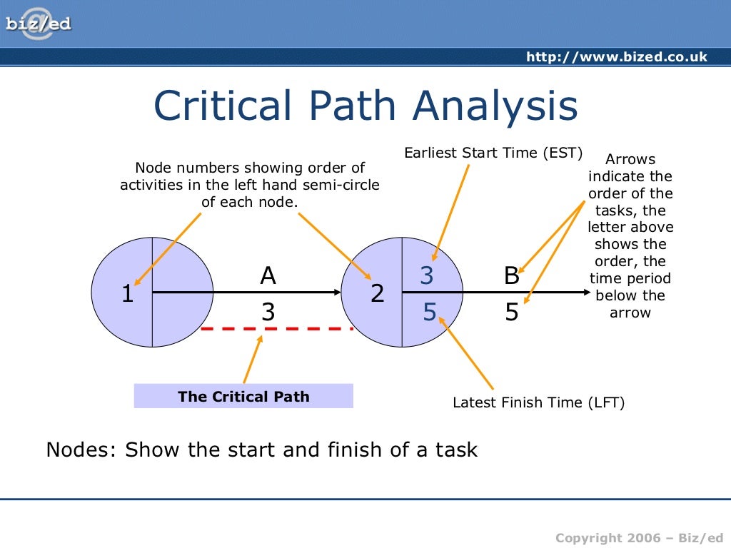
A. Definition and Significance
The critical path, often likened to the central nervous system of project management, serves as the spine, dictating the shortest route from initiation to completion. Defined as the sequential chain of tasks determining the project’s minimum duration, its significance reverberates through the entire project landscape.
-
Definition of Critical Path
- At its core, the critical path encompasses the series of tasks with zero slack, symbolizing the non-negotiable sequence vital for project completion.
- This digital roadmap, etched in the project plan, signifies the lifeline where any delay directly impacts the project’s timeline.
-
Significance in Project Management
- Operating as the project’s heartbeat, the critical path unveils the tasks demanding meticulous attention and adherence to deadlines.
- It’s not merely a theoretical construct but a pragmatic tool that crystallizes the project manager’s vision into a tangible, time-bound reality.
B. Identifying Critical Path Components
Navigating the critical path terrain involves a nuanced understanding of its foundational components, akin to deciphering the alphabet of project progression.
-
Tasks and Subtasks
- The critical path unfurls with tasks and their hierarchical counterparts, subtasks. Each contributes to the project’s symphony, requiring precision in execution.
- Like a meticulously choreographed dance, tasks and subtasks intertwine to create a seamless flow, but their order is sacrosanct on the critical path.
-
Dependencies and Relationships
- Dependencies form the connective tissue of the critical path, outlining the interdependence between tasks. A delay in one can send ripples across the entire project.
- Relationships between tasks aren’t mere casual acquaintances; they are strategic alliances shaping the project’s narrative. Recognizing and managing these relationships is the crux of navigating the critical path.
Unraveling the critical path’s complexity demands a keen eye for detail, strategic thinking, and the adept use of project management tools, notably within the familiar terrain of Microsoft Word. As we delve deeper into the subsequent sections, the aim is not just comprehension but mastery, ensuring that the critical path becomes a dynamic ally rather than a managerial puzzle.
Setting Up Your Project in Microsoft Word
In the intricate tapestry of project management, the initial steps of setting up your project in Microsoft Word lay the foundation for seamless orchestration. This phase isn’t merely about creating a project timeline; it’s a strategic dance with tables and rows, a symphony where each element contributes to the harmonious progression of tasks.
A. Creating a Project Timeline
1. Utilizing Tables and Rows
In the digital realm of Microsoft Word, tables become the virtuoso tool for crafting your project’s visual timeline. Each cell represents a moment in time, a task waiting to unfold. Here, the artistry lies in leveraging the full potential of tables and rows:
- Structured Simplicity: Tables provide a structured canvas, allowing you to delineate timelines with precision. Rows become the scaffolding on which your project’s chronology hangs, neatly organized and visually compelling.
- Visualizing Milestones: With each row, milestones come to life. The strategic use of color, formatting, or even icons can transform a mundane table into a visual roadmap, guiding your team through the project’s intricate journey.
2. Defining Task Durations
In the lexicon of project management, task durations aren’t just numbers; they are the heartbeat of your project’s timeline. Defining these durations within the Microsoft Word ecosystem involves a nuanced approach:
- Realistic Estimation: Like a maestro conducting an orchestra, project managers must set durations realistically. Utilize Microsoft Word’s features to input these durations accurately, acknowledging the variability inherent in different tasks.
- Dynamic Adjustments: The beauty of Microsoft Word lies in its adaptability. As project dynamics shift, the ability to dynamically adjust task durations ensures that your project timeline remains agile and reflective of real-world scenarios.
B. Adding Tasks and Subtasks
1. Inserting Rows for Each Task
As you embark on the journey of adding tasks and subtasks, think of each row as a canvas awaiting the strokes of your project narrative. Precision is key, and Microsoft Word offers the tools for meticulous insertion:
- Task-by-Task Unveiling: Inserting rows for each task is akin to unveiling chapters in a book. Each row represents a narrative turn, a task waiting to contribute its part to the overarching story.
- Hierarchical Organization: With every inserted row, the hierarchy unfolds. Subtasks nestled under overarching tasks create a visual hierarchy, offering clarity on the project’s structural intricacies.
2. Organizing Hierarchy for Subtasks
In the realm of project management, hierarchy isn’t a bureaucratic concept; it’s a navigational tool guiding your team through the project’s labyrinth. Microsoft Word facilitates this organizational dance:
- Indentation Magic: The simple act of indenting subtasks beneath their parent tasks transforms your project document into a dynamic roadmap. Microsoft Word’s indentation feature becomes the choreographer, orchestrating the visual hierarchy effortlessly.
- Clarity Amid Complexity: With the hierarchy established, clarity emerges amid complexity. Each subtask finds its place, contributing to the overarching task’s completion while maintaining a clear delineation of responsibilities.
As you navigate the terrain of setting up your project in Microsoft Word, envision it as more than a mere procedural step; it’s the overture to a symphony of project management. The judicious use of tables, rows, and hierarchy isn’t just about organization; it’s about translating your project’s heartbeat into a visual masterpiece, setting the stage for a successful performance.
Establishing Dependencies
In the intricate ballet of project management, the art of establishing dependencies emerges as the choreography that orchestrates seamless progress. Let’s delve into the intricacies of linking tasks in Microsoft Word, where the ballet begins with a synchronization of task links and a meticulous adherence to the rhythm of proper sequence.
A. Linking Tasks in Microsoft Word
1. Utilizing Task Links
Within the canvas of Microsoft Word, the utilization of task links is akin to threading pearls on a necklace – each link a connection that contributes to the project’s aesthetic whole.
- Interconnecting Tasks: Task links serve as the sinews binding disparate tasks into a cohesive unit. Microsoft Word’s functionality allows for the creation of interdependencies, ensuring that one task’s completion triggers the initiation of the next, creating a seamless flow.
- Visualizing Flow: The visual representation of task links within Microsoft Word is akin to a musical score, each note (task) intrinsically tied to the preceding and succeeding ones. This visual clarity fosters understanding, a key element in effective project management.
2. Ensuring Proper Sequence
In the choreography of project tasks, sequence is paramount. Microsoft Word provides the stage upon which this sequence is meticulously set, ensuring a symphony of tasks unfolding in perfect harmony.
- Sequential Logic: The essence of project management lies in the logic of sequence. Through Microsoft Word, tasks are aligned in a sequential order, creating a roadmap that team members can follow intuitively.
- Preventing Bottlenecks: Proper sequence, facilitated by Microsoft Word’s task linking capabilities, acts as a safeguard against potential bottlenecks. When tasks unfold in a logical order, potential hurdles become more predictable, allowing for proactive resolution.
B. Understanding Lag and Lead Times
1. Defining Lag Time
The concept of lag time is a strategic pause in the project ballet, a momentary breath that ensures synchronization without creating chaos.
- Strategic Delays: Lag time isn’t a stumbling block; it’s a strategic pause. Within Microsoft Word, defining lag time involves a calculated decision to insert delays between linked tasks, accommodating dependencies without compromising efficiency.
- Fine-tuning Precision: Microsoft Word’s flexibility allows project managers to fine-tune lag time with precision. Whether it’s a brief moment of reflection between tasks or a more extended hiatus, the definition of lag time is a deliberate choice reflecting the nuanced understanding of project dynamics.
2. Incorporating Lead Time
Lead time is the anticipatory step in the project choreography, a forward-looking maneuver ensuring that subsequent tasks start with confidence.
- Proactive Preparedness: Incorporating lead time within Microsoft Word is akin to offering a head start to tasks. By defining the duration between the completion of a predecessor task and the initiation of its successor, project managers inject a dose of proactive preparedness into the project’s veins.
- Mitigating Uncertainty: Lead time isn’t just about gaining a head start; it’s a strategic move to mitigate uncertainty. Microsoft Word’s functionality allows for a clear delineation of lead time, transforming ambiguity into a well-charted path.
As project managers waltz through the establishment of dependencies using Microsoft Word, the software becomes not just a tool but a dance partner in the intricate ballet of project progression. Each link, each lag, and lead time represent steps in a meticulously choreographed routine, where the fluidity of dependencies ensures a seamless and graceful execution of tasks.
Determining Task Durations
In the intricate symphony of project management, determining task durations is the melodic undercurrent that dictates the rhythm of project progression. As we delve into the nuanced process of setting realistic timeframes and handling variable durations, the essence lies not just in numerical estimations but in the strategic orchestration of project timelines.
A. Setting Realistic Timeframes
1. Considering Task Complexity
Project timelines, akin to musical compositions, demand a nuanced understanding of each note’s complexity. When setting realistic timeframes within the Microsoft Word canvas, the project manager dons the hat of a seasoned conductor:
- Task as a Musical Note: Each task represents a musical note, with its own nuances and intricacies. Microsoft Word, the orchestra pit, offers a platform to consider the complexity inherent in each task.
- Conducting a Complexity Assessment: Before setting the duration, project managers assess the complexity of tasks. Utilizing Microsoft Word’s features, they navigate through the layers of intricacy, ensuring that each note is accorded the time it deserves.
2. Factoring in Resource Availability
Much like an orchestra requiring skilled musicians, project tasks rely on the availability of resources. Microsoft Word becomes the sheet music, where resource availability is not just a logistical consideration but a key determinant in the tempo of the project:
- Resource as Musical Instruments: Resources are the instruments in the project orchestra, each with its unique sound and contribution. Microsoft Word facilitates a comprehensive overview of resource availability, ensuring that the symphony unfolds with all instruments in play.
- Harmony in Resource Allocation: Balancing the workload, Microsoft Word enables project managers to harmonize resource allocation, preventing overburdening and ensuring that each task is resourced adequately.
B. Handling Variable Durations
1. Best Practices for Estimation
In the dynamic landscape of project management, estimating variable durations is akin to predicting the unpredictable. Microsoft Word transforms into the crystal ball, offering insights that guide the project manager through the labyrinth of uncertainty:
- Past Performance as a Compass: Microsoft Word becomes a compass, guiding project managers through the seas of uncertainty. Historical data on past project performance, easily accessible within the software, serves as a valuable tool for estimation.
- Utilizing Three-Point Estimation: The brilliance of Microsoft Word lies in its adaptability. Project managers employ three-point estimation, factoring in optimistic, pessimistic, and most likely scenarios. The software becomes a versatile canvas for blending these estimates into a coherent projection.
2. Incorporating Contingency Time
The art of project management involves anticipating detours and preparing for unforeseen delays. Microsoft Word is the map, and incorporating contingency time is the strategic decision-making that ensures a smooth journey:
- Contingency as a Safety Net: Just as a safety net ensures the tightrope walker’s confidence, Microsoft Word provides a platform to weave contingency time into the project fabric. Project managers strategically allocate extra time, using the software’s features to visualize and plan for potential delays.
- Real-Time Adjustments: Microsoft Word empowers real-time adjustments. When unforeseen variables enter the project scene, project managers can dynamically adjust contingency time, ensuring that the project sails smoothly even in turbulent waters.
In the grand narrative of project management, Microsoft Word becomes more than a tool; it’s the conductor’s baton, guiding the orchestra of tasks through the intricacies of setting realistic timeframes and navigating variable durations. The software’s functionalities seamlessly blend with project management best practices, transforming the planning process into a symphony where each task’s duration is a note in the harmonious progression towards project success.
Utilizing Critical Path Analysis Tools
In the dynamic landscape of project management, the mastery of critical path analysis tools stands as the beacon guiding project managers through the labyrinth of tasks and dependencies. As we navigate through the indispensable features within Microsoft Word and explore the realm of third-party integrations, the essence lies in leveraging these tools not as mere facilitators but as strategic enablers of project success.
A. Microsoft Word Features
1. Gantt Charts in Word
Within the expansive toolkit of Microsoft Word, Gantt charts emerge as the visual maestro, orchestrating the project timeline with precision.
- Visual Symphony: Gantt charts, seamlessly integrated into Microsoft Word, transform the mundane task list into a visual symphony. Each task is a note, and the chart visualizes their sequential dance, providing an at-a-glance overview of the entire project timeline.
- Timeline Precision: The beauty of Gantt charts lies in their ability to convey not just task durations but also the interdependencies between them. Microsoft Word empowers project managers to create Gantt charts that offer a nuanced understanding of the critical path.
2. Tracking Progress Using Milestones
Milestones, the project’s significant waypoints, become more than markers within Microsoft Word – they are the narrative anchors that signify progress.
- Strategic Milestone Placement: Microsoft Word’s features allow project managers to strategically place milestones, not merely as celebratory markers but as progress indicators. These milestones serve as checkpoints on the critical path, offering real-time insights into the project’s advancement.
- Real-Time Adjustments: As tasks unfold, Microsoft Word facilitates the dynamic adjustment of milestones. Whether accelerating progress or mitigating delays, the software ensures that milestones remain aligned with the project’s evolving narrative.
B. Third-Party Integration
1. Exporting to Project Management Software
While Microsoft Word offers a robust set of tools, seamless integration with third-party project management software amplifies the depth of critical path analysis.
- Interconnected Ecosystems: Exporting critical path data from Microsoft Word to dedicated project management software creates an interconnected ecosystem. Project managers can harness the specialized features of tools like Microsoft Project, ensuring a holistic approach to critical path analysis.
- Enhanced Collaboration: Third-party integration fosters enhanced collaboration. Project teams can seamlessly transition between Microsoft Word and project management software, promoting a fluid exchange of information crucial for effective critical path management.
2. Enhancing Analysis with External Tools
The strategic utilization of external tools supplements Microsoft Word’s capabilities, elevating critical path analysis to a higher plane.
- Specialized Analytics: External tools tailored for critical path analysis bring specialized analytics to the forefront. Project managers can leverage tools with advanced algorithms, providing deeper insights into task dependencies, resource constraints, and potential bottlenecks.
- Data Visualization: The amalgamation of Microsoft Word and external tools results in a dynamic data visualization experience. Complex critical path analyses are distilled into comprehensible visual representations, enhancing the decision-making process.
As project managers traverse the landscape of critical path analysis, Microsoft Word evolves from a word processing tool into a dynamic hub where Gantt charts, milestones, and critical path data converge. The integration with third-party software extends the toolkit, ensuring that critical path analysis becomes not just a task but a strategic endeavor, where tools seamlessly align with the complexities of project management. The symphony of project success is composed not only within the familiar confines of Microsoft Word but through the strategic integration of tools that amplify the orchestration of the critical path.
Updating and Monitoring the Critical Path
In the dynamic landscape of project management, the critical path is the spine that supports the entire framework, and its effective monitoring is akin to maintaining the backbone’s health. As we delve into the crucial task of updating and monitoring the critical path, the emphasis is not merely on periodic assessments but on a continuous, adaptive approach that aligns with the evolving narrative of the project.
A. Regular Review and Adjustments
1. Weekly or Bi-weekly Assessments
Regularity is the heartbeat of effective critical path management. Weekly or bi-weekly assessments within Microsoft Word’s domain become the routine health check-ups, ensuring the critical path remains robust and resilient.
- Consistent Vigilance: The essence of weekly or bi-weekly assessments lies in consistent vigilance. Project managers utilize Microsoft Word to conduct systematic reviews, evaluating the current state of the critical path against the project timeline.
- Identifying Deviations: Like a medical professional identifying deviations in a patient’s health, project managers scrutinize the critical path for any anomalies. Microsoft Word’s features facilitate a granular examination, allowing for the identification of tasks veering off the critical trajectory.
2. Adapting to Changes in the Project
In the fluid environment of project management, adaptability is not a choice but a necessity. Microsoft Word, the versatile tool, becomes the canvas for adapting the critical path to the ever-changing landscape of the project.
- Real-Time Adjustments: Project dynamics evolve, and Microsoft Word ensures real-time adjustments to the critical path. Whether it’s accommodating unforeseen delays or capitalizing on expedited progress, the software becomes the control center for adapting the critical path in lockstep with project changes.
- Dynamic Task Re-prioritization: Tasks on the critical path aren’t set in stone; they are dynamic entities. Microsoft Word enables project managers to dynamically re-prioritize tasks, ensuring that the critical path reflects the most current and strategic sequence.
As project managers engage in the regular review and adjustments of the critical path within Microsoft Word, the process is not a static ritual but a living, breathing aspect of project management. The software serves as more than a tool; it’s the observatory where project managers peer into the intricate workings of the critical path, identifying nuances and making real-time adjustments to maintain optimal project health.
In the symphony of project management, updating and monitoring the critical path is not a standalone act; it’s a recurring motif, seamlessly integrated into the project’s narrative. Microsoft Word, with its user-friendly interface and dynamic features, becomes the conductor’s baton, guiding project managers through the nuances of regular assessments and adaptive adjustments. As the critical path evolves, so does the project’s success, orchestrated within the familiar confines of Microsoft Word’s versatile toolkit.
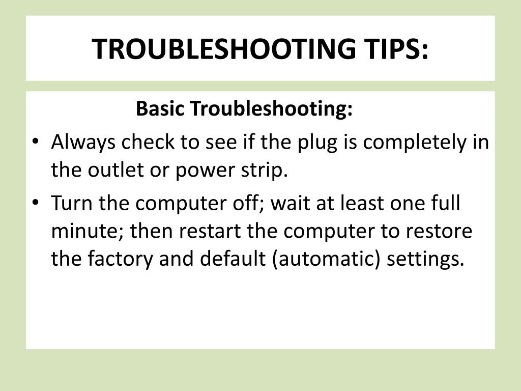
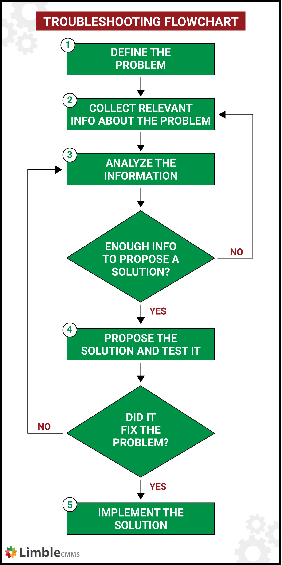
Troubleshooting Common Issues
In the intricate tapestry of project management, navigating unforeseen challenges is not a deviation from the plan but an integral part of the journey. As we unravel the complexities of troubleshooting common issues within the critical path, the focus shifts from merely identifying problems to implementing strategic solutions that keep the project’s heartbeat steady.
A. Dealing with Resource Constraints
1. Resource Leveling Strategies
Resource constraints can disrupt the harmonious flow of the critical path, but within the realm of Microsoft Word, there exist strategies akin to a seasoned conductor orchestrating a symphony:
- Balancing the Orchestra: Resource leveling is the art of balancing the project orchestra. Microsoft Word’s features allow project managers to identify resource bottlenecks, redistributing workloads to ensure a smooth progression along the critical path.
- Utilizing Resource Histograms: Microsoft Word becomes the visual score, featuring resource histograms that illuminate the peaks and valleys of resource availability. Project managers, armed with this insight, strategically level resources to avoid overwhelming constraints.
2. Reallocating Resources on the Critical Path
In the face of resource constraints directly impacting the critical path, Microsoft Word becomes the canvas for resource reallocation, akin to a director reshuffling actors to ensure a flawless performance:
- Dynamic Task Reprioritization: Microsoft Word empowers project managers to dynamically reprioritize tasks on the critical path based on resource availability. It’s a tactical approach where the software serves as the script, allowing managers to reshuffle scenes while ensuring the overall narrative stays on track.
- Real-Time Resource Allocation: Resource allocation is not a static process, and Microsoft Word facilitates real-time adjustments. As constraints ease or intensify, project managers can adapt on the fly, reallocating resources to maintain the critical path’s momentum.
B. Managing Unexpected Delays
1. Assessing Impact on Critical Path
Unexpected delays are the curveballs of project management, and Microsoft Word transforms into the strategic playbook for assessing their impact on the critical path:
- Critical Path Analysis Tools: Leveraging critical path analysis tools within Microsoft Word, project managers assess the domino effect of unexpected delays. The software becomes the magnifying glass, allowing for a meticulous examination of the ripple effects on task dependencies.
- Identifying Critical Tasks: Within the critical path, not all tasks are created equal. Microsoft Word’s features enable project managers to identify critical tasks that, if delayed, would have the most significant impact on project timelines.
2. Implementing Recovery Strategies
When unexpected delays threaten to disrupt the critical path’s tempo, Microsoft Word becomes the stage for implementing recovery strategies, ensuring the show goes on:
- Fast-Tracking and Crashing: Microsoft Word’s functionalities facilitate the implementation of fast-tracking and crashing strategies. Project managers can expedite critical tasks or allocate additional resources to compress timelines, mitigating the impact of unexpected delays.
- Scenario Planning: Microsoft Word serves as the canvas for scenario planning. Project managers, utilizing the software, can simulate various scenarios to identify the most effective recovery strategy, ensuring the critical path remains resilient in the face of unexpected challenges.
In the saga of troubleshooting common issues within the critical path, Microsoft Word transcends its role as a mere tool and emerges as the seasoned navigator guiding project managers through resource constraints and unexpected delays. It’s the compass that directs the orchestra, ensuring that even when faced with challenges, the critical path maintains its rhythm, seamlessly orchestrated within the versatile features of Microsoft Word.