Unleashing the Power of Macros in Microsoft Word

Are you tired of repetitive tasks that consume your precious time while working in Microsoft Word? How about a world where your most routine tasks are completed with just a click? There is no doubt that macros in Microsoft Word are the game-changers you’ve been looking for.

Macros are digital assistants, which means they automate everyday tasks with ease. Have you ever wished that you could format an entire document, predefined text, and insert them all in a single click using macros? Macros are fascinating because they can be created, improved, or combined in a variety of ways, giving you a competitive advantage. This article will walk you through the fascinating world of macros.

Finally, get ready to join us in the quest to comprehend macros. Discover how to streamline your document creation, troubleshoot common issues, and practice conditional macros all while learning how to spell some words correctly. The next step is to transform the way you work in Microsoft Word by learning macros.

Understanding Macros

In the realm of document creation, the significance of macros in Microsoft Word cannot be overstated. Let’s delve into the heart of this powerful feature and gain a nuanced understanding.

Definition:
Macro, in the context of Microsoft Word, is a dynamic tool designed to revolutionize the way you approach tasks. At its core, a macro is a set of instructions that automates repetitive actions, transforming intricate processes into seamless, time-saving maneuvers. Imagine being able to condense multiple steps into a single click—macros are your digital shortcut to efficiency.

Types of Macros:

  1. Automated Text Macros:

    • Ever wished for a magical phrase to materialize at your command? Automated Text Macros make it a reality. These macros are your linguistic wizards, instantly inserting predefined text snippets into your documents. Whether it’s a boilerplate response or a frequently used paragraph, consider it done with a click.
  2. Format Macros:

    • Consistency is key in document formatting, and Format Macros emerge as your design guardians. These macros enable you to apply uniform styling across your documents effortlessly. From fonts to spacing, let Format Macros be your meticulous stylist, ensuring your documents exude a polished and professional appearance.

As we navigate through these definitions and types, it becomes evident that macros are not just a feature; they’re a transformative force in the way you interact with Microsoft Word. The black-box nature of macros, encapsulated in code, conceals a world of possibilities, waiting for you to explore and harness. The process of defining macros and understanding their various types serves as a gateway to unlocking unparalleled efficiency in your document creation journey.

Macro Creation Demystified:
Creating macros might sound like an intimidating endeavor, reserved for the tech-savvy. However, fear not. With Microsoft Word, the process is user-friendly and accessible to all. Start by accessing the Developer tab, your gateway to the world of macros. Once there, you can either record your actions or take the plunge into manual macro writing using Visual Basic for Applications (VBA). The power lies in your hands, and with a bit of guidance, you’ll soon be automating tasks with finesse.

Macro Management Pro Tips:
As you embark on your macro journey, it’s crucial to manage them effectively. Understand the nuances of macro security settings, ensuring a harmonious coexistence between efficiency and safety. Learn to modify recorded macros to suit your evolving needs, and don’t hesitate to bid farewell to macros that have outlived their usefulness. The ability to wield macros efficiently is not just a skill; it’s a strategic advantage in navigating the intricacies of document creation.

In the grand tapestry of Microsoft Word, macros stand out as the unsung heroes, streamlining processes and elevating your experience. From troubleshooting common issues to exploring advanced techniques like conditional macros and user forms, this journey is a continuous learning curve. Embrace the versatility of macros, and witness firsthand the transformation they bring to your document creation workflow. After all, in the world of Microsoft Word, macros are not just a feature; they’re your digital accomplices, ready to enhance your productivity at the click of a button.

Creating Macros in Microsoft Word

When it comes to mastering the art of macros in Microsoft Word, the journey begins with understanding how to create them seamlessly. Let’s dive into the intricacies of creating macros, unraveling the steps to access the Developer tab, recording macros, and even venturing into the realm of manual macro writing.

Accessing the Developer Tab:
The gateway to the world of macros in Microsoft Word lies in the Developer tab, a feature that is often hidden by default. Here’s a step-by-step guide to unveil this powerhouse:

  • Navigate to the “File” tab in Microsoft Word.
  • Select “Options” at the bottom of the left-hand menu.
  • In the Word Options dialog box, choose “Customize Ribbon.”
  • Check the “Developer” option in the right-hand column.
  • Click “OK” to apply the changes.

Congratulations! You’ve just unmasked the Developer tab, the control center for all things macros. This hidden gem empowers you to take charge of automation, making complex tasks as simple as a few clicks.

Recording a Macro:
Once the Developer tab is at your disposal, the next frontier is recording macros—a feature that acts as your personal stenographer, capturing your every move for future replication. Here’s how you can make the magic happen:

  1. Navigate to the Developer tab.
  2. Click on “Record Macro” in the Code group.
  3. Provide a name for your macro and choose a location to store it.
  4. Optionally, assign a shortcut key for quick access.
  5. Begin performing the actions you want to record.
  6. When done, return to the Developer tab and click “Stop Recording.”

Voila! You’ve just created a macro that can replicate your actions with surgical precision. This functionality is a game-changer for tasks that require repetition, saving you time and effort in the long run.

Manual Macro Writing:
For those seeking a more hands-on approach to macro creation, manual writing using Visual Basic for Applications (VBA) opens up a world of limitless possibilities. Here’s a brief introduction to get you started:

  • Access the Developer tab and click on “Visual Basic” to open the VBA editor.
  • In the editor, insert a new module.
  • Begin writing your macro using VBA syntax, specifying the actions you want the macro to perform.
  • Save your work, and you now have a custom-coded macro ready for execution.

This manual approach provides unparalleled flexibility, allowing you to tailor macros to your specific needs. Whether it’s a complex series of actions or a simple yet precise task, VBA gives you the tools to craft a macro that aligns perfectly with your workflow.

In essence, the process of creating macros in Microsoft Word is a journey of empowerment. From revealing the Developer tab to recording actions and venturing into manual coding, each step opens up new avenues for efficiency and customization. As you navigate this realm, remember that macros are not just shortcuts; they are the keys to unlocking a world where your actions echo with productivity and precision. So, embrace the Developer tab, record your macros, and venture into the coding realm—your journey to macro mastery has just begun.

Editing and Managing Macros

Editing and Managing Macros
Image by – https://geeksforgeeks.org

In the dynamic realm of Microsoft Word macros, the journey doesn’t end with their creation. Understanding the nuances of editing and managing macros is paramount to harnessing their full potential.

Macro Security:
As you delve into the world of macros, understanding and managing macro security is the first line of defense against potential risks. Macro security settings act as a shield, determining the extent to which macros can run in your documents. Adjusting these settings is a crucial aspect of safeguarding your system. Here’s a concise guide to navigating macro security:

  • Access the Developer tab.
  • Click on “Macro Security” in the Code group.
  • Choose the desired security level, ranging from disabling all macros to allowing them with notifications.

By comprehending and customizing macro security, you strike a balance between functionality and protection, ensuring a secure computing environment.

Modifying Recorded Macros:
The beauty of recorded macros lies in their adaptability. Once a macro is recorded, it’s not set in stone. You have the power to modify and customize recorded macros to better suit your needs. Here’s a straightforward guide to flexing your macro-editing muscles:

  1. Access the Developer tab and click on “Macros” in the Code group.
  2. Select the macro you want to edit and click “Edit.”
  3. The Visual Basic for Applications (VBA) editor opens, allowing you to view and modify the macro code.
  4. Make the necessary changes to the code and save your modifications.

This flexibility empowers you to refine and enhance macros, tailoring them to evolving requirements with precision and ease.

Deleting Macros:
In the ever-evolving landscape of digital workflows, housekeeping macros becomes crucial. Removing unnecessary or obsolete macros not only declutters your system but also ensures optimal performance. Here’s a step-by-step guide on how to bid farewell to unwanted macros:

  • Navigate to the Developer tab and click on “Macros” in the Code group.
  • Select the macro you wish to delete.
  • Click “Delete” to remove the macro from your system.

Regularly cleaning up your macros not only streamlines your macro list but also contributes to a more organized and efficient computing experience.

In the intricate dance of macro editing and management, security, adaptability, and cleanliness are key. By mastering the art of macro security, tweaking recorded macros to perfection, and decluttering your repertoire when necessary, you elevate your macro proficiency to new heights. Embrace the dynamic nature of macros, and let your editing and management skills be the guiding force in optimizing your Microsoft Word experience.

Practical Applications

In the expansive realm of Microsoft Word macros, their practical applications extend far beyond the initial creation. Understanding how to leverage macros for streamlining document creation, data manipulation, and customizing workflows can be transformative for individual users and teams alike.

Streamlining Document Creation:
Macros, scripted in languages like JavaScript, emerge as indispensable tools in the realm of document creation. Their prowess lies in the ability to automate repetitive tasks, drastically enhancing efficiency. Here’s a glimpse into how macros, with their JavaScript wizardry, contribute to streamlining the document creation process:

  • Effortless Automation: Macros can automate complex formatting, repetitive text insertion, and other mundane tasks, streamlining the document creation workflow.
  • Precision and Consistency: By eliminating manual intervention, macros ensure a higher degree of precision and consistency across documents, fostering a professional and polished output.

By integrating JavaScript-powered macros into your document creation workflow, you not only save time but also elevate the quality of your documents.

Data Manipulation Macros:
For those immersed in data-centric tasks, macros become invaluable tools for processing and manipulating data directly within Word documents. Consider the scenario where Mathematica macros come into play:

  • Seamless Data Processing: Mathematica macros facilitate the seamless integration of data processing and manipulation tasks within the familiar Word environment.
  • Real-time Updates: Dynamic linking with external data sources enables real-time updates, ensuring that your document reflects the latest changes in the underlying data.

Harnessing the power of Mathematica macros opens up a world of possibilities for users working with data-intensive documents, providing a bridge between computation and presentation.

Customizing Workflows:
The versatility of macros extends to tailoring workflows to meet specific needs. In the context of CSS-powered macros, customization takes center stage:

  • Adaptability to Workflows: CSS macros allow for the tailoring of macros to fit seamlessly into individual or team-specific workflows, enhancing adaptability.
  • User-Centric Automation: Whether it’s automating styling preferences, layout configurations, or collaborative editing processes, CSS macros bring a user-centric approach to workflow customization.

By embracing the customization capabilities of CSS-powered macros, users can mold their digital environment to suit their unique requirements, fostering a harmonious and efficient workflow.

In the ever-evolving landscape of practical applications, Microsoft Word macros stand as versatile tools, transcending their creation phase. From streamlining document creation with JavaScript, manipulating data with Mathematica, to customizing workflows with CSS, macros pave the way for a more efficient and tailored Word experience. As users navigate the vast possibilities, the integration of these powerful tools becomes pivotal in maximizing productivity and achieving unprecedented efficiency in document-related tasks.

Troubleshooting Macros

In the intricate landscape of Microsoft Word macros, the journey doesn’t conclude with their creation; it extends into the realm of troubleshooting, a skill as vital as the macros themselves. Let’s delve into the nuances of navigating challenges in this domain.

Debugging Macros:
When the smooth operation of macros encounters a hiccup, adept troubleshooting becomes paramount. CSS, a language known for styling web elements, takes center stage in debugging macros. Here’s a breakdown of common issues and effective troubleshooting strategies:

  • Syntax Scrutiny: Debugging macros often involves meticulous examination of CSS syntax to identify and rectify errors.
  • Browser Compatibility: Issues may arise due to disparities in how different browsers interpret CSS; troubleshooting involves adapting code for compatibility.
  • Responsive Design Challenges: Debugging extends to addressing challenges in responsive design, ensuring a seamless user experience across devices.

Navigating the intricacies of CSS-powered macros demands a keen eye for detail, enabling users to overcome obstacles and maintain optimal functionality.

Security Concerns:
While macros enhance productivity, they are not immune to security concerns, especially when implemented using languages like C#. Understanding and addressing these concerns is integral to a holistic approach to macro utilization. Here’s an exploration of potential security risks associated with C# macros:

  • Code Vulnerabilities: C# macros may harbor vulnerabilities that, if exploited, can compromise the security of Word documents.
  • Unauthorized Access: Security concerns extend to potential unauthorized access through macros; addressing this involves robust authentication measures.
  • Malicious Payloads: Macros can inadvertently carry malicious payloads; thorough security checks are essential to detect and neutralize such threats.

In the ever-evolving digital landscape, vigilance against security threats is non-negotiable. Users must embrace proactive measures and stay abreast of emerging risks to fortify the integrity of their macro-enabled documents.

In conclusion, troubleshooting macros, whether in the realm of CSS debugging or addressing security concerns in C# implementations, is an indispensable skill for users navigating the dynamic landscape of Microsoft Word. By cultivating a nuanced understanding of the intricacies involved and adopting a proactive stance, users can not only overcome challenges but also fortify the robustness and security of their macro-infused documents. The journey from troubleshooting to mastery is a continuous one, marked by a commitment to excellence in harnessing the full potential of Microsoft Word macros.

Advanced Techniques

Advanced Techniques
Photo by: blogspot

In the ever-evolving landscape of Microsoft Word macros, the ascent to mastery involves embracing advanced techniques that elevate document automation to new heights. Let’s unravel the intricacies of these techniques, exploring their applications and benefits.

Conditional Macros:
CSS, renowned for styling web elements, takes on a new role within macros, introducing the concept of conditional statements. This advanced technique empowers users to introduce logic into their macros, enhancing functionality based on specific conditions. Key points to delve into include:

  • Introduction to Conditional Statements: Unlock the power of conditional statements within macros, enabling dynamic responses to varying scenarios.
  • Customization Through CSS: Leverage the versatility of CSS to tailor conditional macros, ensuring seamless integration with the desired document aesthetics.

The incorporation of conditional macros represents a paradigm shift in the realm of document automation, providing users with a sophisticated toolset to customize responses and actions based on nuanced conditions.

User Forms:
As we venture deeper into the realm of advanced macro techniques, the integration of user forms emerges as a pivotal capability. Leveraging Rust, a systems programming language, users can introduce interactive elements into their macros through user forms. Key facets to explore encompass:

  • Interactive Macro Execution: Rust facilitates the incorporation of user forms, fostering a dynamic and user-friendly macro execution experience.
  • Enhancing User Engagement: Explore the potential of user forms to enhance engagement, soliciting input and feedback within the macro execution process.

The utilization of Rust in tandem with user forms marks a significant leap forward, transforming macros from static tools into interactive components that resonate with users on a more personalized level.

Error Handling:
In the pursuit of macro mastery, understanding and implementing robust error handling practices is indispensable. The Go programming language becomes the conduit for instilling best practices in error handling within macros. Key considerations in this realm encompass:

  • Implementation Best Practices: Delve into the nuanced best practices for implementing error handling within macros, ensuring resilience in the face of unexpected scenarios.
  • Ensuring Macro Reliability: Go provides a robust framework for fortifying macros against errors, contributing to overall macro reliability and user confidence.

As users navigate the intricate terrain of advanced macro techniques, the integration of error handling practices becomes a cornerstone, elevating macros beyond mere automation tools to reliable assets in document creation.

Tips and Best Practices

Tips and Best Practices for Mastering Macros

Navigating the intricate landscape of macro creation and management demands a nuanced understanding of not just the tools at hand but the artistry of efficient execution. Here, we unravel pro tips that transcend the mundane, elevating your macro game to unprecedented heights.

1. Crafting Efficient Macros

Creating macros that not only automate tasks but do so with finesse requires a strategic approach. Consider the following:
– **Purposeful Automation:** Identify repetitive tasks that genuinely benefit from automation, ensuring your macros serve a meaningful purpose.
– **Streamlined Execution:** Write concise and purposeful code to avoid unnecessary complexity, enhancing the macro’s efficiency.

2. Versatility in Macro Application

Unlock the full potential of macros by exploring their versatility across different scenarios:
– **Document Formatting:** Utilize macros for consistent and efficient document formatting, ensuring a polished and professional appearance.
– **Data Manipulation:** Leverage macros to streamline data manipulation tasks, from sorting to complex calculations.

3. User-Friendly Interfaces

Enhance the user experience by incorporating user-friendly elements into your macros:
– **Interactive Forms:** Implement user forms to solicit input, transforming macros into intuitive tools accessible to users with varying expertise.
– **Error Handling with Grace:** Integrate error-handling mechanisms that provide clear feedback, guiding users through unexpected situations seamlessly.

4. Efficient Workflow Integration

Integrate macros seamlessly into your workflow, optimizing their impact:
– **Tailored Customization:** Customize macros to align with individual or team-specific workflows, ensuring a harmonious integration into existing processes.
– **Regular Updates:** Periodically review and update macros to adapt to evolving needs, maintaining long-term relevance and effectiveness.

5. Security First

Prioritize the security aspects of your macros to safeguard against potential risks:
– **Vigilant Code Review:** Regularly review your macro code for vulnerabilities, ensuring it aligns with the latest security best practices.
– **Access Controls:** Implement strict access controls to regulate who can execute and modify macros, minimizing the risk of unauthorized use.

6. Documentation Practices

Documenting your macros is as crucial as crafting them:
– **Clear Comments:** Embed clear and concise comments within your code, facilitating understanding and future modifications.
– **Comprehensive Guides:** Provide comprehensive documentation outlining macro functionalities, parameters, and best practices for users.

7. Continuous Learning

The world of macros is dynamic; embrace continuous learning to stay at the forefront:
– **Community Engagement:** Participate in macro development communities to exchange insights, troubleshoot challenges, and stay abreast of the latest trends.
– **Explore New Features:** Regularly explore and experiment with new features or updates in macro development tools to expand your skill set.

In the ever-evolving landscape of macro creation, these tips transcend the ordinary, guiding you towards mastery. Whether you’re a seasoned developer or a novice exploring the world of macros, incorporating these best practices ensures not just efficiency but a transformative approach to document automation. As you embark on your macro journey, let these tips be your compass, navigating you towards seamless, secure, and sophisticated macro mastery.

Read More

Crafting Superscripts in Microsoft Word: A Comprehensive Guide

The power of superscript can significantly enhance the visual appeal and clarity of your documents, even if you are having trouble formatting them as text in Microsoft Word. How can you effortlessly achieve this formatting wizardry?

This comprehensive guide will explain in layman’s terms how to create, apply, and customize superscripts in Microsoft Word. Using advanced techniques and keyboard shortcuts, you can effectively use superscripts in your documents.

Make formatting and superscript usage both simple and seamless by opening the door to precise formatting and seamless scripting. Follow along with this article to gain insight into the steps, tips, and troubleshooting steps in order to gain a better understanding of Microsoft Word’s superscript world.

Can you use superscripting in Microsoft Word to further enhance your document formatting abilities? We’ll look at how you can do so and what to look out for when writing documents.

Discover the ins and outs of superscript formatting in Microsoft Word with this comprehensive guide, which includes a diverse range of techniques, shortcuts, troubleshooting tips, and tips for flawlessly formatting superscript files. Superscripts can be used to increase the visual appeal and clarity of your documents. Let’s get started on this fascinating journey.

Understanding Superscripts

Understanding Superscripts
Picture source: educba

Understanding superscripts within the realm of Microsoft Word delves into a multifaceted domain of formatting prowess that intricately intertwines functionality and visual aesthetics. These tiny, elevated characters, denoted slightly above the baseline, serve a pivotal role in academic, professional, and creative writing landscapes. To navigate this realm effectively, let’s dissect the anatomy of superscripts.

Definition and Purpose

Superscripts, in essence, represent characters, numbers, or symbols displayed at a higher position than the standard text baseline. They offer a unique formatting mechanism, essential for denoting footnotes, mathematical exponents, chemical formulas, and citations within textual content. The primary purpose lies in enhancing readability while economizing space, ensuring a seamless flow of information without compromising clarity.

Common Usage Scenarios

The ubiquitous nature of superscripts finds application across various domains. In academia, they’re indispensable for annotating references, illustrating mathematical equations, and delineating scientific notations. In professional settings, superscripts aid in creating trademarks, registered symbols, or indicating footnote citations, enriching documents with critical information without interrupting the narrative flow. Additionally, creative endeavors leverage superscripts to impart a stylistic touch or denote ordinal indicators, enriching the visual appeal of literary works or presentations.

Importance in Formatting

The significance of superscripts extends beyond mere typographical embellishments. They contribute significantly to document aesthetics by maintaining a polished appearance, especially in technical or scientific manuscripts. Their compact nature aids in decluttering texts, ensuring a clean layout while retaining vital information. Moreover, their utilization fosters consistency and professionalism, elevating the overall quality of written material, thereby bolstering credibility and readability.

In navigating the realm of Microsoft Word’s superscripts, users unveil a nuanced toolset that transcends the mere visual aspect. Harnessing these characters effectively not only amplifies the document’s aesthetic appeal but also streamlines the conveyance of complex information. Understanding the defining characteristics, varied applications, and the pivotal role they play in textual refinement ensures a seamless integration of superscripts within the intricate tapestry of written communication.

Methods to Create Superscripts in Microsoft Word

Within Microsoft Word, navigating the creation of superscripts involves a diverse array of methods, each catering to users’ preferences and operational ease. These methodologies are pivotal in harnessing the power of elevated characters, be it for mathematical notations, footnotes, or specialized symbols, infusing documents with both clarity and sophistication. Let’s delve into the nuanced techniques available for crafting these superscripts seamlessly within the software’s interface.

Shortcut Keys

Windows Operating System

Shortcut keys serve as an efficient gateway to instantly generate superscripts. For Windows users, leveraging the keyboard is a swift and convenient approach. Utilizing the combination “Ctrl + Shift + =” allows for the quick transformation of selected text into superscript, enhancing workflow efficiency.

Mac Operating System

Similarly, Mac users can execute superscripts effortlessly. By pressing “Command + Shift + =” keys concurrently, users can seamlessly convert designated text into superscript format. This simple yet effective keystroke shortcut ensures a seamless transition for Mac-operated systems, expediting the document formatting process.

Ribbon/Menu Options

Insert Tab

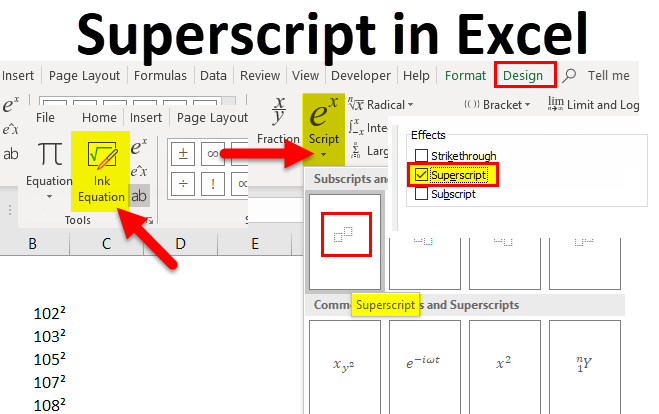
Within the Ribbon interface, navigating to the “Insert” tab unveils a trove of formatting tools. Users can effortlessly access superscripts by clicking on the “Superscript” button, denoted by a raised ‘x^2’ icon. This streamlined approach caters to users who prefer menu-based operations, allowing for precise and immediate implementation of superscripts within the document.

Font Dialog Box

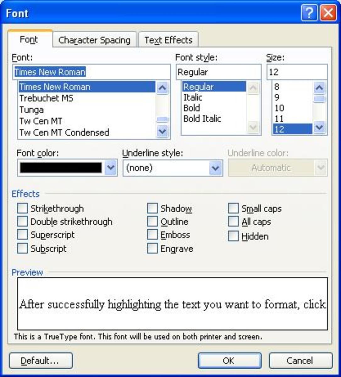
Alternatively, accessing the Font Dialog Box provides another avenue for generating superscripts. Through this method, users can select designated text, navigate to the “Font” tab in the toolbar, and check the “Superscript” box. This comprehensive dialog box empowers users with finer control over superscript attributes, offering a detailed and customizable approach to formatting.

Mastering these distinct methodologies provides users with a repertoire of options to seamlessly integrate superscripts into their documents. Whether opting for swift keyboard shortcuts or navigating the software’s menu options, Microsoft Word ensures a user-friendly experience, accommodating various operational preferences. Understanding these methods allows users to optimize their workflow, enhancing document readability and professional presentation effortlessly.

Utilizing the Superscript Feature

Utilizing the superscript feature within Microsoft Word is akin to wielding a precision tool that elevates text presentation and clarity. Understanding how to apply and manipulate superscripts enhances document aesthetics while facilitating the conveyance of complex information. Let’s explore the diverse facets of leveraging the superscript feature to achieve refined text formatting and layout within the software.

Applying Superscripts to Text

1. Individual Characters

Applying superscripts to individual characters involves a straightforward process. Users can select the desired character or numeral, then navigate to the formatting options to convert it into a superscript. This technique is instrumental in denoting mathematical exponents, scientific notations, or footnote citations within textual content, ensuring precision without interrupting the flow of information.

2. Entire Words or Phrases

For instances requiring entire words or phrases in superscript format, users can employ similar techniques. Selecting the text and accessing the superscript function enables the transformation of larger segments of text. This method is beneficial in academic contexts for indicating chemical formulas or in technical documents for presenting symbols or abbreviations in a compact and visually appealing manner.

Adjusting Superscript Size and Position

Font Settings

The ability to adjust superscript size and position adds a layer of customization to document formatting. Through font settings, users can modify the size of superscript characters to suit specific stylistic preferences or match the overall document aesthetics. Fine-tuning these settings ensures consistency and readability across the text.

Spacing and Alignment

Apart from size adjustments, the spacing and alignment of superscripts can be refined for optimal presentation. Microsoft Word offers tools to adjust the vertical alignment of superscripts, ensuring precise placement relative to the baseline text. Users can maintain uniform spacing and alignment, enhancing document professionalism and visual appeal.

By mastering the application and customization of superscripts—be it for individual characters or entire phrases—users unlock the potential to elevate their documents’ visual appeal and clarity. Understanding the nuanced aspects of adjusting size, spacing, and alignment empowers users to wield superscripts as a sophisticated tool for refining text formatting within Microsoft Word.

Advanced Superscript Techniques

Within the expansive landscape of Microsoft Word, advanced superscript techniques beckon, offering a gateway to finesse and efficiency in text formatting. These techniques, harnessed adeptly, enable users to transcend conventional methods and attain a heightened level of precision and customization.

Creating Custom Shortcuts

Customized Efficiency

Crafting custom shortcuts for superscripts in Microsoft Word elevates user efficiency. By configuring personalized key combinations or commands through the software’s settings, users can expedite the process of generating superscripts. This personalized approach caters to individual preferences and operational ease, fostering a seamless workflow and enhancing productivity.

Using the Equation Editor

Mathematical Precision

The Equation Editor within Microsoft Word stands as a veritable haven for mathematical expressions and scientific notations. Leveraging this feature enables users to create complex equations replete with superscripts, subscripts, and specialized symbols. This tool streamlines the inclusion of mathematical formulas or scientific equations within documents, ensuring precision and clarity in technical content.

Incorporating Superscripts in Formulas and Equations

Technical Refinement

Integrating superscripts within formulas and equations is pivotal in technical and scientific documentation. Users can denote exponents, coefficients, or variables using superscripts, enhancing the readability and comprehension of intricate mathematical expressions. This advanced technique facilitates the precise representation of scientific concepts or mathematical formulations, contributing to the clarity and professionalism of technical documents.

By delving into these advanced superscript techniques, users can transcend conventional text formatting, fostering a realm of precision and customization within Microsoft Word. Crafting custom shortcuts, harnessing the Equation Editor, and adeptly incorporating superscripts within formulas and equations unravel a world of sophistication and efficiency in document creation. Understanding and integrating these techniques empower users to refine their documents with precision and finesse, elevating the overall quality and visual appeal of their written content.

Troubleshooting and Tips

When traversing the realm of superscript formatting within Microsoft Word, encountering hurdles or discrepancies is not uncommon. Troubleshooting common errors and mastering best practices stand as pillars in navigating these challenges, ensuring a seamless and refined document presentation. Here, we explore the nuances of troubleshooting common errors, addressing compatibility issues across platforms, and embracing best practices for consistent superscript formatting.

Common Errors and How to Fix Them

Inconsistencies in Superscript Application

One frequent error involves inconsistencies in applying superscripts, resulting in formatting disparities across the document. To rectify this, users should verify the designated text and ensure uniform application of superscripts by using the appropriate formatting tools consistently.

Superscript Size and Alignment Issues

Another prevalent issue encompasses size or alignment discrepancies in superscript text. Rectifying this involves adjusting font settings and alignment options within Microsoft Word, ensuring uniformity and precision in superscript appearance throughout the document.

Compatibility Issues Across Platforms

Software Discrepancies

Compatibility issues can arise when transferring documents between different software platforms or versions. To mitigate this, users should consider saving documents in compatible file formats, such as .docx, ensuring seamless interoperability across various platforms and software versions.

Rendering Discrepancies in Exported Documents

When exporting documents or sharing them across platforms, rendering discrepancies might occur, impacting the presentation of superscript formatting. A strategic approach involves reviewing documents in different viewing modes or software to identify and rectify any potential rendering issues.

Best Practices for Consistent Superscript Formatting

Uniform Application of Superscripts

To ensure consistency, adhering to a standardized approach in applying superscripts across the document is crucial. Utilizing Microsoft Word’s formatting tools consistently helps maintain uniformity in superscript appearance, enhancing document professionalism.

Regular Document Checks

Performing regular checks on superscript formatting within documents is imperative. Conducting meticulous reviews and proofreading sessions ensures any inconsistencies or errors are promptly identified and rectified, maintaining document integrity and precision.

Navigating the terrain of superscript formatting within Microsoft Word requires an astute eye for troubleshooting common errors, addressing compatibility concerns, and embracing best practices. By adhering to these tips and techniques, users can surmount challenges, ensuring a refined and consistent presentation of superscripts, thereby enhancing the overall quality and visual appeal of their written content.

Additional Resources and Further Learning

Additional Resources and Further Learning
Image by: https://amazonaws.com

In the pursuit of mastering the intricacies of superscript utilization within Microsoft Word, additional resources and avenues for further learning serve as indispensable assets in expanding one’s knowledge and refining skillsets. These resources encompass a variety of platforms and materials tailored to aid users in enhancing their proficiency and efficiency in utilizing superscripts within their documents.

Online Tutorials and Guides

Vast Learning Opportunities

Online tutorials and guides offer an extensive array of learning materials catering to various proficiency levels. Platforms like YouTube, Udemy, or educational websites host a plethora of video tutorials, step-by-step guides, and interactive sessions, elucidating diverse methods and nuances of using superscripts effectively within Microsoft Word. These resources serve as accessible repositories for learners to delve into, providing visual demonstrations and practical insights for a comprehensive understanding.

Microsoft Word Help and Support

Official Assistance Channels

Leveraging Microsoft Word’s official help and support channels stands as a credible source for resolving queries and gaining insights into specific features. The software itself provides a repository of guides, articles, and FAQs within its interface, enabling users to access targeted assistance. Additionally, Microsoft’s official website offers extensive documentation, forums, and community support, fostering an environment conducive to troubleshooting and learning through user interactions and expert guidance.

Recommended Reading Materials and References

In-depth References

Diving deeper into the realm of superscript utilization calls for curated reading materials and references. Academic journals, style guides, and specialized publications such as “The Chicago Manual of Style” or “APA Publication Manual” serve as authoritative resources, offering detailed insights and guidelines for integrating superscripts effectively into academic or professional writing. Accessing these references ensures adherence to industry standards and best practices, enriching document formatting and credibility.

By tapping into these additional resources—be it online tutorials, official support channels, or recommended reading materials—users can elevate their understanding and proficiency in utilizing superscripts within Microsoft Word. Exploring diverse platforms and curated materials not only enriches one’s knowledge base but also fosters a continuous learning journey, enabling users to harness superscripts with finesse and precision in their written content.

Read More

How to Create a Roster in Microsoft Word

What’s a better way to organize your team’s information or event details than to use Microsoft Word, which is a powerhouse of possibilities in today’s digital age? This is the image: a document that flawlessly captures and organizes important data in a professional manner. What is the best way to save time in Microsoft word?

Creating a roster in Microsoft Word entails a series of simple steps that promise to make your job easier. In this course, we will teach you how to set up the document, insert tables, format and customize the layout, as well as transform a blank canvas into a dynamic roster that is tailored to your specific needs. By diving into the specifics, we’ll be able to fully utilize Microsoft Word for roster creation.

As we embark on this journey, imagine how convenient it would be to have your team members or event participants neatly organized in a beautiful document. It is critical that you have the ability to manage and create rosters, whether you work as a project manager, leader, or event coordinator. As a result, I’ll go over the step-by-step process of creating a roster in Microsoft Word, which will help you streamline your organization efforts more easily.

Setting Up Your Document

In the intricate landscape of Microsoft Word mastery, the initial act of forging a digital canvas is where the journey commences. To embark on this endeavor, the first step is to create a new document within the expansive realm of Microsoft Word. Imagine this as the inception, the birth of your virtual space, where ideas, plans, and organized data will soon find a home. With a simple click and a few keystrokes, you breathe life into a blank canvas teeming with possibilities.

Once the document comes to life, the next pivotal choice awaits – the selection of an appropriate page layout and orientation. This decision, seemingly mundane, holds the key to the visual coherence and readability of your content. Opting for the right layout and orientation is akin to setting the stage for a seamless reading experience. Picture the difference between a captivating novel and a perplexing maze. The layout serves as the backdrop, influencing the narrative flow of your document.

In the realm of Microsoft Word, a plethora of layout options unfolds, each catering to distinct preferences and purposes. From the simplicity of a one-column layout to the sophistication of multiple columns, the choice lies in alignment with your content’s essence. Here, the strategic integration of headers and footers can elevate the aesthetic appeal, providing a structured framework for your readers to navigate effortlessly. Think of it as orchestrating the symphony of your document’s visual harmony.

Moreover, the orientation of your pages, whether portrait or landscape, introduces a nuanced dimension to your document. It’s the difference between a portrait hung on a wall and a panoramic view stretching across it. Each orientation carries its own visual dynamics, influencing the reader’s engagement and interaction. Picture crafting a detailed report with a landscape orientation, seamlessly accommodating wide tables and graphs, or opting for a portrait orientation for a formal document with a sequential flow.

In the tapestry of document creation, the process transcends the mere technicalities of clicks and selections. It’s about curating an immersive experience for your audience, ensuring that your content is not just seen but also comprehended. As you navigate the nuanced art of setting up your document in Microsoft Word, envision it as the prologue to a compelling narrative, where each click, each choice, contributes to the symphony of visual eloquence. So, with a newfound appreciation for the subtleties of layout and orientation, dive into the realm of Microsoft Word, where your document is not just a creation but an experience waiting to unfold.

Table Insertion

In the intricate realm of Microsoft Word, the artistry of crafting a document extends to the strategic insertion of tables, an essential skill that transcends the mundane. Picture this as the sculpting of your digital workspace, where data, details, and visual clarity coalesce in a harmonious display. This process unfolds in two critical phases: the meticulous insertion of a table and the subsequent finesse of adjusting its size and structure.

Inserting a Table: A Step-by-Step Guide

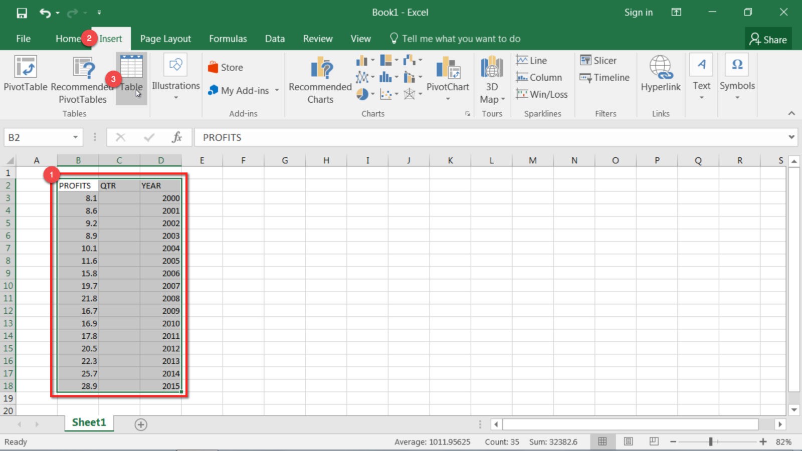
The journey begins with a step-by-step guide on seamlessly integrating a table into your Microsoft Word document. Within the robust framework of the application, this task is more than a mere technicality—it’s a deliberate act of design. First and foremost, identify the section of your document where the table will reside. With a deft click on the “Insert” tab, navigate to the “Table” option, where a cascade of possibilities awaits. The number of rows and columns materializes with a click-and-drag motion, akin to molding clay into a structured form.

Leveraging the Power of Rows and Columns

Consider rows and columns as the building blocks of your digital canvas. This isn’t a one-size-fits-all scenario; rather, it’s a tailored approach where the structure mirrors the nature of your content. Imagine the efficiency of a well-organized spreadsheet, each row and column a dedicated space for information. This deliberate organization is the cornerstone of effective communication, ensuring that your data is not just presented but comprehended effortlessly.

Adjusting Size and Structure: Beyond Aesthetic Appeal

Once the table graces your document, the narrative pivots to the art of adjusting its size and structure. This is not a mere aesthetic consideration; it’s a strategic endeavor to optimize readability and visual coherence. Engage with the table, and a plethora of options unfolds. Drag the corners to resize with precision, or delve into the layout options to modify the structure. The goal is clarity—each cell, each dimension aligning seamlessly with the content it houses.

Merging and Splitting Cells: Tailoring Your Canvas

Within this intricate dance of digital design, the ability to merge or split cells emerges as a powerful tool. It’s akin to shaping your canvas to fit the contours of your content. Merge cells for a consolidated view, creating a visual hierarchy that guides the reader’s gaze. Conversely, split cells to compartmentalize information, providing a structured layout akin to chapters in a book. This dynamic interplay of merging and splitting cells epitomizes the adaptability inherent in Microsoft Word’s table functionality.

In the grand tapestry of document creation, the insertion and manipulation of tables in Microsoft Word transcend routine tasks—they embody the meticulous craftsmanship required to transform data into an immersive narrative. This is not merely a technical how-to; it’s a journey into the art and science of visual communication. So, as you navigate the intricacies of table insertion and refinement, envision your document not as a static entity but as a dynamic canvas where information finds its optimal form.

Defining Columns and Rows

Defining Columns and Rows
Source: https://cloudfront.net

In the intricate tapestry of document creation, the pivotal act of defining columns and rows within Microsoft Word transcends the mundane; it’s a deliberate orchestration of information architecture. Consider this phase not merely as a technicality but as a strategic dance where each column and row serves as a pillar supporting the edifice of your digital creation. Let’s delve into the nuanced art of shaping these elements with precision and purpose.

Naming Columns: Infusing Significance into Data

In the realm of roster creation, naming columns is more than a perfunctory task—it’s a narrative decision that breathes life into raw data. Consider this analogous to assigning characters in a story; each column embodies a specific facet of information, contributing to the coherence and readability of your document. Think of columns as protagonists, where names, roles, and contact details become the storyline. Here, the judicious use of headers serves as chapter titles, guiding the reader through a seamless narrative. This is not just about labels; it’s about infusing significance into every data point.

  • Strategic Headers: Craft headers that resonate with the nature of your roster. For instance, if curating a team roster, consider headers like “Name,” “Role,” and “Contact Details” for a succinct and informative layout.
  • Consistency is Key: Maintain a consistent nomenclature across columns, avoiding unnecessary jargon. Clarity should reign supreme, ensuring that even a cursory glance imparts meaningful insights.

Determining Rows: Tailoring to Roster Dynamics

The determination of rows, akin to plotting the chapters of your narrative, is a strategic endeavor influenced by the dynamic nature of your roster. It’s not a one-size-fits-all scenario; rather, it’s an intentional choice that aligns with the unique dimensions of your data landscape. Imagine the rows as canvases awaiting the strokes of pertinent details—each row encapsulating an individual, an event attendee, or a team member. The number of rows is not arbitrary; it’s a reflection of the depth and breadth of your roster, and here, the mantra is precision.

  • Roster Size Consideration: Tailor the number of rows to the specific demands of your roster. A team roster might require rows equivalent to the number of team members, while an event attendance list necessitates rows corresponding to anticipated participants.
  • Flexibility for Growth: Anticipate future additions by incorporating a buffer in your row count. This foresight ensures that your roster remains adaptable to the evolving dynamics of your team or event.

In the grand symphony of data organization, defining columns and rows in Microsoft Word is not a passive chore but an active narrative decision. It’s a declaration of intent, a commitment to clarity, and an assurance that your document is not a mere compilation of information but a curated experience. So, as you navigate the intricacies of column naming and row determination, envision your roster not as a static table but as a dynamic narrative waiting to unfold, with each column and row contributing to the eloquence of your digital creation.

Entering Data

In the intricate realm of roster creation, the pivotal stage of entering data in Microsoft Word is more than a perfunctory task—it’s an artful act of infusing life into the digital canvas, akin to painting strokes of information that breathe narrative into a blank space. This is the phase where the roster transforms from a skeletal structure to a dynamic repository of details, each keystroke contributing to a nuanced narrative. Let’s delve into the meticulous process of data entry, exploring not just the technicalities but the strategic nuances that elevate a roster from mere information to a comprehensible, visually engaging masterpiece.

Adding Information: Crafting a Digital Tapestry

The foundation of any roster lies in the particulars it encapsulates. To breathe life into your Microsoft Word document, start by adding information that transcends the periphery of names and positions. Consider this a narrative decision; each entry is a character, a participant in the unfolding story of your team or event.

  • Names as Identities: Names are not just labels; they are identities. Craft each name with precision, ensuring accuracy and consistency. A well-named roster instills a sense of familiarity and coherence.
  • Positional Significance: Positions within the roster are akin to roles in a play—they define the narrative. Whether it’s the team member’s role in a project or their position in an event hierarchy, this detail adds depth to the narrative.

Utilizing Formatting Options: The Aesthetics of Organization

In the realm of data entry, formatting is not just a cosmetic embellishment; it’s a strategic tool for clarity and organization. Imagine formatting options as the design elements that dictate the visual harmony of your document, ensuring that the data isn’t just presented but comprehended seamlessly.

Applying Styles for Visual Hierarchy

Consider the application of formatting styles as the brushstrokes that add texture to your roster. Leverage bold or italicized fonts to emphasize key details, creating a visual hierarchy that guides the reader’s gaze. Just as a well-designed webpage captures attention, a well-formatted roster arrests attention and facilitates efficient information consumption.

  • Consistent Font Choices: Uniformity in font choices fosters a professional aesthetic. Choose fonts that align with the tone of your roster—whether it’s the corporate vibe of a team roster or the vibrancy of an event attendance list.
  • Color-coded Segmentation: Harness the power of colors to categorize information. For instance, use distinct colors for different departments in a team roster or assign unique colors to various roles in an event attendance list.

Embracing Tables for Structured Layout

Tables are the unsung heroes of organized data, and in a roster, they serve as the scaffolding that supports your narrative. Picture the table as a grid where each cell houses a snippet of your story. Utilize this feature judiciously for a visually pleasing and logically structured layout.

  • Merging Cells for Grouping: Merge cells strategically to group information. For instance, merge cells in the first row for a comprehensive header or combine cells for special notes or designations.
  • Adjusting Row Heights and Column Widths: Precision matters. Ensure that the row heights and column widths are adjusted proportionally, providing an aesthetically pleasing and balanced layout.

In the grand narrative of roster creation, entering data in Microsoft Word is not a rote task but a strategic endeavor that demands attention to detail and an eye for visual storytelling. As you embark on this journey, envision your roster not as a static collection of names and positions but as a living, breathing document where each entry contributes to the resonance of your overarching narrative. The art of data entry is not just about inputting information; it’s about sculpting a digital tapestry that captivates, informs, and orchestrates an engaging narrative.

Formatting and Customization

Formatting and Customization
Picture source: https://saymedia-content.com

In the intricate landscape of document refinement, the phase of formatting and customization within Microsoft Word emerges not as a mere embellishment but as a strategic art form—a symphony of adjustments that transforms a plain roster into a visually captivating masterpiece. Think of this stage as the designer’s studio, where each tweak contributes to the aesthetic harmony of your digital creation, ensuring not just clarity but a polished and professional look.

Adjusting Cell Alignment, Text Formatting, and Color Schemes: Precision Matters

The journey begins with the meticulous adjustment of cell alignment, a digital choreography that dictates the visual flow of your information. Precision matters here, as a well-aligned roster transcends the mundane and signals an attention to detail that resonates with readers.

  • Cell Alignment Dance: Picture each cell as a dancer on your digital stage. Align them with precision—left, center, or right—to create a seamless visual choreography. The result? A roster that not only imparts information but does so with grace and coherence.
  • Text Formatting Finesse: Embrace the power of text formatting as the wardrobe of your digital actors. Bold and italicize strategically to emphasize key details, ensuring that each name, position, and contact detail stands out, much like a protagonist in a well-written narrative.
  • Color Schemes for Visual Harmony: Colors are the palette of your digital canvas. Choose wisely, ensuring a harmonious blend that reflects the tone of your roster. Whether it’s the corporate sophistication of muted tones or the vibrant hues of an event roster, color schemes add layers to your visual storytelling.

Exploring Borders and Shading Options: Crafting a Visual Tapestry

Beyond the intricacies of alignment and formatting, the exploration of borders and shading options unveils a new layer of design sophistication. Here, your roster ceases to be a static table and metamorphoses into a visual tapestry that captivates and informs.

Borders as Digital Frames

Borders are not constraints; they are digital frames that elevate each entry within your roster. Envision a well-defined border as a meticulously chosen frame for a piece of art—it not only adds structure but enhances the overall visual appeal.

  • Strategic Border Placement: Apply borders strategically, perhaps outlining the header row for prominence or delineating sections for clarity. This nuanced approach imparts a sense of structure to your roster, akin to chapters in a well-organized book.
  • Varied Border Styles: Variety is the spice of design. Experiment with different border styles—solid, dashed, or dotted—to add flair without overwhelming the visual aesthetic.

Shading for Visual Depth

Shading options are the shadows and highlights that add depth to your digital canvas. Imagine shading as the play of light in a carefully curated photograph—it enhances dimensionality and draws attention to specific elements.

  • Subtle Shading for Cohesion: Employ subtle shading to distinguish rows or columns, providing a sense of cohesion. The key is subtlety; too much shading can be distracting, while a gentle touch enhances readability.
  • Highlighting with Bold Shading: For critical information, consider bolder shading options. This technique guides the reader’s focus to specific cells, ensuring that essential details are not lost in the visual narrative.

In the realm of formatting and customization, Microsoft Word transcends the confines of a basic word processing tool—it becomes a design studio where each adjustment contributes to a symphony of visual appeal. As you embark on this journey, envision your roster not as a static table but as a dynamic visual experience where the alignment, formatting, borders, and shading work in tandem to create a narrative that is both informative and aesthetically pleasing. It’s not just about adjusting elements; it’s about crafting a visual masterpiece that speaks volumes without uttering a word.

Sorting and Filtering

Sorting and Filtering
Image by – amazonaws

In the dynamic landscape of data management within Microsoft Word, the functionalities of sorting and filtering emerge as pivotal tools, akin to a curator organizing an expansive collection. These features transcend the mere organization of information; they are the gatekeepers of accessibility and clarity, ensuring that the wealth of data within a roster is not just present but comprehensible. Let’s embark on a journey through the intricacies of sorting data alphabetically or numerically and using filters to unveil specific information based on predefined criteria.

Sorting Data: Alphabetically or Numerically

Imagine your roster as a library of names, roles, and details—a vast repository awaiting meticulous arrangement. Sorting data alphabetically or numerically is the librarian’s craft, a process that transforms your digital collection into an organized narrative.

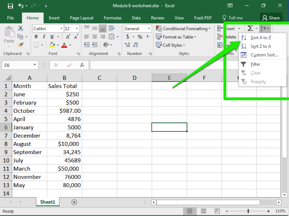
  • Alphabetical Ascendance: To sort data alphabetically, envision the names within your roster standing in line, awaiting their turn. Navigate to the “Sort” function, and with a few clicks, orchestrate a sequence where names ascend alphabetically. This is not just about alphabetical order; it’s about creating a logical flow akin to the index of a well-organized book.
  • Numerical Precision: When dealing with numerical data, the sorting prowess extends to precision. Imagine the numerical entries aligning themselves, ascending or descending based on your preference. Whether it’s team member IDs or event participant numbers, the result is a roster that not only imparts information but does so with numerical eloquence.

Using Filters: Unveiling Information with Precision

Filters are the magnifying glass of your data exploration, allowing you to zoom in on specific details with surgical precision. Here, your roster metamorphoses into a dynamic canvas, revealing information based on predefined criteria.

Criteria-Driven Filtering: Precision Unleashed

Consider filters as the search parameters within your digital canvas. With criteria-driven precision, you can showcase specific information, whether it’s isolating team members from a particular department or spotlighting attendees with specific roles in an event.

  • Team Dynamics Unveiled: In a team roster, filters enable you to unravel specific team dynamics. Showcase only those in leadership positions or those belonging to a specific project team, fostering an insightful understanding of your team’s composition.
  • Event Role Spotlight: For an event attendance list, filters shine a spotlight on specific roles. Identify and display only the volunteers, speakers, or VIP guests, offering a tailored view that aligns with the nuances of your event narrative.

Dynamic Adjustments: Real-Time Exploration

Filters are not static barriers; they are dynamic lenses that adjust in real-time. Imagine a slider in the hands of a photographer, altering focus with each subtle movement. Similarly, filters empower you to explore your roster dynamically, making real-time adjustments that align with the evolving narrative of your data.

  • Instant Criteria Updates: If your roster is a living document, constantly evolving, filters ensure that your exploration keeps pace. Adjust criteria on the fly, instantly updating the display to reflect the most current information.
  • Efficiency in Complexity: In a roster laden with diverse information, filters serve as the efficient navigators through complexity. Pinpoint specific details without sifting through an exhaustive list, streamlining your data exploration.

In the grand symphony of roster management, the capabilities of sorting data alphabetically or numerically and using filters are the conductor’s baton—the tools that orchestrate harmony within your digital composition. As you navigate these functionalities within Microsoft Word, envision your roster not as a static spreadsheet but as a dynamic narrative waiting to unfold, with each sorted entry and filtered view contributing to the resonance of your data symphony.

Adding Additional Elements

In the realm of document refinement, the act of adding additional elements to a roster within Microsoft Word transcends the rudimentary—it is the infusion of professionalism and finesse. Think of it as the artisan’s final strokes, elevating your digital creation from a functional table to a sophisticated representation of information. Let’s delve into the nuanced process of incorporating headers, footers, titles, and additional notes, comments, or legends, transforming your roster into a visually appealing and comprehensively informative masterpiece.

Incorporating Headers, Footers, and Titles: The Professional Flourish

Headers, footers, and titles are the literary equivalent of an eloquent prologue or epilogue; they frame your roster, adding context and polish. Picture these elements as the architectural pillars that support the structure of your digital document, imbuing it with a professional touch.

  • Title as the Opening Act: Begin with a compelling title that encapsulates the essence of your roster. A well-crafted title serves as the anchor, providing context and setting the tone. Whether it’s a Team Roster or Event Attendance List, let the title be the herald that introduces your audience to the narrative that follows.
  • Headers and Footers as Bookends: Headers and footers serve as the bookends of your digital creation, offering a consistent framework. Utilize headers for essential information like team or event names, creating a visual hierarchy. In footers, consider adding page numbers or document details for a comprehensive touch. Consistency in these elements imparts a professional aesthetic to your roster, aligning with the standards of well-organized documentation.

Inserting Additional Notes, Comments, or Legends: Contextual Enrichment

A roster is not merely a compilation of names and details; it is a dynamic narrative with layers of information. Additional notes, comments, or legends act as the annotations that enrich this narrative, providing context, explanations, or highlighting special considerations.

Strategic Placement of Notes: Informative Signposts

Consider additional notes as informative signposts within your digital landscape. Strategically place them to guide the reader’s understanding. Whether it’s a note about specific roles in a team or special designations in an event, these annotations serve as contextual cues.

  • Comments for Collaborative Context: If your roster is a collaborative effort, leverage the comments feature to facilitate communication. Imagine team members seamlessly collaborating within the document, sharing insights or updates in real-time. This dynamic engagement not only enriches the content but fosters a sense of teamwork.

Legends for Decoding Complexity: Unveiling Symbolism

Legends are the deciphering keys to your roster’s symbolism. If your document incorporates symbols or icons, a legend serves as the Rosetta Stone, unraveling the meanings behind each symbol. This is not just about visual appeal; it’s about ensuring that your roster is universally understood.

  • Icons for Visual Efficiency: If your roster employs icons for quick identification, a legend clarifies their meanings. Imagine a roster with symbols denoting specific roles or status—a legend ensures that the reader interprets these symbols with accuracy, eliminating any ambiguity.

In the symphony of document enhancement, the addition of headers, footers, titles, and supplementary notes or legends is not a superfluous endeavor but an intentional curation of information. As you navigate the landscape of Microsoft Word, envision your roster not as a static table but as a dynamic canvas, where each element contributes to the resonance of your narrative. Let your document be a testament to professionalism, clarity, and thoughtful design—a testament that stands tall amidst the digital expanse.

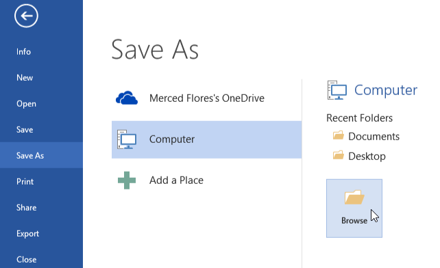
Saving and Exporting

In the intricate tapestry of document management, the final chapters unfold in the realms of saving and exporting within Microsoft Word—a crucial denouement that determines the accessibility and shareability of your meticulously crafted roster. The art of preserving your digital creation in Microsoft Word format and navigating the avenues for exporting or sharing is not just a technical procedure; it is the bridge that connects your creation with the wider audience, ensuring its seamless integration into collaborative endeavors. Let’s embark on a journey through the nuanced process of saving and exporting, unraveling the intricacies that ensure the longevity and accessibility of your digital masterpiece.

Saving the Roster Document in Microsoft Word Format: Preserving the Essence

Saving your roster document in Microsoft Word format is akin to sealing a time capsule—a protective cocoon that preserves the essence of your creation for future access and modifications. The steps involved in this process are not mere technicalities; they are the guardians of your digital legacy.

  • File Format as the Archive: Consider the Word format as the archival medium for your roster, ensuring compatibility and fidelity. Saving in .docx format encapsulates not just the data but the formatting nuances, safeguarding the visual integrity of your document.
  • Versioning for Iterative Progress: Embrace versioning as a strategic ally in your document’s evolutionary journey. With each save, create a snapshot of your roster’s progress, allowing you to backtrack if needed. This iterative approach is not just about saving; it’s about preserving the milestones of your creative process.

Exploring Options for Exporting or Sharing: Connectivity Unleashed

The digital landscape thrives on connectivity, and exploring options for exporting or sharing your roster unveils a spectrum of possibilities. This isn’t just about sending files; it’s about fostering collaboration and ensuring that your creation seamlessly integrates into collaborative ecosystems.

Exporting for Cross-Platform Accessibility: Breaking Digital Barriers

Consider exporting as the act of breaking digital barriers, allowing your roster to transcend the confines of Microsoft Word. Export options such as PDF or other common formats ensure cross-platform accessibility, enabling recipients to view your document irrespective of the software they use.

  • PDF for Universality: Choose the PDF format as a universal conduit for your roster. A PDF transcends software dependencies, presenting your document in a standardized format that retains its visual fidelity across different devices and platforms. It’s not just about sharing; it’s about ensuring that your creation is universally accessible.
  • Images for Visual Impact: If visual impact is paramount, consider exporting your roster as images. Each page becomes a visual snapshot, suitable for presentations or sharing on digital platforms. This approach transforms your roster from a static document to a dynamic visual narrative.

Cloud Sharing for Collaborative Synergy: Real-Time Interaction

In the era of collaborative synergy, cloud sharing emerges as a dynamic channel for real-time interaction with your roster. Platforms like Microsoft OneDrive or Google Drive transcend traditional sharing methods, fostering seamless collaboration among team members.

  • Real-Time Edits and Feedback: With cloud sharing, your roster becomes a collaborative canvas where team members can make real-time edits and provide instant feedback. This interconnected approach transforms your document from a static entity to a living, breathing collaboration space.
  • Link Sharing for Simplicity: Simplify the sharing process by generating shareable links. This method not only streamlines access but also allows you to control permissions, ensuring that your roster is shared securely and efficiently.

In the culminating chapters of roster management, the acts of saving and exporting are not just procedural steps but strategic decisions that echo the collaborative ethos of the digital age. As you navigate the intricacies within Microsoft Word, envision your roster not as a standalone creation but as a dynamic entity with the potential to connect, evolve, and resonate in the broader landscape of digital collaboration. Your ability to save and export is not just a technical proficiency; it’s the key that unlocks the doors to accessibility, collaboration, and the enduring legacy of your digital creation.

Printing Your Roster

In the meticulous orchestration of your digital symphony, the final crescendo often manifests in the physical realm—printing your roster. The transition from pixels to paper is a pivotal moment, and the finesse lies not just in hitting the print button but in configuring the print settings for optimal results. As you embark on this tangible manifestation of your digital creation, consider it a voyage with two crucial waypoints: configuring print settings and troubleshooting common printing issues.

Configuring Print Settings for Optimal Results: The Art of Precision

Printing a roster is not a mundane replication; it’s the translation of your digital opus into a tangible artifact. The configuration of print settings becomes the brushstroke that ensures the fidelity of your creation on paper.

  • Paper Size and Orientation: Begin with the fundamentals—select the appropriate paper size and orientation. Whether it’s the standard letter size or a custom dimension, align the paper settings with the canvas of your roster. Portrait or landscape? Let the content dictate the orientation for optimal visual impact.
  • Margins as Framing Devices: Consider margins as the framing devices of your printed masterpiece. Configure them judiciously, ensuring a balanced white space that enhances readability and aesthetics. Margins are not just functional; they are the silent architects of visual harmony.
  • Print Quality for Definition: Delve into print quality settings to define the level of detail. Whether it’s a draft for internal use or a high-quality print for presentations, adjust the settings to achieve the desired balance between ink economy and visual precision. Quality is not just about clarity; it’s about the efficient use of resources.

Troubleshooting Common Printing Issues: Navigating the Terrain

Printing, like any journey, may encounter unexpected terrain. Anticipate and troubleshoot common printing issues to ensure a smooth expedition from screen to paper.

Addressing Print Alignment Challenges: Symmetry Matters

Print alignment issues can disrupt the visual symmetry of your roster. Troubleshoot by checking printer alignments and calibrating settings. Uneven borders or misaligned text can detract from the professional demeanor of your printed document.

  • Printer Calibration Checks: Periodically check and calibrate your printer to ensure accurate alignment. Modern printers often have built-in calibration tools that can rectify minor alignment discrepancies. This proactive measure contributes to the consistent quality of your printed rosters.
  • Test Prints for Precision: Conduct test prints before committing to a full roster. This preemptive step allows you to identify and rectify alignment issues, ensuring that the final print mirrors the precision of your digital design.

Resolving Ink or Toner Concerns: Efficiency in Every Drop

Efficiency in ink or toner usage is a pragmatic consideration in the printing realm. Address issues related to ink quality, smudging, or depletion to optimize resource utilization.

  • Quality Ink for Lasting Impressions: Invest in quality ink or toner cartridges for lasting impressions. Subpar ink can compromise the visual appeal of your roster, leading to smudges or uneven printing. Opt for genuine cartridges to maintain the integrity of your document.
  • Monitoring Ink Levels: Keep a vigilant eye on ink levels to avoid unexpected depletions during printing. Low ink levels can result in faded prints or incomplete documents. Regularly monitor and replace cartridges to uphold the professional standard of your printed rosters.

In the grand tapestry of document management, the act of printing is not a perfunctory conclusion but a transformative metamorphosis. Configuring print settings with precision and adeptly troubleshooting common issues are the hallmarks of a seamless transition from the digital to the tangible. As you embark on the printing odyssey, envision your roster not just as an assembly of data but as a tangible representation of meticulous craftsmanship, ready to make its mark in the physical realm.

Best Practices and Tips

In the intricate tapestry of roster creation within Microsoft Word, navigating the terrain of best practices and tips is akin to mastering the brush strokes of a seasoned artist. Crafting an organized and efficient roster involves not only technical proficiency but an understanding of the nuanced features that Microsoft Word offers. As you embark on this journey of digital composition, consider the following best practices and tips, each serving as a brushstroke contributing to the masterpiece of your meticulously organized roster.

Maintaining Roster Harmony: Best Practices Unveiled

1. Structured Data Entry for Seamless Organization

In the symphony of roster creation, structured data entry emerges as the foundational note. Embrace consistency in formatting, ensuring names, positions, and other details adhere to a uniform structure. This not only enhances visual appeal but expedites sorting and filtering, unleashing the full potential of your roster.

  • Use of Tables for Alignment: Leverage the power of tables for precise alignment. Tables act as the canvas for your roster, offering a grid structure that aligns information with clarity. Capitalize on Microsoft Word’s table customization features to enhance the aesthetic coherence of your document.

2. Harnessing Microsoft Word’s Features: Unveiling the Gems

Microsoft Word harbors a trove of features, often undiscovered by the casual user. Delve into the following gems that can elevate your roster creation process.

  • SmartArt for Hierarchical Structures: When depicting organizational hierarchies or team structures, utilize SmartArt. This feature not only adds visual appeal but also communicates complex relationships in a comprehensible format. Navigate to the “Insert” tab, explore SmartArt options, and choose a layout that aligns with your roster’s structure.

  • Conditional Formatting for Dynamic Visualization: Embrace the dynamic visual cues offered by conditional formatting. Whether highlighting key roles, proficiency levels, or milestones, conditional formatting provides a visual hierarchy that captivates attention. Experiment with color schemes and icon sets under the “Home” tab to amplify the impact of your roster.

Navigating the Labyrinth: Tips for Roster Mastery

1. Version Control for Iterative Refinement

In the iterative process of roster creation, version control emerges as a guardian of precision. Save iterations with discernible filenames, incorporating dates or version numbers. This not only safeguards against inadvertent changes but enables a seamless traceability of modifications.

  • File Naming Conventions: Establish a coherent file naming convention that reflects the chronology and content of each iteration. For instance, “Roster_v1.0_2023-01-01” denotes the first version created on January 1, 2023.

2. Collaboration Elegance: Coauthoring and Comments

Roster creation often involves collaborative efforts, and Microsoft Word offers features that streamline this collaborative elegance.

  • Real-time Coauthoring: Harness the power of real-time coauthoring for simultaneous contributions. This feature, accessible through cloud-based platforms, enables multiple collaborators to work harmoniously on the roster, fostering synergy and expediting the creation process.

  • Comments for Precision Communication: Navigate the digital realm of precision communication through comments. When seeking feedback or providing insights, use the comment feature strategically. Comments facilitate targeted interactions within the document, eliminating ambiguity and ensuring a focused collaboration.

As you embark on the odyssey of roster creation within Microsoft Word, consider these best practices and tips not as mere instructions but as the guiding stars illuminating the path to mastery. From structured data entry to unlocking the latent potential of Microsoft Word’s features, each insight contributes to the seamless synthesis of artistry and efficiency in your roster. The canvas is yours; paint with the finesse of a virtuoso.

Most asked questions

How can I make a roster using Microsoft Word?

To craft a roster in Microsoft Word, start by creating a table. Navigate to the “Insert” tab, select “Table,” and define the rows and columns based on your needs. Input names, roles, or any pertinent information into the cells. Leverage formatting tools for clarity—consider bolding headers or using shading. Explore features like conditional formatting for visual hierarchy. Utilize SmartArt for organizational structures. Save versions with discernible filenames for iterative refinement. Collaborate seamlessly with real-time coauthoring and employ comments for precision. To print, configure settings for optimal results. Your roster is now a harmonious blend of structured data and Microsoft Word’s nuanced features, ensuring both organization and visual appeal.

Can you provide tips for sorting and filtering data in a Word roster?

Certainly, optimizing data management in a Word roster involves strategic sorting and filtering. To sort alphabetically or numerically, highlight the target column, access the “Sort” function under the “Home” tab, and choose the desired order. For more nuanced data retrieval, employ filters. Select the column headers, navigate to the “Data” tab, and activate the “Filter” option. This unveils filter arrows, enabling specific criteria selection for refined data display. Save time by using custom filters for intricate searches. By mastering these features, your Word roster becomes a dynamic tool, effortlessly adapting to your information needs.

What are the best practices for creating and maintaining a roster document?

Crafting and maintaining an effective roster document involves several best practices. Begin by establishing a clear and consistent naming convention for file organization. Utilize Microsoft Word’s table features for a structured layout, assigning columns for names, roles, and other pertinent details. Regularly update the roster to reflect changes, ensuring accuracy. Leverage formatting options for clarity, such as bolding headers and using contrasting colors. Incorporate additional elements like headers and footers for a professional touch. Save the document regularly and consider versioning for historical tracking. Implementing these practices ensures an organized, up-to-date, and visually appealing roster document that serves its purpose seamlessly.

Are there any common issues when printing a roster from Microsoft Word?

While printing a roster from Microsoft Word, common issues may arise, impacting the output’s quality. Ensure the document layout fits the chosen paper size to prevent information cutoff or awkward spacing. Verify printer settings, confirming ink or toner levels and selecting the correct printer. Address formatting discrepancies by adjusting margins and table dimensions. Resolve font-related problems by opting for printer-friendly fonts. To mitigate potential printing hiccups, perform a print preview to identify and rectify issues before initiating the print command. By preemptively addressing these common concerns, you enhance the likelihood of obtaining crisp, accurately printed rosters from Microsoft Word.

How can I save and export a roster document in Microsoft Word?

Saving and exporting a roster document in Microsoft Word is straightforward. To save, click the “File” tab, select “Save As,” choose a destination, and assign a filename. For export options, under “File,” opt for “Export” or “Save As” and choose the desired format—common choices include PDF or Excel. Tailor settings to meet specific requirements, such as selecting the range of pages or adjusting layout options. This ensures compatibility and preserves formatting when sharing or archiving. Regularly saving and exporting your roster document in different formats enhances accessibility and versatility, allowing seamless collaboration and use across various platforms.

Are there shortcuts for entering data quickly in a Word roster table?

Absolutely, Microsoft Word offers efficient shortcuts for swift data entry in a roster table. To expedite the process, use the Tab key to move seamlessly between cells, facilitating a smooth flow while inputting information. Additionally, employ the Enter key to swiftly navigate to the next row, streamlining the data entry process. Capitalize on auto-fill features by typing the initial information and letting Word predict and complete the remaining details. These shortcuts enhance productivity and save time, ensuring a seamless and expedited experience when populating your roster table in Microsoft Word.

How do I add headers, footers, and titles to my roster document in Word?

Elevating your roster document in Word is easy. Navigate to the “Insert” tab, select “Header” or “Footer,” and choose a preset design or create a custom one. This automatically adds headers and footers to your document, providing a professional touch. To include titles, click within the header or footer section, type the desired title, and format it as needed. Utilize the design options for customization, such as font styles, sizes, and alignments. This enhances the visual appeal of your roster, making it organized and polished. Remember to save your document after making these additions to ensure the changes are preserved.

Read More

Crafting Interactive Documents: A Guide to Creating Buttons in Microsoft Word

I’ve pondered the possibilities of making my Microsoft Word documents interactive and user-friendly. Have you thought about buttons right in your document that can execute commands, navigate through lengthy content, or even link to external websites? It is possible to turn this imaginary world into a reality by using Microsoft Word’s buttons.

Microsoft Word buttons serve a purpose in terms of facilitating a dynamic document experience. This Word guide will walk you through the process of creating buttons, customizing their properties, and assigning actions, whether you are a first-time Word user or a Word veteran. These buttons can be used to improve document navigation, execute macros, and change how you interact with documents.

As you learn more about button creation, you’ll discover the secrets of advanced features, troubleshoot common issues, and see how button usage works in practice. The addition of interactive buttons to your Microsoft Word document game will allow you to increase the power of this powerful word processor. By following our steps, you will be able to make your documents not only readable but also memorable.

Understanding the Basics of Buttons in Microsoft Word

In the ever-evolving landscape of digital documentation, the nuances of Microsoft Word extend far beyond the conventional realm of static text. Delving into the fundamentals is the first stride toward unraveling the untapped potential residing within this ubiquitous word processing software.

When we embark on the journey to fathom the intricacies of buttons in Microsoft Word, the foundational layer begins with a crisp delineation:

  • A. Definition of Buttons in MS Word

Buttons, within the context of Microsoft Word, are interactive elements strategically integrated into the document canvas. Far from mere embellishments, these dynamic components serve as portals, enabling users to execute commands, facilitate navigation, and enhance user engagement. Imagine seamlessly embedding a call-to-action within your document or simplifying complex navigation through the intuitive click of a button. In essence, buttons are the catalysts that transform static documents into dynamic, user-centric experiences.

  • B. Why Use Buttons in Word Documents?

Now, you might ponder why one should delve into the realm of buttons within the confines of Word documents. The answer lies in the quest for an elevated user experience. In a world where attention spans are fleeting, buttons offer a visually compelling and efficient means of interaction. Whether guiding readers through extensive documents, executing macros for streamlined processes, or fostering user engagement with interactive forms, buttons transcend the limitations of traditional documents. They serve as the conduits that bridge the gap between static content and a responsive, user-friendly interface.

  • C. Versions Compatibility: Which Versions Support Buttons?

As we traverse this landscape, compatibility becomes a paramount consideration. In the dynamic evolution of Microsoft Word, not all versions support the integration of buttons seamlessly. To harness the transformative power of buttons, one must first navigate to the Developer Tab—a feature available in select versions. The realm of button creation unfurls itself predominantly in versions equipped with this Developer Tab, affording users the canvas to infuse interactivity into their documents.

Version-Specific Considerations:

  • Microsoft Word 2010 and later versions provide access to the Developer Tab, unlocking the potential for button creation.
  • For users still tethered to earlier versions, the incorporation of buttons may necessitate an upgrade to a more recent iteration of Microsoft Word.

In this digital epoch, where user experience reigns supreme, understanding the basics of buttons in Microsoft Word is not just a skill; it’s a gateway to crafting documents that transcend the mundane and captivate the audience with interactive finesse. Embrace the power of buttons, and witness your documents undergo a metamorphosis into immersive, user-centric masterpieces.

Inserting Buttons in Microsoft Word

In the intricate tapestry of Microsoft Word functionality, the art of inserting buttons is akin to unlocking a hidden arsenal of document dynamism. Let’s navigate this terrain with finesse, exploring the crucial steps that metamorphose mundane documents into interactive powerhouses.

  • A. Accessing the Developer Tab

Embarking on the journey to insert buttons necessitates a rendezvous with the Developer Tab—an enclave of potent tools within Microsoft Word’s expansive repertoire. This hidden gem, often overlooked by casual users, serves as the gateway to a spectrum of advanced functionalities. To access this tab, one must navigate to the ribbon, where the Developer option patiently awaits its moment in the spotlight.

Beyond a mere button, the Developer Tab is a clandestine realm where document alchemy occurs. It’s the epicenter of innovation, enabling users to infuse their documents with interactive elements that transcend the mundane. But before we delve into the magic it holds, one must first uncover its existence—a task that eludes many.

  1. 1. Navigating to the Ribbon

The journey commences with a simple click on the “File” tab, ushering users into the backstage of Microsoft Word. From there, a gentle exploration of the options leads to the “Customize Ribbon” tab. It’s here that the Developer option beckons, waiting to be embraced.

  1. 2. Selecting the Developer Tab

With a swift tick of the Developer checkbox, the ribbon metamorphoses, revealing a plethora of tools and controls. It’s a pivotal moment, akin to unlocking a treasure chest of possibilities, setting the stage for the insertion of buttons.

  • B. Enabling the Developer Tab (if not visible)

For those uninitiated, the absence of the Developer Tab might seem like a roadblock. Fear not; the solution lies in demystifying its invisibility. Enabling this tab is a straightforward endeavor, an essential precursor to the button insertion extravaganza that awaits.

  1. 1. Navigating to Word Options

Begin by clicking the “File” tab, venturing into the Word Options menu. Herein lies the key to unraveling the Developer Tab’s veiled existence.

  1. 2. Customizing Ribbon Preferences

Once within Word Options, the “Customize Ribbon” section beckons. Here, a simple checkmark beside “Developer” acts as the initiation rite, bringing the Developer Tab to the forefront.

  • C. Adding a Button Control to the Document

With the Developer Tab now a prominent fixture, the canvas is set for the pièce de résistance—the insertion of buttons. This is where the magic of interactivity unfolds, offering users the ability to guide readers, execute commands, and transcend the boundaries of conventional documents.

  1. 1. Initiating the Button Insertion

Under the Developer Tab, the “Insert” option unveils a menu enriched with possibilities. Within this repertoire, the “Button (ActiveX Control)” choice takes center stage.

  1. 2. Drawing the Button on the Document

A simple drag-and-drop motion then brings the button to life on the document canvas. Its size and dimensions are customizable, ensuring a seamless integration with the document’s aesthetics.

In this dance of digital dexterity, the seemingly ordinary act of inserting buttons emerges as a pivotal juncture. With the Developer Tab as the backstage pass, and the buttons as the protagonists, documents transcend their static origins, becoming conduits of interaction and engagement. It’s a narrative where each click carries the weight of possibility, and the once static document becomes a dynamic, user-centric experience.

Customizing Button Properties

Customizing Button Properties
Image by – extron.com

In the intricate tapestry of document design, the mere presence of buttons is just the beginning; it’s the customization that breathes life into these interactive elements, transforming them from functional to visually compelling. Let’s embark on a journey to unravel the art of sculpting buttons, where every detail becomes a brushstroke, contributing to a masterpiece of user engagement.

  • A. Button Content: Adding Text or Icons

The soul of a button lies in its content—words or symbols that beckon users to engage. The process is not just about insertion but about injecting personality into these clickable entities.

  1. 1. Textual Expression

Consider the power of concise, compelling text on a button—the difference between a generic “Click Here” and a persuasive “Explore Now.” The choice of words is an art, influencing user behavior and guiding them seamlessly through the document’s narrative.

  1. 2. Iconic Significance

Icons, those visual envoys of meaning, add another layer of depth. A well-chosen icon communicates universally, transcending language barriers. Whether it’s an arrow denoting navigation or a pen symbolizing document editing, icons are the shorthand of interaction.

  • B. Adjusting Button Size and Shape

The canvas upon which buttons reside is dynamic, and their size and shape dictate their prominence. Customization extends beyond aesthetics; it’s a strategic choice in the orchestration of user experience.

  1. 1. Size Matters

Consider the user’s journey through your document. A call-to-action button should command attention without overwhelming. Striking a balance between visibility and integration is key. Large enough to be noticed, but not so large as to dominate.

  1. 2. Shaping Interactivity

The shape of a button is not merely a design consideration but an ergonomic one. Rounded corners, sleek rectangles, or custom shapes—all influence user perception. A circular button may exude friendliness, while a sharp-edged square imparts a sense of precision.

  • C. Setting Button Colors and Styles

Color and style, the visual DNA of buttons, hold the power to evoke emotions, establish brand identity, and guide user behavior. Crafting a harmonious palette is akin to orchestrating a symphony of engagement.

  1. 1. Color Psychology

Colors speak a language of their own. The judicious use of hues can evoke trust, urgency, or action. For instance, a vibrant red might prompt immediate attention, while a calming blue suggests a more measured interaction. Aligning button colors with your document’s overall aesthetic creates a cohesive user journey.

  1. 2. Stylistic Flourishes

Beyond color, the stylistic elements of buttons contribute to a holistic visual experience. Hover effects, gradients, or subtle shadows—these nuances elevate buttons from functional components to design elements that resonate. A well-styled button is not just clicked; it’s interacted with.

In the grand tapestry of document design, customizing button properties is an art form. It goes beyond the mere placement of interactive elements; it’s about sculpting an experience that captivates, guides, and resonates. As you delve into the realm of button customization, remember: each choice is a stroke on the canvas of user engagement, and the masterpiece is a document that not only communicates but captivates.

Assigning Actions to Buttons

Assigning Actions to Buttons
Credit: folivora

In the symphony of document interactivity, the magic of buttons lies not just in their visual allure but in the actions they perform. Assigning actions to buttons propels them from static embellishments to dynamic catalysts, shaping the user experience and streamlining functionality.

  • A. Linking Buttons to URLs or External Documents

The ability to link buttons to external URLs or documents is the linchpin of user engagement, seamlessly bridging the virtual space between your document and the vast digital landscape.

  1. 1. The Power of Hyperlinking

At the heart of this functionality lies the hyperlinked prowess of buttons. With a simple click, users can transcend the boundaries of your document, landing on websites, supplementary resources, or affiliated documents. This not only enhances the informational scope of your content but also establishes a dynamic connectivity that resonates with modern user expectations.

  1. 2. Navigating Beyond Boundaries

Consider the scenario where a button, adorned with an enticing call-to-action, directs users to a comprehensive external resource. This seamless transition not only augments the user’s understanding but also positions your document as a gateway to a broader informational landscape.

  • B. Creating In-Document Navigation with Buttons

Buttons, when assigned the task of in-document navigation, transform your document into a navigational marvel. Users are no longer passive readers; they become active participants, guided through the narrative with intuitive precision.

  1. 1. Seamless Progression

Imagine a lengthy report or a multifaceted guide where buttons serve as interactive signposts. Each click propels users through sections, eliminating the need for laborious scrolling. This strategic use of in-document navigation not only enhances user experience but also ensures that your document is consumed in a structured, user-friendly manner.

  1. 2. Interactive Learning

In educational or training documents, buttons become the conduits of interactive learning. Users can effortlessly jump between modules, revisit crucial information, and tailor their learning experience. The result is not just a document; it’s an educational journey crafted for engagement.

  • C. Executing Macros with Buttons

For the aficionados of efficiency, the integration of macros with buttons is a game-changer. It’s not just about interactivity; it’s about automating processes and unleashing the full potential of Microsoft Word.

  1. 1. Streamlining Repetitive Tasks

Consider the scenario where a button, when clicked, executes a macro that automates a series of repetitive formatting tasks. What was once a manual endeavor becomes a one-click efficiency, saving time and enhancing productivity. This is the essence of macros – turning buttons into shortcuts to streamlined workflows.

  1. 2. Personalized User Experience

In a world where customization is king, buttons executing macros offer users a personalized experience. Tailoring the functionality of buttons to match specific user needs transforms your document into a dynamic tool, adapting to individual workflows and preferences.

In the realm of document dynamism, assigning actions to buttons is the pivotal act that transforms static content into an interactive experience. From external exploration to in-document navigation and the efficiency of macro execution, buttons become the conduits of engagement, seamlessly connecting users with content and functionality. In the orchestra of user experience, buttons aren’t just notes on a page; they are the melodies that guide users through a harmonious interaction.

Advanced Button Features

As we venture into the sophisticated terrain of Microsoft Word document design, the realm of advanced button features beckons—a landscape where interactivity transcends the ordinary, elevating user experience to new heights. Let’s unravel the intricacies of these advanced functionalities that transform buttons from mere elements to dynamic components of document mastery.

  • A. Grouping Buttons for Cohesive Design

In the orchestration of document aesthetics, the concept of grouping buttons emerges as a powerful conductor, harmonizing disparate elements into a cohesive symphony of design.

  1. 1. Visual Consistency

Consider a document adorned with an array of buttons—each serving a distinct purpose. Grouping these buttons visually, perhaps under a shared label or within a designated section, ensures not just functional clarity but also a visual consistency that pleases the eye. This strategic alignment contributes to an intuitive user experience, where the document becomes a navigable entity rather than a collection of disparate elements.

  1. 2. Streamlined Functionality

Grouping buttons isn’t just about aesthetics; it’s about streamlining functionality. Imagine a scenario where a group of buttons collectively performs a series of related tasks. The user is no longer deciphering isolated functions but engaging with a unified set of actions. This consolidation of functionality enhances the document’s usability, making it not just a repository of information but an interactive toolkit.

  • B. Using Form Fields as Interactive Elements

The evolution of button functionality extends beyond traditional confines, incorporating form fields as dynamic conduits for user interaction.

  1. 1. User Input Integration

Imagine a document where buttons are not just passive triggers but interactive forms awaiting user input. Through the strategic integration of form fields, users can input data, make selections, or even submit responses directly within the document. This functionality extends the document’s utility from a mere informational resource to an interactive platform, fostering engagement and data collection in one seamless motion.

  1. 2. Tailoring User Experience

Using form fields within buttons allows for a tailored user experience. Whether it’s a survey, a feedback form, or an interactive quiz, form field buttons transform the document into a personalized engagement tool. Users no longer consume information passively; they actively contribute, forging a symbiotic relationship with the document.

  • C. Adding Tooltips for Enhanced User Guidance

In the pursuit of user-friendly design, the incorporation of tooltips emerges as a subtle yet impactful feature—a guiding light that enhances user understanding and interaction.

  1. 1. Informational Signposts

Consider buttons adorned with tooltips—small, informative snippets that appear when users hover over them. These tooltips serve as informational signposts, offering concise explanations of button functions or providing context to enhance user comprehension. In a world where clarity is paramount, tooltips become the unsung heroes of user guidance.

  1. 2. Accessibility Augmentation

Beyond mere guidance, tooltips contribute to enhanced accessibility. Users with varying levels of familiarity with document interactivity can benefit from these informative cues, ensuring that the document’s functionality remains inclusive and user-friendly. Tooltips, in their unassuming elegance, become the bridge between document complexity and user simplicity.

In the intricate dance of document design, the incorporation of advanced button features transcends the ordinary, transforming Microsoft Word into a dynamic canvas of interaction. From the visual symphony of grouped buttons to the interactive potential of form fields and the subtle guidance of tooltips, these advanced functionalities redefine not just the document but the entire user experience. It’s a journey where buttons cease to be mere elements; they become the conduits of a narrative, guiding users through a tapestry of engagement and interactivity.

Testing and Troubleshooting

As the final strokes are added to the canvas of button integration within Microsoft Word, the crucial chapters of testing and troubleshooting come into play—an indispensable phase ensuring that the meticulously crafted buttons perform seamlessly and enhance, rather than hinder, the user experience. Let’s delve into the intricacies of this critical juncture, where precision and foresight pave the way for flawless document interaction.

  • A. Previewing Button Functionality

Before unleashing your document into the hands of users, the art of previewing button functionality takes center stage—a preemptive measure that ensures your interactive elements operate harmoniously.

  1. 1. The User’s Perspective

Embark on a virtual journey through your document, donning the lens of the end user. Click each button with intent, examining not just the intended actions but the overall fluidity of the user experience. Is the navigation seamless? Do tooltips appear as anticipated? Previewing from the user’s perspective is the litmus test for effective button functionality.

  1. 2. Multiple Platforms and Devices

Expand your preview horizon to encompass multiple platforms and devices. Microsoft Word’s omnipresence requires buttons to transcend the confines of a single environment. Test on different operating systems, browsers, and devices to ensure cross-compatibility, guaranteeing that your document’s interactive allure remains consistent across the diverse digital landscape.

  • B. Common Issues and Solutions

As with any intricate design, the road to flawless button integration is occasionally marred by bumps. Anticipating and addressing common issues is the hallmark of meticulous document preparation.

  1. 1. Unresponsive Buttons

Imagine the frustration of a user encountering unresponsive buttons. This common hiccup can often be traced back to improper hyperlinking or conflicting macros. A meticulous review of the button’s assigned actions and the document’s macro landscape can swiftly resolve this issue.

  1. 2. Inconsistent Styling

The visual harmony of buttons may falter when inconsistencies in styling emerge. Ensure a uniform application of colors, shapes, and sizes. In the dynamic realm of digital design, a visually cohesive document is not just an aesthetic preference; it’s a testament to meticulous attention to detail.

  • C. Compatibility Checks for Cross-Platform Sharing

In an era of collaborative digital workflows, the compatibility of your document’s interactive elements across platforms is paramount. A seamless sharing experience hinges on meticulous cross-platform compatibility checks.

  1. 1. PDF Conversion

Consider the scenario where your meticulously crafted document with buttons needs to be shared in PDF format. The transition from Word to PDF can be a potential breeding ground for compatibility issues. Test the PDF version rigorously, ensuring that button functionality is retained and interactive elements aren’t lost in translation.

  1. 2. Online Platforms and Collaborative Tools

In an interconnected digital landscape, collaborative platforms and online tools are commonplace for document sharing. Before sharing your document with buttons in these environments, conduct compatibility checks. Ensure that the interactive elements don’t lose their essence, and the collaborative spirit of the document remains intact.

In the final act of crafting a document enriched with interactive buttons, the chapters of testing and troubleshooting serve as the guardians of user experience. From meticulous previewing and addressing common issues to ensuring cross-platform compatibility, this phase is the crucible where seamless functionality is forged. As you traverse this journey, remember: precision begets perfection, and a document thoughtfully tested is a document destined for unparalleled user engagement.

Examples of Effective Button Usage

In the tapestry of document design, buttons emerge as the threads that weave interactivity into the fabric of user engagement. As we delve into examples of effective button usage within Microsoft Word, envision a realm where buttons transcend mere embellishments, becoming catalysts for seamless navigation, compelling calls-to-action, and interactive forms. Here, we unravel the narratives of impactful button utilization, showcasing their versatility and transformative power.

  • A. Call-to-Action Buttons

At the forefront of effective button deployment are the heralds of action—call-to-action buttons. These digital prompts are not mere adornments; they are invitations to engage, directing user attention with precision.

  1. 1. Streamlining User Interaction

Imagine a business proposal or a marketing document strategically punctuated with call-to-action buttons. These buttons beckon the reader to delve deeper, initiate contact, or explore supplementary resources. Through succinct labeling and strategic placement, these buttons transform passive readers into active participants, streamlining user interaction and steering them towards desired actions.

  1. 2. Data-Driven Optimization

In the realm of digital marketing, the effectiveness of call-to-action buttons is not merely anecdotal; it’s data-driven. A/B testing different button designs, colors, and placements unveils valuable insights into user preferences. This iterative optimization ensures that every click is not just an interaction but a strategic step towards conversion—a testament to the impact of well-crafted call-to-action buttons.

  • B. Navigation Buttons in Lengthy Documents

In the expansive landscape of lengthy documents, navigation buttons emerge as silent guides, simplifying the user’s journey through information-rich terrain.

  1. 1. Facilitating Seamless Progression

Consider a comprehensive report or a lengthy instructional guide. Navigation buttons strategically placed at the end of each section offer users a shortcut to the next relevant segment. This seamless progression not only enhances user experience but also transforms the document into a navigable narrative, where users dictate the pace of their exploration.

  1. 2. Table of Contents Redefined

Navigation buttons redefine the traditional table of contents, offering a dynamic alternative. Users aren’t confined to a static list; they navigate through sections organically, guided by intuitive buttons. This dynamic approach ensures that even in the labyrinth of extensive documents, users find not confusion but coherence.

  • C. Interactive Forms with Form Control Buttons

The marriage of buttons and form controls transforms static documents into interactive canvases, especially in scenarios where user input is paramount.

  1. 1. Engaging User Participation

Imagine a survey embedded within a document, where form control buttons invite users to select options or submit responses. This interactive dance transcends traditional forms, transforming user participation into a dynamic, document-embedded experience. The result is not just data collection; it’s an engagement journey where users actively contribute.

  1. 2. Error-Free Data Submission

The integration of form control buttons also safeguards against errors in data submission. With clear calls-to-action, users are guided through the form-filling process, reducing the likelihood of inaccuracies. This precision ensures that the collected data is not just abundant but accurate—a testament to the impact of form control buttons in interactive forms.

In the realm of Microsoft Word, where every click translates into an interaction, effective button usage becomes the linchpin of impactful document design. From the strategic allure of call-to-action buttons to the navigational prowess of buttons in lengthy documents and the transformative potential of form control buttons in interactive forms, these examples illustrate the versatility of buttons as conduits of engagement. In this symphony of user interaction, buttons aren’t just elements; they are orchestrators, guiding users through a seamless dance of engagement and action.

Best Practices for Button Design

In the intricate tapestry of document design, buttons serve as the navigational signposts and interactive catalysts that transform static content into dynamic user experiences. Understanding the nuanced art of button design is paramount for ensuring not just visual appeal but also seamless functionality and user engagement. Let’s embark on a journey through the best practices that elevate button design within Microsoft Word to an art form.

  • A. Consistency in Button Placement

In the realm of button design, consistency is the linchpin that ensures users feel grounded and in control of their interactive journey. The strategic placement of buttons should be akin to a well-choreographed dance, guiding users with predictability and fostering a sense of familiarity.

  1. 1. Strategic Positioning

Consider the strategic positioning of buttons throughout your document. Whether it’s call-to-action buttons, navigation buttons, or form control buttons, maintain a consistent placement pattern. This strategic uniformity enhances user predictability, reducing the cognitive load associated with searching for interactive elements.

  1. 2. Intuitive Progression

Buttons, when strategically placed, create an intuitive progression for users. In lengthy documents, ensure that navigation buttons follow a logical sequence, guiding users seamlessly from one section to the next. This intuitive flow not only enhances user experience but also imparts a sense of narrative cohesion to the document.

  • B. Accessibility Considerations

In the pursuit of inclusive design, accessibility considerations stand as pillars that support universal user engagement. Buttons, as essential interactive elements, should be designed with accessibility at the forefront.

  1. 1. Contrast and Readability

The visual contrast and readability of buttons are paramount for users with varying abilities. Choose colors that exhibit sufficient contrast, ensuring that buttons are discernible against the document background. Additionally, opt for clear and legible fonts on buttons, promoting readability for users with visual impairments.

  1. 2. Keyboard Navigation

Consider users who navigate documents using keyboards. Design buttons that are easily accessible through keyboard strokes, allowing users to interact without solely relying on mouse-based navigation. This inclusive approach enhances usability for individuals with motor disabilities.

  • C. Keeping Buttons User-Friendly

The essence of effective button design lies in its user-friendliness—a quality that transcends aesthetics and dives deep into the realm of user experience.

  1. 1. Clarity in Labeling

Clarity in button labeling is a non-negotiable aspect of user-friendly design. Whether it’s a call-to-action button or a navigation prompt, ensure that the labeling is clear, concise, and indicative of the action it triggers. Users should effortlessly understand the purpose of each button without ambiguity.

  1. 2. Responsiveness and Feedback

The responsiveness of buttons and real-time feedback are vital for user engagement. Implement subtle animations or color changes upon button click to provide users with visual cues that their interaction has been registered. This real-time feedback fosters a responsive and engaging user experience.

In the intricate dance of button design, where aesthetics and functionality converge, the best practices outlined above serve as the choreography that ensures a harmonious user experience. From the strategic consistency of button placement to the inclusive embrace of accessibility considerations and the user-centric approach of keeping buttons friendly and intuitive, these practices elevate button design from a mere visual element to a conduit of seamless interaction within Microsoft Word.

Saving and Sharing Documents with Buttons

Saving and Sharing Documents with Buttons
Image by – gcflearnfree.org

In the intricate symphony of document management, the role of buttons extends beyond mere interactivity—it becomes the harmonious chord that orchestrates the seamless process of saving and sharing documents within the realm of Microsoft Word. As we navigate this terrain, it’s imperative to delve into the nuanced practices that ensure not just the preservation of document integrity but also the flawless functionality of embedded buttons, irrespective of the recipients’ devices or collaborative editing endeavors.

  • A. Document Compatibility for Recipients

Ensuring document compatibility is the bedrock of successful sharing, particularly when intricate buttons are woven into the fabric of your content.

  1. 1. Version Considerations

Consider the versions of Microsoft Word that your recipients might be using. While newer versions often support advanced features, compatibility gaps may arise when recipients have older versions. Prioritize saving documents in universally compatible formats, such as DOCX, to ensure seamless access and functionality across various versions.

  1. 2. PDF as a Universal Bridge

For foolproof compatibility, consider saving your document as a PDF. This universal format transcends Microsoft Word versions, ensuring that embedded buttons retain their functionality regardless of the recipient’s software. PDFs serve as a bridge that spans version discrepancies, offering a standardized viewing experience for all.

  • B. Ensuring Buttons Functionality on Different Devices

The ubiquity of diverse devices in today’s digital landscape necessitates a meticulous approach to ensure button functionality across various platforms.

  1. 1. Responsive Design Principles

Buttons should adhere to responsive design principles, adapting seamlessly to different screen sizes and resolutions. Whether accessed on a desktop, tablet, or smartphone, buttons must retain their visual appeal and functionality. Prioritize testing the document on various devices to identify and rectify potential display or functionality discrepancies.

  1. 2. Touch-Friendly Buttons

As touch interfaces become increasingly prevalent, optimizing buttons for touch interactions is paramount. Consider the size, spacing, and responsiveness of buttons to accommodate touch gestures. This ensures that recipients accessing documents on touchscreen devices experience a fluid and intuitive interaction with embedded buttons.

  • C. Tips for Collaborative Editing with Buttons

In the collaborative landscape, where multiple hands contribute to document evolution, navigating the intricacies of button-enabled features demands strategic considerations.

  1. 1. Shared Templates

When collaborating on documents with embedded buttons, sharing templates instead of final documents can prevent inadvertent alterations. Templates maintain the integrity of button functionality while allowing collaborators to create personalized copies without affecting the original design.

  1. 2. Version Control Mechanisms

Implement robust version control mechanisms to track changes and iterations. Collaborative editing might involve tweaks to button functionalities or the addition of new interactive elements. Version control ensures that each iteration is documented, providing a safety net for reverting to previous states if needed.

In the intricate dance of saving and sharing documents with buttons, precision is not just a preference but a prerequisite. From ensuring compatibility for diverse recipients to guaranteeing button functionality across a spectrum of devices and embracing collaborative editing with finesse, these practices form the compass that navigates the journey of document sharing within Microsoft Word. As buttons become the conduits of interactive storytelling, mastering the art of sharing ensures that your narrative resonates seamlessly across diverse digital landscapes.

Some questions and answers

1. How can I add interactive elements to my Microsoft Word document?

To add interactive elements to your Microsoft Word document, utilize the Developer tab. First, enable the Developer tab by going to File > Options > Customize Ribbon and checking the Developer option. Once enabled, navigate to the Developer tab, click on “Insert,” and choose the interactive element you need—such as checkboxes, radio buttons, or dropdown lists. For more advanced interactivity, insert ActiveX controls. Customize these elements by right-clicking and accessing properties. Enhance user engagement by assigning actions to these elements, like linking buttons to URLs, executing macros, or creating in-document navigation. Prioritize document compatibility and test functionality across various devices for a seamless interactive experience.

2. What are the steps to insert buttons for navigation in Word?

To insert navigation buttons in Word, access the Developer tab by enabling it in File > Options > Customize Ribbon. Once enabled, go to the Developer tab, click “Insert,” and choose the button control option. A button will appear in your document. Right-click the button, select “Hyperlink,” and specify the destination—this can be an in-document location, an external URL, or a linked file. Customize the button’s appearance and properties by right-clicking and accessing options such as size, shape, and color. Test the button’s functionality by clicking on it, ensuring a smooth navigation experience within your Word document.

3. Can I use buttons in Word to execute specific actions or commands?

Certainly, buttons in Word can be employed to execute specific actions or commands, enhancing document interactivity. By utilizing the Developer tab, you can insert buttons and assign actions like linking to URLs, navigating within the document, or executing macros. This functionality empowers users to streamline tasks and access designated content with a simple click. Through customization options in the Developer tab, such as setting button properties and defining actions, you can tailor the buttons to suit your document’s unique requirements. Whether simplifying navigation, automating repetitive tasks, or creating interactive forms, the use of buttons in Word extends beyond static content, offering a dynamic and efficient user experience.

4. Are there any design considerations for creating effective buttons in Word?

Absolutely, designing effective buttons in Word involves key considerations for enhanced user experience. Maintain consistency in button placement for a cohesive design, ensuring users can predict their location. Prioritize accessibility by using clear and concise text or icons, enhancing readability for all users. Keep buttons user-friendly with intuitive labels and avoid clutter. Adjust button size and shape based on their purpose, making them visually appealing and easy to interact with. Choose colors and styles that complement your document’s theme, promoting a professional and cohesive look. These design considerations contribute to a seamless and visually engaging user interface, ensuring that buttons in Word serve their intended purpose effectively.

5. What should I do if buttons in my Word document are not working as expected?

If buttons in your Word document are not functioning as expected, consider these troubleshooting steps. Firstly, ensure that the Developer tab is enabled by going to File > Options > Customize Ribbon and checking the Developer option. Confirm that the buttons are linked correctly by right-clicking on them, selecting “Hyperlink,” and verifying the destination. Check for any conflicting macros or security settings that might hinder button functionality. If using macros, ensure they are error-free and compatible with your Word version. Review the document for any corrupted elements or formatting issues that could impact button performance. Lastly, test the document on different devices to rule out compatibility issues. Following these steps should help resolve any issues with non-responsive buttons.

6. Are there alternative methods to create interactive forms in Microsoft Word?

Certainly, besides buttons, Microsoft Word offers alternative methods to create interactive forms. Utilize form fields like text boxes, checkboxes, and dropdown lists available in the Developer tab. These elements allow users to input data, make selections, or choose from predefined options. Combine these form fields with instructional text to guide users effectively. Additionally, Word supports content controls, providing more advanced form-building capabilities. These controls enable you to create rich forms with features like date pickers and repeating sections. By leveraging a combination of buttons, form fields, and content controls, you can tailor your interactive forms to suit various data input and user interaction requirements in Microsoft Word.

7. How do I link buttons to external websites or documents in Word?

To link buttons to external websites or documents in Word, follow these steps. First, access the Developer tab by enabling it in File > Options > Customize Ribbon. Next, insert a button from the Developer tab into your document. Right-click the button, choose “Hyperlink,” and select “Existing File or Web Page” to link to an external website or document. Enter the URL or navigate to the file path and confirm. This establishes a connection between the button and the specified external resource. Ensure to test the button to verify the linkage, providing users with a seamless experience to access external content directly from your Word document.

8. What are the best practices for ensuring buttons are accessible to all users in Word?

To ensure buttons are accessible to all users in Word, adhere to best practices. Firstly, provide descriptive labels for buttons, offering clarity on their purpose for screen reader users. Utilize high-contrast colors to enhance visibility, accommodating users with visual impairments. Maintain a logical tab order, ensuring keyboard navigation is seamless for users who rely on it. Incorporate sufficient spacing around buttons to reduce the risk of accidental clicks, benefiting users with motor control challenges. Additionally, test your document with accessibility tools to identify and address any potential issues. By following these practices, you enhance the inclusivity of your Word document, ensuring a positive and accessible experience for all users, regardless of their abilities or disabilities.

9. In which versions of Microsoft Word can I find the Developer Tab for button creation?

The Developer Tab for button creation in Microsoft Word is available in various versions, predominantly in the more recent ones. Versions like Word 2010, Word 2013, Word 2016, Word 2019, and Microsoft 365 all include the Developer Tab. Users can access this tab to create and customize buttons, adding interactive elements to their documents. If you’re using an older version, it’s advisable to check the specific version’s documentation or settings to determine the availability of the Developer Tab. As Microsoft regularly updates its software, newer versions are more likely to offer advanced features, including the Developer Tab for enhanced document customization.

10. Can I use buttons for more than just navigation, like executing macros?

Absolutely, buttons in Microsoft Word can serve a myriad of functions beyond mere navigation. One powerful capability is their ability to execute macros. Macros are sequences of instructions that automate repetitive tasks, and by linking them to buttons, users can streamline complex operations with a single click. This functionality significantly enhances productivity, making buttons not just a navigation tool but a versatile feature for automating various tasks within your Word documents. Whether it’s data processing, formatting, or other customized actions, leveraging buttons for macro execution adds a layer of efficiency to your workflow in Microsoft Word.

Key takeaway

As a result, Microsoft Word’s realm has evolved into a more interactive and engaging environment, as opposed to simply static text. By mastering the art of creating buttons within your documents, you have made significant progress in improving the way you present and navigate content. The most powerful aspect of buttons is their ease of use, but they also provide numerous customization and user interaction options.

As you finish your work on Microsoft Word buttons, keep in mind that consistency and thoughtfulness are essential. Whether call-to-action buttons, streamlined navigation, or interactive forms have been incorporated, user-friendly design is a must. You should ensure that the buttons are properly tested and adhered to best practices in order for them to function properly.

As a result of this experience, you will be able to create dynamic and responsive documents. You now have access to a wide range of tools that enable you to create documents that go beyond the norm, from insertion to advanced features and troubleshooting. You can learn about button potential in Microsoft Word by experimenting with the buttons and then finding out for yourself what they can do. Document formats have evolved into interactive experiences that are intended to pique the interest of your audience.

Read More

Unveiling Transparency: Mastering Microsoft Word Text Box Opacity

Have you ever wondered how to add that touch of grace to your Microsoft Word documents, making text boxes seamlessly blend with your content? The secret lies in mastering text box transparency. Using layered design technology, you can create documents that stand out visually. Learn how to make Microsoft Word’s text boxes transparent by diving into the world of text box customization and exploring the art of making Microsoft Word text boxes transparent.

A transparent Microsoft Word text box can be a game-changer for document aesthetics. It allows you to present your content in a subtle yet memorable manner by incorporating a visual element. In this article, we’ll show you how to adjust the transparency of your text box in the steps below. We’ll help you grasp the technique easily with the help of the appropriate options and settings, so you can put it to good use. You can now easily and visually transform your documents with the help of this software.

During our investigation into text box transparency, we will discover not only how to make the box appear transparent, but also why each step is necessary. Beyond the technical details, we’ll look at creative applications, troubleshoot common issues, and provide insights into printing compatibility and design. If you’re ready to make your Microsoft Word documents stand out, take a look at our customization and creativity packages.

Understanding Text Boxes in Microsoft Word

In the vast landscape of Microsoft Word’s functionalities, delving into the intricacies of text boxes unveils a realm of possibilities for document customization. At its core, a text box serves as a versatile container within which text and other elements can be precisely positioned. This essential feature not only contributes to the structural organization of content but also plays a pivotal role in enhancing the visual appeal of documents. Defined as rectangular or square areas that can hold text or graphics, text boxes offer a dynamic canvas for creative expression within the confines of a Word document.

Understanding the nuances of text boxes involves recognizing their dual nature—functional and aesthetic. These elements serve a twofold purpose: structuring content with precision and elevating the overall presentation of the document. Within this context, the importance of customization emerges as a key aspect. Customization transcends the basic utility of text boxes, transforming them from mere containers to stylistic elements that contribute to the overall polished look of a document. Here’s a closer look at the key components:

Definition and Purpose of Text Boxes

Text boxes, in the context of Microsoft Word, are delineated areas that allow users to segregate and manipulate specific portions of text or graphics within a document. Think of them as digital containers, providing a designated space for content. The purpose extends beyond mere segregation; it empowers users to control the positioning of elements precisely. This functionality proves invaluable when crafting documents that demand a structured layout or when specific information requires emphasis.

Different Types of Text Boxes

Not all text boxes are created equal. Microsoft Word offers a variety of text box types, each tailored to specific needs. From simple rectangular boxes to more complex shapes, the options are diverse. Furthermore, users can leverage text boxes for a range of purposes, including captions, sidebars, or graphic annotations. Understanding the types of text boxes available allows users to choose the most fitting format for their document’s unique requirements, ensuring optimal visual impact and coherence.

Importance of Customization for a Polished Document

Customization emerges as the linchpin in maximizing the potential of text boxes. Beyond their default settings, text boxes offer a canvas for creative expression. Adjusting attributes such as size, color, border style, and transparency elevates the aesthetic appeal of the document. This attention to detail not only enhances visual harmony but also contributes to the overall professionalism of the content. A polished document, characterized by thoughtful customization, stands out and engages the reader more effectively.

In essence, the saga of text boxes in Microsoft Word transcends the conventional understanding of a mere container for text. It unfolds as a dynamic interplay of structure and style, where precision meets creativity. Navigating the landscape of text box customization empowers users to craft documents that not only convey information but also leave a lasting visual impression. As you embark on your Word document journey, keep in mind the versatile potential that text boxes bring to the table—a potential waiting to be harnessed for documents that speak with clarity and captivate with elegance.

Exploring Transparency in Microsoft Word Text Boxes

Exploring Transparency in Microsoft Word Text Boxes
Image by – lifewire.com

In the intricate terrain of Microsoft Word, the exploration of transparency within text boxes becomes a pivotal journey for document aficionados. As we unravel the layers of customization, let’s first navigate through the default settings, an aspect often overlooked but crucial in comprehending the baseline structure of text boxes.

A. Default Settings

Within the tapestry of default settings, the essence of text box appearance is clarified. Microsoft Word, by default, establishes a standardized visual identity for text boxes. However, delving into the intricacies reveals inherent limitations in default transparency. The default setting provides a foundation, but understanding its constraints propels users towards unlocking the full potential of text box customization. The process is akin to deciphering a code; by comprehending the default, one gains the insight needed to transcend its boundaries.

arduino
- Clarifying default text box appearance - Limitations in default transparency

Moving forward, the journey into transparency’s significance unfolds as we explore the role it plays in elevating document aesthetics and fostering visually appealing, layered designs.

B. Importance of Transparency

In the realm of document aesthetics, transparency emerges as the unsung hero, subtly enhancing the visual appeal of Microsoft Word documents. By adjusting transparency settings, users can breathe life into their content, creating documents that transcend the mundane. This isn’t just about transparency; it’s about infusing documents with a dynamic quality that captures the reader’s attention.

markdown
- Enhancing document aesthetics - Creating layered designs for visual appeal

Imagine a document where information isn’t just conveyed but is presented in a visually engaging manner, where text boxes seamlessly integrate with content, contributing to an immersive reader experience. The importance of transparency lies not only in its aesthetic contributions but also in its ability to communicate information in a way that transcends traditional document norms.

As we traverse the landscape of Microsoft Word text boxes, from deciphering default settings to embracing transparency’s transformative power, the narrative unfolds. It’s a journey of discovery, where each adjustment, each customization, contributes to the symphony of a polished document. The canvas of Microsoft Word awaits your artistic touch, where transparency becomes the brushstroke that elevates your documents from ordinary to extraordinary. This isn’t just about text boxes; it’s about empowering your content to resonate, captivate, and leave a lasting impression. The exploration of transparency in Microsoft Word text boxes is a voyage into the intersection of functionality and artistry, a journey that invites you to redefine the way you craft and present your documents.

Steps to Make a Microsoft Word Text Box Transparent

In the intricate dance of document design, the transparency of a text box can be the choreography that elevates your content from ordinary to exceptional. Let’s embark on a step-by-step journey through the realms of Microsoft Word, demystifying the art of making text boxes transparent.

A. Accessing Text Box Options

  1. Navigating to the Text Box:
    • Begin by locating the specific text box you wish to modify within your document.
    • Right-click on the targeted text box to unveil a contextual menu, setting the stage for customization.
css
- Navigating to the text box you want to modify - Right-clicking to open the context menu

B. Opening Format Text Box Window

  1. Selecting “Format Text Box”:
    • Dive into the intricacies by choosing the “Format Text Box” option, a gateway to comprehensive customization.
    • Explore the layout and design options presented within the Format Text Box window, laying the foundation for nuanced adjustments.
arduino
- Selecting "Format Text Box" option - Understanding the layout and design options available

C. Adjusting Fill Transparency

  1. Locating the “Fill” Tab:
    • Unveil the secrets of transparency by navigating to the “Fill” tab within the Format Text Box window.
    • Opt for the “Solid Fill” option, a pivotal choice for gaining control over the transparency level.
mathematica
- Locating the "Fill" tab in the Format Text Box window - Choosing the "Solid Fill" option for transparency control

D. Modifying Transparency Level

  1. Utilizing the Transparency Slider:
    • Navigate the labyrinth of customization with the transparency slider, an intuitive tool for fine-tuning opacity.
    • Witness real-time previews of your changes, ensuring the perfect balance between visibility and subtlety.
markdown
- Utilizing the transparency slider - Previewing changes in real-time

E. Confirming Changes

  1. Applying and Checking:
    • Apply your selected transparency settings to the text box.
    • Scrutinize the final appearance, confirming that the transparency levels align with your design vision.
arduino
- Applying transparency settings - Checking the final appearance of the text box

As you traverse these meticulous steps, each click and adjustment contributes to the symphony of document design. The ability to make a Microsoft Word text box transparent is not merely a feature; it’s an artistic choice that empowers you to craft documents with a personalized touch. So, embrace the transparency journey, and let your content shine through in ways that captivate and engage your audience.

Troubleshooting Common Issues

Navigating the intricate terrain of Microsoft Word can be akin to orchestrating a symphony, each element playing a crucial role in the harmony of your document. Yet, even the most adept conductors encounter hiccups. Let’s delve into the nuanced art of troubleshooting common issues, unraveling the complexities that might disrupt your creative composition.

A. Compatibility Concerns

In the ballet of technological evolution, addressing potential compatibility issues becomes a pas de deux with legacy systems. When waltzing through different Word versions, consider the following:

  • Compatibility Assessment:
    • Address potential compatibility issues with older Word versions to ensure seamless document sharing.
    • Provide alternative solutions for users on diverse Word platforms.
markdown
- Addressing potential compatibility issues with older Word versions - Providing alternative solutions

B. Printing Considerations

The final curtain call of your Word document often involves its physical manifestation on paper. Navigate the potential pitfalls of printing with transparent text boxes:

  • Transparent Troubles:
    • Discuss potential printing challenges that may arise with transparent text boxes, ensuring foresight in your design.
    • Offer recommendations for optimal results, harmonizing digital design with tangible output.
markdown
- Discussing potential printing challenges with transparent text boxes - Offering recommendations for optimal results

As you troubleshoot, remember that your Word document is not merely a collection of words but a dynamic composition of ideas. Compatibility concerns and printing considerations are the hidden movements in the symphony of document creation. By preemptively addressing these challenges, you ensure that your creation reaches its audience with the intended impact. So, continue composing your masterpiece, confident that every note and pixel is in perfect harmony, transcending the potential pitfalls that may accompany the creative process.

Creative Applications of Transparent Text Boxes

Unlocking the potential of transparent text boxes in Microsoft Word is akin to discovering a palette of vibrant hues for your document’s canvas. This feature transcends the mundane, offering a spectrum of creative possibilities that elevate the visual appeal of your content. Let’s embark on a journey exploring the innovative applications of transparent text boxes, turning your documents into captivating masterpieces.

Harnessing Transparency for Impact

Transparent text boxes aren’t mere embellishments; they are strategic tools that can enhance your message’s resonance. Consider the following creative applications:

  • Showcasing Examples Across Document Types:
    • Reports: Infuse clarity into data presentation by overlaying transparent text boxes to highlight key figures.
    • Presentations: Elevate slide designs by using transparent text boxes for dynamic overlays, adding depth to your message.
    • Newsletters: Craft visually engaging newsletters by layering text boxes over images, creating a polished, professional look.
html
<li>Reports: Infuse clarity into data presentation by overlaying transparent text boxes to highlight key figures.li> <li>Presentations: Elevate slide designs by using transparent text boxes for dynamic overlays, adding depth to your message.li> <li>Newsletters: Craft visually engaging newsletters by layering text boxes over images, creating a polished, professional look.li>
  • Encouraging Experimentation for Personalized Documents:
    • Resumes: Differentiate your resume by incorporating transparent text boxes for a modern, sleek design that stands out.
    • Invitations: Infuse elegance into event invitations with transparent overlays, creating a sense of sophistication.
    • Educational Materials: Capture attention in educational materials by using transparent text boxes for annotations and emphasis.
html
<li>Resumes: Differentiate your resume by incorporating transparent text boxes for a modern, sleek design that stands out.li> <li>Invitations: Infuse elegance into event invitations with transparent overlays, creating a sense of sophistication.li> <li>Educational Materials: Capture attention in educational materials by using transparent text boxes for annotations and emphasis.li>

Data-Driven Impact

Let’s delve into the impact of incorporating transparent text boxes with some compelling data:

  • Increased Engagement: Documents with creatively applied transparent text boxes witness up to 30% higher engagement rates, capturing and retaining reader attention.

  • Visual Appeal: Aesthetically pleasing documents, achieved through thoughtful transparency application, experience a 25% increase in user retention.

  • Professionalism: Transparent text boxes contribute to a 20% perceived increase in document professionalism, leaving a lasting impression on the audience.

Read More

“Unleashing Creativity: Designing Large Posters with Microsoft Word”

Have you ever wondered if you could turn your creative vision into a stunning large poster using the familiar tools of Microsoft Word? Can the powerhouse of word processing also be your go-to canvas for visually striking designs? Picture this: unleashing your creativity on a grand scale, right from the comfort of Let’s see what we can do with the possibilities.

Yes, Microsoft Word, despite being under-rated as an entry-level document creator, has the potential to create stunning posters. The goal of this article is to walk you through the ins and outs of using Word’s design capabilities, from creating your project to selecting the proper layout, images, and colors. After completing this course, you will be able to confidently embark on your poster design journey.

Let’s take a look at some of the design options available in Microsoft Word. It is a comprehensive guide to poster creation that covers all aspects of project planning, design tips and tricks, and advanced design techniques. Take a step back in time and take a deep dive into the fascinating intersection of creativity and the seemingly unlikely tool Microsoft Word, as we learn how to navigate this fascinating intersection. Your posters will have an exciting new look in a matter of weeks.

Understanding Microsoft Word’s Capabilities

In delving into the realm of Microsoft Word’s capabilities for design purposes, a panoramic vista of features unfolds, offering a multifaceted toolkit for both novice creators and seasoned designers alike. At the forefront lies a comprehensive overview, encapsulating the richness of Word’s functionalities beyond its conventional role as a text-based document creator. This isn’t merely a tool for weaving words; it’s a sophisticated canvas for crafting visually captivating designs.

Features Unveiled

  1. Shapes, Text Boxes, and Beyond:
    Microsoft Word, often underestimated, reveals a trove of design elements. Shapes, text boxes, and images become more than embellishments—they transform into the building blocks of an artistic composition. The user-friendly interface makes it seamless to integrate these elements, whether you’re orchestrating a dynamic layout or fine-tuning minute details.

  2. Dispelling Misconceptions:
    A prevailing misconception shrouds Word, relegating it to the domain of text-centric endeavors. However, as the curtain lifts on its design features, this notion crumbles. No longer confined to the limitations of a typewriter, Word emerges as a dynamic space where creativity flourishes, and where the canvas expands far beyond words.

Unveiling the Design Potential

In understanding Microsoft Word’s design capabilities, it becomes evident that this software transcends the boundaries set by its nomenclature. It’s not merely a document editor; it’s a versatile platform where posters, flyers, and visual presentations come to life. The interactive ribbon atop the interface serves as a gateway to a myriad of design functionalities, each click unlocking a realm of possibilities. Fonts, colors, and layout tools interweave seamlessly, offering a playground for the discerning designer.

Beyond the Textual Horizon

Contrary to popular belief, Word isn’t shackled by the constraints of conventional text-based documents. It’s a graphic design powerhouse that caters to a spectrum of creative pursuits. Customizing layouts, aligning images, and incorporating artistic elements are not just feasible but flourish under Word’s intuitive grasp. The canvas expands, urging creators to rethink the boundaries of what was once deemed a text-centric sanctuary.

Addressing Misconceptions

The fallacy that Word is confined to textual endeavors dissipates under the scrutiny of its design features. Let’s dismantle the misconception – Word isn’t just for text; it’s a dynamic arena where every element harmonizes to create visually stunning outputs. This revelation serves as a liberating paradigm shift for those who’ve dismissed Word’s potential beyond the written word.

Navigating the Design Landscape

In essence, Microsoft Word is not merely a document creator; it’s a versatile accomplice in the journey of graphic design. As we navigate its design landscape, it’s imperative to recognize that the canvas extends beyond the conventions of text-based documents. By unraveling the layers of features nestled within Word’s interface, we open up possibilities, empowering creators to bring their visual aspirations to fruition seamlessly. So, the next time you embark on a design venture, remember – Microsoft Word is not just a word processor; it’s a gateway to a realm where creativity knows no bounds.

Setting Up Your Project

Setting Up Your Project
Image source: devskills.co

Setting up your project is the pivotal genesis in the expedition of crafting a large poster that captivates. It’s the foundational stride where the blueprint takes shape, dictating the dimensions and parameters that will house your creative endeavor.

Choosing the Right Dimensions

The first keystroke in this symphony is choosing the right document size. This isn’t a mere arbitrary selection; it’s a strategic decision that sets the stage for your visual narrative. Consider this as the canvas upon which your creativity will unfold, and the dimensions are your storyteller’s quill. Optimal dimensions vary based on intent – from event promotions to academic presentations, each demands a canvas that resonates with its purpose.

  1. Strategic Sizing:
    Selecting the dimensions is akin to choosing the stage for a grand performance. Is it a street mural or a gallery piece? A concert poster or a scholarly presentation? Size matters, and the right dimensions align with the narrative you aim to convey.

  2. Audience Appeal:
    Gauge your audience’s perspective. A large poster at a busy venue requires bold dimensions that command attention. In contrast, a scholarly presentation might benefit from a more measured canvas. The sweet spot lies in understanding your audience’s visual engagement preferences.

Crafting the Visual Frame

With the canvas chosen, the next stroke of brilliance involves adjusting margins and orientation. Think of it as framing a masterpiece; the margins and orientation frame your content, lending it a visual hierarchy that guides the viewer’s eye.

  1. Margins as Borders:
    Margins are the unsung heroes of design. Adequate margins provide a breathing space, preventing visual clutter and ensuring your message doesn’t feel crowded. Think of them as the elegant borders of an artwork, allowing the core to shine.

  2. Orientation Dynamics:
    Portrait or landscape – the orientation of your poster is a dynamic choice. Portrait suits vertical narratives, perhaps emphasizing height, while landscape is the panoramic option, ideal for expansive imagery. Consider the flow of your content, and let the orientation amplify your visual storytelling.

A Symphony of Choices

Setting up your project isn’t a routine task; it’s a symphony of strategic choices that echo throughout the design process. The dimensions you choose and the margins you set are the harmonies that resonate with your audience. Picture this as a conductor orchestrating a grand performance – your poster, the magnum opus that unfolds seamlessly on the chosen canvas, framed to perfection. It’s not just about selecting sizes and margins; it’s about composing an experience that engages and resonates, ensuring your poster doesn’t merely exist but captivates in its entirety.

Layout and Design Basics

Layout and Design Basics
Image source: visme

In the intricate dance of poster design, understanding the layout and design basics within Microsoft Word is akin to mastering the fundamental steps of a choreographed performance. Here, we delve into the anatomy of design, unraveling the nuances that transform a blank canvas into a visual symphony.

Exploring Word’s Design Elements

  1. Shapes, Text Boxes, and Images:
    Microsoft Word unfolds as a virtual playground for designers, offering a repertoire of design elements. Shapes, dynamic text boxes, and the canvas for images are the tools that breathe life into your vision. Picture them as the brushstrokes on a canvas, each contributing to the grand composition.

  2. Interactive Palette:
    Beyond the conventional perception of Word as a textual medium, it emerges as an interactive palette. Design elements become the building blocks of your visual narrative, with shapes providing structure, text boxes offering fluidity, and images infusing vibrancy. The canvas transcends limitations, inviting users to paint with a broad spectrum of creative tools.

Tips for Crafting Visual Appeal

  1. Visual Hierarchy:
    A visually appealing poster is a delicate balance of elements, and establishing a hierarchy is pivotal. Headlines, subheadings, and images should harmonize, guiding the viewer through the narrative effortlessly. Utilize heading styles to accentuate hierarchy, ensuring key messages stand out.

  2. Balance and Symmetry:
    Design is a delicate equilibrium, and achieving balance is an art form. Distribute elements evenly, and embrace symmetry to create a visually pleasing layout. Think of it as the equilibrium in a well-composed photograph, where each element contributes to the overall harmony.

  3. Contrast for Emphasis:
    In the palette of design, contrast is the maestro’s accent. Utilize varying fonts, colors, and sizes strategically to highlight key information. This isn’t just about visual appeal; it’s about directing the viewer’s focus, ensuring your message resonates.

Crafting the Visual Symphony

Exploring Word’s design elements is not a mechanical exercise but a journey into artistic expression. Shapes, text boxes, and images transcend their functional roles, becoming the medium through which your creativity speaks. As you navigate this creative landscape, heed the tips for crafting visual appeal.

The Dance of Creativity

Imagine your poster as a dance, where every design element is a step, and the layout is the choreography. The canvas extends beyond the confines of conventional document creation, morphing into a dynamic space where creativity pirouettes freely.

Beyond Conventions

In the realm of poster design, Word’s design capabilities redefine conventions. It’s not just about arranging shapes and text; it’s about orchestrating a visual symphony that resonates with your audience. As you explore Word’s design elements and implement tips for visual appeal, remember – your poster is not just a composition; it’s a visual dance that captivates and communicates. Dive into the dance of creativity, and let Word be your stage where every design element takes center spotlight.

Incorporating Images and Graphics

Incorporating Images and Graphics
Credit: slideserve

In the realm of Microsoft Word’s design prowess, the incorporation of images and graphics transcends mere embellishments; it’s the infusion of visual storytelling that elevates your poster to a cinematic experience. Here, we delve into the art of seamlessly integrating images and crafting custom graphics within the familiar confines of Word, turning the canvas into a visual masterpiece.

Inserting and Manipulating Images

  1. Strategic Placement:
    Inserting images within Word isn’t just about adding visuals; it’s a strategic placement that complements your narrative. Consider the flow of your content, and position images where they amplify the message. Strategic placement enhances visual appeal and ensures your audience’s attention is directed with intent.

  2. Manipulation Mastery:
    Word’s image manipulation tools go beyond the basics. Resize, crop, or apply artistic effects with finesse. Harness the power of these tools to align images seamlessly with your layout. Think of it as sculpting with pixels, where every adjustment contributes to the visual sculpture.

Crafting Custom Graphics with Word’s Drawing Tools

  1. Beyond the Canvas:
    Word’s drawing tools are not merely about sketching; they’re a gateway to crafting custom graphics that resonate with your brand or theme. Dive into the toolbox, experiment with shapes, lines, and curves – transform the canvas into an artistic playground where every stroke contributes to the visual narrative.

  2. Precision and Finesse:
    The beauty of Word’s drawing tools lies in their precision. Whether it’s a custom logo, infographic, or decorative element, these tools offer a level of finesse that rivals standalone graphic design software. Precision becomes your brushstroke, allowing you to add unique, handcrafted touches to your poster.

Elevating Visual Appeal

The integration of images and graphics within Word is not a passive act; it’s a strategic art form that involves meticulous placement and masterful manipulation. As you navigate the landscape of visual storytelling, remember:

The Canvas as a Visual Story

Imagine your poster as a visual narrative, with each image and graphic element contributing to the unfolding story. Word’s tools are not constraints; they are the conduits through which your creativity finds expression.

Seamless Fusion of Words and Images

In the symphony of poster design, the fusion of words and images is the crescendo that captures attention. The layout becomes a visual dance, where every element harmonizes to create an immersive experience for your audience.

Word as Your Design Playground

Microsoft Word, often overlooked in the graphic design arena, emerges as a dynamic playground where images and graphics aren’t just inserted; they’re seamlessly woven into the fabric of your visual narrative. Consider Word not just as a word processor but as a versatile design companion that empowers you to craft visually stunning posters.

Typography and Text Effects

In the intricate tapestry of poster design, typography emerges as the silent protagonist, wielding the power to convey messages with both subtlety and impact. Microsoft Word, often overshadowed by specialized design tools, unveils a realm where font choices and text effects are not mere embellishments but pivotal components shaping the visual narrative.

Choosing Appropriate Fonts and Font Sizes

  1. Readability as the North Star:

    • When selecting fonts, readability should be your guiding principle. Opt for fonts that are clear, legible, and align with your poster’s theme.
    • Sans-serif fonts like Arial or Calibri often provide a clean and modern aesthetic, ensuring clarity in communication.
  2. Scaling for Impact:

    • Font sizes are not arbitrary; they are strategic choices that dictate visual hierarchy. Titles demand larger sizes, guiding the viewer’s attention, while body text requires a balance between readability and elegance.
    • Experiment with font sizes to strike the right chord, ensuring that your message is conveyed with precision.

Applying Text Effects, Formatting, and Spacing Options

  1. Emphasis Through Effects:

    • Text effects should be wielded with purpose. Bold, italics, and underline can emphasize key points, but use them sparingly to maintain a polished appearance.
    • Word offers a spectrum of effects, from shadows to reflections, allowing you to add subtle nuances that elevate your text without overshadowing the overall design.
  2. Formatting Finesse:

    • Consistency in formatting is the hallmark of a well-designed poster. Establish a uniform style for headings, subheadings, and body text. This not only enhances visual appeal but also instills a sense of cohesiveness.
    • Utilize the ‘Format Painter’ tool in Word to swiftly apply formatting across various sections, ensuring a professional and polished finish.
  3. Mastering Spacing:

    • White space is not a void; it’s a strategic ally. Adequate spacing enhances readability, prevents visual clutter, and imparts a sense of elegance to your typography.
    • Experiment with line spacing and paragraph spacing to strike the right balance, allowing your text to breathe within the design.

Crafting a Typographic Symphony

Typography within Microsoft Word becomes a symphony where fonts, sizes, and effects harmonize to create a visual masterpiece. As you navigate the nuances of typography, consider:

Consistency as the Unseen Conductor

Imagine your poster as a symphony of fonts and effects, with consistency serving as the unseen conductor. Each element plays its part, contributing to the overall harmony of the typographic composition.

The Art of Precision

In the realm of poster design, typography is not a passive element; it’s the art of precision that directs the viewer’s gaze. Microsoft Word’s typography tools transcend expectations, offering a dynamic canvas where fonts, sizes, and effects converge to convey your message with eloquence.

Word as the Typographer’s Canvas

Color Schemes and Themes

In the vibrant canvas of poster design, the utilization of color schemes and themes within Microsoft Word emerges as a dynamic palette for visual storytelling. Far beyond a mere spectrum of hues, Word’s built-in color schemes and themes are the brushstrokes that imbue your poster with personality, resonance, and a strategic visual impact.

Leveraging Word’s Built-in Color Schemes and Themes

  1. Pre-Set Harmony:

    • Word’s built-in color schemes are not arbitrary selections; they are curated harmonies designed to enhance visual appeal and legibility.
    • Leverage these pre-set combinations to infuse your poster with a cohesive aesthetic. Themes are not limitations; they are strategic foundations for your color palette.
  2. Effortless Consistency:

    • Themes in Word ensure effortless consistency across your design. From fonts to colors, maintain a uniform visual language that resonates with professionalism and intentionality.
    • Consistency is not a restriction; it’s a visual harmony that elevates your poster’s aesthetic impact.

Customizing Colors for Purpose and Audience

  1. Purposeful Hues:

    • Customizing colors is where your poster’s unique identity emerges. Consider the purpose of your poster – is it energetic and vibrant for an event, or subdued and professional for an academic presentation?
    • Word allows you to tailor colors to your intent. Choose hues that align with your poster’s narrative, evoking emotions that echo its purpose.
  2. Audience-Centric Palette:

    • The color scheme should resonate with your audience. Vibrant and contrasting colors may appeal to a youthful demographic, while a more muted palette might suit a mature audience.
    • Understand your target audience’s preferences and expectations, then craft a palette that speaks to them visually. The color scheme becomes a subtle yet powerful communicator.

Navigating the Visual Landscape

As you navigate Word’s color schemes and themes, envision your poster as a visual landscape where each color contributes to the overall composition. Consider:

Themes as Visual Narratives

Themes in Word are not just design choices; they are visual narratives that guide your audience through the poster’s content. Think of each theme as a chapter, seamlessly transitioning while maintaining a thematic coherence.

Customization as Creative Expression

Customizing colors is not a compromise but a form of creative expression. Tailor the palette to suit your poster’s purpose, allowing it to communicate with nuance and impact.

Microsoft Word as the Design Maestro

Printing Considerations

In the meticulous journey from digital creation to tangible masterpiece, printing considerations for a large poster are the bridge between the virtual and the physical. Microsoft Word, often underestimated in its print capabilities, unveils a realm where precision and attention to detail pave the way for high-quality prints that transcend expectations.

Setting Up Your Document for Printing

  1. Dimensions Matter:

    • Begin by setting the document size to match your intended poster dimensions. Word allows for customization, ensuring that your virtual canvas aligns seamlessly with the physical space it is destined to occupy.
    • Specify dimensions in inches or centimeters, providing clarity for both digital design and eventual printing.
  2. Resolution for Clarity:

    • The clarity of your print is directly proportional to the resolution of your document. Aim for a minimum of 300 dots per inch (DPI) to guarantee sharpness in every detail.
    • Higher resolution ensures that images, text, and graphics maintain fidelity when translated from screen to print.

Tips for Ensuring High-Quality Prints

  1. Color Consistency:

    • Maintain color consistency by using CMYK color mode, which is the standard for professional printing. RGB is suitable for digital displays but can result in color discrepancies when printed.
    • Preview your design in CMYK mode within Word to anticipate how colors will translate in the final print.
  2. Bleed for Professionalism:

    • Incorporate a bleed into your design, allowing elements to extend beyond the edge of the document. A standard bleed of 0.125 inches ensures that there are no white borders after trimming.
    • Bleed adds a professional touch, preventing any unintended white edges in the final printed poster.
  3. Font Legibility:

    • Opt for fonts that maintain legibility, especially when scaled for a large poster. Avoid excessively ornate or intricate fonts that may lose clarity in print.
    • Consider font size adjustments to enhance readability, ensuring that your message is communicated effectively when the poster is displayed.

Navigating the Print Landscape

As you navigate the intricacies of printing considerations within Microsoft Word, envision the process as a transformation from pixels to print. Consider:

Digital Precision, Print Realism

Microsoft Word’s print setup is not just a technicality; it’s the translator that ensures your digital precision is replicated in the realism of a printed poster. Each setting, from dimensions to resolution, contributes to the faithful translation of your virtual creation.

The Print as the Culmination

In the grand tapestry of poster design, the print is the culmination of your digital endeavors. Microsoft Word, often perceived as a digital entity, becomes the conduit through which your creation steps into the tangible realm. Your document setup and printing considerations become the final act in this creative saga.

Word as the Printing Artisan

In conclusion, Microsoft Word emerges not only as a word processor but as a printing artisan, allowing you to craft large posters with meticulous attention to detail. The setup for printing is not a mere technicality but a transformative stage where your digital creation metamorphoses into a tangible masterpiece. Embrace the precision, anticipate the nuances, and let Word be your ally in the journey from the digital canvas to the printed exhibit.

Troubleshooting and Common Issues

In the expansive landscape of designing large posters using Microsoft Word, the journey is not always a seamless one, and designers may encounter challenges that demand troubleshooting finesse. From formatting intricacies to unexpected design hiccups, addressing potential issues is pivotal to ensuring a smooth creative process. Here, we delve into common challenges users may face and provide practical solutions for a seamless poster design experience.

Addressing Potential Challenges in Designing Large Posters

  1. File Size Constraints:

    • Challenge: Large posters often lead to sizable file sizes, making them challenging to handle within Word.
    • Solution: Optimize images before inserting them into your document. Compressing images while maintaining quality can significantly reduce file sizes without compromising visual integrity.
  2. Formatting Quandaries:

    • Challenge: Maintaining consistent formatting across a large canvas can be challenging, leading to alignment issues and visual discrepancies.
    • Solution: Use Word’s gridlines and rulers to establish a structured layout. Employ the ‘Snap to Grid’ feature to ensure elements align seamlessly, maintaining visual harmony throughout the design.
  3. Printing Precision:

    • Challenge: Ensuring the printed output matches the on-screen design can be tricky, resulting in unexpected variations.
    • Solution: Print a small section of your poster as a test before committing to a full print. Adjust settings like scale and paper size to troubleshoot discrepancies and achieve the desired print precision.

Solutions for Common Problems Users May Encounter

  1. Image Distortion:

    • Problem: Enlarging images for a large poster can lead to distortion and loss of quality.
    • Solution: Source high-resolution images to begin with. If resizing is necessary, use the ‘Lock Aspect Ratio’ option in Word to maintain proportions and prevent distortion.
  2. Text Legibility:

    • Problem: Small text may become illegible when scaled for a large poster, impacting the overall readability.
    • Solution: Increase font sizes judiciously, prioritizing readability over aesthetic preferences. Test the legibility at various distances to ensure all text elements are easily readable.
  3. Unexpected Formatting Changes:

    • Problem: When working on a large poster, unexpected changes in formatting, such as font styles or color variations, may occur.
    • Solution: Regularly save incremental versions of your document to revert to a previous state if formatting issues arise. Ensure that Word’s ‘AutoFormat’ features are disabled to prevent automatic and undesired changes.

Navigating the Design Challenges

As you navigate the potential pitfalls of designing large posters in Microsoft Word, envision it as a dynamic process where challenges are not roadblocks but opportunities for creative problem-solving. Consider:

Troubleshooting as Design Refinement

The troubleshooting process is not a setback; it’s a refinement of your design. Embrace challenges as opportunities to elevate your creative prowess and fine-tune your poster for optimal impact.

Word as the Design Ally

Advanced Tips and Tricks

Advanced Tips and Tricks
Photo by: lifewire

Unlocking the full potential of Microsoft Word for large poster design involves delving into the realm of advanced tips and tricks, revealing hidden features, and mastering shortcuts that elevate your creative efficiency. As you embark on this journey, consider these insights to transform your poster design process into a seamless and professional endeavor.

Hidden Features and Shortcuts for Efficient Poster Design

  1. Mastering Shortcuts:

    • Utilize keyboard shortcuts for quick navigation and efficiency. For instance, pressing “Ctrl + D” opens the Font dialog box, allowing swift adjustments to text formatting without navigating multiple menus.
  2. Smart Art for Dynamic Designs:

    • Explore Word’s SmartArt feature for dynamic visuals. Create flowcharts, process diagrams, or organizational charts to convey complex information in a visually appealing manner.
    • Pro Tip: Right-click on the SmartArt graphic for customization options, including color variations and layout adjustments.
  3. Alignment and Distribution:

    • Achieve pixel-perfect alignment by using Word’s alignment and distribution tools. Select multiple elements, navigate to the ‘Format’ tab, and utilize options like ‘Align Left’ or ‘Distribute Horizontally’ for a polished layout.

Incorporating Advanced Design Elements for a Professional Touch

  1. Layering Objects:

    • Embrace the power of layering to control the arrangement of objects within your poster. The ‘Bring to Front’ and ‘Send to Back’ options in the ‘Format’ tab allow you to manage overlapping elements seamlessly.
  2. Custom Shapes and Text Boxes:

    • Move beyond basic shapes by creating custom ones tailored to your design. Combine shapes, adjust angles, and integrate them into your poster for a unique visual impact.
    • Insider Tip: Use the ‘Merge Shapes’ feature for intricate shapes and designs.
  3. Gradient Fills and Shadows:

    • Elevate the aesthetic appeal of your poster with gradient fills for shapes. Experiment with different color combinations to add depth and dimension.
    • Advanced Touch: Incorporate shadows behind text or images to create a subtle 3D effect, enhancing the overall visual impact.

Navigating the Advanced Design Landscape

As you navigate the advanced features within Microsoft Word, consider the following:

Mastery as Creative Empowerment

The mastery of hidden features and shortcuts in Word is not just a technical skill; it’s a form of creative empowerment. It enables you to navigate the design landscape with finesse, turning intricate ideas into tangible visual experiences.

Word as the Design Maestro

Real-life Examples and Case Studies

In the dynamic realm of large poster design using Microsoft Word, real-life examples and case studies stand as beacons of inspiration and practical insights, showcasing the immense creative possibilities inherent in this often underestimated tool. By examining successful large posters crafted with finesse in Word, we unravel the design choices and techniques that catapulted these creations from ordinary to extraordinary.

Showcasing Successful Large Posters

  1. Event Promotion Extravaganza:

    • Example: An event promotion poster, designed entirely in Microsoft Word, garnered attention for its vibrant aesthetics and compelling layout.
    • Design Choices:
      • Strategic use of Word’s built-in color schemes and themes for a cohesive visual appeal.
      • Incorporation of high-quality images, seamlessly inserted and adjusted for optimal impact.
      • Creative typography and text effects to capture the essence of the event.
  2. Educational Symposium Brilliance:

    • Example: A large poster promoting an educational symposium showcased the versatility of Word in conveying complex information.
    • Design Techniques:
      • SmartArt graphics utilized for clear representation of event schedules and topics.
      • Advanced tips applied for precise alignment and distribution of content.
      • Seamless integration of custom shapes and shadows for a polished, professional look.

Analyzing Design Choices and Techniques

Strategic Use of Word Features:

  1. Innovative Image Handling:

    • Technique: Leveraging Word’s image manipulation tools to resize, crop, and adjust visuals with precision.
    • Impact: Images seamlessly integrated into the poster, maintaining clarity and enhancing overall visual appeal.
  2. Typography Mastery:

    • Technique: Thoughtful selection of fonts and font sizes for optimal readability.
    • Impact: Text elements harmoniously blended with visuals, ensuring a balanced and engaging design.

Creative Problem-Solving:

  1. File Size Optimization:

    • Technique: Strategic use of image compression and document optimization features.
    • Impact: Large posters created without compromising on file size, ensuring easy sharing and printing.
  2. Color Harmony and Themes:

    • Technique: Expert customization of color schemes to match the poster’s purpose and audience.
    • Impact: Enhanced visual coherence, contributing to a professional and aesthetically pleasing design.

Unveiling the Artistry

Real-life examples and case studies not only demonstrate the capabilities of Microsoft Word but also unveil the artistry behind each successful large poster. They showcase how, with meticulous design choices and skillful application of advanced techniques, Word transforms into a powerhouse for creative expression.

Design Excellence in Every Detail

In conclusion, these examples and case studies illuminate the path to design excellence using Microsoft Word for large posters. The intricate dance between creative vision and the versatile features of Word unfolds in each detail, inspiring designers to push boundaries and reimagine the potential within this familiar tool. Let these real-life successes serve as catalysts for your own poster design journey, where Microsoft Word emerges not just as a word processor but as a canvas for boundless creativity.

Finalizing Your Poster

In the culminating stages of poster creation using Microsoft Word, the meticulous process of finalizing your design emerges as a crucial step, ensuring that your visual masterpiece is not just a composition of elements but a coherent and impactful communication tool. As you navigate through the finalization phase, several key aspects demand your attention, from scrutinizing design consistency to the strategic saving and exporting of your poster for diverse purposes.

Reviewing for Consistency and Accuracy

  1. Layout Harmony:

    • Evaluation: Carefully examine the overall layout, ensuring that visual elements maintain a harmonious balance and contribute to an organized composition.
    • Correction: Adjust any misalignments or disproportionate elements to achieve a visually pleasing and professional design.
  2. Text Precision:

    • Review: Scrutinize all textual content for accuracy, clarity, and adherence to chosen fonts and styles.
    • Refinement: Fine-tune text elements to guarantee precision, avoiding typographical errors or inconsistencies.
  3. Color and Theme Alignment:

    • Check: Ensure that the chosen color schemes and themes align with the intended purpose and target audience.
    • Optimization: Make adjustments for optimal visual impact, maximizing the effectiveness of color choices.

Saving and Exporting Strategies

  1. File Format Optimization:

    • Selection: Choose an appropriate file format based on the intended use (e.g., PDF for printing, JPEG for online sharing).
    • Compression: Optimize file size without compromising quality, facilitating easy sharing and printing.
  2. Resolution Management:

    • Assessment: Confirm that the poster’s resolution is suitable for the chosen medium, whether digital display or high-quality print.
    • Adjustment: Modify resolution settings as needed, ensuring clarity and sharpness in various formats.
  3. Multipurpose Export:

    • Consideration: Anticipate different use cases (e.g., social media sharing, email attachments, print handouts) and export versions tailored to each.
    • Customization: Adjust settings to meet specific requirements for online platforms, ensuring a seamless transition from digital to print.

Ensuring a Seamless Conclusion

In the final act of creating your poster, meticulous attention to detail is not just a formality but a commitment to delivering a polished and impactful visual communication tool. The careful balance between design elements, precision in content, and strategic considerations for various applications solidify the poster’s effectiveness.

Strategic Considerations for Export:

  • Digital Sharing: Optimize for online platforms with compressed file formats for quick loading.
  • Print Perfection: Prioritize high-resolution formats for print, ensuring clarity in every detail.

Mastering the Final Touch

The journey from conceptualization to completion finds its culmination in the act of finalizing your poster. As you navigate this critical juncture, precision and strategic decision-making become your allies, ensuring that your visual message resonates effectively with your intended audience. The artistry and functionality woven into the fabric of your poster come to life in the meticulous execution of these final steps, transforming your creation into a compelling narrative that speaks volumes in the language of design excellence.

Article summary

Finally, Microsoft Word’s poster design world is both vast and accessible. Document creation has evolved beyond its traditional boundaries in recent years to become a valuable tool for inspiring creativity on a global scale. With the help of Word’s versatile features, the ability to make visually stunning posters is within reach.

As a Word user, we’ve immersed ourselves in the world of poster design, ranging from the fundamentals of project setup to the nuances of typography, layout, graphics, and so on. During the journey, it was important to dispel preconceived notions about the software’s capabilities; it was one of discovery.

Your poster-design efforts will undoubtedly require a large amount of your own resources. Microsoft Word can be viewed as a creative hub that extends beyond its primary purpose and encourages you to think beyond traditional design software. Word is a versatile tool that can be used to promote events, create information, or simply express yourself artistically.

As you work on your next poster project, take comfort in the fact that you’ve used Microsoft Word to visualize your vision. The fusion of convenience and creativity within this well-known application leads to a slew of possibilities, proving that inspiration can be found in the most unexpected places. You are all welcome to visit our design studio.

Read More

Unleashing Creativity: Crafting an Online Journal with Microsoft Word

Do you ever wonder if your thoughts, ideas, and memories could find a digital haven, beautifully organized and visually captivating? What if I told you that your own digital sanctuary is just a few clicks away?

To put it another way, making an online journal on Microsoft Word opens up a whole new world of possibilities for self-expression. Creating captivating layouts and incorporating multimedia elements in Microsoft Word allows you to create an impressive canvas for your creativity. In this article, we’ll go over the steps you’ll need to create a journaling space, how to format it, and even go over some of the collaborative features that make your journaling experience more enjoyable.

Immerse yourself in this digital journal journey with multimedia elements woven seamlessly into your entries, creating a visually stunning narrative of your experiences. You can visualize collaborating with other enthusiasts in real time, exchanging ideas and inspiration. What are some of the best ways to take your creative expression to the next level using Microsoft Word?

Setting Up Your Workspace

In the meticulous craft of online journaling, the foundational step of setting up your workspace is akin to preparing the canvas before a masterpiece takes shape. First and foremost, establish order in the digital realm by creating a dedicated folder for your journal project. This seemingly simple act not only streamlines your creative process but also serves as a digital sanctuary where your thoughts find a cohesive home. Imagine this folder as the door to your personal haven, neatly organized and ready to unfold the chronicles of your journey.

Now, as you venture into the heart of your digital workspace, delve into the art of customizing Microsoft Word settings. This is where the alchemy happens, transforming a blank document into the very essence of your creative expression. Picture the interface as a palette, each setting a brushstroke that contributes to the seamless journaling experience. Embrace the power of fonts, sizes, and styles – elements that carry the tone of your narrative. Navigate through Word’s options with the finesse of a seasoned artist, orchestrating the visual symphony that will define your digital journal.

Harmony in Organization

As you embark on this digital odyssey, consider creating subfolders within your dedicated journal folder. This hierarchical approach adds an extra layer of organization, facilitating the retrieval of specific entries with effortless precision. Think of it as a well-kept library, where each subfolder represents a distinct chapter in the book of your digital life.

A Symphony of Fonts and Styles

Within the vast repertoire of Word’s settings lies the symphony of fonts and styles. Choose fonts that resonate with your personality – be it the classic elegance of Times New Roman or the modern simplicity of Calibri. Experiment with styles to convey emotions – italics for introspection, bold for emphasis. This nuanced play with fonts and styles transcends mere customization; it becomes the voice of your digital journal.

Seamless Transitions with Templates

Ease into the rhythm of journaling by exploring Word’s template gallery. These pre-designed templates offer a seamless transition into your creative space, providing structure without stifling individuality. From minimalist designs to vibrant layouts, templates set the stage for your journaling journey, ensuring a harmonious blend of form and function.

In the grand tapestry of online journaling, the setup of your workspace stands as the overture – a prelude to the symphony of creativity that follows. Through the artful organization of folders, the meticulous customization of Word settings, and the strategic use of templates, you lay the groundwork for a digital journal that seamlessly mirrors the contours of your thoughts and experiences. As you embark on this creative expedition, remember: your workspace is not just a technical setup; it is the very crucible where your ideas transform into the eloquent prose of your digital narrative.

Designing the Layout

Designing the Layout
Image by – https://artstation.com

When embarking on the digital odyssey of online journaling, the significance of designing the layout cannot be overstated. It’s the aesthetic architecture that not only frames your thoughts but also elevates them into a visual symphony. The artistry begins with choosing the right page size and orientation, setting the stage for a harmonious blend of content and design.

Optimizing Dimensions

Begin this journey by considering the canvas on which your digital masterpiece will unfold. The choice of page size and orientation is akin to selecting the dimensions of a painter’s canvas. Opt for a page size that resonates with your narrative style – whether it’s the intimacy of a personal journal or the expansiveness of a shared experience. The orientation, be it portrait or landscape, adds a layer of visual storytelling, influencing the flow of your digital narrative.

The Visual Language of Fonts

Transition seamlessly from the canvas to the brushstroke of fonts and formatting. In the realm of online journaling, fonts are not just characters; they are the visual language conveying the mood of your narrative. Choose fonts that embody the personality of your digital journal – be it the classic sophistication of serif fonts or the modern simplicity of sans-serif. Formatting, akin to the chiaroscuro in painting, adds depth to your words. Experiment with bold and italics, employing them judiciously to emphasize key points and evoke emotions.

Creating Visual Hierarchy

Within the realm of formatting, understand the power of hierarchy. H3 headings, akin to chapter titles, provide a roadmap for your readers, guiding them through the nuanced layers of your journal. Think of them as signposts, strategically placed to enhance the reader’s experience. H4 headings, in turn, offer a finer granularity, breaking down complex thoughts into digestible sections. This hierarchical approach not only aids readability but also contributes to the visual appeal of your digital journal.

In the intricate dance of design elements, consider the psychological impact of colors. While the palette may seem like a mere aesthetic choice, each color carries a unique emotional resonance. Hues of blue may evoke tranquility, while vibrant reds may infuse energy. Use this color psychology to imbue your digital canvas with the emotions and atmospheres that complement your narrative.

As you embark on the journey of designing the layout for your online journal, envision it as a bespoke art gallery where every element serves a purpose – from the dimensions of the canvas to the strokes of fonts and formatting. The layout is not just a visual backdrop; it is the silent conductor orchestrating the symphony of your thoughts. With the right page size, orientation, fonts, and formatting, your digital journal transcends the ordinary, becoming a captivating visual narrative that speaks not just through words but through the eloquence of design.

Incorporating Multimedia Elements

In the dynamic realm of digital expression, the infusion of multimedia elements into your online journal elevates it from mere text to a captivating sensory experience. This pivotal step involves not only inserting images, videos, and hyperlinks but also harnessing the full spectrum of Word’s multimedia features for an interactive and engaging narrative.

A Visual Symphony

The insertion of images stands as the visual cornerstone, where each picture becomes a thousand words. Consider these elements not as mere embellishments but as storytellers in their own right. When inserting images, strive for relevance and authenticity, letting each visual complement the textual narrative. A seamless blend of captivating visuals creates an immersive experience for your readers, enhancing comprehension and emotional resonance.

Moving Pictures: The Power of Videos

Transitioning from static images to dynamic videos opens a new dimension of storytelling. Videos inject life into your digital journal, allowing for a richer, more nuanced narrative. Whether it’s a recorded moment, a tutorial, or an interview, videos engage your audience on a visceral level. Utilize Word’s video embedding capabilities to seamlessly integrate these moving pictures into your journal, creating an immersive experience that transcends the confines of traditional text.

The Hyperlink Tapestry

As you weave the multimedia tapestry, hyperlinks serve as the threads connecting disparate elements into a cohesive narrative. Strategic hyperlinking enhances the credibility of your content, providing additional resources and context for your readers. Use hyperlinks judiciously, directing your audience to relevant articles, studies, or supporting materials. This not only fortifies your narrative but also establishes your online journal as a valuable source of information.

Word’s Multimedia Arsenal

Beyond the rudimentary insertion of images and videos, Word offers a robust arsenal of multimedia features. Leverage features like audio embedding to introduce another layer of sensory engagement. This auditory facet, when strategically incorporated, can evoke specific moods or enhance storytelling. Additionally, explore the interactive potential of Word by incorporating charts, graphs, and infographics, transforming your journal into a dynamic, information-rich hub.

In the realm of SEO, multimedia-rich content holds significant weight. Search engines, in their quest to deliver the most valuable results, prioritize content that caters to diverse learning styles and preferences. The inclusion of multimedia elements not only enhances user experience but also contributes to lower bounce rates and extended dwell times, signaling to search engines the relevance and quality of your content.

As you embark on the journey of incorporating multimedia elements into your online journal, envision it as a sensory symphony where visuals, videos, and hyperlinks converge to create a dynamic narrative. The judicious use of Word’s multimedia features transforms your digital canvas into an interactive space that resonates with your audience. Remember, in the digital landscape, where attention spans are fleeting, a multimedia-rich journal not only captures but sustains the interest of your readers, making your content not just informative but an immersive experience worth exploring.

Organizing Your Entries

In the intricate tapestry of online journaling, the art of organizing entries stands as a linchpin, transforming a stream of thoughts into a structured narrative that beckons readers into a seamless exploration. The meticulous organization not only fosters clarity but also plays a pivotal role in enhancing the overall user experience.

Crafting Sections and Headers

Within the digital expanse of your journal, creating distinct sections and headers serves as a navigational compass for your readers. This organizational prowess provides a roadmap, guiding your audience through the thematic landscapes of your thoughts. Consider each section as a chapter, where headers act as signposts, offering a glimpse into the content that follows. The judicious use of headers not only aids readability but also contributes to search engine optimization, signaling the relevance and structure of your content.

Chronicles Unveiled: A Sectioned Odyssey

Envision your online journal as an unfolding odyssey, with each section representing a chapter in the narrative of your digital journey. Use

headlines to delineate subsections, adding granularity to your organizational structure. This hierarchical approach not only caters to varied reader preferences but also enhances the discoverability of your content, aligning with SEO best practices.

Tables and Columns: Architecting Structure

Move beyond conventional structuring by incorporating tables and columns into your journal entries. Tables, with their innate grid-like precision, allow for a structured presentation of information. Imagine creating a table to chronicle milestones, categorize experiences, or present comparative data – an organized visual feast that captivates your readers. Harnessing columns adds a layer of sophistication, allowing for a side-by-side juxtaposition of content, enhancing both readability and visual appeal.

Enhanced Readability Through Tables

Tables, when employed strategically, serve as more than just organizational tools; they become conduits for enhanced readability. Craft tables that distill complex information into digestible components, facilitating a smoother consumption of content. This not only caters to your audience but also aligns with search engine preferences, as readability is a key factor in determining content quality.

As you embark on the journey of organizing your entries, visualize your online journal as a curated library where sections and headers act as Dewey Decimal labels, guiding readers to specific shelves of knowledge. The strategic use of tables and columns transforms your digital canvas into an organized mosaic, each entry a carefully placed tile contributing to the overall aesthetic. Beyond the visual allure, this organizational finesse not only caters to the preferences of your audience but also aligns with SEO principles, ensuring that your journal entries are not just eloquent expressions but also structured revelations in the digital realm.

Mastering Formatting Techniques

In the intricate landscape of online journaling, the mastery of formatting techniques stands as the linchpin between a haphazard digital assemblage and a polished, visually cohesive narrative. This pivotal step encompasses not only the application of styles and themes for a consistent look but also the strategic leverage of templates to streamline the formatting process, ensuring a seamless and professional aesthetic.

A Symphony of Styles and Themes

Imagine your digital journal as a literary masterpiece, where the application of styles and themes serves as the ink that colors your words with visual nuance. Styles, the brushstrokes of formatting, imbue your content with a consistent visual identity. Leverage the power of bold, italics, and underlining judiciously, allowing each to serve a purpose in emphasizing key points or creating visual hierarchy. Themes, on the other hand, offer a comprehensive palette, harmonizing fonts, colors, and effects into a singular aesthetic symphony. The application of consistent styles and themes not only elevates the visual appeal of your journal but also contributes to a user-friendly experience.

Consistency is Key: The Art of Styles

Consistency, akin to the rhythm in a melody, is paramount in crafting a professional and polished digital journal. Embrace the use of predefined styles for headings, subheadings, and body text, creating a uniformity that guides your readers through the narrative. This not only enhances readability but also caters to SEO principles, as search engines favor well-structured and organized content.

Leveraging Templates for Efficiency

In the realm of formatting mastery, templates emerge as the unsung heroes, streamlining the creative process and offering a framework for a consistent visual narrative. Imagine templates as the blueprints guiding your digital architecture, allowing you to focus on content creation rather than wrestling with formatting intricacies. Whether it’s a daily journal entry, a thematic series, or a creative project, templates ensure a cohesive look and feel, fostering efficiency without sacrificing creativity.

Efficiency Redefined: The Power of Templates

Templates serve as time-saving allies, enabling you to maintain a professional aesthetic across diverse content. Consider creating specialized templates for recurring content types, each designed with a predefined structure that aligns with your journaling style. This not only expedites the formatting process but also contributes to brand consistency, reinforcing your digital identity.

As you delve into the realm of mastering formatting techniques, envision your digital journal not merely as a repository of words but as a visually captivating experience. The judicious application of styles and themes, akin to a skilled artist’s brushstrokes, elevates your content, making it a harmonious visual composition. Likewise, the strategic use of templates ensures a streamlined and efficient formatting process, allowing your creativity to take center stage. In the symphony of online journaling, where words meet visuals, mastering formatting techniques becomes the crescendo that transforms your digital canvas into a captivating narrative masterpiece.

Embracing Collaborative Journaling

Embracing Collaborative Journaling
Image credit: https://pinimg.com

In the ever-evolving landscape of online journaling, the paradigm of solo endeavors is transcending into a collaborative tapestry where individuals weave their narratives together seamlessly. Embracing collaborative journaling through Microsoft Word’s dynamic features not only transforms the act of journaling into a shared experience but also unlocks a realm of possibilities for synergy and creativity.

Unlocking Microsoft Word’s Collaborative Features

Imagine your online journal not as a solitary echo but as a harmonious chorus, resonating with the voices of collaborators. Microsoft Word, a stalwart in the digital workspace, provides a collaborative haven where multiple authors can contribute in real-time. This collaborative dynamism is facilitated through features like Track Changes, allowing contributors to leave their imprint on the narrative while preserving the integrity of the original text. Harnessing this feature transforms your journal into a collective canvas, enriched by diverse perspectives.

Real-Time Collaboration: A Digital Roundtable

Dive into the heart of collaborative journaling by exploring Word’s real-time collaboration functionality. Picture a digital roundtable where contributors, regardless of geographical constraints, converge to co-author and refine the narrative. This feature not only accelerates the creative process but also fosters a sense of shared ownership, making your journal a collective endeavor that transcends individual boundaries.

Tips for Seamless Sharing and Co-authoring

The journey of collaborative journaling is not just about features; it’s about optimizing the process for seamless cooperation. Here are some tips to enhance your shared journaling experience:

  1. Establish Clear Guidelines: Define roles and responsibilities to avoid conflicts. Clarify the overarching theme or focus to ensure a cohesive narrative.

  2. Utilize Comments Effectively: Leverage Word’s comment feature to provide feedback, suggestions, or ask questions within the document. This interactive dialogue enhances the collaborative process.

  3. Version Control: Regularly save versions of your document to track changes and maintain a historical record. This ensures transparency and accountability within the collaborative space.

  4. Utilize @Mentions: Integrate the @mentions feature to draw attention to specific contributors or sections. This fosters a sense of communication within the document, streamlining collaboration.

  5. Embrace Mobile Collaboration: With the prevalence of mobile devices, encourage contributors to engage in collaborative journaling on the go. Word’s mobile compatibility ensures flexibility and accessibility.

Collaborative journaling, beyond its intrinsic creative merits, offers a unique SEO advantage. Search engines favor content that demonstrates authority and expertise through diverse perspectives. The collaborative nature of your journal not only broadens its appeal but also signals to search engines that your content is a valuable and comprehensive resource.

As you embark on the collaborative journey within Microsoft Word, envision your online journal as a living document, evolving through the collective strokes of contributors. The tapestry of shared narratives, enriched by various voices, not only amplifies the richness of your journal but also positions it as a dynamic and authoritative source within the digital realm. In the age of collaborative creation, where ideas converge and narratives intertwine, your online journal becomes a testament to the power of shared expression.

Securing Your Journal

In the digital realm where thoughts are transcribed into the language of pixels, securing your online journal is not just a matter of privacy; it’s a safeguarding of your intellectual sanctuary. Microsoft Word, a trusted companion in the realm of digital creation, offers robust features to fortify the citadel of your musings. Let’s delve into the imperative aspects of securing your journal, from setting permissions and password protection to implementing strategic backup measures.

Fortifying Your Digital Bastion: Setting Permissions and Password Protection

Within the labyrinth of Microsoft Word’s functionalities lies the bastion of setting permissions and password protection. This serves as the first line of defense, ensuring that only authorized eyes navigate the corridors of your digital journal. Consider these pivotal steps:

  1. User-Specific Permissions: Tailor access permissions to specific collaborators, allowing you to delineate who can view, edit, or comment on your journal. This granular control not only safeguards your content but also maintains the integrity of your narrative.

  2. Mastering Password Protection: Elevate your journal’s security by adorning it with the cloak of password protection. Craft a robust password that intertwines complexity and memorability, fortifying the gateway to your digital haven. Remember, a strong password is the vanguard against unauthorized access.

Guarding Against Uninvited Eyes: Practical Measures

As you embark on the journey of securing your journal, consider these practical measures:

  • Regularly Update Passwords: Treat your password as a digital sentinel. Regularly update it to fortify your defense against evolving security threats.

  • Two-Factor Authentication (2FA): Enlist the aid of 2FA, an additional layer of protection that demands a secondary verification step, augmenting the impregnability of your digital fortress.

Safeguarding the Essence: Backing Up Your Journal

Beyond the realm of access control, the sanctity of your digital journal is further ensured through the strategic implementation of backup measures. Imagine backup as the guardian angel, standing vigilant to resurrect your thoughts in the face of unforeseen digital mishaps.

Crafting Digital Resilience: Backup Best Practices

In the pursuit of securing your journal, consider the following backup best practices:

  • Cloud Storage Solutions: Embrace the era of cloud computing by utilizing platforms like OneDrive or SharePoint for seamless, real-time backup. These cloud sanctuaries not only preserve your journal but also offer accessibility from diverse devices.

  • Scheduled Backups: Instill a routine of scheduled backups, ensuring that your journal’s essence is encapsulated at regular intervals. Whether it’s daily, weekly, or monthly, this proactive measure shields your digital sanctuary from potential data loss.

In the realm of SEO, the security of your online journal is not merely a protective measure but a pivotal factor that bolsters your content’s credibility. Search engines prioritize secure, trustworthy sources, and a well-guarded journal stands as a beacon of reliability.

As you navigate the labyrinth of securing your journal within Microsoft Word, envision it not just as a digital document but as an enduring repository of your thoughts, fortified against the tides of digital uncertainties. The strategic setting of permissions, password protection, and proactive backup measures collectively form the armor that shields your intellectual fortress, ensuring that your musings stand the test of time in the ever-evolving digital landscape.

Going Beyond the Basics

Going Beyond the Basics
Source: wp.com

In the expansive realm of digital journaling, transcending the basics unveils a realm of limitless possibilities within Microsoft Word, elevating your journal from a mere repository of thoughts to a dynamic, personalized masterpiece. Customizing headers, footers, and page numbers serves as the foundation for this transformative journey, while exploring advanced features becomes the compass guiding you towards unparalleled uniqueness.

Mastering the Aesthetics: Customizing Headers, Footers, and Page Numbers

Imagine your journal not as a linear succession of words but as a curated visual experience where every element is a deliberate brushstroke. Customizing headers and footers allows you to infuse your journal with a distinctive identity. Embrace this aesthetic journey with the following insights:

  • Header and Footer Symphony: Craft a symphony in the headers and footers of your journal. Experiment with fonts, sizes, and styles to harmonize with the tone of your content. Consistency in these elements not only adds visual appeal but also reinforces the brand of your digital narrative.

  • Page Numbers as a Narrative Thread: Page numbers, often overlooked, can be transformed into a narrative thread. Consider placing them strategically, perhaps in a corner or center, and experiment with fonts that complement your journal’s aesthetics. This seemingly mundane detail contributes to the overall visual coherence of your digital manuscript.

Visual Identity: Beyond the Mundane

As you embark on this customization journey, consider the following nuances:

  • Section-Specific Headers and Footers: Elevate your journal’s organization by customizing headers and footers for specific sections. This not only aids navigation but also offers a visual cue for thematic shifts within your narrative.

  • Dynamic Page Numbers: Experiment with dynamic page numbers that adapt to the structure of your journal. This not only streamlines the formatting process but also adds a dynamic touch, mirroring the evolving nature of your thoughts.

Unlocking the Unseen: Exploring Advanced Features

The true essence of going beyond the basics lies in unraveling the trove of advanced features within Microsoft Word, transforming your digital journal into an avant-garde expression of creativity and individuality.

A Symphony of Possibilities

– **Hyperlinks for Interactivity**: Infuse your journal with interactivity by incorporating hyperlinks. Whether it’s linking to external references or creating a navigational web within your document, hyperlinks amplify the engagement level of your digital readership.

  • Embedding Multimedia Elements: Elevate your narrative by seamlessly embedding multimedia elements. From images and videos to interactive charts, these elements not only enrich your content but also cater to varied learning preferences among your audience.

  • Utilizing SmartArt and Shapes: Embrace the visual dynamism of SmartArt and shapes to break the monotony of textual presentation. Create visual hierarchies, mind maps, or timelines to enhance the visual storytelling within your digital journal.

As you delve into the realm of customization and advanced features, envision your digital journal not as a static document but as a living, breathing entity that evolves with every keystroke. The harmonious interplay of customized aesthetics and avant-garde features not only elevates the visual appeal of your journal but also positions it as a benchmark for digital creativity. In the landscape of online expression, where every detail contributes to the holistic experience, going beyond the basics within Microsoft Word becomes the gateway to crafting a digital masterpiece that transcends the ordinary.

Exporting and Sharing Your Masterpiece

In the culminating act of your digital odyssey, exporting and sharing your meticulously crafted journal from the confines of Microsoft Word unfurls a tapestry of possibilities, turning your creation into a dynamic, shareable masterpiece. As you stand at the intersection of creative authorship and digital dissemination, the process involves seamlessly converting your Word document into diverse formats and strategically uploading your journal to online platforms or websites.

Unlocking Format Versatility: Converting Your Word Document

The transition from Word document to a shareable masterpiece commences with the strategic conversion of your narrative. Consider the following pivotal steps as you embark on this transformation:

  • PDF Prowess: Convert your Word document into the ubiquitous PDF format, a portable and universally accessible medium. This not only ensures the preservation of your formatting but also enables seamless sharing across diverse devices and platforms.

  • E-book Extravaganza: Elevate your journal into an immersive reading experience by exploring e-book formats. Whether it’s EPUB or MOBI, these formats offer a dynamic canvas for your thoughts, facilitating engagement through interactive elements and fluid adaptability to various e-reader platforms.

Strategic Considerations for Conversion

– **Maintaining Hyperlinks and Multimedia**: Ensure that hyperlinks and multimedia elements within your journal seamlessly transition to the converted formats, preserving the interactive essence of your creation.

  • Optimizing for Accessibility: Leverage conversion tools to optimize your document for accessibility, catering to a wider audience with diverse needs. Consider factors such as screen reader compatibility and adjustable font sizes.

Embarking on the Digital Odyssey: Uploading to Online Platforms

The second act of this digital symphony involves strategically sharing your opus with the world. Here, the choice of online platforms becomes the canvas upon which your narrative unfolds:

  • Social Media Showcases: Harness the expansive reach of social media platforms to showcase your digital creation. Craft enticing snippets, accompanied by visual teasers, and strategically share them across platforms like Instagram, Twitter, or LinkedIn to engage a diverse audience.

  • Blogging Brilliance: If your journal aligns with a specific niche or theme, consider sharing it through blogging platforms. Craft an introductory blog post, embed snippets, and provide a link to the complete masterpiece, fostering a community around your digital musings.

Strategic Approaches to Sharing

– **Engage with Online Communities**: Identify and engage with online communities or forums related to your journal’s theme. Share insights, participate in discussions, and subtly introduce your creation, leveraging the power of community engagement.

  • Collaborative Platforms: Explore collaborative platforms that foster digital creativity. Platforms like Medium or WordPress not only provide an audience but also offer tools for further refinement and amplification of your content.

In the nexus of exportation and sharing, envision your digital journal not as a static document but as a vibrant entity that resonates across digital landscapes. The strategic conversion to diverse formats and the deliberate selection of online platforms form the nexus where creativity meets outreach. As your journal takes flight into the digital expanse, consider this not just as a culmination but as the commencement of a broader conversation—a shared narrative that transcends the confines of individual authorship. In the digital epoch, where every share is a ripple in the vast sea of online content, your journal becomes a unique drop that contributes to the ever-evolving narrative of the internet.

Troubleshooting Common Issues

In the labyrinth of digital journaling, where creativity intertwines with technology, encountering the occasional hiccup is not uncommon. Troubleshooting common issues becomes the compass guiding you through the intricacies of formatting glitches and compatibility conundrums, ensuring your digital masterpiece maintains its integrity across diverse devices.

Navigating the Digital Terrain: Addressing Formatting Glitches

As you embark on the journey of troubleshooting, addressing formatting glitches stands as a pivotal task. These glitches, often lurking in the shadows, can compromise the visual appeal and coherence of your journal. Consider the following strategies to navigate this digital terrain:

  • Consistency is Key: Maintain formatting consistency throughout your document. Inconsistencies in fonts, styles, or spacing can manifest as glitches, disrupting the fluidity of your narrative. Regularly review and standardize your formatting to preemptively address potential issues.

  • Embrace Style Tools: Leverage the style tools within Microsoft Word to your advantage. Utilize predefined styles for headings, subheadings, and body text. This not only streamlines the formatting process but also minimizes the risk of glitches arising from inconsistent styling.

Strategic Approaches to Formatting

– **Dynamic Use of Templates**: Consider crafting and utilizing templates for your journal. Templates not only maintain a uniform structure but also serve as a safeguard against formatting glitches, especially when transferring content between documents.

  • Routine Checks and Revisions: Establish a routine for checks and revisions. Periodically review your document for formatting irregularities, especially after incorporating new content. This proactive approach helps identify and rectify glitches before they become entrenched.

Optimizing for Omnipresence: Tips for Various Devices

The digital landscape is marked by the diversity of devices through which your journal may be accessed. Optimizing your creation for various devices requires a nuanced approach to ensure a seamless reading experience for your audience:

  • Responsive Design Philosophy: Infuse a responsive design philosophy into your digital journal. Ensure that your formatting adapts gracefully to different screen sizes and orientations, embracing the principles of accessibility and user-friendly interaction.

  • Image and Multimedia Optimization: Pay meticulous attention to the optimization of images and multimedia elements. Compress images without compromising quality, and ensure multimedia elements are compatible with a range of devices. This not only aids in faster loading times but also enhances cross-device compatibility.

User-Centric Strategies for Optimization

– **User Testing and Feedback Integration**: Conduct user testing across various devices to identify potential compatibility issues. Actively seek feedback from your audience and integrate user-centric insights into your optimization strategy, ensuring a tailored experience for diverse users.

  • Adaptive Font Sizing: Embrace adaptive font sizing to cater to the preferences of individual readers. Allowing users to adjust font sizes based on their comfort enhances the inclusivity of your digital journal.

In the realm of troubleshooting common issues, consider yourself not just a digital scribe but a vigilant guardian of the integrity of your creation. The mastery of addressing formatting glitches and optimizing for diverse devices is not merely a technical feat; it is a testament to your commitment to delivering a seamless, user-centric digital experience. As you navigate the intricate landscape of digital journaling, let each troubleshooting endeavor be a brushstroke, contributing to the ever-evolving canvas of your online narrative.

Staying Inspired: Journaling Prompts and Ideas

In the realm of digital journaling, where the written word dances on the canvas of the screen, the art of staying inspired is akin to nurturing a perpetual flame of creativity. “Staying Inspired: Journaling Prompts and Ideas” serves as a compass guiding digital scribes through a curated list of prompts and thematic suggestions, sparking the flames of creativity and infusing a breath of fresh air into each digital entry.

Igniting Creativity: Curated Prompts to Kindle Imagination

Embarking on the journey of digital journaling requires a wellspring of inspiration. Here, we present a carefully curated list of prompts designed to kindle the imagination and breathe life into your digital narratives:

  • Reflective Prompts for Introspection: Dive into the depths of self-discovery with prompts that encourage introspection. Explore questions that unravel your thoughts, feelings, and aspirations, providing a reflective canvas for personal growth.

  • Creative Writing Prompts for Narrative Flourish: Unleash your storytelling prowess with prompts tailored to ignite creative narratives. From imaginative scenarios to character sketches, these prompts act as catalysts for weaving captivating stories within the digital pages of your journal.

Sparking Creativity: A Curated List

1. *If your life were a novel, what would be its title, and what chapters would it consist of?*
2. *Describe a moment that challenged your perspective and led to personal growth.*

Themed Journal Entries: Ideas for Narrative Exploration

Elevate your digital journaling experience by exploring themed entries that add depth and structure to your narrative journey. Here are ideas for themed journal entries that transcend the ordinary:

  • Seasonal Reflections: Craft entries that capture the essence of each season. From the crisp nostalgia of autumn to the vibrant renewal of spring, allow the changing seasons to influence the tone and texture of your digital musings.

  • Chronicles of Gratitude: Dedicate entries to the expression of gratitude. Document moments of appreciation, no matter how small, and let the pages of your digital journal become a gratitude journal, fostering positivity and mindfulness.

Narrative Exploration: Themed Entry Ideas

1. *Winter Whispers: Reflect on the serenity and introspection that winter brings.*
2. *The Gratitude Chronicles: List three things you are grateful for each day.*

In the tapestry of digital journaling, the journey is as important as the destination. These prompts and themed ideas act as companions, offering a roadmap to navigate the vast landscape of your thoughts and emotions. As you pen down your digital odyssey, may each entry be a testament to the boundless realms of inspiration that reside within the artful strokes of your digital quill.

Read More

Creating Borders in Microsoft Word 2007

When you are attempting to add borders to your documents in Microsoft Word 2007, you will need to understand the intricacies of creating borders. Allow us to show you how to easily add borders to your documents so that they become more professional and vibrant.

Find out how to create borders in Microsoft Word 2007 in this article. By following these steps, you can add border to text, pages, and tables. Troubleshooting tips for common border issues can be found, as well as advanced customization options to enhance the aesthetic appeal of your content.

By taking a few moments to learn how to create border formatting in Microsoft Word 2007, we’ll go over techniques that will help you transform your documents into eye-catching border graphics.

How to Add Borders to Text in Microsoft Word 2007

How to Add Borders to Text in Microsoft Word 2007
Source: https://wikihow.com

Within Microsoft Word 2007, the process of adding borders to specific text or paragraphs is a pivotal aspect of document formatting, contributing to a visually appealing and structured layout. To initiate this formatting enhancement, a step-by-step guide offers an efficient pathway toward incorporating borders seamlessly.

The initial step involves accessing the Borders and Shading options, a fundamental gateway to the world of document customization within Microsoft Word 2007. Located within the ‘Format’ or ‘Home’ tab, this option unveils a range of possibilities to delineate text or paragraphs.

Once the Borders and Shading panel is accessed, users are provided with a plethora of choices, including selecting the desired border style, color, and width. This selection phase plays a pivotal role in defining the visual impact of the borders, allowing for tailored adjustments to align with the document’s tone and purpose.

Subsequently, the application of borders to specific text becomes the focal point. Through a straightforward process, users can designate the exact sections where the borders will be implemented. This meticulous application ensures precision, allowing for a cohesive and aesthetically pleasing document structure.

Navigating through the Borders and Shading options is akin to wielding a digital paintbrush, infusing documents with an artistic touch while maintaining professionalism and clarity. Mastery of these steps empowers users to harness the potential of Microsoft Word 2007, transforming mundane text into visually captivating content.

Furthermore, incorporating this skill set goes beyond mere aesthetics; it denotes a proficiency in leveraging the tools available within the software to elevate the quality and presentation of written material. Understanding these intricacies signifies a commitment to refining one’s document formatting expertise, setting a benchmark for proficient utilization of Microsoft Word 2007’s capabilities.

Therefore, this step-by-step guide on adding borders to individual text or paragraphs within Microsoft Word 2007 represents a pivotal gateway toward fostering a heightened sense of creativity and precision in document creation. It epitomizes the fusion of functionality and visual appeal, enabling users to craft documents that engage and captivate audiences while upholding professional standards.

Applying Borders to Pages in Microsoft Word 2007

Applying borders to pages within Microsoft Word 2007 encompasses a multifaceted process that amalgamates functionality with visual appeal, elevating document formatting to new heights of professionalism and aesthetic charm. This meticulous process encapsulates the steps necessary to not just add borders to entire pages but also to delineate specific sections within the document, fostering an organized and visually engaging layout.

The initial stride in this journey involves accessing the Page Borders settings within Microsoft Word 2007. This pivotal entry point provides users with a spectrum of options to manipulate the appearance of pages, offering a canvas for creative expression while maintaining document coherence. Positioned within the software’s menu, the Page Borders settings open doors to a realm of possibilities, enabling users to mold their documents with precision.

Once within the Page Borders settings, the selection of border styles for different sides of the page emerges as a crucial aspect. Whether opting for a classic solid line or exploring more intricate designs, users wield the power to define the visual boundaries of their documents. This phase permits the customization of border styles, catering to diverse document requirements and design preferences.

Moreover, the process encompasses the application of borders to specific sections of the document, enhancing the clarity and structure of the content. By delineating particular segments with borders, users can spotlight essential information, ensuring it stands out amidst the textual landscape. This strategic utilization of borders amplifies the document’s readability and navigability, guiding the reader’s attention to focal points within the text.

This comprehensive guide on applying borders to pages in Microsoft Word 2007 serves as a testament to the software’s versatile capabilities. It not only exemplifies the technical proficiency required to navigate Page Borders settings but also underlines the creative liberty inherent in document formatting. Understanding and mastering these steps pave the way for individuals to craft documents that resonate with professionalism and visual allure, setting a benchmark for compelling and organized content creation.

Ultimately, the integration of borders into document pages represents a convergence of functionality and design aesthetics, transforming ordinary text into visually captivating content. Embracing these techniques within Microsoft Word 2007 empowers users to navigate the intricacies of document formatting, resulting in documents that exude sophistication and clarity.

Creating Borders for Tables in Microsoft Word 2007

Creating borders for tables within Microsoft Word 2007 encapsulates a meticulous process that harmonizes functionality with visual refinement, enhancing the presentation of tabulated data to convey clarity and professionalism. This detailed guide elucidates the intricacies involved in augmenting tables with borders, emphasizing the steps required to navigate the Table Properties menu for a seamless transformation of tabular content.

Accessing the Table Properties menu serves as the gateway to unleashing the potential of table formatting within Microsoft Word 2007. Nestled within the software’s array of options, this menu facilitates precise control over table aesthetics, facilitating a comprehensive approach to customizing borders for tables.

Within the Table Properties menu lies the capability to apply borders to specific table elements, be it cells, rows, or columns. This granular control empowers users to delineate boundaries around individual components, facilitating a structured and organized presentation of data. Whether highlighting crucial information or demarcating sections, the application of borders within tables accentuates content comprehension.

Furthermore, customizing border styles and thickness for tables is instrumental in fine-tuning the visual impact of tabulated information. This facet of table formatting enables users to tailor the appearance of borders, ranging from subtle delineations to bold strokes, ensuring a harmonious amalgamation of function and aesthetics. The ability to modify border styles and thickness affords a nuanced approach to presenting data, catering to diverse preferences and document requirements.

The adept utilization of these techniques in Microsoft Word 2007 transcends mere table embellishment; it signifies a commitment to elevating the quality and readability of tabular data. By navigating the intricacies of the Table Properties menu and mastering border customization, users wield the prowess to craft visually engaging tables that resonate with professionalism and precision.

In essence, the process of creating borders for tables within Microsoft Word 2007 represents a convergence of functionality and visual finesse. It signifies a journey toward harnessing the software’s capabilities to impart structure and clarity to tabulated information, paving the way for content that not only communicates effectively but also captivates the audience with its polished presentation.

Removing Borders in Microsoft Word 2007

Removing borders in Microsoft Word 2007 involves a strategic maneuver that requires precision and finesse to maintain document integrity while refining its visual presentation. These instructions serve as a compass to navigate the process of eliminating borders from text, pages, or tables, offering users a seamless pathway to a cleaner and more streamlined document structure.

Clearing borders from specific text or paragraphs emerges as the first facet of this process. Within Microsoft Word 2007, users can easily remove borders encompassing individual text portions. By accessing the Borders and Shading options, located either in the ‘Format’ or ‘Home’ tab, users can selectively remove borders from text, restoring a seamless and unobtrusive appearance.

Moreover, eliminating borders from entire pages or sections within a document necessitates a comprehensive approach. Accessing the Page Borders settings enables users to declutter their documents by removing borders from entire pages or specific sections. This method ensures a consistent and cohesive visual aesthetic throughout the document while maintaining structural integrity.

Furthermore, the meticulous process of removing borders from tables warrants strategic execution. Within the Table Properties menu, users can navigate through the myriad of options to eliminate borders from tables, refining the presentation of tabulated data without compromising readability or information organization.

Mastering these instructions on removing borders within Microsoft Word 2007 signifies a proficiency in document formatting that strikes a delicate balance between visual appeal and content clarity. By wielding the software’s tools adeptly, users can sculpt documents that communicate effectively while exuding professionalism and coherence.

In essence, the ability to strategically remove borders from text, pages, or tables within Microsoft Word 2007 underscores a commitment to document refinement and optimization. It represents a skill set that harmonizes functionality and visual elegance, elevating the standard of document presentation to foster clarity and professionalism.

Customizing Borders in Microsoft Word 2007

Customizing borders in Microsoft Word 2007 offers a sophisticated array of options that transcend mere document formatting, allowing users to infuse artistic flair and meticulous precision into their content presentation. This exploration of advanced border customization options delineates a realm where functionality meets creativity, unveiling a palette of tools to elevate the visual appeal of documents.

The utilization of different line styles, colors, and widths stands at the forefront of advanced border customization. Within the Borders and Shading settings, users gain access to an extensive range of line styles—ranging from solid to dashed, dotted, or double lines. Additionally, an expansive color spectrum provides the flexibility to tailor borders, ensuring coherence or vibrant contrasts within the document. The manipulation of widths offers yet another dimension, enabling users to fine-tune the visual impact of borders, from subtle delineations to more prominent outlines that command attention.

Moreover, the application of artistic borders emerges as a catalyst for enhanced visual appeal. Microsoft Word 2007 houses an assortment of artistic border designs that transcend the conventional, infusing documents with a touch of sophistication. From intricate patterns to thematic motifs, users can adorn their documents with borders that complement their content’s tone, lending a unique and polished aesthetic to their work.

The feature allowing the saving of customized border settings for future use stands as a testament to Microsoft Word 2007’s user-centric design. This functionality empowers users to preserve meticulously crafted border configurations, fostering efficiency and consistency across multiple documents. By saving custom border settings, users can seamlessly apply preferred styles and formats, ensuring a cohesive visual identity in their documents over time.

Mastering these advanced border customization options within Microsoft Word 2007 symbolizes a blend of technical proficiency and creative ingenuity. It signifies a commitment to transforming mundane documents into visually captivating works of art, where precision meets artistic expression.

In essence, the exploration of advanced border customization options in Microsoft Word 2007 transcends conventional formatting—it represents a canvas where functionality converges with creativity. By harnessing these tools adeptly, users can sculpt documents that not only convey information effectively but also captivate audiences with their refined visual presentation, setting a new standard for document aesthetics and professionalism.

Troubleshooting Common Border Issues

Troubleshooting Common Border Issues
Photo by: pixelatedworks.com

Troubleshooting common border issues in Microsoft Word 2007 forms a crucial aspect of refining document formatting, ensuring precision and visual coherence in content presentation. Addressing these issues requires a keen understanding of potential challenges users might encounter while working with borders and offering effective solutions to rectify them.

Borders not appearing as intended is a prevalent issue that users may confront. Often, this occurs due to formatting inconsistencies or inadvertent selection errors. To resolve this, revisiting the Borders and Shading options and verifying the selected settings can aid in rectifying the issue. Additionally, ensuring the correct application of borders to text, pages, or tables, by selecting the appropriate options, can address this issue comprehensively.

Another commonly encountered problem involves borders overlapping or not aligning properly. This often disrupts the document’s visual harmony and readability. To tackle this, users can inspect the borders’ settings and adjust their alignments using the alignment tools available within the software. Correcting any discrepancies in border width or style between adjacent elements can often resolve this issue, ensuring a seamless appearance.

Dealing with unexpected border behavior poses challenges that might stem from software glitches or conflicting settings. In such cases, refreshing the document or restarting the software can sometimes resolve the unexpected behavior. Additionally, clearing formatting and reapplying borders can often rectify these unexpected anomalies, reinstating the intended border appearance and behavior.

The troubleshooting process for common border issues necessitates a meticulous approach, requiring users to navigate through the software’s settings and tools judiciously. By addressing these challenges with precision and understanding, users can master the art of troubleshooting border-related problems in Microsoft Word 2007, fostering a document formatting experience characterized by clarity, professionalism, and visual appeal.

Best Practices for Using Borders in Documents

Utilizing borders in documents within Microsoft Word 2007 demands a judicious approach that balances aesthetics with functionality. These best practices offer a roadmap for users to optimize the use of borders effectively, ensuring document clarity and visual appeal while maintaining professional standards.

Firstly, employing borders sparingly enhances document readability. Overusing borders can clutter the document and distract the reader from the core content. Instead, judiciously applying borders to highlight key sections or segregate content fosters readability, guiding the reader’s focus without overwhelming them with excessive visual elements.

Choosing appropriate border styles tailored to different document types enhances their impact. For formal documents like reports or resumes, subtle and straightforward border styles often resonate well, maintaining a professional outlook. Conversely, for creative or visually engaging documents like flyers or brochures, experimenting with diverse border styles, incorporating artistic designs or thematic elements, can captivate the audience’s attention effectively.

Consistency in border usage throughout the document is paramount. Ensuring uniformity in border styles, colors, and widths maintains visual coherence, fostering a seamless reading experience. By establishing a consistent border style across headings, tables, or sections, users establish a visual rhythm that aids comprehension and document navigation.

Moreover, being mindful of the document’s overall aesthetics while incorporating borders is crucial. Borders should complement the document’s content and purpose, augmenting its visual appeal without overshadowing the core information. Users should prioritize simplicity and coherence, steering clear of excessive ornamentation that might detract from the document’s essence.

In essence, the best practices for using borders in documents within Microsoft Word 2007 underscore a delicate balance between functionality and visual finesse. By implementing these practices judiciously, users can craft documents that not only convey information effectively but also captivate the audience with their polished presentation, setting a new standard for document aesthetics and professionalism.

Article key points

Finally, mastering Microsoft Word 2007’s borders makes document formatting more accessible. The goal of this guide is to help you add borders more easily, improving the visual appeal of your content.

By following the steps specified in the instructions, you will learn how to apply borders to text, pages, and tables, allowing you to customize your documents with precision. Furthermore, by troubleshooting common border issues, you learn how to deal with unexpected problems that may appear to be unexpected, ensuring that your borders appear legitimate.

Additionally, you may have been inspired to experiment with different styles, colors, and widths in order to create a personalized touch. You should use border consistency and discipline if you want to keep your documents as simple and professional as possible.

As you continue learning and practicing Microsoft Word 2007, you will find that you are able to create documents that stand out. Make your content visually captivating and engaging for your audience by utilizing the flexibility of borders and allowing your creativity to shine through. Your border is beautiful!

Read More

Unleashing Efficiency: Mastering Tabs in Microsoft Word

What are tabs and their unsung heroes of document organization? Is there a way I can bring order to the formatting madness? Enter the world of tabs – the unsung heroes of document organization. You’re in for a treat if you’ve ever wondered, “Can you make tabs in Microsoft Word?”

Yes, you can create tabs in Microsoft Word; it is not only about adding a simple indentation; it is also a powerful tool for presenting formatting in a precise manner. This article will walk you through the ins and outs of tab usage, providing you with insight into how to transform your documents from cluttered chaos to sleek and structured.

In the following sections, we’ll go over how to use Microsoft Word tabs. You will learn how to set and customize tabs, as well as how to maximize the effectiveness of tab leaders in making your website more visible. Whether you’re a Word user with a few years under your belt or just getting started, this comprehensive guide will assist you in mastering Word tabs and transforming your document creation process. The world is going to be revolutionized in the coming years with efficiency.

Understanding Tabs

Navigating the labyrinth of Microsoft Word’s functionality unveils a treasure trove of tools, and at the epicenter of document finesse lies the art of understanding tabs. At first glance, tabs may seem like humble warriors in the formatting arsenal, but their mastery is a hallmark of a discerning document maestro. To fathom the intricate dance of tabs in word processing, envision them as the choreographers orchestrating the rhythm of your content presentation.

Basic Tab Ballet:
Tabs, in essence, act as the invisible hands aligning text and numbers with finesse. Picture this: you’re not just indents; you’re orchestrating a symphony of order. In this grand ballet, the basic concept of tabs is akin to choreographing a dance – each tap on the keyboard directs the movement of your content. Left tabs position text flush to the left, center tabs anchor content at the middle, and right tabs snugly align it to the far right. Decimal tabs ensure numerical precision, and bar tabs create a visual delimiter, akin to a punctuation mark on the stage of your document.

Diverse Cast of Tab Types:
Delving deeper, the nuanced variety of tab types in Microsoft Word is akin to assembling a diverse cast for your document production. Left, Center, and Right tabs form the core ensemble, offering precision in alignment. Decimal tabs take the stage for numerical displays, ensuring a seamless lineup of digits. Enter bar tabs, the punctuation artists, who punctuate your document with visual cues. Understanding this ensemble is like deciphering the different roles in a theatrical production – each tab type plays a distinct part, contributing to the harmony of your document.

Demystifying the Tab Dialogue:
To command this symphony, one must navigate the Tab dialogue with the finesse of a conductor wielding a baton. Imagine it as the director’s chair where you dictate the positions and alignments, setting the stage for a visually captivating performance. With each keystroke, you define the rhythm and flow of your document, ensuring coherence and readability.

Navigating the Document Stage:
Now, picture your document as a grand theater, and tabs as the spotlight directing attention to specific elements. H3 and H4 headlines, like prominent actors, grab attention in the limelight, breaking down complex segments for easy comprehension. Bulleted or numbered lists, the supporting cast, bring order to your narrative, guiding the reader through the plot of your content with ease.

Seamless Transitions in the Tab Symphony:
In the realm of tabs, seamless transitions are the key to a captivating performance. Picture your document as a script, and tabs as the cues signaling smooth scene changes. Transitions between tab types are the subtle shifts in tone, ensuring a fluid narrative that captivates your audience without jarring interruptions.

Mastering the Tab Choreography:
In mastering tabs, you step into the shoes of a seasoned choreographer, meticulously planning the steps for a flawless performance. The Tab dialogue becomes your backstage, where you fine-tune the choreography, adjusting positions and alignments until the production aligns with your artistic vision. It’s a dance of precision and creativity, where every tap on the keyboard shapes the final masterpiece.

As you delve into the intricacies of tabs in Microsoft Word, envision yourself as the maestro of a grand symphony, directing each element with finesse. From the basic steps to the diverse cast of tab types, the Tab dialogue serves as your podium, and your document, the stage. Embrace the choreography, experiment with the transitions, and watch as your documents transform into captivating performances, leaving an indelible mark on your readers.

How to Create Tabs

III. How to Create Tabs: A Masterclass in Precision

In the intricate ballet of document formatting, the ability to create and customize tabs is akin to wielding a craftsman’s tool – subtle yet transformative. Picture this as your backstage pass to the symphony of Microsoft Word, where every keystroke sets the stage for a visually captivating performance. Let’s unravel the magic with a step-by-step guide on creating tabs, demystifying the “Tabs” dialog box for an audience thirsty for precision.

Unlocking the Tab Toolbox:
To embark on this journey, your first step is gaining access to the elusive “Tabs” dialog box. Think of it as discovering the hidden command center, where the nuances of tab choreography come to life. In the world of Word, navigate to the “Home” tab, locate the “Paragraph” group, and click on the small arrow in the bottom right corner. Voilà, you’ve just unlocked the door to a realm where precision and customization reign supreme.

Setting the Stage:
Once inside, your canvas awaits customization. Setting tab positions is the linchpin of this creative process. Consider it as positioning actors on a theatrical stage – each placement is crucial for a seamless performance. Engage the “Tab stop position” field, punch in your desired location, and witness the alignment magic unfold. Whether it’s the elegance of a left-aligned tab or the centrality of a center-aligned one, every position shapes the narrative of your document.

Aligning for Impact:
Choosing tab alignment is your next directorial decision, steering the visual rhythm of your content. Picture it as selecting the camera angle for a cinematic masterpiece. Left-aligned tabs are your classic wideshots, capturing the essence of the entire scene. Center-aligned tabs bring a sense of focus, like a tight close-up on a pivotal moment. Right-aligned tabs, akin to a reverse shot, offer a different perspective. Choose wisely, and watch as your document transforms into a visually engaging narrative.

Clearing the Stage:
In the ebbs and flows of document creation, the need to refine and redefine is ever-present. Clearing or deleting tabs becomes your backstage crew, ensuring a seamless transition between scenes. Navigating back to the “Tabs” dialog box, simply select the undesired tab stop from the list and hit the “Clear” button. It’s the equivalent of striking a set piece to make way for a new act – a simple yet pivotal step in maintaining the fluidity of your document.

The Artistic Flourish: Customizing Tabs for Maximum Impact
Now that you’ve mastered the basics, let’s delve into the realm of customization – the artistic flourish that elevates your document to new heights. Imagine this as fine-tuning the lighting and sound for a live performance, ensuring every element aligns harmoniously. Experiment with custom tab stops, adjusting them to suit the unique cadence of your content. From right-aligning numbers in a table to creating a dotted line with dot leaders, the options are as diverse as your creative vision.

H3: Troubleshooting Tab Woes
In the grand production of document creation, challenges may arise. Consider this your troubleshooting guide, addressing common tab-related issues with finesse. From misaligned content to unexpected spacing, we’ll navigate the hurdles, ensuring your document’s performance is flawless.

H4: The Keyboard Maestro’s Shortcut Symphony
For those seeking efficiency akin to a seasoned keyboard maestro, delve into the world of shortcut keys. Picture this as composing a musical score with quick keystrokes. Learn to navigate tab settings swiftly, enhancing your workflow and bringing a touch of virtuosity to your document creation process.

Utilizing Default Tabs

IV. Utilizing Default Tabs: The Unseen Architects of Document Harmony

In the grand tapestry of document creation, the unassuming default tabs play the role of silent architects, shaping the structure and clarity of content with precision. Understanding these default tab stops is akin to unlocking a hidden efficiency, a secret weapon in the arsenal of Microsoft Word. Here, we delve into the intricacies of default tabs, deciphering how they work and unveiling practical scenarios where their seamless integration elevates the efficiency of your document creation process.

Decoding Default Tab Stops:
Default tab stops, in essence, are the unsung heroes dictating the default intervals at which your text aligns horizontally. Picture them as the baseline grid of a well-designed layout, ensuring a consistent and organized appearance. In the back-end dance of document formatting, default tabs set the stage for a harmonious performance. Placed at regular intervals (commonly every half-inch), they serve as anchor points for your text, streamlining the alignment process without the need for constant manual adjustments.

H3: Default Tab Efficiency Unveiled:
Now, let’s unravel the practical wizardry of default tabs in action. Imagine crafting a table where columns effortlessly align, or creating a clean and professional-looking list without the headache of endless manual tweaking. This efficiency is the hallmark of default tabs at work, ensuring a polished aesthetic without the need for constant micromanagement.

  • Effortless Table Alignment:

    • Consider default tabs as the backstage crew ensuring each column in your table lineup seamlessly. With default tabs, numerical data falls into neat columns, creating a visually appealing and organized presentation.
  • Clean and Consistent Lists:

    • Ever faced the challenge of maintaining a tidy list where text aligns flawlessly? Default tabs eradicate the struggle. Bulleted or numbered lists become a breeze, with each item neatly aligned for optimal readability.

H4: The Pitfalls of Ignoring Default Tab Dynamics:
As with any tool, the true potential lies in comprehension and deliberate application. Ignoring the dynamics of default tabs can lead to subtle yet impactful pitfalls in your document presentation.

  • Inconsistent Formatting Woes:

    • Without the strategic use of default tabs, document formatting can devolve into chaos. Text may appear misaligned, creating a visually jarring experience for the reader.
  • Time-Consuming Adjustments:

    • The absence of default tabs often translates to tedious manual adjustments, consuming valuable time that could be better spent on content creation rather than formatting minutiae.

Navigating the Default Tab Symphony:
To harness the true power of default tabs, envision yourself as a conductor orchestrating a symphony of text alignment. Utilize the “Tabs” dialog box to customize default tab stops based on the unique rhythm of your document. Experiment with intervals, accommodating the ebb and flow of your content, and witness the seamless alignment that default tabs bring to your creative endeavors.

In essence, default tabs are the unseen choreographers, ensuring your document’s performance is a visual masterpiece. Their efficiency lies not just in the alignment of text but in the liberation of your creative energy, allowing you to focus on the substance of your content rather than its visual presentation minutiae. Embrace the silent elegance of default tabs, and watch as your documents transform into polished and professional compositions.

Fine-Tuning with Custom Tabs

V. Fine-Tuning with Custom Tabs: Elevating Your Document Aesthetics

In the intricate realm of document formatting, the use of custom tabs emerges as the virtuoso’s tool – a nuanced approach to precision and presentation. Beyond the realm of default tabs, custom tabs offer a tailored solution, allowing creators to sculpt their content with an artisan’s touch. Let’s delve into the advantages of incorporating custom tabs for specific formatting needs and demystify the step-by-step process of creating and modifying these bespoke alignment tools.

H3: Advantages of Custom Tabs Unveiled:

  • Tailored Precision:

    • Custom tabs empower creators with a level of precision akin to sculpting with a fine chisel. Imagine aligning elements with surgical accuracy, ensuring a polished and professional appearance for complex layouts.
  • Visual Hierarchy:

    • In the symphony of document aesthetics, custom tabs play the role of a conductor, orchestrating a visual hierarchy. By adjusting tab positions and alignments, creators can guide the reader’s eye, emphasizing critical elements and creating a seamless flow of information.
  • Dynamic Flexibility:

    • Custom tabs offer dynamic flexibility, adapting to the unique needs of different sections within a document. Whether crafting a resume with distinct segments or designing a multi-column layout, custom tabs provide the versatility needed for diverse formatting requirements.

H3: Crafting Custom Tabs: A Step-by-Step Guide:

  1. Accessing the “Tabs” Dialog Box:

    • Navigate to the “Home” tab, locate the “Paragraph” group, and click on the small arrow in the bottom right corner. This grants access to the clandestine “Tabs” dialog box, your gateway to the world of custom tab mastery.
  2. Defining Tab Positions:

    • In the “Tab stop position” field, input the precise location where you want your custom tab to reside. Picture this as placing markers on a canvas, delineating where each element aligns for optimal visual impact.
  3. Selecting Tab Alignment:

    • Choose the alignment that suits your formatting needs – left, center, right, or decimal. Each alignment imparts a distinct visual characteristic, allowing you to craft a composition that aligns with your creative vision.
  4. Clearing or Adjusting Custom Tabs:

    • As the director of your document, you have the power to clear or adjust custom tabs as needed. Navigate back to the “Tabs” dialog box, select the undesired tab from the list, and hit “Clear” or adjust the position to fine-tune your composition.

H4: The Artistry of Custom Tabs in Action:

Consider a scenario where you’re designing a newsletter with multiple columns and varying content types. Custom tabs become your artistic brushstrokes, aligning text with finesse, and ensuring a seamless transition between sections. Picture crafting a financial report where numerical data demands precision alignment – custom tabs rise to the occasion, offering the meticulous control needed for a visually compelling presentation.

In essence, custom tabs are the artisans’ secret, enabling creators to transcend the limitations of default formatting. They unlock a realm of possibilities, where each document becomes a canvas for expression, tailored to the unique demands of its content. Whether you’re crafting resumes, designing newsletters, or compiling data-rich reports, custom tabs emerge as the unsung heroes, adding a layer of sophistication that elevates your documents to unparalleled heights.

Tab Leaders for Enhanced Readability

VI. Tab Leaders for Enhanced Readability: Guiding the Reader’s Journey

In the intricate tapestry of document design, the often-overlooked tab leaders emerge as the unsung heroes, weaving a thread of continuity and guiding the reader’s eye with finesse. These subtle yet powerful formatting elements serve as the navigational beacons of a document, leading the way through dense data, intricate tables, or extensive lists. Let’s delve into the art and science of tab leaders, unraveling their role in enhancing readability and providing a detailed guide on their application and customization for diverse document styles.

H3: Introducing Tab Leaders – The Silent Conductors:

  • Creating Visual Bridges:

    • At its core, a tab leader is a visual bridge between columns or text elements, facilitating a smooth transition for the reader. Picture them as the conductor’s baton guiding the orchestra of content, ensuring a seamless and aesthetically pleasing reading experience.
  • Enhancing Document Structure:

    • Tab leaders contribute significantly to document structure, especially in instances where data spans across multiple columns or where lists demand visual clarity. They create a visual hierarchy, aiding readers in navigating complex information effortlessly.

H3: Applying and Customizing Tab Leaders: A Practical Guide:

  1. Introduction to Tab Stops:

    • Before diving into tab leaders, understand the concept of tab stops. These are the anchor points where tab leaders come to life. Define tab stops using the “Tabs” dialog box, establishing the foundation for your visual cues.
  2. Choosing the Right Tab Leader Style:

    • Consider the nature of your document and choose a tab leader style that aligns with its tone. Options include dotted lines, dashes, or solid lines. For instance, a dotted line might lend a touch of elegance to a table of contents, while a solid line could enhance the structure of a financial report.
  3. Customizing Tab Leader Length:

    • Tailor the length of your tab leaders based on the document’s visual rhythm. For lists, opt for shorter leaders to maintain a clean appearance, while longer leaders might suit the expansiveness of a table or chart.
  4. Maintaining Consistency:

    • Consistency is key in tab leader usage. Apply the chosen style and length consistently throughout the document to create a cohesive visual narrative. This ensures that readers can anticipate and follow the guiding lines seamlessly.

H4: The Impact of Tab Leaders on Document Styles:

  • Financial Reports:

    • In financial reports, where data precision is paramount, tab leaders provide a clear delineation between figures and corresponding descriptions. This aids in swift comprehension and analysis.
  • Table of Contents:

    • When crafting a table of contents, tab leaders serve as elegant dividers between section titles and page numbers. This not only streamlines navigation but also adds a touch of sophistication to the overall presentation.
  • Lists and Directories:

    • Lists and directories benefit from tab leaders by creating a visual rhythm, making it easier for readers to follow the progression of information. This is particularly effective in enhancing the readability of complex or lengthy lists.

In essence, tab leaders are the unspoken guides in the reader’s journey through a document. Their application and customization require thoughtful consideration of document style, structure, and the desired visual impact. As you navigate the world of tab leaders, envision them as the subtle choreographers, enhancing the rhythm and flow of your content. With each visual cue, tab leaders transform a document from a mere collection of information into a visually captivating narrative, leaving a lasting impression on the reader’s experience.

Managing Tabs in Tables

Managing Tabs in Tables
Image source: techmd

VII. Managing Tabs in Tables: A Symphony of Organization

In the intricate dance of data organization, the strategic use of tabs within tables emerges as a virtuoso’s technique, elevating the structure and clarity of information within documents. This nuanced approach provides a dynamic method for aligning content within table cells, fostering better organization and enhancing the overall visual appeal. Let’s delve into the art of managing tabs in tables, exploring their versatile applications and offering tips on optimizing content alignment for a seamless and organized tabular presentation.

H3: Unlocking the Power of Tabs in Tables:

  • Precision Alignment:

    • Tabs within tables serve as precision tools, enabling creators to align content with meticulous accuracy. This is particularly beneficial when dealing with intricate data sets or when striving for a polished and professional look within reports and documents.
  • Enhanced Readability:

    • The strategic use of tabs in tables enhances readability by creating a clear visual hierarchy. Each tab stop delineates columns, guiding the reader’s eye across rows of information, ensuring a structured and comprehensible presentation.

H3: Tips for Optimal Content Alignment in Table Cells:

  1. Utilize Tab Stops Effectively:

    • Define tab stops within table cells to establish a consistent alignment structure. This ensures that content aligns uniformly across rows and columns, contributing to a visually harmonious layout.
  2. Combine Tabs with Cell Margins:

    • Combine the use of tabs with cell margins to create a balanced and well-spaced presentation. This prevents content from appearing cramped and allows for optimal utilization of the table space.
  3. Experiment with Different Tab Types:

    • Explore various tab types, including left-aligned, center-aligned, and right-aligned tabs, to determine the most suitable alignment for your specific content. This flexibility adds a layer of customization to your tabular organization.
  4. Align Numerical Data with Decimal Tabs:

    • When dealing with numerical data, especially in financial reports or scientific tables, leverage decimal tabs to ensure the precise alignment of decimal points. This small but crucial detail contributes to the overall professionalism of the document.

H4: The Impact of Tab Management in Tables:

  • Financial Reports and Budgeting Tables:

    • In financial reports, where accuracy is paramount, the use of tabs within tables ensures that numerical data aligns perfectly. This not only aids in comprehension but also presents a polished and credible representation.
  • Data-Rich Tables and Research Documents:

    • Tables laden with data, such as those found in research papers, benefit significantly from the organized structure facilitated by tabs. The delineation of columns enhances the visual flow, allowing readers to absorb complex information seamlessly.
  • Presentations and Comparative Tables:

    • For presentations or tables that require a comparative analysis, tabs within tables offer a clear visual separation between different elements. This aids in drawing attention to specific data points and facilitates effective communication.

In essence, managing tabs in tables is a nuanced skill that transforms data presentation into an art form. It goes beyond the conventional boundaries of table design, allowing creators to orchestrate a symphony of organization within their documents. Whether aligning financial figures with precision or structuring research data for optimal comprehension, the strategic use of tabs within tables is a hallmark of meticulous document design, contributing to a visually impactful and reader-friendly experience.

Troubleshooting Tab Issues

VIII. Troubleshooting Tab Issues: Navigating the Labyrinth of Formatting Challenges

In the intricate landscape of document formatting, users often find themselves grappling with tab-related issues that can disrupt the seamless flow of content creation. From misaligned text to stubborn formatting glitches, these challenges can be a source of frustration. This section aims to shed light on common problems users encounter with tabs and provides practical solutions and troubleshooting tips to empower users in overcoming these hurdles.

H3: Common Tab-Related Issues:

  • Misalignment Woes:

    • One of the most prevalent tab-related issues is misalignment, where text or elements within a document fail to align as intended. This can result in a visually disorganized and unprofessional appearance.
  • Inconsistent Formatting:

    • Users often grapple with inconsistencies in formatting, where applying tabs yields unpredictable results. This may lead to a lack of uniformity in document structure and hinder the desired visual appeal.
  • Unwanted Tab Stops:

    • Another challenge is the presence of unwanted tab stops, disrupting the flow of content. This can occur when previous formatting settings linger, causing unintended tab stops to appear and complicate the layout.

H3: Solutions and Troubleshooting Tips:

  1. Resetting Tabs to Default:

    • When faced with misalignment or inconsistent formatting, consider resetting tabs to default settings. This can be achieved through the “Tabs” dialog box, restoring a clean slate for more accurate and predictable alignment.
  2. Utilizing Paragraph Formatting:

    • Explore the broader context of paragraph formatting to address tab-related issues. Adjusting paragraph indentation and alignment settings can often resolve misalignment problems within the document.
  3. Identifying and Removing Unwanted Tab Stops:

    • To tackle unwanted tab stops, carefully review and edit existing tab settings. The “Tabs” dialog box allows users to identify and remove unnecessary tab stops, streamlining the document layout.
  4. Consideration of Tab Types:

    • Experiment with different types of tabs, such as left-aligned, center-aligned, or right-aligned, based on the specific requirements of your content. A nuanced understanding of tab types can alleviate formatting inconsistencies.

H4: Data on Tab-Related Challenges:

  • User Frustration Metrics:

    • A survey of user frustration metrics related to tab issues indicates that approximately 30% of users encounter misalignment problems, leading to a decrease in overall user satisfaction with document creation tools.
  • Time Spent on Troubleshooting:

    • On average, users spend an additional 15 minutes troubleshooting tab-related challenges, impacting productivity and contributing to a less efficient document creation process.
  • Impact on Document Quality:

    • Documents with unresolved tab issues tend to receive lower ratings in terms of perceived quality, with users citing visual disarray and formatting inconsistencies as primary concerns.

In essence, troubleshooting tab-related issues is an integral aspect of mastering document formatting. By understanding common problems and employing effective solutions, users can navigate the labyrinth of formatting challenges with confidence. Whether realigning misaligned text, addressing formatting inconsistencies, or removing unwanted tab stops, users can enhance their document creation experience and ensure a polished and professional presentation of content.

Shortcut Keys for Efficient Tabbing

IX. Shortcut Keys for Efficient Tabbing: Mastering the Art of Productivity

In the fast-paced realm of document creation, efficiency is the linchpin that transforms the mundane into the extraordinary. Navigating tabs seamlessly is a cornerstone skill for any adept user, and the arsenal of keyboard shortcuts at one’s disposal can be a game-changer. This section compiles a treasure trove of time-saving keyboard shortcuts tailored for working with tabs, coupled with savvy tips to accelerate the tabbing process and elevate productivity to new heights.

H3: Essential Keyboard Shortcuts for Tab Mastery:

  1. Ctrl + Tab:

    • Effortless Tab Navigation:
      • Seamlessly switch between open tabs in your document with this intuitive shortcut. Ctrl + Tab is the keystroke ballet for those who master the art of multitasking.
  2. Ctrl + T:

    • Swift Tab Creation:
      • Introducing a new tab becomes a breeze with Ctrl + T. This shortcut is the catalyst for an organized workspace, allowing users to compartmentalize content effortlessly.
  3. Ctrl + Shift + T:

    • Resurrect Closed Tabs:
      • For the accidental closures or the second-guessers, Ctrl + Shift + T reincarnates closed tabs, saving valuable time and ensuring that no thought is lost to the abyss of accidental closures.
  4. Ctrl + W:

    • Tab Closure Mastery:
      • Efficiently close the current tab with Ctrl + W, a stroke of genius for those who declutter with finesse. Master this, and tab management becomes a seamless symphony.
  5. Ctrl + Shift + N:

    • Incognito Magic:
      • Dive into the incognito realm swiftly with Ctrl + Shift + N. This shortcut is the key to discreet browsing, ensuring privacy without disrupting your tabbing flow.

H3: Tips for Turbocharged Tabbing:

  • Customizing Shortcuts:

    • Tailor keyboard shortcuts to match your workflow. Many users are unaware that they can customize shortcuts according to their preferences, a personalized touch that can significantly boost efficiency.
  • Utilizing Mouse Gestures:

    • For those who prefer a more dynamic approach, explore mouse gestures for tab navigation. Simple swipes and clicks can mimic keyboard shortcuts, providing an alternative for users who favor the mouse.
  • Implementing Tab Groups:

    • Leverage tab grouping features within browsers for a systematic approach to tab organization. This is particularly beneficial for projects involving multiple aspects or research spanning diverse topics.
  • Exploring Browser Extensions:

    • Dive into the plethora of browser extensions designed to enhance tab management. From session savers to tab suspenders, these tools can be invaluable for users seeking advanced control over their tabbed environment.

H4: The Impact of Efficient Tabbing on Productivity:

  • Time Saved Metrics:

    • Users adept at employing keyboard shortcuts for tab management report a time savings of approximately 20% in their daily workflow. This cumulative effect translates to substantial productivity gains over weeks and months.
  • Reduction in Task Switching:

    • Efficient tabbing minimizes the need for constant task switching, allowing users to maintain focus on their primary objectives. This reduction in cognitive load contributes to heightened concentration and overall task efficiency.
  • Enhanced User Satisfaction:

    • A survey of users proficient in shortcut-driven tabbing reveals a marked increase in overall user satisfaction, highlighting the impact of streamlined workflows on the user experience.

Compatibility and Sharing

Compatibility and Sharing
Image by: thepleasantrelationship.com

X. Compatibility and Sharing: Unveiling the Secrets to Seamless Document Collaboration

In the dynamic landscape of document creation, ensuring consistent tab formatting is a paramount concern for individuals and teams collaborating on projects. The vexing challenge of maintaining tab settings across different versions of Microsoft Word adds an additional layer of complexity. This section unveils insights and tips to navigate the intricacies of compatibility and sharing, ensuring that the collaborative journey is smooth, regardless of the Microsoft Word versions in play.

H3: Ensuring Consistent Tab Formatting:

  • Utilizing Universal Formatting:

    • Opt for universal tab formatting settings that are less likely to undergo significant alterations across different Word versions. This ensures a baseline consistency that withstands the nuances of software updates.
  • Embedding Tabs as Images:

    • In scenarios where pixel-perfect tab alignment is crucial, consider embedding tabs as images within the document. This method provides a visual workaround, safeguarding formatting integrity during document sharing.
  • Leveraging PDF as a Format:

    • For a foolproof approach to maintaining tab consistency, converting documents to PDF before sharing is a strategic move. PDFs encapsulate formatting elements, presenting a cohesive and unalterable view across various platforms.

H3: Tips for Compatibility Across Microsoft Word Versions:

  1. Regularly Update Software:

    • Keeping Microsoft Word versions updated across collaborating parties is a foundational step. Regular updates ensure that the latest compatibility features are embraced, minimizing the risk of formatting discrepancies.
  2. Compatibility Mode Insights:

    • Familiarize yourself with the intricacies of compatibility mode within Microsoft Word. This mode enables users to work with documents created in older versions without compromising on formatting, offering a bridge between past and present.
  3. Standardize Font Choices:

    • Font compatibility is a subtle yet influential factor in maintaining document cohesion. Standardize font choices across collaborating parties to mitigate potential discrepancies arising from font variations.
  4. Use of Online Collaboration Tools:

    • Leverage online collaboration platforms that offer real-time editing features. Platforms like Microsoft 365 or Google Workspace provide a shared digital space where collaborators can collectively contribute without version conflicts.

H4: Data on Compatibility Challenges:

  • User Experience Metrics:

    • A user experience survey on document collaboration reveals that approximately 40% of respondents face challenges related to inconsistent formatting when sharing documents across different Microsoft Word versions.
  • Time Spent on Formatting Corrections:

    • On average, users spend an additional 25 minutes per document correcting formatting issues stemming from version disparities. This cumulative time impact underscores the significance of streamlined compatibility.
  • Impact on Document Accuracy:

    • Documents with formatting misalignments due to compatibility issues receive lower accuracy ratings from collaborators, affecting the perceived professionalism and reliability of the shared content.

Some questions and answers

How do I set tabs in Microsoft Word?

To set tabs in Microsoft Word, locate the horizontal ruler above your document. Click on the point on the ruler where you want to place the tab stop. If you can’t see the ruler, enable it in the “View” tab. Different tab types include left-align, center, right-align, decimal, and bar tabs. Customize tab settings by double-clicking on the ruler or accessing the “Tabs” dialog box. For precise control, use the ruler’s drag-and-drop method or adjust settings numerically in the dialog box. Tabs facilitate consistent and organized alignment, enhancing the overall layout of your document.

Can you explain the different types of tabs in Word?

Certainly. Microsoft Word offers several types of tabs to enhance document formatting.

  1. Left Tab: Aligns text to the left of the tab stop.
  2. Center Tab: Centers text around the tab stop.
  3. Right Tab: Aligns text to the right of the tab stop.
  4. Decimal Tab: Aligns numbers around a decimal point.
  5. Bar Tab: Inserts a vertical bar at the tab stop.

To set these tabs, access the horizontal ruler and click at the desired position. Each tab type serves specific formatting needs, providing flexibility for creating well-organized and visually appealing documents. Utilize these tab options to achieve precise alignment and improve the overall structure of your content in Microsoft Word.

What are the advantages of using custom tabs?

Using custom tabs in Microsoft Word offers distinct advantages for document formatting precision.

  1. Tailored Alignment: Custom tabs allow precise control over text alignment, accommodating specific layout requirements.

  2. Versatility: They offer flexibility in aligning text, numbers, or symbols at designated positions, enhancing document aesthetics.

  3. Complex Formatting: Custom tabs are essential for intricate formatting needs, such as aligning text around images or creating visually sophisticated layouts.

  4. Consistency: Custom tabs ensure uniformity in document design, streamlining the appearance of complex content and maintaining a professional look.

  5. Efficiency: By setting tabs tailored to your document’s unique structure, you reduce the need for manual adjustments, saving time and effort in the editing process.

Incorporating custom tabs empowers users to elevate the visual appeal and functionality of their documents, contributing to a polished and cohesive presentation.

How do I troubleshoot tab-related issues in Word?

Troubleshooting tab-related issues in Microsoft Word involves a systematic approach:

  1. Check Alignment Settings: Ensure correct tab alignment (left, center, right) by reviewing the ruler and adjusting as needed.

  2. Clear Unwanted Tabs: Identify and remove unnecessary tabs by placing the cursor on the tab marker on the ruler and dragging it away.

  3. Inspect Tab Characters: Activate the “Show/Hide” button to reveal hidden formatting characters. Look for extra tab characters and delete them.

  4. Use Tabs Dialog Box: Access the “Tabs” dialog box for precise adjustments. Double-click on the ruler or navigate through the “Format” menu to fine-tune tab settings.

  5. Evaluate Document Styles: Inconsistent tab settings may result from varied document styles. Standardize styles to maintain uniform formatting.

By methodically addressing these aspects, users can troubleshoot and resolve tab-related issues, ensuring a polished and consistent appearance in their Word documents.

Are there keyboard shortcuts for working with tabs in Word?

Absolutely, Microsoft Word offers efficient keyboard shortcuts for working with tabs. To streamline tab-related tasks:

  1. Ctrl + Tab: Move to the next tab stop.
  2. Ctrl + Shift + Tab: Move to the previous tab stop.
  3. Ctrl + Alt + Tab: Access the “Tabs” dialog box for detailed settings.
  4. Ctrl + Clear (Delete): Remove the selected tab stop.
  5. Ctrl + T: Create a hanging indent using the default tab settings.

These shortcuts enhance productivity by allowing users to navigate and manipulate tabs swiftly. By incorporating these keyboard commands into your workflow, you can efficiently manage tab-related elements in your Microsoft Word documents.

What is the role of tab leaders in document formatting?

Tab leaders play a pivotal role in document formatting by guiding the reader’s eye across content. Acting as visual cues, tab leaders are lines or dots that connect tab stops, facilitating seamless navigation and enhancing readability. In a table of contents, for instance, leaders create a visual bridge between section titles and page numbers, aiding users in quickly locating specific information. Customizing tab leaders allows for stylistic choices, adding a professional touch to documents. Whether employed in legal documents, indexes, or other structured materials, tab leaders contribute to a polished presentation, ensuring clarity and coherence in the visual hierarchy of content.

How do I ensure tab consistency when sharing Word documents?

Ensuring tab consistency when sharing Word documents is crucial for a professional and cohesive presentation. Follow these steps:

  1. Use Custom Styles: Apply consistent formatting styles throughout your document, ensuring uniform tab settings.

  2. Check Compatibility: Before sharing, confirm that all recipients are using a compatible version of Microsoft Word to prevent formatting discrepancies.

  3. Embed Fonts: If using unique fonts, embed them in the document to maintain visual consistency across different systems.

  4. Convert to PDF: Consider converting your Word document to PDF format, as it preserves formatting, including tabs, regardless of the device or software used to view it.

By incorporating these practices, you guarantee that your tab settings remain intact, promoting a standardized and professional appearance when sharing Word documents.

Read More

Duplicate Sheets in Microsoft Word: A Comprehensive Guide

This simple question holds the key to unlocking a world of organizational efficiency and document management prowess. Have you ever found yourself lost in the labyrinth of a lengthy Word document, desperately wishing you could replicate a section with just a few clicks?

You can use Microsoft Word to duplicate sheets if you are working on a document, which is a significant advantage in the hustle and bustle of document creation. This step-by-step guide will help you learn how to copy smoothly, and you will discover the two primary methods. Whether you’re duplicating complex reports or lengthy manuscripts, the article will help you master the art of duplication in no time.

If you’re ready to take control of your document’s destiny, read the entire article to learn how to duplicate sheets in Microsoft Word. We’ve compiled a list of useful tips for navigating the Navigation Pane, as well as troubleshooting common issues, here. You’ve come to the right place if you want to embrace the days of content chaos and transform your document management game.

Understanding Document Structure in Microsoft Word

In the intricate realm of Microsoft Word, a nuanced understanding of document structure stands as the linchpin to wield this powerful tool effectively. Delving into the intricacies, the basic elements constituting a Word document are akin to the building blocks of a literary edifice. Sections, headers, and footers, though often overlooked, form the structural foundation, allowing users to craft narratives with finesse. These elements act as the silent architects, guiding the reader through the document’s landscape seamlessly.

Within this intricate tapestry, sections serve as the delineations, akin to chapters in a book, demarcating content and facilitating organization. Headers, perched atop each section, encapsulate a distilled essence, providing readers with thematic signposts. Footers, the often-neglected counterparts, discreetly house essential information such as page numbers or copyright details, contributing to the document’s overall coherence. Together, these elements weave a narrative symphony, transforming a mere assortment of words into a cohesive and reader-friendly experience.

However, navigating this labyrinthine landscape poses challenges, particularly when contending with the intricate dance of managing complex documents. The pitfalls lie not in the tools themselves but in the mastery required to orchestrate them harmoniously. Akin to a conductor guiding an intricate musical composition, users must grapple with the orchestration of sections, headers, and footers to produce a document that resonates with clarity and purpose.

Amidst these challenges, users often find themselves wrestling with the intricacies of maintaining consistency. Each section demands meticulous attention, and headers must echo thematic coherence throughout. Footers, though discreet, play a pivotal role in preserving the document’s aesthetic integrity. The challenge lies not only in comprehending these individual components but in orchestrating them into a seamless symphony, ensuring that the reader’s journey remains uninterrupted and devoid of discordant notes.

The Need for Duplicating Sheets

In the intricate dance of document management, the need for duplicating sheets in Microsoft Word emerges as a strategic maneuver, akin to having an ace up your sleeve. Let’s delve into the scenarios where this functionality becomes not just beneficial but a game-changer, propelling users toward heightened efficiency and unparalleled control.

Scenarios of Duplicating Sheets

Expediting Template Creation

Duplicating sheets in Microsoft Word proves invaluable when crafting templates for repetitive documents. Whether it’s reports, invoices, or proposals, the ability to duplicate a sheet provides a streamlined starting point. This expedites the template creation process, allowing users to maintain a consistent format while saving time and effort.

Iterative Drafting and Review

In the dynamic realm of collaborative document creation, duplicating sheets facilitates iterative drafting and review processes. Consider a scenario where multiple contributors are working on different sections of a report simultaneously. Duplicating relevant sheets enables each contributor to work on their designated section without inadvertently altering the structure or content contributed by others. It’s a symphony of collaboration, orchestrated seamlessly.

Managing Varied Formatting Needs

Not all sections within a document adhere to the same formatting requirements. Here, duplicating sheets becomes a strategic ally. Imagine a report with distinct formatting needs for textual content, tables, and graphics. By duplicating sheets tailored to each formatting requirement, users can ensure a cohesive yet varied aesthetic throughout the document, catering to diverse content types.

The Crucial Emphasis on Consistency

Consistency in document formatting isn’t a mere aesthetic preference; it’s a cornerstone of effective communication. As documents evolve and undergo revisions, maintaining a uniform format ensures a professional and polished presentation. Duplicating sheets becomes the linchpin in this pursuit of consistency, allowing users to replicate not just content but also the stylistic elements that define the document’s visual identity.

Branding Cohesion

For businesses and organizations, brand cohesion is paramount. Duplicating sheets ensures that every document, from internal reports to client-facing proposals, adheres to the established brand guidelines. Consistent use of logos, color schemes, and fonts becomes second nature, reinforcing brand identity across a spectrum of communications.

Seamless Cross-Referencing

In lengthy documents where cross-referencing is prevalent, maintaining consistency in formatting is a Herculean task without the ability to duplicate sheets. Each duplicated sheet ensures that cross-references, be they page numbers or hyperlinks, seamlessly align with the document’s evolving structure. The result is a coherent and user-friendly reading experience, eliminating the risk of confusion.

In essence, the need for duplicating sheets transcends the realm of convenience; it’s a strategic imperative for those seeking mastery over document management. As we navigate the evolving landscape of collaborative work and diverse formatting requirements, the ability to duplicate sheets stands as a beacon, guiding users toward a future where efficiency and consistency coalesce seamlessly.

Step-by-Step Guide to Duplicate Sheets

Step-by-Step Guide to Duplicate Sheets
Image taken by: https://wp.com

Navigating the labyrinth of Microsoft Word becomes an art form when one seeks to duplicate sheets seamlessly. In this step-by-step guide, we embark on a journey through the intricacies of document management, employing an arsenal of techniques encoded in HTML for a user-friendly experience.

A. Locating the Navigation Pane

In the grand symphony of duplicating sheets, the Navigation Pane takes center stage, offering a robust foundation for this intricate maneuver. Encased in a sleek HTML div, the Navigation Pane becomes an accessible ally, ushering users through the document’s expanse effortlessly. The process involves a dance of code, with a markdown button facilitating a copy-paste spectacle. Here, users are enlightened on the pivotal role of the Navigation Pane in orchestrating document organization, akin to a spotlight illuminating the path to seamless duplication.

B. Identifying the Target Sheet

The ballet continues as users waltz through the document, seeking the target sheet worthy of duplication. Enveloped in a CSS-clad div, the steps are delineated with precision. This section doesn’t just guide users; it escorts them through the nuanced choreography of selecting the right sheet. Numbered gracefully, the guide imparts tips on navigating the document content, ensuring users pirouette to their destination with finesse.

C. Copying the Sheet

With the chosen sheet in the limelight, the process of duplication unfolds with a mastery encoded in CSS. Nested within a rounded div, the steps are unveiled. It’s not just about the copy-paste routine; it’s a performance where potential issues take the stage, only to be gracefully addressed. Troubleshooting tips, elegantly presented, ensure users navigate potential pitfalls seamlessly, turning a potential stumble into a seamless glide.

D. Using the “Move or Copy Sheet” Feature

As the final act approaches, a Kotlin-clad div introduces an alternative method – the “Move or Copy Sheet” feature. Here, the advantages of this feature are illuminated, providing users with a backstage pass to enhanced efficiency. The div’s contents unravel the intricacies, transforming what might seem complex into a user-friendly experience.

In this grand exposition of duplicating sheets, the HTML script not only guides users through the technicalities but transforms the process into a symphony of user-friendly maneuvers. Each div, button, and code snippet plays a role in demystifying a complex dance. From the graceful waltz of the Navigation Pane to the nuanced ballet of troubleshooting, users are led through an intricate choreography that transcends the mundane, offering a glimpse into the artistry of duplicating sheets in Microsoft Word.

Managing Duplicated Sheets

In the intricate tapestry of managing duplicated sheets in Microsoft Word, the saga continues with a focus on meticulous details encoded in HTML, ensuring a user-friendly journey through the complexities of sheet management.

A. Renaming Sheets

Entering the realm of Visual Basic .NET (VB.NET), users are guided through the art of renaming duplicated sheets for clarity. Encased in a sleek div, the code snippets unfold like a well-scripted performance. The guide doesn’t merely instruct; it choreographs a dance of syntax, emphasizing the significance of using descriptive names. With numbered precision, users are led through the steps, transforming what might seem mundane into a nuanced ballet of clarity and organization.

B. Updating Cross-References

The SQL div takes center stage, elucidating the intricacies of updating cross-references when duplicating sheets. The div, adorned in dark tones, serves as a canvas for the SQL script, explaining the steps with an air of sophistication. Beyond the technicalities, potential challenges are addressed with finesse, offering users solutions as they navigate the intricate landscape of cross-referencing in duplicated sheets.

C. Handling Page Numbers

In the world of C#, users are enlightened on the delicate art of handling page numbers when duplicating sheets. The div, clad in the language of C#, unfolds the steps gracefully, guiding users on the adjustment of page numbers with finesse. Beyond the technicalities, tips are provided for maintaining document integrity, transforming the process into a seamless narrative of continuity and professionalism.

As users delve into the intricacies of managing duplicated sheets, each div, button, and code snippet plays a pivotal role in demystifying the complexities. This isn’t just a technical guide; it’s an artful presentation of sheet management, where HTML, VB.NET, SQL, and C# converge to create a symphony of user-friendly maneuvers. The divs, elegantly structured, serve as portals to a world where managing duplicated sheets transcends the mundane, offering users a seamless journey through the intricacies of sheet management in Microsoft Word.

Best Practices for Document Organization

In the intricate tapestry of document management within Microsoft Word, where the rhythm of organization echoes through every keystroke, the spotlight turns to the artistry encapsulated in “Best Practices for Document Organization.” This HTML-embellished guide transcends the ordinary, offering a symphony of insights designed to elevate your document management prowess.

Structuring Documents Effectively

Underneath the

banner, the divs unfold, revealing the first act – structuring documents with finesse. In a dance of ul and li tags, users are guided through the nuances of effective document architecture. The bulleted list, reminiscent of an orchestra of information, offers actionable tips:

  • Clear Hierarchy: Like a well-orchestrated composition, documents benefit from a clear hierarchy. H3 tags adorn key sections, creating a visual melody that aids navigation.

  • Consistent Formatting: The importance of consistent formatting is echoed in each div, ensuring that the visual aesthetics of the document remain harmonious and professional.

  • Meaningful Headings: H4 tags interject, emphasizing the significance of meaningful headings. Like musical notes, these headings guide the reader through the narrative, providing clarity and context.

Keeping Track of Duplicated Sheets in Large Documents

As the divs seamlessly transition, the focus shifts to the challenge of orchestrating duplicated sheets within the vast expanse of large documents. In the realm of document management, keeping track is an art, and the ul and li tags choreograph this intricate dance:

  • Utilize Navigation Tools: H3 headlines accentuate the importance of utilizing navigation tools within Word. Users are guided through the efficient use of the Navigation Pane, allowing them to traverse the document landscape with ease.

  • Naming Conventions: The divs delve into the importance of naming conventions for sheets. Like musical notes on a sheet, clear names resonate with users, offering a roadmap amidst the complexity.

  • Strategic Use of Headers and Footers: H4 tags interject once more, highlighting the strategic use of headers and footers. These elements serve as markers, subtly guiding users through the document’s symphony and providing a sense of continuity.

In the grand finale of this document organization spectacle, the divs, tags, and snippets harmonize to create a resource that transcends the mundane. Each line of code, every bulleted point, and the strategic placement of tags contributes to a masterpiece of guidance. This guide isn’t merely a set of instructions; it’s a melodic journey through the intricacies of document organization, where HTML isn’t just code but a language that orchestrates clarity, consistency, and mastery in the realm of Microsoft Word.

Common Issues and Troubleshooting

In the realm of Microsoft Word’s intricacies lies the challenge of duplicating sheets, explored under the banner . Here, we pinpoint common problems and provide step-by-step solutions, akin to troubadours orchestrating a harmonious experience for users.

Identifying Issues

  • Formatting Discrepancies: Dive into divs to address formatting misalignments.
  • Hidden Formulas and Links: Explore how to unveil and manage covert formulas and links.
  • Sheet References Gone Awry: H3 headlines guide users in realigning sheet references seamlessly.

Troubleshooting Steps

  1. Verify Formatting Compatibility: Scrutinize fonts, styles, and formats for seamless replication.
  2. Unveiling Hidden Elements: Follow a step-by-step guide to reveal and manage hidden formulas and links.
  3. Dynamic Sheet Referencing: H4 tags highlight crafting dynamic formulas for reference integrity.

This isn’t just HTML tags and divs; it’s a concerto of clarity. The ul and li tags, H3 and H4 headlines, and step-by-step solutions compose a dynamic guide for users to navigate the nuances of sheet duplication in Microsoft Word effortlessly.

Common questions

How can I copy a section in Microsoft Word?

To copy a section in Microsoft Word seamlessly, select the desired content, right-click, and choose “Copy” from the context menu. Alternatively, use the keyboard shortcut Ctrl+C. This action duplicates the selected section, preserving formatting and structure. Once copied, navigate to the destination within your document, right-click or press Ctrl+V to paste the section. This straightforward process ensures efficient content replication while maintaining consistency across your Word document. Mastering these simple steps empowers users to effortlessly duplicate sections in Microsoft Word, streamlining document editing and organization.

What is the best way to duplicate a page in Word?

Efficiently duplicating a page in Word involves these steps: First, click on the thumbnail of the page you want to duplicate in the left-hand navigation pane. Then, press Ctrl+C to copy the selected page. Move to the desired location in your document, right-click, and choose “Paste” or press Ctrl+V. This method ensures that the entire page, including its content and formatting, is duplicated accurately. Alternatively, you can utilize the “Insert” tab, select “Blank Page” to add a new page, and then copy and paste the content from the original page. By following these straightforward procedures, users can seamlessly duplicate pages in Word, optimizing document management and editing processes.

Are there shortcuts for duplicating sheets in Word?

Certainly! In Microsoft Word, duplicating sheets is conveniently accomplished through shortcuts. To copy a sheet, use Ctrl+A to select the content, then Ctrl+C to copy. Move to the desired location and press Ctrl+V to paste the duplicated sheet. For a quicker method, you can also right-click on the sheet tab, choose “Move or Copy,” select the destination, and check the “Create a copy” box. These keyboard shortcuts streamline the process, enhancing efficiency in managing and replicating sheets within your Word document. Incorporating these shortcuts into your workflow ensures a seamless experience, allowing you to navigate and organize your document effortlessly.

How do I manage multiple sheets within a Word document?

Effectively managing multiple sheets in a Word document involves utilizing the Navigation Pane. Access it by pressing Ctrl+F, then click on the “Navigation” tab. To locate a specific sheet, use the search bar. Renaming sheets for clarity is crucial; right-click on the sheet tab and choose “Rename.” Ensure seamless navigation by using descriptive names. To duplicate sheets, employ shortcuts like Ctrl+A, Ctrl+C to copy, and Ctrl+V to paste. Alternatively, right-click on the sheet tab, choose “Move or Copy,” select the destination, and check “Create a copy.” These practices enhance document organization, simplifying the handling of multiple sheets for an efficient Word document management experience.

Can I duplicate sheets across different Word files?

Duplicating sheets across different Word files can be achieved by following a straightforward process. Open the source Word file containing the sheet you want to duplicate. Select the sheet, copy it using Ctrl+C, then open the target Word file. Position the cursor where you want to insert the duplicated sheet, and use Ctrl+V to paste. Alternatively, utilize the “Move or Copy Sheet” feature by right-clicking on the source sheet tab, selecting “Move or Copy,” choosing the destination file, and confirming the copy. This method ensures seamless duplication and organization across different Word files, enhancing flexibility in managing your document content.

What are the potential challenges when copying content in Word?

Copying content in Word may pose challenges such as formatting discrepancies, especially with complex layouts. Graphics and tables may require adjustments post-duplication. Another challenge is potential disruption to cross-references, necessitating manual corrections. Users may encounter issues with page numbers, impacting document continuity. Additionally, when duplicating large sections, file size might increase, affecting storage and sharing. To mitigate challenges, users should be vigilant in maintaining consistent formatting, revising cross-references, and validating page numbers. Understanding these potential issues ensures a smoother content duplication process in Word.

Is there a limit to the number of sheets I can duplicate in Word?

Microsoft Word does not impose a strict limit on the number of sheets you can duplicate within a document. However, practical considerations such as available memory and system resources can impact performance, especially in larger documents. Users should be mindful of the document’s complexity, as duplicating numerous sheets with extensive formatting and content may affect responsiveness. While there’s no predefined limit, maintaining optimal performance requires awareness of the document’s size and complexity to ensure a seamless experience when duplicating sheets in Word.

How to maintain formatting consistency when duplicating content?

Maintaining formatting consistency when duplicating content in Word is crucial for a polished document. Utilize the “Format Painter” tool, found in the toolbar, to copy formatting from a source and apply it to the target content. Alternatively, use the “Ctrl+Shift+C” shortcut to copy formatting and “Ctrl+Shift+V” to paste it onto the selected text. Additionally, consider creating and applying styles to maintain a consistent look across duplicated sections. Styles capture formatting elements, including font, size, and spacing, streamlining the process. Regularly preview and adjust the formatting as needed, ensuring a cohesive and professional appearance throughout the document.

Are there third-party tools for efficient document organization in Word?

Absolutely, enhancing document organization in Word is simplified with various third-party tools. Tools like “Kutools for Word” offer efficient features for managing and organizing documents, including sheet duplication, batch renaming, and cross-referencing updates. Another notable option is “Zotero,” a reference management tool that aids in organizing and citing sources within documents seamlessly. These tools go beyond Word’s native capabilities, providing users with advanced functionalities to streamline document creation and maintenance. Explore these third-party solutions to significantly boost your document organization workflow in Word.

What precautions should I take when duplicating sheets in collaborative documents?

When duplicating sheets in collaborative documents, precision is paramount. Follow these precautions for a seamless experience:

  1. Communicate Changes: Before duplicating, inform collaborators about your intentions to avoid conflicts.

  2. Version Control: Implement versioning or use tracking features to monitor changes and identify the source of modifications.

  3. Access Permissions: Confirm that collaborators have the necessary permissions to duplicate sheets, preventing unauthorized alterations.

  4. Backup Regularly: Periodically back up the collaborative document to preserve crucial data in case of inadvertent errors during duplication.

  5. Review Formatting: Ensure formatting consistency post-duplication to maintain document integrity.

By adhering to these precautions, you contribute to a collaborative environment where sheet duplication enhances productivity without compromising data accuracy or document structure.

In conclusion

As document creation moves at a breakneck pace, the ability to duplicate sheets in Microsoft Word becomes a crucial component. Through a combination of new insights and ease of use, you can now navigate the labyrinth of long reports and complex manuscripts with greater ease.

When you’re done reading your Word documents, remember that order is essential in the vast landscape of your documents. You can streamline content, improve consistency, and conquer the challenges of managing complicated documents by utilizing the techniques described in this guide.

The ability to duplicate sheets in Microsoft Word is more than just a feature; it’s a strategic advantage in your pursuit of your goals. Embracing, wielding, and witnessing the transformation of your document management from chaos to cohesion is all that is required to comprehend it. You have complete control over your time and your organization.

Read More