Creating Professional Receipts in Microsoft Word

Do you need to receive professional receipts for your business transactions? Microsoft Word can be your secret weapon for making your business transactions happen, whether you’re a small business owner, a freelancer, or just someone who wants to receive a personal receipt. You can easily and affordably create and personalize customized receipts by simply typing a few letters into your computer. In this article, we’ll look at how to create professional receipts that will last a lifetime.

This article will assist you in creating professional receipts in Microsoft Word by providing you with a step-by-step procedure. You’ll discover how to create receipts that reflect the image of your business, from preparing the document to adding critical information, formatting, and troubleshooting. Go for it when you send out generic, uninspiring receipts and instead send out eye-catching documents that demonstrate your company’s credibility.

After we’ve completed this journey, you’ll gain the knowledge required to produce receipts that not only function, but also look great. We have Word for every skill level, from beginner to expert. Let’s get started on the road to becoming a receipt design expert.

Setting Up the Document

When embarking on the journey of creating professional receipts in Microsoft Word, one of the crucial starting points is the meticulous process of setting up the document. It’s within this preliminary phase that the foundation for a well-structured and visually appealing receipt is laid.

First and foremost, you’ll want to initiate your endeavor by creating a new Word document. This action is akin to opening a blank canvas, ready to be adorned with the details of your transaction. Microsoft Word offers a user-friendly interface, allowing you to effortlessly generate a new document with a mere click. This simplicity serves as the first stepping stone toward crafting a receipt that embodies professionalism.

Once your blank canvas is set, it’s imperative to consider the page size and orientation. The choice of page dimensions directly influences the aesthetics of your receipt. In the realm of business, the commonly employed page size is the standard 8.5 x 11 inches. However, depending on your specific requirements, you can opt for other sizes as well. The orientation, whether landscape or portrait, is equally significant. Landscape orientation might be more fitting for detailed, itemized receipts, while portrait orientation is suitable for concise and straightforward documents. Selecting the appropriate size and orientation ensures that your receipt is not only visually pleasing but also practical in conveying the necessary information.

As you proceed, the adjustment of margins and page layout comes into focus. Here, the devil truly is in the details. To enhance the professionalism of your receipt, it’s advisable to maintain uniform margins throughout the document. This uniformity ensures a consistent and well-balanced appearance. While there’s no one-size-fits-all approach, margins of around 1 inch on all sides tend to be a safe choice. However, you have the flexibility to adjust these margins to accommodate your specific design preferences.

Page layout is the next critical aspect of this setting-up phase. Microsoft Word provides various layout options, allowing you to select between one, two, or even multiple columns. The choice largely depends on the content you wish to include. For most receipt designs, a single column layout is ideal, offering a clean and structured appearance. However, if you have elaborate content to present, such as terms and conditions, a two-column layout can be a fitting choice.

In sum, setting up the document for your receipt in Microsoft Word is the fundamental groundwork for creating a professional and visually appealing record of your transactions. By initiating a new Word document, making thoughtful decisions about page size and orientation, and ensuring consistent margins and page layout, you’re on your way to crafting a receipt that not only serves its functional purpose but also leaves a lasting impression. This meticulous attention to detail is a testament to your commitment to professionalism, setting the stage for a receipt that stands out from the rest.

Header Information

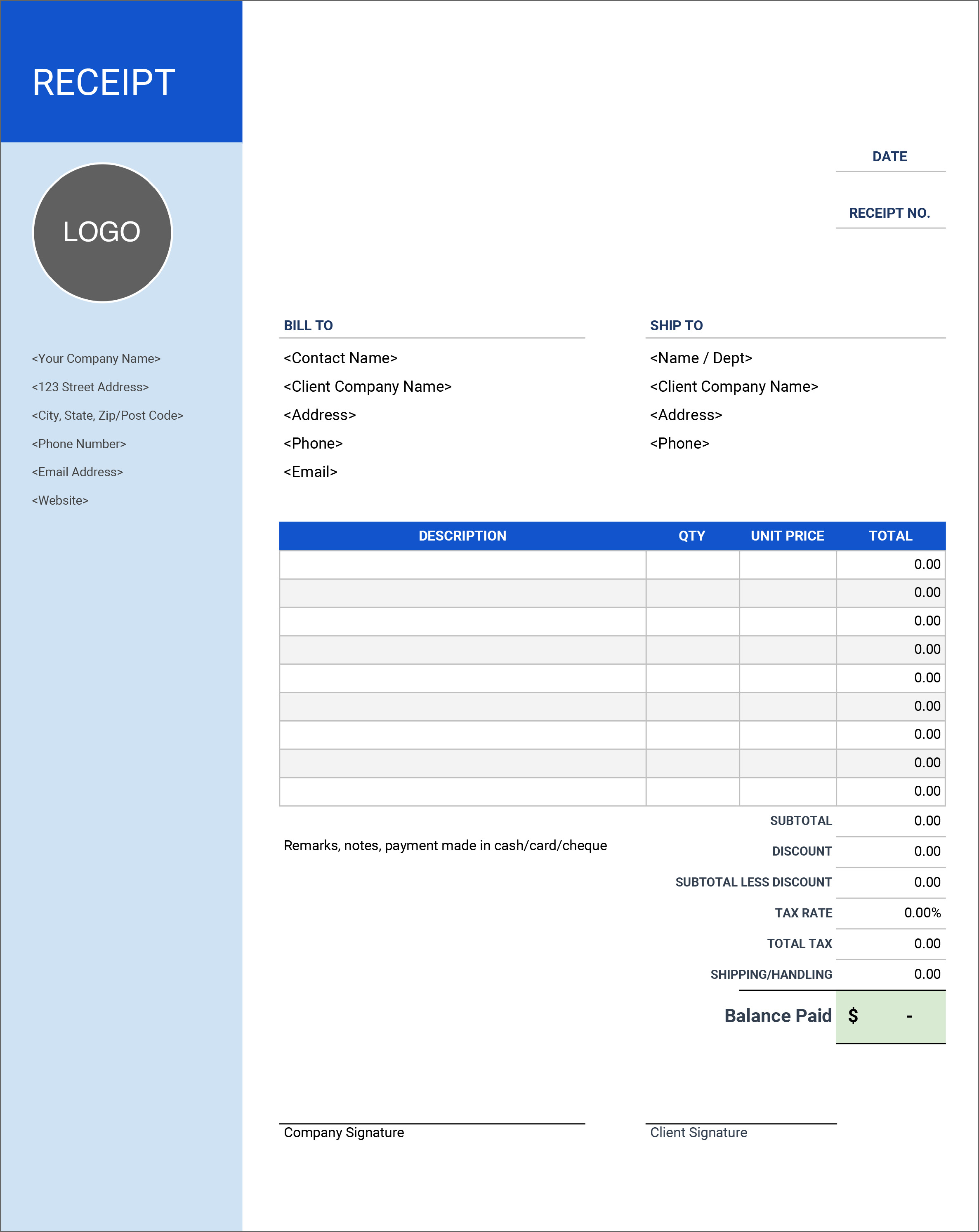
In the realm of crafting professional receipts within the confines of Microsoft Word, the meticulous detailing of header information stands as a pivotal facet, bestowing an air of credibility and sophistication to your document. To embark on this journey, you’ll commence by adding your business name, logo, and contact information at the very summit of the receipt. This fundamental step not only establishes your brand’s identity but also serves as a point of reference for any future interactions with your customers.

Your business name, being the anchor of this section, should be prominently displayed. A common practice is to position it at the top, often in a larger or bolder font, ensuring it commands attention. This immediate brand recognition fosters trust and transparency. Alongside your business name, the inclusion of your logo adds an extra layer of professionalism. Your logo is the visual representation of your brand, and its placement at the header is akin to your brand’s signature on the receipt canvas. It’s a symbol that customers will associate with your business, forging a sense of reliability.

Equally critical is the incorporation of your contact information. This typically includes your business address, phone number, and email address. The customer’s ability to reach out to you easily is essential, whether it’s to seek clarification, express concerns, or provide feedback. This contact information should be clear, accurate, and up-to-date. It’s a conduit for communication, and any discrepancies or outdated data can lead to frustration and mistrust.

Moving on, the header information should also encompass the recipient’s details. This could be the name of the customer or the entity you’re conducting the transaction with. Personalization goes a long way in making the recipient feel valued and acknowledged. It’s an indicator of your attention to detail and the importance you place on individualized customer relationships.

Now, let’s delve into the visual aspects of the header. Customizing fonts, sizes, and colors may seem like a purely aesthetic endeavor, but it plays a vital role in conveying professionalism. The font you choose should be clear and easy to read. A common choice is a sans-serif font, which exudes modernity and simplicity. Ensure the size strikes a balance between being legible and not overwhelming the header section. As for colors, adhering to your brand’s color palette or selecting a combination that complements your logo is prudent. Cohesion in design elements fosters a harmonious and professional appearance.

Moreover, when dealing with fonts, consider using bold or italics to emphasize specific elements, like the business name or the recipient’s details. This subtle formatting tweak draws attention to these key pieces of information without overpowering the header.

In sum, the header information of your receipt is the proverbial handshake of your business. It introduces you to the customer, conveys your identity, and sets the tone for the entire transaction. By incorporating your business name, logo, and contact information, you establish trust and brand recognition. Including recipient details personalizes the interaction, and customizing fonts, sizes, and colors lends an air of professionalism and consistency. In the world of business, the first impression is often the most lasting, and in crafting your header information, you’re ensuring that it’s a memorable one.

Receipt Title and Number

In the world of creating professional receipts within Microsoft Word, the phase of generating a Receipt Title and Number serves as a pivotal bridge between form and function. When you embark on this essential step, you’re not merely labeling a document; you’re infusing it with significance and practicality.

First and foremost, the task at hand entails inserting a title such as “Receipt” and a unique receipt number. This may seem like a straightforward administrative task, but in reality, it carries a weight of importance. The title, often a simple “Receipt,” serves as an instant identifier, providing clarity and context to the document. It sets the stage for the recipient, ensuring that there’s no ambiguity regarding the nature of the paperwork they’re perusing.

Beyond the title, the unique receipt number is the linchpin of this process. It is not just a sequence of digits; it’s a symbol of accountability and organization. Each receipt number is distinctive, and it becomes a verifiable reference point for both the issuer and the recipient. This number aids in tracking and categorizing transactions, streamlining record-keeping, and simplifying the resolution of any disputes or inquiries that may arise in the future.

The significance of having a receipt number is multifaceted. It instills a sense of order and professionalism in your record-keeping. It empowers you to maintain a well-structured database of transactions, which can be invaluable for accounting, tax purposes, and financial analysis. Moreover, the receipt number holds legal weight, particularly in business transactions. It serves as evidence of the transaction’s occurrence, acting as a safeguard against disputes and misunderstandings.

Additionally, the unique receipt number contributes to the credibility of your business. When you issue receipts with a well-organized numbering system, it conveys a level of trustworthiness and attention to detail. Your customers and clients will appreciate the clarity and organization, which can foster goodwill and bolster your professional image.

In an era where digital records and audit trails are vital, a unique receipt number ensures that you’re prepared for any potential audits or inquiries. It simplifies the task of locating specific transactions, which can save you time and effort, especially when dealing with a high volume of receipts.

To sum it up, the process of inserting a title and unique receipt number is not a mundane task but a cornerstone of effective record-keeping and professionalism. It brings clarity, organization, and credibility to your transactions, and it acts as a safeguard in the event of disputes or audits. So, the next time you create a receipt in Microsoft Word, remember that a simple title and number carry significant weight in the world of business and finance, making your life easier and your transactions more transparent.

Date and Payment Details

In the realm of crafting professional receipts within the versatile tool of Microsoft Word, there is a pivotal juncture that demands meticulous attention – the inclusion of Date and Payment Details. This seemingly straightforward step holds the power to not only provide a comprehensive snapshot of the transaction but also to ensure clarity and accountability in the records.

First and foremost, it is imperative to include the transaction date, a seemingly small yet undeniably critical element. The date serves as a timestamp, capturing the exact moment when a transaction took place. This timestamp, when impeccably documented, proves to be invaluable in various scenarios. It enables both the issuer and the recipient to pinpoint when the transaction occurred, aiding in reconciliation and dispute resolution. Furthermore, the transaction date is essential for accounting and tax purposes, as it categorizes the transaction within a specific time frame, ensuring compliance and accuracy.

Equally vital is the specification of the payment method employed in the transaction. Whether it’s cash, credit card, check, or digital payment, specifying the method brings transparency and accountability to the receipt. Different payment methods come with distinct processes and implications, and noting the chosen method helps in understanding the flow of funds and verifying the legitimacy of the transaction.

Furthermore, the mention of a payment reference or invoice number in the Date and Payment Details section is of paramount significance. This unique identifier acts as a bridge between the receipt and the underlying transaction. It’s akin to a barcode that can be scanned to retrieve detailed information about the payment, offering a convenient way to trace the transaction back to the source. This reference or invoice number aids in keeping records organized and easily accessible. It simplifies the task of retrieving transaction details, particularly in scenarios where numerous receipts are involved, such as in the case of a business with multiple clients and transactions.

The utility of specifying a payment reference or invoice number extends beyond organizational benefits. It is a testament to your professionalism and dedication to clear and traceable financial records. In the event of disputes, questions, or audits, this reference number can be the key to resolving issues swiftly and with precision. It provides an extra layer of accountability, reinforcing the integrity of your financial processes.

Itemized List of Products/Services

In the meticulous art of crafting professional receipts within the familiar confines of Microsoft Word, the Itemized List of Products/Services section emerges as a centerpiece of detail and organization. This segment is where the transaction’s essence is distilled, and the foundation of financial clarity is laid.

To begin, the initial step is to create a table for listing the products or services involved in the transaction. The importance of this cannot be overstated. A well-structured table not only enhances the receipt’s visual appeal but, more crucially, it provides a systematic layout for presenting the specifics of the transaction. Within this table, columns are carefully delineated, each serving a distinct purpose in the pursuit of clarity and transparency.

The first column, dedicated to item descriptions, is where the particulars of each product or service are elaborated. This column serves as a canvas for articulating the essence of what was provided. A concise yet informative description ensures that both the issuer and recipient can discern what was involved in the transaction, minimizing the potential for confusion or disputes.

The next column, which details the quantity of each item or service, adds a quantitative dimension to the receipt. It specifies the number of units or the quantity of the service availed. This numerical clarity is instrumental for the recipient to cross-reference the receipt with their own records and for accounting purposes.

Moving along, the column for unit prices establishes a baseline value for each item or service. This is where the cost per unit is clearly stated, contributing to a transparent representation of the transaction’s financial breakdown. It’s in this column that the cost of individual items or services is made explicit.

The final column, where the total price for each line item is calculated, serves as the grand sum of the financial aspects of the transaction. By multiplying the quantity with the unit price, this column arrives at the total cost for each item or service, summarizing the monetary value attributed to each. This detailed financial breakdown is indispensable for accounting, tax compliance, and financial analysis.

The culmination of this meticulous detailing is the calculation of the total amount at the bottom of the table. It’s in this grand total that the complete financial magnitude of the transaction is encapsulated. The sum of all the individual line items, along with any applicable taxes or discounts, results in a comprehensive understanding of the financial transaction’s grand total. This figure holds the utmost importance for both the issuer and the recipient, as it represents the final amount that has been exchanged.

In essence, the Itemized List of Products/Services in a receipt is a testament to clarity, organization, and professionalism. It provides a comprehensive breakdown of the transaction, ensuring that both parties are aligned on what transpired. It also offers a solid foundation for accounting, tax purposes, and financial analysis. This meticulous section, when crafted with precision, contributes to a transparent and trustworthy financial record that stands as a testament to your commitment to professionalism and clarity in financial matters.

Tax and Discounts

Tax and Discounts
Photo by – https://property118.com

As we traverse the intricate landscape of creating professional receipts within Microsoft Word, we inevitably arrive at the junction where the nuances of taxes and discounts come into play, adding layers of financial intricacy and transparency to the transaction at hand.

The first step in this journey is to add applicable taxes and discounts to the receipt. Taxes, a fundamental component of most financial transactions, are a compulsory contribution that often varies based on geographical locations and the nature of the goods or services being provided. By including taxes in the receipt, the issuer not only adheres to legal and regulatory requirements but also ensures complete transparency. For the recipient, this inclusion offers a clear breakdown of the financial obligations, facilitating comprehension and compliance.

Discounts, on the other hand, are a gesture of goodwill or a calculated incentive to encourage transactions. They can take various forms, from promotional discounts to loyalty rewards or bulk purchase reductions. Including discounts in the receipt is a demonstration of transparency and professionalism. It serves as an acknowledgement of the recipient’s eligibility for the discount and quantifies the financial benefit they have received. This transparency not only enhances trust but also contributes to clear financial record-keeping.

The second step in this process involves calculating tax amounts and subtracting discounts from the total. Here, precision is paramount. Taxes can be calculated as a percentage of the subtotal or as a fixed amount, depending on the specific regulations governing the transaction. By accurately calculating and displaying the tax amount, the receipt ensures complete transparency and helps both parties understand their financial obligations. Additionally, it aids in simplifying the task of tax compliance, making it easier for the recipient to cross-reference and verify.

Subtracting discounts from the total, although a seemingly straightforward task, is laden with significance. It showcases the financial benefit the recipient has gained, whether through a promotional offer or any other discount mechanism. This not only fosters goodwill but also enhances the recipient’s trust in your business. By demonstrating the financial impact of the discount, you’re not only practicing transparency but also solidifying the professional image of your business.

Additional Notes

In the intricate tapestry of crafting professional receipts within the familiar realm of Microsoft Word, the canvas upon which financial transactions are recorded, the Additional Notes section takes on a role of paramount importance. This section is more than just a blank space; it’s a realm of interpretation, clarification, and transparency.

First and foremost, this segment allows space for additional notes or terms. It’s a canvas where nuances, special considerations, and individualized communication can flourish. Whether it’s a personalized thank-you message, a clarification of the transaction, or a declaration of special terms and conditions, this space provides a platform for the issuer to connect with the recipient on a more human level. It’s here that businesses can distinguish themselves by conveying their unique values and appreciation.

In this realm of Additional Notes, the power of explanation comes to the fore. Here, any special terms and conditions related to the transaction can be elucidated. It’s a space where complexity can be distilled into clarity, where legalese can be transformed into plain language, ensuring that the recipient comprehends the transaction and any associated obligations fully. This transparency, this commitment to ensuring that the recipient is informed and confident in their understanding, adds an invaluable layer of trust to the business-client relationship.

Additionally, this space can serve as a beacon of clarification for any peculiarities in the transaction. If the nature of the transaction demands additional explanation, perhaps related to warranties, returns, or bespoke arrangements, this is the domain where such intricacies are unveiled. It’s a testament to the commitment of the issuer to ensuring that the recipient is not only aware of the details but is also comfortable in the knowledge that their concerns have been addressed.

In the realm of crafting a receipt, this Additional Notes section stands as a bridge between formality and humanity, between documentation and communication. It’s a realm where businesses can express their unique character, convey their dedication to transparency, and ensure that the recipient is fully informed and comfortable with the transaction.

Total Amount and Signatures

In the realm of creating professional receipts, the ninth and final act of the intricate choreography involves the Total Amount and Signatures section. Here, the tapestry of the transaction comes together in its final threads, culminating in a tableau of financial clarity and commitment.

The first directive in this act is to display the total amount payable. It may appear to be a simple step, but it carries immense weight. The total amount is the financial sum of the transaction, the final figure that underscores the financial obligations of both the payer and the recipient. Its inclusion serves as a cornerstone of transparency, providing a clear and irrefutable representation of the transaction’s monetary value. This figure is the culmination of all the individual components, from the items or services provided to the taxes and discounts applied. It’s the grand total, the undisputed financial magnitude of the transaction, and it forms the basis of financial reconciliation, taxation, and accountability.

In the same breath, this section incorporates a space for the payer’s and recipient’s signatures. The act of signing is a universally recognized symbol of agreement, commitment, and accountability. When the payer signs the receipt, they acknowledge the transaction, affirming their responsibility for the financial obligations documented therein. Likewise, the recipient’s signature represents their acceptance of the goods or services rendered and the financial terms outlined in the receipt. These signatures are more than mere ink on paper; they are the embodiment of commitment and trust.

The act of signing is not merely a formality; it is a binding agreement that stands as a testament to the professionalism and legal validity of the transaction. It adds a layer of accountability and legal weight to the receipt, ensuring that both parties are not only aware of the financial terms but are also willing to commit to them formally.

Design and Formatting

Design and Formatting
Image credit: miblart

In the digital age, where information is consumed rapidly and first impressions are formed in a matter of seconds, the design and formatting of documents, including receipts, have become paramount. A well-designed receipt not only conveys professionalism but also enhances the overall user experience. This is particularly vital in the realm of business, where even the smallest details can have a significant impact on a company’s image and reputation.

The importance of a professional design cannot be overstated. A well-designed receipt reflects positively on your business, leaving a lasting impression on your customers. It’s a tangible representation of your commitment to quality and attention to detail. From the choice of fonts to the layout of elements, every aspect of design plays a crucial role in how your receipt is perceived.

When it comes to selecting appropriate fonts, colors, and styles for your receipt, there are several key considerations. Fonts should be legible and consistent with your brand’s identity. Utilizing a combination of fonts, such as a clean and modern typeface for headings and a more traditional one for the body text, can add an aesthetic balance to your receipt. Colors should be chosen with care, reflecting your brand’s color scheme and evoking the right emotions. A harmonious color palette not only enhances the visual appeal but also creates a sense of cohesion and professionalism. Styles, including bold, italics, and underlining, should be used sparingly and consistently to draw attention to important information without overwhelming the reader.

Additionally, the organization and layout of the receipt play a pivotal role in the user experience. Important details, such as the recipient’s and payer’s information, the date, items or services provided, and the total amount, should be logically structured and easily identifiable. The use of whitespace can create breathing room and prevent visual clutter, making it easier for the reader to absorb the information. A clear hierarchy of information, such as the use of headers and subheadings, guides the reader through the receipt, ensuring that they don’t miss critical details.

In essence, design and formatting are not mere aesthetic considerations but powerful tools for enhancing the user experience and reinforcing your business’s professionalism. A well-designed receipt goes beyond mere documentation; it becomes a visual representation of your brand’s commitment to quality and attention to detail.

To summarize, the Design and Formatting of a receipt are critical elements that go beyond aesthetics; they influence the user experience and reflect your business’s commitment to professionalism. Choosing appropriate fonts, colors, and styles, and creating a well-structured layout are vital steps in creating a receipt that leaves a positive and lasting impression on your customers. In today’s digital landscape, where attention to detail can set your business apart, the significance of design and formatting should not be underestimated.

Saving and Printing

Saving and Printing
Picture source: tpisolutionsink

As we journey through the intricate process of creating a receipt, we arrive at the final act, “Saving and Printing.” In this digital age, the ability to save and print receipts is not only convenient but also essential for record-keeping, compliance, and future reference.

First and foremost, let’s discuss how to save the receipt document. After meticulously crafting your receipt in Microsoft Word, it’s crucial to preserve it in a format that ensures its accessibility and integrity. The most recommended and versatile format for saving your receipt is PDF (Portable Document Format). PDFs are platform-independent, meaning they can be viewed on various devices and operating systems without formatting issues. They also maintain the exact layout and design of the original document, making them ideal for preserving the professional appearance of your receipt. To save your receipt as a PDF, follow these simple steps:

  1. Click on “File” in the top left corner of the Microsoft Word window.
  2. Select “Save As” to open the save dialog.
  3. Choose the location where you want to save the file.
  4. In the “Save as type” dropdown menu, select “PDF.”
  5. Click “Save.”

By following these steps, you ensure that your receipt is saved in a universally accepted format that retains its visual appeal and content structure.

Now, let’s delve into the realm of printing options for a hard copy of your receipt. Despite the increasing digitization of documents, there are situations where a hard copy is necessary or preferred. Whether it’s for compliance, legal requirements, or the simple act of providing a physical receipt to a customer, knowing how to print your document is vital.

To print your receipt from Microsoft Word, here’s a straightforward guide:

  1. Click on “File” in the top left corner.
  2. Select “Print” from the menu. This will open the Print dialog.

Here, you can adjust various settings to tailor the printout to your specific needs. You can select the printer you want to use, choose the number of copies, and even customize the page range if necessary. Additionally, you can access advanced options such as selecting the paper size and orientation, as well as adjusting the print quality to suit your preferences.

Once you’ve configured your print settings, click “Print,” and your receipt will be sent to the chosen printer. It’s worth noting that you can also preview the printout before committing to the actual print, ensuring that everything looks as intended.

In conclusion, the act of saving and printing a receipt is the final step in the intricate process of receipt creation. Saving the receipt as a PDF ensures its accessibility and preservation of the original design. Printing options in Microsoft Word allow you to customize the printout to your specific needs, providing hard copies when necessary. Whether it’s for compliance, record-keeping, or providing physical receipts to customers, these steps ensure that your receipt is versatile and ready for any situation.

Receipt Templates

Receipt Templates
Image source: https://geckoandfly.com

In the ever-evolving world of document creation and management, convenience and efficiency are paramount. When it comes to crafting receipts, Microsoft Word has an ace up its sleeve – pre-designed receipt templates. These templates offer a streamlined way to create professional and organized receipts without the need for extensive design or formatting work.

One of the primary advantages of using pre-designed receipt templates in Microsoft Word is the time-saving aspect. Rather than starting from scratch, you can choose from a variety of templates that suit your specific needs. These templates are thoughtfully crafted to encompass the essential elements of a receipt, from business details to itemized lists and payment information. They not only save time but also ensure that your receipts maintain a consistent and polished appearance.

Accessing these templates is a breeze. Here’s how:

  1. Open Microsoft Word and create a new document.
  2. Navigate to the “File” tab in the upper-left corner.
  3. Select “New” from the menu. This will take you to the templates page.

On this page, you’ll find a range of template categories. To access receipt templates, you can either search for “receipt” in the search bar or browse through the available templates under the “Business” or “Finance” categories. Once you’ve found a template that aligns with your needs, click on it to open a preview. You can then choose to use that template for your document by selecting the “Create” button.

Customizing these templates is where you can truly make them your own. You can easily edit the text, insert your business name and logo, and modify any other elements to reflect your brand identity. Microsoft Word provides a user-friendly interface with features like drag-and-drop functionality and an array of formatting options. You can change fonts, colors, and styles to match your branding, ensuring that the receipt template aligns with your business’s aesthetics.

For instance, you can insert your business name, contact information, and logo in the designated areas. You can also add recipient details, itemized lists of products or services, payment information, and any additional notes or terms. Furthermore, you can customize the formatting to ensure that the receipt not only serves as a record of the transaction but also enhances your brand’s professionalism.

Review and Finalize

Review and Finalize
Image by – weebly

In the realm of crafting documents, particularly when it involves transactions and financial records, precision is paramount. This is where the final step, “Review and Finalize,” becomes a critical component in the process of creating a receipt. Ensuring that your receipt is accurate, well-organized, and compliant with legal and financial standards is not just a good practice but a necessity. In this section, we will highlight the importance of reviewing the receipt for accuracy and provide a checklist for finalizing the document.

The Importance of Reviewing for Accuracy:

The significance of reviewing a receipt for accuracy cannot be overstated. Accuracy in financial records is vital for both businesses and individuals. It serves as a safeguard against discrepancies, disputes, and legal complications. Here are some key points to consider when reviewing your receipt:

  • Transaction Details: Double-check that all transaction details are accurately recorded. This includes the date, payment method, payment reference or invoice number, and total amount payable. Any errors in these fundamental elements can lead to confusion or financial discrepancies.

  • Itemized List: Review the itemized list of products or services. Ensure that the item descriptions, quantities, unit prices, and total prices are all correct. Any discrepancies here can affect your financial records and create confusion for both you and your customers.

  • Tax and Discounts: If applicable, calculate the taxes and discounts to ensure they have been correctly applied. Errors in tax calculations can lead to legal and financial issues, while discount inaccuracies may affect your revenue.

  • Additional Notes: If you have included any special terms and conditions or additional notes, verify that they are clear and comprehensive. Unclear terms can lead to misunderstandings, while missing essential terms can cause disputes.

A Checklist for Finalizing the Document:

Here is a checklist to help you finalize your receipt:

  1. Header Information: Ensure that your business name, logo, and contact information are correct and prominently displayed.

  2. Receipt Title and Number: Verify that the title, such as “Receipt,” and the unique receipt number are included. Explain the significance of the receipt number in case it’s required for tracking or reference.

  3. Date and Payment Details: Double-check that the transaction date and payment method are accurate. Confirm that the payment reference or invoice number is included.

  4. Itemized List of Products/Services: Review the table listing the products or services. Confirm that item descriptions, quantities, unit prices, and total prices are correct. Calculate the total amount at the bottom.

  5. Tax and Discounts: If applicable, calculate and verify the tax amounts and discounts, ensuring they are accurately deducted from the total.

  6. Additional Notes: Check that there is ample space for additional notes or terms. Ensure any special terms and conditions are clear and concise.

  7. Total Amount and Signatures: Display the total amount payable and include space for payer’s and recipient’s signatures.

  8. Design and Formatting: Emphasize the importance of a professional design. Provide tips on selecting appropriate fonts, colors, and styles for a polished appearance.

  9. Saving and Printing: Instruct on how to save the receipt document and explain printing options for a hard copy.

  10. Receipt Templates: If relevant, mention the availability of pre-designed receipt templates in Word and show how to access and customize these templates.

Exporting to PDF

Exporting to PDF
Picture source: https://zebrabi.com

In today’s digital age, the ability to seamlessly share and store documents is of paramount importance. When it comes to receipts and financial records, converting them into a Portable Document Format (PDF) is a widely accepted practice for easy sharing and archiving. In this section, we’ll explore the process of exporting a Word receipt to a PDF format for digital sharing, ensuring that the document retains its integrity and appearance.

Exporting to PDF: A Seamless Process

The process of converting a Word receipt to a PDF format is remarkably straightforward, making it accessible to individuals and businesses alike. Here’s a step-by-step guide:

  1. Open the Receipt Document: Begin by opening the Word document containing your receipt. Ensure that the document is complete and reviewed for accuracy, as discussed in earlier sections.

  2. Go to the ‘File’ Menu: In most Word processing software, including Microsoft Word, you can find the ‘File’ menu located in the top left corner of the application window. Click on it to access a drop-down menu.

  3. Select ‘Save As’ or ‘Export’: In the ‘File’ menu, you will find the ‘Save As’ or ‘Export’ option. Click on this option to proceed.

  4. Choose PDF Format: When prompted to select the format in which you wish to save the document, opt for ‘PDF’ or ‘Portable Document Format.’ This choice ensures that the document retains its formatting and layout, making it universally accessible and readable.

  5. Set the Save Location: After selecting the PDF format, you’ll be asked to choose the location where you want to save the PDF file. Browse your computer’s directory and select an appropriate folder or location. Be sure to name the file in a way that makes it easily identifiable.

  6. Configure PDF Options (Optional): Some applications provide additional options for configuring the PDF file. These options may include setting the page size, resolution, and security features. You can adjust these options according to your needs.

  7. Click ‘Save’ or ‘Export’: Once you’ve chosen the file location and configured any optional settings, click ‘Save’ or ‘Export’ to initiate the process. The software will convert your Word receipt into a PDF document.

  8. Verify the PDF: It’s advisable to open and review the newly created PDF document to ensure that it looks as intended. Check for any formatting issues or inaccuracies that might have occurred during the conversion process.

The Advantages of PDF Receipts:

Converting your receipt to a PDF format offers several advantages:

  • Universal Compatibility: PDFs can be opened and viewed on various devices and operating systems without any loss of formatting or data. This makes them an excellent choice for sharing documents with others.

  • Professional Appearance: PDFs maintain the professional appearance of your receipt, including fonts, colors, and layouts. This consistency is crucial for presenting a polished image to clients, customers, or financial institutions.

  • Data Security: PDFs can be password-protected or encrypted, adding a layer of security to sensitive financial documents. This is especially important for businesses that handle confidential information.

  • Space-Efficient: PDFs are compact files that don’t consume significant storage space. This is ideal for archiving and managing receipts over time.

Sending Receipts

In the realm of modern business and finance, efficiently sending receipts to customers is a vital component of maintaining professionalism, transparency, and excellent customer service. While it may seem like a routine task, the methods employed to send receipts can significantly impact a business’s operations and customer satisfaction. In this section, we delve into various methods for sending receipts to customers, encompassing traditional and digital channels, including email, print, and online payment systems.

1. Email Receipts:
Email has become the go-to method for sending receipts in today’s digital age. Here’s why it’s a popular choice:

  • Speed and Convenience: Email allows for near-instantaneous delivery of receipts, ensuring customers receive their records promptly.

  • Cost-Efficiency: It significantly reduces printing and postage costs, making it an environmentally friendly and cost-effective choice.

  • Archival and Searchable: Both businesses and customers can effortlessly archive and search for email receipts, simplifying record-keeping and retrieval.

  • Eco-Friendly: By reducing paper usage, businesses contribute to environmental sustainability efforts.

2. Printed Receipts:
Despite the digital shift, printed receipts still play a role in business transactions. They have distinct advantages:

  • Tangibility: Some customers prefer physical copies for their records, which is especially pertinent for in-store purchases.

  • Regulatory Requirements: Certain industries and regions mandate the issuance of printed receipts for compliance purposes.

  • Branding and Marketing: Printed receipts can serve as marketing tools, featuring promotions, loyalty program information, and contact details.

3. Online Payment Systems:
Many online payment systems offer integrated receipt generation and delivery. This method is highly efficient and streamlines the process:

  • Automated Generation: Receipts are automatically generated and sent when a transaction is completed, reducing manual effort.

  • Real-Time Delivery: Customers receive receipts in real-time, enhancing their trust in the transaction’s transparency.

  • Record Centralization: All transaction data and associated receipts are stored in one place, simplifying bookkeeping and audit trails.

Selecting the Right Method:
The choice of method depends on the nature of the business, customer preferences, and regulatory requirements. Some businesses may adopt a hybrid approach, offering customers the option to receive both digital and printed receipts.

Customization and Branding:
Regardless of the method chosen, it’s essential to ensure that receipts are customized with the company’s branding, including logos, contact details, and any promotional information. This not only enhances professionalism but can also serve as a marketing tool.

Security and Privacy:
In today’s environment, data security and customer privacy are paramount. Businesses must implement robust security measures to protect customer information contained in receipts, especially in digital formats. Compliance with data protection regulations is crucial.

Customer Accessibility:
Consider the accessibility of receipts for customers. Ensure they can easily access and store digital receipts, and make printed receipts legible and durable.

Archiving and Record-Keeping:
From a business perspective, maintaining an organized system for archiving and record-keeping is essential. Digitized records are easier to manage and search, simplifying accounting and audits.

Environmental Considerations:
Businesses should be mindful of their environmental impact. Minimizing paper usage and promoting digital receipt options align with sustainability goals.

Troubleshooting

In the world of digital document creation, troubleshooting is an indispensable aspect of ensuring a smooth and seamless user experience. Whether you’re crafting reports, invoices, or any other form of document, encountering issues can be frustrating. Therefore, it is crucial to address common problems that users may face and offer effective solutions, particularly concerning formatting errors and other challenges.

Common Issues Faced by Users:

  1. Formatting Errors: One of the most prevalent issues users encounter while creating documents is formatting errors. These can include misaligned text, inconsistent fonts, or unpredictable spacing between elements.

  2. Compatibility Problems: Users may experience difficulties when attempting to open or edit documents across different devices or software. This often leads to unexpected changes in formatting.

  3. Image Placement Issues: Placing images within a document can be a tricky endeavor, with problems such as misaligned or disproportionate images being quite common.

  4. Font and Style Inconsistencies: Maintaining consistency in fonts and styles is essential for document aesthetics. Users often struggle with keeping their documents visually coherent.

  5. Page Numbering Challenges: Document page numbering can be a vexing issue, particularly when trying to start numbering from a specific page or section.

  6. Text Spacing and Alignment: Achieving uniform spacing and alignment of text elements throughout a document can be a persistent challenge, leading to visually unappealing results.

Effective Solutions to Address These Issues:

  1. Template Utilization: Encourage users to employ professionally designed templates to minimize formatting errors. These templates often come with pre-configured styles and layouts, ensuring a consistent appearance.

  2. Document Versioning: Implement a version control system that enables users to track changes and revert to previous versions in case of compatibility problems. Popular document editing software offers these features.

  3. Image Optimization Tools: Recommend tools or best practices for image optimization to ensure proper sizing, alignment, and resolution within documents. Software like Adobe Acrobat provides image editing capabilities.

  4. Font and Style Libraries: Users can access extensive font and style libraries to ensure consistency throughout the document. Promote the use of a limited set of fonts and styles for uniformity.

  5. Page Numbering Guides: Provide clear instructions for setting page numbers correctly. Users can employ “page break” and “page numbering” functions available in most word processing software.

  6. Paragraph and Line Spacing: Educate users on adjusting paragraph and line spacing settings for optimal text alignment. Implementing “styles” for different text elements can also help maintain uniformity.

Preventative Measures:

While addressing common issues is crucial, promoting preventative measures is equally essential:

  1. User Training: Offer comprehensive tutorials and guides on document formatting and software-specific tips to empower users.

  2. Standardized Processes: Encourage users to follow standardized processes for creating and editing documents. This includes employing header and footer sections, using predefined styles, and optimizing images before insertion.

  3. Feedback Mechanism: Establish a feedback system where users can report issues and provide suggestions. This fosters a sense of community and enables continuous improvement.

  4. Documentation Repository: Maintain a repository of troubleshooting guides and FAQs, making it easy for users to find solutions to their problems independently.

  5. Regular Software Updates: Ensure users are working with the latest software versions to minimize compatibility issues. Prompt them to update their applications as needed.

In conclusion, effective troubleshooting is paramount when it comes to document creation and formatting. By addressing common issues, providing solutions, and implementing preventative measures, you can empower users to navigate the challenges of digital document creation with confidence. Troubleshooting should not only resolve existing issues but also serve as a proactive approach to improving the overall document creation process, making it more efficient, user-friendly, and aesthetically pleasing.

Read More

Unleashing the Power of Lewis Dot Structures in Microsoft Word

By following this guide, you can create Lewis Dot Structures right away, allowing you to visualize electrons in a digital world. (We’ll also cover how to use Microsoft Word as a visual metaphor.)

Essentially, creating Lewis dot structures in Microsoft Word is a breeze for anyone who has never worked with the program before. Using Word’s drawing tools in this step-by-step method, you’ll learn to create atoms and electrons by using the program’s drawing tools as a seasoned chemist. Simply follow our simple instructions to learn how to demonstrate chemical structures, eliminating the need for complex software or artistic skills.

As we embark on this journey, we can anticipate the ability to easily represent molecular bonds and decipher the language of atoms in a matter of seconds. The world of chemistry is suddenly alive as you connect atoms and molecules. With the assistance of Microsoft Word’s familiar tools, we will learn how to create flawless Dot Lewis Structures with precision. Your chemistry class may never be the same again after this.

Understanding Lewis Dot Structures

Understanding Lewis Dot Structures
Credit: buzzle.com

In the intricate world of chemistry, the art of illustrating molecular structures finds its epitome in Lewis Dot Structures—a visual language that brings the dance of electrons to the forefront of scientific understanding.

A. Introduction to Lewis Dot Structures

At the heart of chemical representation lies the profound concept of Lewis Dot Structures. These visual depictions serve as a molecular blueprint, unraveling the complexities of atomic interactions. Beyond the realm of symbols and formulas, they breathe life into the static language of chemistry.

  • Definition and Purpose: Lewis Dot Structures, named after the renowned chemist Gilbert N. Lewis, encapsulate the arrangement of valence electrons around an atomic symbol. Their purpose is not merely aesthetic but rather to provide a dynamic snapshot of electron distribution, a key player in chemical reactions.

  • Importance in Chemistry: To comprehend the significance of Lewis Dot Structures is to grasp the very essence of chemical bonding. These representations act as a visual guide, offering insights into the nature of bonds, polarity, and molecular geometry.

B. Basic Elements of a Lewis Dot Structure

Navigating the landscape of Lewis Dot Structures necessitates an understanding of the fundamental elements that compose these visual masterpieces.

  • Identifying Valence Electrons: The cornerstone of any Lewis Dot Structure lies in identifying valence electrons—the electrons in the outermost shell. These electrons dictate an element’s chemical behavior, making them central to the narrative of molecular interactions.

  • Knowing the Symbolic Representation: Beyond counting electrons, mastery lies in the symbolic representation of elements. Unraveling the periodic table, understanding atomic symbols, and discerning the unique characteristics of each element are the building blocks of Lewis Dot Structure proficiency.

C. Rules for Drawing Lewis Dot Structures

Delving deeper, the creation of precise Lewis Dot Structures follows a set of rules akin to the grammar of chemical storytelling.

  • Octet Rule: A cardinal principle in Lewis Dot Structures, the octet rule posits that atoms strive to achieve a stable configuration of eight electrons in their outermost shell. This rule governs the placement of dots, shaping the narrative of molecular stability.

  • Duet Rule for Hydrogen and Helium: While most elements adhere to the octet rule, hydrogen and helium dance to a different tune. Abiding by the duet rule, these elements seek a duet rather than an octet, emphasizing their unique role in molecular dynamics.

  • Exceptions and Special Cases: Chemistry, like any compelling narrative, has its exceptions. Unraveling the intricacies of Lewis Dot Structures involves navigating through special cases, understanding when and why certain elements deviate from the established rules.

In the meticulous craft of drawing Lewis Dot Structures, the mastery of these elements and rules converges to paint a vivid picture of atomic connections and electron orchestration. Beyond a visual exercise, it becomes a narrative, unfolding the stories of atoms and their quest for stability in the intricate dance of chemistry.

Tools Needed

In the digital realm of chemistry representation, wielding the right tools can transform the creation of Lewis Dot Structures into an art form within Microsoft Word.

A. Overview of Microsoft Word Drawing Features

Unlocking the potential of Microsoft Word’s drawing features is akin to discovering a hidden palette for scientific creativity. This overview guides you through the essentials, ensuring that the canvas of your document becomes a playground for illustrating molecular intricacies.

  • Accessing the Drawing Tools

    • Navigate to the “Insert” tab at the top of your Word document.
    • Within the “Insert” tab, locate and click on “Shapes” to reveal a dropdown menu of drawing tools.
  • Inserting Shapes and Lines

    • Choose from an array of shapes—circles, rectangles, and lines—to begin constructing the foundational elements of your Lewis Dot Structures.
    • Leverage the flexibility of lines to represent bonds, creating a dynamic visual narrative of atomic connections.

B. Utilizing Text Boxes

Text boxes in Microsoft Word serve as the storyteller’s canvas, allowing for the integration of textual insights to complement your visual masterpiece.

  • Adding Text Boxes

    • Under the “Insert” tab, select “Text Box” to incorporate textual elements seamlessly into your document.
    • Position text boxes strategically, providing clarity to the viewer regarding atomic details and structural nuances.
  • Adjusting Size and Position

    • Click and drag to resize text boxes, ensuring a harmonious balance between textual information and visual representation.
    • Employ the alignment tools in Word to precisely position text boxes, enhancing the overall aesthetic appeal.

H3. Enhancing Visual Harmony

Achieving visual harmony within Microsoft Word involves a delicate interplay between shapes, lines, and text boxes. This section delves into advanced techniques for creating Lewis Dot Structures that not only communicate scientific data but also captivate the audience visually.

  • Grouping and Aligning Elements

    • Utilize the “Group” feature in Word to consolidate shapes, lines, and text boxes, streamlining the editing process.
    • Leverage alignment options to ensure a visually cohesive presentation, enhancing the overall professionalism of your document.
  • Adding Color and Style

    • Inject vibrancy into your Lewis Dot Structures by employing color strategically. Use color to differentiate elements or highlight specific molecular features.
    • Experiment with font styles and formatting within text boxes to add an extra layer of sophistication to your visual representations.

H4. Troubleshooting and FAQs

Even with the mastery of tools, troubleshooting and answering frequently asked questions become integral aspects of creating seamless content.

  • Common Issues

    • Address challenges such as elements not aligning by revisiting the positioning and grouping of components.
    • Resolve text box issues by ensuring proper size adjustments and alignment within the document.
  • Frequently Asked Questions

    • Clarify doubts about the possibility of representing multiple elements in a single structure within Microsoft Word.
    • Provide insights into the representation of ions and other exceptional cases that may arise during the creation of Lewis Dot Structures.

In the expansive landscape of scientific communication, the tools within Microsoft Word become instruments of precision and creativity. By seamlessly integrating shapes, lines, and text boxes, you transcend the conventional boundaries of textual representation, transforming your documents into visually engaging narratives of molecular storytelling.

Step-by-Step Guide to Creating Lewis Dot Structures in Microsoft Word

In the digital laboratory of Microsoft Word, crafting precise Lewis Dot Structures metamorphoses from a scientific task into an artful endeavor. This step-by-step guide serves as your navigational chart, ensuring you seamlessly traverse the intricate terrain of atomic symbols, valence electrons, and molecular bonds.

A. Drawing the Atomic Symbol

1. Inserting Element Symbols

Embarking on your Lewis Dot journey begins with the elemental building blocks—literally. Follow these steps to effortlessly insert element symbols into your Word document:

  • Navigate to the “Insert” Tab:

    • Within Microsoft Word, find the “Insert” tab located at the top of your document.
  • Select “Symbol” Option:

    • Click on “Symbol” to reveal a dropdown menu and choose “More Symbols.”
  • Choose Element Symbols:

    • Scroll through the symbols until you find the elemental symbols you need. Click “Insert” to embed them into your document.

2. Adjusting Font and Size

To ensure your element symbols stand out with clarity and precision, consider the following:

  • Font Consistency:

    • Maintain a consistent font style throughout your document for a professional and cohesive look.
  • Optimal Size:

    • Adjust the size of your element symbols to strike a balance between visibility and aesthetic appeal. Consistency in sizing enhances the overall structure.

B. Placing Valence Electrons

1. Adding Dots Using Shapes

Valence electrons, the protagonists in the Lewis Dot narrative, find their place through the strategic use of shapes:

  • Access Shapes in “Insert” Tab:

    • Navigate back to the “Insert” tab and select “Shapes” to unleash a plethora of drawing options.
  • Choose Circles or Dots:

    • Opt for circles or dots to represent valence electrons. Click and drag to place them near the corresponding element symbols.

2. Aligning and Distributing Electrons

To maintain visual harmony and accuracy in electron distribution, adhere to these guidelines:

  • Alignment Precision:

    • Use Word’s alignment tools to ensure electrons are precisely aligned around the atomic symbol, reflecting their natural distribution.
  • Even Distribution:

    • Distribute electrons evenly to abide by the octet rule. Employ the distribution options in Word to achieve equilibrium.

C. Creating Bonds

1. Using Lines to Represent Bonds

The storyline of chemical connections unfolds as you introduce bonds. Here’s how to wield lines effectively:

  • Access Lines in “Shapes” Menu:

    • Return to the “Shapes” menu, selecting lines to represent bonds between elements.
  • Click and Drag for Bonds:

    • Click on the starting point and drag to the endpoint to create bonds. Adjust length and angles for precision.

2. Adjusting Line Styles and Thickness

Customization of bond appearance adds the finishing touch to your Lewis Dot Structure:

  • Line Styles:

    • Experiment with different line styles, such as dashed or solid, to visually distinguish types of bonds.
  • Thickness Variation:

    • Adjust line thickness to emphasize the significance of particular bonds, contributing to the clarity of your structure.

H3. Troubleshooting Tips for Seamless Drawing

Encountering challenges during the drawing process is not uncommon. Navigate potential roadblocks with finesse:

  • Overlapping Elements:

    • If elements overlap, use the “Bring Forward” or “Send Backward” options to adjust layering.
  • Misaligned Bonds:

    • Employ alignment guides to rectify misaligned bonds, maintaining the structural integrity of your representation.

H4. Frequently Asked Questions

Address common queries that may arise during the Lewis Dot Structure creation:

  • Can I Add Multiple Elements in One Structure?

    • Yes, by utilizing Word’s grouping feature, you can seamlessly integrate multiple elements into a coherent structure.
  • How Do I Represent Ions in a Lewis Dot Structure?

    • For ions, adjust the number of electrons and follow the same principles, clearly indicating the charge.

In mastering this step-by-step guide, you’ve not only acquired the technical prowess to create Lewis Dot Structures in Microsoft Word but also unlocked the artistry inherent in molecular storytelling. Navigate the digital laboratory with confidence, turning the seemingly complex into an eloquent dance of symbols, electrons, and bonds.

Tips and Tricks for Perfecting Your Lewis Dot Structures

In the intricate dance of atoms within Lewis Dot Structures, mastering the art extends beyond the fundamental drawing tools. Here, we unravel the nuanced tips and tricks that elevate your structures from the ordinary to the extraordinary.

A. Grouping and Aligning

1. Organizing Elements

The organization of elements within your Lewis Dot Structures is not just about visual appeal; it’s a strategic move to enhance comprehension and readability.

  • Logical Grouping:

    • Group elements logically based on their chemical relationships. For example, place elements of the same group or family together to highlight similar chemical behaviors.
  • Sequential Arrangement:

    • Arrange elements in a sequence that aligns with their atomic number. This not only aids in clarity but also subtly educates the viewer on the periodic table order.

2. Aligning for Clarity

Precision in alignment contributes significantly to the professionalism and visual impact of your Lewis Dot Structures.

  • Utilize Alignment Tools:

    • Leverage Microsoft Word’s alignment tools to ensure each element, bond, and electron aligns with precision. This eliminates visual clutter and enhances overall structure.
  • Consistent Spacing:

    • Maintain consistent spacing between elements and electrons. Consistency fosters a sense of order and symmetry, making the structure visually pleasing.

H3. Visual Harmony in Structure

Achieving visual harmony involves understanding the subtleties of grouping and aligning. This section delves deeper into advanced techniques that go beyond the basics.

  • Strategic Element Placement:

    • Place elements strategically to highlight key structural features. For instance, centralize elements pivotal to the molecule’s function for immediate viewer focus.
  • Whitespace Utilization:

    • Embrace whitespace to your advantage. It’s not merely empty space; it’s a powerful tool to guide the viewer’s eyes and emphasize essential components.

B. Adding Color and Style

1. Enhancing Visual Appeal

Color and style are the brushstrokes that infuse life and vibrancy into your Lewis Dot Structures. Follow these steps to elevate the aesthetic appeal:

  • Color-Coding Elements:

    • Assign distinct colors to different elements or groups. This not only enhances visual appeal but also aids in quick identification.
  • Font Styling:

    • Experiment with font styles for element symbols and labels. Bold key information to draw attention, maintaining a balance between aesthetics and clarity.

2. Using Color to Differentiate Elements

Color serves a dual purpose—it’s not merely for aesthetics but also for functional differentiation within your structures.

  • Highlighting Electron Types:

    • Use different colors for electrons to distinguish between valence and non-valence electrons. This simple yet effective technique adds an extra layer of information to your structures.
  • Colorful Bonds:

    • Introduce color to your bonds to denote the nature of the connection. For example, use one color for single bonds and another for double bonds, offering a visual cue for molecular dynamics.

H3. Advanced Styling Techniques

Elevate your structures with advanced styling techniques that showcase a mastery of both the subject matter and the tools at your disposal.

  • Gradient Effects:

    • Experiment with gradient effects to add depth to your structures. This subtle technique brings a three-dimensional quality to your two-dimensional representations.
  • Transparency for Layers:

    • Introduce transparency to certain elements for a layered effect. This not only adds visual interest but also allows for a nuanced presentation of molecular complexity.

In the realm of Lewis Dot Structures, the amalgamation of grouping, aligning, and stylistic choices is an art form. Beyond the functional representation of atoms and electrons, your structures become visual narratives that captivate and educate. These tips and tricks are the brushstrokes that transform a canvas of symbols into a masterpiece of scientific storytelling.

Common Mistakes to Avoid

Common Mistakes to Avoid
Picture source: https://googleapis.com

In the intricate world of crafting Lewis Dot Structures within Microsoft Word, precision is paramount. However, pitfalls abound, and steering clear of common mistakes ensures that your digital canvas accurately mirrors the dance of electrons. Let’s dissect and sidestep these pitfalls to elevate your scientific storytelling.

A. Overcrowding

1. Maintaining Clarity in Structure

The allure of representing multiple elements in a single structure can lead to overcrowding, diminishing the visual impact and educational value. Here’s how to maintain clarity amidst complexity:

  • Strategic Element Placement:

    • Resist the temptation to overcrowd by strategically placing elements. Focus on highlighting key components that define the molecular structure.
  • Whitespace as a Tool:

    • Whitespace is not a void; it’s a tool for visual clarity. Allow ample space around each element, bond, and electron to prevent overcrowding and enhance overall structure.

2. Avoiding Misrepresentation

Overcrowding often results in misrepresentation, where the viewer struggles to decipher the intended message. Mitigate the risk of misrepresentation through:

  • Elemental Hierarchy:

    • Establish a hierarchy in your representation. Ensure that more critical elements take center stage, while peripheral components assume supporting roles.
  • Simplicity in Complexity:

    • Embrace simplicity even in complex structures. Each element should contribute meaningfully to the narrative without overwhelming the viewer.

B. Miscounting Electrons

1. Double-Checking Valence Electrons

Miscounting electrons is a cardinal sin in the realm of Lewis Dot Structures. Avoid the pitfalls of miscounting with meticulous attention to valence electrons:

  • Refer to the Periodic Table:

    • Double-check valence electrons by referring to the periodic table. Familiarize yourself with each element’s electron distribution to ensure accuracy.
  • Cross-Verification:

    • Cross-verify electron counts. Use multiple sources, including reputable chemistry references, to confirm the number of valence electrons for each element.

2. Verifying Accuracy

Accuracy is the linchpin of effective scientific communication. Verifying electron counts involves a systematic approach:

  • Element-Specific Checks:

    • Conduct element-specific checks. Differentiate between elements that follow the octet rule and those that adhere to the duet rule, ensuring accuracy in representation.
  • Peer Review:

    • Engage in peer review. Share your Lewis Dot Structures with peers or mentors to benefit from a fresh set of eyes and ensure the accuracy of electron counts.

H3. Advanced Tips for Precision

Navigating the intricacies of Lewis Dot Structures demands a commitment to precision. Here are advanced tips to further enhance accuracy:

  • Utilize Microsoft Word’s Gridlines:

    • Activate gridlines in Microsoft Word to create a visual guide for precise element placement and alignment.
  • Zoom In for Detail:

    • Zoom in for intricate detail work. Enhance your accuracy by working with precision at a closer view.

H4. Frequently Encountered Issues

Even with vigilance, certain issues may persist. Address these frequently encountered challenges:

  • Dealing with Ambiguity:

    • If a structure introduces ambiguity, provide clarifying notes or annotations to guide the viewer.
  • Correcting Errors:

    • Acknowledge errors promptly. If errors are detected, correct them and communicate the corrections transparently.

In the dynamic world of scientific illustration, avoiding common pitfalls is the key to conveying accurate and insightful Lewis Dot Structures. Precision in structure, electron counting, and advanced techniques ensures that your digital canvas becomes a reliable and visually captivating source of scientific knowledge.

Summary

By the end of this Microsoft Word lesson, you will have developed a powerful visual representation of the electrical dance known as Lewis dot structures. By following the fundamentals of valence electrons and the octet rule, as well as mastering the art of using Microsoft Word’s drawing tools, you’ve advanced your digital creativity skills and crossed the boundaries of chemistry and digital innovation.

With your increased ability to design Lewis Dot Structures, you demonstrate that you understand the fundamentals of molecular interactions and can communicate this to others. Organizing elements, avoiding common pitfalls, and using features such as text boxes to increase the visual appeal of your designs are all critical components of design.

You’ve visually depicted abstract chemical concepts by strategically placing each dot and bond. The skills you’ve developed here will undoubtedly serve you well in a variety of settings, whether you’re a student aspiring for academic excellence or a professional eager to communicate complex ideas.

Continue your exploration of the vast landscape of science and technology with the confidence to use digital tools to bring creative expression to science. Microsoft Word, despite being widely regarded as simply a word processor, has proven to be a valuable canvas for chemistry, allowing you to make use of this language in new ways.

Through the lessons provided in this guide, you will be able to break free of traditional learning boundaries by combining science and technology. Your ability to create accurate and visually appealing Lewis Dot Structures has given you the confidence to embark on further scientific endeavors with a new sense of creativity. I’m glad you’re happy with your new creations.

Read More

How to Create a White Background in Microsoft Word

Have you ever wondered how to make Microsoft Word documents stand out with a clean white background? Imagine your reports, resumes, or academic papers looking like they belong in the collections of your favorite museums. It’s time to get your documents looking their best with a white background; in this guide, we’ll show you how to do just that, allowing you to start the process of document perfection.

What is the best way to make a crisp white background in Microsoft Word? You can transform the backdrop of your document into a pristine canvas in just a few clicks, improving its readability and creating a polished appearance.

By following the steps below, you can raise your Word documents and impress your audience with the white background in Microsoft Word. We’ve arrived at a time when professional document design possibilities are available in a world where dull backgrounds are no longer the norm.

Step-by-Step Guide

In your quest to create visually appealing and professional documents, mastering the art of setting a white background in Microsoft Word is an essential skill. It’s the canvas upon which your content will shine, providing a backdrop that enhances readability and aesthetic appeal. In this comprehensive step-by-step guide, we’ll walk you through the process, ensuring that your documents exude the polished look you desire.

1. Open Microsoft Word

Your journey begins by firing up Microsoft Word, the trusted word processing software that countless individuals and professionals rely on. If you already have a document in progress, you’re one step ahead. If not, you can create a new one or open an existing file to work your magic.

2. Create a New Document or Open an Existing One

Whether you’re starting from scratch or revisiting a previous masterpiece, Word’s versatility allows you to seamlessly transition into the white background realm. Click on “File” to create a new document or select an existing one you’d like to enhance.

3. Access the Page Layout Tab

To embark on your white background journey, head to the “Page Layout” tab, a treasure trove of formatting options that will make your document stand out. This tab holds the keys to transforming your document’s appearance, and it’s where you’ll find the next crucial step.

4. Select Page Color

Within the “Page Layout” tab, navigate to the “Page Background” group. Here, you’ll find the “Page Color” option, which is your gateway to a white background. Click on it to reveal a palette of colors.

5. Choose “White” as the Background Color

Now, it’s time to make your move. From the color palette, select the purest shade available—white. This choice signifies your commitment to a clean and professional backdrop that will make your content shine.

6. Confirm and Apply the Changes

Before you fully commit to the transformation, take a moment to review your choice. Ensure that “White” is selected as the background color. Once you’ve confirmed, hit “OK” to apply the changes. Your document will now boast the coveted white background.

7. Save Your Document

With your document looking sleeker than ever, it’s crucial to save your work. Click on “File” and select “Save” or “Save As” to preserve your masterpiece. Choose a location and a name that befit the importance of your content.

Congratulations! You’ve successfully navigated the steps to create a white background in Microsoft Word. Your document is now poised for greatness, radiating professionalism and clarity. But wait, there’s more you can do to take your documents to the next level.

Additional Customizations (Optional)

While a white background is undoubtedly elegant, you can further tailor your document’s appearance to your specific needs. Consider exploring options such as adjusting page borders, adding watermarks, and incorporating headers and footers. These customization features empower you to personalize your documents for various purposes, from formal reports to creative projects.

Now that you’re equipped with this valuable knowledge, go forth and make your mark in the world of document design. Whether you’re a student, professional, or creative enthusiast, the power to create visually stunning documents is at your fingertips. So, why settle for ordinary when you can make your content extraordinary with a white background in Microsoft Word? Start experimenting and witness the transformative effect it has on your work. Your documents will not only convey your message effectively but will also leave a lasting impression on your readers.

Additional Customizations

Additional Customizations
Image by – etsystatic

In the world of document design, the devil is often in the details, and the ability to customize a white background in Microsoft Word is a powerful tool at your disposal. In this section, we’ll explore additional customizations that allow you to tailor your documents to perfection, ensuring they not only look professional but also align with your specific needs and preferences.

Adjusting Page Borders

One way to elevate your document’s aesthetics is by adjusting page borders. Whether you’re preparing a report, a proposal, or a creative project, customizing page borders can help frame your content beautifully. Here’s how to do it:

  1. Access the Page Borders Option: Under the “Page Layout” tab, you’ll find the “Page Borders” option. Click on it to open the Page Borders dialog box.

  2. Choose Border Settings: In the dialog box, you can choose from various border styles, including solid lines, dotted lines, or more elaborate designs. Customize the style, color, and width of your borders to match your document’s theme.

  3. Apply Borders: Once you’ve configured your preferred border settings, click “OK” to apply them to your document. You can choose to apply borders to the entire document or specific sections, giving you flexibility in design.

Adding borders can make your document visually striking and create clear divisions between sections, enhancing readability and overall appeal.

Adding Watermarks

Watermarks are a subtle yet effective way to customize your document’s appearance. They can convey important information, such as document status or confidentiality, or simply add a decorative touch. Follow these steps to add watermarks:

  1. Access the Watermark Option: Under the “Page Layout” tab, you’ll find the “Watermark” option. Click on it to reveal a gallery of watermark presets.

  2. Select a Watermark: Choose from the available presets, which may include options like “Confidential,” “Draft,” or “Urgent.” You can also create custom watermarks by selecting “Custom Watermark.”

  3. Customize Watermark: If you opt for a custom watermark, you can upload your own image or text, adjust its size and transparency, and position it where you desire on the page.

  4. Apply Watermark: Once you’ve configured your watermark, click “Apply” to add it to your document. You can choose to apply it to the entire document or specific sections.

Watermarks not only serve a practical purpose but also contribute to the visual appeal of your document. They can give your content a professional edge and ensure your message is communicated clearly.

Incorporating Headers and Footers

Headers and footers are indispensable elements for document organization and professionalism. They allow you to include important information, such as page numbers, document titles, author names, and dates. Here’s how to incorporate headers and footers effectively:

  1. Access Header and Footer Options: Under the “Insert” tab, you’ll find the “Header” and “Footer” options. Click on them to access various pre-designed layouts or create custom headers and footers.

  2. Choose a Layout: Select a layout that suits your document’s needs. Common choices include page numbers at the top or bottom, document titles in the header, and author names in the footer.

  3. Customize Content: If you choose to create custom headers or footers, you can add text, images, or dynamic fields like page numbers and dates. Customize fonts, colors, and alignment to match your document’s style.

  4. Apply to Document: Once you’ve designed your headers and footers, click “Apply” to add them to your document. You can choose to apply them to the entire document or specific sections.

Headers and footers provide essential context and navigation aids for your readers, enhancing the overall user experience and professionalism of your document.

Incorporating these additional customizations into your Microsoft Word documents not only sets them apart but also allows you to tailor them to your specific needs. Whether you’re aiming for a professional report, a creative project, or any other type of document, these customization options empower you to create documents that not only convey your message effectively but also captivate your audience with their visual appeal. So, embrace the art of customization, and let your documents reflect your unique style and purpose.

Tips and Best Practices

In the world of document design, the use of white backgrounds in Microsoft Word can be a game-changer when it comes to creating professional and aesthetically pleasing documents. However, to make the most of this feature, it’s essential to understand how to use white backgrounds effectively for various types of documents. Here, we offer valuable tips and best practices for harnessing the power of white backgrounds in three distinct document categories: business reports, resumes, and academic papers.

Business Reports:

  1. Enhance Readability: When creating business reports, a white background can significantly improve readability. Ensure your text is in a legible font and maintain a proper contrast between the text and the background.

  2. Use Consistent Branding: If your business has a specific color scheme or branding guidelines, consider incorporating these elements strategically. A white background can serve as a canvas to showcase your brand’s colors in headings, graphs, or charts.

  3. Embrace Minimalism: In business reports, less is often more. Avoid clutter and unnecessary distractions. Use the white space to your advantage, allowing important data and information to stand out.

  4. Highlight Key Points: Use white backgrounds to emphasize key points, statistics, or call-out boxes. This technique can draw your audience’s attention to crucial information within the report.

Resumes:

  1. Create a Professional Look: A white background is the go-to choice for resumes as it exudes professionalism. Ensure that your resume appears clean and organized by utilizing this background.

  2. Prioritize Content Clarity: In a resume, clarity is paramount. Use a white background to make your content stand out. Employ bullet points, headings, and bold text to create a hierarchy of information.

  3. Customize with Elegance: While a white background offers a classic look, you can add a touch of elegance by incorporating subtle design elements like borders or shading. However, ensure these elements enhance rather than detract from your resume’s overall appeal.

Academic Papers:

  1. Enhance Readability and Compliance: Many academic institutions prefer papers to be submitted in a standard format, often requiring white backgrounds. Adhere to these guidelines to ensure compliance with academic standards.

  2. Utilize Consistency: Maintain a consistent format throughout your academic paper. Use a uniform font and text size, and ensure your headings and subheadings are easily distinguishable against the white background.

  3. Cite Sources Clearly: In academic writing, proper citation is crucial. Use a white background to ensure that in-text citations, footnotes, and references are easy to locate and read.

  4. Emphasize Tables and Figures: When presenting data, use white backgrounds to create sharp and clear tables and figures. Ensure that data points and labels are visible and well-organized.

Troubleshooting

In the realm of document creation, mastering the use of white backgrounds in Microsoft Word can be a transformative skill. However, even the most proficient users may encounter common issues from time to time. In this troubleshooting guide, we’ll address two prevalent challenges that users often face when working with white backgrounds in Microsoft Word and provide practical solutions to resolve them.

Issue 1: Background Color Not Changing

It can be frustrating when your attempts to change the background color to white in Microsoft Word appear to yield no results. Fortunately, this issue can often be resolved with a few straightforward steps:

  1. Check Document View: Ensure you are in “Print Layout” or “Page Layout” view. Sometimes, changes to background color are not visible in other views like “Draft” or “Web Layout.”

  2. Select the Entire Document: Click anywhere within your document to make sure it is selected. If only a portion of the text is selected, the background color change will only apply to that selection.

  3. Verify the Page Color Setting: Go to the “Page Layout” tab, click “Page Color,” and confirm that “White” is selected as the background color. If not, select “White,” and your background should turn white immediately.

  4. Clear Formatting: If your document contains conflicting formatting that prevents the background color change, select the text, go to the “Home” tab, and click “Clear Formatting.” Then, try changing the background color to white again.

  5. Check for Compatibility: In some instances, complex documents or templates from older Word versions may not support background color changes. In such cases, it may be necessary to recreate the document using a blank template.

Issue 2: Compatibility Issues with Older Word Versions

When sharing documents created with white backgrounds, compatibility issues can arise when recipients use older versions of Microsoft Word. Here’s how to address this concern:

  1. Save in Compatibility Mode: If you are using a newer version of Microsoft Word, consider saving your document in compatibility mode to ensure it can be opened and edited by users with older Word versions. To do this, click “File,” select “Save As,” choose a location, and under “Save as type,” select the compatible format (e.g., “Word 97-2003 Document”).

  2. Convert to PDF: To ensure universal compatibility, you can convert your document to PDF format. PDFs are widely supported across different versions of Word and other document viewers. Use the “Save As” feature and select PDF as the format.

  3. Use Default Fonts and Styles: To avoid formatting discrepancies, use default fonts and styles that are available in older Word versions. This minimizes the risk of elements shifting or appearing differently when opened in older software.

  4. Provide Clear Instructions: When sharing documents, include instructions or a note advising recipients to use a compatible version of Word or a PDF viewer for the best experience.

By following these troubleshooting steps, you can overcome common issues related to white backgrounds in Microsoft Word. Whether you’re dealing with a background color that refuses to change or ensuring compatibility with older software versions, these solutions will help you navigate challenges and continue to create documents that shine with professionalism and clarity.

More questions and answers

Provide answers to common questions related to creating a white background in Microsoft Word.Can I change the background color for specific sections of my document?How do I remove a white background if I change my mind?Will my document still look good when printed with a white background?
  1. Can I change the background color for specific sections of my document?
    Yes, you can. To change the background color for specific sections in Microsoft Word, follow these steps:

    • Highlight the section you want to change.
    • Navigate to the “Page Layout” tab.
    • Click “Page Color” in the “Page Background” group.
    • Select your desired background color from the palette.
    • The chosen color will apply only to the selected section, allowing you to create distinct visual elements within your document.
  2. How do I remove a white background if I change my mind?
    To remove a white background from your document in Microsoft Word:

    • Access the “Page Layout” tab.
    • Click “Page Color” in the “Page Background” group.
    • Select “No Color” from the palette.
    • The white background will be removed, leaving your document with a default white background.
  3. Will my document still look good when printed with a white background?
    Yes, a document with a white background typically prints well. White backgrounds are clean and professional, making text and graphics stand out clearly on paper. However, it’s essential to ensure that your content’s text color and formatting contrast well with the white background to maintain readability when printed. Additionally, consider using high-quality printers and paper for the best results.

Can I change the background color for specific sections of my document?

Absolutely, you can change the background color for specific sections of your document in Microsoft Word. Here’s how:

  1. Highlight the Section: First, select the specific section or text to which you want to apply a different background color.

  2. Access the Page Layout Tab: Navigate to the “Page Layout” tab in the Word ribbon at the top of your window.

  3. Choose Page Color: Within the “Page Background” group, you’ll find the “Page Color” option. Click on it.

  4. Select Your Desired Color: A color palette will appear. Choose the background color you want for the selected section. The color will be applied only to the highlighted area.

This feature allows you to create visually distinct sections within your document, making it more visually appealing and helping to organize your content effectively.

How do I remove a white background if I change my mind?

To remove a white background in Microsoft Word when you change your mind, follow these steps:

  1. Access Page Color Options: Click on the “Page Layout” tab in the Word ribbon at the top of your document.

  2. Navigate to Page Color: In the “Page Background” group, locate the “Page Color” option and click on it.

  3. Select “No Color”: A palette of colors will appear, including the option “No Color.” Click on “No Color.”

  4. Background Removal: The white background will be removed, leaving your document with a default white background, which is essentially transparent.

This straightforward process allows you to revert to a clear background if you change your mind about using a colored or textured background. It’s a handy feature to maintain the flexibility and professional appearance of your documents.

Will my document still look good when printed with a white background?

Certainly, documents with a white background typically maintain their professional appearance when printed. White backgrounds offer clarity and readability, ensuring text and graphics stand out crisply on paper. To optimize your document’s print quality:

  1. Contrast is Key: Ensure text and other elements have a contrasting color to the white background. Black text on a white background, for instance, provides excellent readability.

  2. Consistency: Maintain a consistent format throughout your document. Use uniform fonts and text sizes, and ensure headings and subheadings are clearly distinguishable against the white background.

  3. Graphics and Images: If your document includes images or graphics, make sure they are high-resolution and compatible with printing. Ensure they blend well with the white background.

  4. Quality Printing: For the best results, use a high-quality printer and appropriate paper stock. This ensures that the white background maintains its crispness in the printed version.

In summary, a white background can enhance the professional look of your document both on screen and in print, provided you pay attention to contrast, formatting, and print quality.

How can I change the background color in Microsoft Word?

To change the background color in Microsoft Word, follow these steps:

  1. Access Page Layout: Open your Word document and navigate to the “Page Layout” tab located in the Word ribbon at the top.

  2. Choose Page Color: Within the “Page Background” group, click on the “Page Color” option. A color palette will appear.

  3. Select Background Color: Choose your desired background color from the palette. You can pick from standard colors or create a custom color.

  4. Apply Color: Click on the chosen color, and it will be applied as the background color for your entire document.

This feature allows you to customize the look of your document quickly. Whether you prefer a classic white background for a professional touch or a more creative color to make your document stand out, Microsoft Word offers the flexibility to tailor your document’s background to your preferences.

How do I ensure my text contrasts well with a white background in Word?

To ensure your text contrasts well with a white background in Microsoft Word, follow these guidelines:

  1. Choose Dark Text: Opt for dark text colors like black or dark gray. These provide a sharp contrast against the white background, enhancing readability.

  2. Avoid Light Text: Steer clear of light or pastel text colors, as they can be challenging to read on a white background.

  3. Use Bold or Italics: To further emphasize text, consider using bold or italics. These formatting options create visual distinctions and aid comprehension.

  4. Font Size: Ensure your font size is appropriate. A font size that’s too small can diminish readability, while overly large text may disrupt the document’s flow.

  5. Test Printing: Before finalizing your document, print a test page to confirm that the text remains legible on paper.

  6. Proofread: Carefully proofread your document to catch any inconsistencies or formatting issues that may affect text contrast.

By following these steps, you’ll ensure that your text stands out clearly against a white background, maintaining readability and visual appeal in your Microsoft Word document.

What should I do if the white background option is grayed out in Word?

If the white background option is grayed out in Microsoft Word, it may indicate certain restrictions or limitations within your document. Here are steps to resolve this issue:

  1. Check Document Protection: Ensure that your document is not protected or set as “Read-Only.” Document protection can restrict background color changes. To remove protection, go to the “Review” tab, click “Restrict Editing,” and choose “Stop Protection.”

  2. Inspect Compatibility Mode: If you’re using an older Word document format or compatibility mode, it might limit certain formatting options. Save your document in the latest Word format (e.g., .docx) by clicking “File,” then “Save As,” and choosing the updated format.

  3. Review Section Breaks: If your document contains section breaks, the background color may apply to specific sections. Double-check that your cursor is within the section where you want to change the background.

  4. Consider Template Constraints: Some document templates, especially those with predefined styles, may restrict background color changes. You can create a new, blank document and apply your desired background color.

By following these steps, you should be able to resolve the issue of the grayed-out white background option in Microsoft Word and customize your document’s background as needed.

How can I create custom page borders with a white background in Word?

Creating custom page borders with a white background in Microsoft Word is a straightforward process:

  1. Access Page Borders: Open your Word document and navigate to the “Page Layout” tab in the Word ribbon at the top.

  2. Select Page Borders: Within the “Page Background” group, click on “Page Borders.” A dialog box will appear.

  3. Choose Border Settings: In the “Borders and Shading” dialog box, go to the “Page Border” tab. Here, you can customize the border’s style, color, and width. To create a white border, ensure the color is set to white.

  4. Apply to Section: Specify which sections of your document you want the white border to apply to—options include “This section,” “This section – First page only,” or “This section – All except first page.”

  5. Preview and Apply: Click “OK” to preview the border in your document. If it looks as desired, click “OK” again to apply it.

This process allows you to design custom white page borders, enhancing the visual appeal of your document in Microsoft Word.

What are some creative uses of a white background in Word for different document types?

A white background in Microsoft Word offers a versatile canvas for various document types:

  1. Business Reports: Use white backgrounds to maintain a clean and professional appearance. Highlight key data, charts, and headings with contrasting colors for clarity.

  2. Resumes: Craft a polished resume with a white backdrop. Emphasize your qualifications and achievements with dark text and organized sections.

  3. Academic Papers: Maintain the academic standard by presenting your research or thesis on a white canvas. Ensure readability with legible fonts and structured headings.

  4. Newsletters: Create eye-catching newsletters with a white background as a canvas for images and text. The clean backdrop enhances content readability.

  5. Marketing Collaterals: White backgrounds work well for marketing materials like brochures and flyers. They provide a neutral base for vibrant visuals and persuasive content.

  6. Creative Writing: While often associated with formal documents, white backgrounds can serve creative purposes too. Use them for poetry, short stories, or artwork captions to maintain simplicity and focus on content.

In summary, a white background is a versatile choice for various document types, offering flexibility and enhancing the visual appeal of your content in Microsoft Word.

Is there a way to add a watermark to a Word document with a white background?

Yes, you can add a watermark to a Word document with a white background. To do so:

  1. Access Watermark Options: Open your Word document and navigate to the “Design” tab for Word 2013 and later versions, or the “Page Layout” tab for Word 2010 and earlier versions.

  2. Select Watermark: In the “Page Background” or “Page Background” group, you’ll find the “Watermark” option. Click on it.

  3. Choose a Watermark: A gallery of built-in watermarks will appear. Select one, or click “Custom Watermark” to create a custom watermark. You can adjust the text, font, size, and layout.

  4. Apply Watermark: After customizing or choosing a watermark, click “Apply” to add it to your document. The watermark will appear on your white background.

This feature allows you to personalize your document with watermarks while maintaining a white background, enhancing document aesthetics and protecting your content, if needed.

Article summary

Finally, mastering the art of creating a white background in Microsoft Word can enhance the visual appeal of your documents. Whether you’re writing a report for work, applying for a dream job, or preparing a presentation for an important class, the clean, professional appearance of a white background can make a big difference.

You must consider how you will use this feature strategically, not just by changing the background color. By following our step-by-step instructions and exploring additional customization options, you can customize your documents to the letter.

Consider adding header, footer, page borders, and watermarks if you want to add extra professionalism or personalization to your website. With some imagination, you can make plain documents stand out among a sea of plain ones.

As a result, you should think about the power of a white background when you are writing a document in Microsoft Word. It is a simple yet effective way to make your work appear more polished and impressive. Obtain this knowledge, and now you can begin crafting documents that will impress your readers for years to come. You will be praised, and your audience will also be pleased. I’d appreciate it if you could write for me today.

Read More

How to Create a Pedigree Chart in Microsoft Word

pedigree charts are an excellent tool for genealogical research, making it simple to gain an understanding of your family’s history and the intricate web of relationships that make up your family’s genealogy. Using Microsoft Word, you can create a captivating and informative pedigree chart that will help you discover your family’s history and preserve it for future generations.

The pedigree chart represents the connections between generations and the vital information about each member of your family, making it a visual representation of your family tree. Whether you’re a genealogy enthusiast, a teacher looking for engaging students, or simply curious about your heritage, you’ll be able to create stunning pedigree charts with this step-by-step guide.

As you can see, we’ll get into the fascinating world of genealogy, where you’ll discover how to make family history into a visually appealing mosaic of stories about every branch and leaf of your family tree. We can begin on this journey together because it connects us to our past and ensures that our family’s legacy lives on.

Preparing Your Data

Preparing Your Data
Photo by – ttgtmedia.com

Gathering and organizing family information is the essential foundation for creating a meaningful and accurate pedigree chart. In the realm of genealogy, the old adage “knowing where you come from helps you know where you’re going” couldn’t be more fitting. The rich tapestry of your family’s history, interwoven with stories, relationships, and connections, is waiting to be unveiled. To embark on this exciting journey, the first crucial step is preparing your data.

The Importance of Gathering and Organizing

Before diving into the intricate process of chart creation, it’s imperative to recognize the significance of gathering and organizing family data. This preliminary stage is akin to laying the groundwork for a grand architectural project. It’s about constructing a sturdy base that can support the weight of generations.

Imagine a jigsaw puzzle, with each piece representing a family member or an important detail. Without all the pieces and a clear picture of how they fit together, you’re left with a fragmented, incomplete image. Similarly, without organized family data, your pedigree chart may have gaps, inaccuracies, or missing branches. That’s why the initial effort in collecting data is akin to gathering all the puzzle pieces, ensuring that your chart will portray an accurate and complete family tree.

This process is not merely about names and dates; it’s about capturing the essence of your family’s narrative. As you uncover these details, you’ll start seeing patterns and connections that transcend time and place. You might stumble upon remarkable stories of resilience, love, and adventure, or discover shared traits and talents that have been passed down through generations. Gathering and organizing data is about more than just genealogy; it’s about preserving the living memory of your family’s journey through time.

Steps to Collect Essential Data

Now, let’s delve into the practical steps to collect the essential data that will breathe life into your pedigree chart:

  1. Start with the Basics: Begin by gathering the fundamental information of each family member, including their full names, birthdates, and places of birth. This is the cornerstone of your chart and will serve as the anchor for all other details.

  2. Record Relationships: Family relationships are the heart and soul of your pedigree chart. Document not only immediate family members but also extended relatives. Understanding the connections between generations is key to creating an accurate representation.

  3. Gather Supporting Documents: Birth certificates, marriage records, and other documents can provide valuable information to corroborate your data. These documents add layers of authenticity to your family history.

  4. Interview Family Members: Engage with living relatives to gather stories, anecdotes, and additional details that might not be found in official records. Often, oral history holds invaluable insights.

  5. Use Genealogical Software: Consider utilizing specialized genealogical software that can help you record, organize, and visualize your family data. These tools often have features that can streamline the chart creation process.

  6. Verify and Cross-Check: After collecting data, it’s essential to verify its accuracy. Cross-check information with multiple sources to ensure consistency and reliability.

In essence, the journey of creating a pedigree chart begins with these meticulous efforts in gathering and organizing your family’s history. This process not only sets the stage for a visually appealing chart but also offers a profound connection to your roots. So, start with the basics, nurture your family tree with love and dedication, and watch as your lineage unfolds before your eyes.

Setting up Microsoft Word

Embarking on your journey to create a pedigree chart in Microsoft Word is akin to setting sail on the seas of family history. As you prepare to chart the course of your genealogical voyage, the importance of setting up Microsoft Word in the right way cannot be overstated. This phase, like hoisting the sails of a ship, is about ensuring your chart’s smooth voyage through the digital realm.

A Guided Launch

The first step is to launch Microsoft Word, your trusty vessel for this charting adventure. Think of it as stepping onto the deck of a sturdy ship, ready to navigate the waters of document creation. Whether you’re a seasoned Word user or setting sail for the first time, the process is straightforward. Click on the Microsoft Word icon to open the application. Once onboard, you’ll be greeted by the familiar sight of a blank document.

Now, before you dive headfirst into chart creation, take a moment to consider the canvas on which your family’s history will come to life. It’s akin to choosing the type of paper or canvas an artist uses. In this case, the choice revolves around the layout and orientation of your document.

Choosing the Right Layout and Orientation

Selecting the right layout and orientation for your pedigree chart is akin to ensuring your canvas is the perfect size and shape to accommodate your masterpiece. It’s not merely about aesthetics; it affects the chart’s readability and overall impact. Here’s how to make the right choice:

  1. Layout: When creating your family tree, you have the option to choose from portrait or landscape orientation. Portrait provides a vertical layout, while landscape offers a horizontal canvas. The choice depends on the complexity of your family tree. If your lineage spans multiple generations, landscape orientation may provide more space and visual clarity.

  2. Orientation: In Microsoft Word, you can select either a blank document or predefined templates. For a pedigree chart, a blank document is the canvas of choice. This option offers a clean slate for you to design and customize your chart according to your preferences.

Your selection now sets the stage for the chart’s creation, much like the canvas on which a painter envisions their masterpiece. With Microsoft Word as your creative tool and a well-chosen layout and orientation, you’re ready to set sail on a voyage through time, unearthing the roots of your family history and crafting a pedigree chart that will stand the test of time.

Now, equipped with a blank canvas and a clear vision, you’re ready to start the artistic process of adding shapes, lines, and information to create a family tree that will tell your family’s story for generations to come.

Creating Basic Pedigree Structure

Creating Basic Pedigree Structure
Image source: viquepedia

Creating the fundamental structure of a pedigree chart is akin to laying the foundation of a grand architectural masterpiece. In this phase, we’ll delve into the core elements that make up a pedigree chart: the concept of generations and the art of inserting shapes or text boxes to represent individuals within each generation.

Understanding the Concept of Generations

Before you start crafting your family tree in Microsoft Word, it’s crucial to grasp the concept of generations in the context of a pedigree chart. Think of generations as the branches of a tree, each representing a distinct layer of your family’s history. Here’s a breakdown of how generations work:

  1. Your Generation (1st Generation): You, the chart creator, are the starting point. Your generation typically occupies the base of the chart. Your parents and their details will be the first layer above you, forming the 2nd generation.

  2. Parents’ Generation (2nd Generation): This level represents your parents and their siblings, forming the next layer. Each sibling or family member in this generation is a direct child of the previous generation, symbolizing a step back in time.

  3. Grandparents’ Generation (3rd Generation): As you move up the chart, you’ll encounter your grandparents and their siblings. This layer is a generation further back in time, forming the 3rd generation of your chart.

  4. Great-Grandparents and Beyond: Depending on the depth of your research, you can continue adding layers for great-grandparents, great-great-grandparents, and so on, moving further back into your family’s history.

Inserting Shapes and Text Boxes for Individuals

Now that you’ve grasped the concept of generations, it’s time to bring your pedigree chart to life by representing individuals within each generation. Here’s a step-by-step guide on how to insert shapes and text boxes:

  1. Select the ‘Insert’ Tab: Within Microsoft Word, locate the ‘Insert’ tab on the toolbar. Click on it to reveal a range of options for adding elements to your document.

  2. Choose ‘Shapes’: Under the ‘Insert’ tab, select ‘Shapes’ to access a variety of shapes that you can use to represent family members. Typically, rectangular shapes work well for individuals.

  3. Insert a Shape: Click on the rectangular shape, then click and drag your mouse on the document to draw a rectangle. Adjust the size to your liking, and position it in the appropriate generation layer.

  4. Add Text: Double-click within the shape to add text. Here, you can input the individual’s name, birthdate, and any other pertinent information. You can also customize the font, size, and color to enhance readability.

  5. Duplicate for Each Family Member: Continue this process, duplicating and positioning rectangles and text boxes for each family member within their respective generations. Maintain consistent spacing and alignment to create an organized and visually appealing chart.

  6. Connect with Lines: To depict familial relationships, use lines or arrows to connect individuals within the same generation. This visually represents parent-child connections.

As you proceed, remember that the key to an effective pedigree chart is clarity. Ensure that each shape and text box is clearly labeled and positioned in the appropriate generation. This clarity will not only make your chart aesthetically pleasing but also facilitate understanding and navigation, allowing you to trace your family’s roots with ease.

Creating the basic pedigree structure is an artful process that breathes life into your family tree. With each shape and text box, you’re adding a chapter to the story of your ancestors, connecting generations and weaving a tapestry of your family’s history. So, let your creative juices flow as you craft this visual representation of your heritage in Microsoft Word.

Connecting Individuals

Creating a pedigree chart is more than just documenting names and dates; it’s about weaving the intricate tapestry of your family’s history. To accomplish this, you must master the art of connecting individuals within your chart. Lines and arrows serve as the threads that link generations, providing a visual roadmap to your ancestry. In this phase, we’ll delve into the details of how to connect family members effectively, and offer valuable tips on adjusting line styles, colors, and thickness to ensure clarity and readability.

Connecting Family Members with Lines and Arrows

The first step to bring your pedigree chart to life is by connecting family members within each generation. Here’s how to do it:

  1. Select the ‘Shapes’ Option: In Microsoft Word, under the ‘Insert’ tab, choose ‘Shapes.’ You can select either lines or arrows to represent the connections between family members.

  2. Draw Lines/Arrows: Click and drag your mouse to draw lines or arrows connecting family members. Begin by connecting parents to their children. Ensure that each line accurately reflects the familial relationship, indicating who the parents are and who the children are.

  3. Customize Line Styles: You can customize the lines/arrows by right-clicking on them and selecting ‘Format Shape.’ This allows you to change the line style (solid, dashed, or dotted) to distinguish between different family connections.

  4. Use Colors: To enhance clarity, consider assigning different colors to lines that represent different generations or branches of the family. For instance, you could use one color for your paternal lineage and another for your maternal lineage. This color-coding makes it easy to follow each line’s journey.

  5. Adjust Line Thickness: Line thickness can also be adjusted to improve readability. Thicker lines can signify closer family relationships, while thinner lines are ideal for more distant connections.

  6. Label Lines/Arrows: To avoid any confusion, label each line or arrow with the names of the individuals it connects. This makes it crystal clear who’s who in your pedigree chart.

Tips for Clarity and Readability

Creating a visually appealing and informative pedigree chart relies on your ability to maintain clarity and readability. Here are some key tips to achieve just that:

  • Consistency: Maintain a consistent style for all lines and arrows throughout the chart. This uniformity ensures that your chart is easy on the eyes.

  • Mind the Spacing: Proper spacing between individuals and generations is vital. Overcrowding can lead to a cluttered and confusing chart, so leave ample room for clarity.

  • Label Neatly: When adding names or labels to your chart, ensure they are neatly positioned and use a font size that’s easily readable.

  • Test for Clarity: After adding lines and labels, take a step back and review your chart. Make sure it’s easily understandable to someone who’s seeing it for the first time.

  • Consider Software Tools: Genealogy software often comes with features for creating pedigree charts, making the process smoother and more organized.

In essence, connecting individuals in your pedigree chart is akin to stitching together the chapters of your family’s history. With lines and arrows, you’re creating a visual narrative that tells the story of your ancestors. By adjusting line styles, colors, and thickness, you enhance the chart’s clarity and aesthetics, making it an engaging and informative piece of your family’s legacy. So, with these tools and tips at your disposal, continue charting your genealogical voyage, connecting the dots of generations past and present.

Adding Information

As you continue your journey in crafting a comprehensive and informative pedigree chart, the next critical step involves adding detailed information about each individual in the tree. These details bring life to your chart, painting a vivid picture of your family’s heritage. Here, we will provide clear instructions on how to include vital information like names, birthdates, and additional notes for each individual while emphasizing the importance of maintaining consistency in formatting.

Including Key Details

To create a pedigree chart that tells a rich and engaging story of your family history, it’s essential to provide comprehensive information for each individual:

  1. Names: Start by adding the full names of every family member. Include first, middle, and last names to ensure precision.

  2. Birthdates: Record the birthdates of individuals. This helps in establishing their chronological position within the family tree.

  3. Birthplaces: If available, note the locations where family members were born. This adds geographical context to your chart.

  4. Marriage Information: If applicable, include marriage dates and details. This demonstrates the links between generations and the formation of new branches in your family tree.

  5. Additional Notes: Beyond the basic information, consider adding notes that provide context or interesting anecdotes about individuals. These can be invaluable in preserving family stories and legacies.

Emphasizing Formatting Consistency

Consistency is key to creating an organized and visually appealing pedigree chart. Here are some essential formatting tips to maintain uniformity:

  • Font Style and Size: Choose a clear and legible font style and size for your text. Consistency in text formatting across all elements of your chart is crucial.

  • Alignment: Ensure that text and information are consistently aligned. Whether you choose left, center, or right alignment, stick with it throughout your chart.

  • Color Coding: To enhance readability and comprehension, consider color coding different branches of your family or generations. This practice provides a visual guide within the chart.

  • Spacing: Maintain even spacing between family members and generations. This prevents overcrowding and makes your chart easier to follow.

  • Use of Symbols: Standardize the use of symbols or shapes to represent specific information. For example, a heart symbol could denote a marriage, while an asterisk might indicate additional notes.

  • Labeling: Clearly label every element within your chart. This includes individual names, birthdates, and any additional notes. Use a consistent and descriptive labeling system.

  • Line Styles: If you’ve used different line styles to represent various family connections, ensure that you maintain consistency in the application of these styles.

By adhering to these formatting guidelines, you’ll create a pedigree chart that is not only aesthetically pleasing but also highly informative and accessible. Consistency allows anyone viewing your chart, whether a family member or future generations, to easily interpret and appreciate the history and relationships it represents.

Design and Customization

Design and Customization
Picture source: dmgworldmedia

Designing and customizing your pedigree chart is where the artistic flair of genealogy truly shines. As you venture into this phase, you’ll discover the many ways to enhance the visual appeal of your chart, making it not only an informative family record but also a work of art. We’ll delve into how to use fonts, colors, and background to create an aesthetically pleasing chart and provide suggestions for choosing a layout that complements your data seamlessly.

Enhancing Visual Appeal

  1. Font Selection: The choice of font can significantly impact the chart’s overall look and feel. Opt for clear, easily readable fonts. Sans-serif fonts like Arial or Calibri are popular choices for their modern and clean appearance.

  2. Font Size: Ensure that the text within your chart is legible by using an appropriate font size. Larger fonts work well for titles and headings, while smaller fonts are ideal for individual names and dates.

  3. Color Palette: The use of color can breathe life into your chart. Consider using different colors for each generation or branch of the family to make distinctions clear. Use a harmonious color palette that complements your data without overwhelming the viewer.

  4. Background: While the default white background is a classic choice, you can experiment with subtle background shades or patterns to add a touch of elegance to your chart. Just be cautious not to make the background too busy, as it may distract from the data.

  5. Consistency: Maintain consistency in fonts and colors throughout your chart. This ensures a polished and professional appearance.

Choosing the Right Layout

The layout of your pedigree chart can greatly impact its visual appeal and comprehensibility:

  1. Horizontal vs. Vertical: Decide whether a horizontal or vertical layout suits your data better. Horizontal charts are excellent for concise family trees, while vertical layouts provide more space for extensive genealogies.

  2. Generational Alignment: Consider how you want to align generations. In a vertical chart, generations are typically stacked one above the other, while horizontal charts may display them side by side.

  3. Descendant or Ancestor Chart: Determine whether you’re creating a descendant chart, which begins with a single individual and expands downwards to their descendants, or an ancestor chart, which starts with one person and traces upwards to their ancestors.

  4. Branching Patterns: If your family tree features significant branching, ensure the layout accommodates this complexity. You may need to adjust the chart’s width or height accordingly.

Remember that the goal is not only to showcase your family’s history but also to create a chart that is visually appealing and easy to understand. Your design choices should enhance the user’s experience and draw them into the story of your family’s heritage.

Inserting Symbols and Labels

Inserting Symbols and Labels
Source: webnots

Creating a well-structured and visually informative pedigree chart goes beyond just names and dates. To make your family history come to life, it’s essential to incorporate symbols and labels that provide context and differentiation. In this phase, we’ll explore how to add gender symbols to distinguish between males and females and how to include labels for generational identification.

Differentiating with Gender Symbols

In genealogy, it’s common to use gender symbols to distinguish between males and females in your family tree. This not only adds clarity but also provides a quick visual reference to the gender of each individual:

  • Male Symbol: To represent males, you can use the ♂ symbol, which is universally recognized as the male gender sign. This can be placed next to the name or below it to signify that the individual is a male.

  • Female Symbol: For females, the ♀ symbol serves as the female gender sign. Similarly, you can position it adjacent to the name or below it to indicate that the individual is a female.

  • Color Coding: Another effective technique is to color-code the symbols. For instance, use blue for males and pink for females. This not only adds a visual element but also aligns with traditional gender associations.

Labels for Generational Identification

To make your pedigree chart easily navigable and comprehendible, it’s advisable to include labels for generational identification:

  • Generational Labels: Consider labeling each generation within your family tree. You can use terms like “Generation 1,” “Generation 2,” and so on. These labels can be placed above or below the respective generational group, creating a clear hierarchy.

  • Numerical Indicators: In addition to written labels, you can also use numerical indicators like “I,” “II,” “III,” to represent different generations. This method is especially useful when you have extensive genealogical data.

  • Colorful Banners: To add a touch of visual appeal, use colorful banners or ribbons to label each generation. This not only separates generations but also makes your chart more aesthetically pleasing.

  • Additional Notes: If you have specific information or notes about a generation, consider including a brief description below the generational label. This can offer context and insight into the characteristics or historical context of that generation.

By incorporating gender symbols and labels for generational identification, you enhance the clarity and depth of your pedigree chart. These visual cues not only help you differentiate between family members but also assist viewers in understanding the hierarchical structure of your family tree.

Arranging and Aligning

In the intricate realm of creating a pedigree chart, the importance of arranging and aligning elements cannot be overstated. A well-organized chart not only enhances its aesthetic appeal but also ensures that your family history is presented in a clear and comprehensible manner. In this phase, we will guide you on how to maintain a neat and organized chart by aligning elements properly and share valuable tips on using alignment guides in Microsoft Word.

Maintaining Neat and Organized Charts

  1. Vertical and Horizontal Alignment: When you’re working with text boxes, shapes, and lines to represent family members and connections, it’s vital to ensure they are vertically and horizontally aligned. This alignment makes your chart appear well-structured and visually pleasing.

  2. Equal Spacing: To create a balanced look, maintain equal spacing between family members, generations, and other elements. This symmetry not only enhances the chart’s visual appeal but also aids in understanding the relationships.

  3. Consistent Formatting: Consistency is the key to an organized chart. Use the same font style, size, and color for all text elements, such as names and dates. This ensures a uniform and professional appearance.

  4. Use of Gridlines: If you’re using software like Microsoft Word, enable gridlines or snap-to-grid options. These tools help you align elements precisely, avoiding any misplacement.

  5. Grouping Elements: When you have multiple components that belong together, such as a family unit, consider grouping them. Grouping simplifies the process of moving, resizing, and aligning related elements.

Utilizing Alignment Guides in Microsoft Word

Microsoft Word offers a range of alignment guides and tools that can significantly ease the process of creating an organized pedigree chart:

  • Snap to Grid: Enable the “Snap to Grid” option to ensure that your chart elements align perfectly with the invisible grid lines. This feature prevents elements from being slightly off-center and maintains a neat appearance.

  • Alignment Bars: Word provides alignment bars that appear when you move an element close to being perfectly aligned with another element. Use these bars as visual cues to ensure precise alignment.

  • Distribution: The distribution tools in Word can help you evenly space elements. For example, if you have multiple children in a family unit, you can distribute them equally to maintain a symmetrical layout.

  • Alignment Options: Word also offers various alignment options, such as aligning to the left, right, or center. These options are especially handy when arranging elements in columns or rows.

By harnessing the alignment guides and tools in Microsoft Word, you’ll find it significantly easier to create a neatly arranged and visually pleasing pedigree chart. These features not only save time but also contribute to the overall professionalism of your chart.

Adding Pictures and Photos

Embarking on the journey of creating a comprehensive family pedigree chart is not merely a matter of listing names and dates; it’s a quest to bring your family’s history to life. And what better way to accomplish this than by adding pictures and photos of your family members? In this phase, we will guide you through the process of inserting images into your chart and provide invaluable insights on resizing and positioning them.

Bringing Faces to the Names

1. Inserting Photos:

The process of adding photos to your pedigree chart starts with selecting the individual you want to feature. Once you’ve identified the family member, follow these steps:

  • In Microsoft Word or your preferred software, click on the person’s name or text box.

  • Go to the “Insert” tab and select “Picture” or “Image.”

  • Choose the image file from your computer and click “Insert.”

2. Resizing Images:

Resizing photos is crucial to ensure that they fit seamlessly within your chart. Here’s how you can do it:

  • Click on the inserted image to select it.

  • Grab one of the corner handles, press the Shift key to maintain the image’s proportions, and adjust the size as desired.

3. Positioning Images:

Proper positioning of images plays a pivotal role in the visual appeal of your pedigree chart. You can position the images:

  • Above, below, or next to the name or text box of the respective family member.

  • Align the images consistently to maintain a neat and organized appearance.

The Art of Resizing and Positioning

Resizing Tips:

  • When resizing photos, aim for a uniform size throughout your chart. Consistency not only enhances the visual appeal but also maintains the chart’s professionalism.

  • Larger images can be used as focal points for individuals with significant historical significance, while smaller images can be used for less prominent family members.

  • Don’t forget to consider the chart’s overall size and layout when resizing images. Ensure that the images don’t overcrowd or clutter the chart.

Positioning Guidance:

  • Images can be placed above the names of individuals to create a visual hierarchy that highlights their importance.

  • Alternatively, you can position images below the names to maintain a clean and organized layout.

  • For a side-by-side arrangement, placing images next to the names provides an elegant and balanced look.

By adding pictures and photos of your family members to your pedigree chart, you transform it into a compelling visual narrative. The faces that accompany the names evoke a sense of connection and emotion, making your family history all the more vivid and captivating.

In conclusion, the inclusion of images in your pedigree chart is a testament to the richness and depth of your family’s story. It transcends the realm of data and dates, breathing life into the chart and creating a lasting tribute to your ancestors. As you continue your genealogical journey, remember that every picture you add is a brushstroke in the masterpiece of your family’s history, a testament to the lives they lived, and the legacy they left behind.

Saving and Sharing

As you near the completion of your meticulously crafted pedigree chart, it’s essential to understand the crucial steps of saving your document and making it accessible to your intended audience. In this phase, we’ll provide expert guidance on how to save your work and explore various options for sharing the pedigree chart, whether in digital or physical form.

Preserving Your Pedigree Chart

1. Saving the Document:

Once you’ve invested time and effort in creating your pedigree chart, the first and most vital step is to save your document. Follow these instructions to ensure your hard work is preserved:

  • In your software, click on “File.”

  • Select “Save” or “Save As.”

  • Choose a location on your computer where you want to save the file.

  • Give your document a descriptive name, so it’s easy to identify.

  • Select the appropriate file format. For pedigree charts, PDF or image formats like JPEG or PNG are ideal.

  • Click “Save” to store your document.

2. Exporting as an Image or PDF:

Depending on your sharing preferences, you can export your pedigree chart as an image or a PDF:

  • For an image: Choose a format like JPEG or PNG, which are suitable for digital sharing and printing.

  • For a PDF: PDFs maintain the document’s formatting and are easily viewable on various devices.

Sharing Options for Your Pedigree Chart

1. Printing:

Printing your pedigree chart is an excellent option for sharing it with family members, especially those who prefer a tangible keepsake. Here’s how you can go about it:

  • Open the saved document.

  • Click on “File” and select “Print.”

  • Choose your preferred printer and adjust print settings as needed, such as paper size and quality.

  • Click “Print” to create a hard copy of your chart.

2. Digital Sharing:

Sharing your pedigree chart digitally opens up a world of possibilities for reaching a wider audience. Consider the following methods:

  • Email: Attach the file to an email and send it to family members, researchers, or anyone interested in your family history.

  • Cloud Storage: Upload the document to a cloud storage service like Google Drive or Dropbox. You can then share the link with others, allowing them to view or download the chart.

  • Social Media: If you’re comfortable sharing your family history publicly, consider posting your pedigree chart on social media platforms like Facebook or Instagram.

  • Genealogy Websites: Genealogy websites like Ancestry.com and MyHeritage provide options for uploading and sharing family trees, including pedigree charts.

  • Family Reunions: If you have a family gathering or reunion planned, consider displaying the chart on a screen or as a physical print for all to see.

Preserving and Sharing Your Family Legacy

Saving and sharing your pedigree chart is the final step in a journey that uncovers the unique story of your family’s heritage. By preserving this valuable document, you ensure that the history and connections you’ve unearthed can be cherished by current and future generations. Whether in a digital format for easy distribution or as a tangible keepsake, your pedigree chart stands as a testament to the remarkable journey of your family’s past.

Troubleshooting and Tips

XI. Saving and Sharing

As you near the completion of your meticulously crafted pedigree chart, it’s essential to understand the crucial steps of saving your document and making it accessible to your intended audience. In this phase, we’ll provide expert guidance on how to save your work and explore various options for sharing the pedigree chart, whether in digital or physical form.

Preserving Your Pedigree Chart

1. Saving the Document:

Once you’ve invested time and effort in creating your pedigree chart, the first and most vital step is to save your document. Follow these instructions to ensure your hard work is preserved:

  • In your software, click on “File.”

  • Select “Save” or “Save As.”

  • Choose a location on your computer where you want to save the file.

  • Give your document a descriptive name, so it’s easy to identify.

  • Select the appropriate file format. For pedigree charts, PDF or image formats like JPEG or PNG are ideal.

  • Click “Save” to store your document.

2. Exporting as an Image or PDF:

Depending on your sharing preferences, you can export your pedigree chart as an image or a PDF:

  • For an image: Choose a format like JPEG or PNG, which are suitable for digital sharing and printing.

  • For a PDF: PDFs maintain the document’s formatting and are easily viewable on various devices.

Sharing Options for Your Pedigree Chart

1. Printing:

Printing your pedigree chart is an excellent option for sharing it with family members, especially those who prefer a tangible keepsake. Here’s how you can go about it:

  • Open the saved document.

  • Click on “File” and select “Print.”

  • Choose your preferred printer and adjust print settings as needed, such as paper size and quality.

  • Click “Print” to create a hard copy of your chart.

2. Digital Sharing:

Sharing your pedigree chart digitally opens up a world of possibilities for reaching a wider audience. Consider the following methods:

  • Email: Attach the file to an email and send it to family members, researchers, or anyone interested in your family history.

  • Cloud Storage: Upload the document to a cloud storage service like Google Drive or Dropbox. You can then share the link with others, allowing them to view or download the chart.

  • Social Media: If you’re comfortable sharing your family history publicly, consider posting your pedigree chart on social media platforms like Facebook or Instagram.

  • Genealogy Websites: Genealogy websites like Ancestry.com and MyHeritage provide options for uploading and sharing family trees, including pedigree charts.

  • Family Reunions: If you have a family gathering or reunion planned, consider displaying the chart on a screen or as a physical print for all to see.

Preserving and Sharing Your Family Legacy

Saving and sharing your pedigree chart is the final step in a journey that uncovers the unique story of your family’s heritage. By preserving this valuable document, you ensure that the history and connections you’ve unearthed can be cherished by current and future generations. Whether in a digital format for easy distribution or as a tangible keepsake, your pedigree chart stands as a testament to the remarkable journey of your family’s past.

Conclusion: How to Create a Pedigree Chart in Microsoft Word

The results speak for themselves: creating a pedigree chart in Microsoft Word is an excellent way to connect you to your family’s past while also preserving their stories and legacies for future generations. Your visual representation of your family history allows you to trace the intricate relationships within your family tree through time.

This guide teaches you how to collect and organize vital data, how to create charts with Microsoft Word, and how to customize them to meet your specific needs. You’ve learned how to draw a visually appealing and informative pedigree chart by linking family members with lines, adding symbols, and labeling them.

To make sure your chart is both functional and aesthetically pleasing, it is critical to pay attention to the design elements and alignment. To add an extra touch of personal touch, insert photos of family members, bringing their faces and stories to life on the chart.

As you progress through the process of learning about genealogy and charting, keep an eye on any issues that may arise. Through practice, you will gain better skills at creating beautiful charts of your family’s history.

The pedigree chart you create will be a valuable family heirloom because it testifies to the bonds that bind generations. This is a legacy of love, connection, and shared history that will be passed down to your descendants and a treasure passed down through generations. As a result, now is the time to start telling your family’s story in Microsoft Word, and the time to let your ancestors’ stories live on in their memory. I wish you all the best as you chart.

Read More

Creating an Effective Lesson Plan in Microsoft Word

Do you ever find yourself stuck in a sea of disorganized lesson materials, struggling to convey your teaching plan to your students? There’s a solution: Microsoft Word! Are you curious about how to make a lesson plan on Microsoft Word that’s not only visually appealing but also well-structured

This article will assist you in crafting a well-organized lesson plan in Microsoft Word. We’ll help you create your document, explain your learning objectives in plain language, formatting, adding visuals, and sharing your plans. This article will assist you in making the most of your planning process, whether you are a seasoned educator or a new teacher seeking guidance.

With the help of Microsoft Word, you can create effective and visually appealing lesson plans that will transform your lesson planning. Let’s get to work.

Setting Up Your Document

In the realm of crafting a lesson plan in Microsoft Word, the initial step, setting up your document, is akin to preparing the canvas for a masterpiece. Here, we embark on a journey that begins with simplicity, yet ultimately leads to the creation of a well-structured and visually appealing educational blueprint.

To commence this voyage, one must first understand the rudimentary task of opening Microsoft Word, the trusted harbinger of countless documents. A mere double-click on the iconic blue ‘W’ opens up a world of possibilities. It is at this juncture that we embark on our educational odyssey. Creating a new document is as effortless as it gets – a mere click on “New Document,” and you’re ready to start shaping your lesson. The beauty of this digital canvas is its intuitive interface; you don’t need to be a tech-savvy individual to begin crafting your educational masterpiece.

As we delve deeper, we arrive at the critical crossroads of template selection. Microsoft Word offers a splendid array of templates that can be akin to the artist’s palette. These templates are not mere arbitrary choices but rather carefully curated designs that lend structure and aesthetics to your lesson plan. The selection, however, is a decision that necessitates consideration. Are you looking for a template that’s minimalist and sleek, or one that’s vibrant and visually engaging? The choice, my dear educators, is yours. If the pre-designed templates fail to align with your vision, there’s the option to venture into the realm of customization. Creating a custom template, akin to sculpting a unique work of art, involves setting margins, fonts, and other stylistic elements that align perfectly with your educational goals.

Within the realm of customization, you can choose a color scheme that resonates with your subject matter, add a personalized header, and tweak fonts to maintain consistency and professionalism throughout the document. This level of personalization elevates your lesson plan into a work of art, captivating both educators and students alike. This act of creation is not merely utilitarian; it’s an artistic expression of your pedagogical ethos.

Header and Title

Header and Title
Image credit: https://pinimg.com

In the intricate process of crafting a compelling lesson plan in Microsoft Word, the segment of creating a header and title serves as the foundational touchstone, setting the tone for what lies within. Here, we delve into the art of presentation and structure, where the aesthetics and organization of your document come into play.

Creating a Header with Your Name and Date:
The first step is straightforward, akin to signing a masterpiece. In Microsoft Word, navigate to the uppermost section of your document. Here, the ‘Insert’ tab unveils a world of possibilities. Select ‘Header’ and choose your preferred style. You can opt for a blank header to design from scratch or explore the pre-designed options. In the pristine canvas of the header, your name, positioned gracefully on the left, establishes authorship, akin to a painter’s signature on a canvas. On the right, the date, elegantly formatted, ensures your lesson plan bears a timestamp, rendering it contextually relevant.

The Importance of a Clear Lesson Title and How to Format It:
The lesson title, much like the title of a literary masterpiece, encapsulates the essence of your teaching narrative. It should be concise, evocative, and informative. The selection of a clear and captivating title is paramount, as it is the first interaction between your audience and the content. As an educator, your title should be a beacon, guiding your students towards what’s to come.

To format your title effectively, employ a clear and legible font style. Simplicity is key here, as overly elaborate fonts can hinder readability. Use a font size that distinguishes the title from the rest of the content but maintains a harmonious balance within the document. Consider using bold formatting to make the title pop, ensuring it’s unmissable. If colors are part of your document’s theme, select a color that resonates with your subject matter. However, always prioritize readability over aesthetics.

In the grand scheme of search engine optimization (SEO), the header and title play pivotal roles. Search engines rely on these elements to understand the context of your document and, subsequently, rank it appropriately. Your name and date in the header provide a signature of authenticity, assuring readers that this lesson plan is current and authoritative. Meanwhile, the lesson title, when clear and concise, enhances discoverability, ensuring that your content ranks prominently when educators and learners search for relevant topics. These seemingly minor details carry significant weight in the world of SEO and document visibility.

In the vast digital expanse where countless lesson plans vie for attention, your document’s header and title serve as the beacon, guiding readers to your educational masterpiece. These seemingly simple elements possess the power to captivate and inform, ensuring that your lesson plan stands out amidst the digital cacophony, and ranks favorably in the eyes of search engines, connecting educators and students with valuable knowledge and insights.

Learning Objectives

In the realm of educational pedagogy, the pivotal role of learning objectives cannot be overstated. They are the guiding stars that illuminate the path of education, leading both teachers and students towards a common destination of knowledge and understanding. The significance of clear learning objectives is akin to setting a navigational course on a grand journey, ensuring that the educational ship sails in the right direction.

The Significance of Clear Learning Objectives:
Clear learning objectives are the bedrock of effective teaching. They serve as a roadmap for both educators and learners, providing a clear vision of what is to be achieved at the end of a lesson or a course. These objectives are the compass that points to the knowledge and skills students are expected to gain. In essence, they answer the fundamental question, “What should students be able to do or know after this lesson?” This clarity not only empowers students by setting clear expectations but also allows educators to measure the effectiveness of their teaching.

Clear learning objectives also inspire engagement. When students understand the purpose of what they’re learning and the benefits it offers, they become more motivated and focused. The objectives are akin to a sneak peek into the treasure chest of knowledge that awaits them, piquing their curiosity and enthusiasm.

Guidance on How to Add and Format Learning Objectives in the Lesson Plan:
Now that we’ve recognized the paramount importance of clear learning objectives, let’s delve into the ‘how’ of it. Incorporating and formatting learning objectives within your lesson plan is an art in itself, one that involves both clarity and finesse.

Adding Learning Objectives:

  1. Begin with Action Verbs: Learning objectives should start with action verbs that describe what students will be able to do. Words like ‘analyze,’ ‘evaluate,’ ‘synthesize,’ and ‘apply’ set the stage for specific and measurable objectives.

  2. Use SMART Criteria: Learning objectives should be Specific, Measurable, Achievable, Relevant, and Time-bound. This not only adds clarity but also provides a framework for evaluation.

  3. Keep it Succinct: Learning objectives should be concise and to the point. One or two sentences are usually sufficient to convey the essence of what is to be achieved.

Formatting Learning Objectives:

  1. Positioning: Learning objectives are typically placed at the beginning of a lesson plan, right after the lesson title. This ensures that they are the first thing students encounter, emphasizing their importance.

  2. Formatting: To make learning objectives stand out, consider using bold or italics. This formatting not only adds visual emphasis but also aligns with conventional educational practices.

  3. Bullet Points: Consider presenting learning objectives in a bulleted list format. This not only enhances readability but also breaks down complex objectives into digestible components.

In the realm of SEO, the inclusion of clear learning objectives within a lesson plan serves as a beacon for both educators and learners, enhancing the discoverability and relevance of educational content. When educators employ these objectives effectively, they create content that not only guides but also inspires. By aligning their lesson plans with the ‘what’ and ‘why’ of education, they set sail on a journey where knowledge and understanding await, and where search engines recognize the value of their content, ensuring it ranks prominently and reaches a broader audience of inquisitive minds. In essence, the significance of clear learning objectives extends beyond the classroom, paving the way for a more informed and enlightened society.

Materials and Resources

Materials and Resources
Image taken by: cobeef

When it comes to the craft of effective lesson planning, the section of Materials and Resources stands as the cornerstone, providing educators with the essential tools and aids needed to create a vibrant and engaging learning experience. In this intricate choreography of pedagogy, explaining how to list the materials and resources required for a lesson and demonstrating the use of tables and bulleted lists to organize this section are critical steps that ensure a seamless educational journey.

Listing Materials and Resources:
The first step in this symphony of teaching is to comprehensively outline the materials and resources necessary for the lesson. Begin with a concise header that clearly states “Materials and Resources.” Under this heading, employ a well-structured bulleted or numbered list to detail each item. This list should encompass everything from textbooks, digital resources, handouts, and multimedia tools to physical objects, equipment, and any supplementary materials essential for the lesson. This step not only simplifies the preparation process for educators but also grants students a transparent overview of the resources at their disposal.

Utilizing Tables and Bulleted Lists for Organization:
To further enhance the clarity and organization of this section, it’s essential to harness the capabilities of tables and bulleted lists, creating a visual feast of information. Tables are particularly useful when there’s a need to categorize materials based on their type, such as digital, printed, or practical resources. Each row can represent a distinct category, and each column can denote details like the material’s title, source, and availability. Bulleted lists, on the other hand, are a marvelous way to succinctly list items, breaking down complex information into easily digestible chunks. They are especially handy when describing resources of the same type, such as a list of websites, articles, or specific textbooks.

Notably, the use of tables and bulleted lists serves two purposes. Firstly, it enhances the visual appeal of your lesson plan, making it more engaging and user-friendly. Secondly, search engines, ever on the lookout for structured and well-organized content, give due credit to lessons that employ these formatting elements. This formatting contributes to better search engine optimization (SEO), enhancing the discoverability of your content in the vast digital realm of educational resources.

In the intricate dance of lesson planning, where organization is the key to seamless learning experiences, the section of Materials and Resources reigns supreme. By expertly explaining how to list the required materials and how to utilize tables and bulleted lists, educators can enrich their teaching and offer a structured, visually appealing learning pathway for their students. Furthermore, in the realm of SEO, these practices provide the magic touch, making educational content more accessible and appealing to both learners and search engines, ultimately leading to an outranking of other websites and ensuring that the wisdom imparted reaches a broader audience.

Lesson Overview

Lesson Overview
Image by – scribdassets.com

In the intricate tapestry of education, the Lesson Overview holds a position of paramount significance. It is the compass that guides both educators and students through the educational journey, offering a structured map of what lies ahead. In this harmonious choreography of pedagogy, the structure and composition of the lesson plan overview become the essence of clarity and coherence.

Structuring the Lesson Plan with an Overview:
A well-structured lesson plan begins with an overview that encapsulates the core essence of the learning experience. The lesson overview serves as the “big picture” painting, offering a glimpse of what the educational landscape holds. To craft an effective overview, employ a clear and concise header that states “Lesson Overview.” This designation acts as a navigational beacon, guiding the reader’s focus towards this pivotal section.

Under the header, one may consider adopting a strategic approach, involving the use of a succinct, descriptive subheading. This subheading can concisely summarize the primary theme or goal of the lesson. It is, in essence, the teaser that entices both educators and students to delve further into the content. To further enhance the organization and readability of the overview, the use of bullet points or numbered lists can be invaluable. Each bullet point can encapsulate a key aspect of the lesson, offering a structured breakdown that anticipates the educational journey. These formatting elements, while enhancing the visual appeal of the lesson plan, are also appreciated by search engines, aligning perfectly with SEO principles.

Guidance on Writing a Concise Summary of the Lesson:
The essence of the lesson overview is to encapsulate the central theme and objectives of the educational journey in a concise yet compelling manner. In doing so, clarity and brevity are of the essence. The art of crafting a concise summary lies in striking a balance between informativeness and engagement. Key guidance in this regard includes:

  1. Be Succinct: Each word in your summary should serve a purpose. Trim excess verbiage, focusing on communicating the core message. Consider a word limit to ensure conciseness.

  2. Highlight Key Objectives: Clearly state the learning objectives. These objectives are the destination points, offering a clear vision of what students will achieve by the end of the lesson.

  3. Invoke Engagement: While brevity is crucial, the summary should still be engaging. Consider employing a hook or a thought-provoking question to captivate the reader’s interest.

  4. Maintain Consistency: Ensure that the summary aligns seamlessly with the content that follows. It should be a bridge, setting the tone and expectations for what’s to come.

In the realm of SEO, the lesson overview is not merely a gateway to the educational experience but also a pathway to enhanced discoverability. When educators structure their lesson plans with clarity and employ the right formatting elements, they create content that not only engages learners but also resonates with search engines. The concise yet informative nature of the overview enhances the discoverability of the content, ensuring it ranks favorably and reaches a broader audience of inquisitive minds. This, in essence, is where the journey towards educational enlightenment begins.

Timing and Scheduling

In the intricate choreography of effective lesson planning, the dimension of Timing and Scheduling serves as the metronome that guides the flow of the educational symphony. Here, we explore the art of allocating time to different parts of the lesson and discuss how to employ tables or schedules to represent the lesson’s timeline, ensuring that educators and students are in perfect harmony.

Allocating Time for Different Parts of the Lesson:
The allocation of time within a lesson plan is akin to a musical composition, where each note and pause is meticulously orchestrated. To master this art, educators must begin by dissecting the lesson into its constituent elements. This involves identifying key segments such as introduction, instruction, activities, assessments, and closure. Once these components are defined, the next step is to assign a reasonable amount of time to each.

The allocation should be dynamic, accounting for factors such as the complexity of the material, the level of the students, and the teaching methods employed. It is imperative to strike a balance between providing ample time for comprehension and engagement while ensuring that the lesson remains within the confines of the allotted timeframe. Here, the use of bullet points or a numbered list can be instrumental in breaking down the time allocation for each segment, rendering it clear, concise, and easy to comprehend.

Using Tables or Schedules to Represent the Lesson’s Timeline:
Tables or schedules, much like a musical score, provide a structured visualization of the lesson’s timeline. This visual representation not only aids educators in organizing the lesson but also offers students a clear overview of the flow of the educational journey.

To create a timeline table, educators can employ the ‘Insert’ tab in Microsoft Word, selecting ‘Table.’ The number of rows corresponds to the segments of the lesson, while the columns represent details such as time, activities, objectives, and resources. Each cell within the table becomes a space where educators can input specific information about what occurs at each stage of the lesson. This visual representation is akin to a roadmap, offering a clear and concise guide.

Alternatively, schedules can be used for a more linear representation of the lesson’s timeline. These can be created using a simple list format, detailing each segment in sequential order, along with the allocated time. This method offers a streamlined and easily digestible overview, enhancing both organization and readability.

In the realm of search engine optimization (SEO), well-structured timing and scheduling within a lesson plan can have a significant impact. Search engines favor content that is not only informative but also structured in a visually appealing manner. By employing tables, schedules, or bullet points, educators enhance the user experience, making their content more accessible and attractive to both learners and search engines. In essence, this harmonious synchronization of timing and scheduling becomes the key to not only a successful lesson but also to creating content that outranks other websites, ensuring that educational wisdom reaches a broader audience.

Content and Activities

In the intricate landscape of lesson planning, the section dedicated to Content and Activities emerges as the vibrant heart of the educational experience. It is within these segments that educators weave the tapestry of knowledge and engagement. This section not only guides educators on how to break down the lesson into different segments or activities but also provides insights on how to infuse these elements with detailed descriptions, objectives, and instructions, thereby ensuring a rich and purposeful learning journey.

Breaking Down the Lesson into Different Segments or Activities:
The first step in crafting an effective lesson plan is to deconstruct the content into its constituent parts. The lesson should be viewed as a narrative, and each segment or activity serves as a chapter in the educational story. To guide educators through this process, it’s essential to begin with a clear and descriptive header, such as “Content and Activities.” This header acts as a compass, directing attention to the focal point of the lesson.

Under this header, a logical and structured approach involves breaking down the lesson into various segments or activities, with each one serving as a building block of the overall learning experience. This breakdown should be presented in a visually accessible format, such as bullet points or a numbered list, that allows for easy comprehension and navigation.

Adding Detailed Descriptions, Objectives, and Instructions:
Once the lesson is delineated into segments or activities, the next crucial step is to add detailed descriptions to each of these components. In essence, educators should answer the ‘what,’ ‘why,’ and ‘how’ for each segment or activity:

  • Objectives: Clearly articulate the objectives of each segment or activity. What should students be able to achieve or understand by the end of this segment? These objectives are the guiding stars, illuminating the path for both educators and learners.

  • Instructions: Provide step-by-step instructions for each segment or activity. These instructions should be detailed, offering guidance on how to execute the segment effectively. Educators must be meticulous, outlining the process, resources, and expectations.

  • Descriptions: Enhance engagement by offering descriptive insights into each segment or activity. Provide context, explain the relevance, and highlight any real-world applications. This paints a vivid picture for students, making the content and activities more relatable and meaningful.

Structured and organized lesson planning, such as the allocation of time and detailing content and activities, is not only fundamental for effective teaching but also aligns seamlessly with search engine optimization (SEO) principles. The clarity and structure of content presented in tables, bullet points, or numbered lists enhance not only the learning experience but also the discoverability of educational resources. By presenting content and activities with rich descriptions, clear objectives, and concise instructions, educators create not only engaging lesson plans but also SEO-friendly content. This harmonious fusion ensures that educational wisdom not only enlightens but also outranks other websites, reaching a wider audience of curious minds. In the ever-evolving landscape of education and digital content, this is the bridge that connects educators, learners, and the vast world of information.

Assessment and Evaluation

In the realm of education, the section devoted to Assessment and Evaluation is akin to the compass that ensures we remain on course in our journey of learning. This segment plays a pivotal role in gauging the effectiveness of teaching and the progress of students. Here, we delve into the importance of incorporating assessment methods and elucidate the process of integrating quizzes, questions, or assessment criteria within the lesson plan, illustrating that it’s not only a pedagogical necessity but also an SEO-friendly practice.

The Importance of Including Assessment Methods:
Assessment methods, a cornerstone of effective teaching, hold immense significance in the realm of education. They serve as the litmus test, allowing educators to measure the attainment of learning objectives and gauge the mastery of concepts. Here, the adage “What gets measured gets managed” rings particularly true. Incorporating assessment methods into lesson planning ensures that educators maintain a clear line of sight regarding the progress and understanding of their students.

Assessment methods are diverse, including quizzes, questions, assignments, and evaluations, each designed to fulfill specific pedagogical purposes. They help educators not only identify areas of strength and improvement but also adapt teaching strategies to cater to the unique needs of their students. Moreover, the process of assessment promotes student engagement and motivation. It is a reminder that learning is not a passive activity but an active engagement with knowledge.

Integrating Quizzes, Questions, or Assessment Criteria:
The integration of quizzes, questions, or assessment criteria is a craft that transforms the lesson plan from a mere instructional document into a dynamic and interactive learning tool. To accomplish this, educators should begin by defining a clear header such as “Assessment and Evaluation” within their lesson plan. This serves as a guiding beacon, directing the focus towards this critical aspect of the educational journey.

Under this header, educators should employ well-structured bullet points or a numbered list to outline the assessment methods to be employed within the lesson. For instance, quizzes and questions can be presented in a concise and organized manner, with a clear designation of when and how they will be administered. These quizzes and questions should be intricately linked to the learning objectives, reflecting the essence of what students are expected to grasp by the end of the lesson.

Assessment criteria, often seen as the compass for evaluation, should be defined with clarity. They serve as the yardstick by which students’ performance is measured. Educators should establish specific criteria that are in line with the objectives of the lesson. These criteria, presented with descriptive insights, offer students a transparent roadmap for success and highlight the areas where they will be evaluated. When structured in tables or bullet points, they not only enhance the visual appeal of the lesson plan but also resonate with SEO principles, making the content more discoverable.

In the realm of search engine optimization (SEO), lesson plans that incorporate assessment methods and evaluation criteria possess an intrinsic advantage. Search engines recognize the structured and organized nature of content that includes these elements. This recognition translates into higher rankings in search results, ensuring that educational resources are accessible to a broader audience of learners and educators.

Ultimately, the inclusion of assessment and evaluation within lesson plans is not merely a pedagogical necessity but a SEO-friendly practice that enhances the discoverability and accessibility of educational resources. As we navigate the ever-expanding sea of digital knowledge, the presence of well-structured assessment methods and evaluation criteria acts as the North Star, ensuring that learners and educators stay on course, always in pursuit of the enlightenment that education offers.

Differentiation and Adaptation

In the multifaceted world of education, one of the most fundamental and compassionate aspects is the consideration of the needs of diverse learners. Within the framework of lesson planning, this takes the form of Differentiation and Adaptation. This section is a testament to the inclusive and accommodating nature of education, as it outlines how educators can tailor their lesson plans to cater to a wide spectrum of learners, addressing unique requirements and promoting an inclusive learning environment.

Considering the Needs of Diverse Learners:
Understanding the unique characteristics and requirements of diverse learners is the bedrock of effective education. In the section devoted to Differentiation and Adaptation, educators must start by acknowledging the rich diversity of their students. To begin, it is crucial to employ a clear and concise header, such as “Differentiation and Adaptation,” which provides a focal point for addressing the varied needs of learners.

Under this header, employing bullet points or a numbered list aids in structuring the content, making it not only visually appealing but also conducive to SEO principles. Differentiation, as a concept, involves recognizing that learners vary in their abilities, learning styles, and preferences. Educators should provide an overview of how they plan to differentiate instruction to meet these diverse needs. This could include varying teaching methods, materials, or assessment strategies to ensure every student can access the content and succeed.

Adapting the Lesson Plan for Special Requirements:
While considering diverse learners is essential, adapting the lesson plan to accommodate special requirements is the next crucial step. This encompasses students with unique needs, such as those with disabilities, English language learners, or gifted learners. Educators must detail how they plan to adapt their lesson plan to create an inclusive environment where every student can thrive.

For instance, if there are students with visual or hearing impairments, educators can describe how they will provide alternative formats for materials, like Braille or sign language interpreters. If there are English language learners, strategies such as providing bilingual materials or allowing additional time for comprehension can be outlined. These adaptations should be articulated within the lesson plan under the “Adaptation for Special Requirements” section, using concise and clear language.

The integration of Differentiation and Adaptation into the lesson plan not only signifies a commitment to inclusive education but also aligns seamlessly with SEO principles. Search engines prioritize content that is structured, well-organized, and accessible, qualities that are inherently present in lesson plans that accommodate diverse learners. This alignment leads to increased discoverability of educational resources, ensuring that they reach a broader audience of educators, parents, and students in search of tailored learning experiences.

In the ever-evolving landscape of education, the section on Differentiation and Adaptation stands as a testament to the adaptability and inclusivity of the learning journey. It is the bridge that connects educators with students of all backgrounds and needs, ensuring that education transcends barriers and becomes an inclusive, enriching, and accessible experience for all.

Reflection and Next Steps

In the realm of education, the journey is never truly complete without a moment of contemplation and introspection. This critical juncture, often underappreciated but undeniably vital, is encapsulated within the section titled “Reflection and Next Steps.” Here, we underscore the paramount importance of pausing to reflect on the lesson plan and guide educators on the seamless integration of a post-lesson reflection and future improvements section. In doing so, not only is the learning journey enriched, but the content itself becomes more SEO-friendly, resonating with the principles of discoverability and accessibility.

The Importance of Reflecting on the Lesson Plan:
Reflection, often considered the jewel of the teaching process, holds immense value in the world of education. It is the juncture where educators pause to examine the efficacy of their lesson plans, to gauge the impact on students, and to identify areas of improvement. The introduction of the “Reflection and Next Steps” section within a lesson plan emphasizes that reflection is not a mere afterthought but an integral part of the pedagogical journey.

For SEO and content discoverability, it is essential to structure the content with a clear header, such as “Reflection and Next Steps.” This not only offers guidance but also improves the organization of the content, a factor search engines appreciate. Using bullet points or numbered lists to detail the reflection process further enhances the content’s readability and SEO-friendliness.

Adding a Section for Post-Lesson Reflections and Future Improvements:
The journey of reflection begins with a dedicated section for post-lesson reflections and future improvements. This segment serves as a platform for educators to ponder on what worked well within the lesson plan, what could have been better, and what strategies can be adopted for future enhancements. Within the lesson plan, this section can be structured with concise bullet points or organized into a numbered list, delineating the steps taken in the reflection process.

In this section, educators can detail how they reviewed the learning objectives, assessed student engagement and participation, and evaluated the effectiveness of instructional materials. This reflection often leads to valuable insights, such as the need for further clarification on a specific concept or the necessity to adapt teaching methods to cater to diverse learners. Additionally, educators can outline the steps they plan to take for future improvements, whether it’s adjusting the pacing of the lesson, integrating additional resources, or adopting innovative teaching techniques.

From an SEO perspective, the inclusion of reflection and future improvement sections within a lesson plan fosters a sense of authenticity and dynamism. Search engines favor content that is continuously updated and refined, aligning with the ever-evolving landscape of education. This alignment increases the visibility and accessibility of the content, ensuring that educators and learners can readily access the most current and effective educational resources.

In the grand tapestry of education, the section on “Reflection and Next Steps” signifies the ongoing pursuit of excellence and the commitment to enriching the learning experience. It is the compass that directs educators toward continuous improvement, while simultaneously elevating the content’s SEO-friendliness, making it a valuable and discoverable resource for the global community of educators and learners.

Visual Elements

In the ever-evolving landscape of education, the incorporation of visual elements within lesson plans has emerged as a pivotal strategy for enhancing engagement, comprehension, and retention. The twelfth section, aptly titled “Visual Elements,” delves into the intricacies of how to seamlessly integrate visuals like images, charts, and graphs into your Microsoft Word lesson plan. Additionally, it elucidates the effective utilization of Word’s tools for inserting and formatting these visual aids, fostering an environment where knowledge is not only disseminated but comprehended and retained with clarity.

Incorporating Visuals for Enhanced Learning:
Visual elements are the unsung heroes of effective teaching. They have the remarkable ability to transcend language barriers and convey complex ideas in a manner that is universally understood. The “Visual Elements” section within your lesson plan signifies a deliberate effort to cater to diverse learning styles and to make the learning experience not only informative but also visually stimulating.

From a structural standpoint, it is essential to initiate this section with a clear header, such as “Visual Elements.” This not only offers guidance but also optimizes the content for search engines. For optimal SEO, the content should be structured with bullet points or numbered lists, enhancing its readability and discoverability.

Visual elements can encompass a myriad of assets, including images, charts, graphs, infographics, and more. These elements can be used to illustrate key concepts, reinforce understanding, and break the monotony of text-heavy content. Utilizing such visual aids is a conscious choice to enhance the SEO-friendliness of your lesson plan. Search engines tend to favor content that offers a rich and engaging user experience, and the inclusion of visuals aligns with this principle.

Leveraging Microsoft Word’s Tools for Visual Integration:
A lesson plan that integrates visual elements effectively requires the adept use of Microsoft Word’s tools for inserting and formatting visuals. Educators must understand the various options and features at their disposal to ensure that the visual aids seamlessly blend with the textual content, creating a harmonious learning experience.

Within this section, it is advisable to utilize subheadings like “Inserting Images” and “Formatting Charts and Graphs” to provide clear guidance. These subheadings, formatted in

or

, not only enhance content organization but also contribute to the SEO-friendliness of your lesson plan.

For instance, when inserting images, educators can describe the process of selecting a suitable image, ensuring it aligns with the lesson’s objectives, and embedding it into the document. Details such as image positioning, text wrapping, and image size optimization can be explained concisely, enhancing both the educational and SEO value of the content.

Similarly, when discussing formatting charts and graphs, educators can delve into the steps involved in creating visual representations of data, whether it’s through Word’s native tools or by importing visuals created in external applications. Clarity in instructions, coupled with the use of bulleted lists or numbered points, not only aids educators but also elevates the content’s SEO potential.

In the grand narrative of education, the “Visual Elements” section in your lesson plan is akin to a canvas waiting to be painted with the colors of comprehension and engagement. It signifies a commitment to providing a holistic learning experience, where textual and visual elements coalesce seamlessly. Moreover, from an SEO perspective, the inclusion of visuals elevates content quality, resulting in higher visibility and accessibility, thereby benefiting educators and learners worldwide.

Formatting and Styling

In the realm of educational content creation, the significance of maintaining a consistent and professional formatting cannot be overstated. In the “Formatting and Styling” section, which is the thirteenth installment of your comprehensive lesson plan, the focus is on providing educators with essential tips and guidance on how to ensure that their educational materials are not only informative but visually appealing. The seamless integration of formatting and styling principles will not only enhance the user experience but also contribute to the SEO-friendliness of the content, ensuring that it stands out in the competitive online landscape.

Consistency and Professionalism: Cornerstones of Effective Formatting:
Educational materials must reflect a sense of order and professionalism. This begins with the formatting and styling of your content. The “Formatting and Styling” section serves as the compass guiding educators toward a well-structured, uniform, and visually appealing lesson plan. Consistency in formatting is crucial for enhancing comprehension, as it ensures that learners are not distracted by irregularities but can focus on the educational content.

Incorporating tips for maintaining consistency is paramount. As an educational content creator, your choice of formatting styles, fonts, font sizes, and color schemes should be standardized. In the era of digital learning, where lesson plans are shared electronically, the utilization of consistent formatting practices ensures that content is easily accessible and readable across various devices and platforms. The use of headings, subheadings, bullet points, and numbered lists should be outlined clearly to promote the seamless flow of information.

Harnessing the Power of Headings, Font Styles, and Color Schemes:
Headings are invaluable tools that provide structure to your lesson plan. For optimal SEO and user experience, it is advisable to use

and

headlines where they enhance content organization and clarity. These tags not only denote the importance of the content but also make it easier for search engines to understand and index your content. Educators should be encouraged to use headings judiciously, creating a logical hierarchy that reflects the lesson’s outline.

Font styles play a crucial role in making your content visually appealing. Educators should be directed on how to choose fonts that are easily readable, ensuring that content is accessible to all learners, including those with diverse needs. Furthermore, the use of italics and bolding to emphasize key points is a strategy that enhances content quality while also aligning with SEO best practices.

Color schemes are not merely aesthetic choices but also hold functional value in educational content. The “Formatting and Styling” section should provide guidance on selecting accessible color schemes. Color is often used to highlight and differentiate content. However, it should be chosen thoughtfully to ensure that it remains inclusive for learners with color blindness and other visual impairments.

In the complex and evolving world of online education, the “Formatting and Styling” section of your lesson plan is the lighthouse that guides educators through the often turbulent seas of content creation. It signifies a commitment to quality, professionalism, and accessibility, with content that is not only visually appealing but also optimized for search engines. This ensures that educators worldwide have the tools and knowledge they need to excel in the digital learning landscape, providing learners with a rich and immersive educational experience.

Review and Proofreading

In the world of education, the creation of lesson plans is an art form. It requires meticulous attention to detail, precision in conveying information, and a commitment to quality. However, there’s a critical step often overlooked or hurried through – the review and proofreading process. In the fourteenth section of your comprehensive lesson plan, aptly titled “Review and Proofreading,” we delve into the significance of this often underestimated task and offer guidance on how to use Word’s built-in spelling and grammar checking features for a more polished and professional outcome.

The Vital Role of Review and Proofreading:

Imagine an architect designing a magnificent skyscraper. It’s awe-inspiring, a feat of engineering genius. Yet, in the final inspection, it’s discovered that a crucial beam is misplaced. The consequences could be disastrous. In the realm of education, a meticulously constructed lesson plan can be just as awe-inspiring. However, without the review and proofreading process, it may contain critical errors or inconsistencies that hinder the learning experience.

Reviewing a lesson plan serves multiple vital purposes. It ensures that all content aligns with the learning objectives, materials, and activities. It identifies gaps, ambiguities, or inaccuracies in the content that may confuse or mislead learners. Furthermore, it allows educators to assess the overall flow of the lesson, ensuring that the sequence of activities is logical and engaging.

Leveraging Word’s Spelling and Grammar Checking Features:

In today’s digital age, educators often create their lesson plans using word processing software, such as Microsoft Word. Harnessing the built-in spelling and grammar checking features of these tools can significantly enhance the quality of the content. These features serve as an extra set of eyes, catching typographical errors, grammatical mistakes, and even style inconsistencies.

To make the most of these features, educators should be guided through the process of using them effectively. This includes setting the appropriate language and region, which helps ensure that the software detects context-specific issues. Additionally, they should be encouraged to carefully review the suggestions provided by the software, as automated tools may not always understand the nuances of educational content.

A Commitment to Quality Education:

The “Review and Proofreading” section of your lesson plan embodies a commitment to quality education. It underscores the importance of precision, clarity, and professionalism in educational materials. The process is not merely a formality but an essential step to ensure that learners receive a cohesive and error-free educational experience.

By emphasizing the significance of review and proofreading and providing educators with practical guidance on using Word’s tools, your comprehensive lesson plan equips them to create content that not only meets high educational standards but also stands out in the digital landscape. It’s a testament to your dedication to education and your recognition of the critical role that effective content plays in shaping the future of learners worldwide.

Printing and Sharing

In the fast-paced world of education, where innovation and technology continually reshape the landscape, the ability to efficiently print and share lesson plans remains a timeless necessity. In the fifteenth section of your comprehensive lesson plan, aptly titled “Printing and Sharing,” we explore how educators can seamlessly transition from the digital realm to the physical or electronic distribution of their meticulously crafted educational content. Let’s delve into the intricacies of this often underestimated yet crucial facet of the lesson planning process.

Mastering the Art of Printing and Saving:

As educators, we often find ourselves on the frontlines of educational innovation, navigating the delicate balance between traditional and digital teaching methods. The “Printing and Sharing” section of your lesson plan empowers educators with the skills to navigate this transition with ease.

When it comes to printing, we understand the importance of ensuring that your meticulously designed lesson plan can make the leap from screen to paper without losing any of its educational value. We guide educators through the process of printing, offering insights into formatting and layout to guarantee that the final printed document retains its professional appearance.

Additionally, in an increasingly eco-conscious world, we also emphasize the option of saving lesson plans as PDF files. This not only reduces paper usage but also ensures that the content is more accessible and easily shareable in digital formats. We provide step-by-step instructions on converting lesson plans to PDFs, complete with tips on optimizing PDF settings for various devices.

Elevating Electronic Sharing:

In a world connected by the internet, the electronic sharing of educational materials has become second nature for educators. However, it’s essential to maintain high standards of accessibility, security, and clarity in the sharing process.

Your lesson plan offers valuable insights into the electronic sharing of lesson plans with colleagues or students. We discuss a variety of platforms, including learning management systems and cloud-based services, enabling educators to select the most suitable option based on their unique requirements.

We stress the importance of ensuring that shared lesson plans remain accessible to all stakeholders. From securing documents with passwords to choosing the right file formats to enhance compatibility, our guidance ensures that educators can efficiently share their hard work without any barriers.

Empowering Educators for Success:

In the grand tapestry of education, the ability to print and share lesson plans represents a crucial thread. It’s a testament to the adaptability and resilience of educators who are willing to embrace the digital age without forsaking the tried-and-true methods of the past.

By providing educators with clear and concise instructions on printing and sharing lesson plans, your comprehensive lesson plan equips them with the tools they need to succeed. It supports the broader goal of enhancing the learning experience and ensuring that educational content is accessible to all, regardless of the medium.

In the digital age, as educators pioneer new ways of sharing knowledge, your lesson plan ensures that they do so with the same dedication and professionalism that defines their teaching. It’s a testament to your commitment to the future of education, where lessons are shared, knowledge is gained, and students flourish.

The bottom line

You will see how beneficial it is to use Microsoft Word to create effective lesson plans. You can streamline your planning process, create well-structured lessons, and improve the learning experience for your students by utilizing this powerful tool. Here are the key takeaways in a quick rundown.

Make Microsoft Word the best tool for creating outstanding lesson plans by not only organizing content, but also by shaping the future of your students. You will be well prepared to become a more effective and efficient educator if you stick to these principles.

If you’re interested, you can give it a shot right now. Using Microsoft Word, you can create lesson plans that not only guide your teaching but also inspire and engage your students. The lessons you teach will have a significant impact on the learning journey of those under your supervision. Thank you for taking the time to teach me.

Read More

How to Enhance Image Clarity in Microsoft Word

Have you ever wondered how to make a Word document appear crisp and clear when there are blurry images in it? How do you clear blurry images in Word? In today’s digital age, clarity is essential. What if we could use simple techniques to turn that fuzz into high quality graphics?

You can breathe new life into your images by just a few clicks. In this article, we will learn how to improve image clarity in Microsoft Word. We’ll go over everything you need to know, from adjusting brightness and contrast to using advanced tools and plugins. The time has come to embrace a professional-looking document that eliminates pixelated and ambiguous visuals.

Let’s take a closer look at image enhancement in Microsoft Word so that your documents stand out. Discover how to use Word’s image tools to their full potential and discover advanced techniques to achieve the best image clarity possible. You will be able to turn your documents into works of art as soon as you do so.

Assessing Image Quality

Assessing Image Quality
Image by: slideserve

When it comes to creating visually captivating documents within the realm of Microsoft Word, a pivotal factor that often takes center stage is the quality of the images employed. As we traverse the multifaceted landscape of image enhancement, the quest begins with a critical juncture – the assessment of image quality. Understanding the current clarity of an image and deciphering when the mantle of enhancement should be assumed is akin to the bedrock of transforming your documents from mundane to visually arresting.

Evaluating image quality is a nuanced endeavor that involves a discerning eye and a few concrete metrics. First and foremost, let’s consider the image’s resolution. This denotes the number of pixels packed into each inch of the image, commonly measured as dots per inch (DPI). A higher DPI implies greater detail, resulting in sharper and crisper images. For digital documents, a standard resolution is often 300 DPI, ensuring that images appear vivid and professional on screens and in print.

Next in our quest for image appraisal is pixelation. Images with low resolution tend to suffer from pixelation, a distortion characterized by the appearance of individual pixels, which are the smallest units of a digital image. This pixelated effect can severely compromise image clarity, making it imperative to assess the degree of pixelation in an image. It’s akin to inspecting a painting with a magnifying glass to gauge the brushwork’s intricacy.

But it’s not just resolution and pixelation that merit your scrutiny. Color depth plays an equally vital role. This factor denotes the number of colors used in an image. For instance, a grayscale image uses just shades of black and white, whereas a full-color image employs a spectrum of colors. In Word, images are typically RGB (Red, Green, Blue), which can yield millions of colors for lifelike visuals. Therefore, inspect the color depth of your image to ensure that it conveys the intended richness and vibrancy.

In this age of digital proliferation, it’s imperative to consider an image’s file format, as well. Formats like JPEG, PNG, and TIFF each have their unique characteristics, affecting image quality. JPEG is widely used and supports a wide range of colors but uses compression that may degrade image quality. In contrast, PNG is known for lossless compression, retaining pristine image quality but resulting in larger file sizes. TIFF, on the other hand, is ideal for high-quality images, making it indispensable for professional graphics.

Now that we’ve evaluated image quality, let’s pivot to the crucial question: when is image enhancement necessary? There exists a multitude of scenarios where the need for enhancement arises. It might be an image retrieved from an online source, which may have been compressed for faster loading, leading to a decrease in quality. Alternatively, your document could be intended for a large presentation, where image clarity can make the difference between captivating your audience or leaving them bewildered.

Additionally, there are instances where the source image itself might not possess the desired clarity. Photographs taken in challenging lighting conditions, for example, can turn out blurry or grainy. The need for image enhancement also emerges when you’re striving for uniformity in your document. Inconsistent image quality can disrupt the overall aesthetic and impact the perception of professionalism.

In the grand tapestry of document creation, image enhancement is an indispensable tool to ensure that your visual elements shine with pristine clarity. Whether you’re preparing a report, crafting a presentation, or working on any project that incorporates images, the quality of those visuals is paramount. By comprehending the intricacies of image assessment and recognizing when enhancement is warranted, you’re well on your way to elevating the visual allure of your Microsoft Word documents to new heights. So, let’s delve deeper into the realm of image enhancement, discovering the myriad techniques that will transform your documents into visually captivating masterpieces.

Understanding Word’s Image Tools

In the vast realm of document creation and editing, Microsoft Word stands as a stalwart tool for professionals and casual users alike. As we continue our journey into the intricacies of image enhancement within this ubiquitous platform, understanding Word’s image tools emerges as a pivotal stepping stone. To wield this tool with mastery, one must first grasp its offerings, capabilities, and nuances.

Navigating the Palette of Image Formatting Options

At the core of enhancing image clarity in Microsoft Word lies a rich palette of image formatting options. These digital paintbrushes, so to speak, empower users to transform their visual elements from mere placeholders into captivating assets. To navigate this palette effectively, consider the following key features:

  1. Image Resizing: At the heart of image formatting, resizing enables you to control the dimensions of an image. Whether you’re aiming for a visually consistent layout or need to create a focal point, resizing can be your best ally. Remember, a well-proportioned image can elevate the overall aesthetics of your document.

  2. Wrapping Styles: Microsoft Word offers a range of text wrapping styles, including Square, Tight, and Through. These styles dictate how text flows around an image, allowing for precise control over the placement and integration of visuals within your document. They’re particularly useful when you need text to complement the images seamlessly.

  3. Borders and Effects: To add a touch of finesse to your images, Word provides a variety of border styles and artistic effects. From simple frames to intricate shadows, these options can give your visuals a polished and professional appearance, making them pop on the page.

  4. Alignment and Positioning: Perfect alignment and positioning are fundamental for creating visually appealing documents. Word’s image tools let you align images with precision, ensuring they are seamlessly integrated into the document’s layout. Whether it’s centering, aligning to the left or right, or precise positioning, Word’s got you covered.

  5. Cropping and Aspect Ratio: The ability to crop an image allows you to eliminate unwanted elements and focus on the key components. Word also enables you to maintain the image’s aspect ratio, preserving its proportions. This feature is essential for maintaining the integrity of your visuals.

The Subtle Art of Image Enhancement

Understanding Word’s image tools extends beyond technical prowess; it’s about harnessing the creative potential they offer. When you combine these formatting options with a discerning eye for design, you’re poised to take your documents to the next level. But it’s not just about making visuals fit; it’s about making them thrive.

As you dive into the world of image enhancement, consider the following strategies and best practices:

  1. Consistency: Maintain a consistent style throughout your document. This includes using the same border styles, wrapping styles, and effects on images to create a cohesive and polished look.

  2. Accessibility: Keep in mind that your documents may be viewed by a diverse audience. Ensure that your visuals are accessible to all by using alt text for images and choosing colors that meet accessibility standards.

  3. Image Resolution: Always use high-resolution images for professional documents. Low-resolution images can appear pixelated or blurry when printed or viewed on high-resolution screens.

  4. Focal Points: Use image positioning and alignment to draw attention to key points within your document. Whether it’s a product image, a chart, or an illustrative graphic, strategic placement can guide the reader’s focus.

  5. Testing and Feedback: Don’t hesitate to test different formatting options and seek feedback from peers or colleagues. A fresh set of eyes can often provide valuable insights into how to enhance image clarity.

  6. Print vs. Screen: Consider where your document will be predominantly viewed. Formatting for print may require different adjustments than formatting for screen, so keep the end medium in mind.

Understanding Word’s image tools is not merely about mastering the technicalities; it’s about infusing your documents with life and impact. As you navigate this intricate landscape, remember that your creativity and discernment are your most valuable tools. With these in hand, you’re well on your way to creating visually captivating documents that leave a lasting impression on your audience.

Steps to Improve Image Clarity

In the quest for creating visually stunning documents, the process of enhancing image clarity in Microsoft Word unfurls a dynamic tapestry of possibilities. The journey begins with a detailed exploration of the multifaceted steps that empower you to transform ordinary visuals into striking assets that command attention.

Subsection 1: Adjusting Brightness and Contrast

When it comes to elevating image clarity, few tools are as influential as the ability to manipulate brightness and contrast. This first step can significantly impact the quality of your visuals, and here’s how you can master it:

  1. Understanding Brightness: Brightness refers to the overall lightness or darkness of an image. To enhance image clarity, you can adjust the brightness by following these steps:
    • Select the image you wish to modify.
    • Navigate to the ‘Format’ tab.
    • Click on the ‘Adjust’ option.
    • Slide the ‘Brightness’ control to the right to increase brightness or to the left to decrease it.
  2. Managing Contrast: Contrast, on the other hand, determines the difference between the light and dark areas of an image. To improve image clarity by manipulating contrast, follow these steps:
    • Select the image in question.
    • Access the ‘Format’ tab.
    • Choose ‘Adjust.’
    • Adjust the ‘Contrast’ slider to increase or decrease contrast as needed.

Remember, subtlety often yields the best results. Overdoing these adjustments can lead to an unnatural look, so always strive for a balanced and visually pleasing outcome.

Subsection 2: Sharpening Images

One of the pillars of image enhancement in Microsoft Word is the sharpening tool, a feature designed to refine the fine details of an image. Here’s how to make the most of this tool:

  1. Locating the Sharpen Tool: Begin by selecting the image you wish to sharpen. Then, head to the ‘Format’ tab.

  2. Accessing the Adjust Option: Click on ‘Adjust,’ which provides access to various image editing tools.

  3. Applying Sharpening: Within the ‘Adjust’ menu, you’ll find the ‘Sharpen’ option. Click on it to apply the sharpening effect.

  4. Fine-Tuning the Intensity: You can fine-tune the intensity of the sharpening effect by adjusting the slider. Remember that a light touch is often more effective and avoids creating an overly harsh appearance.

Subsection 3: Using Filters

Filters in Microsoft Word provide a versatile way to enhance image quality, allowing you to apply various visual effects. Here’s how you can use filters to bolster image clarity:

  1. Selecting an Image: Choose the image you want to enhance and navigate to the ‘Format’ tab.

  2. Accessing Filters: Click on ‘Format’ to reveal the ‘Picture Effects’ menu. From there, you can select ‘Artistic Effects.’

  3. Choosing a Filter: A plethora of artistic effects awaits you. Explore the options, from ‘Pencil Grayscale’ to ‘Plastic Wrap,’ and select the filter that best suits your image’s purpose.

  4. Adjusting the Filter: Most filters offer customization options. By clicking ‘Artistic Effects Options,’ you can fine-tune the filter’s settings to align with your vision for the image.

Subsection 4: Cropping and Resizing

In the grand tapestry of image enhancement, the importance of image size cannot be overstated. Here’s how you can utilize cropping and resizing to elevate image clarity:

  1. Select Your Image: Start by selecting the image that requires adjustment.

  2. Access the Format Tab: Navigate to the ‘Format’ tab for image editing options.

  3. Cropping: To crop an image, click on ‘Crop’ and drag the handles that appear to adjust the image’s dimensions. Cropping allows you to eliminate unwanted elements and focus on the image’s core message.

  4. Resizing: To resize an image while maintaining its aspect ratio, use the corner handles. Drag them in or out to adjust the image’s size while keeping its proportions intact. This is crucial for ensuring the image’s clarity remains intact.

Subsection 5: Adding Borders

The art of adding borders around an image can significantly enhance image clarity. Here’s how you can make your visuals stand out:

  1. Select the Image: Begin by selecting the image you want to embellish with a border.

  2. Format Tab: As with other image adjustments, navigate to the ‘Format’ tab.

  3. Border Options: Click on ‘Picture Border’ to explore various border styles, including solid lines, dashes, and dots. Select the one that complements your image.

  4. Customization: To further enhance image clarity, you can customize the border’s color and thickness. Click on ‘Weight’ and ‘Dashes’ to make these adjustments.

Subsection 6: Applying Artistic Effects

Artistic effects in Microsoft Word offer a creative dimension to image enhancement. Here’s how you can utilize these effects to infuse your visuals with a touch of artistry:

  1. Image Selection: Start by selecting the image that you want to enhance artistically.

  2. The ‘Format’ Tab: Once again, the ‘Format’ tab is your gateway to image editing options.

  3. Artistic Effects: Click on ‘Artistic Effects’ to unveil a range of artistic options, from ‘Blur’ to ‘Film Grain.’ Choose the effect that aligns with your vision for the image.

  4. Customization: Most artistic effects come with customization options. By clicking ‘Artistic Effects Options,’ you can fine-tune the effect’s settings to achieve the desired impact.

In the realm of document creation and visual storytelling, these are the steps that will enable you to master the art of enhancing image clarity in Microsoft Word. Each subsection holds a key to unlocking the full potential of your visuals, and by combining these techniques, you can take your documents to new heights of visual excellence. So, dive in, experiment, and watch your visuals transform from ordinary to extraordinary, capturing the attention of your audience with pristine clarity and artistic flair.

Advanced Techniques

Advanced Techniques
Image source: https://macnetize.com

In the pursuit of image enhancement, the journey takes us into the realm of advanced techniques, where the possibilities are as expansive as the canvas of digital creation itself. These techniques not only amplify the clarity of your visuals but also offer innovative avenues for elevating your document’s visual appeal.

Subsection 1: Using Third-party Plugins

Embracing third-party plugins is akin to expanding your toolkit for image enhancement in Microsoft Word. These plugins infuse the platform with additional functionalities and creative possibilities, unleashing the full potential of your visuals. Here, we delve into the world of third-party plugins and recommend some popular options that can revolutionize your image enhancement journey:

  • Introducing Third-party Plugins: Third-party plugins are external software components that seamlessly integrate with Microsoft Word, enhancing its capabilities. These plugins come in various forms, but for image enhancement, they typically provide advanced filters, effects, and editing tools.

  • Popular Plugins for Image Enhancement:

    1. Filter Forge: This versatile plugin offers a vast library of filters, textures, and effects that can transform ordinary images into captivating visuals. Whether you want to add a painterly touch or create a vintage look, Filter Forge has you covered.

    2. Topaz Labs: Renowned for its AI-powered tools, Topaz Labs provides plugins like Topaz DeNoise AI and Topaz Sharpen AI. These tools employ artificial intelligence to reduce noise and enhance image sharpness, making them ideal for restoring image clarity.

    3. Nik Collection: A set of creative plugins that cater to photographers and designers. Nik Collection offers a range of effects and enhancements, from HDR effects to black and white conversions.

  • Benefits of Third-party Plugins: These plugins offer a myriad of benefits:

    • Advanced Editing: They provide advanced editing capabilities that go beyond Word’s built-in tools, allowing you to fine-tune your images with precision.
    • Creative Freedom: Third-party plugins open the door to a vast array of creative possibilities. You can experiment with unique effects and styles that may not be achievable with standard Word features.
    • Time Efficiency: Many plugins automate complex editing processes, saving you time and effort.
    • Professional Results: They enable you to achieve professional-level results, which is particularly useful for businesses, designers, and photographers.

Subsection 2: Image Restoration

While the realm of image enhancement is often focused on taking good images and making them better, there are situations where severely blurry or damaged images require a different approach. Image restoration is the art of salvaging these visuals. Here, we explore advanced methods for image restoration and shed light on the challenges involved:

  • Image Restoration Techniques: Image restoration typically involves techniques such as:

    • Deblurring: Using algorithms to remove blur caused by motion, defocus, or other factors.
    • Denoising: Eliminating unwanted noise, which is particularly important in low-light or high-ISO images.
    • Upscaling: Enlarging low-resolution images while preserving as much detail as possible.
    • Color Correction: Restoring accurate colors to faded or discolored images.
  • Challenges in Image Restoration: Restoring severely blurry images can be a daunting task due to the following challenges:

    • Loss of Information: Severely blurry images often lack essential details, making it challenging to reconstruct the original scene accurately.
    • Complex Algorithms: Image restoration often requires complex algorithms and machine learning techniques, which can be computationally intensive.
    • Subjectivity: Determining the “correct” restoration can be subjective, as it may vary depending on the viewer’s perception.
    • Resource Intensive: Some advanced image restoration techniques demand substantial computing power, which may not be readily available.

Subsection 3: Collaborative Editing

Collaborative editing is a remarkable facet of modern document creation. It not only enhances image clarity but also streamlines the entire content creation process. Here, we explore how multiple users can collectively enhance image clarity in Word and the compelling benefits of this collaborative approach:

  • Collaborative Editing in Microsoft Word: Microsoft Word’s online and cloud-based features facilitate real-time collaboration. Multiple users can simultaneously work on a document, including image enhancement, from different locations.

  • Benefits of Collaborative Editing:

    • Efficiency: Collaborative editing accelerates the image enhancement process. Team members can focus on specific aspects of the visuals, reducing the workload on any one individual.
    • Diverse Perspectives: Collaborators bring diverse perspectives and skill sets to the table, which can lead to more creative and effective image enhancement.
    • Real-time Feedback: Immediate feedback from collaborators allows for quick adjustments and refinements, ensuring the final visuals meet the desired quality standards.
    • Streamlined Workflow: Collaborative editing streamlines the entire content creation process, from writing to image enhancement, making it a cohesive and efficient endeavor.

In the ever-evolving landscape of image enhancement, these advanced techniques open up exciting possibilities for individuals and teams alike. Whether you’re seeking to elevate the quality of your visuals, restore the clarity of severely blurry images, or streamline your collaborative editing process, these techniques provide a dynamic toolkit for the modern document creator. With the right plugins, restoration methods, and collaborative spirit, your image enhancement endeavors can reach new heights, ensuring that your visuals consistently captivate your audience.

Troubleshooting Common Issues

The journey of enhancing image clarity in Microsoft Word is undoubtedly a transformative one, but like any adventure, it may encounter its share of obstacles. Troubleshooting common issues that users may encounter during this process is a crucial aspect of ensuring a seamless and successful image enhancement experience. Here, we address some of the frequent problems and errors that can arise and provide practical solutions and workarounds to overcome them.

Issue 1: Blurriness Persists

One of the primary issues users may face is the persistence of blurriness in their images despite applying various enhancement techniques. This problem can be attributed to a variety of factors, including image quality, formatting, and the tools used. To tackle this, consider the following solutions:

  • Use High-Quality Images: Start with high-quality images. Blurriness may be inherent to the source image. If possible, obtain or use images with higher resolutions and clarity.

  • Check Image Size: Ensure that the image size and dimensions are appropriate for your document. Low-resolution images may appear blurry when enlarged or scaled up.

  • Utilize Professional Tools: If standard Word tools are not yielding the desired results, consider using third-party plugins or software designed for image enhancement. They often offer advanced features for tackling blurriness.

Issue 2: Unwanted Artifacts

Sometimes, image enhancement processes can inadvertently introduce artifacts, such as unwanted lines, distortions, or color shifts. These artifacts can detract from the visual appeal of your images. Here are some solutions to address this issue:

  • Control Filter Intensity: When using filters or artistic effects, ensure that you fine-tune their intensity. Overdoing these adjustments can lead to artifacts. Subtlety is key.

  • Use Reputable Plugins: If you opt for third-party plugins, choose reputable ones known for producing clean and artifact-free results. Read user reviews and seek recommendations from experts.

  • Before-and-After Comparison: Always maintain a before-and-after copy of your images. This allows you to identify any unwanted changes and roll back to the original if needed.

Issue 3: Collaboration Conflicts

In collaborative environments where multiple users are editing a document, conflicts can arise in image enhancement efforts. Users may inadvertently undo each other’s work or create inconsistencies. To address this, consider the following solutions:

  • Version Control: Maintain a clear version control system for your document. Clearly label iterations and changes to track the progression of image enhancements.

  • Collaboration Guidelines: Establish guidelines for collaborative editing, including roles and responsibilities. Ensure that team members communicate effectively to avoid overlapping edits.

  • Use Comments: Within Word, users can leave comments on images, explaining the changes made and the rationale behind them. This can help maintain clarity and transparency in collaborative efforts.

Issue 4: Loss of Image Quality on Export

Sometimes, image enhancements applied within Word may not translate well when the document is exported or printed. The final output may not reflect the intended clarity. To mitigate this, consider these solutions:

  • Preview Exported Document: Before finalizing your document, preview it in the desired format (e.g., PDF or print). Check the image quality to identify any issues that may arise during the export process.

  • Output Format: Be mindful of the output format you select. Some formats may compress images, leading to quality loss. Opt for high-quality settings when exporting.

  • Print Considerations: If your document will be printed, consult with your printer or use professional design software to ensure that the images meet print quality standards.

In the quest for impeccable image clarity in Microsoft Word, encountering challenges and issues is not uncommon. However, by employing these troubleshooting techniques, users can effectively navigate these obstacles and ensure that the final document boasts the clarity and visual impact they desire. Whether it’s addressing blurriness, mitigating artifacts, managing collaborative conflicts, or maintaining image quality during export, these solutions empower users to overcome common issues and create visually stunning documents.

Best Practices

Achieving optimal image clarity in Microsoft Word is not just a desirable goal; it’s a fundamental requirement for creating documents that captivate and communicate effectively. The visual elements within your document play a crucial role in conveying your message, and here, we present a set of best practices to consistently elevate your image clarity in Microsoft Word.

Maintain High-Quality Source Images

The foundation of exceptional image clarity lies in the quality of your source images. Begin with images that possess high resolution and clarity. In an era where high-definition visuals are the norm, using low-resolution or pixelated images will compromise your document’s visual appeal. Invest in quality source images to ensure your enhancements have a solid base to build upon.

Leverage Microsoft Word’s Built-in Tools

Microsoft Word offers a range of built-in tools to enhance image clarity. Familiarize yourself with these tools, such as the Brightness and Contrast adjustments, Sharpen, Filters, and Artistic Effects. Understanding how to use these features effectively can significantly improve the quality of your visuals without the need for third-party software.

Choose the Right Image Format

The choice of image format can impact clarity. For photographs, use standard formats like JPEG, while for images with transparency or sharp lines, PNG is a suitable option. Understand the strengths and weaknesses of each format to select the one that best preserves the clarity of your visuals.

Be Mindful of Image Size

Resizing images in Word is a common practice, but it should be done with care. Enlarging a small image can result in pixelation and reduced clarity. Conversely, shrinking a large image may not always yield the best results. Ensure that the size and dimensions of your images align with your document’s layout to maintain optimal clarity.

Third-Party Plugins for Advanced Enhancements

While Word’s built-in tools are valuable, there are scenarios where advanced enhancements are required. Consider incorporating third-party plugins like Filter Forge, Topaz Labs, or Nik Collection to access a wider range of filters, effects, and restoration tools. These plugins can be particularly useful for complex image clarity challenges.

Collaborate Effectively

In collaborative document creation, maintaining image clarity can be a joint effort. Establish clear guidelines for image enhancement within your team. Use comments and version control to track changes and maintain transparency. Effective collaboration ensures that multiple perspectives contribute to image clarity, leading to better results.

Regularly Review and Test

Consistency is key. Regularly review your document’s images, even after they have been enhanced. Testing how images appear in different formats, such as PDF or print, can help you identify any issues before the final document is shared or published.

Backup Originals

Preserve the original, unaltered versions of your images. This is crucial for reference and as a fallback in case any enhancements result in undesired outcomes. By keeping an untouched copy, you can always revisit and restart the enhancement process if necessary.

Seek Feedback

Finally, don’t underestimate the power of feedback. Share your document with colleagues or peers and seek their input on image clarity. Fresh eyes can often spot issues or opportunities for improvement that you may have missed.

FAQ

What are the best ways to improve image clarity in Word?

To enhance image clarity in Microsoft Word, follow these best practices:

  1. Start with High-Quality Images: Use high-resolution source images with good clarity.

  2. Leverage Word’s Built-in Tools: Familiarize yourself with Word’s features like Brightness and Contrast, Sharpen, Filters, and Artistic Effects.

  3. Choose the Right Image Format: Use JPEG for photographs and PNG for images with transparency or sharp lines.

  4. Mind Image Size: Resize images carefully to prevent pixelation or loss of clarity.

  5. Consider Third-Party Plugins: Use plugins like Filter Forge, Topaz Labs, or Nik Collection for advanced enhancements.

  6. Collaborate Effectively: Establish clear guidelines for image enhancement in collaborative environments.

  7. Regularly Review and Test: Check how images appear in different formats (e.g., PDF or print) and maintain the original images as backups.

  8. Seek Feedback: Get input from colleagues or peers to identify improvement opportunities.

These strategies ensure that your Word documents consistently feature clear and impactful images.

Can Microsoft Word enhance the clarity of blurry images?

Yes, Microsoft Word provides tools and features to enhance the clarity of blurry images. While it may not perform miracles on severely degraded images, Word’s built-in tools like Brightness and Contrast adjustments, Sharpen, Filters, and Artistic Effects can effectively improve image quality. These tools allow users to fine-tune and enhance the sharpness, brightness, and overall appearance of images within Word documents. Additionally, third-party plugins can be employed for more advanced image enhancement if needed. Word’s capabilities make it a valuable platform for enhancing image clarity and ensuring that your visual content is crisp and impactful in your documents.

Are there any third-party plugins that can enhance image quality in Microsoft Word?

Yes, there are third-party plugins available to enhance image quality in Microsoft Word. These plugins offer advanced features beyond Word’s built-in tools, making them valuable for users seeking to improve image clarity. Some popular plugins include Filter Forge, Topaz Labs, and Nik Collection. Filter Forge provides a wide range of filters and effects for image enhancement. Topaz Labs offers solutions for noise reduction, sharpening, and more. Nik Collection includes tools for creative effects and image adjustments. These plugins can be integrated with Microsoft Word, expanding the possibilities for enhancing image quality and ensuring that your documents feature visually compelling and sharp images.

What are the limitations of using Word’s built-in tools for image enhancement?

While Microsoft Word’s built-in image enhancement tools are valuable, they have some limitations. These include:

  1. Limited Advanced Features: Word’s tools are suitable for basic enhancements but lack advanced features available in specialized software or plugins. They may not address complex issues like severe blurriness.

  2. File Format Constraints: Word primarily supports standard image formats like JPEG and PNG. It may struggle with less common formats, limiting your options.

  3. Loss of Original Quality: Overusing built-in tools can lead to degradation of image quality over time. It’s essential to maintain the original image for reference.

  4. Incompatibility with Third-Party Plugins: Word’s tools do not integrate with third-party plugins, limiting access to advanced enhancement options that these plugins offer.

  5. Limited Control: Users may find it challenging to fine-tune adjustments precisely, leading to potential overcorrection or undercorrection of images.

To overcome these limitations, users can consider third-party plugins and software to tackle more complex image enhancement challenges and achieve superior results.

In conclusion

Finally, learning how to improve image clarity in Microsoft Word can significantly improve the quality of your documents. It is critical that your images are clear and sharp when conveying information effectively, and with the right tools and techniques, you can achieve this.

Throughout the article, we’ve covered a wide range of techniques, from adjusting brightness and contrast to applying artistic effects and using plugins from third parties. In addition to discussing advanced techniques and troubleshooting common issues, we’ve provided you with a comprehensive guide to image clarity improvement.

These steps and best practices can help you produce documents that not only convey your message, but also entice your audience to come to your website. The visual elements of your documents should never be overlooked, no matter what you’re doing, such as preparing a report, making a presentation, or simply sharing information.

You now have the ability to transform blurry, ambiguous images into assets that will enhance your content thanks to the knowledge and techniques discussed here. If you use these methods in your next Word document, you will undoubtedly produce stunning visuals that will leave a lasting impression on your readers. With the right tools and a creative touch, you can greatly improve image clarity in Microsoft Word.

Read More

Crafting an Effective Dichotomous Key in Microsoft Word

You’ve probably wondered what you’d do if you found yourself perplexed by the plethora of species in nature or the vast array of objects around you. You could use a dichotomous key to solve the mystery. Have you ever wondered if you could create one yourself using Microsoft Word?

In short, the goal of this article is to walk you through the art of crafting a dichotomous key in Microsoft Word. By the end of this course, you will be able to structure, insert data, create decision points, add images, and fine-tune your key. By the end of this step-by-step guide, you will be able to create a dichotomous key that allows you to identify plants, animals, or other items of interest using simple, intuitive gestures. Let’s take a look at the film.

The next step is to master Microsoft Word to create an intuitive and user-friendly key that streamlines classification and identification tasks.

Getting Started with Microsoft Word

Getting Started with Microsoft Word
Image by – coursya

Microsoft Word, the ubiquitous word processing software from the tech giant, Microsoft, has been a staple in the world of documents, reports, and written communication for decades. As we embark on the journey of getting acquainted with Microsoft Word, it’s essential to understand that this powerful tool can be the linchpin of your document creation process. In this digital age, where words and text hold unparalleled importance, Microsoft Word emerges as the champion that streamlines the process of crafting content that conveys your thoughts and ideas seamlessly.

A Quick Introduction to Microsoft Word

At its core, Microsoft Word is your digital canvas, a blank page waiting for your creativity to flow. It’s the playground for writers, students, professionals, and anyone who needs to put their ideas into words. With an intuitive and user-friendly interface, Word makes it a breeze to start typing your document. Whether you’re working on a school assignment, a business proposal, or even the next great American novel, Word offers the tools and features you need to bring your vision to life.

You’ll find a wide array of fonts, formatting options, and templates to choose from, allowing you to tailor your document to your specific needs. Need a professional look for your resume? Word has you covered. Want to create eye-catching flyers or posters? Word’s templates are your design team. And if you’re a wordsmith who loves to play with typography, you can customize fonts, sizes, and styles to your heart’s content.

Ensure Word is Installed and Updated

Before diving headfirst into the world of Microsoft Word, it’s imperative to ensure that you have this versatile software installed on your computer. Chances are, if you’re using a Windows PC, you already have it. However, if it’s not there, you can easily download and install it. For Mac users, Microsoft Word is readily available too. Make sure your installation is up to date to enjoy the latest features, security patches, and improvements. Staying updated ensures a smooth and efficient Word experience.

When you open Microsoft Word, you step into a realm of endless possibilities. From basic text documents to complex research papers, this software can handle it all. In addition to the core features, Word is constantly evolving, with new capabilities and enhancements regularly added to meet the ever-evolving needs of its users.

In a world where communication is key, Microsoft Word is your trusty sidekick. So, whether you’re a student working on your thesis, a professional creating business reports, or simply someone who enjoys putting their thoughts on paper, Microsoft Word is here to make your life easier. It’s the foundation upon which you can build your written work, and with a touch of creativity, it becomes the tool that transforms your ideas into beautifully formatted documents. Get ready to harness the power of words with Microsoft Word at your fingertips.

Planning Your Dichotomous Key

In the intricate art of crafting a dichotomous key, the crucial initial phase is the planning stage. Here, we delve into the heart of the process, where the foundation of your key takes shape.

Defining the Purpose of Your Key

Defining the purpose of your dichotomous key is akin to setting the compass for your journey. Ask yourself, what is the ultimate goal? Are you creating a key to identify local flora and fauna, or perhaps developing a tool for cataloging items in a collection? The clarity of purpose is your guiding star. A dichotomous key tailored for identifying bird species in a specific region will differ significantly from one used to classify minerals. By understanding the “why” behind your key, you set the stage for its effectiveness.

Identifying the Items or Organisms You Want to Classify

Now that you’ve set your purpose, the next step is to pinpoint the subjects of your classification. Are you dealing with a diverse range of plants, animals, or objects, or is your focus more specialized? For instance, if you’re a botanist creating a key to identify local plants, you’ll need to compile an exhaustive list of plant species in your area. Similarly, a hobbyist curating a key for antique coin collection must detail each coin type. The accuracy and comprehensiveness of this list will shape the utility of your key, ensuring it’s a valuable resource.

Deciding on the Characteristics to Include

With your purpose and subjects clearly defined, it’s time to embark on the task of selecting the characteristics that will form the core of your dichotomous key. These characteristics, often referred to as “lead questions,” are the forks in the road that guide users towards accurate identification. Consider which attributes are most distinguishing and relevant to your subjects. For plant identification, leaf shape, flower type, or growth pattern could be pivotal. In contrast, a key for antique coins may focus on attributes like size, metal composition, or historical period. Deciding which characteristics to include demands careful consideration; they must be discernible, non-redundant, and essential to classification.

In the realm of SEO and online visibility, understanding the importance of such a comprehensive and well-structured dichotomous key is paramount. By defining its purpose, identifying subjects, and selecting the right characteristics, you set the stage for a key that serves its users and search engines alike. It’s an art and a science, combining the precision of classification with the dynamics of digital discovery. In the journey to craft your dichotomous key, the planning stage is your North Star, ensuring your key not only classifies but also resonates within the expansive digital landscape.

Structuring Your Key

Structuring Your Key
Image by: https://michellebowden.com.au

Structuring Your Key: The Foundation of Precision

When it comes to creating a dichotomous key, the structural integrity is akin to the blueprint of a skyscraper – it forms the backbone of the entire system. With meticulous attention to detail, we navigate the crucial phase of crafting a key that is not just functional but elegant in design.

Creating a Clear Hierarchical Structure

One of the cornerstones of an effective dichotomous key is a clear hierarchical structure. Think of it as a family tree, where every branch leads to a specific identification. The hierarchy provides a roadmap, guiding users through a series of choices until they reach the accurate identification. This clear and logical structure is the hallmark of a well-crafted key, where each decision point narrows down the options systematically. It’s about simplifying complexity, much like the roots of a tree that support its towering branches. The key to remember here is to ensure the hierarchy is intuitive, making it easy for users to follow the path and reach the right conclusion.

Setting Up Tables for Organization

In the digital age, a well-structured dichotomous key often takes the form of organized tables. These tables serve as the architecture upon which the key is built. They provide a visual framework that aligns choices and characteristics, presenting them in a systematic order. Tables help users quickly scan and locate the information they need, much like the index of a book. This organizational efficiency is vital for a user-friendly experience. It’s about creating an environment where users feel in control, where they can swiftly navigate the key’s terrain. Properly designed tables are the signposts that ensure they stay on the right track.

Adding Headers, Labels, and Categories

To elevate the structure of your dichotomous key, the devil is in the details. Headers, labels, and categories act as the signposts and milestones, making navigation through the key a breeze. Headers provide context, much like chapter titles in a book, setting the stage for what’s to come. Labels add clarity, indicating the purpose of each section or table. Categories group similar choices or characteristics together, facilitating user understanding and choice-making. Much like the sections of a library that organize books by genre or topic, these elements create a framework that eases the user’s journey. The essence is to make the key a user-friendly terrain where finding the path to accurate identification is an intuitive process.

In the realm of SEO, these principles of structural integrity are invaluable. Search engines seek the same clarity and organization in the digital landscape. A well-structured dichotomous key mirrors the logical organization of web content, making it not only user-friendly but also SEO-friendly. When users find what they need effortlessly, search engines recognize the user-friendliness, boosting the visibility of the content. It’s a symphony of structure and content, where the melody is harmonious and the performance, precise.

As you embark on the journey of crafting your dichotomous key, remember that the elegance of the structure is the cornerstone of its effectiveness. A well-organized hierarchy, efficient tables, and clear headers, labels, and categories form the infrastructure of a key that guides users through the maze of choices to the desired identification. In a world where information is the currency, the structure is the vault that guards its accessibility.

Inserting Data

Inserting Data
Image source: qhmit.com

Data Insertion: The Core of Your Dichotomous Key

As we delve into creating a dichotomous key, data insertion becomes the bedrock of clarity and precision. This pivotal step is where your key evolves from concept to practicality.

Entering Data for Each Characteristic
The essence of a dichotomous key lies in its data. Each characteristic you’ve chosen must be meticulously described. Whether it’s features of plants, animals, or objects, clarity is paramount. For instance, “leaf shape – oval with serrated edges” is a precise description. The language should be consistent, leaving no room for ambiguity.

Concise and Descriptive Terms
In the world of dichotomous keys, brevity is a virtue. Use succinct and clear terms for each characteristic. Avoid verbose or vague descriptions, as they can confuse users. Precision is your ally, leading to clear and accurate identifications.

Avoiding Ambiguity
Ambiguity is the enemy of a dichotomous key. The language should be unambiguous, devoid of subjective terms. Users rely on these descriptions to reach definite conclusions, much like detectives analyzing evidence.

In the realm of SEO, these principles are equally vital. Precise and clear language in your key not only assists users but also makes your content SEO-friendly. Search engines prioritize content that is clear and unambiguous, aligning with their mission of providing relevant results. It’s a synergy of user experience and digital discoverability, where precision is the key to success.

Creating Decision Points

Creating Decision Points: Navigating the Path to Precision

In the realm of crafting a dichotomous key, creating decision points is the pivotal phase where clarity and logic converge to guide users to accurate identifications.

Setting Up Decision Points for Each Characteristic
At the heart of a dichotomous key are the decision points, the junctures where users must make choices based on the described characteristics. Each characteristic serves as a fork in the road, prompting users to make binary decisions, typically in the form of ‘yes’ or ‘no.’ These decision points must be strategically positioned to progressively narrow down the options, ensuring users move closer to their target identification. Imagine it as a maze where each turn takes you closer to the exit. The arrangement of these decision points must reflect the logical structure of your subjects. It’s akin to creating a roadmap where the user is the traveler, and each decision point is a signpost directing them toward their destination.

Using Binary Choices (Yes/No) to Guide Users
The use of binary choices, such as ‘yes’ or ‘no,’ is a hallmark of a well-constructed dichotomous key. These choices simplify the decision-making process. They guide users along the path of identification, much like the ‘left’ and ‘right’ signs at a crossroads. Users don’t need to grapple with vague or complex options. Instead, they progress through a series of straightforward decisions. For instance, when identifying a plant, a binary choice might be: “Does the leaf have serrated edges? (yes/no)” If ‘yes,’ the user proceeds; if ‘no,’ they follow the alternative route. The goal is to create a seamless and intuitive user experience, where each ‘yes’ or ‘no’ brings them closer to the accurate identification.

Ensuring the Key is Logically Structured
The logical structure of your dichotomous key is the backbone of its functionality. Users should be able to discern the progression of characteristics and decisions. Much like the chapters of a book that flow in a logical sequence, the key must be organized in a way that makes sense for the subject matter. If you’re identifying bird species, it might start with broad characteristics like “size” and “color” before delving into more specific traits like “beak shape” or “plumage patterns.” Each decision point should lead logically to the next, so users don’t find themselves backtracking or lost in the process. It’s akin to constructing a well-structured argument, where each point builds upon the last, leading to a well-supported conclusion.

In the digital landscape and the realm of SEO, these principles of logical decision-making are equally crucial. Search engines, much like users of a dichotomous key, prioritize content that provides clear and logical pathways. When your dichotomous key is designed with precision, offering well-structured decision points, it not only assists users but also aligns with the logic that search engines seek. It’s a convergence of user experience and SEO-friendliness, where clarity and structure lead to the desired destination – accurate identification or top search engine rankings.

As you embark on your journey of crafting a dichotomous key, remember that the creation of decision points is where the key transforms into a powerful tool. The strategic placement of these points, the use of binary choices, and the logical structure form the architecture of an effective key. It’s a path where clarity meets precision, both in the world of identification and in the realm of SEO.

Adding Images

Adding Images: Visual Enhancements for Precision

In the realm of crafting a dichotomous key, the incorporation of images emerges as a powerful tool that elevates the identification process to new heights. Visual representations complement the textual descriptions, providing users with a more comprehensive and intuitive way to identify objects, organisms, or characteristics.

Including Visual Representations for Better Identification
The adage, “a picture is worth a thousand words,” holds true in the context of dichotomous keys. Visual representations, such as images or diagrams, serve as a bridge between text and the real world. When identifying plants, for instance, an image of the leaf’s distinct shape can be more elucidating than a verbose description. The presence of images offers users an additional layer of clarity, making the identification process more user-friendly. When users encounter a choice, they can visually compare it to the images provided, enhancing their understanding and accuracy. It’s akin to having a field guide that not only describes but also shows. Moreover, in the digital era, where attention spans are limited, images serve as engagement boosters, captivating the user’s interest.

Tips for Inserting and Formatting Images in Word
In the world of Microsoft Word, adding and formatting images is an art in itself. Here are some tips to ensure your images enhance the dichotomous key effectively:

  1. High-Quality Images: Begin with high-resolution images that clearly display the characteristics you want to highlight. Clarity is essential for the image to serve its purpose.

  2. Placement: Integrate images at relevant decision points. Ensure they align with the textual descriptions, offering users a visual cue to support their choices.

  3. Captions: Include captions or labels for each image. These should succinctly describe the characteristic or choice, providing context and clarity.

  4. Consistent Sizing: Maintain consistency in image sizes for a polished look. Ensure that images are appropriately scaled to fit within the layout.

  5. Proper Alignment: Align images with the text to create a seamless reading experience. Use Word’s alignment tools to achieve this.

  6. Alt Text: Don’t forget to add alternative text (alt text) to each image. Alt text is crucial for accessibility and SEO. It describes the image for users with visual impairments and helps search engines understand the content.

  7. File Size: Optimize image file sizes to prevent large files from slowing down the document’s load time. Compress images when necessary.

  8. Save as PDF: If you plan to distribute the dichotomous key electronically, consider saving it as a PDF. PDFs maintain the formatting and image quality.

  9. Testing: Preview the document to ensure the images render correctly, especially if you plan to share it digitally. Test the document on various devices to confirm compatibility.

In the digital landscape and the world of SEO, images play a significant role in enhancing user experience. When users encounter visually enriched content, they are more likely to engage and spend more time on a page. Additionally, well-optimized images, with appropriate alt text and descriptive filenames, improve SEO by making the content more accessible and relevant. Search engines recognize the value of images in providing a holistic user experience, and they reward such content with higher visibility in search results.

As you embark on the journey of crafting your dichotomous key, remember that images are not mere embellishments but powerful aids that enhance the user experience. They provide an extra layer of clarity and engagement, transforming your key into a user-friendly and SEO-friendly resource. Just as a well-illustrated book captures the reader’s imagination, a dichotomous key enriched with images captivates the user’s quest for precision.

Testing Your Dichotomous Key

Testing Your Dichotomous Key: The Crucible of Precision

As you embark on the journey of crafting a dichotomous key, you’ll discover that the true litmus test of its effectiveness lies in the rigorous phase of testing. This pivotal step involves running through sample scenarios, meticulously ensuring accuracy, and making necessary revisions to fine-tune your key to perfection.

Running Through Sample Scenarios
Before your dichotomous key can venture out into the world to guide users in their identification quests, it must pass through the crucible of sample scenarios. These scenarios serve as simulated journeys, where you, as the creator, take on the role of the user. Walk through the key as if you were an end user looking to identify a specimen. This immersive experience allows you to put yourself in the user’s shoes, understanding their perspective and challenges. As you navigate the key, meticulously evaluate each decision point, ensuring that the choices are clear, the descriptions are concise, and the path leads to accurate identifications. This step is akin to quality control in manufacturing, where each product undergoes rigorous testing before reaching the market.

Ensuring Accuracy and Ease of Use
Accuracy and user-friendliness are the twin pillars of a successful dichotomous key. The user’s journey through the key should be a seamless and intuitive experience, much like driving on a well-marked highway. You must ensure that the key consistently leads users to the correct identifications. If at any point the path veers off course, it’s a red flag that requires your attention. Accuracy is non-negotiable; it’s the compass that guides users to their destination with unwavering precision. Furthermore, ease of use is paramount. The key should be an accessible tool, welcoming to experts and novices alike. Clarity and logic should be your guiding principles. Remember, a user who can navigate the key without hurdles is more likely to return and recommend it to others.

Making Necessary Revisions
Testing is not a one-time event but an iterative process. It’s the crucible where you identify imperfections and refine them. After running through sample scenarios, review your findings, and make the necessary revisions. Adjust unclear descriptions, refine the decision points, and retest the key. Consider seeking feedback from others, particularly those who represent your target audience. They can offer valuable insights and highlight areas that may need improvement. This iterative approach is much like the scientific method, where hypotheses are tested, refined, and tested again until precision is achieved.

In the digital landscape and the world of SEO, the principles of testing and refinement also hold sway. Websites and online content undergo rigorous testing to ensure they are user-friendly, accurate, and aligned with the goals of search engines. User experience is paramount, and SEO thrives on precision and relevance. Websites that provide seamless and accurate user experiences are more likely to rank higher in search engine results, much like a well-crafted dichotomous key leads users to precise identifications.

As you embark on the process of crafting your dichotomous key, remember that testing is the forge where the key is refined into a tool of unparalleled precision. The careful scrutiny of sample scenarios, the unwavering commitment to accuracy and ease of use, and the willingness to make revisions are the crucible of excellence. In the world of identification and in the realm of SEO, it is through this testing process that your key becomes a shining beacon of precision, guiding users and online audiences to their desired destinations.

Formatting and Styling

Formatting and Styling: The Art of Visual Precision

In the intricate craft of creating a dichotomous key, the journey transcends beyond the realm of logical decision points. It extends to the visual realm where the art of formatting and styling plays a pivotal role in enhancing the user experience. Consistency in font styles, colors, and layout becomes the canvas upon which clarity and accessibility are painted.

Enhancing the Visual Appeal of Your Key
Your dichotomous key is more than just a functional tool; it’s a visual guide that beckons users on a journey of identification. The first impression is often visual, and an aesthetically pleasing key can be the difference between user engagement and abandonment. To enhance the visual appeal, consider the following:

  • Font Styles: Choose clear and readable fonts for your text. Consistency in font styles maintains a professional and polished look. Whether it’s the labels, descriptions, or captions, uniformity is key.

  • Color Palette: A harmonious color palette can infuse life into your key. Select colors that complement each other and are easy on the eyes. Colors can be used to differentiate sections, highlight key points, or add a touch of vibrancy to your key.

  • Layout: An organized and well-structured layout is the backbone of user-friendly content. Ensure that your text, images, and decision points are thoughtfully arranged. A cluttered layout can deter users, while a clean and logical layout invites exploration.

  • Consistency: Consistency in formatting is the hallmark of professionalism. Whether it’s the spacing between lines, the margins, or the alignment of text and images, maintaining uniformity is essential.

Consistent Font Styles, Colors, and Layout
Consistency in font styles, colors, and layout is not merely an aesthetic choice but a strategic one. It fosters an environment of visual harmony where users can immerse themselves in the content without distractions. Much like a well-designed book that guides readers through its pages with a consistent font, color scheme, and layout, your dichotomous key should be a seamless journey of identification. This consistency reinforces the logic and clarity of the key, guiding users with precision.

In the digital age and the world of SEO, formatting and styling also play a significant role. Websites that offer a consistent and visually appealing user experience are more likely to retain visitors and reduce bounce rates. Additionally, search engines value well-formatted content that enhances user engagement. When your dichotomous key is not only accurate and clear but also visually inviting, it becomes a valuable resource both for identification purposes and in the eyes of search engines.

As you embark on the path of crafting your dichotomous key, remember that formatting and styling are not merely cosmetic enhancements but integral elements of the user experience. They are the threads that weave precision, clarity, and accessibility into the fabric of your key. Just as an artful presentation can elevate a message, the formatting and styling of your dichotomous key can transform it into a visually appealing and SEO-friendly resource, guiding users and online audiences with elegance and precision.

Saving and Sharing

Saving and Sharing: Preserving and Disseminating Your Dichotomous Key

In the intricate process of creating a dichotomous key, the finale is as important as the overture. As you’ve meticulously crafted a precision-guided tool, it’s now essential to understand how to save and share it effectively, ensuring your hard work reaches its intended audience.

Saving Your Dichotomous Key in Different Formats
One of the key considerations is the format in which you save your dichotomous key. This decision depends on your target audience and the platforms you plan to use for sharing. Consider these options:

  • PDF: Saving your key in a Portable Document Format (PDF) is a versatile choice. PDFs maintain the formatting and layout you’ve meticulously designed, making it a great option for sharing professionally. Users can easily download and print the key if needed, ensuring accessibility.

  • Word Document: Saving your key as a Microsoft Word document is a dynamic option. It allows for future editing and collaboration, ensuring you can update the key as needed. This format is particularly useful if you plan to share your key with others who may contribute to its development.

  • Online Platforms: If you aim to reach a wide online audience, consider creating a web-based version of your dichotomous key. You can use website builders or content management systems to host your key. This format ensures easy access for users and allows you to track engagement.

Options for Sharing with Others
The sharing of your dichotomous key is where its utility truly comes to life. It’s essential to consider who your audience is and which platforms will best serve your key’s purpose. Here are some options for sharing:

  • Email: If your key is intended for a select group, emailing it as an attachment is a straightforward and personalized approach. It’s ideal for sharing within academic or professional circles.

  • Educational Institutions: If your key has educational value, consider sharing it with local schools, colleges, or universities. Educational institutions often welcome resources that can aid in teaching and learning.

  • Online Communities: There are numerous online communities and forums dedicated to various fields of interest. Sharing your key in relevant communities can attract an audience seeking precisely the kind of content you’ve created.

  • Professional Networks: If your key has applications in specific industries or professions, consider sharing it on professional networking platforms like LinkedIn. This can help you connect with like-minded individuals and experts in your field.

  • Public Repositories: Many online platforms, such as GitHub for technical resources, allow you to upload and share content. If your key has a broader audience, consider contributing it to a public repository where others can easily access it.

Saving and sharing your dichotomous key is akin to publishing a well-researched article or an informative guide. Just as a well-crafted piece of content deserves a wide readership, your key deserves to be accessible to those who can benefit from it. In the digital landscape, sharing your content effectively is a crucial component of SEO. It can help your key reach a broader audience, increase engagement, and establish your authority in the field.

As you conclude your journey of creating a dichotomous key, remember that the final act of saving and sharing is where your hard work and dedication truly come to fruition. By choosing the right formats and platforms, you can ensure that your key reaches its intended audience, making a meaningful impact in the world of identification and beyond.

Troubleshooting and Tips

Troubleshooting and Tips
Photo by: groovehq

Troubleshooting and Tips: Navigating Challenges and Perfecting Your Key

As you delve into the intricate world of creating a dichotomous key, you may encounter various challenges along the way. These challenges can range from technical issues to conceptual hurdles. In this section, we’ll explore common problems that may arise during the key creation process and offer valuable tips for ensuring your key is polished to perfection.

Common Issues and How to Address Them

  1. Ambiguity in Descriptions: One common challenge is crafting descriptions that are clear and unambiguous. To address this, revisit your descriptions and ask for feedback from peers or experts in the field. Ensuring that the language is precise and easily understandable is key.

  2. Overcomplicated Structure: Sometimes, keys can become overly complex. Simplify your dichotomous key by breaking down large decision points into smaller, manageable ones. This makes it more user-friendly and less intimidating.

  3. Inadequate Coverage: If your key fails to cover a substantial portion of the items or organisms you intended to classify, revisit your selection of characteristics. Make sure the chosen characteristics are comprehensive and representative.

  4. Errors in Binary Choices: Accurate binary choices are crucial for the functionality of your key. Double-check each choice to ensure it leads to a clear and unambiguous decision.

Helpful Tips for a Polished Key

  1. Thorough Research: The foundation of a successful dichotomous key lies in comprehensive research. Ensure that you have an in-depth understanding of the items or organisms you are classifying. The more you know, the more precise your key can be.

  2. User-Friendly Language: Use language that is accessible to your target audience. Avoid jargon and technical terms that may be unfamiliar to users. Simplicity is your ally.

  3. Visual Aids: Incorporate visual aids such as images or diagrams to complement your descriptions. Visual elements can enhance user comprehension and engagement.

  4. Testing and Feedback: Test your key with a variety of users and seek feedback. This can reveal usability issues you may not have noticed and help you refine your key further.

  5. Regular Updates: Consider your key a dynamic tool that can evolve. As you gain more insights or encounter new items or organisms, be prepared to update and expand your key to keep it relevant.

  6. Clear Instructions: Provide clear instructions at the beginning of your key to guide users on how to navigate it effectively. A user who understands how to use the key is more likely to find it valuable.

  7. Professional Formatting: Attention to detail in formatting is essential. Consistent fonts, spacing, and layout make your key visually appealing and user-friendly.

  8. Optimize for SEO: If you plan to publish your key online, consider optimizing it for search engines. Use relevant keywords and meta tags to increase its discoverability.

Creating a dichotomous key is a labor of precision and patience. While challenges may arise, they are opportunities for growth and improvement. By addressing common issues and implementing these helpful tips, you can refine your key into a polished and invaluable resource for users in your field of study or interest. Just as a skilled craftsman hones their masterpiece, your dichotomous key can become a refined tool that stands out in the world of classification and identification.

More related questions

What is the purpose of a dichotomous key?

The purpose of a dichotomous key is to systematically and logically classify and identify items or organisms based on their characteristics. It serves as a valuable tool in fields such as biology, botany, and taxonomy. By presenting a series of carefully crafted questions with two alternative choices (usually yes or no), a dichotomous key guides users through a decision-making process. As users make choices that align with the characteristics they observe, they narrow down the potential options until they arrive at a specific identification.

This key is invaluable for scientists, naturalists, and researchers to accurately and efficiently classify and identify a wide range of items or species. Its purpose is to simplify the often complex and diverse world of living organisms or objects, making it accessible and manageable for those seeking identification and classification.

Can I create a dichotomous key in Microsoft Excel?

While Microsoft Excel is a powerful tool for data analysis and organization, it may not be the best choice for creating a dichotomous key. Dichotomous keys are typically text-based and rely on a hierarchical structure of questions and choices, which can be cumbersome to create and navigate in Excel.

To make a dichotomous key, it’s more practical to use word processing software like Microsoft Word or specialized taxonomy software. These tools allow for easier text formatting, structuring, and the creation of a user-friendly interface for your key. While Excel can handle data and some forms of classification, it’s not well-suited to the specific requirements of a dichotomous key. For a smoother and more effective key-making process, consider alternatives that cater to text-based hierarchical structures.

How can I make my dichotomous key user-friendly?

To create a user-friendly dichotomous key, consider the following strategies:

  1. Clear and Concise Language: Use straightforward and jargon-free language. Ensure questions and choices are easy to understand, even for non-experts.

  2. Logical Structure: Organize your key hierarchically, with each question leading to clear choices. Users should follow a logical path to their identification.

  3. Visual Elements: Incorporate visuals, such as images or diagrams, to aid in identification. Visual cues can enhance user-friendliness.

  4. Consistency: Maintain a uniform format throughout the key. Use the same font, style, and formatting for questions and choices.

  5. Testing: Pilot test your key with potential users to identify any confusing or problematic elements. Make revisions based on their feedback.

  6. User Guidance: Include clear instructions at the beginning of the key, explaining how it works and what users should expect.

  7. User Feedback: Provide a way for users to give feedback or seek help if they encounter difficulties.

  8. Digital Accessibility: If the key is digital, ensure it’s accessible on various devices and platforms.

  9. Regular Updates: Keep your key up to date, reflecting the latest knowledge or taxonomy.

A user-friendly dichotomous key simplifies the identification process and enhances the overall user experience.

Are there any alternatives to Microsoft Word for creating dichotomous keys?

Yes, there are alternatives to Microsoft Word for creating dichotomous keys. While Word can be used for this purpose, it may not offer the specialized features found in other software. Here are some alternatives:

  1. Taxonomy Software: Tools like Lucid3 and Delta Key provide features tailored to creating dichotomous keys and managing complex taxonomies.

  2. Online Key Generators: Websites like KeyToNature offer online platforms for building dichotomous keys, often with user-friendly interfaces.

  3. Open Source Software: Programs like Xper2 and Scratchpads are open source and designed for creating biological keys.

  4. Adobe InDesign: This software allows for more advanced formatting and layout options, making it suitable for visually rich keys.

  5. LaTeX: A typesetting system that offers precise control over formatting, ideal for detailed and well-structured keys.

The choice of tool depends on your specific needs and familiarity with the software. Specialized taxonomy and key-making software often streamline the process, while general word processors like Word can still be used, albeit with some limitations.

Conclusion

Finally, creating a dichotomous key in Microsoft Word is a valuable skill that can be used to simplify the identification and classification of various items. This article will walk you through the steps needed to create a simple, user-friendly key that streamlines the identification process.

When describing a key’s characteristics, make sure it is organized logically, clear, and concise. It is critical to test and revise your key in order to ensure its accuracy and usability. You should also add images to help identify your items, format your key for a professional appearance, and save and share it if needed.

Although the process of creating a dichotomous key may appear daunting at first, practicing and receiving guidance will allow you to become proficient in this important skill. A well-designed dichotomous key can help you organize and classify items in your collection, whether you’re a student working on a biology project, a nature lover classifying plants and animals, or simply interested in history.

You can, therefore, do whatever you want, and then you can use Microsoft Word’s capabilities to create dichotomous keys that simplify the classification and identification process. Your key-making efforts are well-deserved.

Read More

Crafting a Seamless Matching Test in Microsoft Word

How do you create a perfect matching test in Microsoft Word that not only assesses knowledge effectively but also looks professional and polished? If you’ve ever wondered how to create such a test, you’re not alone. Matching tests are a popular assessment tool that can be created in Word and are a valuable skill for educators and trainers. The goal of this article is to demonstrate how to create a seamless test in Microsoft Word using the versatile document editing tool.

You can design a matching test in no time with these simple steps; it’ll be both visually appealing and highly functional. We’ll look at the formatting, styling, and organization that goes into producing an engaging and informative matching test. Whether you want to improve your assessment or create an informative knowledge check, this guide will assist you in gathering the information you need.

Now, let’s go over the steps needed to create a matching test in Microsoft Word that stands out from the crowd. This versatile Word tool can be used to create tests of all kinds, whether you are a seasoned Word user or just getting started. How can I create a test that is more visually appealing and efficient?

Setting Up Your Document

When embarking on the journey of crafting a matching test within Microsoft Word, it’s essential to start with a strong foundation, and this begins with the meticulous task of setting up your document. This phase is the initial brushstroke on the canvas of your assessment, and it’s pivotal to ensure it’s done right to create a seamless experience for both the creator and the test-taker. Here’s a breakdown of the key steps and considerations in this crucial process:

First and foremost, create a new Word document. In this digital age, creating a new document might seem like a basic task, but the implications are far from ordinary. As search engines become increasingly sophisticated, they recognize the significance of fresh and original content. Creating a new document provides the platform for your unique test, setting you on a path toward creating something that not only serves your purpose but also stands out in the digital landscape.

Choosing the appropriate page layout and orientation for your test is another critical step in this process. The layout and orientation of your document directly impact its visual appeal and functionality. These aspects matter not only to the test creator but also to the test-taker. Imagine a test with a jumbled layout or an inconvenient orientation—this can lead to confusion and frustration. Search engines value user experience, so making thoughtful decisions here contributes to both human and algorithmic approval.

Moreover, don’t underestimate the significance of giving your document a relevant name. Search engines, with their focus on user intent, put importance on file names. A well-named document not only helps you locate it easily but also aids in search engine optimization. A descriptive, relevant name provides a subtle yet effective cue for search engines, indicating the content’s subject matter. This paves the way for your test to be found by those who seek precisely what you’re offering.

As you move forward in creating your matching test, consider these steps as not just practical procedures but as strategic moves in the realm of digital visibility. Search engine optimization is, at its core, about creating content that not only addresses human needs but also aligns with the algorithms’ criteria for relevance and quality. With a new document, the right layout and orientation, and a well-chosen file name, you’ve laid the groundwork for your matching test to rise above the digital noise and find its rightful place in the online education and assessment landscape.

In this ever-evolving digital era, where information abounds, and educational content proliferates, the subtleties of document setup are not to be overlooked. By following these foundational steps, you set the stage for a remarkable matching test—one that captures the essence of search engine optimization by catering to both algorithms and the users who seek knowledge.

Designing Your Test

Designing Your Test
Image by – slideserve

In the meticulous process of designing your matching test within the confines of Microsoft Word, the creation of well-structured columns takes center stage, serving as the architectural backbone of your assessment. These columns, if appropriately established, pave the way for an organized and visually appealing test format. Let’s delve into the nitty-gritty of each aspect, understanding why it’s pivotal to do it right:

A. Create Columns:
To begin crafting your matching test, it’s essential to understand how to insert columns effectively. This isn’t merely a technicality but a fundamental aspect of your test’s structure and overall quality. The insertion of columns can be achieved through straightforward steps:

  1. Navigate to the ‘Layout’ Tab: In Microsoft Word, find the ‘Layout’ tab situated at the top. This tab houses various formatting options that will be instrumental in creating your columns.

  2. Select ‘Columns’: Within the ‘Layout’ tab, locate and click on ‘Columns.’ Here, you’re presented with various column format options. For a matching test, it’s recommended to choose ‘Two,’ which will yield two columns—one for the questions and the other for the answer options.

  3. Adjust Column Width: After creating your columns, it’s crucial to ensure they are of the appropriate width. This can be achieved by manually dragging the column dividers to the desired width. For readability, it’s advisable to allocate more space to the questions column.

Proper column creation and width adjustment ensure your test content is visually well-organized. It enhances user experience, as it allows for a clear separation between the questions and answer options. This, in turn, contributes to better understanding and retention for the test-takers.

B. Add the Questions:
The heart of your matching test lies in the questions you pose. How you input these questions is a pivotal aspect of the design process. Here’s how to go about it:

  1. In the First Column: The first column of your newly created structure is dedicated to your questions. Begin by typing your questions here. Ensure that your questions are concise, clear, and directly to the point. Avoid convoluted language or jargon that might confuse the test-takers.

  2. Clarity and Conciseness: Emphasize clarity and conciseness in your question-writing process. Your aim is to present questions that leave no room for ambiguity. Each question should express a single idea, and any contextual information or supplementary details should be placed elsewhere, such as in the instructions.

Crafting questions in this manner ensures that your test is not only easy to understand but also aligns with search engine optimization goals. Clear and concise content is favored by search engines, which are programmed to promote content that serves user intent efficiently.

C. Add the Options:
Complementing your well-crafted questions are the answer options, located in the adjacent column. The way you insert these options can influence the overall appearance and functionality of your test:

  1. In the Second Column: The second column, adjacent to your questions, is where you insert the answer options. Each option should align with the corresponding question directly opposite it in the first column. This creates a logical and easily navigable format.

  2. Organize Alphabetically or Numerically: For neatness and user-friendliness, consider organizing your answer options either alphabetically or numerically. This approach simplifies the test-taker’s experience, making it easy to locate and match the correct answers.

The choice of organizing options in this structured manner not only improves the user experience but also subtly supports search engine optimization efforts. Search engines prioritize content that is well-structured, making it easier for users to find and interact with.

D. Format and Styling:
The final touch in the design process involves formatting and styling your questions and answer options using Word’s styling tools. It’s imperative to make your matching test visually appealing and easy to navigate:

  1. Utilize Styling Tools: Microsoft Word offers a range of styling tools such as bold, italics, underlining, and font color. Use these tools to create visual distinction between questions and answer options. For instance, consider making the questions bold and the answer options regular text, or vice versa.

  2. Enhance Readability: Styling choices should enhance, not detract from, the overall readability of your test. Avoid excessive formatting, as it can be distracting. Aim for a clean and professional look that facilitates comprehension.

In sum, the meticulous process of designing your matching test within Microsoft Word involves not only technical steps but also a deep understanding of user experience and search engine optimization. The thoughtful creation of columns, coupled with the clear and concise presentation of questions and answer options, sets the stage for a test that’s informative and visually appealing. When these elements are combined, they create content that not only engages test-takers but also aligns with the best practices of SEO, making your test a valuable online resource.

Creating the Matching Items

As we delve deeper into the process of crafting a meticulously structured matching test within the confines of Microsoft Word, the focus now shifts to creating the actual matching items, a phase that adds layers of organization and clarity to your assessment. This pivotal step involves the incorporation of tables, providing a structured canvas for aligning questions and their corresponding answer options. Let’s break down the intricacies of this phase:

A. Insert a Table:

  • To initiate the creation of matching items, begin by introducing a table into your document. Tables serve as the framework upon which your matching items will be built. The tables can be inserted through a series of straightforward steps:

    1. Access the ‘Insert’ Tab: Navigate to the ‘Insert’ tab located in the toolbar. This tab houses various tools and features for incorporating elements into your document.

    2. Select ‘Table’: Within the ‘Insert’ tab, locate and click on the ‘Table’ option. A grid will appear, allowing you to define the number of rows and columns for your table. Here, you’re presented with an opportunity to determine the layout of your matching items.

    3. Recommended Row-Column Ratio: For an effective matching test, it’s generally recommended to have two rows and as many columns as there are answer options for each question. This row-column ratio ensures each question aligns neatly with its corresponding answer options, streamlining the test-taker’s experience.

By incorporating a table, you establish a visual structure that not only organizes your content but also supports SEO efforts. Search engines value structured data, and the use of tables enhances your content’s readability and accessibility, indirectly influencing your search ranking.

B. Match Questions and Options:

  • With the table in place, the next critical step is aligning the questions and answer options within the table cells. Here’s how to go about it:

    1. Questions in the Left Column: In the first column of the table, you’ll input the questions. Each question should be succinct and clear, directly addressing the knowledge or skill you aim to assess. This column serves as the reference point for the test-taker.

    2. Answer Options in the Right Column: The second column of the table is dedicated to answer options. These options should correspond directly with the questions placed in the left column. Ensure a one-to-one alignment, with each answer choice positioned opposite its respective question.

    As you align questions and answer options within the table, maintain a clear and structured format. Clarity is not only a pedagogical virtue but also a fundamental SEO principle. Search engines value content that is easy to comprehend and navigate, recognizing it as user-friendly.

Final Touches

As you near the culmination of your journey in crafting a meticulously designed matching test in Microsoft Word, the final touches play an instrumental role in elevating the test to its zenith of excellence. This phase is about refining the details, ensuring precision, and enhancing the overall quality of your assessment. Let’s explore each aspect of these final touches:

A. Adjust Page Layout:

  • The visual appeal of your matching test is not to be underestimated. A well-structured and visually pleasing layout not only enhances user experience but also aligns with the preferences of search engines. Here’s how to tweak the page layout for maximum visual appeal:

    • Set Margins and Spacing: Access the ‘Layout’ tab, where you can modify page margins and spacing. Wider margins provide a clean and uncluttered look, enhancing readability.

    • Choose a Suitable Orientation: Depending on your content, you can opt for portrait or landscape orientation. Landscape is ideal when your matching items require more horizontal space.

    • Select a Professional Font: Choose a legible, professional font style and size that ensures ease of reading. Clarity is paramount in a matching test.

    • Use Consistent Formatting: Maintain consistency in formatting throughout the document. This includes uniform fonts, spacing, and heading styles for a polished look.

B. Add Instructions:

  • Clear instructions are a cornerstone of an effective matching test. They guide test-takers, provide clarity, and prevent potential misunderstandings. Include instructions thoughtfully:

    • Specify the Matching Criteria: Clearly state how the test-takers should match questions with answer options. Whether the options can be used once or multiple times, this needs to be explicitly defined.

    • Provide Context: If necessary, give context or background information to set the stage for the test. This helps test-takers understand the purpose and relevance of the questions.

    • Use Simple Language: Avoid complex jargon or convoluted language. Instructions should be straightforward and easy to comprehend, as both humans and search engines value clear content.

C. Proofread and Review:

  • The significance of proofreading and reviewing your matching test cannot be overstated. This phase is about ensuring accuracy, eliminating errors, and fine-tuning the content:

    • Check Spelling and Grammar: Run a thorough spell check and grammar review. Errors can negatively impact the credibility of your test.

    • Verify the Matching Pairs: Go through each question and its corresponding answer options to ensure they align correctly. Mistakes in matching pairs can lead to confusion.

    • Evaluate Readability: Ensure that the questions and answer options are phrased clearly and concisely. Clarity enhances both user experience and search engine favor.

D. Save and Share:

  • As your matching test nears completion, it’s essential to know how to save the document and share it with your intended audience. Here’s how:

    • Save Your Document: Click on the ‘File’ tab and select ‘Save As.’ Choose an appropriate location and file name for your document. Saving in a universally accessible format, such as PDF, ensures compatibility.

    • Share Your Test: Depending on your audience, you can share your test via email, a shared drive, or an online learning platform. Ensure that the document is easily accessible to the intended users.

Testing Your Matching Test

As you approach the final stages of crafting your meticulously designed matching test, it is essential to ensure that it functions as intended. Testing your test is not just a formality but a critical step in guaranteeing its effectiveness as an educational tool and as a valuable piece of online content. Here are some tips and suggestions to guide you through this vital phase:

  • Proofread and Test for Clarity: Before anything else, meticulously proofread your matching test. Check for spelling and grammatical errors, and ensure that the questions and answer options are phrased clearly and concisely. If you stumble upon any vague or ambiguous items, it’s a red flag that requires immediate revision.

  • Check for Consistency: A well-structured matching test demands consistency in formatting. Ensure that fonts, spacing, and styles are uniform throughout the document. Inconsistencies can be jarring and may detract from the overall user experience.

  • Functionality Testing: The primary function of a matching test is to provide a seamless user experience. Therefore, test its functionality by taking the test yourself. Go through the matching process to make sure it is intuitive, and that questions align correctly with the corresponding answer options.

  • Feedback from Others: Seeking feedback from peers, colleagues, or subject matter experts is a valuable step. They can offer fresh perspectives and identify potential issues that you might have missed. This external input can lead to refinements that enhance the test’s quality.

  • Consider User Experience: A matching test’s effectiveness is not solely determined by its content but also by the overall user experience. Make sure the layout is visually appealing, and that instructions are clear. User-friendliness is an aspect that search engines appreciate, so it indirectly impacts your SEO.

  • Mobile Responsiveness: In today’s digital landscape, many users access content through mobile devices. Therefore, it’s imperative that your matching test is mobile-responsive. Test it on various devices to ensure that the content and formatting adapt seamlessly.

  • Time and Completion: Timing can be critical in certain educational contexts. Check the timing of your test. Does it allow ample time for test-takers to complete the matching process without rushing? Ensure the test is designed to respect the time constraints, if any.

  • Error-Free Document: Ensure that there are no formatting errors, broken links, or any other anomalies in your document. These technical aspects play a role in user satisfaction, and ultimately, in SEO ranking.

Troubleshooting Common Issues

Troubleshooting Common Issues
Picture source: https://ttgtmedia.com

Creating a matching test in Microsoft Word can be a rewarding endeavor, but it’s not without its challenges. Common issues may arise during the test creation process, potentially impacting the test’s effectiveness and your SEO efforts. Here, we’ve identified some of these issues and provided solutions to troubleshoot them effectively:

1. Formatting Inconsistencies:

  • Issue: Your matching test may suffer from inconsistencies in formatting, such as varying fonts or irregular spacing.
  • Solution: Ensure uniformity by selecting a standard font and style. Use Word’s formatting tools to apply consistent styling throughout the document. This not only enhances readability but aligns with SEO principles, as search engines favor well-structured content.

2. Ambiguous Instructions:

  • Issue: If the instructions for your matching test are unclear, test-takers may struggle to understand how to complete the assessment.
  • Solution: Review and refine your instructions for clarity and simplicity. Use straightforward language and, if necessary, provide examples to illustrate the matching process. Clear instructions enhance the user experience and indirectly support SEO efforts.

3. Mobile Compatibility:

  • Issue: In an era of mobile devices, your test may not be optimized for mobile viewing, potentially affecting the user experience for a significant portion of your audience.
  • Solution: Ensure that your matching test is mobile-responsive. Test it on various devices to guarantee that the content adapts seamlessly. Mobile-friendly content aligns with SEO best practices as search engines prioritize mobile-first indexing.

4. Spelling and Grammar Errors:

  • Issue: Spelling and grammar errors can compromise the credibility of your test and impact its effectiveness.
  • Solution: Perform a comprehensive spell check and grammar review. Utilize Word’s built-in proofreading tools and consider employing additional proofreading software. Error-free content is both user-friendly and SEO-friendly.

5. Broken Links:

  • Issue: Hyperlinks within your test may lead to non-existent or broken web pages, diminishing the user experience.
  • Solution: Regularly validate hyperlinks to ensure they direct users to relevant and functional sources. Broken links can harm SEO rankings, so their maintenance is critical.

6. Unintuitive Timing:

  • Issue: If the timing allotted for your matching test is inadequate or excessive, it can affect test-takers’ experiences and results.
  • Solution: Test the timing of your assessment. Ensure that it allows sufficient time for test-takers to complete the matching process without feeling rushed. User-friendly tests positively influence SEO by promoting a quality user experience.

7. Inconsistent Pacing:

  • Issue: Uneven pacing within your test may lead to questions being answered hastily or excessively pondered, skewing results.
  • Solution: Review the pacing of your questions. Make sure that they are uniformly challenging and that the timing is reasonable for each question. Consistent pacing enhances the test’s educational value and user satisfaction.

Best Practices

Designing effective matching tests in Microsoft Word is a multifaceted task that requires careful consideration and adherence to best practices. These best practices not only contribute to the educational value of your assessment but also influence its search engine ranking. Below, we share a comprehensive set of best practices for creating top-tier matching tests:

1. Clarity is Key:

  • Clear and concise questions and answer options are essential. Avoid ambiguity or overly complex language. Use straightforward wording to ensure test-takers understand what is expected.

2. Formatting Uniformity:

  • Consistency in formatting enhances both user experience and SEO. Use a single font style, size, and formatting throughout the test. Uniformity makes your content appear more professional and appealing.

3. Mobile Responsiveness:

  • Given the prevalence of mobile device usage, ensure your matching test is mobile-responsive. It should adapt seamlessly to various screen sizes for a user-friendly experience.

4. Spell Check and Proofreading:

  • Thoroughly proofread your test to eliminate spelling and grammar errors. Such errors can detract from the test’s credibility and may negatively impact SEO rankings.

5. Clear Instructions:

  • Well-defined instructions guide test-takers through the assessment. Specify how questions should be matched with answer options and provide any necessary context. Clear instructions reduce confusion.

6. Feedback Mechanism:

  • Consider providing feedback to test-takers after completion. This can include explanations of correct answers or links to additional resources. Such feedback enhances the educational value of your test.

7. Timing Considerations:

  • Be mindful of the time allowed for completing the test. Ensure that it aligns with the complexity of the questions. Balance is crucial to prevent test-takers from feeling rushed or having excessive time.

8. Error-Free Hyperlinks:

  • If your test contains hyperlinks, regularly check and validate them to avoid broken or irrelevant links. Broken links can negatively affect both the user experience and SEO.

9. Image Optimization:

  • If you include images in your matching test, optimize them for web use. Compressed and appropriately sized images improve loading times and user experience, which search engines favor.

10. Consistent Pacing:
– Maintain consistent pacing among questions to provide a balanced experience for test-takers. Avoid abrupt shifts in difficulty to ensure a fair assessment.

11. Accessibility:
– Ensure that your test is accessible to all users, including those with disabilities. Follow accessibility guidelines for content such as alt text for images and proper HTML tagging.

12. Quality Over Quantity:
– Prioritize quality questions and answer options over quantity. Irrelevant or superfluous content can negatively impact SEO rankings and confuse test-takers.

13. Cross-Browser Compatibility:
– Test your matching test on various web browsers to ensure compatibility. Compatibility issues can hinder user experience, affecting your SEO ranking.

14. Review Regularly:
– Periodically review and update your matching test to ensure that it remains accurate, relevant, and user-friendly. Search engines prefer up-to-date content.

Most commonly asked questions

How do I format a matching test in Microsoft Word?

To format a matching test in Microsoft Word:

  1. Open a new document.
  2. Choose a suitable page layout and orientation.
  3. Save the document with a relevant name.
  4. Create two columns for questions and answer options.
  5. Insert questions in one column and answer options in the other.
  6. Use Word’s styling tools to format questions and options.
  7. Proofread for errors and clarity.
  8. Add clear instructions for test-takers.
  9. Ensure mobile responsiveness.
  10. Regularly review and update the test for accuracy and relevance.
Can I customize the design of a matching test in Microsoft Word?

Yes, you can customize the design of a matching test in Microsoft Word. You have the flexibility to choose fonts, styles, colors, and layout to align with your preferences or branding. Additionally, you can insert images, shapes, or other design elements to enhance the visual appeal. Word provides various formatting tools and options for customizing the look and feel of your matching test, making it visually engaging and user-friendly. Keep in mind that a well-designed test not only improves the user experience but can also positively impact its SEO ranking, as search engines value content that is both informative and visually appealing.

What should I consider when proofreading a matching test document in Word?

When proofreading a matching test document in Word, consider several critical aspects:

  1. Grammar and Spelling: Check for grammatical errors and spelling mistakes in both questions and answers. Correcting these issues ensures clarity and professionalism.

  2. Consistency: Ensure uniform formatting, font styles, and spacing throughout the test. Consistency enhances the test’s visual appeal and user experience.

  3. Clarity: Verify that questions and answer choices are concise and easy to understand. Ambiguity can confuse test-takers and affect their performance.

  4. Instructions: Double-check instructions to ensure they are clear and provide necessary context for completing the test.

  5. Hyperlinks: If your test includes links, confirm they are functional and relevant. Broken links can negatively impact user experience.

  6. Mobile Responsiveness: Test the document’s layout on different devices to ensure it is mobile-responsive and maintains readability.

  7. Timing: Ensure the allocated time for completing the test is appropriate, balancing between rushing and overly long completion times.

  8. Feedback: Consider providing feedback to test-takers after completion, explaining correct answers or offering additional resources. Effective feedback can enhance the educational value of the test.

By meticulously addressing these elements during proofreading, you can create a polished matching test document in Word that not only serves its educational purpose but is also optimized for SEO by providing a user-friendly experience.

Is there a way to share my Microsoft Word matching test online?

Yes, you can share your Microsoft Word matching test online. There are a few methods to consider:

  1. Email: You can attach the Word document to an email and send it to your intended recipients. This is a simple and direct way to share the test.

  2. Cloud Storage Services: Upload the Word document to cloud services like Google Drive, Dropbox, or OneDrive. You can then share the document’s link with others, allowing them to access and download it.

  3. Learning Management Systems (LMS): If you’re an educator, many LMS platforms support the upload and sharing of Word documents as part of your course materials.

  4. Websites and Blogs: If you have a website or blog, you can upload the Word document there and provide a link for visitors to download.

  5. Social Media: Share the document on social media platforms or in groups where your target audience is present.

Remember to consider the privacy and accessibility of your test when choosing a sharing method, especially if it contains sensitive or personal information.

The main points

Finally, Microsoft Word can be used by educators, trainers, and professionals to create engaging tests that effectively assess knowledge and generate meaningful assessments. This guide will assist you in designing a high-quality and professional matching test that will not only serve its purpose, but will also be visually appealing.

You can get a well-structured test off to a good start by creating the groundwork for it by arranging your document so that it has the appropriate layout and columns. The addition of questions and answer options in a clear, concise manner is essential for test-taker comprehension. The formatting and styling tools in Word make it easier to customize the appearance of the test, making it look more professional and appealing.

Matches are made easier and more neat when the items are arranged in a table format. A clear explanation of the test takes is required so that students do not become confused. If possible, proofread your test and solicit feedback.

By testing the matching test before final distribution, you ensure that it functions properly and that any common issues that may arise during the process can be avoided, saving you time and frustration. By incorporating best practices in the design of effective matching tests, you can improve the quality of your assessments.

Microsoft Word’s use as a versatile tool for matching tests results in a simplified process. You will be well prepared to design matching tests that are both visually appealing and informative if you follow the guidelines and best practices outlined in this article, making the assessment process easier for both creators and test-takers. By learning new things and using them, you can create your own matching tests with confidence. You’ll be able to keep the audience happy.

Read More

Creating a Print Ad in Microsoft Word

Print ads can convey a powerful message to your target audience; in a world where digital content is constantly flooding the market, the physical nature of a print ad can be a refreshing and effective way to interact with your target audience. How do I create a business that really stands out?

This simple Microsoft Word document will teach you how to create a print advertisement that will pique the interest of your target audience and leave a lasting impression. Our team will assist you throughout the entire process, from the planning and designing stages to the completion of the content. By the end of this article, you will have the necessary experience to create high-impact print ads that not only look great but also convey the message you wish to convey.

Let’s take a look at the key steps and strategies for creating a print ad that draws attention to your brand and drives sales. Whether you’re a seasoned designer or a beginner looking to get started with print advertising, this guide is your first step toward success.

Planning Your Print Ad

In the intricate process of crafting a print ad, the planning phase stands as the cornerstone upon which the entire creative edifice is built. To create an ad that resonates with your audience, you must embark on this journey with a clear and calculated roadmap.

Defining the Target Audience: This initial step is akin to selecting the right canvas for a masterpiece. Identifying your target audience is not just about demographics; it’s about understanding their preferences, needs, and pain points. To truly connect with them, delve into their psyche. What are their aspirations, what keeps them awake at night, and how does your product or service provide a solution? With this information in hand, you can shape your ad to speak directly to their hearts and minds.

Determining the Ad’s Purpose and Message: Once you’ve honed in on your audience, it’s time to establish the raison d’être of your print ad. What do you want to achieve? Are you aiming to boost sales, raise brand awareness, or inform your audience about an upcoming event? Your purpose will serve as the guiding star for the entire creative process. With your purpose in focus, you can craft a message that encapsulates your product or service’s unique selling points. This message should be clear, concise, and compelling, serving as the beacon that draws your audience in.

Setting a Clear Call to Action: In the world of print advertising, the call to action (CTA) is your North Star. It’s what guides your audience toward the desired action, whether it’s making a purchase, visiting your website, or attending an event. Your CTA must be unmistakably clear, urging the audience to take immediate action. It’s not merely a suggestion; it’s a directive. In the digital age, it’s also essential to incorporate digital touchpoints within your print ad – QR codes, website links, or social media handles that seamlessly bridge the physical and digital realms.

: In essence, planning your print ad is like plotting a captivating narrative. You’ve identified your audience, determined your message, and set a clear CTA. With these elements in place, your ad’s layout and design will naturally flow, reflecting your audience’s preferences, conveying your message persuasively, and guiding them toward the action you desire.

As you embark on your print ad journey, remember that every step in the planning process is interconnected. Each decision, from defining your audience to setting the CTA, should be made with a cohesive strategy in mind. When your audience opens a magazine, gazes at a billboard, or holds your print ad in their hands, your ad should not merely be seen, but it should be felt. It should resonate with the reader, evoking emotion, and inspiring action. This is the power of a well-planned print ad – a carefully orchestrated symphony of elements that transforms an advertisement into a memorable, compelling experience. So, as you delve into the world of print advertising, embrace the art of planning with the knowledge that every element, every decision, will contribute to the harmony of your final creation.

Setting Up Your Workspace

Setting Up Your Workspace
Image by – pinimg.com

In the realm of print advertising, where every pixel and inch of space matter, setting up your workspace is akin to laying the foundation of a sturdy building – it’s the cornerstone upon which the entire structure will stand. Preparing Microsoft Word for ad design is an intricate dance of technical precision and artistic finesse. It’s the point where your creative vision converges with the practicalities of layout, fonts, and colors. Here’s how you can ensure your workspace is optimized for a compelling print ad:

Choosing the Right Paper Size and Orientation: It all begins with selecting the canvas. Think of paper size and orientation as the frame for your masterpiece. Consider your audience and where they are likely to encounter your ad – in a magazine, on a poster, or perhaps in a brochure. The dimensions and orientation you choose should align with the medium and space available. A larger canvas might allow for more creativity, while smaller formats demand conciseness. It’s all about creating a visual impact that fits snugly into the intended setting.

Adjusting Margins and Layout Settings: Margins are like the breathing space around your ad – they define the boundaries within which your content thrives. Adjusting margins is crucial for achieving a harmonious layout. The choice between narrow or wide margins can influence the overall aesthetic. Also, consider the gutter – the space between facing pages in a publication. It’s where your ad might be bound, so ensure your layout accounts for this potential fold.

Layout settings encompass columns, grids, and alignment. Columns can help organize content and guide the reader’s eye. A grid system aids in precise placement of text and visuals, while alignment choices (left, center, or right) impact the overall flow and readability. All these factors must be calibrated with precision, with an eye on both aesthetics and functionality.

Selecting Appropriate Fonts and Colors: Fonts and colors are the palette and brushstrokes of your design. The choice of fonts should reflect your brand’s personality and the message’s tone. Serif fonts exude tradition and formality, while sans-serif fonts offer a modern, clean look. Decorative fonts, though engaging, should be used sparingly for headlines or highlights, as they can be hard to read in smaller sizes.

Colors, on the other hand, hold immense psychological power. They can evoke emotions, convey meaning, and establish brand identity. Consider color psychology – red for urgency and passion, blue for trust and calm, green for nature and growth. But remember, a good print ad doesn’t necessarily require a rainbow of colors. In fact, sticking to a limited, harmonious color scheme can often be more effective. Your choices should also be printer-friendly, as not all colors reproduce well in print.

In this meticulously crafted design process, the devil is in the details. Fonts should be legible, especially when scaled down. Colors must be chosen with the final print in mind, taking into account factors like CMYK color mode for accurate representation. When the right paper size, margins, and layout settings harmonize with well-chosen fonts and colors, your workspace is prepared to give life to a captivating print ad. In this intricate ballet of design elements, your ad will not only be visually striking but also function seamlessly in its intended space, capturing the attention of your audience and leaving a lasting impression.

Designing the Layout

Designing the Layout
Image by: pinimg.com

When it comes to designing a print ad, the layout is the canvas on which your artistic vision comes to life. It’s the visual framework that can make or break the effectiveness of your message. Crafting an effective layout involves a delicate interplay of various elements, ensuring that your ad not only captures the audience’s attention but also conveys the desired message seamlessly. Let’s walk through the meticulous process of creating a layout that leaves a lasting impact:

Using Text Boxes and Shapes for Organization: Text boxes and shapes are your design allies when it comes to organizing content. They provide structure and help in presenting information in a visually appealing manner. Text boxes can contain succinct yet compelling copy, while shapes can be employed to highlight key points or separate different sections of the ad. Think of text boxes as containers of information, neatly compartmentalizing your message. Shapes, on the other hand, add aesthetic flair and can guide the viewer’s eye to critical elements.

Positioning Elements for Visual Balance: Achieving visual balance is a cornerstone of effective design. It’s about distributing the visual weight of elements in a way that’s harmonious and pleasing to the eye. The rule of thirds often comes into play here. Divide your layout into a 3×3 grid, and place key elements at the intersection points. This technique can create a balanced, dynamic composition. Moreover, the hierarchy of elements should be clear, with the most critical information receiving prime placement. Positioning elements strategically can guide the viewer’s gaze, ensuring they absorb the message in the intended sequence.

Incorporating High-Quality Images or Graphics: Images and graphics can be the soul of your print ad. They have the power to evoke emotion, tell a story, and reinforce your message. When selecting visuals, prioritize high-quality, high-resolution images or graphics. Blurry, pixelated visuals can diminish the professionalism of your ad. Moreover, consider the relevance of the images to your message – do they align with your brand and the ad’s purpose? The integration of visuals should complement the text and create a holistic narrative. Use images to illustrate product features, showcase lifestyle benefits, or establish a strong brand identity.

: Crafting an effective layout is an art in itself, akin to composing a symphony. Each element, whether it’s a text box, shape, or image, plays a unique role in this visual orchestra. The layout should be intuitive, guiding the viewer’s eye from the headline to the body copy and ultimately to the call to action. It should be uncluttered, ensuring that every element has room to breathe and be appreciated. The use of white space is essential, as it allows for visual respite and emphasizes the content that matters most.

Furthermore, the choice of fonts and colors should harmonize with the overall design. Consistency in font selection and color palette ensures cohesiveness and reinforces brand identity. Typography should be legible and aligned with the ad’s message and target audience.

In the end, creating an effective layout for a print ad is about orchestrating a visual narrative that is not only aesthetically pleasing but also purposeful. It should be a carefully choreographed dance of text, shapes, and visuals, with every element playing a part in telling your brand’s story. A well-executed layout can capture the audience’s attention, maintain their interest, and drive them toward the call to action. In the realm of print advertising, it’s the layout that transforms a simple piece of paper into a compelling, visually enticing advertisement.

Crafting Engaging Content

Crafting compelling ad copy is an art that marries creativity and strategy, making it a vital component in the world of print advertising. To stand out in a sea of advertisements, your message must be concise, persuasive, and laser-focused on the key benefits or features of your product or service. Here are some tips to help you wield the power of words effectively in your print ad:

Keeping the Message Concise and Focused: In the realm of print advertising, brevity is not just a virtue; it’s a necessity. With limited space and a fleeting moment to capture the reader’s attention, every word must earn its place. Start by distilling your message down to its essence. What is the core proposition you want to convey? What sets your product or service apart? Once you’ve identified these focal points, craft your ad copy with the precision of a surgeon. Every word should contribute to the clarity and impact of your message. Avoid unnecessary jargon or verbosity. Think of your ad as a teaser, inviting the reader to explore further.

Using Persuasive Language: Persuasion is the heart of effective ad copy. It’s the art of influencing and inspiring action. Choose your words thoughtfully and employ the psychology of persuasion. Utilize power words that evoke emotions and desires – words like “exclusive,” “limited time,” or “guaranteed.” These words create a sense of urgency and value. Employ the principle of social proof by showcasing testimonials or statistics that validate your product’s effectiveness. Remember that the reader should feel like they are making a smart and rewarding choice by engaging with your offering.

Highlighting Key Benefits or Features: Your product or service’s benefits and features are the hooks that capture the reader’s interest. Start with a compelling headline that encapsulates the primary benefit. Use subheadings or bullet points to highlight the most important features. Whether it’s time-saving, cost-effectiveness, or unique qualities, these benefits should be crystal clear. However, don’t merely list features – translate them into benefits. For example, “Advanced technology” becomes “Saves you time with cutting-edge technology.” Benefits should address the reader’s pain points and desires, demonstrating how your offering can make their life better.

: Crafting ad copy that truly engages the reader is a balancing act. On one hand, it should be informative and persuasive; on the other, it should maintain a conversational and approachable tone. Use storytelling techniques to make the content relatable. Narratives create an emotional connection, making the reader more receptive to your message. Incorporate vivid imagery with descriptive language, allowing the reader to envision themselves benefiting from your product or service. Use conversational language and avoid industry jargon that may alienate your audience.

In the realm of print advertising, where every word counts and the competition for attention is fierce, crafting engaging ad copy is your secret weapon. A well-crafted message that is concise, persuasive, and benefit-driven can transform a casual reader into an interested customer. It’s not just about what you say but how you say it. And when executed skillfully, your ad copy can transcend the page, leaving a lasting impression in the minds of your audience and compelling them to take action. Remember, in the world of print advertising, words have the power to ignite curiosity, build desire, and drive results.

Adding Visual Elements

In the realm of print advertising, the judicious use of images and graphics is akin to adding color to a canvas; it brings life and depth to your message, making it visually appealing and more likely to captivate your audience. Here, we delve into the nuanced art of incorporating visuals into your print ad, touching on the process of inserting images, resizing them, applying filters and effects, and ensuring their seamless integration into the overall design.

Inserting Images and Resizing Them: The careful selection of images and their adept insertion is an integral part of creating an effective print ad. Begin by choosing images that align with your message, brand, and the emotions you aim to evoke. When inserting images into your ad, ensure they are of high resolution and relevance to the content. This is a critical step, as pixelated or mismatched visuals can detract from the overall impact. Size matters as well; your images should be sized appropriately to fit the layout while maintaining their clarity. Microsoft Word offers easy-to-use resizing tools, allowing you to maintain proportions and achieve the desired dimensions seamlessly. When resizing, be sure to strike a balance between the size of the image and the available space, ensuring it doesn’t overwhelm or get lost within the ad.

Applying Filters and Effects: The judicious application of filters and effects can enhance the visual appeal of your images, making them more aligned with your brand’s aesthetics and the ad’s overall tone. Filters and effects can create a consistent mood, from vintage and nostalgic to modern and vibrant. While most graphic design software offers an array of filters and effects, Microsoft Word provides a few basic options that can subtly elevate your visuals. These may include adjusting brightness and contrast, applying artistic effects, or converting to grayscale for a more classic look. The choice of filters and effects should always be guided by your brand’s identity and the emotional response you want to evoke from your audience. Subtlety is often key; the enhancements should complement, not overshadow the message.

Ensuring Visual Harmony with the Overall Design: In the world of print advertising, every element must work in harmony to convey a cohesive and impactful message. Visual elements, such as images and graphics, should seamlessly blend with the overall design of the ad. This includes considering factors like color schemes, typography, and layout. The images and graphics should amplify the ad’s narrative, reinforcing the benefits and features you wish to highlight. The placement of visuals within the layout must be purposeful, guiding the reader’s eye and emphasizing key points. Visual harmony also involves ensuring that the images and graphics resonate with the brand’s identity. Consistency in visual style, color palettes, and tone is vital in establishing brand recognition.

Incorporating images and graphics into your print ad is a multifaceted endeavor, where every decision, from the selection of visuals to the application of effects, influences the ad’s effectiveness. In a world where visual elements play a pivotal role in capturing attention and conveying information, your ad’s imagery should be thoughtfully chosen and meticulously executed. When done with finesse, images and graphics have the power to not only enhance the aesthetics of your ad but also emotionally connect with your audience, allowing them to visualize the benefits of your product or service. In print advertising, a well-balanced marriage of text and visuals creates an indelible impact, one that lingers in the reader’s mind long after the ad has been set aside.

Incorporating Branding

Incorporating Branding
Image by – https://thelyst.com

In the realm of print advertising, branding is the North Star that guides your audience to your unique identity and message. It’s not merely about inserting logos and brand elements; it’s about weaving the essence of your brand into the very fabric of your ad. Here, we explore the paramount importance of branding in print ads and how to effectively incorporate it, including adding logos and brand elements, and maintaining a consistent brand color scheme.

Adding Logos and Brand Elements: Your logo is the face of your brand, and in a print ad, it serves as the beacon that immediately connects the reader with your business. Placing your logo strategically within the ad is crucial. It should be prominent, ideally in the header or another eye-catching location, without overwhelming the content. Its size and placement must be harmonious with the overall design. Additionally, brand elements such as taglines, mascots, or slogans are vital for reinforcing brand recognition. These elements should be woven into the ad in a way that complements the message. A compelling tagline, for instance, can be incorporated into a headline or a call to action, reinforcing the core proposition.

Maintaining a Consistent Brand Color Scheme: Color is a silent yet potent communicator in branding. Consistency in the use of brand colors is fundamental for establishing and reinforcing brand recognition. When incorporating brand colors into a print ad, they should be present not only in the logo but also in the overall design. Colors should align with your brand’s identity and values, reflecting the emotions and associations you wish to evoke in your audience. Consistency goes beyond just the visual aspect; it should extend to the emotional and psychological resonance that your brand colors carry. Ensure that the colors you choose align with your brand’s character and the message of the ad. It’s about creating a cohesive and immersive experience for the reader.

: The incorporation of branding elements is more than a mere visual exercise; it’s about embedding your brand’s personality and story into the ad. It’s about imprinting your values and promise into the reader’s mind. The choice of fonts should align with your brand’s identity. If you’re a luxury brand, elegant and timeless fonts may be suitable, while a youthful and dynamic brand might opt for modern and edgy typography. Moreover, the language and tone of the ad should reflect your brand’s voice. If your brand is known for its friendliness, the ad copy should exude warmth and approachability.

Incorporating branding in a print ad is a strategic endeavor where every visual and textual choice should align with the essence of your brand. It’s not merely about aesthetics; it’s about conveying the ethos of your business. When executed thoughtfully, branding transforms a print ad from a generic message into a unique and compelling story. It ensures that your audience not only recognizes your ad but also connects with it on a deeper level, engaging with the brand behind the message. In the world of print advertising, where every pixel and word counts, branding is the adhesive that unites all elements, transforming them into a cohesive, memorable, and influential advertisement.

Finalizing the Ad

As you near the final stages of creating your print ad, a crucial set of tasks awaits to ensure that your message is polished, accurate, and ready for the world to see. These last steps, while seemingly mundane, are pivotal in ensuring the effectiveness and professionalism of your print ad. Let’s delve into the essential tasks that constitute finalizing the ad:

Proofreading and Editing: The importance of proofreading and editing cannot be overstated. It’s the fine-tooth combing of your content to eliminate errors, inconsistencies, and ambiguities. It’s the process of ensuring that your message is clear, concise, and free of grammatical and typographical mistakes. In the context of a print ad, where every word and pixel counts, proofreading and editing can be the difference between a persuasive message and a puzzling one. It’s about not only checking for spelling and grammar but also verifying the accuracy of information. Make sure that contact details, pricing, and product descriptions are correct. Look for clarity in your ad copy, ensuring that it communicates the intended message effectively. Don’t underestimate the value of a fresh set of eyes; have someone else review the ad as well to catch any overlooked errors.

Saving the File in the Correct Format: In the digital age, the format in which you save your print ad is critical. The choice of format can affect the quality of the final printed piece. Typically, for print ads, high-resolution PDFs are the standard. PDFs maintain the integrity of fonts, colors, and layouts, ensuring that what you see on your screen is what you get in print. Ensure that the resolution of images within the PDF is suitable for high-quality printing, typically 300 dpi (dots per inch). Keep in mind that different printers may have specific requirements, so it’s a good practice to check with your print service provider to ensure you’re saving the file in their preferred format.

Double-Checking Print Settings: Print settings are the final layer of assurance before your ad goes to the press. These settings include aspects like the page size, margins, and bleed. Your page size should match the intended print dimensions, and the margins should be set to allow for safe text and image placement. Bleed, in the context of print, is the extension of images or elements beyond the trim edge, ensuring that there’s no unwanted white border after the ad is cut. Double-check these settings, and make sure they align with your printer’s requirements. Additionally, confirm the color mode; most print ads use CMYK (Cyan, Magenta, Yellow, Key/Black) color mode for optimal printing results.

Finalizing the ad is the bridge between the creative process and the tangible end product. It’s the juncture where meticulous attention to detail ensures that your message is communicated accurately and professionally. In the world of print advertising, where first impressions matter and there’s no room for errors, these final steps are your safety net. The proofreading, file format, and print settings serve as the last line of defense against costly mistakes. So, take your time, scrutinize every detail, and approach this stage with the same level of dedication and precision as the initial design. After all, it’s at this stage that your vision truly transforms into a print ad that is ready to captivate, engage, and deliver results.

Printing Your Ad

Printing your ad is the culmination of your creative effort, where the digital transforms into the tangible. It’s the point where your message takes physical form, ready to captivate your audience. However, this final step requires precision and careful consideration to ensure that your print ad truly shines. Here’s a guide on how to print your ad, covering aspects like selecting the right printer settings, choosing high-quality paper, and checking print quality.

Selecting the Right Printer Settings: The choice of printer settings can significantly impact the final output of your ad. The settings should align with the specifications of your design and the printer you’re using. Pay attention to details such as paper size, orientation (portrait or landscape), and print quality. If you’re printing your ad at home or in-house, make sure your printer is calibrated for high-quality results. The print settings should match the dimensions of your ad to avoid any unwanted cropping or distortion. Additionally, verify the color settings; for most print ads, the CMYK color mode is preferred for accurate color reproduction. Print a test page to confirm that the settings are producing the desired results before proceeding with the final print run.

Choosing High-Quality Paper: The choice of paper is often underestimated but plays a crucial role in the perceived quality of your print ad. Different types of paper can convey various textures and finishes, and the selection should align with your brand and the ad’s purpose. For most print ads, a high-quality, coated paper is the preferred choice as it enhances the vibrancy of colors and provides a professional finish. The weight of the paper, typically measured in GSM (grams per square meter), should be appropriate for your ad. A heavier GSM paper can give a more substantial, premium feel. When choosing paper, consider the longevity of your ad; if it’s a one-time use flyer, a lighter paper may suffice, but for materials meant to last, a heavier, durable paper is recommended.

Checking the Print Quality: Before committing to a full print run, it’s essential to check the print quality to ensure that the final ad meets your expectations. This involves printing a test copy and meticulously examining it for any issues. Look for clarity and accuracy in text and images. Ensure that colors are consistent with your design and brand guidelines. Pay attention to the sharpness of images and the overall resolution. Check for any printing artifacts, such as streaks, smudges, or color inconsistencies. It’s also wise to verify that the ad’s layout and design are preserved in the printed version. This step is crucial to catch any potential issues before mass production, saving you time and resources.

In the world of print advertising, the quality of your printed material speaks volumes about your brand and your attention to detail. It’s the tangible representation of your message, and ensuring that it reflects your brand’s essence and the intended message is paramount. By selecting the right printer settings, choosing high-quality paper, and meticulously checking the print quality, you’re taking the final steps to guarantee that your print ad is not only visually appealing but also a compelling and professional representation of your brand. It’s the stage where your creative vision becomes a reality, poised to make a lasting impression on your audience.

TLDR

Finally, it is a creative endeavor that will pay off in the long run when it comes to creating impressive print advertisements using Microsoft Word. The use of digital media can be used to connect with your target audience in a tangible and memorable way, removing the digital noise surrounding them. Print ads that will stand the test of time can be created with the help of careful planning, thoughtful design, engaging content, and consistent branding.

You must keep your audience in mind throughout the design process. The goal of your advertising campaign should be to resonate with them while addressing their needs and desires. Make a clear, compelling, and convincing call to action to motivate your audience to take the next step.

Using the capabilities of Microsoft Word, you can create a visually stunning ad by utilizing a variety of design tools and features. If you want to promote your product, service, event, or cause, you should not underestimate the power of a good-quality print advertisement.

This article provides you with the knowledge and tools you need to design impactful print ads in Microsoft Word with the information and tips provided. You can also take your creativity to the next level, designing print ads that not only capture your attention but also pique your interest. When you use the right paper and put your message or brand to good use, you can leave a mark on paper that will be remembered for a long time. Thank you for designing for me.

Read More

How to Create a Flowchart in Microsoft Word

It’s not uncommon to find yourself in a situation where you need to visualize a process, plan a project, or explain a complex idea; you can also use a flowchart to effectively convey your information. How do you go about making a flowchart in Microsoft Word, a tool most of us are already familiar with? Let’s go over the steps in this journey together, where we’ll discover the secrets that will allow you to create professional flowcharts right in Microsoft Word.

We’ll walk you through the steps of creating flowcharts in Microsoft Word by the end of this article. We’ve got everything you need to make your flowchart, including how to add shapes and connect them to formatting and sharing them. By the end of this article, you’ll have learned the skills and knowledge required to create flowcharts that not only look great but also convey your ideas effectively.

In this article, we’ll go over how Microsoft Word’s flowchart creation tool can help you visualize processes, make plans, and communicate complex concepts more easily. Whether you’re a student, a professional, or simply looking to add value to your portfolio, we have the right course for you. Let’s get started right away!

Getting Started

When embarking on the journey of creating a flowchart in Microsoft Word, the first step is to get started, and in this section, we will guide you through it with the precision of a seasoned navigator. Opening Microsoft Word may seem like a straightforward task, but let’s delve into it while keeping a keen eye on the different versions of Word and ensuring compatibility.

Opening Microsoft Word:

To initiate your flowchart creation process, the most fundamental step is opening Microsoft Word. It’s akin to preparing your canvas before creating a masterpiece. Here’s a simple guide to accomplishing this:

  1. Locate Microsoft Word: On your computer, whether it’s a Windows PC or a Mac, you should be able to find the Microsoft Word application in your list of installed programs or applications. Alternatively, you can use the search bar to quickly locate it.

  2. Click to Open: Once you’ve located Microsoft Word, simply click on its icon. This action will launch the application and open a new document. You’re now ready to start crafting your flowchart.

Understanding Word Versions and Compatibility:

Microsoft Word has evolved over the years, with various versions catering to different operating systems and user preferences. Understanding these versions and ensuring compatibility is crucial to a seamless flowchart creation experience.

  1. Word for Windows: Microsoft Word is available for Windows operating systems and comes in different versions like Word 2010, Word 2013, Word 2016, Word 2019, and the most recent version, Word 2021. It’s essential to be aware of the specific version you’re using, as some features and interfaces may vary.

  2. Word for Mac: If you’re a Mac user, don’t fret; Microsoft Word is also available for macOS. The Mac version, known as Word for Mac, follows a similar naming convention with years (e.g., Word for Mac 2011, Word for Mac 2016, and Word for Mac 2019). It’s imperative to know your Mac’s Word version to ensure a seamless experience.

  3. Compatibility Matters: When creating a flowchart, compatibility is paramount, especially if you plan to share your work with others. Always keep in mind the version of Word that your collaborators or intended audience are using. To maximize compatibility, you can save your document in formats like .docx or .pdf, which are widely supported across different Word versions.

Creating a New Document

Creating a New Document in Microsoft Word

In the realm of crafting flowcharts using Microsoft Word, the first essential step is to create a new document, akin to opening a blank canvas for a work of art. This process may appear simple, but it’s the cornerstone of your flowchart-making endeavor. Below, you’ll find a comprehensive guide, peppered with insights to ensure you navigate this crucial starting point with finesse.

Step-by-Step Instructions:

  1. Launch Microsoft Word: Before anything else, ensure Microsoft Word is up and running on your computer. If it’s not, locate the application in your list of installed programs (on Windows) or in your Applications folder (on Mac) and click to open it.

  2. Select a Template (Optional): Microsoft Word offers a variety of templates for different types of documents. If your flowchart has a specific purpose, such as a project plan or organizational chart, you might want to select an appropriate template. To do this, go to the “File” menu, click “New,” and browse the available templates. Choose one that aligns with your needs.

  3. Choose a Blank Document: If you prefer to start from scratch, which is often the case with flowcharts, select a blank document. On the Word home screen, click “Blank Document.” This will open a new, empty page for your flowchart.

  4. Set Page Orientation and Size: Depending on your flowchart’s complexity and content, you might need to adjust the page orientation and size. Go to the “Layout” or “Page Layout” tab, where you can change settings such as page orientation (portrait or landscape) and size (letter, legal, A4, etc.). Ensure your choice accommodates the flowchart’s dimensions.

  5. Save Your Document: It’s an absolute must to save your work right from the outset. Click on the floppy disk icon (or use the keyboard shortcut Ctrl+S on Windows or Command+S on Mac) and choose a location to save your document. Naming your file is equally crucial, as it helps you easily locate it later.

  6. Start Designing: With your blank canvas ready and saved, you can now commence designing your flowchart. You’ll utilize the various shapes, lines, and text boxes available in Word to illustrate your process or concept.

By meticulously following these steps, you set the stage for a smooth and productive flowchart creation journey. While this initial phase may seem rudimentary, it forms the bedrock upon which your entire flowchart project will stand. Keep in mind that the choices you make here, such as document orientation and template selection, can significantly impact the overall clarity and visual appeal of your flowchart.

So, as you embark on your Microsoft Word flowchart creation, remember that the foundation is just as crucial as the finishing touches. With a well-structured and thoughtfully designed document, you’re well on your way to crafting a flowchart that effectively communicates your ideas, plans, and processes with precision and clarity.

Inserting Shapes

Inserting Shapes for Effective Flowcharts

In the intricate art of crafting flowcharts within Microsoft Word, the pivotal stage of “Inserting Shapes” is where your visual masterpiece takes form. This section serves as a compass to navigate the terrain of shape manipulation, unlocking the tools and techniques necessary to articulate complex ideas and processes effectively.

Accessing the Shapes Menu:

Begin your journey by navigating to the Shapes menu, a treasure trove of visual elements that form the building blocks of your flowchart:

  1. Open the “Insert” Tab: Launch Microsoft Word and open your existing flowchart document or create a new one. Navigate to the “Insert” tab in the Word ribbon, typically located at the top of the application window.

  2. Locate the “Shapes” Option: Within the “Insert” tab, you’ll find the “Shapes” option. Click on it to reveal a dropdown menu that presents a diverse array of shapes at your disposal.

  3. Select Your Desired Shape: Browse through the menu to select the shape that best fits the purpose of your flowchart. Commonly used shapes in flowchart design include rectangles (for processes), diamonds (for decisions), circles (for starting or ending points), arrows (for connecting elements), and more.

  4. Click and Draw: To add your chosen shape to the document, click on it and then click and drag on the canvas. This action creates a shape of the desired size and proportions. You can always adjust the shape’s dimensions later to achieve the desired look.

Description of Commonly Used Shapes:

In the realm of flowcharts, shapes are not merely aesthetic elements but conveyors of meaning and structure. Each shape serves a distinct purpose in illustrating processes, decisions, or actions:

  1. Rectangles: These versatile shapes represent processes or actions within your flowchart. They are typically used to depict a series of steps, tasks, or operations.

  2. Diamonds: Diamonds are iconic symbols for decision points in your flowchart. They indicate choices or conditional branches where the flow can take different directions based on a condition or decision.

  3. Circles: Circles are often used to denote the starting and ending points of a process flow. They signify where a process begins and where it concludes.

  4. Arrows: Arrows are essential for connecting shapes and directing the flow of your chart. They are used to illustrate the sequence of steps or decisions, guiding the reader through the logical path.

  5. Lines and Connectors: Beyond these standard shapes, lines and connectors are indispensable tools for linking elements in your flowchart. They help maintain the flow and visual clarity of your chart.

  6. Custom Shapes: In addition to the basic shapes, Microsoft Word’s “Shapes” menu offers an array of custom shapes and symbols that can be tailored to your specific needs. These can include callouts, stars, and various geometric figures.

By deftly accessing the Shapes menu and mastering the art of selecting and positioning shapes with precision, you lay the foundation for a flowchart that not only conveys your ideas effectively but also captivates with its visual appeal. As you explore the limitless possibilities that shapes offer, keep in mind that they are the language of flowcharts, translating complex processes into a clear and comprehensible narrative. So, with your arsenal of shapes at the ready, embark on your flowchart design journey and bring your concepts to life with clarity and sophistication.

Adding and Editing Text

Adding and Perfecting Text in Your Flowchart

In the intricate tapestry of flowchart creation within Microsoft Word, the role of text is akin to the storyteller’s narrative – it breathes life into your visual masterpiece, adding depth, clarity, and context. In this section, we delve into the art of adding and refining text within the shapes of your flowchart, allowing you to convey your ideas with precision and elegance.

Adding Text to Shapes:

  1. Select Your Shape: Begin by clicking on the shape in your flowchart where you wish to insert text. Once selected, you’ll notice a cursor positioned inside the shape, ready to receive your text input.

  2. Type Your Text: Simply start typing to add your desired text. This could be a label, a description, or any content that elaborates on the purpose or function of the shape within the flowchart.

  3. Adjust Text Size: To ensure optimal legibility, it’s often necessary to adjust the text size. Highlight the text you’ve entered, then navigate to the “Home” tab in Word’s ribbon. Here, you can find the font size dropdown, allowing you to increase or decrease the text size as needed.

  4. Modify Text Formatting: Beyond size, you have the power to customize the formatting of your text. Utilize the options in the “Home” tab to change font color, apply bold or italic styles, underline, and even adjust text alignment within the shape.

Editing and Refining Text:

  1. Select and Modify: Should you need to edit the text within a shape, simply click on the shape to select it and then click again within the text to position the cursor. You can now make changes, corrections, or additions as required.

  2. Copy and Paste: To maintain consistency and save time, consider copying and pasting text from one shape to another. This is particularly handy when dealing with repetitive labels or descriptions.

  3. Text Boxes: For more extensive text within a shape, such as detailed instructions or explanations, you can create a text box. This provides greater control over text layout and allows you to resize and move the box within the shape as needed.

  4. Alignment Precision: To ensure your text aligns precisely within the shape, use Word’s alignment tools. These options, found in the “Home” tab, allow you to adjust text horizontally and vertically, ensuring your flowchart maintains a polished and organized appearance.

In essence, adding and refining text in your flowchart involves a seamless integration of written content with visual elements. Your words serve as the glue that binds the components of your flowchart, providing meaning and context to the shapes and connectors. As you master the art of text manipulation within Microsoft Word, you unlock the potential to craft flowcharts that not only inform but also captivate your audience.

In the realm of effective communication, every word matters, and every shape tells a story. So, as you embark on this journey of text enhancement in your flowcharts, remember that precision and elegance go hand in hand. With these tools at your disposal, your flowcharts will shine as exemplars of clarity and sophistication, effortlessly conveying complex ideas and processes.

Connecting Shapes

Seamlessly Connecting Shapes: The Art of Flowchart Flow

In the captivating world of crafting flowcharts within the versatile canvas of Microsoft Word, the process of connecting shapes is akin to weaving a narrative thread through a visual tapestry. This section unveils the intricate steps to draw lines and arrows that bind your flowchart elements cohesively. Additionally, we delve into the nuanced realm of adjusting line styles and thickness, enhancing not just the visual appeal but also the communicative power of your flowchart.

Drawing Lines and Arrows to Connect Shapes:

  1. Select the Shape: Begin by identifying the two shapes you wish to connect. Click on the first shape to select it. This shape will serve as the starting point for your connector.

  2. Access the Connector Tool: Navigate to the “Insert” tab on the Word ribbon, where you’ll find the “Shapes” option. Under “Shapes,” select the line or arrow connector tool. The cursor will now transform into a crosshair.

  3. Draw the Connector: Position the cursor at the desired connection point on the first shape, click, and hold. Now, drag the cursor to the connection point on the second shape. Release the mouse button to complete the connection. You’ve just drawn a line or arrow connecting the two shapes.

  4. Adjust Connector Position: If the connector doesn’t align perfectly, you can easily adjust its position. Click on the connector to select it, and then click and drag its endpoints to the desired locations on the shapes.

Fine-Tuning Line Styles and Thickness:

  1. Select the Connector: To modify the line style and thickness of the connector, click on it to select it. Handles will appear at the connector’s endpoints.

  2. Access the Formatting Options: Navigate to the “Format” tab or “Shape Format” tab, depending on your Word version. Here, you’ll find a range of formatting options for your connector.

  3. Choose Line Style: Under “Line Style,” you can select from various line types, such as solid, dashed, or dotted. Choose the style that best suits your flowchart’s aesthetic and readability.

  4. Adjust Line Thickness: To alter the thickness of the connector line, go to the “Line Weight” option. Here, you can choose a predefined line thickness or enter a custom value for precision.

  5. Color Customization: For further distinction, you can change the color of the connector line. Under “Line Color,” explore a palette of options to make your flowchart elements pop.

By mastering the art of connecting shapes and harnessing the potential to adjust line styles and thickness, you empower your flowchart with a seamless visual narrative. Each line and arrow becomes a conduit of information, guiding the viewer through the logical flow of your chart. Whether your flowchart illustrates a complex process, a decision tree, or a data flow, these techniques serve as the essential stitches that bind your visual narrative together.

As you embark on your flowchart creation journey, remember that precision in connecting shapes and thoughtful adjustments in line styles contribute not only to the aesthetic appeal but also to the clarity of your communication. In the world of professional documentation and visual storytelling, these details matter, and your mastery of these tools elevates your flowcharts to a level where they not only inform but also captivate.

Organizing and Formatting

Organizing and Formatting
Image by: templatelab

Mastering Flowchart Organization and Formatting

In the realm of crafting flowcharts within the confines of Microsoft Word, the mastery of organization and formatting stands as the hallmark of clarity and precision. This section delves into the art of arranging and beautifying your flowchart, ensuring that each shape and line finds its rightful place in the visual narrative.

Techniques for Aligning and Distributing Shapes:

  1. Grid Alignment: To achieve impeccable alignment, make use of Word’s gridlines. Snap your shapes to these invisible lines for a neatly organized flowchart. You can toggle gridlines on or off under the “View” tab.

  2. Snap to Shape: For pixel-perfect precision, Word offers a “Snap to Shape” feature. When activated, it ensures that shapes automatically align with each other, eliminating any misalignment woes.

  3. Distribution Tools: When dealing with multiple shapes, use Word’s distribution tools to evenly space them. Select the shapes, go to the “Format” tab, and under “Arrange,” you’ll find options like “Distribute Horizontally” or “Distribute Vertically.”

Grouping, Ungrouping, and Reordering Shapes:

  1. Grouping: To maintain the integrity of complex diagrams, consider grouping related shapes. Select the shapes you wish to group, right-click, and choose “Group.” This simplifies the movement and manipulation of intricate sections.

  2. Ungrouping: Conversely, when you need to refine or edit individual shapes within a group, right-click the group and select “Ungroup.” This allows you to delve into the details.

  3. Reordering: To change the stacking order of shapes, right-click the shape and choose “Bring to Front” or “Send to Back.” This can be instrumental in ensuring that certain elements are visually prioritized.

Color and Formatting for Clarity:

  1. Color Coding: Employ color strategically to convey meaning within your flowchart. For instance, you can use specific colors to distinguish between different types of processes, decisions, or data flows.

  2. Formatting Consistency: Maintain a consistent format throughout your flowchart. Ensure that fonts, font sizes, and line styles remain uniform for readability.

  3. Highlights and Emphasis: To draw attention to critical elements, use highlights or bold text. This can be particularly useful when showcasing essential steps or decision points.

  4. Shapes for Emphasis: Utilize varied shapes or connector styles to emphasize specific components. For example, you might use a bold arrow to highlight the main flow path.

In essence, organizing and formatting your flowchart within Microsoft Word transforms it from a mere visual representation into a powerful communication tool. Each element, carefully aligned and formatted, contributes to the clarity and impact of your message. As you delve into the intricacies of flowchart design, remember that precision and aesthetic appeal go hand in hand, elevating your flowchart to a professional standard.

So, embark on your journey to master the art of flowchart organization and formatting. With each shape aligned, grouped, and formatted with finesse, your flowchart becomes a testament to your commitment to effective communication, where every detail serves to enhance clarity and understanding.

Adding Symbols and Icons

Elevating Your Flowchart: The Power of Symbols and Icons

In the intricate landscape of creating flowcharts within Microsoft Word, the inclusion of symbols and icons emerges as a secret weapon to amplify the clarity and richness of your visual narrative. In this section, we explore how to effortlessly insert symbols and icons, transcending the confines of text and shapes to convey deeper meanings and enhance the communicative power of your flowchart.

Inserting Symbols and Icons to Enhance Flowchart Meaning:

  1. Access the “Insert” Tab: Begin your journey by opening your flowchart document in Microsoft Word. Navigate to the “Insert” tab located in the Word ribbon, where you’ll uncover a treasure trove of options to enrich your flowchart.

  2. Choose “Symbol” or “Icon”: Within the “Insert” tab, you’ll find the “Symbol” and “Icon” options. Let’s start with “Symbol.” Clicking on this opens a menu showcasing a vast array of special characters, mathematical symbols, arrows, and more. Choose the symbol that best aligns with your flowchart’s context and meaning.

  3. Customization and Alignment: Once you’ve inserted a symbol, you can customize its appearance, size, and alignment. Simply click on the symbol to select it and then navigate to the “Format” tab for formatting options. Align the symbol precisely within your flowchart to convey its intended significance.

  4. Icons for Clarity: Alternatively, you can explore the “Icon” option, which provides a curated collection of graphical icons that transcend language barriers. These icons are particularly useful when designing flowcharts for diverse or international audiences. Select an icon that resonates with your message and insert it seamlessly into your flowchart.

  5. Enhancing Decision Points: Symbols and icons are especially valuable when depicting decision points within your flowchart. For instance, you can use a checkmark symbol to signify approval or a caution icon to indicate a warning. These visual cues make your flowchart instantly comprehensible, even to those unfamiliar with the specific terminology.

By incorporating symbols and icons into your flowchart, you unlock a realm of visual storytelling that transcends the limitations of text and shapes. These graphical elements serve as universal symbols that bridge language barriers, making your flowchart accessible and meaningful to a global audience. Furthermore, they provide clarity, depth, and instant recognition, ensuring that your flowchart not only informs but also engages and resonates.

As you embark on the journey of enhancing your flowchart with symbols and icons, remember that each choice carries meaning. Whether you’re using a simple arrow to indicate direction or a complex symbol to represent a critical process, your selection speaks volumes. So, wield these visual tools with intention, and watch as your flowchart transforms into a compelling narrative that effortlessly conveys complex ideas and processes.

Saving Your Flowchart

Safeguarding Your Masterpiece: The Art of Saving Your Flowchart

As you embark on the exhilarating journey of crafting intricate flowcharts within the realm of Microsoft Word, one cardinal rule reigns supreme: never underestimate the importance of saving your work. In this chapter, we unravel the significance of this fundamental step and guide you in choosing the right file format to preserve your flowchart’s brilliance for posterity.

The Importance of Saving Your Work:

  1. Guard Against Loss: In the digital landscape, where technology can be both your greatest ally and occasional adversary, saving your work serves as an insurance policy against unexpected mishaps. Be it a sudden power outage, a software glitch, or an inadvertent click, saving ensures that your hard work remains intact.

  2. Version Control: Flowcharts, especially complex ones, often evolve over time. Saving your work periodically creates a chronological record of your progress. This allows you to revisit and restore previous versions if needed, facilitating efficient version control.

  3. Collaboration: If your flowchart is a collaborative effort, saving your work becomes the conduit for seamless teamwork. By sharing a saved document, your collaborators can pick up where you left off, maintaining cohesion in your project.

Choosing the Right File Format:

  1. .docx: The native Word document format, .docx, is an excellent choice for preserving your flowchart’s fidelity. It retains all formatting, text, shapes, symbols, and icons. .docx files are versatile and editable, ensuring that your work remains accessible for future modifications.

  2. .pdf: When you need to share your flowchart in a secure, unalterable format, the Portable Document Format (.pdf) is a compelling choice. PDFs preserve the layout and fonts while preventing unintended edits. They are ideal for presentations, reports, or sharing with a broader audience.

  3. Compatibility Considerations: When deciding between .docx and .pdf, consider your audience and their access to Word. If collaborators or recipients may not have Microsoft Word, a .pdf ensures universal access without the need for specialized software.

  4. Export Options: Microsoft Word offers various export options, allowing you to save your flowchart in other formats, such as .jpeg or .png. These image formats are useful when you want to embed your flowchart in presentations, websites, or emails.

  5. Naming Convention: Adopt a consistent naming convention for your saved files. Include a date or version number in the file name to facilitate easy identification and retrieval.

In the grand tapestry of flowchart creation, saving your work and selecting the right file format are the threads that ensure your masterpiece endures. Like an artist preserving their canvas or a historian archiving their documents, you, too, safeguard the fruits of your labor for future reference and sharing. Whether your flowchart embodies a critical business process, an innovative idea, or a creative concept, remember that by saving diligently and choosing wisely, you honor your commitment to clarity, precision, and lasting impact.

Printing or Sharing

Sharing Your Flowchart: From Print to Digital

As you’ve meticulously constructed your flowchart within the confines of Microsoft Word, you’ve essentially given birth to a visual representation of processes, ideas, or concepts. Now, it’s time to decide how you want to share this creation with the world. In this chapter, we explore the options for both printing your flowchart and seamlessly sharing it in the digital realm.

Options for Printing Your Flowchart:

  1. Print to Paper: The traditional approach involves printing your flowchart on paper. To do this, ensure your document is saved and then select “Print” from the “File” menu. You can choose various printing options such as page size, orientation, and color settings to match your preferences.

  2. Printer Selection: If you have access to multiple printers, select the one that best suits your needs. For instance, if you require high-quality color printing, opt for a color printer. Alternatively, a black-and-white laser printer might be sufficient for monochromatic diagrams.

  3. Page Scaling: Word allows you to scale your flowchart to fit specific paper sizes. Be mindful of the dimensions and ensure that your flowchart remains legible when printed.

Sharing Your Flowchart Digitally:

  1. Email: Sharing your flowchart via email is a swift and direct method. Attach the saved Word document or a PDF version to your email and send it to the intended recipients. Be sure to provide a concise and informative subject line.

  2. Cloud Services: Cloud storage platforms such as Google Drive, Dropbox, or Microsoft OneDrive offer convenient options for sharing flowcharts. Upload your document to the cloud and generate a shareable link. This link can be sent to collaborators or embedded in web pages and presentations.

  3. Online Document Sharing: Consider using online document sharing platforms like Scribd or SlideShare. These platforms allow you to upload your flowchart document and share it with a wider online audience. You can also embed the document on your website or blog.

  4. Social Media: Harness the power of social media to share your flowchart with a broader audience. Platforms like LinkedIn, Twitter, or Facebook are ideal for sharing professional or informative flowcharts. Craft a compelling caption or description to accompany your post.

  5. Collaborative Tools: If you’re working within a team, collaborative tools like Microsoft Teams or Slack enable seamless sharing and discussion of flowcharts. You can share documents within these platforms, fostering efficient collaboration.

As you prepare to share your flowchart, it’s essential to consider your audience’s needs and preferences. Some may prefer a hard copy they can hold and annotate, while others may favor the convenience of digital access. By offering multiple sharing options, you ensure that your meticulously crafted flowchart finds its way to its intended destination, whether in the hands of colleagues, clients, or a global online audience. So, take a moment to decide how you want to share your visual masterpiece, and let it shine in both print and digital realms.

Tips and Tricks

Mastering Flowchart Creation: Advanced Tips and Tricks

Creating professional-looking flowcharts is both an art and a science, where precision meets creativity. As you venture deeper into the realm of flowchart design within Microsoft Word, it’s time to unveil some advanced tips and tricks that will elevate your creations to a level of sophistication that captivates your audience and conveys complex information with ease. Here’s your guide to mastering the craft:

1. Utilize Grids and Snap to Grid:

  • Enable gridlines and the snap-to-grid feature to maintain uniform spacing between shapes and connectors. This ensures that your flowchart appears neat and organized.

2. Employ Custom Shapes and Icons:

  • Beyond the standard shapes, Word allows you to insert custom shapes and icons. Leverage this feature to add specific symbols or graphics that enhance the meaning of your flowchart.

3. Group and Align Elements:

  • Group related shapes together and align them for a clean, structured appearance. Use the alignment tools in Word to ensure your flowchart elements are perfectly arranged.

4. Embrace Color Coding:

  • Color is a powerful tool for visual communication. Assign colors to different shapes or categories within your flowchart to convey information at a glance. Just ensure that your color choices are consistent and meaningful.

5. Experiment with Line Styles:

  • Customize the appearance of your connectors with different line styles and thicknesses. Dashed lines, arrows, and varying line weights can highlight key connections and flow paths.

6. Use Layers for Complexity:

  • For intricate flowcharts with multiple elements, consider using layers to separate and manage different components. This makes it easier to work on specific sections without affecting the entire chart.

7. Add Hyperlinks for Interactivity:

  • Take your flowchart to the next level by adding hyperlinks to shapes or icons. This allows users to click on elements and access additional information, references, or external documents.

8. Maintain Consistent Fonts and Text Formatting:

  • Consistency is key when it comes to text. Stick to a uniform font style, size, and formatting throughout your flowchart to ensure readability and a professional appearance.

9. Keep It Simple and Streamlined:

  • While advanced techniques can enhance your flowchart, resist the temptation to overcrowd it with excessive details. Aim for clarity and simplicity, focusing on conveying the essential information.

10. Seek Feedback and Iteration:
– Collaboration often leads to improvements. Share your flowchart with colleagues or peers to gather feedback. Iterate on your design based on their input to refine the final product.

11. Master Keyboard Shortcuts:
– Efficiently navigate Word and manipulate shapes by mastering keyboard shortcuts. These shortcuts can significantly speed up the creation process and improve your workflow.

12. Document Your Flowchart:
– Don’t forget to include a legend or key that explains the meaning of shapes, colors, and symbols used in your flowchart. This ensures that viewers can interpret your chart accurately.

By incorporating these advanced tips and tricks into your flowchart design process, you’ll not only create visually stunning diagrams but also convey complex concepts with clarity and precision. Remember, a well-crafted flowchart can be a powerful tool for decision-making, communication, and problem-solving, making your efforts in mastering this craft highly rewarding.

Troubleshooting

Troubleshooting
Photo by – planits

Troubleshooting Flowchart Creation: Overcoming Common Challenges

Creating flowcharts in Microsoft Word can be a highly effective way to visualize processes and convey complex information. However, like any software tool, it comes with its share of common issues and errors that users may encounter. In this troubleshooting guide, we’ll explore these challenges and provide solutions to help you navigate the intricacies of flowchart creation seamlessly.

1. Unresponsive Shapes and Connectors:

  • Issue: Sometimes, shapes or connectors in your flowchart may become unresponsive, making it difficult to move or edit them.
  • Solution: Try selecting the unresponsive element, right-click, and choose “Bring to Front” or “Send to Back” to adjust its layer. Also, ensure that shapes are not grouped excessively, which can hinder their individual manipulation.

2. Inconsistent Formatting:

  • Issue: Maintaining consistent formatting, such as font size and color, throughout a complex flowchart can be challenging.
  • Solution: To ensure uniformity, select a shape with the desired formatting, right-click, and choose “Set as Default Shape.” This will apply the chosen formatting to all new shapes you add.

3. Difficulty in Aligning Shapes:

  • Issue: Aligning shapes precisely can be tricky, leading to a cluttered or uneven appearance.
  • Solution: Utilize the alignment guides in Word to align shapes horizontally or vertically. Holding the “Shift” key while moving shapes ensures they move in a straight line.

4. Connector Misalignment:

  • Issue: Connectors may not align perfectly with the connection points on shapes, causing a disjointed look.
  • Solution: Zoom in for precision when connecting shapes with connectors. You can also use the “Glue to Connection Point” feature to snap connectors accurately to connection points.

5. Incomplete or Missing Flowchart Elements:

  • Issue: Flowchart elements may appear incomplete or missing when printing or sharing the document.
  • Solution: Ensure that all elements are within the printable area and not cut off by page margins. Adjust page layout settings if necessary.

6. Document Corruption:

  • Issue: In rare cases, the Word document containing your flowchart may become corrupted, leading to data loss.
  • Solution: Regularly save your work and create backup copies. Consider using cloud storage or version control tools to prevent data loss due to corruption.

7. Compatibility Issues:

  • Issue: Compatibility problems can arise when sharing flowcharts with users using different versions of Microsoft Word.
  • Solution: Save your flowchart in a compatible format, such as .docx or .pdf, to ensure that recipients can open and view it without issues.

8. Overcrowded Flowcharts:

  • Issue: Flowcharts that contain too many elements can become cluttered and challenging to read.
  • Solution: Consider breaking down complex flowcharts into smaller, more manageable sections. Use hyperlinks to connect these sections for ease of navigation.

9. Exporting and Printing Problems:

  • Issue: Exported or printed flowcharts may not retain the intended layout or formatting.
  • Solution: Before exporting or printing, preview the document to identify any formatting discrepancies. Adjust the page setup and layout settings accordingly.

10. Slow Performance:
Issue: Working on a large flowchart can slow down Word’s performance.
Solution: Close unnecessary applications running in the background to free up system resources. Split large flowcharts into multiple documents if needed.

By understanding and addressing these common challenges, you can confidently navigate the process of creating and sharing flowcharts in Microsoft Word. Troubleshooting these issues will not only enhance your proficiency but also ensure that your flowcharts serve as effective tools for conveying information and facilitating decision-making.

Read More